Project properties
The following describes the project properties. The container attribute is added to the container, and the item attribute is written on the item, just like the container attribute to ul and the item attribute to li.
The following six properties are set on the project:
- Order: used to determine the order of items. The default value is 0. The larger the value, the lower the order. You can take a negative value.
- Flex growth: defines the magnification of the project. The default value is 0. That is, if there is no remaining space, it will not be enlarged.
- Flex shrink: defines the reduction scale of the project. The default value is 1. That is, if there is insufficient space, the project will be reduced. Negative values are not valid for this property.
- Flex basis: defines the spindle space occupied by the project before allocating excess space.
- Flex: short for flex grow, flex shrink and flex basis. The default value is 0 1 auto.
- Align self: sets the alignment of a single item. Align self: Auto | flex start | flex end | center | baseline | stretch;
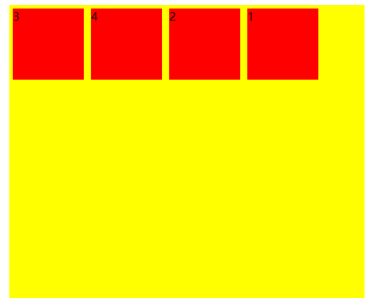
order attribute
The value of order is an integer, which defaults to 0. The smaller the integer is, the higher the item is arranged. It is used to determine the order of items. The larger the value, the lower the ranking. You can take a negative value.
The basic syntax format is as follows:
.item {
	order: <integer>;
}
<!DOCTYPE html>
<html>
	<head>
		<meta charset="UTF-8">
		<title></title>
		<style>
			.box {
				width: 500px;
				height: 800px;
				background-color: yellow;
				display: flex;
			}
			div {
				width: 100px;
				height: 100px;
				background-color: red;
				margin: 5px;
			}
			.item1 {
				order: 4;
			}
			.item2 {
				order: 3;
			}
			.item3 {
				order: -1;
			}
		</style>
	</head>
	<body>
		<div class="box">
			<div class="item1">1</div>
			<div class="item2">2</div>
			<div class="item3">3</div>
			<div class="item4">4</div>
		</div>
	</body>
</html>
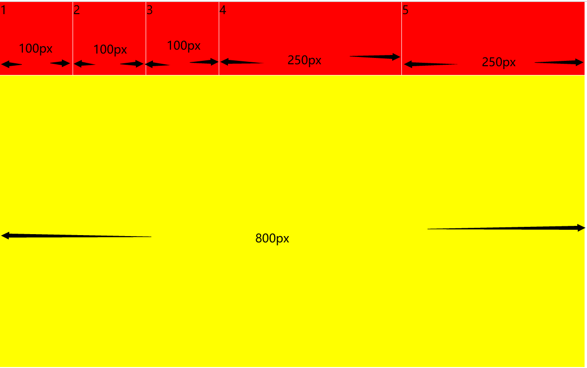
Flex growth attribute
The flex growth attribute defines the magnification of the item. The default value is 0. That is, if there is no remaining space, it will not be enlarged.
The basic syntax format is as follows:
.item {
	flex-grow: <number>; /* default 0 */
}
If all items have a flex growth attribute of 1, they will equally divide the remaining space, if any. If the flex growth attribute of one item is 2 and all other items are 1, the remaining space occupied by the former will be twice that of other items.
<!DOCTYPE html>
<html>
	<head>
		<meta charset="UTF-8">
		<title></title>
		<style>
			* {
				margin: 0;
				padding: 0;
			}
			.box {
				width: 800px;
				height: 500px;
				background-color: yellow;
				display: flex;
			}
			div {
				width: 100px;
				height: 100px;
				background-color: red;
				outline: 1px solid #FFFFFF;
			}
			.item4 {
				flex-grow: 1;
			}
			.item5 {
				flex-grow: 1;
			}
		</style>
	</head>
	<body>
		<div class="box">
			<div class="item1">1</div>
			<div class="item2">2</div>
			<div class="item3">3</div>
			<div class="item4">4</div>
			<div class="item5">5</div>
		</div>
	</body>
</html>
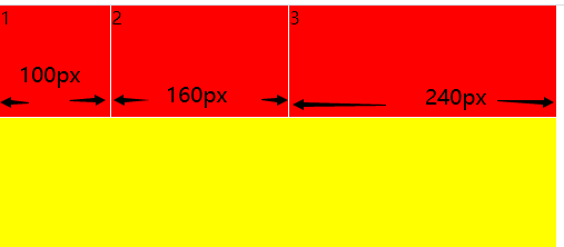
Flex shrink attribute
The flex shrink attribute defines the reduction scale of the item, which is 1 by default, that is, if there is insufficient space, the item will be reduced. Negative values are not valid for this property.
The basic syntax format is as follows:
.item {
	flex-shrink: <number>; /* default 1 */
}
<!DOCTYPE html>
<html>
	<head>
		<meta charset="UTF-8">
		<title></title>
		<style>
			* {
				margin: 0;
				padding: 0;
			}
			.box {
				width: 500px;
				height: 500px;
				background-color: yellow;
				display: flex;
			}
			div {
				height: 100px;
				background-color: red;
				outline: 1px solid #FFFFFF;
			}
			.item1 {
				width: 100px;
				flex-shrink: 0;
			}
			.item2 {
				width: 200px;
				flex-shrink: 1;
			}
			.item3 {
				width: 300px;
				flex-shrink: 1;
			}
		</style>
	</head>
	<body>
		<div class="box">
			<div class="item1">1</div>
			<div class="item2">2</div>
			<div class="item3">3</div>
		</div>
	</body>
</html>
Flex basis attribute
The flex basis attribute defines the main size occupied by the project before allocating extra space. Based on this attribute, the browser calculates whether the spindle has excess space. Its default value is auto, which is the original size of the project.
The basic syntax format is as follows:
.item {
	flex-basis: <length> | auto; /* default auto */
}
It can be set to the same value as the width or height attribute (such as 350px), and the project will occupy a fixed space.
flex attribute
Flex attribute is short for flex grow, flex shrink and flex basis. The default value is 0 1 auto. The last two properties are optional.
The basic syntax format is as follows:
.item {
	flex: none | [ <'flex-grow'> <'flex-shrink'>? || <'flex-basis'> ]
}
This attribute has two quick values: auto (1 1 auto) and none (0 0 auto).
It is recommended to use this attribute first rather than write three separate attributes separately, because the browser will calculate the relevant values.
Align self attribute
The align self attribute allows a single item to have a different alignment from other items, which can override the align items attribute. The default value is auto, which means to inherit the align items attribute of the parent element. If there is no parent element, it is equivalent to stretch.
The basic syntax format is as follows:
.item {
	align-self: auto | flex-start | flex-end | center | baseline | stretch;
}
The align self attribute allows items to have their own unique alignment on the cross axis. This attribute may take six values, which are completely consistent with the align items attribute except auto.
- auto: consistent with the value of the parent element align self
- Flex start: Top alignment
- Flex end: bottom alignment
- Center: align the center vertically
- baseline: align the bottom of the first line of item text
- stretch: when the item has no height set, the item will be aligned with the container at the same height
<!DOCTYPE html>
<html>
<head>
<meta charset="UTF-8">
<title></title>
<style>
.box {
width: 500px;
height: 800px;
background-color: yellow;
display: flex;
align-items: center;
}
div {
width: 100px;
height: 100px;
background-color: red;
margin: 5px;
}
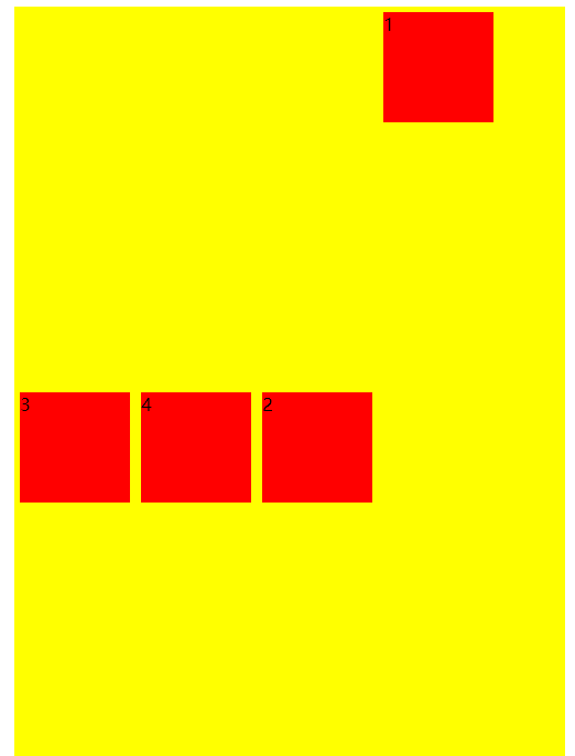
.item1 {
order: 4;
align-self: flex-start;
}
.item2 {
order: 3;
}
.item3 {
order: -1;
}
</style>
</head>
<body>
<div class="box">
<div class="item1">1</div>
<div class="item2">2</div>
<div class="item3">3</div>
<div class="item4">4</div>
</div>
</body>
</html>
Grid layout - average distribution
The simplest grid layout is the average distribution. Allocate space evenly in the container, but you need to set the automatic scaling of items
<!DOCTYPE html>
<html>
	<head>
		<meta charset="UTF-8">
		<title></title>
		<style>
			* {
				margin: 0;
				padding: 0;
			}
			.box {
				display: flex;
			}
			.item {
				flex: 1;
				background-color: red;
				margin: 3px;
			}
		</style>
	</head>
	<body>
		<div class="box">
			<div class="item">1</div>
			<div class="item">2</div>
			<div class="item">3</div>
			<div class="item">4</div>
		</div>
	</body>
</html>
Percentage layout
<!DOCTYPE html>
<html>
<head>
<meta charset="UTF-8">
<title></title>
<style>
* {
margin: 0;
padding: 0;
}
.box {
display: flex;
width: 500px;
height: 50px;
background-color: green;
}
.box div {
outline: 1px solid #FFFFFF;
}
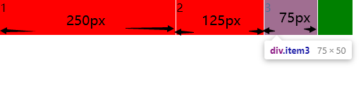
.item1 {
flex: 0 1 50%;
background-color: red;
}
.item2 {
flex: 0 1 25%;
background-color: red;
}
.item3 {
flex: 0 1 15%;
background-color: red;
}
</style>
</head>
<body>
<div class="box">
<div class="item1">1</div>
<div class="item2">2</div>
<div class="item3">3</div>
</div>
</body>
</html>
Grail layout
<!DOCTYPE html>
<html>
	<head>
		<meta charset="UTF-8">
		<title></title>
		<style>
			* {
				margin: 0;
				padding: 0;
			}
			.content {
				display: flex;
				min-height: 100vh;
				flex-direction: column;
			}
			header {
				flex: 1;
				background-color: #92D050;
			}
			footer {
				flex: 1;
				background-color: #FFC000;
			}
			.content-main {
				display: flex;
				flex: 1;
			}
			.main-middle {
				flex: 1;
				background-color: #FBE5D6;
			}
			.main-left {
				flex: 0 1 12em;
				background-color: #00B0F0;
			}
			.main-right {
				/* The width of the two sidebars is set to 12em */
				flex: 0 1 12em;
				background-color: #ED7D31;
			}
		</style>
	</head>
	<body class="content">
		<header>header</header>
		<div class="content-main">
			<nav class="main-left">left</nav>
			<main class="main-middle">center</main>
			<aside class="main-right">right</aside>
		</div>
		<footer>footer</footer>
	</body>
</html>
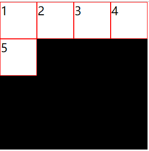
Streaming layout
The number of items in each line is fixed and will be automatically split.
<!DOCTYPE html>
<html>
	<head>
		<meta charset="UTF-8">
		<title></title>
		<style>
			* {
				margin: 0;
				padding: 0;
			}
			.parent {
				width: 200px;
				height: 200px;
				background-color: black;
				display: flex;
				flex-flow: row wrap;
				align-content: flex-start;
			}
			.child {
				box-sizing: border-box;
				background-color: white;
				flex: 0 0 25%;
				height: 50px;
				border: 1px solid red;
			}
		</style>
	</head>
	<body>
		<div class="parent">
			<div class="child">1</div>
			<div class="child">2</div>
			<div class="child">3</div>
			<div class="child">4</div>
			<div class="child">5</div>
		</div>
	</body>
</html>