CSS details - lecturer Lao sun
Course objectives
- CSS introduction
- Combination of CSS and HTML
- Use of CSS
- CSS3 new features
1. Introduction to CSS
1.1 what is CSS?

- CSS refers to cascading style sheets
- CSS allows us to define how HTML elements are displayed.
- CSS can let us describe the effects that cannot be described by HTML through CSS.
- Describing our html page through CSS can make our page more beautiful and improve work efficiency.
2. Combination of CSS and HTML
2.1 the first method is inline / inline style
It refers to CSS code through the style attribute on our HTML tag.
Advantages: simple and convenient;
Disadvantages: only one label can be decorated.
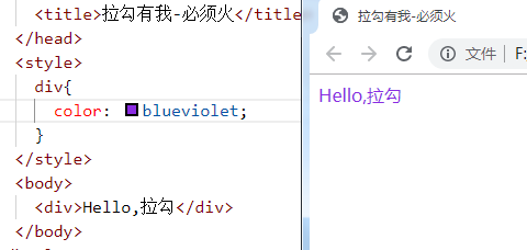
2.2 the second method is internal style sheet
We declare our CSS through the < style > tag Generally, we recommend that the < style > label be written between head and body, that is, "neck"
Location of
Advantages: uniform style settings can be made through multiple labels
Disadvantages: it can only be modified on this page
Syntax: selector {attribute: value; attribute: value}
2.3 the third method is external style sheet
We need to define a CSS file separately. Note that the suffix of CSS file is css
Under the root directory of the project, create the CSS directory, and create the CSS file css01 in the CSS directory css
Use the < link > tag in < head > to reference an external css file
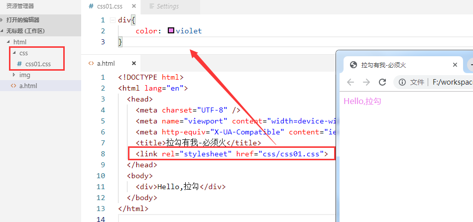
You can also use another way to import css files:
<style>
 @import 'css/css01.css'
</style>
What is the difference between using < link > and @ import for importing css externally?
- Loading order is different
- @ import will load html first and then import css style. If the network conditions are bad, you will see the unmodified page first and then the modified page.
– if the link method is used, it will load the style sheet first, that is, what we see directly is the decorated page; - @css style is imported in import mode, which does not support dynamic modification of javascript. And link support.
- Priority of three style sheets: meet the proximity principle: inline > internal > external
3. Use of CSS
3.1 selector in CSS
3.1. 1 element (label) selector
It can uniformly set the same label on the page. It describes the name of the label

3.1. Type 2 selector
Class selectors use '.' when used It describes the class attribute value on the element

3.1.3 id selector
It can only select one element. It is introduced with "#" and refers to the id attribute value of the element.
id selector is more unique than class selector

3.1. 4 selector group
Commas indicate who and who.
For example, I have a mobile phone, you have a mobile phone, and he also has a mobile phone. If it's too troublesome to write one by one, you can merge and write it
I,you,he{
 mobile phone
}

3.1. 5 derived selector
Offspring: parent-child relationship (regardless of generation)
Descendants: father, son, grandson, great grandson

3.1.6 CSS pseudo class
- CSS pseudo classes can add some special effects to CSS selectors
- Pseudo class attribute list:
- : active adds a style to the active element.
- : hoverwhen the mouse hovers over an element, add a style to the element.
- : linkadd styles to links that are not accessed.
- : visited adds a style to a link that has been accessed.
- : first child adds a style to the first child element of the element.
Pseudo class of hyperlink: abide by the use order, love hate principle, LoVeHAte, lvha
a:link {color: #FF0000} / * links not visited*/
a:visited {color: #00FF00} / * links visited*/
a:hover {color: #FF00FF} / * mouse over link*/
a:active {color: #0000FF} / * selected links*/

3.2 CSS basic properties
3.2. 1 text properties
- Specified font: font family: value;
- Font size: font size: value;
- px: pixels
- em: multiple
- Bold font: font weight: normal / bold;
- Text color: Color: value;
- Text alignment: left / right / center;
- Text decoration: text decoration: none / underline;
- Line height: line height: value;
- Indent the first line of text: text indent: value (2em);

3.2. 2 background properties
CSS allows you to apply a solid color as the background, as well as use background images to create fairly complex effects.
- Background color sets the background color of the element.
- Background image sets the image as the background.
background-image: url('img/1.jpg'); - Background repeat sets the wallpaper effect of the background image, whether and how to repeat it
- Repeat: repeat in the vertical and horizontal directions. It is a duplicate value
- repeat-x: repeat only horizontally
- repeat-y: repeat only in the vertical direction
- No repeat: display only once
- Background position sets the starting position of the background image
- 1: Control horizontal x-axis: positive value, moving to the right; Negative value, move left
- 2: Control vertical y axis: positive value, moving downward; Negative value, move up
/* The picture moves 50px to the left and 100px to the down (can be negative) */
 background-position:50px 100px;
- Whether the background attachment image is fixed or scrolls with the rest of the page
- The default value is scroll: by default, the background scrolls with the document
- Fixed: the background image is fixed and will not scroll with the rest of the page. It is often used to realize the image called watermark
background-attachment: fixed;
3.2. 3 list properties
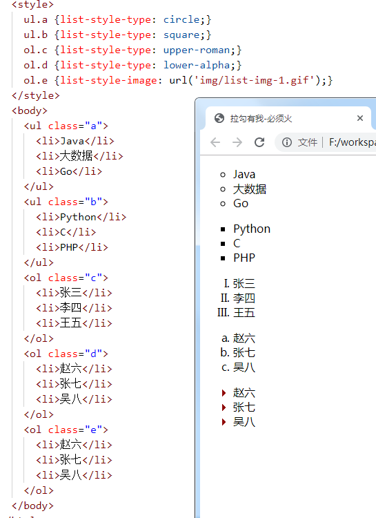
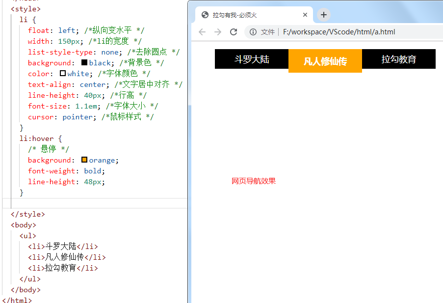
The CSS list attribute functions as follows:
- Set different list items to be marked as a sequential table
- Set different list items to be marked as unordered lists
- Set list item as image
There are two types of lists:
- Unordered list - special graphics for marking list items (such as small black dots, small boxes, etc.)
- Ordered list - list items are marked with numbers or letters
With CSS, you can list further styles and use images as list item tags.
- none: no tag. (remove marks)
- disc: default. The marker is a solid circle.
- Circle: the marker is a hollow circle.
- Square: the marker is a solid square.
- decimal: the tag is a number.
- Decimal leading zero: a numeric marker beginning with 0. (01, 02, 03, etc.)
- Lower Roman: lowercase Roman numerals (i, ii, iii, iv, v, etc.)
- Upper Roman: capital Roman numerals (I, II, III, IV, V, etc.)
- Lower alpha: the marker is lower alpha (a, B, C, D, e, etc.)
- Upper alpha: the marker is upper alpha (a, B, C, D, e, etc.)
3.2. 4 border properties
CSS border properties allow you to specify the style and color of an element's border.

<style>
	div{border-width: 20px;
	 	border-color: green;
	 	border-style: outset;
	}
	</style>
	<body>
	<div>hello</div>
	</body>
Border style value: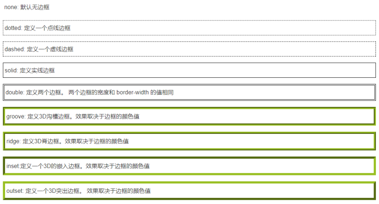
3.2. 5 profile properties
An outline is a line drawn around an element. It is located at the periphery of the border edge and can highlight the element.
Difference between outline and border:
- The border can be one or more lines around the element content and inner margin;
- An outline is a line drawn around an element. It is located at the periphery of the border edge and can highlight the element.
The CSS outline property specifies the style, color, and width of the element outline

3.2. 6 box model
All HTML elements can be regarded as boxes. In CSS, the term "box model" is used for design and layout.
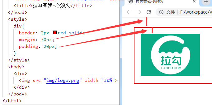
CSS box model is essentially a box that encapsulates the surrounding HTML elements, including margins, borders, padding, and actual content.
The box model allows us to place elements in the space between other elements and the surrounding element frame.
The following picture illustrates the box model:

- Margin - the distance between boxes
- Border - the protective shell of the box
- Padding - padding, the distance between the box edge and the content
- Content - the content of the box, the text or image displayed
3.3 CSS positioning
3.3. 1 default positioning
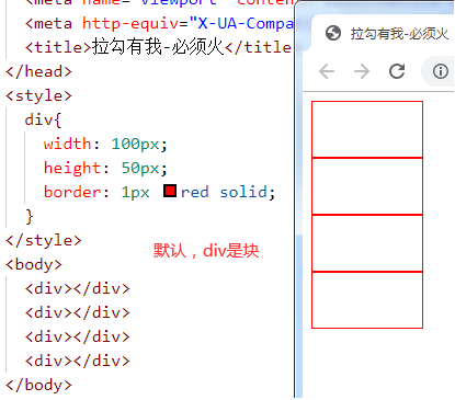
- Block level elements: h1~h6, p, div, etc., arranged vertically from top to bottom (auto wrap); width and height can be changed
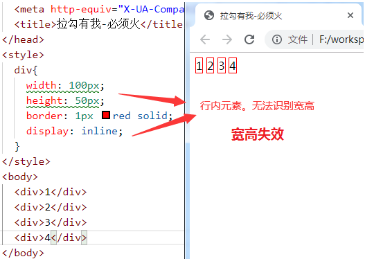
- In line elements: a,b,span, etc., arranged horizontally from left to right (no line break); width and height cannot be changed
- In line block elements: input,img, etc., arranged horizontally from left to right (auto wrap); width and height can be changed
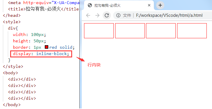
3.3. 2 floating positioning
- Let the element "fly". Not only on the left or right. It can also eliminate the overbearing feature of "block level" (occupying one line alone).
- float value:
- none: No floating
- Left: floating against the left
- Right: float next to the right
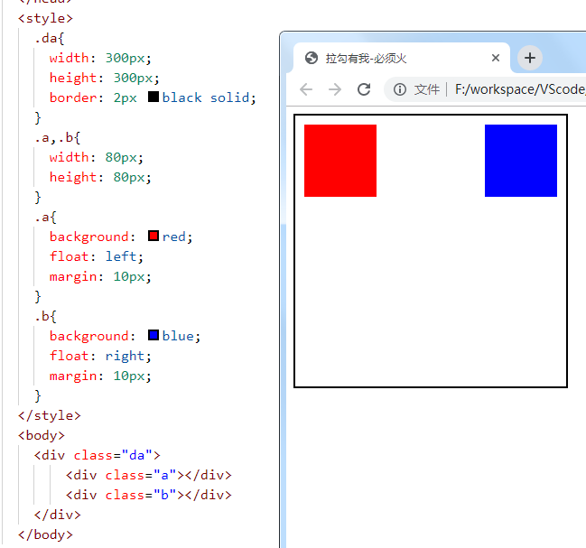
3.3. 3 relative positioning
Compare with the original position to move and locate (offset)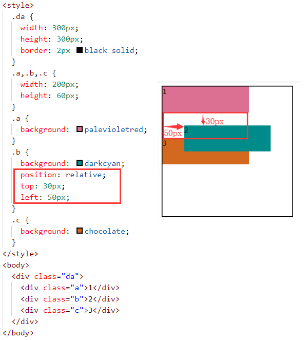
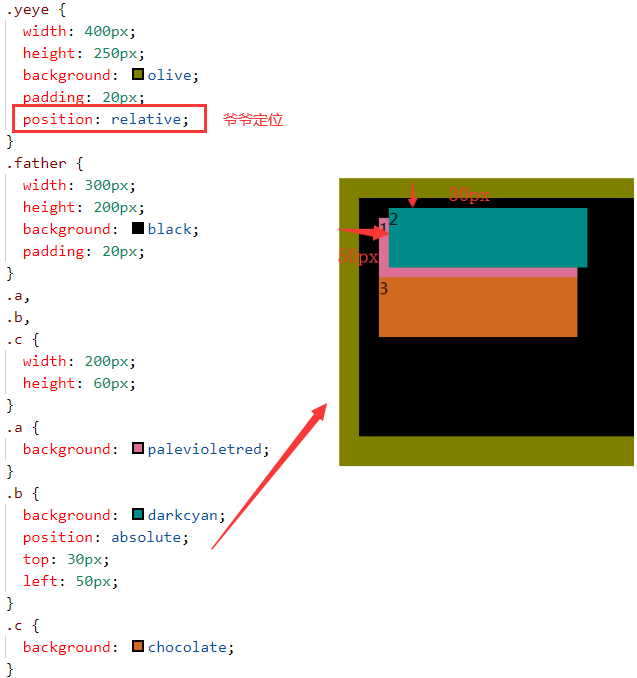
3.3. 4 absolute positioning
Distance between this element and the located ancestor element
- If the parent element is located, take the parent as the reference;
- If the parent level is not located, find the grandpa level. Grandpa is located and takes grandpa as the reference.
- If grandpa doesn't locate and continues to look up, if he doesn't locate, body is the final choice.
<div class="yeye">
 <div class="father">
  <div class="a">1</div>
  <div class="b">2</div>
  <div class="c">3</div>
 </div>
</div>
- Take the parent node as the reference
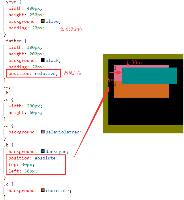
- Take the grandfather node as the reference
3.3. 5 fixed positioning
The content of the element is fixed at a certain position on the page. When the user scrolls down the page, the element box does not move with it
3.3.6 z-index
If there are overlapping elements, use the z-axis attribute to define the upper and lower levels.
be careful:
- The z-axis attribute should be used in conjunction with relative or absolute positioning.
- There is no rated value for the z value (integer is OK, and the specific number is optional)
4. CSS3
4.1 fillet
Border radius: upper left, upper right, lower right, lower left;
Border radius: four corners;
border-radius: 50%; circular
4.2 box shadow
box-shadow: 1 2 3 4 5;
1: Horizontal offset
2: Vertical offset
3: Fuzzy radius
4: Expansion radius
5: Colour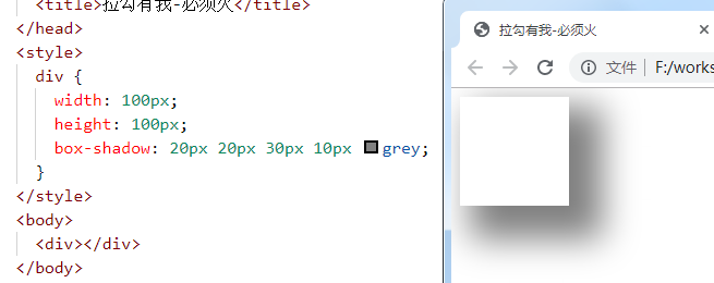
4.3 gradient
4.3. 1 linear gradient
background:linear-gradient([direction/angle],Color list);
<style>
 div{
 	width: 200px;
 	height: 60px;
 	margin: 10px;
 	}
 .a1 {background: linear-gradient(red,black); }
 .a2 {background: linear-gradient(red,black,pink, green); }
 .a3 {background: linear-gradient(to left,red,black); }
 .a4 {background: linear-gradient(to top left,red,black); }
 .a5 {background: linear-gradient(30deg,red,black); }
</style>
<body>
	<div class="a1"></div>
	<div class="a2"></div>
	<div class="a3"></div>
	<div class="a4"></div>
	<div class="a5"></div>
</body>
4.3. 2 radial gradient
Diverge outward at the center of the circle
background: radial-gradient(Color list);
<style>
	div {
		width: 200px;
		height: 200px;
		margin: 10px;
		}
	.a1 { background: radial-gradient(red, black); }
	.a2 { background: radial-gradient(red, black, pink, green); }
	.a3 { border-radius: 50%; background: radial-gradient(red, black); }
</style>
<body>
	<div class="a1"></div>
	<div class="a2"></div>
	<div class="a3"></div>
</body>
4.4. 2 background cutting
background-clip:
- Border box border cut
- Padding box inner margin cut
- Content box content cut
<style>
	div {
		width: 200px;
		height: 80px;
		border: 10px dashed red;
		background-color: darkcyan;
		margin: 20px;
		padding: 20px;
	}
	.a {background-clip: border-box; }
	.b {background-clip: padding-box; }
	.c {background-clip: content-box; }
</style>
<body>
	<div class="a"></div>
	<div class="b"></div>
	<div class="c"></div>
</body>
4.4. 3 background size
background-size:
- cover scales to the minimum size that fully covers the background area
- contain scales to the maximum size that fully fits the background area
<style>
div {
 background: url("img/1.jpg") no-repeat;
 width: 200px;
 height: 100px;
 border: 2px solid red;
 margin: 20px;
}
.a {background-size: cover; /* Full coverage */ }
.b {background-size: contain; /* Complete adaptation */ }
</style>
<body>
	<div class="a"></div>
	<div class="b"></div>
</body>
4.5 transition animation
4.5. 1 transition
A "slow" process from one state to another;
The disadvantage is that you can't control a certain point in time.
transition{1 2 3 4}
1: css properties of transition or animation simulation
2: Time taken to complete the transition (completed within 2s)
3: Transition function...
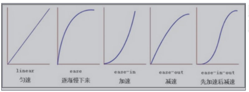
4: Delay time at the beginning of transition
transition: width 2s ease 1s;
At present, css3 only develops some transition attributes, as shown in the following figure:

<style>
div{
	width: 100px;
	height: 50px;
	border: 2px solid red;
}
.a{ transition: width 2s linear 1s; /*1 After 2 seconds, the div widens slowly at a constant speed in 2 seconds*/ }
div:hover{ width: 300px;} /*Trigger div widening*/
</style>
<body>
	<div class="a">Hello,pinkie promise</div>
</body>
4.5. 2 animation
From one state to another, each time point in the process can be controlled.
- Key frames: @ keyframes animation frame {from{} to {}} or {0% {} 20% {}...}
- Animation attributes: animation {1, 2, 3, 4, 5}
- Animation frame
- execution time
- Transition function
- Delay in animation execution (can be omitted)
- Number of animation executions
Requirement 1: an element moves from left to right and executes twice in 3 seconds
<style>
div{
	width: 700px;
	border: 1px solid red;
}
@keyframes x{
	from{ margin-left: 0px;}
	to{ margin-left: 550px;}
}
img{animation: x 3s linear 2; }
</style>
	<body><div><img src="img/cat.gif"> </div>
</body>
Requirement 2: an element moves from left to right and is executed within 3 seconds. Infinite alternate execution
Infinite: infinite times
Alternate: execute back and forth (alternate, go back and forth)
<style>
.wai{
	width: 600px;
	height: 100px;
	border: 2px solid red;
}
.nei{
	width: 40px;
	height: 80px;
	margin: 5px;
	background: red;
}
.nei{animation: x 3s linear infinite alternate; }
@keyframes x{
	0%{ margin-left: 0px; }
	25%{ background: yellowgreen; }
	50%{ background: goldenrod; }
	75%{ background: palevioletred;}
	100%{background: coral; margin-left: 550px; }
}
</style>
<body>
	<div class="wai">
		<div class="nei"></div>
	</div>
</body>