Hello, I'm A bowl week , a front end that doesn't want to be drunk. If you are lucky enough to get your favor, I am very lucky~
Write in front
In actual development, in order to increase the user experience, transition animation is often used, and transition animation is through CSS transition and animation Implemented. In Vue, some components and API s are built in Vue itself, which can help us easily realize the transition animation effect; Next, let's learn.
Vue's transition component
Vue provides a transition component, which can automatically add entry / exit transition effects to elements in one of the following cases:
- Using v-if conditional rendering
- Using v-show conditional display
- Dynamic component
- Component root node
The use method is also relatively simple. You need to wrap the components or elements that need animation display with < transition > components, and then define a group of class es.
Transition demo
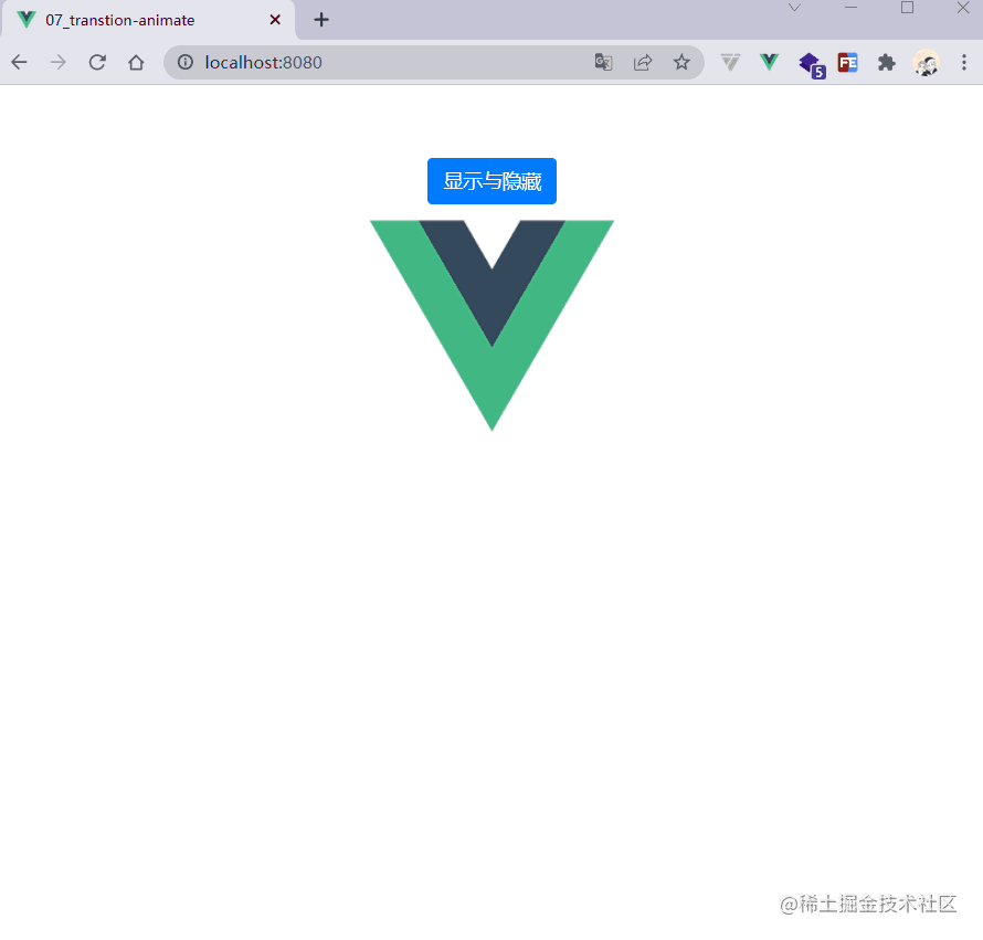
The following code shows the basic usage of the < transition > component:
<template>
  <button class="btn btn-primary" @click="helloWorldShow = !helloWorldShow">
    Show and hide
  </button>
  <br />
  <img alt="Vue logo" src="./assets/logo.png" />
  <transition>
    <hello-world v-if="helloWorldShow" msg="[[one bowl week] transition animation demonstration demo" />
  </transition>
</template>

<script setup>
import { ref } from 'vue'
import HelloWorld from './components/HelloWorld.vue'
const helloWorldShow = ref(true)
</script>

<style>
#app {
  /* more css */
}
/* Style before entering and after leaving */
.v-enter-from,
.v-leave-to {
  opacity: 0;
}
/* Style in the process of leaving and entering */
.v-enter-active,
.v-leave-active {
  /* Add transition animation */
  transition: opacity 0.5s ease;
}
/* Style after entering and before leaving */
.v-enter-to,
.v-leave-from {
  opacity: 1;
}
</style>
The running results of the code are shown in the following figure:

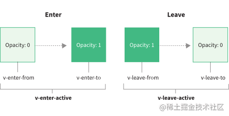
Some class es used above have the following meanings:
- v-enter-from: defines the start state of the transition. Takes effect before the element is inserted and is removed at the next frame after the element is inserted.
- v-enter-active: defines the state when the transition takes effect. Applied throughout the transition phase, it takes effect before the element is inserted and removed after the transition / animation is completed. This class can be used to define the process time, delay and curve function of entering the transition.
- v-enter-to: defines the end state of the transition. The next frame takes effect after the element is inserted (at the same time, v-enter-from is removed), and is removed after the transition / animation is completed.
- v-leave-from: defines the start state of the exit transition. Takes effect immediately when the exit transition is triggered and the next frame is removed.
- v-leave-active: defines the state when the exit transition takes effect. Applied throughout the exit transition phase, it takes effect immediately when the exit transition is triggered and is removed after the transition / animation is completed. This class can be used to define the process time, delay and curve function of leaving the transition.
- v-leave-to: leave the end state of the transition. After the departure transition is triggered, the next frame takes effect (at the same time, v-leave-from is removed), which is removed after the transition / animation is completed.
The following figure is a diagram in the Vue document, which perfectly explains the whole process
Naming rules for class
The class name of the < transition > component does not have to be prefixed with v -. In fact, we can customize the prefix. We only need to add a name attribute, such as < transition name = "ywz" >, and all prefixes will become ywz -.
Using animation
Previously, we used the transition attribute to realize the transition effect of components entering and leaving. Now we can use the animation attribute. The example code is as follows:
<transition>
  <hello-world v-if="helloWorldShow" msg="[[one bowl week] transition animation demonstration demo" />
</transition>
css
/* Style in the process of leaving and entering */
.v-enter-active,
.v-leave-active {
  /* Add transition animation */
  transition: opacity 0.5s ease;
}
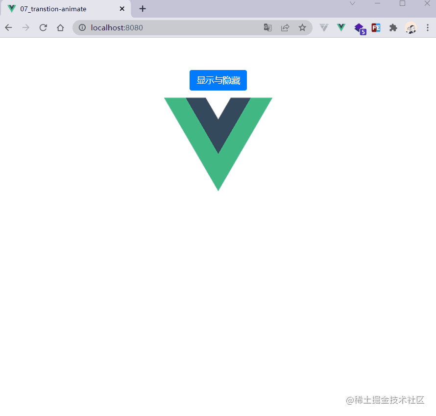
The running results of the code are as follows:
Transition mode
Let's look at a problem first. When the animation switches between two elements, there will be a problem. The code to reproduce this problem is as follows:
<template>
  <button class="btn btn-primary" @click="show = !show">Show and hide</button>
  <br />
  <transition>
    <hello-world v-if="show" msg="[[one bowl week] transition animation demonstration demo" />
    <img v-else alt="Vue logo" src="./assets/logo.png" />
  </transition>
</template>

<script setup>
import { ref } from 'vue'
import HelloWorld from './components/HelloWorld.vue'
const show = ref(true)
</script>

<style>
/* ellipsis */
</style>
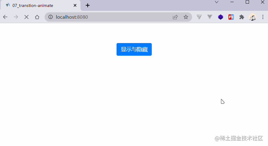
The operation effect is as follows:
We can see that two components exist simultaneously in an instant. Sometimes we don't need this effect, so we need to set the transition mode of the < transition > component, that is, the mode attribute, which contains three values:
- default: the new element is processed simultaneously with the current element.
- In out: the new element enters the transition first, and then the current element leaves the transition.
- Out in: the current element will leave the transition first, and then the new element will enter the transition.
After understanding this attribute, we will modify the code as follows:
<transition mode="out-in">
  <hello-world v-if="show" msg="[[one bowl week] transition animation demonstration demo" />
  <img v-else alt="Vue logo" src="./assets/logo.png" />
</transition>
The running results are as follows:

Appearance property
The appear ance attribute of the < transition > component is used to start the animation rendered for the first time. It accepts a Boolean value. The example code is as follows:
<transition mode="out-in" appear>
  <img v-if="show" alt="Vue logo" src="./assets/logo.png" />
</transition>
animate. Use of CSS Library
If we write these animation sequences one by one in the actual development, the efficiency is relatively low, so we often use some animation libraries, the most common is animation css.
Now let's take a look at how to use animate in Vue css:
- Install animate css
npm i animate.css
- Introduce animate css
// main.js
import 'animate.css'
Use animation sequences
.v-enter-active {
  animation: fadeInDown 0.5s;
}
.v-leave-active {
  animation: fadeOutDown 0.5s;
}
Use custom transition class
The < transition > component also provides attributes to customize the transition class, as follows:
- enter-from-class
- enter-active-class
- enter-to-class
- leave-from-class
- leave-active-class
- leave-to-class
Their priority will be higher than ordinary class names.
<transition
  mode="out-in"
  enter-active-class="animate__animated animate__fadeInDown"
  leave-active-class="animate__animated animate__fadeOutDown"
>
  <img v-if="show" alt="Vue logo" src="./assets/logo.png" />
</transition>
Write at the end
This article introduces the basic use of transition, and master the < transition > component provided by Vue to cooperate with animate CSS can easily realize transition animation.
In addition to the transition of individual components, Vue also provides TransitionGroup Component, which is used to realize the transition animation of multiple components, which will be introduced later.