Preface
This article will introduce our form solution. @femessage/el-form-renderer Show us how we deal with the following issues under the Vue technology stack:
- Dynamic display or hiding of form items
- Form Data Linkage
- Format Input/Output Data Formatting
- Processing of Unconventional Form Items
- Complex form validation
programme
Dynamic Display or Hide of Form Items
You can control the display or hiding of a form item by hiding.

<template>
<el-form-renderer ref="form" :content="content" />
</template>
<script>
export default {
name: 'hidden',
data() {
return {
content: [
{
type: 'select',
id: 'selected',
label: 'Selection of projects',
options: [
{
label: 'project A',
value: 'optionA'
},
{
label: 'project B',
value: 'optionB'
}
]
},
{
label: 'data',
type: 'input',
id: 'data',
el: {
placeholder: 'project B Specific content'
},
hidden: form => form.selected !== 'optionB' // Hide if the option is not item B
},
]
}
}
}
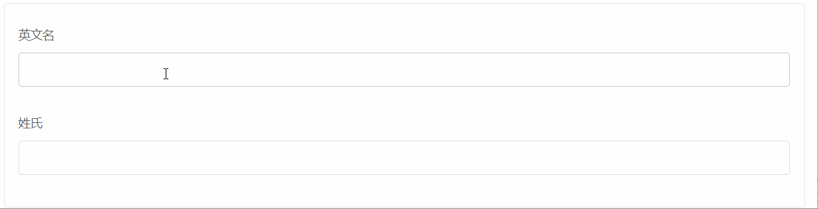
</script>Form Data Linkage (on)
Form linkage can be achieved by on monitoring events such as blur, focus, etc.
For example, after filling in fullName, last Name is automatically filled in
<template>
  <el-form-renderer ref="form" :content="content" />
</template>

<script>
export default {
  data() {
    return {
      content: [
        {
          label: 'English Name',
          type: 'input',
          id: 'fullName',
          on: {
            blur: ([event], updateForm) => {
              const value = event.target.value
              const lastName = value.split(' ')[1] // Segmentation of content by spaces
              updateForm({ lastName })                       // Update other form items
            },
          },
        },
        {
          label: 'Surname',
          type: 'input',
          id: 'lastName',
        }
      ]
    }
  }
}
</script>
Input/output Format
Take the date range selector as an example. The output value of the component is a string, but the back-end interface format is two fields {startDate, endDate}, then the data needs to be formatted.
inputFormat
Convert the input data into the data format required by the form item
<template>
  <el-form-renderer :content="content" ref="form" />
</template>

<script>
export default {
  data() {
    return {
      content: [
        {
          el: {
            type: 'daterange',
            placeholder: 'Choose a date',
            valueFormat: 'yyyy-MM-dd'
          },
          type: 'date-picker',
          id: 'date',
          label: 'date',
          // The time range of interface design is two fields,'2019-07-23','2019-07-24'.
          // The treated values are ['2019-07-23','2019-07-24']
          inputFormat: row => ([row.startDate, row.endDate])
        }
      ]
    }
  }
}
</script>
outputFormat
Convert the output data to the desired (interface expected) data format
<script>
export default {
  data() {
    return {
      content: [
        {
          el: {
            type: 'daterange',
            placeholder: 'Choose a date',
            valueFormat: 'yyyy-MM-dd'
          },
          type: 'date-picker',
          id: 'date',
          label: 'date',
          // The value before processing is date: ['2019-07-23','2019-07-24']
          // The treated values are {startDate:'2019-07-23', endDate:'2019-07-24'}.
          outputFormat: val => {
            if (!val) {
              return {startDate: '', endDate: ''}
            }
            return {
              startDate: val[0],
              endDate: val[1]
            }
          }
        }
      ]
    }
  }
}
</script>
Custom Components
@femessage/el-form-renderer The default supported type is limited and can only render common form items. For personalized requirements, such as rendering an upload component, type is not enough. So what? Component options come in handy.
component can render custom components, and the key to writing custom components is to implement v-model within components:
- There is a props for value
- Triggering input events externally

<!-- Custom Components my-input -->
<template>
  <div class="my-component">
    <el-input :value="value" @input="onInput" />
    <el-button @click="onInput('Let me input something for you.')">Help me type something in</el-button>
  </div>
</template>

<script>
export default {
  props: {
    value: String
  },
  methods: {
    onInput(val) {
      this.$emit('input', val)
    }
  }
}
</script>
Then you can use the component attribute to make the ____________ @femessage/el-form-renderer Render this custom component
<template>
  <div class="my-component">
    <el-input :value="value" @input="onInput" />
    <el-button @click="onInput('Let me input something for you.')">Help me type something in</el-button>
  </div>
</template>

<script>
export default {
  props: {
    value: String
  },
  methods: {
    onInput(val) {
      this.$emit('input', val)
    }
  }
}
</script>
At present, the team has implemented v-model for common form extension components according to the standard, so they can not write template. @femessage/el-form-renderer Implementing data-driven rendering
- Upload component https://github.com/FEMessage/upload-to-ali
- Rich Text Editor https://github.com/FEMessage/v-editor
- Provincial and Urban Selector https://github.com/FEMessage/el-select-area
- Scope input box https://github.com/FEMessage/el-number-range
- Version Number Input Box https://github.com/FEMessage/el-semver-input
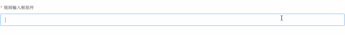
Complex form validation (rules)
A complex form item configuration often needs to define some rules to restrict user input. There may also be a custom validator in the rules. If there are more such forms, the page file configuration items will become very long.
The solution is to set validation rules inside components to achieve the purpose of encapsulation hiding. Users don't need to care about the validation rules of forms, just introduce components directly and use them.
Here is a validation rule encapsulated with a custom component (basic input box). The rules are as follows:
- No null value allowed
- Enter only 3 digits or more.
- Must start with 123
<template>
  <el-input :value="value" @input="onInput"/>
</template>
<script>
export default {
  rules() {
    return [
      {
        required: true,
        validator: (rule, val, callback) => {
          if (!val) {
            callback(new Error('Can't be empty!'))
          } else if (!val.length >= 3) {
            callback(new Error('Enter only 3 digits or more.!'))
          } else if (!/^123/.test(val)) {
            callback(new Error('Must start with 123!'))
          } else {
            callback()
          }
        }
      }
    ]
  },
  props: ['value'],
  methods: {
    onInput(val) {
      this.$emit('input', val)
    }
  }
}
</script>
epilogue
Our internal projects are in use. @femessage/el-form-renderer That's right. github Find more information.
Welcome to use it to improve the efficiency of project development~