3.1 view container assembly
| View container | Scrollable view area | Slider view container | Removable view container | View containers that override native components |
|---|---|---|---|---|
| view | scroll-view | swiper | movable-view | cover-view |
3.1.1 view container
Similar to div in html
Properties:
| attribute | type | Default value | explain |
|---|---|---|---|
| hover | Boolean | false | Enable click mode |
| hover-class | String | none | Specifies the style class to be pressed down. When the value is none, there is no click effect |
| hover-start-time | Number | 50 | How long does the click state appear after holding down, in milliseconds |
| hover-stay-time | Number | 400 | Click state retention time after finger release, unit: ms |
3.1.2 scroll view scrollable view area
Scroll view scrolls the view area, allowing the contents of the view area to scroll horizontally or vertically
Similar to the browser's horizontal scroll bar and vertical scroll bar
| attribute | type | Default value | explain |
|---|---|---|---|
| scroll-x | Boolean | false | Allow lateral scrolling |
| scroll-y | Boolean | false | Allow vertical scrolling |
| upper-threshold | Number | 50 | When it is far from the top / left (in px), the scrollloader event is triggered |
| lower-threshold | Number | 50 | When it is far from the bottom / right (px), the scrollviewer event is triggered |
| scroll-top | Number | Set vertical scroll bar position | |
| scroll-left | Number | Set horizontal scroll bar position | |
| scroll-into-view | String | If the value should be a child element id, scroll to the element and align the top of the element with the top of the scrolling area | |
| bindscroll toupper | EventHandle | Scrolling to the top / left triggers the scrollloader event | |
| bindscroll tolower | EventHandle | Scrolling to the bottom / right triggers the scrollviewer event | |
| bindscroll | EventHandle | Triggered when scrolling, event detail={ scrollLeft,scrollTop,scrollHeight, scrollwidth, deltax, deltaY) |
3.1.3 swiper slider view container
The swiper slider view container is used to toggle the display within a specified area
It is often used to make poster rotation effect and tab content switching effect
attribute
| attribute | type | Default value | explain |
|---|---|---|---|
| indicator-dots | Boolean | false | Display panel indicator points |
| autoplay | Boolean | false | Whether to switch automatically |
| current | Number | 0 | index of the current page |
| interval | Number | 5000 | Automatic switching interval |
| duration | Number | 500 | Slide animation duration |
| circular | Boolean | false | Whether connection sliding is adopted |
| bindchange | EventHandle | The change event will be triggered when the current is changed detail={ current: current } |
Sample code (poster rotation)
<view class="haibao">
  <swiper indicator-dots="{{findicatorDots}}" autoplay="{{autoplay}}}" interval="{{interval}}" duration="{{duration}}">
	<block wx:for="{{imgUrls}}">
		<swiper-item>
			<image src="{{item}}" class="silde-image" style="width:100%"></image>
		</swiper-item>
	</block>
  </swiper>
</view>
Page({
	data:{
		indicatorDots:true,
		autoplay:true,
		interval:5000,
		duration:1000,
		imgUrls:["../img/wx1.jpg", "../img/wx2.jpg", "../img/wx3.jpg"]}
})
Example code (tab switching)
<view class="content">
	<view class="loginTitle">
		<view class="{{currentTab==O?'select':'default'}})" data-current="0" bindtap="switchNav">Mobile number login</view>
		<view class="{{currentTab==1?'select':'default'}})" data-current="1" bindtap="switchNav">Mailbox register</view>
		<view class="{{currentTab==2?'select':'default'}})" data-current="2" bindtap="switchNav">Love course login</view>
	</view>
	<view class="hr"></view>
	<swiper current="{{currentTab}}" style="height:{{winHeight}}px">
		<swiper-item>
			<view style="margin-top:10px;border:lpx solid #cccccc; width:99%; height:200px; "> this is the mobile number login area < / View >
		</swiper-item>
		<swiper-item>
			<view style="margin-top:10px;border:lpx solid #cccccc; width:99%; height:200px; "> this is the email login area < / View >
		</swiper-item>
		<swiper-item>
			<view style="margin-top:10px;border:lpx solid #cccccc; width:99%; height:200px; "> this is the login area of aike.com < / View >
		</swiper-item>
	</swiper>
</view>
Page({
	data:{
		currentTab:0,
		winWidth:0,
		winHeight:0
	},
	onLoad:function(options){
		var page = this;
		wx.getSystemInfo({
			success:function(res){
				console.log(res);
				page.setData({
					winWidth: res.windowWidth
				});
				page.setData({
					winHeight:res.windowHeight
				});
			}
		})
	},
	switchNav: function(e){
		var page = this;
		if(this.data.currentTab ==e.target.dataset.current){
			return false;
		}else {
			page.setData({
				currentTab:e.target.dataset.current});
		}
	}
})
.loginTitle {
	display:flex;
	flex-direction:row;
	width: 100%;
}
.select {
	font-size:12px;
	color:black;
	width:33%;
	text-align:center;
	height: 45px;
	line-height: 45px;
	border-bottom:5rpx solid green;
}
.default {
	font-size:12px;
	margin:0 auto;
	padding:15px;
}
.hr {
	border:1px solid #ccc;
	opacity:O.2;
}
3.1.4 movable view container
- This component is a movable view container, which can be dragged and slid in the page
- When using this component, you need to define the movable area first, and then define the direct child node movable view, otherwise it cannot be moved
- The width and height properties of movable area must be set. If not, the default value is 10px
- The width and height properties of movable view must be set. If not, the default value is 10px
- The movable view defaults to absolute positioning, and the top and left attributes are Opx
attribute
| attribute | type | Default value | explain |
|---|---|---|---|
| direction | string | none | The moving direction of the movable view. The attribute values include all, vertical, horizontal, and none |
| inertia | boolean | false | Is the movable view inertial |
| out-of-bounds | boolean | false | Can the movable view be moved after the movable area is exceeded |
| x | number | Define the offset in the x-axis direction. If the value of X is not within the movable range, it will automatically move to the movable range; Changing the value of X triggers the animation | |
| y | number | Define the offset in the y-axis direction. If the value of Y is not within the movable range, it will automatically move to the movable range; Changing the value of Y triggers the animation | |
| damping | number | 20 | Damping coefficient, used to control the animation when x or y changes and the animation of over bound rebound. The larger the value, the faster the movement |
| friction | number | 2 | Friction coefficient, used to control the animation of inertial sliding. The greater the value, the greater the friction, and the faster the sliding stops; Must be greater than 0, otherwise it will be set to the default value |
| disabled | boolean | false | Disable |
| scale | boolean | false | Whether to support two finger scaling. The default effective area of scaling gesture is in movable view |
| scale-min | number | 0.5 | Defines the minimum zoom factor |
| scale-max | number | 10 | Defines the maximum zoom factor |
| scale-value | number | 1 | Define the scaling multiple, and the value range is 0.5 - 10 |
| bindchange | eventhandle | Event triggered during dragging, event detail = {x, y,source} | |
| bindscale | eventhandle | Event triggered during scaling, event detail = {x, y,scale} |
Two special events provided by movable view
①htouchmove
It means that the movement after the first finger touch is lateral movement
②vtouchmove
Refers to the vertical movement after the first touch of the mobile phone
Note: if these two events are caught, it means that the touchmove event is also caught
3.1.4 cover view covers the view container of native components
- Cover view and cover image are two view containers that cover native components
- Cover view refers to the text view overlaid on the native components. The native components that can be overlaid include map, video, canvas and camera. Only nested cover view and cover image are supported
- Cover image refers to the picture view overlaid on the native components. The overlayable native components, like cover yiew, support nesting in cover view
attribute
| attribute | type | Required | explain |
|---|---|---|---|
| scroll-top | number/string | no | Set the top scroll offset, which takes effect only after overflow-y: scroll is set as a scroll element |
| src | string | Icon path, supporting temporary path, network address (supported from 1.6.0) and cloud file ID (supported from 2.2.3). base64 format is not supported at present. | |
| bindload | eventhandle | Triggered when the picture is loaded successfully | |
| binderror | eventhandle | Triggered when picture loading fails |
<video id="myVideo"
src="http://wxsnsdy.tc.qq.com/105/20210/snsdyvideodownload?filekey=30280201010421301f0201690402534804102ca905ce620b1241b726bc41dcff44e00204012882540400&bizid=1023&hy=SH&fileparam=302c020101042530230204136ffd93020457e3c4ff02024ef202031e8d7f02030f42400204045a320a0201000400" controls="{{false}}," event-model="bubble">
	<cover-view class="controls">
		<cover-view class="play" bindtap="play">
			<cover-image class="img" src="../img/play.jpg"/>
		</cover-view>
		<cover-view class="pause" bindtap="pause">
			<cover-image class="img" src="../img/pause.jpg"/>
		</cover-view>
		<cover-view class="time">00:00</cover-view>
		</cover-view>
</video>
Page({
	onReady({
		this.videoCtx =wx.createVideoContext('myVideo')
	},
	play(){
		this.videoCtx.play()},
	pause(){
		this.videoCtx.pause()
	}
})
.controls {
	position: relative;
	top: 50%;
	height: 50px;
	margin-top: -25px;
	display: flex;
}
.play,.pause,.time {
	flex: 1;
	height: 100%;
}
.time {
	text-align: center;
	background-color: rgba(0,0,0,.5);
	color: white;
	line-height: 50px;}
.img{
	width: 40px;
	height: 40px;
	margin: 5px auto;
}
3.2 basic content components
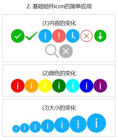
3.2.1 icon component
| attribute | type | Default value | explain |
|---|---|---|---|
| type | string | Type of icon, valid values: success, success_no_circle,info, warn, waiting,cancel,download, search, clear | |
| size | number / string | 23 | Size of icon in px |
| color | string | The color of icon is the same as that of css |
Sample code
<!--pages/demo02/icon/icon.wxml-->
<view class='container'>
  <view class='page-body'>
    <view class='title'>2. Basic components icon Simple application of</view>
    <view class='demo-box'>
      <view class='title'>(1)Changes in content</view>
      <block wx:for='{{iconType}}'>
          <icon type="{{item}}" size='36' />
      </block>
    </view>
    <view class='demo-box'>
      <view class='title'>(2)Color change</view>
      <block wx:for="{{iconColor}}">
        <icon type="info" color="{{item}}" size='36' />
      </block>
    </view>
    <view class='demo-box'>
      <view class='title'>(3)Change in size</view>
      <block wx:for="{{iconSize}}">
        <icon type="info" size="{{item}}" />
      </block>
    </view>
  </view>
</view>
Page({
  data: {
    iconType: ['success', 'success_no_circle', 'info', 'warn', 'waiting', 'cancel', 'download', 'search', 'clear'],
    iconColor:['red','orange','yellow','green','cyan','blue','purple'],
    iconSize:[20,25,30,35,40,45,50]
  }
})
3.2.2 text component
text component supports escape character "\", such as line feed \ n and space \ t
< text / > only < text / > nesting is supported in the component. Nodes other than text nodes cannot be selected by long pressing
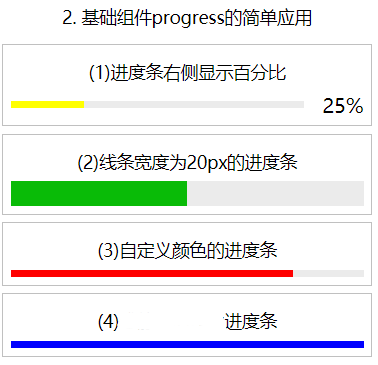
3.2.3 progress bar component
- A component for improving user experience
- If you can see the length of the complete video and the current playback progress through this component
| attribute | type | Default value | explain |
|---|---|---|---|
| percent | number | Percentage 0 ~ 100 | |
| show-info | boolean | false | Displays the percentage to the right of the progress bar |
| stroke-width | number / string | 6 | Width of progress bar |
| color | string | #09BB07 | Progress bar color (use activeColor) |
| active | boolean | false | Progress bar animation from left to right |
Sample code
<!--pages/demo02/progress/progress.wxml-->
<view class='container'>
  <view class='page-body'>
    <view class='title'>2. Basic components progress Simple application of</view>
    <view class='demo-box'>
      <view class='title'>(1)The percentage is displayed on the right side of the progress bar</view>
      <progress percent='25' activeColor='yellow' show-info />
    </view>
    <view class='demo-box'>
      <view class='title'>(2)The line width is 20 px Progress bar for</view>
      <progress percent='50' stroke-width='20' />
    </view>
    <view class='demo-box'>
      <view class='title'>(3)Custom color progress bar</view>
      <progress percent='80' activeColor='red' />
    </view>
    <view class='demo-box'>
      <view class='title'>(4)Dynamic progress bar</view>
      <progress percent='100' activeColor='blue' active />
    </view>
  </view>
</view>
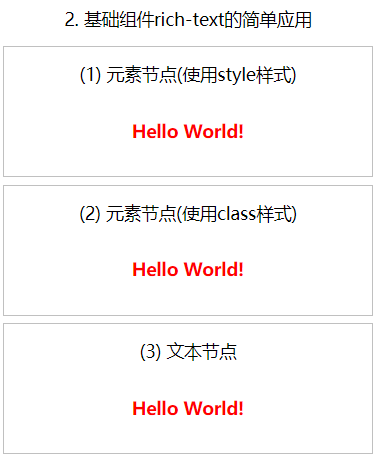
3.2.4 rich text component
- This component can display some rich text in the wxml page file, such as the element content of html
- It has a nodes node list attribute. The nodes attribute recommends the Array type
- Nodes supports two types of nodes, which are distinguished by type
- Element node type=node
- Text node type=text
Element node
| attribute | type | Default value | explain |
|---|---|---|---|
| name | Tag name | string | Support for partially trusted HTML nodes |
| attrs | attribute | object | Support partially trusted attributes and follow Pascal naming method |
| children | Child node list | array | The structure is consistent with nodes |
Text node
| attribute | type | Default value | explain |
|---|---|---|---|
| text | text | string | Support entities |
<!--pages/demo02/rich-text/rich-text.wxml-->
<view class='container'>
  <view class='page-body'>
    <view class='title'>2. Basic components rich-text Simple application of</view>
    <view class='demo-box'>
      <view class='title'>(1) Element node(use style style)</view>
      <rich-text nodes='{{nodes01}}'></rich-text>
    </view>
    <view class='demo-box'>
      <view class='title'>(2) Element node(use class style)</view>
      <rich-text nodes='{{nodes02}}'></rich-text>
    </view>
    <view class='demo-box'>
      <view class='title'>(3) Text node</view>
      <rich-text nodes='{{nodes03}}'></rich-text>
    </view>
  </view>
</view>
Page({
  data: {
    nodes01: [{
      name: 'div',
      attrs: {
        style: 'line-height: 60px; color: red; font-weight: bold'
      },
       children: [{
        type: 'text',
        text: 'Hello World!'
      }]
    }],
    nodes02: [{
      name: 'div',
      attrs: {
        class: 'myStyle'
      },
      children: [{
        type: 'text',
        text: 'Hello World!'
      }]
    }],
    nodes03:'<div style="line-height: 60px; color: red;font-weight: bold">Hello World!</div>'
  }
 })
3.3 form components
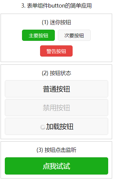
3.3.1 button button
| attribute | type | Default value | Required | explain |
|---|---|---|---|---|
| size | string | default | no | Button size |
| type | string | default | no | The style type of the button |
| plain | boolean | false | no | Whether the button is hollow and the background color is transparent |
| disabled | boolean | false | no | Disable |
| loading | boolean | false | no | Is there a loading icon in front of the name |
| form-type | string | no | Used for form components. Clicking will trigger submit/reset events of form components respectively | |
| hover-class | string | button-hover | no | Specifies the style class to which the button is pressed. When hover class = "none", there is no click state effect |
| hover-start-time | number | 20 | no | How long does the click state appear after pressing and holding, in milliseconds |
| hover-stay-time | number | 70 | no | Click state retention time after finger release, unit: ms |
| session-from | string | no | Session source, valid when open type = "contact" |
Legal value of size
| value | explain |
|---|---|
| default | Default size |
| mini | Small size |
Legal value of type
| value | explain |
|---|---|
| primary | green |
| default | white |
| warn | gules |
<!--pages/demo03/button/button.wxml-->
<view class='container'>
  <view class='page-body'>
    <view class='title'>3. Form component button Simple application of</view>
    <view class='demo-box'>
      <view class='title'>(1) Mini button</view>
      <button type='primary' size='mini'>Main button</button>
      <button type='default' size='mini'>Secondary button</button>
      <button type='warn' size='mini'>Warning button</button>
    </view>
    <view class='demo-box'>
      <view class='title'>(2) Button status</view>
      <button>Normal button</button>
      <button disabled>Disable button</button>
      <button loading>Load button</button>
    </view>
    <view class='demo-box'>
      <view class='title'>(3) Click the button to listen</view>
      <button type='primary' bindgetuserinfo='getUserDetail' open-type='getUserInfo'>Let me try</button>
    </view>
  </view>
</view>
Page({
  data: {
  },
  /**User defined function -- listening for button events*/
  getUserDetail: function (e) {
    console.log(e.detail.userInfo)
  }
 })
3.3.2 checkbox multiple selectors
- This component is what we often call a check box
- Used to make multiple choices
- checkbox group is a container used to hold multiple checkboxes
- It has a binding event bindchange
- change event is triggered when the selected item in < checkbox group / > changes
- Detail = {value: [array of values of the selected checkbox]}
| attribute | type | Default value | Required | explain |
|---|---|---|---|---|
| value | string | no | Checkbox ID, when selected, triggers the change event of checkbox group and carries the value of checkbox | |
| disabled | boolean | false | no | Disable |
| checked | boolean | false | no | Whether it is currently selected can be used to set the default selection |
| color | string | #09BB07 | no | The color of the checkbox is the same as that of css |
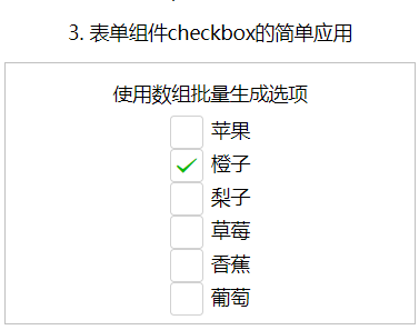
<!--pages/demo03/checkbox/checkbox.wxml-->
<view class='container'>
  <view class='page-body'>
    <view class='title'>3. Form component checkbox Simple application of</view>
    <view class='demo-box'>
      <view class='title'>Use array bulk generation option</view>
      <checkbox-group bindchange='checkboxChange'>
        <view class='test' wx:for='{{checkboxItems}}' wx:key='item{{index}}'>
          <checkbox value='{{item.value}}' checked='{{item.checked}}' />{{item.name}}
        </view>
      </checkbox-group>
    </view>
  </view>
</view>
// pages/demo03/checkbox/checkbox.js
Page({
  data: {
    checkboxItems: [
      { name: 'Apple', value: 'apple' },
      { name: 'orange', value: 'orange', checked: 'true' },
      { name: 'Pear', value: 'pear' },
      { name: 'strawberry', value: 'strawberry' },
      { name: 'Banana', value: 'banana' },
      { name: 'Grape', value: 'grape' },
    ]
  },
  /*User defined function -- listening for multiple box changes*/
  checkboxChange: function (e) {
    console.log('checkbox The selected values are:'+ e.detail.value)
  }
})
3.3.3 radio single selector
- This component is the opposite of the checkbox
- Only one option can be selected at a time
- Options are mutually exclusive
- radio group is a container used to hold multiple radios
- It has a binding event bindchange
- The bindchange event is triggered when the selected item in < radio group / > changes
- event.detail={value: the value of the selected radio}
| attribute | type | Default value | Required | explain |
|---|---|---|---|---|
| value | string | no | Radio identification. When the radio is selected, the change event of the radio group will carry the value of the radio | |
| checked | boolean | false | no | Currently selected |
| disabled | boolean | false | no | Disable |
| color | string | #09BB07 | no | The color of radio is the same as that of css |
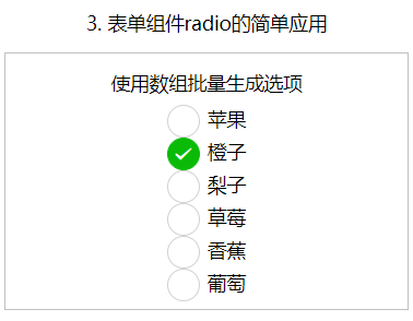
<!--pages/demo03/radio/radio.wxml-->
<view class='container'>
  <view class='page-body'>
    <view class='title'>3. Form component radio Simple application of</view>
    <view class='demo-box'>
      <view class='title'>Use array bulk generation option</view>
      <radio-group bindchange='radioChange'>
        <view class='test' wx:for='{{radioItems}}' wx:key='item{{index}}'>
          <radio value='{{item.value}}' checked='{{item.checked}}' />{{item.name}}
        </view>
      </radio-group>
    </view>
  </view>
</view>
Page({
  data: {
    radioItems: [
      { name: 'Apple', value: 'apple' },
      { name: 'orange', value: 'orange', checked: 'true' },
      { name: 'Pear', value: 'pear' },
      { name: 'strawberry', value: 'strawberry' },
      { name: 'Banana', value: 'banana' },
      { name: 'Grape', value: 'grape' },
    ]
  },
  /*Custom function -- listening for radio box changes*/
  radioChange: function (e) {
    console.log('radio The selected values are:' + e.detail.value)
  }
})
3.4 navigation components
3.4.1 navigator page link component
- This component is used to implement jump in WXML page
- It has three types:
- Keep the current page and jump. After jumping, you can return to the current page, which is the same as Wx Navigateto works the same
- Turn off the current page Jump, unable to return to the current page, and Wx The effect of redirectto is the same
- Jump to the bottom tab to navigate to the specified page, with Wx Switchtab has the same jump effect
- The above jump effect is controlled through the open type attribute
| attribute | type | Default value | Required | explain |
|---|---|---|---|---|
| target | string | self | no | On which target to jump, the default is the current applet |
| url | string | no | Jump links within the current applet | |
| open-type | string | navigate | no | Jump mode |
| delta | number | 1 | no | Valid when the open type is' navigateBack ', indicating the number of layers to fallback |
| path | string | no | Valid when target="miniProgram", open the page path. If it is empty, open the home page | |
| extra-data | object | no | When target="miniProgram", it is valid and needs to be passed to the target applet. The target applet can | |
| version | string | release | no | Valid when target="miniProgram", the applet version to be opened |
| hover-class | string | navigator-hover | no | Specifies the style class when clicking. When hover class = "None", there is no clicking effect |
| hover-stop-propagation | boolean | false | no | Specify whether to prevent the click status of the ancestor node of this node |
| hover-start-time | number | 50 | no | How long does the click state appear after pressing and holding, in milliseconds |
| hover-stay-time | number | 600 | no | Click state retention time after finger release, unit: ms |
| bindsuccess | string | no | It is valid when target="miniProgram", and the jump applet is successful | |
| bindfail | string | no | Valid when target="miniProgram", failed to jump applet | |
| bindcomplete | string | no | Valid when target="miniProgram", the jump applet is completed |
Legal value of target
| value | explain |
|---|---|
| self | Current applet |
| miniProgram | Other applets |
Legal value of open type
| value | explain |
|---|---|
| navigate | Corresponding to Wx Navigateto or Wx Functions of navigatetominiprogram |
| redirect | Corresponding to Wx Functions of redirectto |
| switchTab | Corresponding to Wx Functions of switchtab |
| reLaunch | Corresponding to Wx Functions of relaunch |
| navigateBack | Corresponding to Wx Functions of navigateback |
| exit | Exit applet, effective when target="miniProgram" |
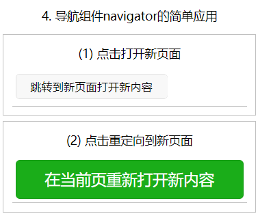
<!--pages/demo04/navigator/navigator.wxml-->
<view class='container'>
  <view class='page-body'>
    <view class='title'>4. Navigation components navigator Simple application of</view>
    <view class='demo-box'>
      <view class='title'>(1) Click to open a new page</view>
      <navigator url="../new/new">
        <button type="default" size="mini">Jump to a new page and open new content</button>
      </navigator>
    </view>
    <view class='demo-box'>
      <view class='title'>(2) Click redirect to new page</view>
      <navigator url="../redirect/redirect" open-type='redirect'>
        <button type="primary">Reopen new content on the current page</button>
      </navigator>
    </view>
  </view>
</view>
Note: open a new page to return to the navigator page, and redirect to the new page. After returning, you can directly enter the index page
3.5 media components
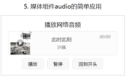
3.5.1 audio
- The audio component needs to have a unique id
- Use Wx according to id Createaudiocontext ('myaudio ') creates an audio playback environment
Note: since version 1.6.0, this component is no longer maintained. It is recommended to use more powerful ones
| attribute | type | Default value |
|---|---|---|
| id | string | Unique identifier of the audio component |
| src | string | Resource address to play audio |
| loop | boolean | Loop play |
| controls | boolean | Show default controls |
| poster | string | The picture resource address of the audio cover on the default control. If the controls property value is false, the setting of poster is invalid |
| name | string | The audio name on the default control. If the controls property value is false, the setting name is invalid |
| author | string | The author name on the default control. If the controls property value is false, the setting of author is invalid |
| binderror | eventhandle | An error event is triggered when an error occurs, detail ={errMsg:MediaError.code} |
| bindplay | eventhandle | The play event is triggered when playback starts / continues |
| bindpause | eventhandle | The pause event is triggered when playback is paused |
| bindtimeupdate | eventhandle | When the playback progress changes, the timeupdate event is triggered. detail = {currentTime,duration} |
| bindended | eventhandle | The end event is triggered when the playback reaches the end |
audio component returns error code
| Return error code | describe |
|---|---|
| 1 | Obtaining resources is prohibited by the user |
| 2 | network error |
| 3 | Decoding error |
| 4 | Inappropriate resources |
<!--pages/demo05/audio/audio.wxml-->
<view class='container'>
  <view class='page-body'>
    <view class='title'>5. Media component audio Simple application of</view>
    <view class='demo-box'>
      <view class='title'>Play network audio</view>
      <audio id="myAudio" poster="{{poster}}" name="{{name}}" author="{{author}}" src="{{src}}"  controls loop></audio>
      <button size='mini' bindtap='audioPlay'>play</button>
      <button size='mini' bindtap='audioPause'>suspend</button>
      <button size='mini' bindtap='audioSeek0'>Back to the beginning</button>
    </view>
  </view>
</view>
Page({
  data: {
    poster: 'http://y.gtimg.cn/music/photo_new/T002R300x300M000003rsKF44GyaSk.jpg?max_age=2592000',
    name: 'this moment',
    author: 'Xu Wei',
    src: 'http://ws.stream.qqmusic.qq.com/M500001VfvsJ21xFqb.mp3?guid=ffffffff82def4af4b12b3cd9337d5e7&uin=346897220&vkey=6292F51E1E384E06DCBDC9AB7C49FD713D632D313AC4858BACB8DDD29067D3C601481D36E62053BF8DFEAF74C0A5CCFADD6471160CAF3E6A&fromtag=46'
  },
  audioPlay: function (options) {
    this.audioCtx.play()
  },
  audioPause: function (options) {
    this.audioCtx.pause()
  },
  audioSeek0: function (options) {
    this.audioCtx.seek(0)
  },
  /* Life cycle function -- monitor the completion of the first rendering of the page*/
  onReady: function () {
    this.audioCtx = wx.createAudioContext('myAudio')
    //this.audioCtx.play()
  }
})
3.5.2 image image
- Support JPG, PNG and SVG formats, and support cloud file ID since 2.3.0
- The image component has two display modes:
- Zoom mode (this mode contains 4 modes)
- Crop mode (this mode contains 9 modes)
| attribute | type | Default value | Required | explain |
|---|---|---|---|---|
| src | string | no | Picture resource address | |
| mode | string | scaleToFill | no | Picture clipping and zooming mode |
| webp | boolean | false | no | webP format is not parsed by default, and only network resources are supported |
| lazy-load | boolean | false | no | The picture is lazy to load. It starts to load when it is about to enter a certain range (up and down three screens) |
| show-menu-by-longpress | boolean | false | no | Open long press the picture to display the identification applet code menu |
| binderror | eventhandle | no | Triggered when an error occurs, event detail = {errMsg} | |
| bindload | eventhandle | no | Triggered when the picture is loaded, event detail = {height, width} |
Legal value of mode
| value | explain | Examples |
|---|---|---|
| scaleToFill | In zoom mode, the image is scaled without maintaining the aspect ratio, so that the width and height of the image are fully stretched to fill the image element | 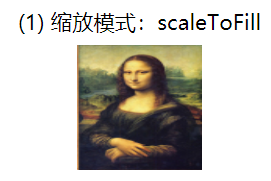 |
| aspectFit | Zoom mode, keep the aspect ratio to zoom the picture, so that the long edge of the picture can be fully displayed. In other words, the picture can be displayed completely. | 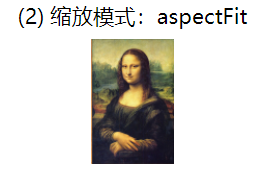 |
| aspectFill | Zoom mode, keep the aspect ratio to zoom the picture, and only ensure that the short edge of the picture can be fully displayed. In other words, the picture is usually complete only in the horizontal or vertical direction, and will be intercepted in the other direction. | 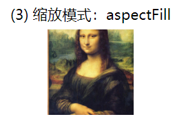 |
| widthFix | Zoom mode, the width remains unchanged, the height changes automatically, and the width height ratio of the original image remains unchanged | 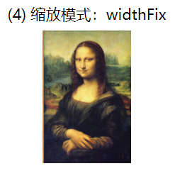 |
| heightFix | Zoom mode, the height remains unchanged, the width changes automatically, and the aspect ratio of the original image remains unchanged | |
| top | Crop mode, does not scale the picture, only displays the top area of the picture | 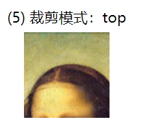 |
| bottom | Crop mode, does not scale the picture, only displays the bottom area of the picture |  |
| center | Crop mode, does not scale the picture, only displays the middle area of the picture | |
| left | Crop mode, does not scale the picture, only displays the left area of the picture | |
| right | Crop mode, does not scale the picture, only displays the right area of the picture | |
| top left | Crop mode, does not scale the picture, only displays the upper left area of the picture | |
| top right | Crop mode, does not scale the picture, only displays the upper right area of the picture | |
| bottom left | Crop mode, does not scale the picture, only displays the lower left area of the picture | |
| bottom right | Crop mode, does not scale the picture, only displays the lower right area of the picture |
 <view class='demo-box'>
      <view class='title'>(*) Zoom mode:*</view>
      <image src='{{src}}' mode='scaleToFill'></image>
      <view class='title'>*Zoom picture</view>
    </view>
Page({
  data: {
    src:'/images/demo05/monalisa.jpg'
  }
})
3.5.3 video
- Video component
- Use Wx according to id Createvideocontext ('myvideo ') creates a video playback environment
| attribute | type | Default value | Required | explain |
|---|---|---|---|---|
| src | string | yes | The resource address of the video to be played supports network path, local temporary path and cloud file ID (2.3.0) | |
| danmu-list | Array.< object> | no | Barrage list | |
| danmu-btn | boolean | false | no | Whether to display the bullet screen button is only valid during initialization and cannot be changed dynamically |
| enable-danmu | boolean | fals | no | Whether to display the barrage is only valid during initialization and cannot be changed dynamically |
| controls | boolean | true | no | Whether to display default playback controls (play / pause button, playback progress, time) |
See wechat open document for other attributes
https://developers.weixin.qq.com/miniprogram/dev/component/video.html
<!--pages/demo05/video/video.wxml-->
<view class='container'>
  <view class='page-body'>
    <view class='title'>5. Media component video Simple application of</view>
    <view class='demo-box'>
      <view class='title'>Play network video</view>
      <video id="myVideo" src="{{src}}" danmu-list="{{danmuList}}" enable-danmu danmu-btn controls></video>
    </view>
  </view>
</view>
Page({
  data: {
    src: 'http://wxsnsdy.tc.qq.com/105/20210/snsdyvideodownload?filekey=30280201010421301f0201690402534804102ca905ce620b1241b726bc41dcff44e00204012882540400&bizid=1023&hy=SH&fileparam=302c020101042530230204136ffd93020457e3c4ff02024ef202031e8d7f02030f42400204045a320a0201000400',
    danmuList: [
      {
        text: '1st s A barrage of bullets',
        color: 'yellow',
        time: 1
      },
      {
        text: 'Third s A barrage of bullets appeared',
        color: 'purple',
        time: 3
      }]
  },
  /* Life cycle function -- monitor the completion of the first rendering of the page
   */
  onReady: function () {
    this.videoContext = wx.createVideoContext('myVideo')
  }
})
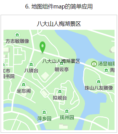
3.5.4 map components
- Map component is used to develop map related applications (such as map navigation, taxi software, order track of e-commerce)
- On the map, you can mark the cover and specify a series of coordinate positions
- Personalized map capability can be applied and opened in the applet background "development - Developer Tools - Tencent location service"
- Map components in applets should use the same subkey
| attribute | type | Default value | explain |
|---|---|---|---|
| longitude | number | yes | |
| latitude | number | yes | |
| scale | number | 16 | no |
| min-scale | number | 3 | no |
| max-scale | number | 20 | no |
| markers | Array.< marker> | no | |
| polyline | Array.< polyline> | no | |
| circles | Array.< circle> | no | |
| include-points | Array.< point> | no | |
| show-location | boolean | false | no |
marker
Marker points are used to display the location of markers on the map
| attribute | explain | type | Required | remarks |
|---|---|---|---|---|
| id | Marker point id | number | no | Marker clicking the event callback will return this id. It is recommended to set the number type id for each marker to ensure better performance when updating the marker. |
| clusterId | id of the aggregation cluster | Number | no | Used when customizing point aggregation cluster effects |
| joinCluster | Participate in point aggregation | Boolean | no | By default, it does not participate in point aggregation |
| latitude | latitude | number | yes | Floating point number, range - 90 ~ 90 |
| longitude | longitude | number | yes | Floating point number, range - 180 ~ 180 |
| title | Label point name | string | no | When clicked, it will be displayed. When callout exists, it will be ignored |
| zIndex | Display hierarchy | number | no | |
| iconPath | Icons displayed | string | yes | The image path under the project directory supports network path, local path and code package path (2.3.0) |
| rotate | Rotation angle | number | no | Clockwise rotation angle, range 0 ~ 360, default 0 |
| alpha | Transparency of dimensions | number | no | Default 1, no transparency, range 0 ~ 1 |
| width | Dimension icon width | number/string | no | The default is the actual width of the picture |
| height | Dimension icon height | number/string | no | The default is the actual height of the picture |
| callout | Bubble window above marker point | Object | no | See wechat open document for supported attributes, which can recognize line breaks. |
| customCallout | Customize bubble window | Object | no | See wechat open document for supported properties |
| label | Add a label next to the marked point | Object | no | See wechat open document for supported attributes, which can recognize line breaks. |
| anchor | The longitude and latitude are at the anchor point of the dimension icon, and the default is the midpoint of the bottom edge | Object | no | {x, y}, X represents horizontal (0-1), Y represents vertical (0-1). {X:. 5, Y: 1} indicates the midpoint of the bottom edge |
<!--pages/demo06/map/map.wxml-->
<view class='container'>
  <view class='page-body'>
    <view class='title'>6. Map components map Simple application of</view>
    <view class='demo-box'>
      <view class='title'>Badashan Renmei Lake Scenic Spot</view>
      <map latitude='{{latitude}}' longitude='{{longitude}}' markers='{{markers}}' bindregionchange='regionChange'>
      </map>
    </view>
  </view>
</view>
Page({
  data: {
    latitude: 28.597940,
    longitude: 115.917940,
    markers: [{
      id:'001',
      latitude: 28.597940,
      longitude: 115.917940,
      iconPath:'/images/demo06/location.png',
      label:{
        content:'Badashan Renmei Lake Scenic Spot'
      }
    }]
  },
  regionChange: function (e) {
    console.log('regionChange Triggered, visual field changes.');
  }
})
3.6 canvas components
- The canvas canvas component is used to draw squares, circles, or some other shapes
- The default width of the component is 300px and the height is 150px
- Unique identification is required when using
- Use Wx Createcanvascontext gets the drawing context
Since 2.9.0, it supports a new Canvas 2D interface (the type attribute needs to be specified), and supports the same layer rendering. The original interface is no longer maintained.