Review 2D mapping
Use the Seibel curve to make a 2d graph. This figure is realized through the Seibel curve with Path based on Matplotlib. Friends who are interested in the Seibel curve can have an in-depth understanding. In Matplotlib, figure is the canvas, axes is the drawing area, and fig.add_subplot(),plt. The subplot () method can create subgraphs. The following is the drawing practice.
import matplotlib.path as mpath
import matplotlib.patches as mpatches
import matplotlib.pyplot as plt

fig, ax = plt.subplots()
#Define drawing instructions and control point coordinates
Path = mpath.Path
# Drawing Bezier curve with Path control coordinate points
# Graphic data construction

# MOVETO means to move the drawing start point to the specified coordinates
# CURVE4 means to draw cubic Bezier curve with 4 control points
# CURVE3 means to draw a quadratic Bezier curve with 3 control points
# LINETO means to draw a straight line from the current position to the specified position
# CLOSEPOLY means to draw a line from the current position to the specified position and close the polygon
path_data = [
    (Path.MOVETO, (1.88, -2.57)),
    (Path.CURVE4, (0.35, -1.1)),
    (Path.CURVE4, (-1.75, 1.5)),
    (Path.CURVE4, (0.375, 2.0)),
    (Path.LINETO, (0.85, 1.15)),
    (Path.CURVE4, (2.2, 3.2)),
    (Path.CURVE4, (3, 0.05)),
    (Path.CURVE4, (2.0, -1.5)),
    (Path.CLOSEPOLY, (1.58, -2.57)),
    ]
codes,verts = zip(*path_data)
path = mpath.Path(verts, codes)
patch = mpatches.PathPatch(path, facecolor='r', alpha=0.5)
ax.add_patch(patch)
# plot control points and connecting lines
x, y = zip(*path.vertices)
line, = ax.plot(x, y, 'go-')
ax.grid()
ax.axis('equal')
plt.show()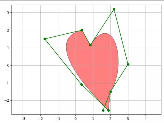
Heart effect drawing
3D hat Figure 1
Matplotlib draws 3D graphics using the mplot3d Toolkit, that is, the mplot3d Toolkit. To draw a 3D graph, you can create a sub graph, then specify the projection parameter as 3D, and the returned ax is Axes3D object.
Import package:
from matplotlib import cm
from matplotlib.ticker import LinearLocator, FormatStrFormatter
from mpl_toolkits.mplot3d import Axes3D
The whole process of drawing:
import matplotlib.pyplot as plt
from matplotlib import cm
from matplotlib.ticker import LinearLocator, FormatStrFormatter
from mpl_toolkits.mplot3d import Axes3D
import numpy as np

fig = plt.figure()

# Specifies that the drawing type is 3d
ax = fig.add_subplot(projection='3d')

# Construction data
X = np.arange(-5, 5, 0.25)
Y = np.arange(-5, 5, 0.25)
X, Y = np.meshgrid(X, Y)
R = np.sqrt(X**2 + Y**2)
Z = np.sin(R)

# Plot the surface.
surf = ax.plot_surface(X, Y, Z, cmap=cm.coolwarm,
                       linewidth=0, antialiased=False)
# Customize the z axis.
ax.set_zlim(-1.01, 1.01)
ax.zaxis.set_major_locator(LinearLocator(10))
ax.zaxis.set_major_formatter(FormatStrFormatter('%.02f'))
# Add a color bar which maps values to colors.
fig.colorbar(surf, shrink=0.5, aspect=5)

plt.show()
Rendering effect:
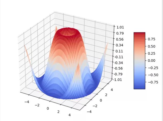
Hat Figure 1
3D hat Figure 2
import numpy as np
import matplotlib.pyplot as plt
from mpl_toolkits.mplot3d import Axes3D

fig = plt.figure()
# Specifies that the drawing type is 3d
ax = fig.add_subplot(111, projection='3d')
# X, Y value
X = np.arange(-5, 5, 0.25)
Y = np.arange(-5, 5, 0.25)

# Sets the mesh for the x-y plane
X, Y = np.meshgrid(X, Y)
R = np.sqrt(X ** 2 + Y ** 2)
# height value
Z = np.sin(R)

# rstride: span between rows cstride: span between columns
# rcount: sets the number of intervals. The default is 50. The number of intervals in the a ccount: column cannot appear at the same time as the above two parameters
#Maximum and minimum values of vmax and vmin colors
ax.plot_surface(X, Y, Z, rstride=1, cstride=1, cmap=plt.get_cmap('rainbow'))

# Zdir: 'Z' | 'x' | 'y' indicates which surface the contour map is projected to
# offset: indicates that the contour map is projected to a scale on the specified page
ax.contourf(X,Y,Z,zdir='z',offset=-2)

# Set the display range of the z-axis of the image, and the x-axis and y-axis are set in the same way
ax.set_zlim(-2,2)

plt.show()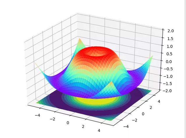
Hat Figure 2
3D linear graph
The 3D linear graph uses axes3d Plot. The basic method of painting: axes3d plot(xs, ys[, zs, zdir='z', *args, **kwargs])
Parameter Description:
Parameter description xs one-dimensional array, X-axis coordinates of points ys one-dimensional array, Y-axis coordinates of points zs one-dimensional array, optional, z-axis coordinates of points zdir optional. When drawing 2D data on the 3D axis, the data must be passed in the form of xs and ys. If zdir is set to 'y', the data will be drawn on the x-z axis plane, The default is' Z '* * kwargs. Other keyword parameters are optional. See Matplotlib axes. Axes. plot
import numpy as np
import matplotlib.pyplot as plt
from mpl_toolkits.mplot3d import Axes3D

# Take the canvas and the drawing area in turn and create Axes3D objects
fig = plt.figure()
ax = fig.gca(projection='3d')

# Linear graph 3D first data
theta = np.linspace(-4 * np.pi, 4 * np.pi, 100)
z1 = np.linspace(-2, 2, 100)
r = z1**2 + 1
x1 = r * np.sin(theta)
y1 = r * np.cos(theta)

# Second 3D linear graph data
z2 = np.linspace(-3, 3, 100)
x2 = np.sin(z2)
y2 = np.cos(z2)

# Draw 3D linear graph
ax.plot(x1, y1, z1, color='b', label='3D Line1')
ax.plot(x2, y2, z2, color='r', label='3D Line2')

# Set the title, axis label and legend, or use PLT directly title,plt.xlabel,plt.legend...
ax.set_title('3D Line View', pad=15, fontsize='10')
ax.set_xlabel('x ', color='r', fontsize='14')
ax.set_ylabel('y ', color='g', fontsize='14')
ax.set_zlabel('z ', color='b', fontsize='14')
ax.legend()
plt.show()
The results show that:
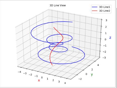
Linear graph
3D scatter diagram
The basic method of drawing 3D scatter diagram is: axes3d scatter(xs, ys[, zs=0, zdir='z', s=20, c=None, depthshade=True, *args, **kwargs])
Detailed explanation of parameters:
Parameter description xs one-dimensional array, X-axis coordinates of points ys one-dimensional array, Y-axis coordinates of points zs one-dimensional array, optional, z-axis coordinates of points zdir optional. When drawing 2D data on the 3D axis, the data must be passed in the form of xs and ys. If zdir is set to 'y', the data will be drawn on the x-z axis plane, and the default is' Z's scalar or array type, Optional, the size of the mark, the default 20c mark color, optional, can be a single color or a color list, support English color name and its abbreviation, hexadecimal color code, etc. for more color examples, see the official website color demodpthshadebool value, optional, default True, whether to color the scatter mark to provide a deep appearance * * kwargs other keywords
import matplotlib.pyplot as plt
import numpy as np
from mpl_toolkits.mplot3d import Axes3D

def randrange(n, vmin, vmax):

    return (vmax - vmin) * np.random.rand(n) + vmin

fig = plt.figure()
ax = fig.add_subplot(111, projection='3d')

n = 100

# For each set of style and range settings, plot n random points in the box
# defined by x in [23, 32], y in [0, 100], z in [zlow, zhigh].
for c, m, zlow, zhigh in [('r', 'o', -50, -25), ('b', '^', -30, -5)]:
    xs = randrange(n, 23, 32)
    ys = randrange(n, 0, 100)
    zs = randrange(n, zlow, zhigh)
    ax.scatter(xs, ys, zs, c=c, marker=m)

ax.set_title('3D Diagram View', pad=15, fontsize='10')
ax.set_xlabel('x ', color='r', fontsize='14')
ax.set_ylabel('y ', color='g', fontsize='14')
ax.set_zlabel('z ', color='b', fontsize='14')

plt.show()
The results are displayed as:
Scatter diagram
summary
This article mainly introduces the use of Python third-party library Matplotlib to draw 3D graphics. Of course, in addition to the above demonstrations, there are more rich graphics and functions waiting for you to mine. Compared with 2D graphics, 3D graphics can show more data features of one dimension, which will have a more intuitive effect in visualization. In the actual data visualization process, we should decide how to show it according to the specific needs, and more understanding of some tools can be more comfortable. These powerful tools are also one of the advantages of Python in data analysis and visualization.
Finally, we will give you a python gift bag [Jiajun sheep: 419693945] to help you learn better!