1, Introduction to css
1. Concept of css
1.1 what is css
		The web page is divided into three parts:
				Structure( html)
				Performance( css)
				Behavior( js)

		css:Cascading style sheets
			The web page is essentially a multi-layer structure CSS To set the style for each layer of the web page,
			In the end, we see the top layer of the web page.
1.2 nature of CSS
CSS Nature of: cascade and inheritance
1) Lamination
	Lamination:
		Later added css The original style will be overwritten. That is, overwrite according to the weight value of the selector. Styles are cascading.
2) Inheritance
	Inheritance of style: we set a style for an element, which will also be applied to its descendant elements.
			  		 [Inheritance occurs between ancestors and offspring]


	 1.Inherited settings are for our development convenience.
	   With inheritance, we can set some common styles to common ancestor elements.
	   In this way, you only need to set it once to make all elements have this style.

	2.Basically, the styles of text are inherited.
	  But not all styles will inherit. For example, background related and layout related styles will not be inherited.
	body{
		color:white;
		font-size:14px;
	}
>>>>>>Inherit
From the case, p All child elements in the element inherit the font color
<!DOCTYPE html>
<html lang="en">
<head>
    <meta charset="UTF-8">
    <meta http-equiv="X-UA-Compatible" content="IE=edge">
    <meta name="viewport" content="width=device-width, initial-scale=1.0">
    <title>Document</title>
</head>

<style>

    p{
      color:red;
    }

</style>
<body>

    <p>
        I am P element
        <span>
            I am p In element span element
            <small>I am span In element small element</small>
        </span>
    </p>

</body>
</html>

>>>>>>Not all elements are inherited
	Styles related to background and layout will not be inherited.
	p Element has a background color set and will not be inherited by its child elements. However, because the default background style of the element is transparent,
	That's why there are the following styles.
<!DOCTYPE html>
<html lang="en">
<head>
    <meta charset="UTF-8">
    <meta http-equiv="X-UA-Compatible" content="IE=edge">
    <meta name="viewport" content="width=device-width, initial-scale=1.0">
    <title>Document</title>
</head>

<style>

    p{
      background-color:red;
    }

</style>
<body>

    <p>
        I am P element
        <span>
            I am p In element span element
            <small>I am span In element small element</small>
        </span>
    </p>

</body>
</html>

2. The foundation of css
2.1 introduction of CSS
1) Inline type (can only be used in this label, poor reusability, not recommended)
	   		 <p stype="color:red;font-size:40px;">Young leave home and old return</p>

			 Note: not recommended for development. because css And html Code coupling is too high and maintenance is troublesome.
2) Embedded type (can only be used in this page, and the reusability is not strong)
		     <style type="text/css">
		        p{
		            color:red;
		        }
		     </style>

			 be careful: style The label is written in head Inside.
3) Outside chain
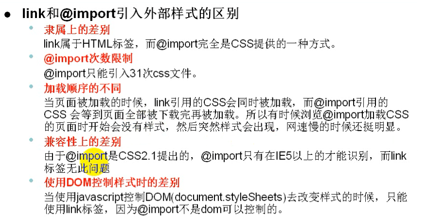
			External chain lead-in css Documents. There are two ways.

			Mode 1:	use link Label introduction

				 		 	External style file:
										p{
										    color:blue;
										    font-size: 30px;
										    font-weight: bold;
										}

				 		 	Introducing external styles:
									 <link type="text/css"    rel="stylesheet"  href="./js.js" />


			Mode 2:	use style Label introduction

				 		 	Introducing external styles:
									<style type="text/css" >
									 	@import  url("1.css") ;
									</style>
2.2 css notes
   +++	css Note: the content of the note will be automatically ignored by the browser!
			    <style>

			        /*
			            css notes

			        */
			    </style>


	+++	html notes
				<!---Note Content --\>
2.3 basic CSS syntax
	css Basic syntax:
				Selector declaration block

		selector:Selectors allow you to select elements in a page.

		Declaration block: Specifies the style to be set for the element by declaring the block.
			   A declaration block consists of a declaration.
			   Declarations are in the form of key value pairs:
			   					Keys: Values;
	<!DOCTYPE html>
	<html lang="en">
	<head>
	    <meta charset="UTF-8">
	    <title>Document</title>

	    <style>
	        p{
	            color:red;
	        }
	    </style>

	</head>
	<body>
	    <p >Young leave home and old return</p>
	</body>
	</html>
2, css selector
1. css selector
1.1 foundation selector
	1,element selector :
		     effect:Specify a set of elements based on the tag name.
		     Syntax: tag name{ }
		     example:
		     	  p{}   	Select all in the page P label
		     	  div{} 	Select all in the page div label


	2,ID selector:
		     effect:according to ID To specify an element.
		     Syntax:#id attribute value {}
		     example:
				 #box{}
				 #c{}


	3,class selector:
		     effect:according to class To specify a set of elements.
		     Syntax:.class Attribute value{ }
		     example:
				 .box{}
				 .c{}


	4,Wildcard selector:
		     effect:Select all elements in the page.
		     Syntax:*{ }
1.2 intersection selector
	Intersection selector:
			 effect:Select the element that meets multiple conditions at the same time.

		     Syntax: selector 1 selector 2{}
		     	   Selector 1 selector 2 selector 3{}
		     	   Selector 1 selector 2 selector 3 selector 4{}
				   ...


			 be careful:If there is an element selector in the intersection selector, you must start with an element selector.
			 				Element selector 1 selector 2{}
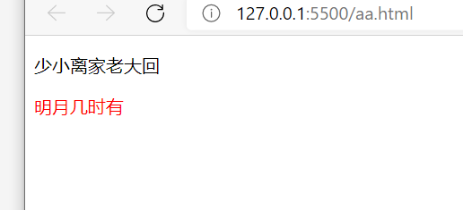
>>>>>>Case 1
<!DOCTYPE html>
<html lang="en">
<head>
    <meta charset="UTF-8">
    <title>Document</title>

    <style>
        div.a{
            color:red;
        }
    </style>

</head>
<body>
    <p  class="a">Young leave home and old return</p>
    <div class="a">When is the moon</div>
</body>
</html>
>>>>>>Case 2
<!DOCTYPE html>
<html lang="en">
<head>
    <meta charset="UTF-8">
    <title>Document</title>

    <style>


        .a.b.c{
            color:red;
        }
    </style>

</head>
<body>

    <div class="a b c">When is the moon</div>
</body>
</html>

1.3 union selector (group selector)
	Union selector:
			 effect:Select the elements corresponding to multiple selectors at the same time.

		     Syntax: selector 1,Selector 2{}
		     	   Selector 1,Selector 2,Selector 3{}
		     	   Selector 1,Selector 2,Selector 3,Selector 4{}
				   ...
>>>>>>Case 1
<!DOCTYPE html>
<html lang="en">
<head>
    <meta charset="UTF-8">
    <title>Document</title>

    <style>
       p,.b,div.c{
           color:red;
       }

    </style>

</head>
<body>
    <p  class="a">Young leave home and old return</p>
    <div class="b">When is the moon</div>
    <div class="c">When is the moon</div>
</body>
</html>
1.4 relationship selector
1) Detailed explanation of the relationship between elements
	Parent element:
		  Elements that directly contain child elements are called parent elements

	Child element:
		  Elements directly contained by the parent element are called child elements.

	Ancestor element:
		  Elements that directly or indirectly contain descendant elements are called ancestor elements.
		  The parent element of an element is also its ancestor element.

	Descendant element:
		  Elements directly or indirectly contained by ancestor elements are called descendant elements.
		  Child elements also have descendant elements.

	Sibling element:
		  An element with the same parent element is a sibling element.
2) Child element selector
	Child Selector :
			 effect:Select the specified child element under the specified parent element.

		     Syntax: parent element > Child element{ }        Select the direct child element of the specified parent element
		     	   Parent element > Child element > Child element{ }	Select the direct child element of the direct child element of the specified parent element
				   ...
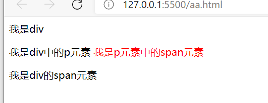
>>>>>>Case 1
	/**Select all span child elements under the div element*/
    <style>
        div > span{color:red;}
    </style>

	---------------------------------------------------

    <div>
        I am div
        <p>
            I am div Medium p element
            <span>I am p In element span element</span>
        </p>
        <span>
            I am div of span element
        </span>

    </div>

>>>>>>Case 2
	/** Select all span sub elements under the p sub element under the div element */
    <style>
        div > p >span{color:red;}
    </style>

	-------------------------------------------------

    <div>
        I am div
        <p>
            I am div Medium p element
            <span>I am p In element span element</span>
        </p>
        <span>
            I am div of span element
        </span>

    </div>
3) Descendant element selector
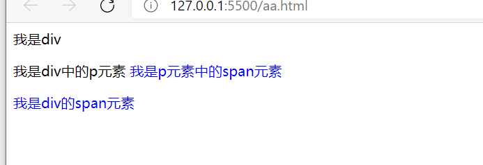
	Descendant element selector:
			 effect:Selects all descendant elements within the specified element.

		     Syntax: ancestor element descendant element{ }
		     	   Ancestor element descendant element 1 descendant element 2{ }
		     	   ...
    <style>
    	/**Select all descendant span elements of the div element*/
        div span{
            color:blue;
        }
    </style>

	-----------------------------------------------------------

    <div>
        I am div
        <p>
            I am div Medium p element
            <span>I am p In element span element</span>
        </p>
        <span>
            I am div of span element
        </span>

    </div>
4) Sibling element selector
	Sibling element selector:

			Select next brother:
		    		 previous + next{ }

		    Select all the brothers below (excluding the brothers above):
		    		 Brother ~ Younger brother{ }
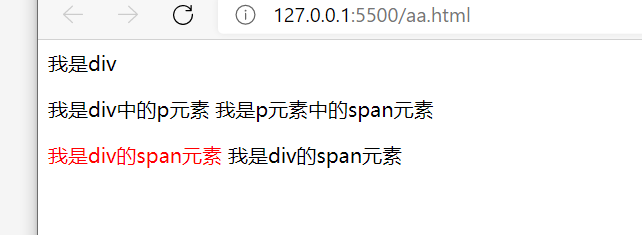
>>>>>>Case 1: select the next brother
    <style>

      p + span{
          color:red;
      }

    </style>

	--------------------------------------------------

    <div>
        I am div
        <p>
            I am div Medium p element
            <span>I am p In element span element</span>
        </p>
        <span>
            I am div of span element
        </span>
        <span>
            I am div of span element
        </span>
    </div>
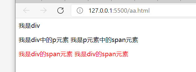
>>>>>>Case 2: select all the brothers below
    <style>

      p ~ span{
          color:red;
      }

    </style>

	-----------------------------------------------------

    <div>
        I am div
        <p>
            I am div Medium p element
            <span>I am p In element span element</span>
        </p>
        <span>
            I am div of span element
        </span>
        <span>
            I am div of span element
        </span>
    </div>
1.5 attribute selector
	There are two ways to write an attribute selector:

			Mode 1:
				 p[title] appoint p Element contains title Attribute element

			Mode 2 (both modes are the same in mode 2):
				  [title]  Specify containing title Attribute element
				  *[title] Specify containing title Attribute element

	Type of attribute selector:

			[Attribute name] Select the element that contains the specified attribute
			[Attribute name=Attribute value]  Select the element with the specified attribute and the same attribute value
			[Attribute name^=Specified value] Select the element that contains the specified attribute and whose attribute value begins with the specified value
			[Attribute name $=Specified value] Select the element that contains the specified attribute and the attribute value ends with the specified value
			[Attribute name*=Specified value] Select the element that contains the specified attribute and the attribute value contains the specified value
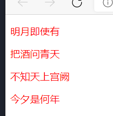
>>>>>>Case 1: [attribute name] select the element containing the specified attribute
<!DOCTYPE html>
<html lang="en">
<head>
    <meta charset="UTF-8">
    <meta http-equiv="X-UA-Compatible" content="IE=edge">
    <meta name="viewport" content="width=device-width, initial-scale=1.0">
    <title>Document</title>
    <style>

       [title]{
           color:red;
       }


    </style>
</head>
<body>

    <p title="a">Even if there is a bright moon</p>
    <p title="b">Ask Qingtian about the wine</p>
    <p title="c">I don't know the palace in the sky</p>
    <p title="d">what year it is now</p>

</body>
</html>
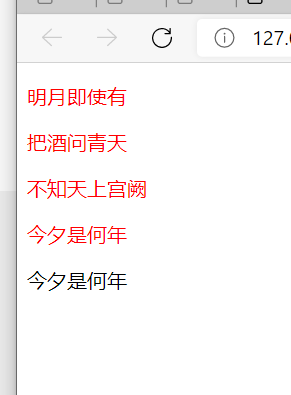
>>>>>>Case 2: tag name [attribute name] select the element containing the specified attribute
<!DOCTYPE html>
<html lang="en">
<head>
    <meta charset="UTF-8">
    <meta http-equiv="X-UA-Compatible" content="IE=edge">
    <meta name="viewport" content="width=device-width, initial-scale=1.0">
    <title>Document</title>
    <style>

       p[title]{
           color:red;
       }


    </style>
</head>
<body>

    <p title="a">Even if there is a bright moon</p>
    <p title="b">Ask Qingtian about the wine</p>
    <p title="c">I don't know the palace in the sky</p>
    <p title="d">what year it is now</p>
    <div title="d">what year it is now</div>

</body>
</html>
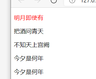
>>>>>>Case 3: [attribute name = attribute value] select the element with the specified attribute and the same attribute value
<!DOCTYPE html>
<html lang="en">
<head>
    <meta charset="UTF-8">
    <meta http-equiv="X-UA-Compatible" content="IE=edge">
    <meta name="viewport" content="width=device-width, initial-scale=1.0">
    <title>Document</title>
    <style>

       p[title=a]{
           color:red;
       }


    </style>
</head>
<body>

    <p title="a">Even if there is a bright moon</p>
    <p title="b">Ask Qingtian about the wine</p>
    <p title="c">I don't know the palace in the sky</p>
    <p title="d">what year it is now</p>
    <div title="d">what year it is now</div>

</body>
</html>
>>>>>>Case 4: [attribute name ^ = specified value] select the element containing the specified attribute and the attribute value starts with the specified value
<!DOCTYPE html>
<html lang="en">
<head>
    <meta charset="UTF-8">
    <meta http-equiv="X-UA-Compatible" content="IE=edge">
    <meta name="viewport" content="width=device-width, initial-scale=1.0">
    <title>Document</title>
    <style>

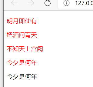
       p[title^=abc]{
           color:red;
       }


    </style>
</head>
<body>

    <p title="abc">Even if there is a bright moon</p>
    <p title="abcsd32">Ask Qingtian about the wine</p>
    <p title="abcrere">I don't know the palace in the sky</p>
    <p title="abc323abc">what year it is now</p>
    <div title="eweweabc">what year it is now</div>

</body>
</html>
>>>>>>Case 5: [attribute name $= specified value] select the element containing the specified attribute and the attribute value ends with the specified value
<!DOCTYPE html>
<html lang="en">
<head>
    <meta charset="UTF-8">
    <meta http-equiv="X-UA-Compatible" content="IE=edge">
    <meta name="viewport" content="width=device-width, initial-scale=1.0">
    <title>Document</title>
    <style>

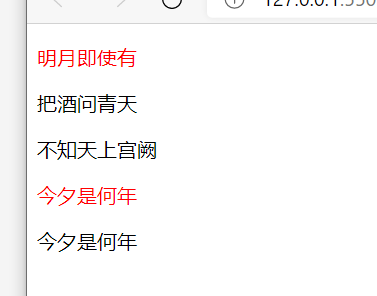
       p[title$=abc]{
           color:red;
       }


    </style>
</head>
<body>

    <p title="abc">Even if there is a bright moon</p>
    <p title="abcsd32">Ask Qingtian about the wine</p>
    <p title="abcrere">I don't know the palace in the sky</p>
    <p title="abc323abc">what year it is now</p>
    <div title="eweweabc">what year it is now</div>

</body>
</html>
>>>>>>Case 6: [attribute name * = specified value] select the element that contains the specified attribute and the attribute value contains the specified value
<!DOCTYPE html>
<html lang="en">
<head>
    <meta charset="UTF-8">
    <meta http-equiv="X-UA-Compatible" content="IE=edge">
    <meta name="viewport" content="width=device-width, initial-scale=1.0">
    <title>Document</title>
    <style>

       p[title*=abc]{
           color:red;
       }


    </style>
</head>
<body>

    <p title="abc">Even if there is a bright moon</p>
    <p title="abcsd32">Ask Qingtian about the wine</p>
    <p title="abcrere">I don't know the palace in the sky</p>
    <p title="abc323abc">what year it is now</p>
    <div title="eweweabc">what year it is now</div>

</body>
</html>
1.6 pseudo class selector
1) Pseudo class selector
	Pseudo class:
			Pseudo classes are used to describe the state of an element.
			For example: the first element, the clicked element and the element moved in by the mouse....
	Pseudo classes are generally used:start.

			1)
				:first-child 	First child element
				:last-child 	Last child element

				:nth-child(value) 	Check No n Child element
					 example:
					 		1 	 Select the first child element
					 		n 	 Select all child elements
					 		2n or even  Select all even bit child elements
					 		2n+1 or odd Select all odd child elements

				Note: the above pseudo classes are sorted according to all child elements.

			2)
				:first-of-type 	First child element
				:last-of-type	Last child element
				:nth-of-type(value) 	Check No n Child element

				Note: the above pseudo classes are used in the same way as the first one.
					 However, these pseudo classes are sorted according to the first child element of the same type.


			3)
				:not()   Negative pseudo class
						  Removes eligible elements from the selector.

				:empty() Empty selector
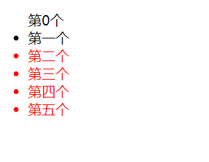
2) The difference between: first child and: first of type
: first child is the first to query the sorting of all child elements,
Because span is the first child element, but not li, the css set below will not take effect.
<!DOCTYPE html>
<html lang="en">
<head>
    <meta charset="UTF-8">
    <meta http-equiv="X-UA-Compatible" content="IE=edge">
    <meta name="viewport" content="width=device-width, initial-scale=1.0">
    <title>Document</title>
</head>

<style>

    /**ul Remove all child elements. The element name is li and the first element*/
    ul > li:first-child{
        color:red;
    }

</style>
<body>

    <ul>
        <span>0</span>
        <li>first</li>
        <li>the second</li>
        <li>Third</li>
        <li>Fourth</li>
        <li>Fifth</li>
    </ul>
</body>
</html>
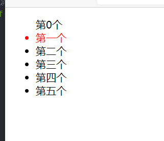
: first of type is the first to query the sorting of elements of the same type
<!DOCTYPE html>
<html lang="en">
<head>
    <meta charset="UTF-8">
    <meta http-equiv="X-UA-Compatible" content="IE=edge">
    <meta name="viewport" content="width=device-width, initial-scale=1.0">
    <title>Document</title>
</head>

<style>


    /**ul Remove all child elements. The element name is li and the first element*/
    ul > li:first-of-type{
        color:red;
    }


</style>
<body>

    <ul>
        <span>0</span>
        <li>first</li>
        <li>the second</li>
        <li>Third</li>
        <li>Fourth</li>
        <li>Fifth</li>
    </ul>
</body>
</html>
3) Usage of: not()
<!DOCTYPE html>
<html lang="en">
<head>
    <meta charset="UTF-8">
    <meta http-equiv="X-UA-Compatible" content="IE=edge">
    <meta name="viewport" content="width=device-width, initial-scale=1.0">
    <title>Document</title>
</head>

<style>


    /*  */
    ul > li:not(:nth-child(2)){
        color:red;
    }


</style>
<body>

    <ul>
        <span>0</span>
        <li>first</li>
        <li>the second</li>
        <li>Third</li>
        <li>Fourth</li>
        <li>Fifth</li>
    </ul>
</body>
</html>
4) Case
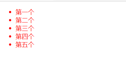
>>>>>>Case 1: set all sub elements under ul to red
<!DOCTYPE html>
<html lang="en">
<head>
    <meta charset="UTF-8">
    <meta http-equiv="X-UA-Compatible" content="IE=edge">
    <meta name="viewport" content="width=device-width, initial-scale=1.0">
    <title>Document</title>
</head>

<style>

    /* Set all sub elements under UL and li elements under ul to red */
    ul > li{
        color:red;
    }


</style>
<body>

    <ul>
        <li>first</li>
        <li>the second</li>
        <li>Third</li>
        <li>Fourth</li>
        <li>Fifth</li>
    </ul>
</body>
</html>
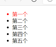
>>>>>>Case 2: set the first child element to red
<!DOCTYPE html>
<html lang="en">
<head>
    <meta charset="UTF-8">
    <meta http-equiv="X-UA-Compatible" content="IE=edge">
    <meta name="viewport" content="width=device-width, initial-scale=1.0">
    <title>Document</title>
</head>

<style>

    /* Set all sub elements under UL and li elements under ul to red */
    ul > li:first-child{
        color:red;
    }


</style>
<body>

    <ul>
        <li>first</li>
        <li>the second</li>
        <li>Third</li>
        <li>Fourth</li>
        <li>Fifth</li>
    </ul>
</body>
</html>
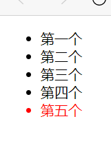
>>>>>>Case 2: set the last child element under ul to red
<!DOCTYPE html>
<html lang="en">
<head>
    <meta charset="UTF-8">
    <meta http-equiv="X-UA-Compatible" content="IE=edge">
    <meta name="viewport" content="width=device-width, initial-scale=1.0">
    <title>Document</title>
</head>

<style>

    /* Set all sub elements under UL and li elements under ul to red */
    ul > li:last-child{
        color:red;
    }


</style>
<body>

    <ul>
        <li>first</li>
        <li>the second</li>
        <li>Third</li>
        <li>Fourth</li>
        <li>Fifth</li>
    </ul>
</body>
</html>
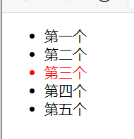
>>>>>>Case 3: set the third child element to red
<!DOCTYPE html>
<html lang="en">
<head>
    <meta charset="UTF-8">
    <meta http-equiv="X-UA-Compatible" content="IE=edge">
    <meta name="viewport" content="width=device-width, initial-scale=1.0">
    <title>Document</title>
</head>

<style>

    /* Set all sub elements under UL and li elements under ul to red */
    ul > li:nth-child(3){
        color:red;
    }


</style>
<body>

    <ul>
        <li>first</li>
        <li>the second</li>
        <li>Third</li>
        <li>Fourth</li>
        <li>Fifth</li>
    </ul>
</body>
</html>
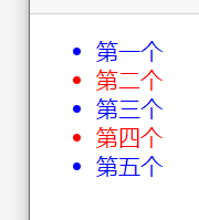
>>>>>>Case 4: set the ul lower even bit sub element to red and the odd bit sub element to yellow
<!DOCTYPE html>
<html lang="en">
<head>
    <meta charset="UTF-8">
    <meta http-equiv="X-UA-Compatible" content="IE=edge">
    <meta name="viewport" content="width=device-width, initial-scale=1.0">
    <title>Document</title>
</head>

<style>

    /* Set the ul lower even digit element to red */
    ul > li:nth-child(2n){
        color:red;
    }


    /* Set the ul lower odd element to blue */
    ul > li:nth-child(2n+1){
        color:blue;
    }


</style>
<body>

    <ul>
        <li>first</li>
        <li>the second</li>
        <li>Third</li>
        <li>Fourth</li>
        <li>Fifth</li>
    </ul>
</body>
</html>
5) Pseudo class of hyperlink
		:link 		Used to indicate a hyperlink that has not been visited
		:visited	Used to indicate visited hyperlinks
		:hover		Used to indicate the state of the mouse when moving in
		:active		Used to indicate the state when the mouse clicks
<!DOCTYPE html>
<html lang="en">
<head>
    <meta charset="UTF-8">
    <meta http-equiv="X-UA-Compatible" content="IE=edge">
    <meta name="viewport" content="width=device-width, initial-scale=1.0">
    <title>Document</title>
</head>

<style>

    /** Indicates a connection that has not been accessed */
    a:link{
        color:red;
    }

    /** Indicates a visited connection*/
    a:visited{
        color:blue;
    }

    /** Indicates the state when the mouse is moved in*/
    a:hover{
        color:green;
    }

    /** Indicates the state when the mouse clicks*/
    a:active{
        color:violet;
    }


</style>
<body>

    <a href="http://www.baidu. Com "> Baidu</a>

    <a href="http://www.baidu. Com "> Baidu 2</a>

</body>
</html>
6) Pseudo element
	Pseudo element: refers to some special and unreal elements in the page.
		   Pseudo element::start.

		::first-letter 	Represents the first letter
		::first-line	Represents the first line
		::selection 	Indicates the selected content

		::before		Represents the starting position of the element
		::after			Represents the end position of the element
				before and after Must combine content Property to use. content Property to insert content.
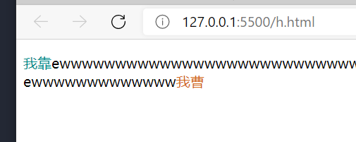
>>>>>>Case 1:
<!DOCTYPE html>
<html lang="en">
<head>
    <meta charset="UTF-8">
    <meta http-equiv="X-UA-Compatible" content="IE=edge">
    <meta name="viewport" content="width=device-width, initial-scale=1.0">
    <title>Document</title>
</head>

<style>

    /** Represents the first letter  */
    p::first-letter{
        color:red;
    }

   /** Represents the first line   */
    p::first-line{
        color:blue;
    }

    /** Indicates the selected content  */
    p::selection{
        color:blanchedalmond;
    }


    /** Represents the starting position of the element  */
    p::before{
        color:darkcyan;
        content: 'holy crap';
    }

    /** Represents the end position of the element  */
    p::after{
        color:chocolate;
        content: 'I Cao';
    }
</style>
<body>

  <p>ewwwwwwwwwwwwwwwwwwwwwwwwwww<br/>ewwwwwwwwwwwww</p>
</body>
</html>
>>>>>>Case 2: using css to insert content [key]
<!DOCTYPE html>
<html lang="en">
<head>
    <meta charset="UTF-8">
    <meta http-equiv="X-UA-Compatible" content="IE=edge">
    <meta name="viewport" content="width=device-width, initial-scale=1.0">
    <title>Document</title>
</head>

<style>


    /** Represents the starting position of the element  */
    p::before{
        color:darkcyan;
        content: 'holy crap';
    }

    /** Represents the end position of the element  */
    p::after{
        color:chocolate;
        content: 'I Cao';
    }
</style>
<body>

  <p>ewwwwwwwwwwwwwwwwwwwwwwwwwww<br/>ewwwwwwwwwwwww</p>
</body>
</html>
2. Restaurant selector exercise
https://flukeout.github.io/
3. Weight of selector (priority of selector)
3.1 weight of selector (priority of selector)
	1.Priority of selector (from large to small, digital is analog digital):
					1.inline style 			 1,0,0,0
					2.ID selector			 0,1,0,0
					3.Class selector and pseudo class selector	 0,0,1,0
					4.tag chooser 			 0,0,0,1
					5.universal selector

	2.Calculation of priority:
		1.When comparing priorities, you need to add the priorities of all selectors. Finally, the higher the priority, the higher the priority.
	     (Group selectors are calculated separately)
	    2.The accumulation of selectors will not exceed its maximum order of magnitude. For example, the accumulation of class selections will not exceed ID Selector.
		3.If the priorities are the same, the lowest priority (style override) takes precedence


	3.Highest priority:
				p{
					color:red !importent;
				}

				1.Add after style! importent ,The priority is the highest, even exceeding the inline style.
				2.Try not to use this method in development.
3.2 precautions
1) When styles conflict, the one with higher selector priority is used
		When styles conflict, styles with higher priority are used.
		ID Selector priority > class selector
<!DOCTYPE html>
<html lang="en">
<head>
    <meta charset="UTF-8">
    <meta http-equiv="X-UA-Compatible" content="IE=edge">
    <meta name="viewport" content="width=device-width, initial-scale=1.0">
    <title>Document</title>
</head>

<style>

    #s{
        color:red;
    }

    .a{
        color:blue;
    }

</style>
<body>

    <p id="s"  class="a b c">I am P element</p>

</body>
</html>

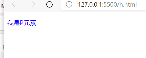
2) Priority accumulation is performed when calculating priority
<!DOCTYPE html>
<html lang="en">
<head>
    <meta charset="UTF-8">
    <meta http-equiv="X-UA-Compatible" content="IE=edge">
    <meta name="viewport" content="width=device-width, initial-scale=1.0">
    <title>Document</title>
</head>

<style>

    .a{
        color:red;
    }

    .a.b{
        color:blue;
    }

</style>
<body>

    <p id="s"  class="a b c">I am P element</p>

</body>
</html>
3) When calculating priority, priority accumulation will be carried out, but it will not exceed its maximum order of magnitude
	The priority is accumulated and will not exceed its maximum order of magnitude.
	Namely class The selector accumulates 100 times and will not exceed ID Selector.
<!DOCTYPE html>
<html lang="en">
<head>
    <meta charset="UTF-8">
    <meta http-equiv="X-UA-Compatible" content="IE=edge">
    <meta name="viewport" content="width=device-width, initial-scale=1.0">
    <title>Document</title>
</head>

<style>

    #a{
        color:red;
    }

    .a.b.c.d.e{
        color:blue;
    }

</style>
<body>

    <p id="a"  class="a b c d e">I am P element</p>

</body>
</html>

4) If the priority is the same, the style will be overwritten
<!DOCTYPE html>
<html lang="en">
<head>
    <meta charset="UTF-8">
    <meta http-equiv="X-UA-Compatible" content="IE=edge">
    <meta name="viewport" content="width=device-width, initial-scale=1.0">
    <title>Document</title>
</head>

<style>

    .a{
        color:red;
    }

    .b{
        color:blue;
    }

</style>
<body>

    <p id="s"  class="a b c d e">I am P element</p>

</body>
</html>

3, CSS units
1. Unit of pixel
1.1 concept of pixels and percentages
	pixel
		1.The screen display is essentially composed of luminous dots one by one. (each dot shows a different color and forms our screen)
		  The dots of these squares are called pixels.

		2.Different screens have different pixel sizes.
		  The smaller the pixel, the clearer the picture displayed. (the smaller the pixel, the finer the picture)

		3.Different screens have different pixel sizes. So 200 px The display effect is different on different display screens.
		   (For example: 200 px On my computer is 10 cm. However, if it is displayed on the high-definition screen, it may be 5 cm)

		4.200px Represents 200 dots. Because the size of points will be different on different screens, the display effect is also different.
Case:
	percentage:
		1.You can also set the attribute value as a percentage relative to the parent element.
		2.Set the percentage to make the child element change according to the change of the parent element.
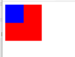
<!DOCTYPE html>
<html lang="en">
<head>
    <meta charset="UTF-8">
    <meta http-equiv="X-UA-Compatible" content="IE=edge">
    <meta name="viewport" content="width=device-width, initial-scale=1.0">
    <title>Document</title>
</head>

<style>

   #b1{
        width:100px;
        height:100px;
        background-color: red;;
   }

   #b2{
        width:50%;
        height: 50%;
        background-color: blue;;
   }

</style>
<body>

    <div id="b1">
        <div id="b2"></div>
    </div>

</body>
</html>
1.2 pixel units em and rem
1) Concept
	em
		  1.em It is calculated relative to the font size of the element itself.

		  2.1em=1font-size
		  			font-size The default value for is 16 px.
		    		So 10 em = 10*16px=160px

		  3.em It will change according to the font size of the element.
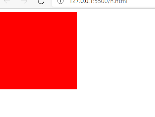
	rem
		  1.rem Is calculated relative to the font size of the root element.
		  2.The root element is html Element.
2) Precautions
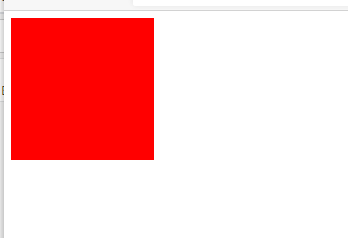
>>>>>>EM is calculated based on the font size of the element itself
	em It is calculated according to the font size of the element itself.
	So modify font-size The size of the element will also change.
<!DOCTYPE html>
<html lang="en">
<head>
    <meta charset="UTF-8">
    <meta http-equiv="X-UA-Compatible" content="IE=edge">
    <meta name="viewport" content="width=device-width, initial-scale=1.0">
    <title>Document</title>
</head>

<style>

   #b1{
        font-size:16px;
        width:10em;
        height:10em;
        background-color: red;;
   }


</style>
<body>

    <div id="b1">
    </div>

</body>
</html>
>>>>>>Rem is calculated relative to the font size of the root element.
<!DOCTYPE html>
<html lang="en">
<head>
    <meta charset="UTF-8">
    <meta http-equiv="X-UA-Compatible" content="IE=edge">
    <meta name="viewport" content="width=device-width, initial-scale=1.0">
    <title>Document</title>
</head>

<style>

    html{
        font-size:20px;
    }

   #b1{
        font-size:15px;
        width:10rem;
        height:10rem;
        background-color: red;;
   }


</style>
<body>

    <div id="b1">
    </div>

</body>
</html>
2. Color unit
2.1 color units
	Color unit:

			1.stay css You can directly use English names to specify colors.
			  For example: white ,black ,red ,blue ,green ...


			2.rgb value
				  1.rgb Different colors are prepared through the concentration of three different colors.
				  2.r:gules  g: green  b: blue
				  3.The range of each color is 0-255(0%-100%)between
 				  4.grammar:
 				  		rgb(255,255,255)
 				  		rgb(100%,100%,100%)

				  5.Three primary tones of light:
				  	 	rgb(0,0,0) 	  black
				  	 	rgb(255,255,255) white


			3.rgba value
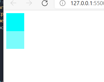
				  1.rgba namely rgb Added one on the basis of a,Indicates opacity.
				  2.Four values are required, the first three and rgb Like,
				    The fourth represents opacity (0)-1 Between).
				    			 1  Indicates complete opacity
				    			 0  Indicates complete transparency
				    			 .5 Indicates translucency


 				  3.grammar:
 				  		rgba(255,255,255,.3)
 				  		rgba(255,255,255,0)


			4.Hexadecimal rgb value
				  1.grammar: #Red green blue
				  		rgb:#00aa1f
				  		rgb:#ff0000

				  2.Color concentration range:00-ff
				  3.If the color is repeated in two digits, it can be abbreviated.
				  		For example: #aabbcc --> #abc

				  		For example: rgb:#00aa11 ---> rgb:#0a1
			5.HSL Value HSLA value
				  1. H Hue (0)-360)
				     S Saturation (0)%-100%)
				     L Brightness (0)%-100%)

				  2.hsl(50,100%,50%)
2.2 cases
1) English words represent colors
<!DOCTYPE html>
<html lang="en">
<head>
    <meta charset="UTF-8">
    <meta http-equiv="X-UA-Compatible" content="IE=edge">
    <meta name="viewport" content="width=device-width, initial-scale=1.0">
    <title>Document</title>
</head>

<style>


   #b1{
        width:50px;
        height:50px;
        background-color: red;;
   }


</style>
<body>

    <div id="b1">
    </div>

</body>
</html>
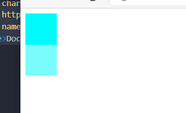
2)rgb,rgba
<!DOCTYPE html>
<html lang="en">
<head>
    <meta charset="UTF-8">
    <meta http-equiv="X-UA-Compatible" content="IE=edge">
    <meta name="viewport" content="width=device-width, initial-scale=1.0">
    <title>Document</title>
</head>

<style>


   #b1{
        width:50px;
        height:50px;
        background-color: rgb(0,250,250)
   }

   #b2{
        width:50px;
        height:50px;
        background-color: rgba(0,250,250,0.521)
 }


</style>
<body>

    <div id="b1">
    </div>

    <div id="b2">
    </div>

</body>
</html>
3) Hex rgb
<!DOCTYPE html>
<html lang="en">
<head>
    <meta charset="UTF-8">
    <meta http-equiv="X-UA-Compatible" content="IE=edge">
    <meta name="viewport" content="width=device-width, initial-scale=1.0">
    <title>Document</title>
</head>

<style>


   #b1{
        width:50px;
        height:50px;
        background-color: #00ff11;
   }

   #b2{
        width:50px;
        height:50px;
        background-color: #11ffaa;
 }


</style>
<body>

    <div id="b1">
    </div>

    <div id="b2">
    </div>

</body>
</html>
4) hsl and hsla
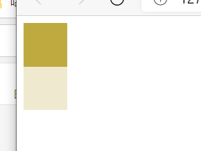
<!DOCTYPE html>
<html lang="en">
<head>
    <meta charset="UTF-8">
    <meta http-equiv="X-UA-Compatible" content="IE=edge">
    <meta name="viewport" content="width=device-width, initial-scale=1.0">
    <title>Document</title>
</head>

<style>


   #b1{
        width:50px;
        height:50px;
        background-color:hsl(50,50%,50%)
   }

   #b2{
        width:50px;
        height:50px;
        background-color:hsla(50,50%,50%,0.251)
   }


</style>
<body>

    <div id="b1">
    </div>

    <div id="b2">
    </div>


</body>
</html>
3, Box model
1.4.5 layout style
	Document flow(normal flow)
			1.The web page is a multi-layer structure, one layer after another. For users, it is from the perspective of looking down
			2.adopt css You can style each layer.
			3.Among these layers, the lowest layer is called document flow. Document flow is the basis of web pages.
			  The elements we create are arranged in the document flow by default.

			4.For us, elements have two main states:
								In document flow
								Not in document stream (out of document stream)
		Characteristics of elements in document flow
				Block element:
					  The block element has a single row. (arranged vertically from top to bottom)
					  The default width is the full width of the parent element (which will fill the parent element)
				      The default height is spread by the content.

				Inline elements:
					  Inline elements do not monopolize a row. (only its own size)
					  The elements in the row are arranged horizontally from left to right in the page. If they overflow, the line feed continues to be arranged.
1.4.5 box model
	1.Box model concept
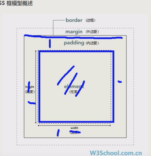
			CSS Set the elements in the page as a rectangular box.
			Set the element as a rectangular box, and the layout of the page will be transformed into placing different boxes in different positions.

	2.Box composition model
			1.Content( content)
			2.Inner margin( padding)
			3.Border( border)
			4.Outer margin( margin)
1.1.1 content area
	1.Content area( content),All child elements and text in the element are arranged in the content area.

	  The size of the content area is determined by width and height Attribute.
 							width: 10px; Sets the width of the content area
 							height:10px; Sets the height of the content area

	2.width The default value is auto;
<!DOCTYPE html>
<html lang="en">
<head>
    <meta charset="UTF-8">
    <meta http-equiv="X-UA-Compatible" content="IE=edge">
    <meta name="viewport" content="width=device-width, initial-scale=1.0">
    <title>Document</title>
</head>

<style>


   /**
        The size of the content area is set by width and height
   */
   #b1{
        width:50px;
        height:50px;
        background-color:hsl(50,50%,50%)
   }


</style>
<body>

    <div id="b1">
    </div>


</body>
</html>
1.1.2 border
| Border style | Default value | semantics | Separate style | semantics |
|---|---|---|---|---|
| border-width | Generally, the default is 3 pixels | Specify border width | border-top-width border-left-width border-right-width border-bottom-width | Specify the width of each side separately |
| border-style | The default is none | Specifies the style of the border | border-top-style border-left-style border-right-style border-bottom-style | Specify the style for each side separately |
| border-color | The default color is color | Specifies the border color | border-top-color border-left-color border-right-color border-bottom-color | Specify the color of each side separately |
| border | Uniformly specify the border style (the order can be arbitrary) | border-top border-left border-right border-bottom | Specify the border style uniformly |
	  1.Border( border),The border belongs to the edge of the box. The contents of the box in the frame belong to the outside.

	  2.To set the border, set at least three styles:

 						Sets the length of the border	border-width  		border-xxx-width
						Sets the color of the border	border-color		border-xxx-color
						Sets the style of the border	border-style	    border-xxx-style

						Set border style uniformly  border				border-xxx
		1.border-width:10px;
					  	1.Default: usually 3 pixels.

					  	2.border-width You can specify the width of the four borders.	You can also specify them separately(border-xxx-width).
					  					Specify style:
								  					border-width: 10px 20px 30px 40px;  //Upper right lower left
								  					border-width: 10px 20px 30px ;      //Up, left, right and down
								  					border-width: 10px 20px ;           //Up, down, left and right
								  					border-width: 10px ;          	    //Up, down, left and right

									    Specifies the style for each side:
									    			border-top-width: 10px;
													border-left-width: 10px;
													border-right-width: 10px;
													border-bottom -width: 10px;


		2.border-color:red;
					    1.Default: element color Sets the color value of the.

						2.border-color You can specify the colors of the four borders, or you can specify them separately(border-xxx-color).
										 Specify style
											  		border-color: red  blue  red  blue;
											  		border-color: red  blue  red  ;
											  		border-color: red  blue    ;
											  		border-color: red      ;


										 Specifies the style for each side
											        border-top-color: red;
											        border-bottom-color: red;
											        border-left-color: red;
											        border-right-color: red;


		3.border-style:solid;
						1.Default: none;//no border

						2.border-style Specifies the style of the border
											solid    	Represents a solid line
											dotted      Dotted line
											dashed      Dotted line
											double      Double line

						3.border-style You can specify the style of the four borders. You can also specify them separately(border-xxx-style).
										    Specify style
											  		  border-style: solid   dotted      dashed      double ;
											  		  border-style: solid   dotted      dashed    ;
											  		  border-style: solid   dotted      ;
											  		  border-style: solid        ;

										    Specifies the style for each side
											          border-top-style: solid;


			4.border Abbreviated attribute of
						1.border The shorthand property of the border, through which all related styles of the border can be set at the same time. And there is no order requirement.
						2.border-xxx,Specified by this attribute

						2.Syntax:
									Uniform style assignment
															border:solid  red   10px;
															border:10px  solid  red;

									Specify the style of each side uniformly
															border-top:solid  red   10px;
>>>>>>Case: setting border style
<!DOCTYPE html>
<html lang="en">
<head>
    <meta charset="UTF-8">
    <meta http-equiv="X-UA-Compatible" content="IE=edge">
    <meta name="viewport" content="width=device-width, initial-scale=1.0">
    <title>Document</title>
</head>

<style>

    div{
        width:50px;
        height:50px;
        background-color:hsl(50,50%,50%);

    }


   /** Set styles separately*/
   #b1{


        border-width:10px;
        border-color:yellow;
        border-style:solid;
   }


   /** Style each side separately*/
   #b2{

        border-top-width:10px;
        border-left-width:10px;
        border-right-width:10px;
        border-bottom-width:10px;


        border-top-color:yellow;
        border-left-color:yellow;
        border-right-color:yellow;
        border-bottom-color:yellow;


        border-top-style:solid;
   }


   /** Uniform style setting*/
   #b3{

        border:10px solid red;
   }

     /** Set the style of each side uniformly*/
     #b4{

          border-top:10px solid red;
     }


</style>
<body>

    <div id="b1">b1 </div>

    <div id="b2">b2 </div>

    <div id="b3"> b3</div>

    <div id="b4"> b4</div>


</body>
</html>
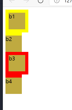
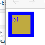
>>>>>>Case: the default value of border color is the style of element color
		backgound-color Set the background color.
		color The foreground color is set.

		therefore border-color If not set, the default is color The color of the.
<!DOCTYPE html>
<html lang="en">
<head>
    <meta charset="UTF-8">
    <meta http-equiv="X-UA-Compatible" content="IE=edge">
    <meta name="viewport" content="width=device-width, initial-scale=1.0">
    <title>Document</title>
</head>

<style>

    div{
        width:50px;
        height:50px;
        background-color:hsl(50,50%,50%);
        color:blue;
    }


   /** Set styles separately*/
   #b1{


        border-width:10px;
        border-style:solid;
   }


</style>
<body>

    <div id="b1">b1 </div>


</body>
</html>
1.1.3 padding
| style | semantics | case | Separate style | semantics | case |
|---|---|---|---|---|---|
| padding | Specify inner margin | padding:10px 20px 30px 40px padding:10px 20px 30px padding:10px 20px padding:10px | padding-top padding-left padding-right padding-bottom | Specify the width of each side separately | padding-top :10px |
	  1.Inner margin( padding),The distance between the content area and the border is the inner margin.

 	  2.The background color extends to the inside margin.

 	  3.The size of the visible area is determined by the common border and the content in the box.
 	    So when calculating the size of the box, you need to add three areas together.
 	    However, the outer margin does not affect the size of the box.


	  4.To set the inside margin, there is only one:
 								padding      padding-xxxx
		padding:10px;

					  	1.padding You can specify the inside margin in four directions.	You can also specify them separately(padding-xxx).
					  					Specify the inside margin:
								  					padding: 10px 20px 30px 40px;  //Upper right lower left
								  					padding: 10px 20px 30px ;      //Up, left, right and down
								  					padding: 10px 20px ;           //Up, down, left and right
								  					padding: 10px ;          	    //Up, down, left and right

									    Specify the inside margin in each direction:
									    			padding-top: 10px;
													padding-left: 10px;
													padding-right: 10px;
													padding-bottom: 10px;
1.1.4 margin
		Outer margin( margin):
					1.The outer margin does not affect the size of the visible box of the box
					2.However, the outer margin will affect the actual space occupied by the box.


		To set the outer margin, there is only one:
 							margin      margin-xxxx


		margin-xxx Setting a negative value sets the outer margin in the opposite direction.
		margin-xxx Setting a positive value sets the outer margin in that direction.
		margin:10px;

					  	1.margin You can specify outer margins in four directions.	You can also specify them separately(padding-xxx).
					  					Specify the inside margin:
								  					margin: 10px 20px 30px 40px;  //Upper right lower left
								  					margin: 10px 20px 30px ;      //Up, left, right and down
								  					margin: 10px 20px ;           //Up, down, left and right
								  					margin: 10px ;          	    //Up, down, left and right

									    Specify the inside margin in each direction:
									    			margin-top: 10px;
													margin-left: 10px;
													margin-right: 10px;
													margin-bottom: 10px;
1.4 horizontal layout of boxes
	1.The horizontal position of an element in its parent element is determined by the following attributes.

			margin-left		 border-left
			padding-left     width
			padding-right    border-right
			margin-right
	1.The horizontal layout of an element in its parent element must satisfy the following equation:

					margin-left + border-left + padding-left + width  + padding-right + border-right  + margin-right = The width of the parent element's content area (must be met).


	2.Box horizontal layout identity

			1.The above equation must be satisfied. If the addition result equation is not tenable, it is called over constraint. The equation adjusts automatically.

			2.If the constraint is excessive, the browser will automatically adjust to meet the equation. nothing auto,adjustment margin-right. have auto,adjustment auto Value.

					1)If these seven values are not auto The browser will adjust automatically margin-right Value to satisfy the equation.

					2)If these seven values have auto The browser will adjust auto To make the equation hold.

							 1. These seven values have three properties that can be set to auto:
														width(width The default value is auto)
																					If div If the width is not set, it accounts for 100% of the parent element%.
																					The reason is because width The default value for is auto. The browser automatically adjusts to satisfy the equation auto Value, i.e width.
														margin-left
														margin-right

							 2.If you set a width and an outer margin to auto,Then the box width will be adjusted to the maximum, and the adjusted outer margin is 0

							 3.If both outer margins are set to auto,If the width is fixed, the outer margin is set to the same value.
			 				   We often use this feature to set the horizontal center of the element.
														width:100px;
														margin:0 auto;


							-
1.1.1 only width and outer margin can be set as auto value
		width(width The default value is auto)
		margin-left
		margin-right

		Only these three properties can be set to auto Value.
1.1.2 the width of div is 100% of the parent element by default.
	 div The width of the element is 100% of the parent element by default%.

	  reason:According to the horizontal layout identity of the box, due to width The default value for is auto. The browser automatically adjusts to satisfy the equation auto Value, i.e width.
1.1.3 element centered style
		div{
			width:100px;
			margin:0 auto;
		  }

		Reason: element level identity:
						auto+0+0+width+0+0+auto=Parent element width
						To satisfy the equation, the browser automatically sets the outer margin to the same value.
1.1.4 horizontal layout identity of box
	The horizontal layout of an element in its parent element must satisfy the following equation:
			margin-left + border-left + padding-left + width  + padding-right + border-right  + margin-right = The width of the parent element's content area (must be met).

	If not, the browser will automatically adjust.
			If none of these seven attributes auto,Will be adjusted margin-right.
			If these seven attributes have auto,Will be adjusted auto Value.
						1.as long as width by auto,name Box
						2.If width by auto,Both outer margins are auto. Then the box width will be adjusted to the maximum, and the outer margin will be adjusted to 0.
						3.If the width is fixed, both outer margins are auto,The outer margin is set to the same value.

			1.Box horizontal layout identity:
					auto Value auto adjust priority: width > Left and right outer margin
>>>>>>If there is no auto for these seven attributes, the browser will automatically adjust margin right
	inner:0+0+0+100+0+0+0 = 1000

	Since the above equation is not satisfied, it will be adjusted margin-right=900. Namely:
					inner:0+0+0+100+0+0+900 = 1000
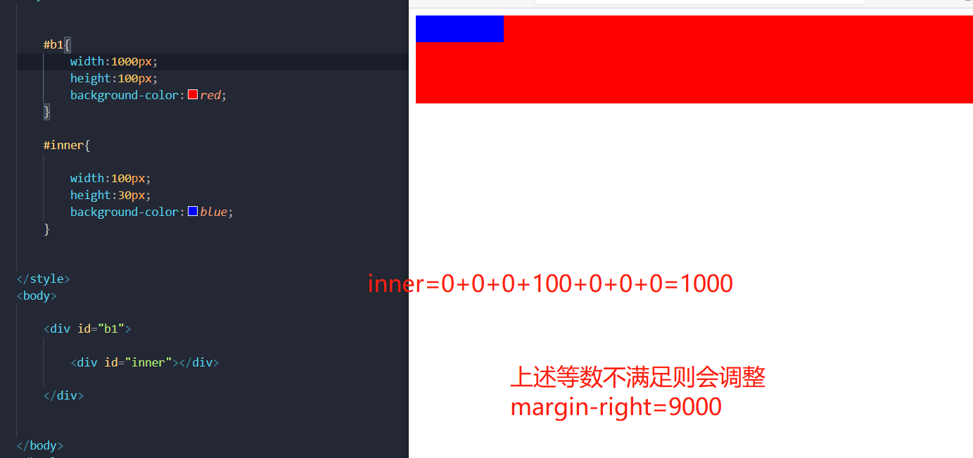
>>>>>>If the width is auto and an outer margin is auto, the box width will be adjusted to the maximum and the outer margin will be adjusted to 0
 	inner:0+0+0+auto+0+0+0 = 1000

	Since the above equation is not satisfied, it will be adjusted width=1000.
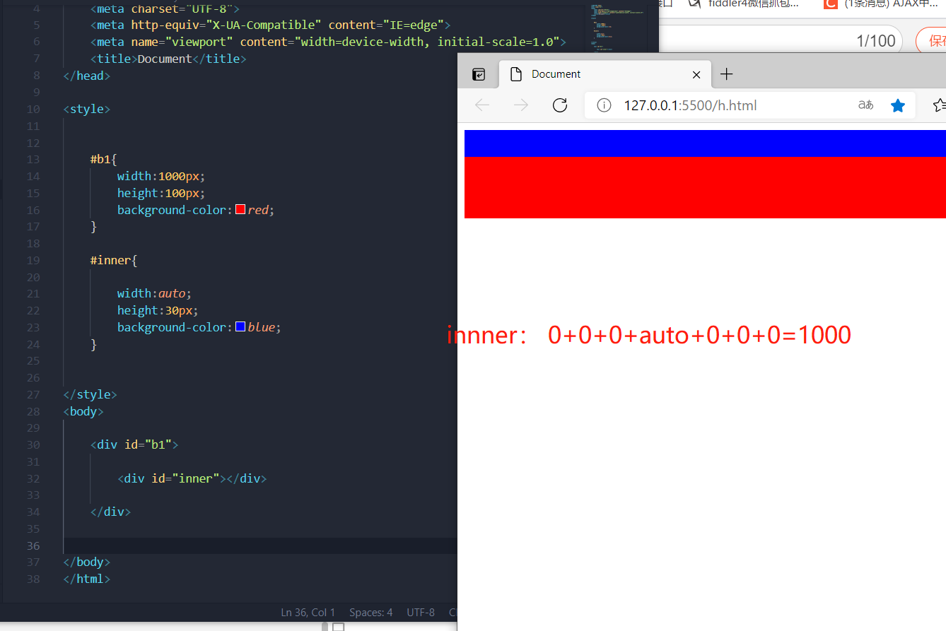
>>>>>>If both outer margins are set to auto and the width is fixed, the outer margin is set to the same value.
If both outer margins are set to auto,If the width is fixed, the outer margin is set to the same value.
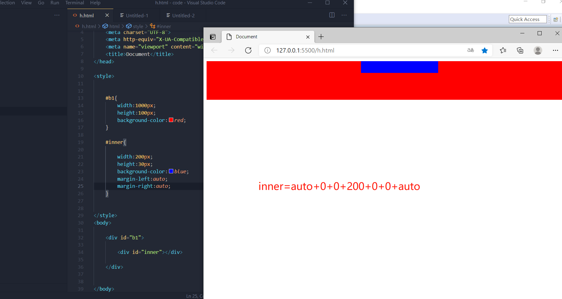
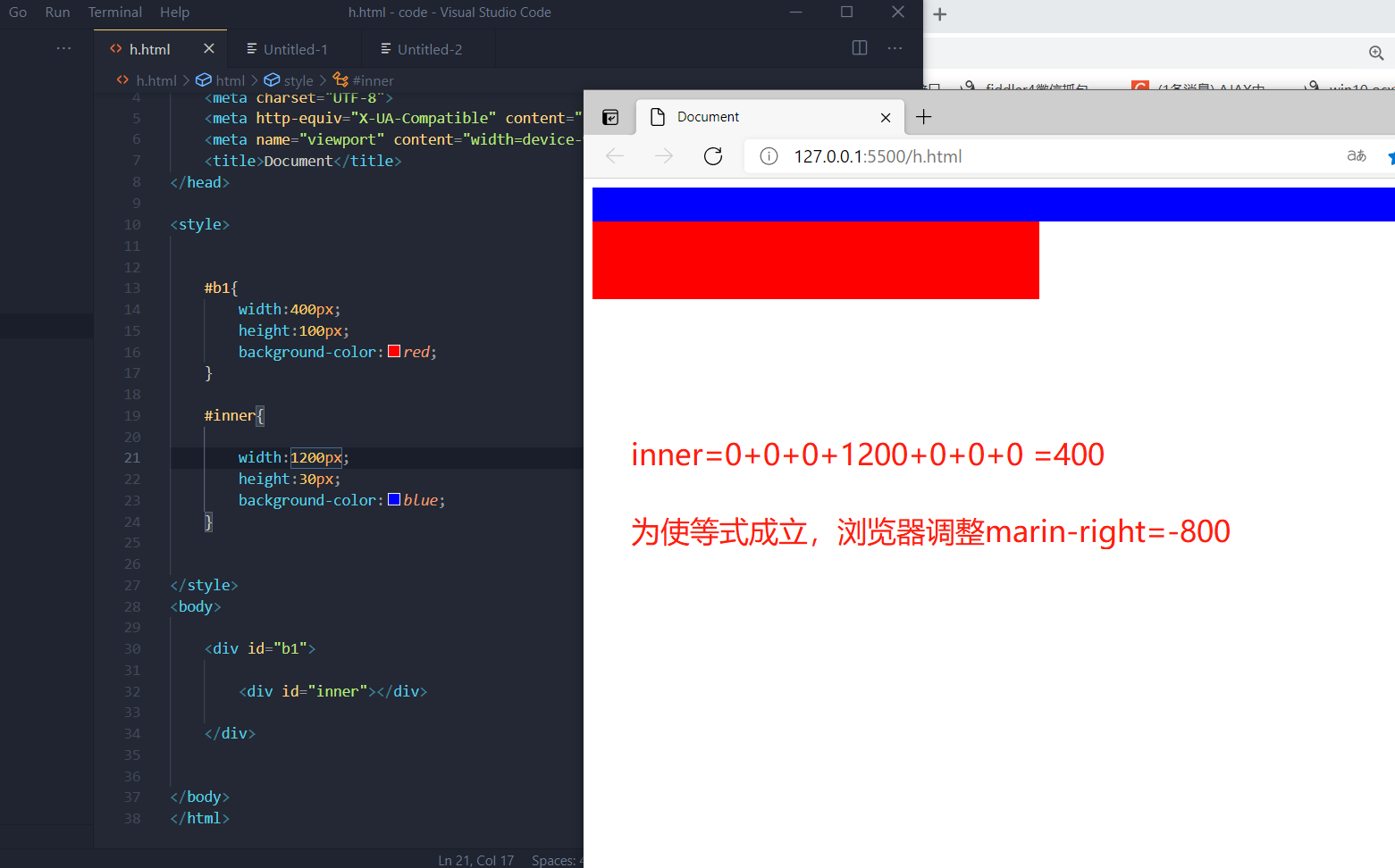
>>>>>>If the width of the element exceeds the width of the parent element, the browser will still automatically adjust the identity, but adjust it to a negative value
	inner: 0+0+0+1200+0+0+0 =400

	For the equation to hold, the browser will margin-right Adjust to-800.Namely:
					inner: 0+0+0+1200+0+0+-800 =400
1.4 vertical layout of boxes
1.4.1 by default, the height of the parent element is expanded by the content
<!DOCTYPE html>
<html lang="en">
<head>
    <meta charset="UTF-8">
    <meta http-equiv="X-UA-Compatible" content="IE=edge">
    <meta name="viewport" content="width=device-width, initial-scale=1.0">
    <title>Document</title>
</head>

<style>


    #b1{
        width:400px;
        background-color:red;
    }

    .inner{

        width:100px;
        height:30px;
        background-color:blue;
        margin-bottom:20px;
    }


</style>
<body>

    <div id="b1">

        <div class="inner"></div>
        <div class="inner"></div>

    </div>


</body>
</html>
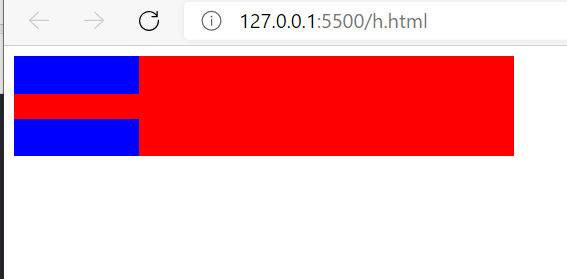
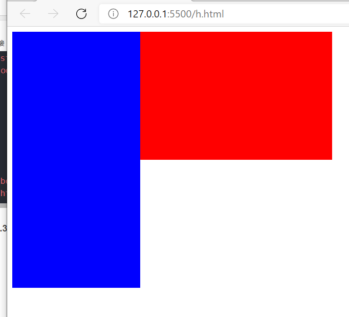
1.4.2 the child elements are arranged in the content area of the parent element. If the size of the child element exceeds the size of the parent element, the child element will overflow by default
<!DOCTYPE html>
<html lang="en">
<head>
    <meta charset="UTF-8">
    <meta http-equiv="X-UA-Compatible" content="IE=edge">
    <meta name="viewport" content="width=device-width, initial-scale=1.0">
    <title>Document</title>
</head>

<style>


    #b1{
        width:500px;
        height:200px;
        background-color:red;
    }

    .inner{

        width:200px;
        height:400px;
        background-color:blue;
        margin-bottom:20px;
    }


</style>
<body>

    <div id="b1">

        <div class="inner"></div>

    </div>


</body>
</html>
1.4.3 overflow
		overflow:
				visible (Default value) The child element can overflow from the parent element and be displayed outside the parent element
				hidden       The overflow content will be hidden and the overflow part will not be displayed
				scroll       Generate horizontal and vertical scroll bars
				auto	     Automatically generate scroll bars based on content

		overflow-x:
				Handle horizontal direction separately, optional values and overflow Same.

		overflow-y:
				Handle the vertical direction separately, with optional values and overflow Same.
<!DOCTYPE html>
<html lang="en">
<head>
    <meta charset="UTF-8">
    <meta http-equiv="X-UA-Compatible" content="IE=edge">
    <meta name="viewport" content="width=device-width, initial-scale=1.0">
    <title>Document</title>
</head>

<style>


    #b1{
        width:1000px;
        height:200px;
        background-color:red;
        overflow: auto;
    }

    .inner{

        width:200px;
        height:400px;
        background-color:blue;
        margin-bottom:20px;
    }


</style>
<body>

    <div id="b1">

        <div class="inner"></div>

    </div>


</body>
</html>

1.4 overlapping effect of vertical outer margin
	 Vertical outer distance of overlapping direction: The outer margin in the vertical direction will overlap.

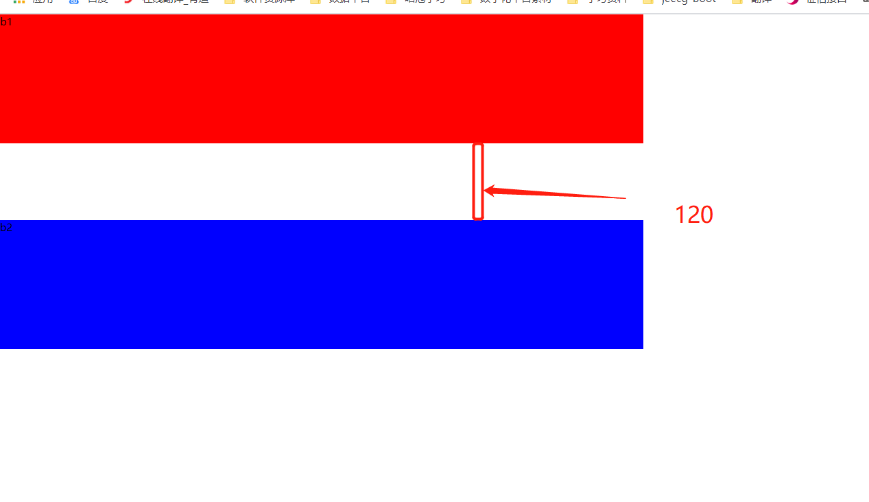
			1.The outer margins of sibling elements overlap in the vertical direction
					1.The outer margin in the vertical direction is positive or, and the outer margin is the largest.
					2.The outer margin in the vertical direction is negative, and the absolute value is the maximum.
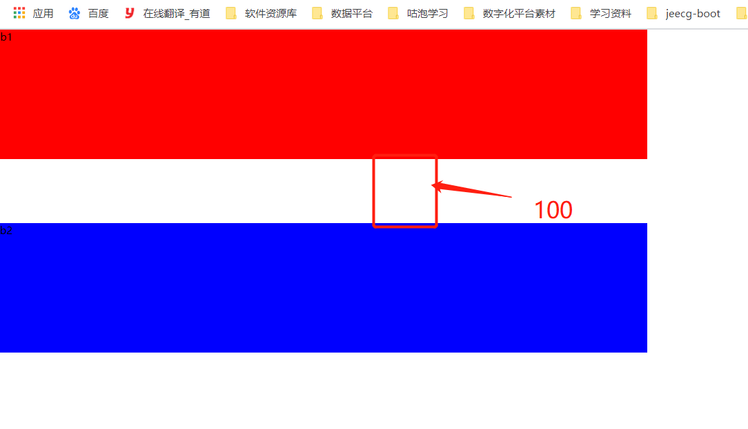
					3.If the outer distance in the vertical direction is positive and negative, the sum of the two is taken.

			  The overlapping of the outer margins of elements between brothers is beneficial to development and does not need to be handled.


			2.Overlap of vertical outer margins of parent and child elements
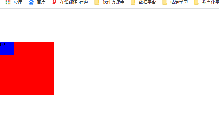
					 1.The outer margins of the parent and child elements overlap in the vertical direction, and the outer margins of the child elements are passed to the parent element (upper outer margin)
					 2.The overlap of upper and lower margins of parent and child elements will affect the layout of the page, so it must be handled
1.5.1 the upper and lower outer margins of sibling elements overlap
>>>>>>The outer margin in the vertical direction is positive, and the maximum value is taken
<!DOCTYPE html>
<html lang="en">
<head>
    <meta charset="UTF-8">
    <meta http-equiv="X-UA-Compatible" content="IE=edge">
    <meta name="viewport" content="width=device-width, initial-scale=1.0">
    <title>Document</title>
</head>

<style>

    *{
        margin:0px;
        padding:0px;
    }

    #b1{
        width:1000px;
        height:200px;
        background-color:red;
        margin-bottom:120px;
    }


    #b2{
        width:1000px;
        height:200px;
        background-color:blue;
        margin-top:120px;
    }

</style>
<body>

    <div id="b1"> b1 </div>
    <div id="b2"> b2 </div>


</body>
</html>
>>>>>>The outer margin in the vertical direction is negative, and the maximum absolute value is taken [different browsers have different effects]
<!DOCTYPE html>
<html lang="en">
<head>
    <meta charset="UTF-8">
    <meta http-equiv="X-UA-Compatible" content="IE=edge">
    <meta name="viewport" content="width=device-width, initial-scale=1.0">
    <title>Document</title>
</head>

<style>


    #b1{
        width:1000px;
        height:200px;
        background-color:red;
        margin-bottom:-20px;
    }


    #b2{
        width:1000px;
        height:200px;
        background-color:blue;
        margin-top:-100px;
    }

</style>
<body>

    <div id="b1"> b1 </div>
    <div id="b2"> b2 </div>


</body>
</html>
>>>>>>The outer distance in the vertical direction is positive and negative, and the sum is taken
<!DOCTYPE html>
<html lang="en">
<head>
    <meta charset="UTF-8">
    <meta http-equiv="X-UA-Compatible" content="IE=edge">
    <meta name="viewport" content="width=device-width, initial-scale=1.0">
    <title>Document</title>
</head>

<style>

    *{
        margin:0px;
        padding:0px;
    }

    #b1{
        width:1000px;
        height:200px;
        background-color:red;
        margin-bottom:-20px;
    }


    #b2{
        width:1000px;
        height:200px;
        background-color:blue;
        margin-top:120px;
    }

</style>
<body>

    <div id="b1"> b1 </div>
    <div id="b2"> b2 </div>


</body>
</html>
1.5.2 overlapping outer margins on parent-child elements
>>>>>>The outer margins of the parent and child elements overlap, and the outer margins of the child elements are passed to the parent element
		Child element set margin-top: 120px;Because the upper and lower outer margins of parent and child elements overlap,
		Therefore, the outer margin of the child element is passed to the parent element. So both parent and child elements move down.
<!DOCTYPE html>
<html lang="en">
<head>
    <meta charset="UTF-8">
    <meta http-equiv="X-UA-Compatible" content="IE=edge">
    <meta name="viewport" content="width=device-width, initial-scale=1.0">
    <title>Document</title>
</head>

<style>

    *{
        margin:0px;
        padding:0px;
    }

    #b1{
        width: 200px;;
        height:200px;
        background-color:red;
    }


    #b2{
        width:50px;
        height:50px;
        background-color:blue;
        margin-top:120px;
    }

</style>
<body>

    <div id="b1">
        <div id="b2"> b2 </div>
    </div>


</body>
</html>
>>>>>>The overlap of outer margins on parent-child elements will affect the layout of the page, so it must be handled
Mode 1:
			Processing method: add border-top: 1px solid.
			Reason: add to parent element border,At this time, the outer margin of the parent element and the outer margin of the child element do not overlap.
<!DOCTYPE html>
<html lang="en">
<head>
    <meta charset="UTF-8">
    <meta http-equiv="X-UA-Compatible" content="IE=edge">
    <meta name="viewport" content="width=device-width, initial-scale=1.0">
    <title>Document</title>
</head>

<style>

    *{
        margin:0px;
        padding:0px;
    }

    #b1{
        width: 200px;;
        height:200px;
        background-color:red;
        border-top :1px solid;
    }


    #b2{
        width:50px;
        height:50px;
        background-color:blue;
        margin-top:120px;
    }

</style>
<body>

    <div id="b1">
        <div id="b2"> b2 </div>
    </div>


</body>
</html>
Mode 2:
   #b1::before{
         content:'';
         display:table;
     }
<!DOCTYPE html>
<html lang="en">
<head>
    <meta charset="UTF-8">
    <meta http-equiv="X-UA-Compatible" content="IE=edge">
    <meta name="viewport" content="width=device-width, initial-scale=1.0">
    <title>Document</title>

    <style>

      #b1{
        background-color: red;
      }


      #b2{
          width:100px;
          height:100px;
          background-color: blue;
          margin-top:50px;
      }

     #b1::before{
         content:'';
         display:table;
     }


    </style>

</head>
<body>


    <div id="b1">
        <div id="b2"> </div>
    </div>


</body>
</html>

1.4 box model of inline elements
	Box model of inline elements:
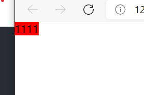
					1.Inline elements do not support setting width and height. Its size is supported by the content
					2.Inline elements can be set padding,border,margin,
					  However, the vertical direction will not affect the page layout. Also, the property on is invalid.
>>>>>>Inline elements do not support setting width and height. Its size is supported by the content
<!DOCTYPE html>
<html lang="en">
<head>
    <meta charset="UTF-8">
    <meta http-equiv="X-UA-Compatible" content="IE=edge">
    <meta name="viewport" content="width=device-width, initial-scale=1.0">
    <title>Document</title>
</head>

<style>

    *{
        margin:0px;
        padding:0px;
    }

    #b1{
        width: 200px;;
        height:200px;
        background-color:red;

    }


</style>
<body>

    <span id="b1">1111</span>

</body>
</html>
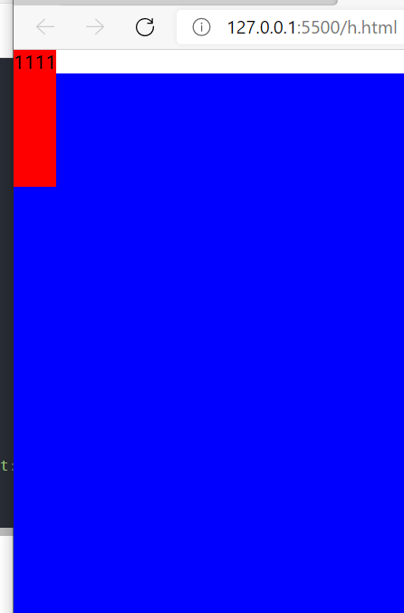
>>>>>>In line elements can set padding, border and margin, but the vertical direction will not affect the page layout.
		Inline elements can be set padding,border,margin,However, the vertical direction will not affect the page layout.
		That is, you can set these three attributes, but these three attributes will not affect the page layout in the vertical direction, but will only cover.
<!DOCTYPE html>
<html lang="en">
<head>
    <meta charset="UTF-8">
    <meta http-equiv="X-UA-Compatible" content="IE=edge">
    <meta name="viewport" content="width=device-width, initial-scale=1.0">
    <title>Document</title>
</head>

<style>

    *{
        margin:0px;
        padding:0px;
    }

    #b1{
        width: 200px;;
        height:200px;
        background-color:red;
        padding-bottom:100px;

    }


</style>
<body>

    <span id="b1">1111</span>

    <div style="width:500px;height:500px ; background-color:blue;"></div>
</body>
</html>
>>>>>>padding, border and margin can be set for in-line elements, but the upper attribute is invalid.
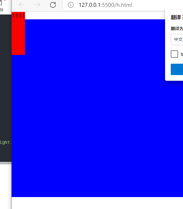
	Inline elements can be set padding,border,margin,But the property on is invalid.
	As shown in the case, the pading-top and padding-bottom. Can see padding-top Invalid.
<!DOCTYPE html>
<html lang="en">
<head>
    <meta charset="UTF-8">
    <meta http-equiv="X-UA-Compatible" content="IE=edge">
    <meta name="viewport" content="width=device-width, initial-scale=1.0">
    <title>Document</title>
</head>

<style>

    *{
        margin:0px;
        padding:0px;
    }

    #b1{
        width: 200px;;
        height:200px;
        background-color:red;
        padding-bottom:100px;
        padding-top:200px;
    }


</style>
<body>

    <span id="b1">1111</span>

    <div style="width:500px;height:500px ; background-color:blue;"></div>
</body>
</html>
1.4 conversion of block elements and inline elements
		1.display:Used to set the element type.

			Optional value:
			      inline   Set element as inline element
			      block    Set element to block element
			      inline-blobk  Sets the element as an inline block element.
				  table		Set element as a table
				  none      Hide elements. But the element has been physically deleted

		2.visibility: Used to set the display state of elements.

			 Optional values:
			 	  visible(Default value)  The element is displayed in the page
			 	  hidden    Hide elements. But the element still exists


		2.Characteristics of inline block elements:
					1.It can be set to width and height, but it will not monopolize one row
1.4 browser default style
		Usually, the browser sets some default styles for elements.
		The default style will affect the page layout. Usually, we will remove the default style.
    *{
        margin:0px;
        padding:0px;
        list-style:none;
    }
1.4.4 box size
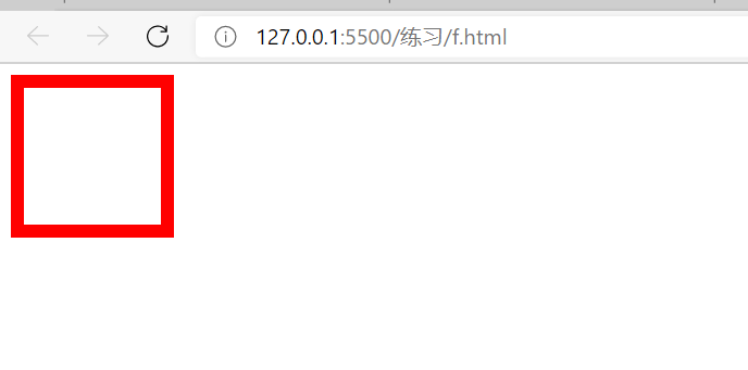
		1.By default, the size of the visible box of the box is determined by the content area, inner margin and border.

		2.box-sizing:Used to set the calculation method of box size. (setting) width,height (role of)

			Optional value:
					content-box  (Default) width and height are used to set the size of the content area.
					 			  width,height Refers to the size of the content area

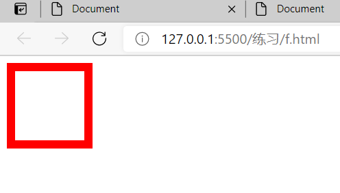
					border-box   Width and height are used to set the size of the visible box of the whole box.
					 			  width,height The size of the visible box is
By default, the size of the visible box of the box is determined by the content area, inner margin and border.
The size of the box=width,height Specified size+border
<!DOCTYPE html>
<html lang="en">
<head>
    <meta charset="UTF-8">
    <meta http-equiv="X-UA-Compatible" content="IE=edge">
    <meta name="viewport" content="width=device-width, initial-scale=1.0">
    <title>Document</title>
    <style>
        div{
            width:100px;
            height:100px;
            border:10px solid red;
        }

    </style>
</head>
<body>

    <div>


    </div>

</body>
</html>
box-sizing:border-box;
The size of the box=width,height Specified size
<!DOCTYPE html>
<html lang="en">
<head>
    <meta charset="UTF-8">
    <meta http-equiv="X-UA-Compatible" content="IE=edge">
    <meta name="viewport" content="width=device-width, initial-scale=1.0">
    <title>Document</title>
    <style>
        div{
            width:100px;
            height:100px;
            border:10px solid red;
            box-sizing:border-box;
        }

    </style>
</head>
<body>

    <div>


    </div>

</body>
</html>
1.4.4 contours, shadows and fillets
		1,outline:10px solid  red;
			  Used to set the outline, usage and of the element border agreement.
			  The difference between the outline and the border is that the outline will not affect the size of the visible box and the page layout.


		2,box-shadow:10px  10px 10px balck;
			  Used to set the shadow effect of elements. The shadow will not affect the page layout.

			  box-shadow:10px  10px 10px balck;
					The first value is the horizontal offset. Positive values move to the right and negative values move to the left
					The second value is the vertical offset, with positive values moving down and negative values moving up
					The third value is the blur radius of the shadow. The higher the value, the more blurred the shadow is
					The fourth value is the color of the shadow

		3. border-radius: 10px;
			  Used to set the fillet size of the element. A value indicates the radius size of the circle set by the fillet

			 1.Set four corners at the same time
              		  border-radius: 10px 20px 30px  40px;   Upper left, upper right, lower right, lower left
              		  border-radius: 10px 20px 30px ;        Upper left and upper right/Lower left and lower right
              		  border-radius: 10px 20px;              Upper left/Lower right upper right/Lower left
					  border-radius: 10px;                   Specify four corners at the same time

             2.Set four corners respectively
		              border-top-left-radius: 10px;
		              border-top-right-radius: 10px;
		              border-bottom-left-radius: 10px;
		              border-bottom-right-radius: 10px

			3.Set an element to round
					  border-radius: 50%;
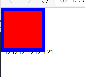
outline
		outline:10px solid  red;
			 Used to set the outline, usage and of the element border agreement.

			 The difference between outline and border is that outline does not affect page layout. That is, the outline does not affect the layout arrangement.
<!DOCTYPE html>
<html lang="en">
<head>
    <meta charset="UTF-8">
    <meta http-equiv="X-UA-Compatible" content="IE=edge">
    <meta name="viewport" content="width=device-width, initial-scale=1.0">
    <title>Document</title>
    <style>
        div{
            width:100px;
            height:100px;
            background-color: red;
            outline:10px solid blue;
     }

    </style>
</head>
<body>

    <div>


    </div>
    121212
    1212
    121
</body>
</html>
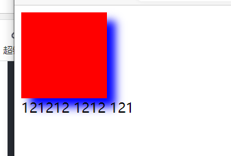
shadow
			box-shadow:10px  10px 10px balck;

						1.Used to set the shadow effect of elements. The shadow will not affect the page layout.

						2.The first value is the horizontal offset. Positive values move to the right and negative values move to the left
						  The second value is the vertical offset, with positive values moving down and negative values moving up
						  The third value is the blur radius of the shadow. The higher the value, the more blurred the shadow is
						  The fourth value is the color of the shadow
<!DOCTYPE html>
<html lang="en">
<head>
    <meta charset="UTF-8">
    <meta http-equiv="X-UA-Compatible" content="IE=edge">
    <meta name="viewport" content="width=device-width, initial-scale=1.0">
    <title>Document</title>
    <style>
        div{
            width:100px;
            height:100px;
            background-color: red;
            box-shadow: 10px 10px 10px blue;
     }

    </style>
</head>
<body>

    <div>


    </div>
    121212
    1212
    121
</body>
</html>
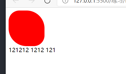
fillet
	border-radius: 10px;
			  Used to set the fillet size of the element. A value indicates the radius size of the circle set by the fillet

			 1.Set four corners at the same time
              		  border-radius: 10px 20px 30px  40px;   Upper left, upper right, lower right, lower left
              		  border-radius: 10px 20px 30px ;        Upper left and upper right/Lower left and lower right
              		  border-radius: 10px 20px;              Upper left/Lower right upper right/Lower left
					  border-radius: 10px;                   Specify four corners at the same time

             2.Set four corners respectively
		              border-top-left-radius: 10px;
		              border-top-right-radius: 10px;
		              border-bottom-left-radius: 10px;
		              border-bottom-right-radius: 10px

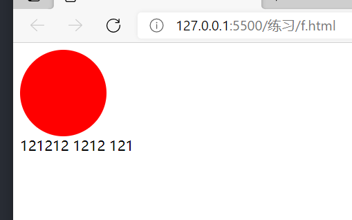
			3.Set an element to round
					  border-radius: 50%;
>>>>>>Case setting element fillet
<!DOCTYPE html>
<html lang="en">
<head>
    <meta charset="UTF-8">
    <meta http-equiv="X-UA-Compatible" content="IE=edge">
    <meta name="viewport" content="width=device-width, initial-scale=1.0">
    <title>Document</title>
    <style>
        div{
            width:100px;
            height:100px;
            background-color: red;

             border-radius: 30px  50px;

     }

    </style>
</head>
<body>

    <div>


    </div>
    121212
    1212
    121
</body>
</html>
>>>>>>Case setting element circle
<!DOCTYPE html>
<html lang="en">
<head>
    <meta charset="UTF-8">
    <meta http-equiv="X-UA-Compatible" content="IE=edge">
    <meta name="viewport" content="width=device-width, initial-scale=1.0">
    <title>Document</title>
    <style>
        div{
            width:100px;
            height:100px;
            background-color: red;

             border-radius: 50%;

     }

    </style>
</head>
<body>

    <div>


    </div>
    121212
    1212
    121
</body>
</html>
1.4.4 floating
1.4.4 floating
	  float  Floating allows an element to move to the left or right of its parent element.

			Optional values:
				  none ((default) the element does not float
				  left   The element floats to the left
				  right  Move element right

		    be careful:
		    	 1,After the element is set to float, the equation of horizontal layout does not need to be enforced.
		Floating characteristics:

			 1,After floating is set, the element moves to the left or right of the parent element. However, floating elements are not removed from the parent element by default.

			 2,Floating elements will be completely separated from the document flow and no longer occupy the position of the document flow. Other normal elements will automatically move upward to occupy this position.
			    If a floating element is preceded by a block element without floating, the floating element cannot be moved up.

			 3,When a floating element floats left or right, it does not exceed the other floating elements in front of it.
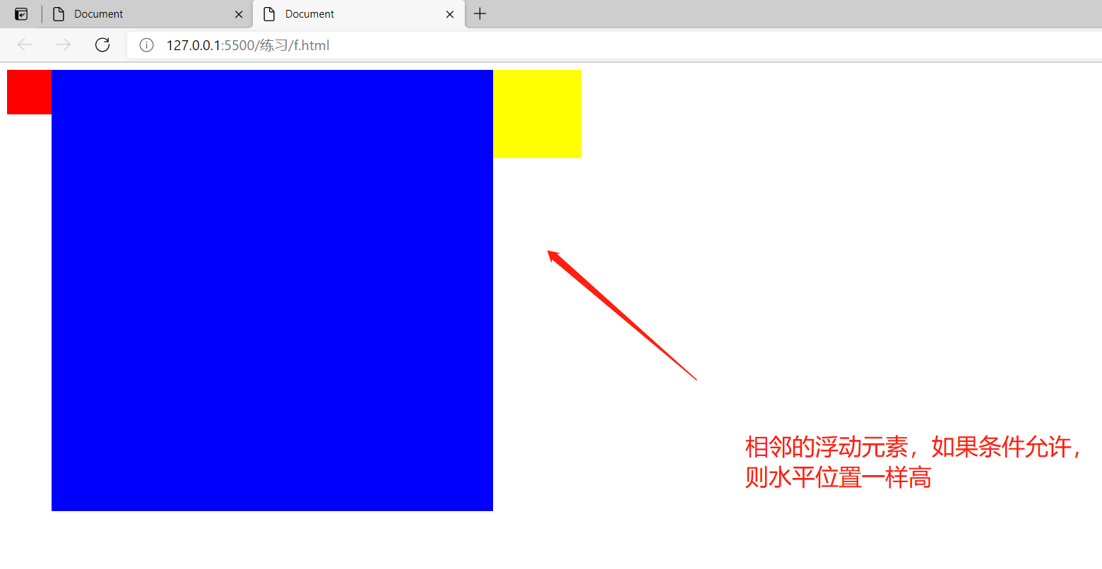
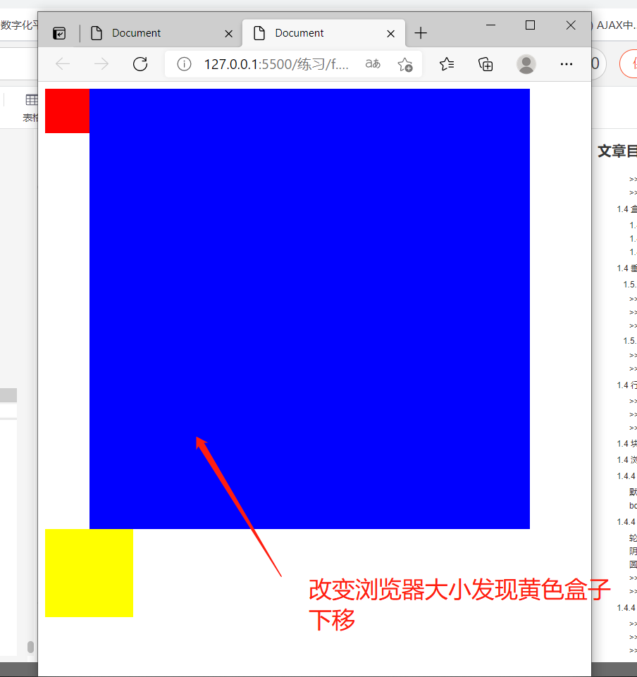
			 4,The floating element will not exceed the floating sibling element above it. At most, it is as high as it is.
				[If conditions permit, the adjacent floating elements will be at the same height in the horizontal position. If conditions do not permit, the floating elements on the right will automatically move down one layer and float automatically.]


		     5,When a floating element floats, it is completely separated from the document flow. The following normal elements will automatically move upward.
	            However, the floating element will not cover the text, and the text will automatically surround the floating element, so we can use floating to set the effect of text surrounding the picture.

	         6,When an element leaves the document stream, the element type becomes an inline block element.

	            Away from the document flow, the element type is transformed into an inline block element.
					            Inline block element:
					            	  1.Not in exclusive row
					            	  2.By default, the width and height of the element are expanded by the content and can be specified
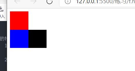
>>>>>>If a floating element is preceded by a block element without floating, the floating element cannot be moved up.
		The red box is a normal element, while the blue and black boxes are floating elements, which can be seen from the figure
		If a floating element is preceded by a block element without floating, the floating element cannot be moved up.
<!DOCTYPE html>
<html lang="en">
<head>
    <meta charset="UTF-8">
    <meta http-equiv="X-UA-Compatible" content="IE=edge">
    <meta name="viewport" content="width=device-width, initial-scale=1.0">
    <title>Document</title>
    <style>
         #b1{
            width:50px;
            height:50px;
            background-color: red;
          }

         #b2{
            width:50px;;
            height:50px;
            background-color: blue;
            float:left;
         }


         #b3{
            width:50px;;
            height:50px;
            background-color: black;
            float:left;
         }


    </style>
</head>
<body>

    <div id="b1"> </div>
    <div id="b2"> </div>
    <div id="b3"> </div>

</body>
</html>
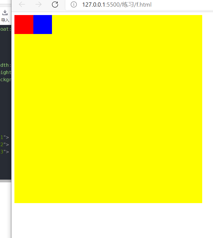
>>>>>>Floating elements will be completely separated from the document flow and no longer occupy the position of the document flow. Other normal elements will automatically move upward to occupy this position.
The red box and blue box float to the left, leaving the document flow, and the lower normal element moves upward
<!DOCTYPE html>
<html lang="en">
<head>
    <meta charset="UTF-8">
    <meta http-equiv="X-UA-Compatible" content="IE=edge">
    <meta name="viewport" content="width=device-width, initial-scale=1.0">
    <title>Document</title>
    <style>
         #b1{
            width:50px;
            height:50px;
            background-color: red;
            float:left;
          }

         #b2{
            width:50px;;
            height:50px;
            background-color: blue;
            float:left;
         }


         #b3{
            width:500px;;
            height:500px;
            background-color: yellow;
         }


    </style>
</head>
<body>

    <div id="b1"> </div>
    <div id="b2"> </div>
    <div id="b3"> </div>

</body>
</html>
>>>>>>If conditions permit, the adjacent floating elements will be as high as the horizontal position. If conditions do not permit, the floating elements on the right will automatically move down one layer and float automatically
<!DOCTYPE html>
<html lang="en">
<head>
    <meta charset="UTF-8">
    <meta http-equiv="X-UA-Compatible" content="IE=edge">
    <meta name="viewport" content="width=device-width, initial-scale=1.0">
    <title>Document</title>
    <style>
         #b1{
            width:50px;
            height:50px;
            background-color: red;
            float:left;
          }

         #b2{
            width:500px;;
            height:500px;
            background-color: blue;
            float:left;
         }


         #b3{
            width:100px;;
            height:100px;
            background-color: yellow;
            float:left;
         }


    </style>
</head>
<body>

    <div id="b1"> </div>
    <div id="b2"> </div>
    <div id="b3"> </div>

</body>
</html>
>>>>>>Text automatically wraps around floating elements
<!DOCTYPE html>
<html lang="en">
<head>
    <meta charset="UTF-8">
    <meta http-equiv="X-UA-Compatible" content="IE=edge">
    <meta name="viewport" content="width=device-width, initial-scale=1.0">
    <title>Document</title>
    <style>
         #b1{
            width:50px;
            height:50px;
            background-color: red;
            float:left;
          }


    </style>
</head>
<body>

    <div id="b1"> </div>
    ewewe232323
    2323
    2323

</body>
</html>
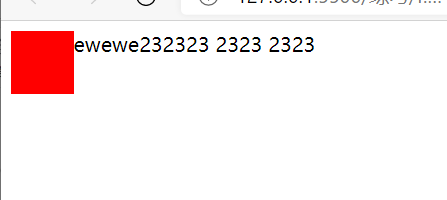
>>>>>>Away from the document flow, the element type is transformed into an inline block element
			Characteristics of inline block elements:
							1.Not exclusive line
							2.The default size is expanded by the content, and the width and height can be set
<!DOCTYPE html>
<html lang="en">
<head>
    <meta charset="UTF-8">
    <meta http-equiv="X-UA-Compatible" content="IE=edge">
    <meta name="viewport" content="width=device-width, initial-scale=1.0">
    <title>Document</title>
    <style>


         div{
            width:100px;
            height:100px;
            background-color: red;
            float:left;
          }

          span{
            width:100px;
            height:100px;
            background-color: blue;
            float:left;
          }

    </style>
</head>
<body>

    <div >111111 </div>
    <span > 222222</span>

</body>
</html>
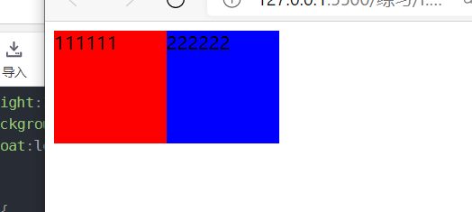
1.4.4 height collapse and BFC solution
		Height collapse:
				In a floating layout, the height of the parent element is extended by the child element by default,
				When the child element floats, the child element is separated from the document flow, and the height of the parent element cannot be supported, resulting in the loss of the height of the parent element.

				If the height of the parent element is lost, the elements below it will move upward, resulting in disordered page layout.
				Therefore, height collapse is a common problem in floating layout, which we must deal with.
		BFC :Block Formatting Context Block level formatting environment
				1.BFC yes css An implicit attribute in that can be turned on for an element BFC.
			      open BFC,The element becomes a separate layout area

			    2.BFC yes css An implicit attribute in, which can be opened in some ways BFC:
			    	Method 1: set element floating (not recommended, with serious side effects)
			    					Side effects: 1.Detach from document stream

					Method 2: set the element as an inline block element (not recommended, with serious side effects)

					Method 3: put the element overflow Set to non visible Default value.
1.4.1 height collapse
		Case 1 did not start floating, case 2 started floating,
		According to the comparison of the effect drawing, due to inner The floating of the element results in the loss of the height of the parent element.
Case 1: No floating
<!DOCTYPE html>
<html lang="en">
<head>
    <meta charset="UTF-8">
    <meta http-equiv="X-UA-Compatible" content="IE=edge">
    <meta name="viewport" content="width=device-width, initial-scale=1.0">
    <title>Document</title>

    <style>

        #out{
            border:2px solid blue;
        }

        #innner{
            width:50px;
            height:50px;
            background-color: red;
        }

    </style>

</head>
<body>

    <div id="out">

        <div id="innner">

        </div>
    </div>

</body>
</html>

Case 2: floating
<!DOCTYPE html>
<html lang="en">
<head>
    <meta charset="UTF-8">
    <meta http-equiv="X-UA-Compatible" content="IE=edge">
    <meta name="viewport" content="width=device-width, initial-scale=1.0">
    <title>Document</title>

    <style>

        #out{
            border:2px solid blue;
        }

        #innner{
            width:50px;
            height:50px;
            background-color: red;
            float: left;
        }

    </style>

</head>
<body>

    <div id="out">

        <div id="innner">

        </div>
    </div>

</body>
</html>

1.4.2 start BFC
   BFC yes css An implicit attribute in, which can be opened in some ways BFC:
	    	Method 1: set element floating (not recommended, with serious side effects)
	    					Side effects: 1.Detach from document stream

			Method 2: set the element as an inline block element (not recommended, with serious side effects)

			Method 3: put the element overflow Set to non visible Default value.
>>>>>>Float on (BFC not recommended)
<!DOCTYPE html>
<html lang="en">
<head>
    <meta charset="UTF-8">
    <meta http-equiv="X-UA-Compatible" content="IE=edge">
    <meta name="viewport" content="width=device-width, initial-scale=1.0">
    <title>Document</title>

    <style>

        #out{
            border:2px solid blue;
            float:left;
        }

        #innner{
            width:50px;
            height:50px;
            background-color: red;
        }

    </style>

</head>
<body>

    <div id="out">

        <div id="innner">

        </div>
    </div>

</body>
</html>
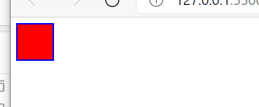
>>>>>>Display: inline bock enable BFC (not recommended)
<!DOCTYPE html>
<html lang="en">
<head>
    <meta charset="UTF-8">
    <meta http-equiv="X-UA-Compatible" content="IE=edge">
    <meta name="viewport" content="width=device-width, initial-scale=1.0">
    <title>Document</title>

    <style>

        #out{
            border:2px solid blue;
            display:inline-block;
        }

        #innner{
            width:50px;
            height:50px;
            background-color: red;
        }

    </style>

</head>
<body>

    <div id="out">

        <div id="innner">

        </div>
    </div>

</body>
</html>
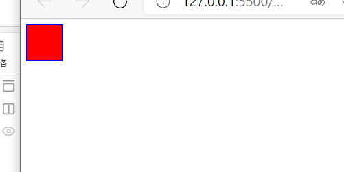
>>>>>>Overflow start BFC (recommended, less side effects)
<!DOCTYPE html>
<html lang="en">
<head>
    <meta charset="UTF-8">
    <meta http-equiv="X-UA-Compatible" content="IE=edge">
    <meta name="viewport" content="width=device-width, initial-scale=1.0">
    <title>Document</title>

    <style>

        #out{
            border:2px solid blue;
            overflow:hidden;
        }

        #innner{
            width:50px;
            height:50px;
            background-color: red;
        }

    </style>

</head>
<body>

    <div id="out">

        <div id="innner">

        </div>
    </div>

</body>
</html>

1.4.3 characteristics of opening BFC
	Element on BFC Characteristics of:
			    	1.open BFC Elements of are not overwritten by floating elements
			    	2.open BFC The outer margins of child elements and parent elements do not overlap.
			    	3.open BFC Can contain floating elements.
>>>>>>Elements with BFC enabled will not be overwritten by floating elements
Case 1: box 1 is set to float, box 2 moves upward, and box 1 covers box 2
<!DOCTYPE html>
<html lang="en">
<head>
    <meta charset="UTF-8">
    <meta http-equiv="X-UA-Compatible" content="IE=edge">
    <meta name="viewport" content="width=device-width, initial-scale=1.0">
    <title>Document</title>

    <style>

      #b1{
          width:50px;
          height:50px;
          background-color: red;
          float:left;
      }


      #b2{
          width:50px;
          height:50px;
          background-color: blue;
      }


    </style>

</head>
<body>


    <div id="b1"></div>

    <div id="b2"> </div>


</body>
</html>
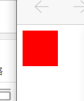
Case 2: box 2 opens BFC and will not be covered by floating elements
<!DOCTYPE html>
<html lang="en">
<head>
    <meta charset="UTF-8">
    <meta http-equiv="X-UA-Compatible" content="IE=edge">
    <meta name="viewport" content="width=device-width, initial-scale=1.0">
    <title>Document</title>

    <style>

      #b1{
          width:50px;
          height:50px;
          background-color: red;
          float:left;
      }


      #b2{
          width:50px;
          height:50px;
          background-color: blue;
          overflow: hidden;
      }


    </style>

</head>
<body>


    <div id="b1"></div>

    <div id="b2"> </div>


</body>
</html>

>>>>>>For elements with BFC enabled, the outer margins of child elements and parent elements will not overlap
<!DOCTYPE html>
<html lang="en">
<head>
    <meta charset="UTF-8">
    <meta http-equiv="X-UA-Compatible" content="IE=edge">
    <meta name="viewport" content="width=device-width, initial-scale=1.0">
    <title>Document</title>

    <style>

        #out{
            border:2px solid blue;
            overflow:hidden;
        }

        #innner{
            width:50px;
            height:50px;
            background-color: red;

			//The outer margins of child elements and parent elements do not overlap
            margin-top:50px;
        }


    </style>

</head>
<body>


    <div id="other"></div>

    <div id="out">

        <div id="innner">

        </div>
    </div>


</body>
</html>

>>>>>>Elements that enable BFC can contain floating elements
<!DOCTYPE html>
<html lang="en">
<head>
    <meta charset="UTF-8">
    <meta http-equiv="X-UA-Compatible" content="IE=edge">
    <meta name="viewport" content="width=device-width, initial-scale=1.0">
    <title>Document</title>

    <style>

        #out{
            border:2px solid blue;
            overflow:hidden;
        }

        #innner{
            width:50px;
            height:50px;
            background-color: red;
            margin-top:50px;
            float:right;
        }


    </style>

</head>
<body>


    <div id="other"></div>

    <div id="out">

        <div id="innner">

        </div>
    </div>


</body>
</html>

1.4.4 clear
		clear: Clears the effect of floating elements on the current element.

		    Optional values:
		         left  Clears the influence of the floating element on the left on the current element
		         		In essence:Add an upper and outer margin to the element with the height of the left floating element as the value

		         right Clears the influence of the floating element on the right on the current element
		         		Essentially: add an upper and outer margin to the element with the height of the left floating element as the value

		         both  Clears the effect of floating elements on the current element
		         		 Essentially: add an element with max(The height of the left floating element and the height of the right floating element) are the upper and outer margins of the value


		     clear It can clear the influence of floating elements on the current element:
		         After the floating element is cleared, the browser will automatically add an upper and outer margin to the element,
		         So that its position is not affected.
1.4.1 influence of floating elements
		because box1 Is a floating element, out of the document stream, box2 Move up, so box2 cover box1 Covered by.
		Because text cannot be covered by floating elements, text elements surround floating elements.

		Final effect: box2 Move up and be box1 Cover.
		         Text around box1 Floating element display.
<!DOCTYPE html>
<html lang="en">
<head>
    <meta charset="UTF-8">
    <meta http-equiv="X-UA-Compatible" content="IE=edge">
    <meta name="viewport" content="width=device-width, initial-scale=1.0">
    <title>Document</title>

    <style>

      #b1{
          width:50px;
          height:50px;
          background-color: red;
          float:left;
      }


      #b2{
          width:50px;
          height:50px;
          background-color: blue;
      }


    </style>

</head>
<body>


    <div id="b1">box1</div>
    <div id="b2"> box2</div>


</body>
</html>
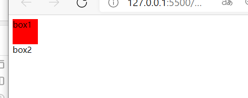
1.4.2 removing the influence of floating elements
>>>>>>Clear the influence of floating elements
<!DOCTYPE html>
<html lang="en">
<head>
    <meta charset="UTF-8">
    <meta http-equiv="X-UA-Compatible" content="IE=edge">
    <meta name="viewport" content="width=device-width, initial-scale=1.0">
    <title>Document</title>

    <style>

      #b1{
          width:50px;
          height:50px;
          background-color: red;
          float:left;
      }


      #b2{
          width:50px;
          height:50px;
          background-color: blue;
          clear:left; //Clear the influence of floating elements
      }


    </style>

</head>
<body>


    <div id="b1">box1</div>
    <div id="b2"> box2</div>


</body>
</html>
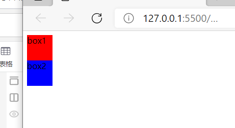
>>>>>>Box3 is influenced by two floating elements
<!DOCTYPE html>
<html lang="en">
<head>
    <meta charset="UTF-8">
    <meta http-equiv="X-UA-Compatible" content="IE=edge">
    <meta name="viewport" content="width=device-width, initial-scale=1.0">
    <title>Document</title>

    <style>

      #b1{
          width:50px;
          height:50px;
          background-color: red;
          float:left;
      }


      #b2{
          width:50px;
          height:100px;
          background-color: blue;
          float:right;
      }

      #b3{
          width:50px;
          height:50px;
          background-color: yellow;
      }


    </style>

</head>
<body>


    <div id="b1">box1</div>
    <div id="b2"> box2</div>
    <div id="b3"> box3</div>


</body>
</html>

>>>>>>Box3 is influenced by two floating elements. Clear the influence of left float
Add an upper and outer margin to the element with the height of the left floating element as the value
<!DOCTYPE html>
<html lang="en">
<head>
    <meta charset="UTF-8">
    <meta http-equiv="X-UA-Compatible" content="IE=edge">
    <meta name="viewport" content="width=device-width, initial-scale=1.0">
    <title>Document</title>

    <style>

      #b1{
          width:50px;
          height:50px;
          background-color: red;
          float:left;
      }


      #b2{
          width:50px;
          height:100px;
          background-color: blue;
          float:right;
      }

      #b3{
          width:50px;
          height:50px;
          background-color: yellow;
          clear:left;
      }


    </style>

</head>
<body>


    <div id="b1">box1</div>
    <div id="b2"> box2</div>
    <div id="b3"> box3</div>


</body>
</html>

>>>>>>Box3 is influenced by two floating elements. Clear the effect of right float
Add an upper and outer margin to the element with the height of the right floating element as the value
<!DOCTYPE html>
<html lang="en">
<head>
    <meta charset="UTF-8">
    <meta http-equiv="X-UA-Compatible" content="IE=edge">
    <meta name="viewport" content="width=device-width, initial-scale=1.0">
    <title>Document</title>

    <style>

      #b1{
          width:50px;
          height:50px;
          background-color: red;
          float:left;
      }


      #b2{
          width:50px;
          height:100px;
          background-color: blue;
          float:right;
      }

      #b3{
          width:50px;
          height:50px;
          background-color: yellow;
          clear:right;
      }


    </style>

</head>
<body>


    <div id="b1">box1</div>
    <div id="b2"> box2</div>
    <div id="b3"> box3</div>


</body>
</html>

1.4.3 use clear to solve the problem of high collapse (final method)
>>>>>>Mode 1
box3 wipe out box2 The effect of floating to box3 The outer margin is added to support it box1.
<!DOCTYPE html>
<html lang="en">
<head>
    <meta charset="UTF-8">
    <meta http-equiv="X-UA-Compatible" content="IE=edge">
    <meta name="viewport" content="width=device-width, initial-scale=1.0">
    <title>Document</title>

    <style>

      #b1{
        border:2px solid red;
      }


      #b2{
          width:100px;
          height:100px;
          background-color: blue;
          float:left;
          clear:both;
      }

      /* Clear height collapse */
      #b3{
          clear:both;
      }


    </style>

</head>
<body>


    <div id="b1">
        <div id="b2"> </div>
        <div id="b3"> </div>
    </div>


</body>
</html>
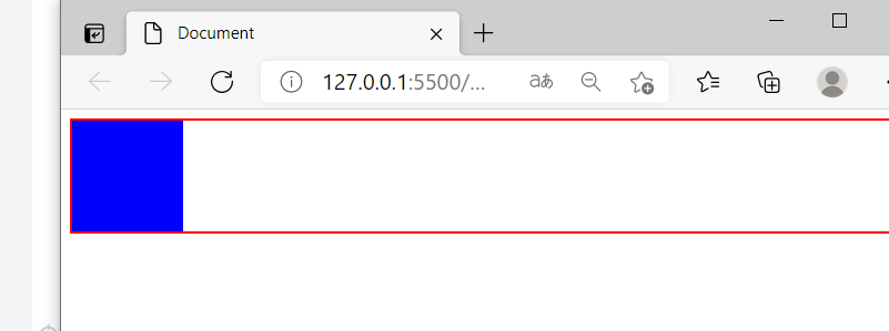
>>>>>>Mode 2
      #b1::after{
          content:'';
          display:block;
          clear:both;
      }

	::after coordination content Use to add a child element to the element.
	The added child element defaults to the inline label. So use display Convert to a block label and clear the floating effect.
<!DOCTYPE html>
<html lang="en">
<head>
    <meta charset="UTF-8">
    <meta http-equiv="X-UA-Compatible" content="IE=edge">
    <meta name="viewport" content="width=device-width, initial-scale=1.0">
    <title>Document</title>

    <style>

      #b1{
        border:2px solid red;
      }


      #b2{
          width:100px;
          height:100px;
          background-color: blue;
          float:left;
      }

      #b1::after{
          content:'';
          display:block;
          clear:both;
      }


    </style>

</head>
<body>


    <div id="b1">
        <div id="b2"> </div>
    </div>


</body>
</html>

1.4.5 unified solution for height collapse and upper and outer margin overlap
	Solve the problem of overlapping upper and outer margins:
		     .clearfix::before{
		         content:'';
		         display:table;
		     }

    Solve the problem of high collapse:
		     .clearfix::after{
		         content:'';
		         display:table;
		         clear:both;
		     }
     Solve the problems of height collapse and upper and outer margin overlap:
		     .clearfix::before,.clearfix::after{
		         content:'';
		         display:table;
		         clear:both;
		     }
<!DOCTYPE html>
<html lang="en">
<head>
    <meta charset="UTF-8">
    <meta http-equiv="X-UA-Compatible" content="IE=edge">
    <meta name="viewport" content="width=device-width, initial-scale=1.0">
    <title>Document</title>

    <style>

      .b1{
        background-color: red;
      }


      .b2{
          width:100px;
          height:100px;
          background-color: blue;
          margin-top:50px;
      }


     /* Solve the problems of height collapse and upper and outer margin overlap */
     .clearfix::before,.clearfix::after{
         content:'';
         display:table;
         clear:both;
     }


    </style>

</head>
<body>


    <div class="b1 clearfix">
        <div class="b2 clearfix"> </div>
    </div>


</body>
</html>
