The use of wxss has brought about some changes in patterns and thinking for responsive development.
WXSS(WeiXin Style Sheets) is a set of style languages used to describe the component style of WXML.

WXSS is used to determine how components of WXML should be displayed.

In order to adapt to the vast number of front-end developers, our WXSS has most of the features of CSS. At the same time, in order to be more suitable for the development of Wechat applet, we have expanded and modified CSS.

Compared with CSS, our extended features are:
Front-end engineers are familiar with rem, which is a measurement unit based on font-size of html elements. REM makes it easy for developers to manage the size of responsive UI as a whole.
rem in wxss is totally different from rem in css. Here is the definition of rem in official documents of wechat:
REM (root em): specify a screen width of 20 rem; 1 REM = 750/20 rpx
The value of 750 is that wxss defines the width of the device screen as 750 rpx, which is explained below.
<!DOCTYPE HTML PUBLIC "-//W3C//DTD HTML Strict//EN">
<META http-equiv="Content-Type" content="text/html; charset=utf-8">
<html lang="zh-cn">
<head>
<style>
.cnblogs-markdown .hljs,blockquote,html{background-attachment:scroll;background-size:auto;background-origin:padding-box;background-clip:border-box}#mainContent,.cnblogs-markdown .hljs,blockquote,html{background-image:none;background-repeat:repeat;background-position-x:0;background-position-y:0}pre{margin-top:0;margin-bottom:0;white-space:pre-wrap;word-wrap:break-word}blockquote{margin-top:10px;margin-bottom:10px;background-color:transparent;border-color:#efefef;border-width:2px;border-style:solid}#cnblogs_post_body{margin-bottom:20px}#cnblogs_post_body ul{padding-left:0;margin-left:30px}#cnblogs_post_body ol{padding-left:40px}#cnblogs_post_body ol li{list-style-type:decimal}#cnblogs_post_body ul li{list-style-type:disc}#cnblogs_post_body p{text-indent:0;margin:10px auto}#cnblogs_post_body h3{line-height:1.5;font-size:16px;font-weight:700;margin:10px 0}.cnblogs-markdown .hljs,.cnblogs-markdown code{font-family:"Courier New",sans-serif!important;font-size:12px!important}.cnblogs-markdown .hljs{color:#000;display:block;overflow-x:auto;background-color:#fff}.hljs-built_in,.hljs-keyword,.hljs-name,.hljs-selector-tag,.hljs-tag{color:#00f}.hljs-addition,.hljs-attribute,.hljs-literal,.hljs-section,.hljs-string,.hljs-template-tag,.hljs-template-variable,.hljs-title,.hljs-type{color:#a31515}.hljs-attr{color:red}.cnblogs-markdown code{line-height:1.8;vertical-align:middle;display:inline-block;background-color:#f5f5f5!important;padding:0 5px!important;margin:1px 5px;border-color:#ccc!important;border-width:1px!important;border-style:solid!important;border-radius:3px!important}.cnblogs-markdown pre code{height:auto;line-height:normal;vertical-align:auto;display:block;margin:auto}.cnblogs-markdown .hljs{line-height:1.5!important;padding:5px!important}.cnblogs-markdown pre{margin-top:10px;margin-bottom:10px}body{background-image:url(images/bg.gif);background-repeat:repeat;background-color:#fffdfa}html{color:#000;overflow-y:scroll;background-color:#fff}blockquote,body,button,dd,dl,dt,fieldset,form,h1,h2,h3,h4,h5,h6,hr,input,lengend,li,ol,p,pre,td,textarea,th,ul{list-style-type:none;list-style-image:none;padding:0;margin:0}body,button,input,select,textarea{line-height:1.5;font-family:Tahoma,Arial,Helvetica,sans-serif;font-size:12px;font-style:normal;font-variant:normal;font-weight:400;font-size-adjust:none;font-stretch:normal}h1,h2,h3,h4,h5,h6{font-size:100%;font-weight:400}address,cite,dfn,em,var{font-style:normal}code,kbd,pre,samp,tt{font-family:"Courier New",Courier,monospace}ol,ul{list-style:none}a:link,a:visited{color:#39f;text-decoration:none}:focus{outline:0}fieldset,img{border-color:currentColor;border-width:medium;border-style:none}img{-ms-interpolation-mode:bicubic}#blogTitle,#footer,#main,#navigator{width:1000px;position:relative;margin:0 auto}#main{margin-top:6px;margin-bottom:0;background-color:#f5f5f5}#mainContent,.postBody blockquote,.postCon blockquote{background-attachment:scroll;background-size:auto;background-origin:padding-box;background-clip:border-box;background-color:#fff}#mainContent{width:765px;float:left;display:inline-block;box-shadow:0 0 8px #999;border-radius:6px}.entrylistPostSummary,.postBody,.postCon{clear:both;margin-top:26px;color:#444;line-height:1.8;font-size:14px}.postBody h3,.postCon h3{font-size:16px}.postBody ul,.postCon ul{margin-left:20px;list-style:none}.postBody ul li,.postCon ul li{list-style:disc inside}.postBody ol,.postCon ol{margin-left:20px;list-style:none}.postBody blockquote,.postCon blockquote{width:90%;color:#666;background-image:url(/images/blockquote.gif);background-repeat:no-repeat;background-position-x:left;background-position-y:top;padding:6px 0 6px 45px;margin:0 auto}.post{padding:32px}.forFlow p{margin-bottom:18px}.forFlow img{margin-top:20px;margin-bottom:20px}#cnblogs_post_body{font-size:14px}#cnblogs_post_body img{max-width:650px}
</style>
</head>
<body>
<div id="home">
<div id="main">
<div id="mainContent">
<div class="forFlow">
<div id="post_detail">
<div id="topics">
<div class="post">
<div class="postBody">
<div class="cnblogs-markdown" id="cnblogs_post_body">
<p>
Use wxss Some changes in patterns and thinking brought about by responsive development.
</p>
<h3 id="rem Redefinition">
rem Redefinition
</h3>
<p>
Front end engineer pair<code>rem</code>Very familiar with, rem In order to html Elemental<code>font-size</code>A unit of measurement for a reference size. rem Easy for developers to respond UI Dimensions are managed as a whole.
</p>
<p>
wxss Medium<code>rem</code>and css Medium<code>rem</code>The meaning is totally different. Here is the official document of Wechat. rem Definition:
</p>
<blockquote>
<p>
rem(root em): Set screen width to 20 rem;1rem = (750/20)rpx
</p>
</blockquote>
<p>
Of these, 750 is<strong>wxss Define the width of the device screen as 750 rpx</strong>,This is explained below.
</p>
<p>
When you read this, do you have an idea in mind?<strong>wxss Of rem Why does it sound a bit like that? bootstrap Of<a href="http://What about v3. bootcss.com/css/ grid"> grid system </a>? </strong>
</p>
<p>
wxss Divide the screen width into 20 rem,bootstrap Divide the device screen width into 12 columns. It does look a little similar at first. But actually wxss Of rem and bootstrap The grid system is not the same. although wxss and bootstrap It's all about splitting screen sizes into cells, but rem It is different from the grid location.
</p>
<p>
bootstrap Developers use the specified classname To allocate proportions among elements, this is actually close to css3 Medium flexbox;and wxss Of rem It is a<em>Dimension unit</em>,You can be there.<strong>Reasonable Scene</strong>Next will be any with<code>px</code>Replace the attribute value for a unit with<code>rem</code>.
</p>
<p>
So, develop small programs UI When you need to abandon the right way of thinking rem Conventional Cognition. Up to now, the author has not encountered the need to use small procedures rem Needs, I hope you are enthusiastic discussion.
</p>
<h3 id="rpx The Magic">
rpx The Magic
</h3>
<p>
Mentioned above wxss Define the width of the device screen as 750 rpx,Among them rpx yes wxss Bring new size units. rpx Definitions are as follows:
</p>
<blockquote>
<p>
rpx(responsive pixel): It can be adapted to the screen width. Set the screen width to 750 rpx. If in iPhone6 Up, the screen width is 375 px,A total of 750 physical pixels, 750 rpx = 375px = 750 Physical pixels, 1 rpx = 0.5px = 1 Physical pixels.
</p>
</blockquote>
<p>
css Medium px It is not an absolute one-to-one relationship with the physical pixels of the device. Especially on mobile devices, px Ratio to physical pixels and device dpr(devicePixelRadio)Relevant, detailed correspondence can be consulted by yourselves.
</p>
<p>
rpx It is called relative pixel value. rpx It is not absolutely one-to-one with physical pixels. wxss Define device width as 750 rpx,In order to iPhone6 Resolution (750) x1334)It is classified as a benchmark. That is to say, in iPhone6 Last, 1 rpx=1 Physical pixels=0.5px. The official document lists several screens rpx The corresponding relationships are as follows:
<br />
<img src="http://images2015.cnblogs.com/blog/595796/201611/595796-20161126150826440-870835684.png" />
</p>
<p>
You can get it from it. rpx and px Conversion formulas of the proposed method are as follows:
</p>
<blockquote>
<p>
1rpx = 1px/dpr
</p>
</blockquote>
<p>
among iPhone6 Of dpr=2.
</p>
<p>
that rpx Bringing Response Formula UI What changes?
</p>
<p>
At present, most of them are UI Engineers are making UI When drafting, it is in accordance with iPhone6 Dimension design, and then front-end engineer according to UI Half of the draft size UI The reductive development. In this way iPhone6 And close to iPhone6 There is no problem with the size of the equipment. But mobile devices come in many sizes, and our products can't just deal with them. iPhone6(moreover iPhone7 Has come to Haha...),So the usual practice is to use css The media query is adjusted according to the size of the device.
</p>
<p>
If used rpx Is it possible to solve this problem? The author tries to use it in the development process. rpx replace px,Use UI Reduction of original size of manuscript UI,So far the experience has been very good. rpx It represents relative pixels, so no matter how big the screen is,<strong>rpx Of UI The proportion of screens occupied is absolutely fixed</strong>,It's scaled equally.
</p>
<p>
however rpx Not everything, like using css sprites Icon. See below.
</p>
<h3 id="sprites Responsive processing of icons">
sprites Responsive processing of icons
</h3>
<p>
Use css sprites As the background of the icon, the size of each icon is as follows px Fixed for units, such as:
</p>
<div class="sourceCode">
<pre class="sourceCode css">
<code class="sourceCode css hljs"><span class="fl"><span class="hljs-selector-class">.icon</span></span><span class="kw">{</span>
<span class="kw"><span class="hljs-attribute">background-image</span>:</span> <span class="dt"><span class="hljs-built_in">url</span>(</span><span class="st"><span class="hljs-string">'//image.daojia.com/icon.png'</span></span><span class="dt">)</span><span class="kw">;</span>
<span class="kw"><span class="hljs-attribute">display</span>:</span> <span class="dt">inline-block</span><span class="kw">;</span>
<span class="kw"><span class="hljs-attribute">vertical-align</span>:</span> <span class="dt">middle</span><span class="kw">;</span>
<span class="kw">}</span>
<span class="fl"><span class="hljs-selector-class">.icon__circle</span></span><span class="kw">{</span>
<span class="kw"><span class="hljs-attribute">background-position</span>:</span> <span class="dt"><span class="hljs-number">0</span></span> <span class="dt"><span class="hljs-number">0</span></span><span class="kw">;</span>
<span class="kw"><span class="hljs-attribute">width</span>:</span> <span class="dt"><span class="hljs-number">40px</span></span><span class="kw">;</span>
<span class="kw"><span class="hljs-attribute">height</span>:</span> <span class="dt"><span class="hljs-number">40px</span></span><span class="kw">;</span>
<span class="kw">}</span></code>
</pre>
</div>
<p>
If the size of the icon does not match UI The design is scaled to a certain extent:
</p>
<div class="sourceCode">
<pre class="sourceCode css">
<code class="sourceCode css hljs"><span class="fl"><span class="hljs-selector-class">.icon__circle</span></span><span class="kw">{</span>
<span class="kw"><span class="hljs-attribute">transform</span>:</span> <span class="hljs-built_in">scale</span>(<span class="dt"><span class="hljs-number">0.5</span></span>)<span class="kw">;</span>
<span class="kw">}</span></code>
</pre>
</div>
<p>
That is to say, use sprites Icons are inevitably used px,If and rpx The combination of use is not guaranteed. rpx Equal to the zoom effect. So how to solve this problem?
</p>
<p>
Based on the summary above rpx and px If you want to use the conversion formula of px Stipulated UI Achieve the same rpx For the same responsive scaling effect, you must px And equipment dpr Calculate. however css As a markup language, it does not have dynamic characteristics and can not dynamically acquire devices. dpr And calculate. So, just use it. wxss It does not solve the problems mentioned above.
</p>
<p>
The good news is that widgets provide access to device information API,And support CommonJS Modularization scheme. With these functions, we can add dynamic logical configurations when encapsulating components.
</p>
<p>
Or take the above code as an example. sprites Graph<code>icon__circle</code>The size is 40. px*40px,Our goal is to adapt it to 20 rpx,The following is the author's development plan.
</p>
<p>
For example, there is one in the project. user Components, including some sprites Icon node. user The file directory of the component is as follows:
</p>
<ul>
<li>
<code>user.wxml</code> - Component template;
</li>
<li>
<code>user.wxss</code> - Component style;
</li>
<li>
<code>user.js</code> - Component logic.
</li>
</ul>
<p>
First give<code>user.wxml</code>in icon Corresponding element Setting up dynamic<code>transform</code>:
</p>
<div class="sourceCode">
<pre class="sourceCode xml">
<code class="sourceCode xml hljs"><span class="kw"><span class="hljs-tag"><<span class="hljs-name">view</span></span></span><span class="ot"><span class="hljs-tag"> <span class="hljs-attr">class</span>=</span></span><span class="st"><span class="hljs-tag"><span class="hljs-string">'icon icon__circle'</span></span></span><span class="ot"><span class="hljs-tag"> <span class="hljs-attr">style</span>=</span></span><span class="st"><span class="hljs-tag"><span class="hljs-string">"transform: scale({{iconScale}})"</span></span></span><span class="kw"><span class="hljs-tag">></span><span class="hljs-tag"></<span class="hljs-name">view</span>></span></span></code>
</pre>
</div>
<p>
among<code>iconScale</code>Is quoted user External components index Pass to user Component:
</p>
<div class="sourceCode">
<pre class="sourceCode xml">
<code class="sourceCode xml hljs"><span class="kw"><span class="hljs-tag"><<span class="hljs-name">import</span></span></span><span class="ot"><span class="hljs-tag"> <span class="hljs-attr">src</span>=</span></span><span class="st"><span class="hljs-tag"><span class="hljs-string">'user.wxml'</span></span></span><span class="kw"><span class="hljs-tag">/></span></span>
<span class="kw"><span class="hljs-tag"><<span class="hljs-name">template</span></span></span><span class="ot"><span class="hljs-tag"> <span class="hljs-attr">is</span>=</span></span><span class="st"><span class="hljs-tag"><span class="hljs-string">'product-user'</span></span></span><span class="ot"><span class="hljs-tag"> <span class="hljs-attr">data</span>=</span></span><span class="st"><span class="hljs-tag"><span class="hljs-string">"{{iconScale: userIconScale}}"</span></span></span><span class="kw"><span class="hljs-tag">/></span></span></code>
</pre>
</div>
<p>
userIconScale yes index One of the components data,userIconScale The value is not index Components specify, but by index Component js call<code>user.js</code>Dynamic acquisition. The following code is<code>user.js</code>Exposed API:
</p>
<div class="sourceCode">
<pre class="sourceCode javascript">
<code class="sourceCode javascript hljs"><span class="kw"><span class="hljs-keyword">const</span></span> ORIGIN_ICON_PX <span class="op">=</span> <span class="dv"><span class="hljs-number">40</span></span><span class="op">;</span>
<span class="kw"><span class="hljs-keyword">const</span></span> TARGET_ICON_RPX <span class="op">=</span> <span class="dv"><span class="hljs-number">20</span></span><span class="op">;</span>
<span class="va"><span class="hljs-built_in">module</span></span>.<span class="at">exports</span> <span class="op">=</span> <span class="op">{</span>
<span class="at">getIconScale</span>() <span class="op">{</span>
<span class="kw"><span class="hljs-keyword">let</span></span> result <span class="op">=</span> <span class="dv"><span class="hljs-number">1</span></span><span class="op">;</span>
<span class="va">wx</span>.<span class="at">getSystemInfo</span>(<span class="op">{</span>
<span class="dt">success</span><span class="op">:</span> <span class="kw"><span class="hljs-function"><span class="hljs-keyword">function</span></span></span><span class="hljs-function">(<span class="hljs-params">res</span>) </span><span class="op">{</span>
<span class="kw"><span class="hljs-keyword">let</span></span> _dpr <span class="op">=</span> <span class="va">res</span>.<span class="at">pixelRatio</span><span class="op">;</span>
result <span class="op">=</span> TARGET_ICON_RPX/(ORIGIN_ICON_PX <span class="op">*</span> _dpr)<span class="op">;</span>
<span class="op">}</span>
<span class="op">}</span>)<span class="op">;</span>
<span class="cf"><span class="hljs-keyword">return</span></span> result<span class="op">;</span>
<span class="op">}</span>
<span class="op">}</span></code>
</pre>
</div>
<p>
Then in index Component js Call above API:
</p>
<div class="sourceCode">
<pre class="sourceCode javascript">
<code class="sourceCode javascript hljs"><span class="kw"><span class="hljs-keyword">let</span></span> getIconScale <span class="op">=</span> <span class="at"><span class="hljs-built_in">require</span></span>(<span class="st"><span class="hljs-string">'user.js'</span></span>).<span class="at">getIconScale</span><span class="op">;</span>
<span class="at">Page</span>(<span class="op">{</span>
<span class="dt">data</span><span class="op">:</span> <span class="op">{</span>
<span class="dt">userIconScale</span><span class="op">:</span> <span class="dv"><span class="hljs-number">1</span></span>
<span class="op">},</span>
<span class="at">onLoad</span>()<span class="op">{</span>
<span class="kw"><span class="hljs-keyword">this</span></span>.<span class="at">setData</span>(<span class="op">{</span>
<span class="dt">userIconScale</span><span class="op">:</span> <span class="at">getIconScale</span>()
<span class="op">}</span>)<span class="op">;</span>
<span class="op">}</span>
<span class="op">}</span>)<span class="op">;</span></code>
</pre>
</div>
<p>
These are just preliminary plans, which need to be carefully considered in many places. However, the above scheme basically has a logical encapsulation of components and meets our responsive development needs.
</p>
</div>
</div>
</div>
</div>
</div>
</div>
</div>
</div>
</div>
</body>
</html>
The use of wxss has brought about some changes in patterns and thinking for responsive development.
Redefinition of rem
Front-end engineers are familiar with rem, which is a measurement unit based on font-size of html elements. REM makes it easy for developers to manage the size of responsive UI as a whole.
rem in wxss is totally different from rem in css. Here is the definition of rem in official documents of wechat:
REM (root em): specify a screen width of 20 rem; 1 REM = 750/20 rpx
The value of 750 is that wxss defines the width of the device screen as 750 rpx, which is explained below.
When you read this, do you have an idea in mind: how does rem of wxss sound like bootstrap? grid system What about it?
Wxss divides the screen width into 20 rem and bootstrap divides the device screen width into 12 columns. It does look a little similar at first. But the rem and bootstrap grid systems of wxss are not the same. Although wxss and bootstrap are both about dividing screen size into cells, rem and grid locations are different.
bootstrap developers use the specified class name to allocate proportions among elements, which is close to flexbox in css3; rem in wxss is a unit of size, and you can replace any attribute value in px with REM in a reasonable scenario.
Therefore, when developing a widget UI, you need to abandon the conventional perception of REM in your mind. Up to now, the author has not met the need to use rem, the small program, I hope you will enthusiastically explore.
The magic of rpx
As mentioned above, wxss defines the width of the device screen as 750 rpx, where rpx is a new dimension unit brought about by wxss. Rpx is defined as follows:
Rpx (responsive pixel): Adaptive to screen width. Set the screen width to 750 rpx. For example, on the iPhone 6, the screen width is 375 px, with 750 physical pixels, 750 rpx = 375 PX = 750 physical pixels, and 1 rpx = 0.5 PX = 1 Physical pixel.
px in css is not absolutely one-to-one with the physical pixels of the device. Especially on mobile devices, the ratio of px to physical pixels is related to device dpr (device Pixel Radio). Detailed correspondence can be consulted by you.
Rpx is called relative pixel value, and rpx is not absolutely one-to-one with physical pixels. wxss defines device width as 750rpx, which is based on the resolution of the iPhone 6 (750x1334). That is to say, on the iPhone 6, 1rpx=1 Physical pixel = 0.5px. The official document lists the rpx correspondences of several screens as follows: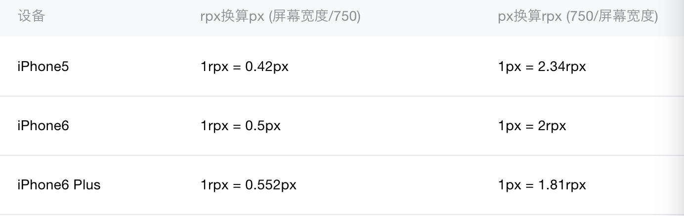
You can get the conversion formulas of rpx and px from them:
1rpx = 1px/dpr
The DPR of the iPhone 6 is 2.
So what changes does rpx bring to responsive UI?
At present, most UI engineers design their UI manuscripts according to the size of the iPhone 6, and then the front-end engineers restore the UI according to half the size of the UI manuscript. There's no problem with the iPhone 6 and devices that are close to the size of the iPhone 6. But mobile devices come in a variety of sizes, and our products can't only deal with the iPhone 6 (and the iPhone 7 has come to Haha...), so the usual approach is to use css media queries to fine-tune according to the size of the device.
If you use rpx, can you solve this problem? The author tried to use rpx instead of px in the development process, and restored the UI using the original size of the UI draft. So far, the experience is very good. Rpx itself represents relative pixels, so no matter how large the screen size, the proportion of screen occupied by the UI of rpx is absolutely fixed, and it is scaled equally.
But rpx is not omnipotent, such as using css sprites icons. See below.
Responsive processing of sprites icons
When using css sprites as icon background, the size of each icon is fixed in units of px, such as:
.icon{
     background-image: url('//image.daojia.com/icon.png');
     display: inline-block;
     vertical-align: middle;
   }
   .icon__circle{
     background-position: 0 0;
     width: 40px;
     height: 40px;
   }
If the size of the icon does not conform to the UI design, zoom in a certain proportion:
.icon__circle{
       transform: scale(0.5);
   }
That is to say, using sprites icon inevitably uses px, if combined with rpx, it can not guarantee the same scaling effect as rpx. So how to solve this problem?
According to the conversion formula of rpx and PX summarized above, if you want to achieve the same responsive scaling effect as rpx with the UI specified by px, you must calculate the dpr of PX and equipment. However, as a markup language, css does not have dynamic characteristics and can not dynamically acquire device dpr and calculate it. Therefore, wxss alone can not solve the problems mentioned above.
The good news is that widgets provide API s for getting device information and support CommonJS modularization. With these functions, we can add dynamic logical configurations when encapsulating components.
As an example, the icon__circle size of the sprites diagram is 40px*40px. Our goal is to adapt it to 20rpx. The following is the author's development plan.
For example, there is a user component in the project that contains sprites icon nodes. The file directory of user component is as follows:
- user.wxml - Component template;
- user.wxss - Component style;
- user.js - Component logic.
Firstly, dynamic transform is set for the element ary corresponding to icon in user.wxml:
<view class='icon icon__circle' style="transform: scale({{iconScale}})"></view>Where iconScale refers to the user's external component index passed to the user component:
<import src='user.wxml'/>
   <template is='product-user' data="{{iconScale: userIconScale}}"/>
UserIconScale is a data of index component. The value of userIconScale is not specified by index component, but dynamically obtained by calling user. JS of index component. The following code is the API exposed by user.js:
const ORIGIN_ICON_PX = 40;
   const TARGET_ICON_RPX = 20;

   module.exports = {
     getIconScale() {
       let result = 1;
       wx.getSystemInfo({
         success: function(res) {
           let _dpr = res.pixelRatio;
           result = TARGET_ICON_RPX/(ORIGIN_ICON_PX * _dpr);
         }
       });
       return result;
     }
   }
Then the above API is invoked in the js of the index component:
let getIconScale = require('user.js').getIconScale;
   Page({
       data: {
           userIconScale: 1
       },
       onLoad(){
           this.setData({
               userIconScale: getIconScale()
           });
       }
   });
These are just preliminary plans, which need to be carefully considered in many places. However, the above scheme basically has a logical encapsulation of components and meets our responsive development needs.