| Openlayers | ol.js | v5.3.0 |
| Highcharts | highcharts.js | v7.0.1 |
| jquery | jquery-3.3.1.js | v3.3.1 |
Display effect
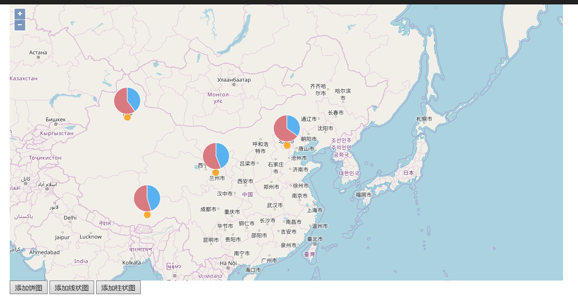
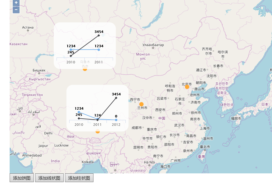
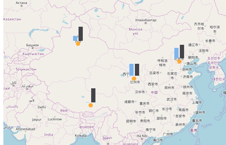
The enlargement and reduction of map have no effect on the size of statistical map
Take pie chart as an example
1. Add a map and render the points where the statistical map is located,
vector is the layer needed to render features. Be sure to be at the front of all layers, or the rendered features will be covered. (this problem has been solved all morning during map calculation)
sourceMeasure = new ol.source.Vector({ wrapX: false });

    vector = new ol.layer.Vector({
        source: sourceMeasure,
        style: new ol.style.Style({
            fill: new ol.style.Fill({
                color: 'rgba(255, 255, 0, 0.2)'
            }),
            stroke: new ol.style.Stroke({
                color: '#ffcc33',
                width: 2
            }),
            image: new ol.style.Circle({
                radius: 7,
                fill: new ol.style.Fill({
                    color: '#ffaa33'
                })
            })
        })
    });

    map = new ol.Map({
        controls: ol.control.defaults({
            attribution: false
        }),
        target: 'map',
        layers: [
            new ol.layer.Tile({
                source: new ol.source.OSM()
            }),
            vector
        ],
        view: new ol.View({
            projection: 'EPSG:3857',
            center: ol.proj.transform([121, 37], 'EPSG:4326', 'EPSG:3857'),
            //center: [121, 37],
            zoom: 6
        })
    });

    DrawPoint();
2. Method of drawing points
function DrawPoint() {
    for (var i = 0; i < dataPie.length; i++) {
        var d = dataPie[i];
        var pt = ol.proj.transform([d.x, d.y], 'EPSG:4326', 'EPSG:3857');

        var point = new ol.geom.Point(pt);

        var feature = new ol.Feature(point);

        sourceMeasure.addFeature(feature);
    }
}
3. Add statistical chart
The following is the original method, which can display the statistical chart, but the initial position is not right, but when you drag the map a little, the position jumps to the right position again, no problem is found, instead, change to the following method 2
//Method 1
//$("#addPieChart").on("click", function () {
//    clearChartOverlay();
//    for (var i = 0; i < dataPie.length; i++) {
//        var d = dataPie[i];
//        var pt = ol.proj.transform([d.x, d.y], 'EPSG:4326', 'EPSG:3857');
//        var domid = "chart" + guid();
//        $("#chart").append("<div id='" + domid + "'></div>");
//        var chart = new ol.Overlay({
//            id: domid,
//            position: pt,
//            positioning: "bottom-center",
//            element: document.getElementById(domid),
//            offset: [0, 18],
//            Stopevent: false / / overlay also supports ball zoom in and out
//        });
//        map.addOverlay(chart);
//        addPieChart(domid, d, 100);
//        overlayId.push(domid);
//    }
//});
Maybe it's because the element of Overlay has been set to solve this problem. It's more metaphysical
//Method 2
$("#addPieChart").on("click", function () {
        clearChartOverlay();
        for (var i = 0; i < dataPie.length; i++) {
            var d = dataPie[i];
            var pt = ol.proj.transform([d.x, d.y], 'EPSG:4326', 'EPSG:3857');
            var domid = "chart" + guid();
            $("#chart").append("<div id='" + domid + "'></div>");

            addPieChart(domid, d, 100);

            var chart = new ol.Overlay({
                id: domid,
                element: document.getElementById(domid),
                positioning: "bottom-center", //The position relationship between statistical graph and rendered point
                offset: [0, 18],//If the statistical chart is offset from the point, you can use this attribute to move the statistical chart back
                stopEvent: false  //overlay also supports ball zoom
            });
            map.addOverlay(chart);

            var element = chart.getElement();
            chart.setPosition(pt);
            //Use the following method to display Overlay, which can avoid the problem that the initial position is not right and the map jumps by dragging
            $(element).popover({
                placement: 'top',
                animation: false
            });
            $(element).popover('show');

            overlayId.push(domid);
        }
    });
Remove all the overlays and pie charts used to display statistics. There are many methods in highcharts. If you want other styles, you can see the api of highcharts
/**
 * Remove the Overlay used by the chart
 * */
function clearChartOverlay() {
    for (var i = 0; i < overlayId.length; i++) {
        map.removeOverlay(map.getOverlayById(overlayId[i]));
    }
}

function addPieChart(domid, data, size) {
    $('#' + domid).highcharts({
        chart: {
            backgroundColor: 'rgba(255, 255, 255, 0)',
            plotBorderColor: null,
            plotBackgroundColor: null,
            plotBackgroundImage: null,
            plotBorderWidth: null,
            plotShadow: false,
            width: size,
            height: size
        },
        tooltip: {
            pointFormat: '<b>{point.percentage:.1f}%</b>'
        },
        credits: {
            enabled: false
        },
        title: {
            text: ''
        },
        plotOptions: {
            pie: {
                dataLabels: {
                    enabled: false
                }
            }
        },
        series: [{
            type: 'pie',
            name: data.name,
            data: data.data
        }]
    });
}
4. There are almost so many. The line chart and the bar chart are similar. Here is the completion code
html
@{
    ViewBag.Title = "StatisticalChart";
    Layout = "~/Views/Shared/_Layout.cshtml";
}

@Styles.Render("~/Content/openlayers")

<div id="map" class="map">

</div>
<div class="tool">
    <button id="addPieChart">Adding pie chart</button>
    <button id="addLineChart">Add line chart</button>
    <button id="addColumnChart">Add histogram</button>
</div>
<div style="display: none;" id="chart">
</div>

@Scripts.Render("~/bundles/openlayers")
<script src="~/Scripts/openlayers/MapStatisticalChart.js"></script>
<script src="~/Scripts/Highcharts/highcharts.js"></script>
<script type="text/javascript">

    $(document).ready(function () {
        init();
    });

</script>
js
/*
*Show statistics on map
*/
//Two objects for map rendering
var vector;
var sourceMeasure;
//x,y represents the rendering position. If it's a point layer, it's easy to say. If it's a face or a line, you need to get the center point
var overlayId = [];
var dataPie = [{
name: "Urumqi", x: 87.5758285931, y: 43.7822116460, data: [
{
name: 'male',
y: 40.0,
color: "#5ab1ef"
}, {
name: 'female',
y: 60.0,
color: "#d87a80"
}
]
},
{
name: "Lhasa", x: 91.1629975040, y: 29.7104204643, data: [
{
name: 'male',
y: 45.0,
color: "#5ab1ef"
}, {
name: 'female',
y: 55.0,
color: "#d87a80"
}
]
},
{
name: "Beijing", x: 116.4575803581078, y: 40.04054437977018, data: [
{
name: 'male',
y: 35.0,
color: "#5ab1ef"
}, {
name: 'female',
y: 65.0,
color: "#d87a80"
}
]
},
{
name: "Lanzhou", x: 103.584297498, y: 36.1190864503, data: [
{
name: 'male',
y: 44.0,
color: "#5ab1ef"
}, {
name: 'female',
y: 56.0,
color: "#d87a80"
}
]
}];
var map;
function init() {
sourceMeasure = new ol.source.Vector({ wrapX: false });
vector = new ol.layer.Vector({
source: sourceMeasure,
style: new ol.style.Style({
fill: new ol.style.Fill({
color: 'rgba(255, 255, 0, 0.2)'
}),
stroke: new ol.style.Stroke({
color: '#ffcc33',
width: 2
}),
image: new ol.style.Circle({
radius: 7,
fill: new ol.style.Fill({
color: '#ffaa33'
})
})
})
});
map = new ol.Map({
controls: ol.control.defaults({
attribution: false
}),
target: 'map',
layers: [
new ol.layer.Tile({
source: new ol.source.OSM()
}),
vector
],
view: new ol.View({
projection: 'EPSG:3857',
center: ol.proj.transform([121, 37], 'EPSG:4326', 'EPSG:3857'),
//center: [121, 37],
zoom: 6
})
});
DrawPoint();
$("#addPieChart").on("click", function () {
clearChartOverlay();
for (var i = 0; i < dataPie.length; i++) {
var d = dataPie[i];
var pt = ol.proj.transform([d.x, d.y], 'EPSG:4326', 'EPSG:3857');
var domid = "chart" + guid();
$("#chart").append("<div id='" + domid + "'></div>");
addPieChart(domid, d, 100);
var chart = new ol.Overlay({
id: domid,
element: document.getElementById(domid),
positioning: "bottom-center",
offset: [0, 18],
stopEvent: false //overlay also supports ball zoom
});
map.addOverlay(chart);
var element = chart.getElement();
chart.setPosition(pt);
//Use the following method to display Overlay, which can avoid the problem that the initial position is not right and the map jumps by dragging
$(element).popover({
placement: 'top',
animation: false
});
$(element).popover('show');
overlayId.push(domid);
}
});
$("#addLineChart").on("click", function () {
clearChartOverlay();
for (var i = 0; i < dataLine.length; i++) {
var d = dataLine[i];
var pt = ol.proj.transform([d.x, d.y], 'EPSG:4326', 'EPSG:3857');
var domid = "chart" + guid();
//$("#chart").append("<div id='" + domid + "'></div>");
//var chart = new ol.Overlay({
// id: domid,
// position: pt,
// positioning: "bottom-center",
// element: document.getElementById(domid),
// Stopevent: false / / overlay also supports ball zoom in and out
//});
//map.addOverlay(chart);
//addLineChart(domid, d.data, 200, 150);
//overlayId.push(domid);
$("#chart").append("<div id='" + domid + "'></div>");
var chart = new ol.Overlay({
id: domid,
positioning: "bottom-center",
element: document.getElementById(domid),
stopEvent: false //overlay also supports ball zoom
});
map.addOverlay(chart);
addLineChart(domid, d.data, 200, 150);
var element = chart.getElement();
chart.setPosition(pt);
//Use the following method to display Overlay, which can avoid the problem that the initial position is not right and the map jumps by dragging
$(element).popover({
placement: 'top',
animation: false
});
$(element).popover('show');
overlayId.push(domid);
}
});
$("#addColumnChart").on("click", function () {
clearChartOverlay();
for (var i = 0; i < dataColumn.length; i++) {
var d = dataColumn[i];
var pt = ol.proj.transform([d.x, d.y], 'EPSG:4326', 'EPSG:3857');
var domid = "chart" + guid();
$("#chart").append("<div id='" + domid + "'></div>");
var chart = new ol.Overlay({
id: domid,
positioning: "bottom-center",
element: document.getElementById(domid),
offset: [0, 5],
stopEvent: false //overlay also supports ball zoom
});
map.addOverlay(chart);
addColumnChart(domid, d.data, 80, 80);
var element = chart.getElement();
chart.setPosition(pt);
//Use the following method to display Overlay, which can avoid the problem that the initial position is not right and the map jumps by dragging
$(element).popover({
placement: 'top',
animation: false
});
$(element).popover('show');
overlayId.push(domid);
}
});
}
/**
* Remove the Overlay used by the chart
* */
function clearChartOverlay() {
for (var i = 0; i < overlayId.length; i++) {
map.removeOverlay(map.getOverlayById(overlayId[i]));
}
}
function addPieChart(domid, data, size) {
$('#' + domid).highcharts({
chart: {
backgroundColor: 'rgba(255, 255, 255, 0)',
plotBorderColor: null,
plotBackgroundColor: null,
plotBackgroundImage: null,
plotBorderWidth: null,
plotShadow: false,
width: size,
height: size
},
tooltip: {
pointFormat: '<b>{point.percentage:.1f}%</b>'
},
credits: {
enabled: false
},
title: {
text: ''
},
plotOptions: {
pie: {
dataLabels: {
enabled: false
}
}
},
series: [{
type: 'pie',
name: data.name,
data: data.data
}]
});
}
var dataLine = [{
name: "Urumqi", x: 87.5758285931, y: 43.7822116460, data: [
{
name: 'Installation and implementation personnel',
series: [
{ x: 2010, y: 1234 },
{ x: 2011, y: 1234 }
],
color: "#5ab1ef"
}, {
name: 'Worker',
series: [
{ x: 2010, y: 245 },
{ x: 2011, y: 3454 }
],
color: "#d87a80"
}
]
},
{
name: "Lhasa", x: 91.1629975040, y: 29.7104204643, data: [
{
name: 'Installation and implementation personnel',
series: [
{ x: 2010, y: 1234 },
{ x: 2011, y: 124 },
{ x: 2012, y: 0 }
],
color: "#5ab1ef"
}, {
name: 'Worker',
series: [
{ x: 2010, y: 245 },
{ x: 2011, y: 0 },
{ x: 2012, y: 3454 }
],
color: "#d87a80"
}
]
}];
function addLineChart(domid, data, width, height) {
var categoriesX = [];
var seriesValue = [];
for (var i = 0; i < data.length; i++) {
var value = [];
for (var j = 0; j < data[i].series.length; j++) {
categoriesX.push(data[i].series[j].x);
value.push(data[i].series[j].y);
}
seriesValue.push({ "name": data[i].name, "data": value });
}
$('#' + domid).highcharts({
chart: {
backgroundColor: 'rgba(255, 255, 255, 0.8)',
borderRadius: 20,
plotBorderColor: null,
plotBackgroundColor: null,
plotBackgroundImage: null,
plotBorderWidth: null,
plotShadow: false,
width: width,
height: height
},
credits: {
enabled: false
},
title: {
text: ''
},
yAxis: {
visible: false,
title: {
text: ''
}
},
xAxis: {
categories: categoriesX,
crosshair: true
},
legend: {
enabled: false
},
plotOptions: {
series: {
label: {
connectorAllowed: false
}
},
line: {
dataLabels: {
enabled: true,
formatter: function () {
return '<b>' + this.point.y + '</b><br>';
}
}
}
},
series: seriesValue,
responsive: {
rules: [{
condition: {
maxWidth: 500
},
chartOptions: {
legend: {
layout: 'horizontal',
align: 'center',
verticalAlign: 'bottom'
}
}
}]
}
});
}
var dataColumn = [{
name: "Urumqi", x: 87.5758285931, y: 43.7822116460, data: [
{
name: 'Installation and implementation personnel',
series: [
{ x: 2011, y: 1234 }
],
color: "#5ab1ef"
}, {
name: 'Worker',
series: [
{ x: 2011, y: 3454 }
],
color: "#d87a80"
}
]
},
{
name: "Lhasa", x: 91.1629975040, y: 29.7104204643, data: [
{
name: 'Installation and implementation personnel',
series: [
{ x: 2012, y: 123 }
],
color: "#5ab1ef"
}, {
name: 'Worker',
series: [
{ x: 2012, y: 3454 }
],
color: "#d87a80"
}
]
}, {
name: "Beijing", x: 116.4575803581078, y: 40.04054437977018, data: [
{
name: 'Installation and implementation personnel',
series: [
{ x: 2014, y: 252 }
],
color: "#5ab1ef"
}, {
name: 'Worker',
series: [
{ x: 2014, y: 324 }
],
color: "#d87a80"
}
]
},
{
name: "Lanzhou", x: 103.584297498, y: 36.1190864503, data: [
{
name: 'Installation and implementation personnel',
series: [
{ x: 2013, y: 2341 }
],
color: "#5ab1ef"
}, {
name: 'Worker',
series: [
{ x: 2013, y: 2341 }
],
color: "#d87a80"
}
]
}];
function addColumnChart(domid, data, width, height) {
var categoriesX = [];
var seriesValue = [];
for (var i = 0; i < data.length; i++) {
var value = [];
for (var j = 0; j < data[i].series.length; j++) {
categoriesX.push(data[i].series[j].x);
value.push(data[i].series[j].y);
}
seriesValue.push({ "name": data[i].name, "data": value });
}
$('#' + domid).highcharts({
chart: {
backgroundColor: 'rgba(255, 255, 255, 0)',
borderRadius: 20,
plotBorderColor: null,
plotBackgroundColor: null,
plotBackgroundImage: null,
plotBorderWidth: null,
plotShadow: false,
width: width,
height: height,
type: 'column'
},
credits: {
enabled: false
},
title: {
text: ''
},
yAxis: {
visible: false,
title: {
text: ''
}
},
xAxis: {
visible: false,
categories: categoriesX,
crosshair: true
},
legend: {
enabled: false
},
plotOptions: {
series: {
label: {
connectorAllowed: false
}
},
line: {
dataLabels: {
enabled: true,
formatter: function () {
return '<b>' + this.point.y + '</b><br>';
}
}
}
},
series: seriesValue,
responsive: {
rules: [{
condition: {
maxWidth: 500
},
chartOptions: {
legend: {
layout: 'horizontal',
align: 'center',
verticalAlign: 'bottom'
}
}
}]
}
});
}
function DrawPoint() {
for (var i = 0; i < dataPie.length; i++) {
var d = dataPie[i];
var pt = ol.proj.transform([d.x, d.y], 'EPSG:4326', 'EPSG:3857');
var point = new ol.geom.Point(pt);
var feature = new ol.Feature(point);
sourceMeasure.addFeature(feature);
}
}
References include: https://blog.csdn.net/gisshixing/article/details/50926948, https://blog.csdn.net/henry/article/details/81149015