Author CSDN: Sisyphus of the attack
Link to this article: https://blog.csdn.net/qq_42216093/article/details/116994199
Copyright notice: This article is the author's original article. Reprint requires the consent of the author
Nowadays, machine learning is hot, and Python is the most commonly used implementation of machine learning for data analysts or data related workers. From a practical point of view, taking the classic Titanic survivor data set as an example and sklearn as the main tool, this paper will comprehensively and carefully explain the standardized process of Python machine learning modeling.
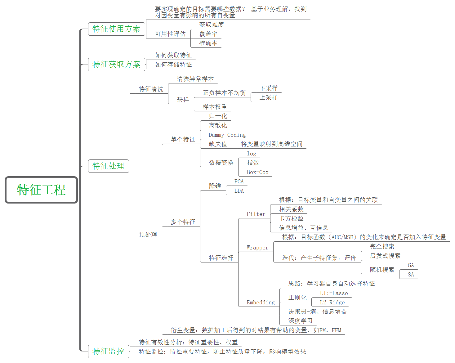
1. Characteristic Engineering
Feature engineering is to transform the original data processing into features that can better express the essence of the problem, so that applying these features to the machine learning model can improve the prediction accuracy of new data.
Why do feature engineering before machine learning modeling? There is a famous saying in the industry: "the sample data and feature quality determine the upper limit that machine learning can reach, and models and algorithms just keep approaching this upper limit". Therefore, feature engineering is an important preparation before machine learning algorithm modeling.
1) . data cleaning
The data used in this paper are taken from the Titanic survivor data set of Kaggle website, as shown in the figure below. There are 891 samples in total. The category label column has a total of 12 dimensions, including name, gender, age, boarding port, ticket price and other characteristic attributes. Among them, the observed column is the result category column (0 represents death and 1 represents survival).
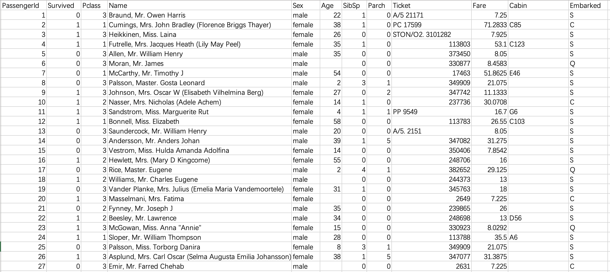
It can be seen that the original data is not cleaned and the noise is very loud. Our next work mainly focuses on:
(1) Through visual analysis, delete the features that have no impact on survival, including passenger number, name and ticket number. Delete the cabin column again because there are too many missing values in this column.
(2) Replace the character values of gender and login port with numerical type, because sklearn modeling will be called later, which has format requirements for input data.
(3) . process the column with missing value and replace the missing value with the mode of the column. The age column is processed separately: the samples (rows) with missing age values are directly deleted. Because age is a key attribute, we do not allow too much error.
(4) Reconstruction of age characteristics: discretization of continuous variables. However, this should be combined with the specific algorithms to be used. For example, this paper uses the random forest algorithm, which can deal with continuous variables, so this step can be omitted.
The code is as follows, with detailed notes
# Load all the libraries needed for the project first
import pandas as pd		# Necessary for data analysis
import numpy as np		# Necessary for data analysis
import matplotlib.pyplot as plt		# Visualization drawing
from sklearn.feature_selection import SelectKBest,f_classif,chi2	# Feature analysis and feature selection
from sklearn.model_selection import train_test_split, cross_val_score, learning_curve		# Training set, test set division, ten fold cross validation, learning curve
from sklearn.decomposition import PCA		# principal component analysis
from sklearn.preprocessing import scale		# Data standardization
from sklearn.ensemble import RandomForestClassifier		# Random forest classifier
from sklearn.metrics import roc_curve,auc,precision_recall_curve,average_precision_score	# ROC curve, PR curve


# read file
df = pd.read_csv('Titanic.csv')

# Delete the columns of passenger number, name and ticket number because they have no impact on survival; Delete the cabin column because there are too many missing values
df = df.drop(['PassengerId','Name','Ticket','Cabin'], axis=1)

# Replace the character values of gender and login port with numeric type to adapt to the data format requirements of sklearn later
df.loc[df['Sex'] == 'male','Sex'] = 1
df.loc[df['Sex'] == 'female','Sex'] = 0
df.loc[df['Embarked'] == 'C', 'Embarked'] = 0
df.loc[df['Embarked'] == 'S', 'Embarked'] = 1
df.loc[df['Embarked'] == 'Q', 'Embarked'] = 2

# Process the column with missing value and replace the missing value with the mode of the column. The age column is processed separately: the samples (rows) with empty age values are deleted directly. Because age is a key attribute, we do not allow too much error
df = df.dropna(axis=0, subset=['Age'])
df = df.reset_index(drop=True)
df['SibSp'] = df['SibSp'].fillna(df['SibSp'].mode()[0])     # The mode result is a Series type, which is different from the above mean value, so the index
df['Embarked'] = df['Embarked'].fillna(df['Embarked'].mode()[0])

# # Reconstruction of age characteristics: discretization of continuous variables. The random forest algorithm in this paper can omit this step
# for i in range(df.shape[0]):
#     if df.loc[i, 'Age']<=10 and df.loc[i, 'Age']>=0:
#         df.loc[i, 'Age'] = 0
#     elif df.loc[i, 'Age']<=20 and df.loc[i, 'Age']>10:
#         df.loc[i, 'Age'] = 1
#     elif df.loc[i, 'Age']<=30 and df.loc[i, 'Age']>20:
#         df.loc[i, 'Age'] = 2
#     elif df.loc[i, 'Age']<=40 and df.loc[i, 'Age']>30:
#         df.loc[i, 'Age'] = 3
#     elif df.loc[i, 'Age']<=50 and df.loc[i, 'Age']>40:
#         df.loc[i, 'Age'] = 4
#     elif df.loc[i, 'Age']<=60 and df.loc[i, 'Age']>50:
#         df.loc[i, 'Age'] = 5
#     elif df.loc[i, 'Age']<=70 and df.loc[i, 'Age']>60:
#         df.loc[i, 'Age'] = 6
#     elif df.loc[i, 'Age']<=80 and df.loc[i, 'Age']>70:
#         df.loc[i, 'Age'] = 7

df.to_csv('cleaned.csv')
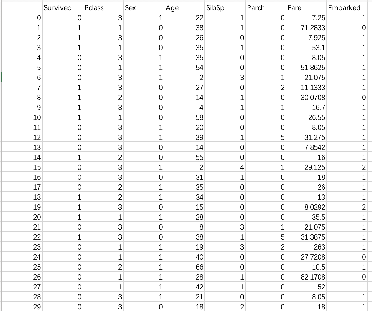
The data after cleaning are as follows:
2) 2. Characteristic analysis
Feature analysis is to evaluate the quality of each feature, that is, the correlation between the feature and the dependent variable. The commonly used methods include analysis of variance, chi square statistics and so on. Here we call sklearn. Feature_ The selection.selectkbest module constructs the feature selection model, uses F-value analysis of variance to analyze each feature, and finally visualizes the results as a bar graph.
The code is as follows (Continued), with detailed notes
x = df.drop(['Survived'], axis=1)		# Independent variable set
y = df['Survived']		# dependent variable
# Convert the y column into a color list for drawing
colors = list()
for i in y:
    if i == 0:
        colors.append('c')
    elif i == 1:
        colors.append('y')

# Build feature selection model, parameter score_func: feature score calculation method, where F-value analysis of variance is used; k: Select the top k features with the highest score
skb = SelectKBest(score_func=f_classif,k='all')
# Fitting models using datasets
skb.fit(x,y)
# Score for each feature
F_scores = skb.scores_
# New dataset after the first k feature selections
x_new = skb.transform(x)
features = x.columns
# Accurate each feature to one decimal place
for i in range(len(F_scores)):
    F_scores[i] = round(F_scores[i],1)
# Rebuild the feature selection model using chi square statistics and score
skb = SelectKBest(score_func=chi2, k='all')
skb.fit(x, y)
Chi_scores = skb.scores_
for i in range(len(Chi_scores)):
    Chi_scores[i] = round(Chi_scores[i], 1)

# The two feature score results are visualized as bar graphs respectively
fig = plt.figure(dpi=200, figsize=(10,5))
ax1 = fig.add_subplot(121)
ax1.bar(features, F_scores, alpha=0.8, color='dodgerblue')
for i in zip(features, F_scores, F_scores):
    ax1.text(i[0],i[1],i[2], horizontalalignment = 'center')
ax1.set_title('F-scores of the features')
ax2 = fig.add_subplot(122)
ax2.bar(features, Chi_scores, alpha=0.8, color='dodgerblue')
for i in zip(features, Chi_scores, Chi_scores):
    ax2.text(i[0],i[1],i[2], horizontalalignment = 'center')
ax2.set_title('Chi-scores of the features')
plt.savefig('Features analysis.jpg')
plt.show()
result:
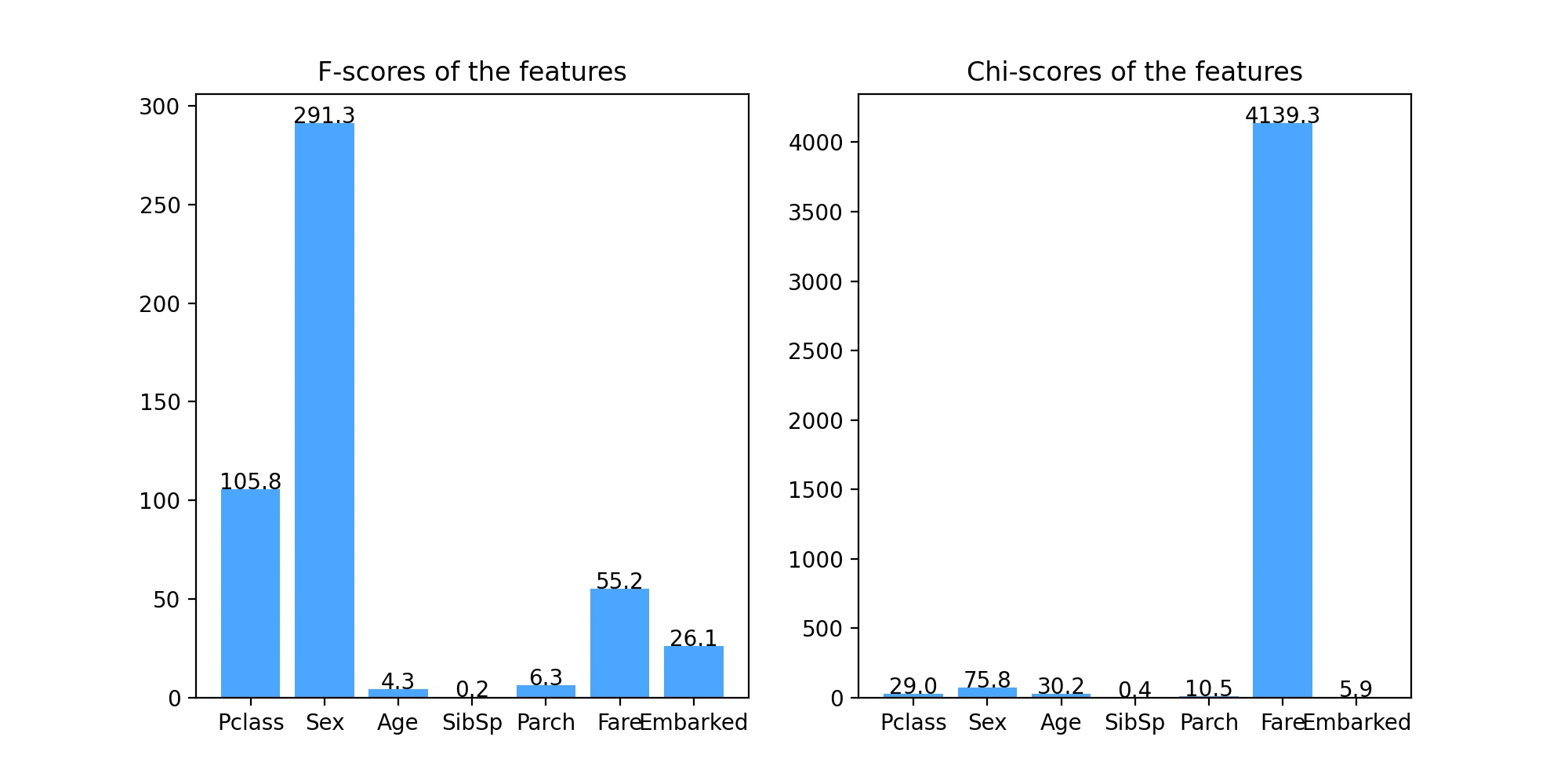
It can be seen from the results of analysis of variance (left figure) and chi square statistical analysis (right figure) that the score of feature SibSp is very low, close to 1, that is, the correlation between this feature and classification prediction results is very low and almost irrelevant, so we can consider deleting this feature when building the model, but because we want to build a random forest model, It has strong robustness to irrelevant features, so the feature can also be retained.
3) 3. Dimensionality reduction visualization
Before constructing the classifier, we usually want to intuitively see what our dataset looks like from the image, that is, the difference between different categories of datasets. Generally speaking, the greater the category difference, the better the classification model. At this time, we will use dimension reduction visualization. Next, we use PCA (principal component analysis) and Andrews curve to reduce the dimension of the data set and draw the image.
The code is as follows (Continued), with detailed notes
# Dimensionality reduction and visualization of data sets using PCA
standard_x = scale(x, axis=0, with_mean=True, with_std=True)   # with_mean: mean standardization; with_std: variance standardization; axis=0: standardize each feature. If 1 is taken, standardize each observation sample
pca = PCA(n_components = 2)
res_x = pca.fit_transform(standard_x)
fig = plt.figure(dpi=200, figsize=(10,5))
ax1 = fig.add_subplot(121)
ax1.scatter(res_x[:,0], res_x[:,1], c=colors)
ax1.set_title('PCA')
ax1.legend()

# Visualization of dimension reduction of dataset using Andrew curve
ax2 = fig.add_subplot(122)
pd.plotting.andrews_curves(df, 'Survived', color=['g','m'], ax = ax2)     # The parameter ax can pass the drawing result to axes of matplotlib
ax2.grid(True)
ax2.set_title('Andrews curve')

plt.savefig('Feature_analyze.jpg')
plt.show()
result:
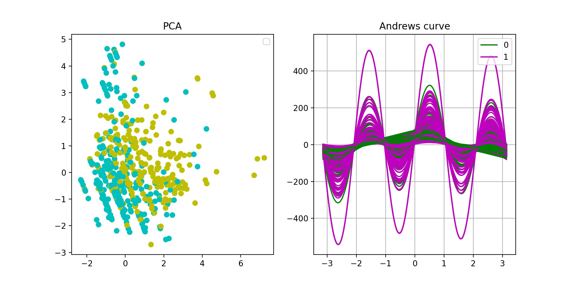
From the PCA dimensionality reduction visualization results (left figure), it can be seen that there are certain differences between the two categories of data sets, but they are not very significant, and the separation is not obvious, which indicates that the quality of the sample data set is not high enough. The reason may be that there is a certain deviation in the sample set; It is also possible that some features strongly related to classification prediction have not been collected in the data set because the purity of the features is not enough. The results of Andrews curve (right figure) are similar to those of PCA. There are differences between the two types of samples, but they are not significant enough.
2. Modeling and parameter adjustment
After the feature analysis, you can build the model. In this paper, we use random forest, which is a powerful classification algorithm and belongs to one of ensemble learning. For the introduction of random forest algorithm, please refer to another blog post: Introduction to random forest algorithm
Firstly, divide the data set, 80% of the training set and 20% of the test set, then build the random forest model by calling the sklearn.ensemble.RandomForestClassifier module, and then adjust the parameters. The common method of parameter adjustment is grid search, but it is not recommended here because it takes too much time and computer resources. Here, we directly adjust each parameter based on the original model, and visualize it to observe the optimal parameters.
Note: the final goal of parameter adjustment should be based on the high score of the verification set, supplemented by the score of the training set, otherwise there will be over fitting.
The code is as follows (Continued), with detailed notes
# Independent variable set
x = df.drop(['Survived'], axis=1)
# Dependent variable set
y = df['Survived']

# Data set division: training set 80%, test set 20%
x_train, x_test, y_train, y_test = train_test_split(
    x,      # Independent variable set
    y,      # Dependent variable set
    stratify = y,   # Stratified sampling according to the proportion of column y
    random_state = 0,     # Specify random state
    train_size = 0.8)     # Training set proportion

# Adjustment parameters: n_estimators (number of decision trees in the forest), build the model and draw the cross validation score image
trees = list()
cross_val_scores = list()
train_set_scores = list()
for i in range(1,51):
    rf = RandomForestClassifier(n_estimators=i)
    rf.fit(x_train, y_train)
    scores = cross_val_score(rf, x_train, y_train)
    cross_val_scores.append(scores.mean())
    train_set_scores.append(rf.score(x_train, y_train))
    trees.append(i)
fig = plt.figure(figsize=(12,10), dpi=200)
ax1 = fig.add_subplot(221)      # Next, a total of four subgraphs will be drawn together
ax1.plot(trees, train_set_scores, color='dodgerblue', alpha=0.8)
ax1.plot(trees, cross_val_scores, color='g', alpha=0.8)
ax1.set_title('Scores for the number of trees')
ax1.legend(labels=['train_set_scores', 'cross_val_scores'])

# Adjustment parameters: max_depth (the maximum depth of the tree), build the model and draw the cross validation score image
trees = list()
cross_val_scores = list()
train_set_scores = list()
for i in range(1,21):
    rf = RandomForestClassifier(max_depth=i)
    rf.fit(x_train, y_train)
    scores = cross_val_score(rf, x_train, y_train)
    cross_val_scores.append(scores.mean())
    train_set_scores.append(rf.score(x_train, y_train))
    trees.append(i)
ax2 = fig.add_subplot(222)
ax2.plot(trees, train_set_scores, color='dodgerblue', alpha=0.8)
ax2.plot(trees, cross_val_scores, color='g', alpha=0.8)
ax2.set_title('Scores for the maximum depth of tree')
ax2.legend(labels=['train_set_scores', 'cross_val_scores'])

# Adjustment parameter: min_samples_leaf (minimum sample number of leaves), build the model and draw the cross validation score image
trees = list()
cross_val_scores = list()
train_set_scores = list()
for i in range(1,21):
    rf = RandomForestClassifier(min_samples_leaf=i)
    rf.fit(x_train, y_train)
    scores = cross_val_score(rf, x_train, y_train)
    cross_val_scores.append(scores.mean())
    train_set_scores.append(rf.score(x_train, y_train))
    trees.append(i)
ax1 = fig.add_subplot(223)
ax1.plot(trees, train_set_scores, color='dodgerblue', alpha=0.8)
ax1.plot(trees, cross_val_scores, color='g', alpha=0.8)
ax1.set_title('Scores for the minimum samples of leaf')
ax1.legend(labels=['train_set_scores', 'cross_val_scores'])

# Adjustment parameter: min_samples_split (the minimum number of samples required to split internal nodes), build the model and draw the cross validation score image
trees = list()
cross_val_scores = list()
train_set_scores = list()
for i in range(1,21):
    rf = RandomForestClassifier(min_samples_leaf=i)
    rf.fit(x_train, y_train)
    scores = cross_val_score(rf, x_train, y_train)
    cross_val_scores.append(scores.mean())
    train_set_scores.append(rf.score(x_train, y_train))
    trees.append(i)
ax1 = fig.add_subplot(224)
ax1.plot(trees, train_set_scores, color='dodgerblue', alpha=0.8)
ax1.plot(trees, cross_val_scores, color='g', alpha=0.8)
ax1.set_title('Scores for the minimum samples of split')
ax1.legend(labels=['train_set_scores', 'cross_val_scores'])

plt.savefig('Parameter adjustment.jpg')
plt.show()
result:
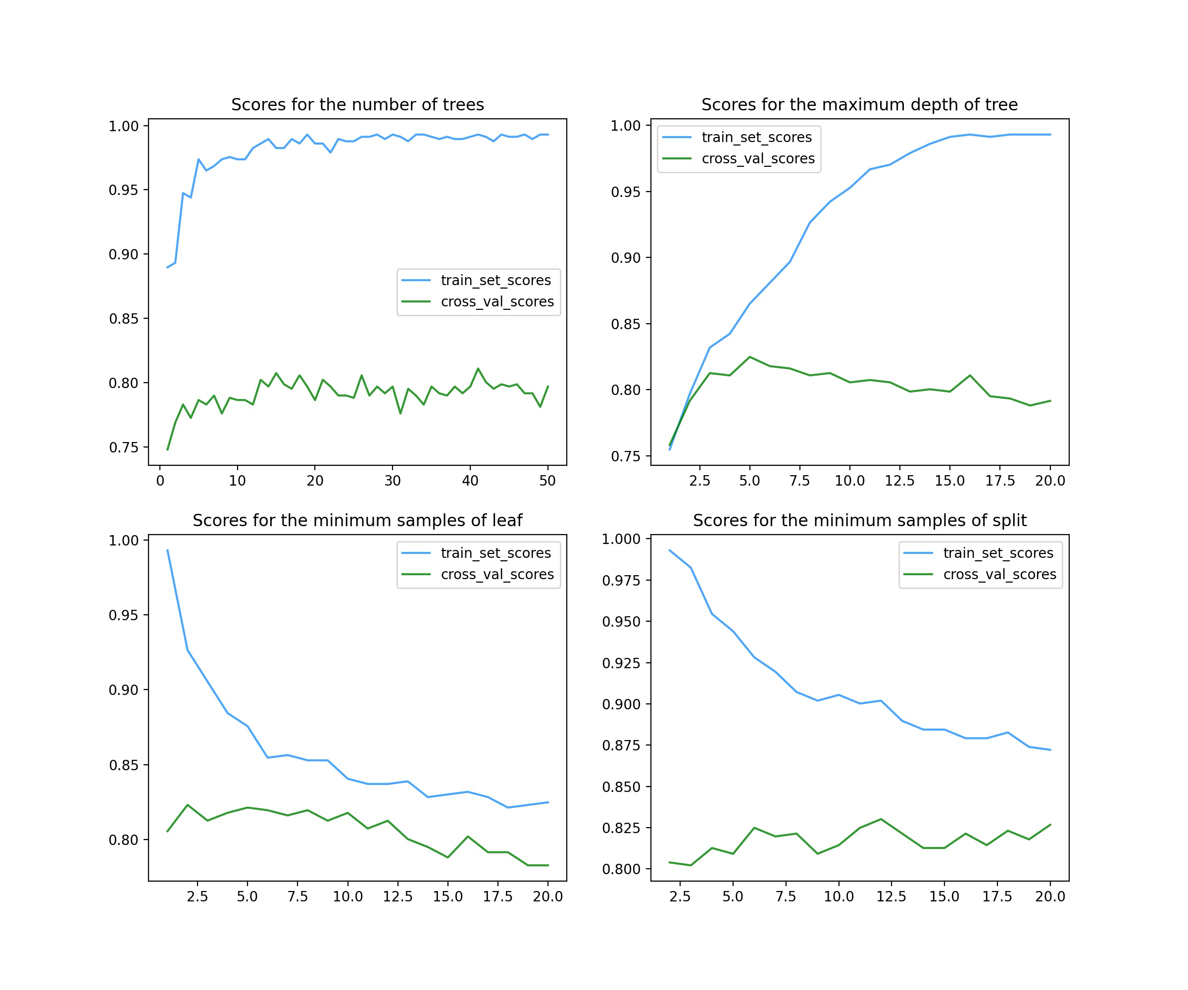
A total of 4 parameters are adjusted here.
The first parameter is n_estimators (top left), representing the number of decision trees in a random forest. In ensemble learning classifier, generally, the larger the parameter, the better the classifier effect, but at the same time, the operation speed will be greatly reduced, so it should be considered. As can be seen from the figure, it is possible to select more than 20.
The second parameter is max_depth (top right), representing the maximum depth of a single tree. The greater the depth, the higher the complexity of the model, and the deviation will decrease, but the variance may increase (over fitting). It can be seen from the figure that it is OK to select 5 ~ 7.
The third parameter is min_samples_leaf (bottom left), representing the minimum number of samples of leaves. The score image adjusted by this parameter basically shows a downward trend, so it is good to use the default value of 1.
The fourth parameter is min_samples_split, which represents the minimum number of samples required to split internal nodes. From the image, the score has little impact. You can choose about 11 or no adjustment.
3. Model evaluation
After building the model, we should evaluate the effect of the model. Common evaluation methods include learning curve, ROC curve, PR curve, etc. For a detailed introduction to model evaluation, please refer to another blog post: Common evaluation methods and indicators of machine learning models
Learning curve is an effective tool to detect whether the machine learning algorithm is running normally or to improve the algorithm model. You can call sklearn.model_selection. learning_curve module implementation. ROC curve and PR curve are also common tools for evaluating model quality by calling sklearn.metrics.roc_curve and sklearn.metrics.precision_recall_curve. Finally, the model is tested and scored on the test set.
The code is as follows (Continued), with detailed notes
# Build the model with the adjusted parameters and draw the learning curve
rf = RandomForestClassifier(n_estimators=40, max_depth=6)
train_sizes, train_scores, cv_scores = learning_curve(
    rf,
    x_train,
    y_train,
    cv=5,
    train_sizes=np.linspace(0.01,1,100)   # The increasing proportion of the number of training samples is np.linspace(0.1,1,5) by default
)           # Call the learning curve function and return three values: a one-dimensional array with increasing number of training samples, a two-dimensional table of training set scores in cross validation (including each cv), and a two-dimensional table of verification set scores in cross validation (including each cv)
train_scores_mean = np.mean(train_scores, axis=1)   # Find the mean value of the training set score corresponding to the number of training samples for each time with respect to multiple cv
train_scores_std = np.std(train_scores, axis=1)     # Calculate the variance of the verification set score corresponding to the number of training samples per time with respect to multiple cv
cv_scores_mean = np.mean(cv_scores, axis=1)     # Find the mean value of the verification set score corresponding to the number of training samples for each time with respect to multiple CVs
cv_scores_std = np.std(cv_scores, axis=1)       # Calculate the variance of the verification set score corresponding to the number of training samples per time with respect to multiple cv
# visualization
fig = plt.figure(figsize=(8,6), dpi=200)
ax = fig.add_axes([0.1, 0.1, 0.8, 0.8])
ax.plot(train_sizes, train_scores_mean, color='dodgerblue', alpha=0.8)
ax.plot(train_sizes, cv_scores_mean, color='g', alpha=0.8)
ax.fill_between(train_sizes, train_scores_mean - train_scores_std, train_scores_mean + train_scores_std, alpha=0.1, color="dodgerblue")
ax.fill_between(train_sizes, cv_scores_mean - cv_scores_std, cv_scores_mean + cv_scores_std, alpha=0.1, color="g")
ax.legend(labels=['train_set_scores', 'cross_val_scores'], loc='best')
ax.set_title('Learning curve of the random forests')
ax.grid(True)
ax.set_xlabel('The number of training samples')
ax.set_ylabel('Model score')
plt.savefig('Learning curve of the random forests.jpg')
plt.show()

# Using the constructed model, change the threshold gradient, and draw the ROC curve and PR curve with the test set data
rf.fit(x_train, y_train)
scores = rf.predict_proba(x_test)      # Get an array (n_samples, n_features), and each sample predicts the probability of 0 and 1 respectively
y_score = scores[:,1]
fpr, tpr, shresholds = roc_curve(y_test, y_score, pos_label=1)   # Get false positive rate array, true positive rate array, y_score sorted array (as threshold)
aucval = auc(fpr, tpr)      # Calculate AUC (area under ROC curve)
precision, recall, shresholds = precision_recall_curve(y_test, y_score, pos_label=1)   # Get the accuracy rate array, recall rate array, y_score sorted array (as threshold)
apval = average_precision_score(y_test, y_score)       # Calculate AP (area under PR curve, average accuracy)
# visualization
fig = plt.figure(dpi=200, figsize=(10,5))
ax1 = fig.add_subplot(121)
ax1.plot([0,1], [0,1], linestyle='--', color='dodgerblue')
ax1.plot(fpr, tpr, color='orange', linewidth = 3)
ax1.text(0, 0.9, 'AUC = '+str(round(aucval, 2)), color='orange', fontsize=15)
ax1.set_title('ROC curve')
ax1.set_xlabel('FPR')
ax1.set_ylabel('TPR')
ax2 = fig.add_subplot(122)
ax2.plot([0,1], [1,0], linestyle='--', color='dodgerblue')
ax2.plot(recall, precision, color='orange', linewidth=3)
ax2.text(0.7, 0.9, 'AP = '+str(round(apval, 2)), color='orange', fontsize=15)
ax2.set_title('PR curve')
ax2.set_xlabel('Recall')
ax2.set_ylabel('Precision')
plt.savefig('ROC curve and PR curve of the model')
plt.show()

# Finally, the test set is used to test the model and score
test_score = rf.score(x_test, y_test)
print("The score of the test set of the final model is:{}".format(test_score))
Learning curve results:
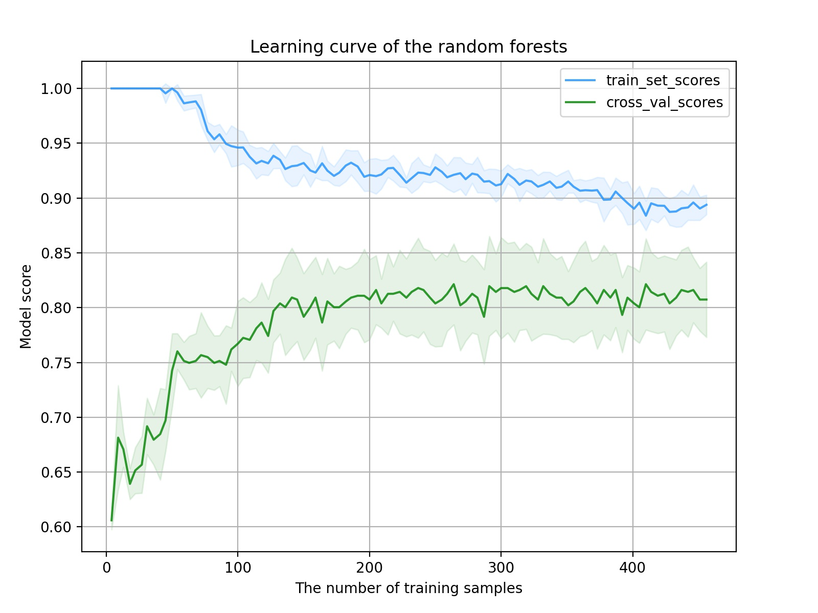
It can be seen from the image that with the increase of the number of samples, the score of the training set decreases and the score of the verification set increases. The model training process is normal and there is no big problem. However, further analysis shows that there are two problems in the learning curve of the model. One is that the change to the middle part of the curve is relatively gentle, which shows that the quality of features is not high enough to enable the model to quickly learn the key factors of classification; Another problem is that the distance between the final training set score and the verification set score is not small enough, which indicates that the model has not reached the best fitting state at this time. Continuing to increase the sample size can improve this problem (provided that there are still samples).
ROC curve and PR curve results:
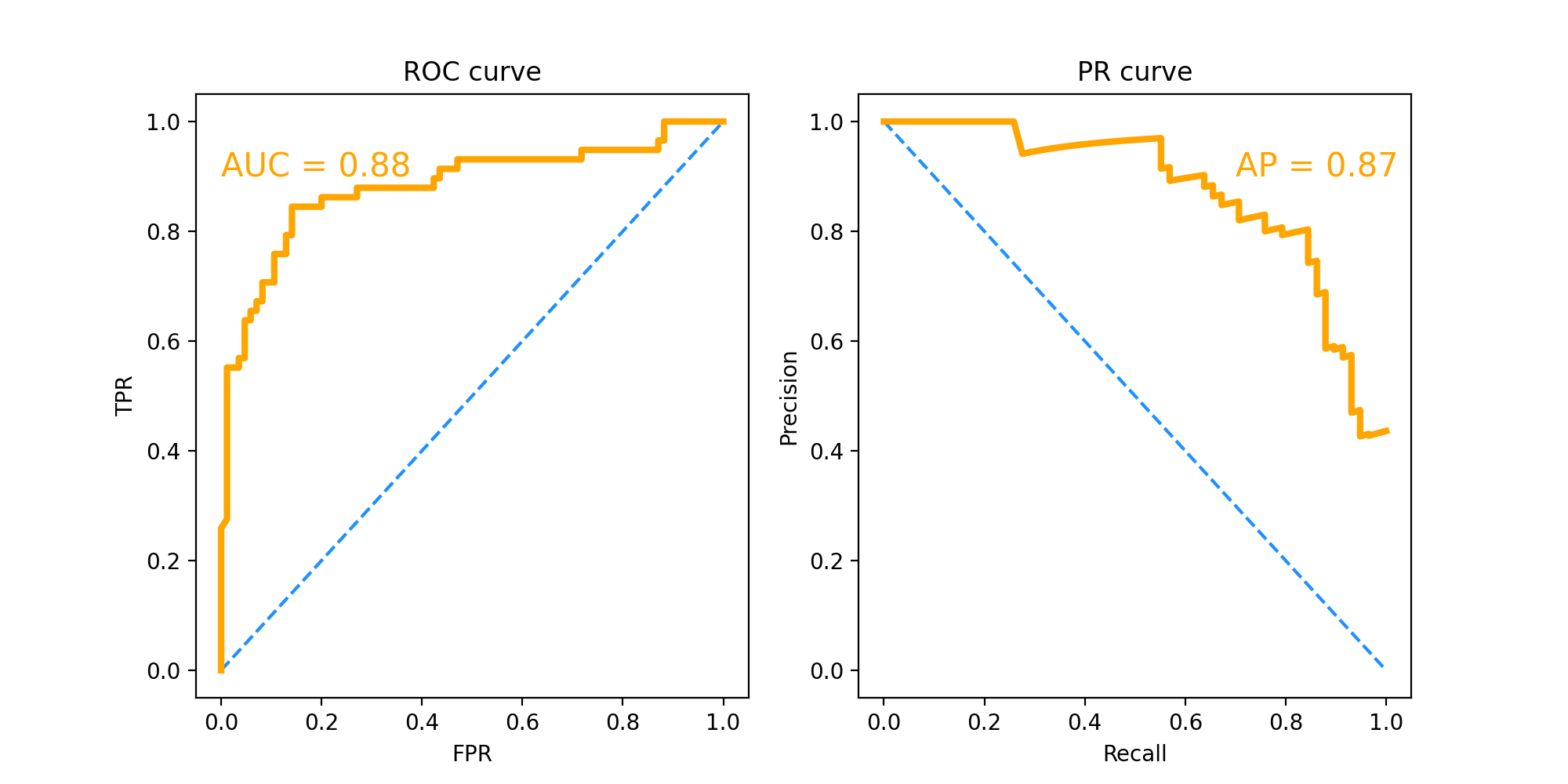
ROC curve and PR curve are mainly used to compare the performance of different classifiers. ROC curve has strong robustness to data sets with unbalanced categories of positive and negative samples.
Here we mainly look at the value of AUC and AP, that is, the area under the curve. AUC=0.88, AP=0.87. This score is already relatively high, indicating that the performance of the final model is good.