Course Directory:
01_ Build wechat applet project from zero_ Project overview
02_ Build wechat applet project from zero_ Project environment construction
03_ Build wechat applet project from zero_ Home page static effect implementation
04_ Build wechat applet project from zero_ Implementation of static effect of consultation page
Updating continuously
Page effect display

1, Page title and search box
The page title is also realized through page configuration;
If the search box does not consider code reuse, you can directly copy and paste the relevant structure and style from the code on the home page;
2, Small navigation

Page structure
1. Define a view and define its id: smallNavView;
2. Define three sub view s in smallNavView
3. The sub view can carry the corresponding pictures and text respectively;
<!-- Small navigation -->
<view id="smallNavView">
  <view>
    <image src="/images/@2x_online.png"></image>
    <text> Online courses</text>
  </view>
  <view>
    <image src="/images/@2x_teacher.png"></image>
    <text> Faculty team</text>
  </view>
  <view>
    <image src="/images/@2x_gonggao.png"></image>
    <text> Advisory notice</text>
  </view>
</view>
Style implementation
1. Set the size of all pictures in smallNavView;
2. Set the font size and color for the text in smallNavView;
3. Set the background color, height and row height for the view in smallNavView;
4. Set vertical alignment for text and pictures in smallNavView;
5. Set flex layout for smallNavView; Enlarge the sub view of smallNavView by 1;
6. Set the text Center for the child view of smallNavView
7. Set the left and right borders for the second child view of smallNavView;
/* Small navigation style implementation */
/* The application of flex layout is called flex container */
#smallNavView {
  display: flex;
}

/* flex We call it the flex project */
#smallNavView > view{
  height: 88rpx;
  line-height: 88rpx;
  background: #87cefa;
  flex-grow: 1;
  text-align: center;
}

#smallNavView > view:nth-child(2){
  border-left: 2rpx solid #fff;
  border-right: 2rpx solid #fff;
}

#smallNavView image{
  width: 44rpx;
  height: 44rpx;
  vertical-align: middle;
}

#smallNavView text{
  font-size: 30rpx;
  color: #fff;
  vertical-align: middle;
}
3, Rotation chart

Copy and paste relevant structures and styles from the home page, and then modify the picture resources;
<!-- Rotation chart -->
<swiper indicator-dots="{{indicatorDots}}" indicator-active-color="{{activeColor}}" autoplay="{{autoplay}}"
  interval="{{interval}}" duration="{{duration}}" circular="{{circular}}">
  <block wx:for="{{imgUrls}}" wx:key="*this">
    <swiper-item>
      <!-- swiper-item Inside is a picture,different swiper-item Different pictures hosted -->
      <image src="{{item}}"></image>
    </swiper-item>
  </block>
</swiper>
data: {
imgUrls: ['/images/kc01.jpg', '/images/kc02.jpg', '/images/kc03.jpg'],
indicatorDots: true,
vertical: false,
autoplay: true,
interval: 3500,
duration: 500,
activeColor: "#fff",
circular: true
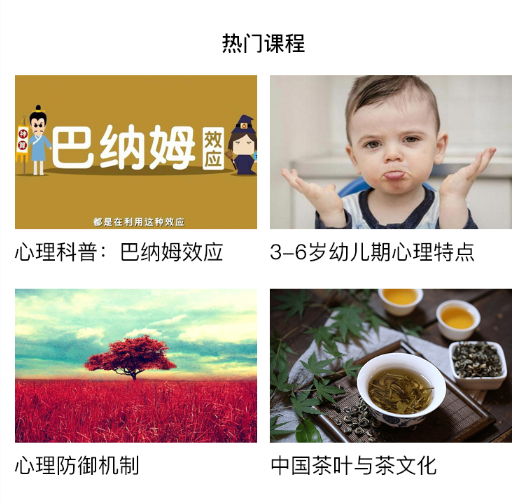
},4, Popular courses

Page structure
1. Define a view and add id: hotsourceview to it
2. Define hotsourcetitleview in hotsourceview to carry the total title
3. Define the courseListView in hotCourseView to carry four courses. Each course is a view. Add class: courseView to it
4. Define pictures and text in courseView;
<!-- Popular courses -->
<view id="hotCourseView">
  <!-- Popular course title -->
  <view id="hotCourseTitleView">
    Popular courses
  </view>
  <!-- Course list -->
  <view id="courseListView">
    <!-- A course -->
    <view class="courseView">
      <image src="/images/hotkc01.jpg"></image>
      <text>Psychological Science Popularization: Barnum effect</text>
    </view>

    <view class="courseView">
      <image src="/images/hotkc02.jpg"></image>
      <text>Psychological Science Popularization: Barnum effect</text>
    </view>

    <view class="courseView">
      <image src="/images/hotkc03.jpg"></image>
      <text>Psychological Science Popularization: Barnum effect</text>
    </view>

    <view class="courseView">
      <image src="/images/hotkc04.jpg"></image>
      <text>Psychological Science Popularization: Barnum effect</text>
    </view>
  </view>

  <!-- See more -->
  <view id="moreView">
    <text>See more</text>
    <view class="arrow"></view>
  </view>
</view>
Style implementation
1. Set the left and right inner margins for hotsourceview;
2. Set the height, text size, bold, text center and line height for hotsourcetitleview;
3. Set the size of all pictures in the courseListView;
4. Set the width of courseView to be consistent with the picture;
5. Set flex layout, line feed and item alignment on the main axis for courseListView;
6. Set the outer margin and text Center for courseView;
/* Popular course styles */
#hotCourseView{
  padding: 0 20rpx;
}

#hotCourseTitleView{
  height: 108rpx;
  line-height: 108rpx;
  font-size: 30rpx;
  text-align: center;
  font-weight: bold;
}

#courseListView{
  display: flex;
  flex-wrap: wrap;
  /* Alignment of items on the spindle */
  justify-content: space-between;
}

.courseView{
  width: 346rpx;
  margin-bottom: 40rpx;
  text-align: center;
}

#courseListView image{
  width: 346rpx;
  height: 220rpx;
}

#moreView{
  height: 88rpx;
  line-height: 88rpx;
  font-size: 28rpx;
  color: #A6A6A6;
  position: relative;
}

.arrow{
  width: 16rpx;
  height: 16rpx;
  border-top: 4rpx solid #999;
  border-right: 4rpx solid #999;
  /* Rotate 45 degrees */
  transform: rotate(45deg);
  /* Adjust position */
  position: absolute;
  right: 30rpx;
  top: 38rpx;
}