1 Preface
1.1 data set source
- The data in this case comes from the real data of Toronto in 2018-2019 on Airbnb website.
- The data set contains the listing data set, with about 20000 pieces of data, recording all the house information, including dozens of information fields including price.
- Another data set in the data set is calendar, which contains about 6.5 million rental transaction data and has the entry information of each house every day.
1.2 data analysis ideas
1.2.1 ETL four Board axe
- . isnull().sum() checks for nulls to see the overall quality of the dataset
- shape checks the data size, how many rows and how many columns know the amount of data
- describe view the data dictionary data type count, mean, std, min, 25%, 50%, 75%, max.
- value_counts() to view the data collection and data distribution. The data distribution in machine learning is balanced, with a ratio of 1:1.
1.2.2 data visualization tricks
In this case, our main research goal is the price dependent factor, so we use the comparison between price and another factor to observe. Common visualization tricks include:
- Histogram to observe the distribution of data. The influence of factors on the data can be seen from the height of the histogram.
- Box chart to observe the range of data. Upper lead (maximum) lower lead (minimum) 75% 25% average. The range of data can be seen from a graph.
- Pairplot to observe the relationship between different factors. The 15 factors are compared with the price factors. They are drawn at one time, and the histogram can only be one at a time.
- Thermodynamic diagram to quickly screen out information factors with high correlation. Quickly select the factors with high correlation.
1.2.3 transformation of data set
Traditional data analysis generally ends here, but for exploratory test data analysis, things have just begun. In order to conduct more in-depth data analysis, we began to introduce machine learning model. Since machine learning model is essentially a mathematical model, we need to carry out feature engineering on the data set to turn the data set into an array convenient for model identification, In this example, the following steps are taken:
- Standardization of data
- Repair of missing data
- Encoding of string data
- Data type conversion and unit unification
1.2.4 model
For many fields in this example, simple linear regression and other models can not capture the dynamics of data well, so we use some machine learning models, that is, we use a series of related features to combine strong features. In this example, we use two models:
- Random forest. This model is a composite model, which arranges and combines the features and labels arbitrarily, and then models them in a probabilistic way to minimize the occurrence of over fitting
- Microsoft's LightGBM model is also a very popular composite model in recent years. In this example, we use this model to compare with the random forest model, and use the R2 (0-1) value to select the most appropriate machine learning model.
Multiple models should be used in data analysis to see which model is the best.
2 data practice
The practical steps are as follows:
Practice 1: data loading and basic ETL
Actual combat 2: the first round of data set analysis using data visualization
Practice 3: digitize the data set using feature engineering and standardization to prepare for machine learning
Practice 4: use the comparison of two machine learning models to find the most appropriate modeling scheme
2.1 data loading and basic ETL
Data field description of dataset:
listing_id house data number
date current record time
available whether the current room is not rented, t has a price, f is rented.
Price if it is not leased, the price is displayed.
Only 1048576 rows can be loaded with excel, and more than that with python.
import pandas as pd
import numpy as np
import matplotlib.pyplot as plt
import seaborn as sns
%matplotlib inline

calendar = pd.read_csv('toroto/calendar.csv.gz')
print('We have', calendar.date.nunique(), 'days and', calendar.listing_id.nunique(), 'unique listings in the calendar data.')
We have 365 days and 17333 (listings) unique listings in the calendar data
The basic four piece set is as follows:
1.calendar.date.min(), calendar.date.max() transaction time range is from October 6, 2018 to October 5, 2019, a whole year
2.calendar.shape has 630w + transaction records and 4 fields.
listing_id house data number
date current record time
available whether the current room is not rented, t has a price, f is rented.
Price if it is not leased, the price is displayed.
3. In the calendar. Isnull(). Sum() price field, there is a missing value because there is no price display after the house is rented, and there is only a price if it is not rented.
4.calendar.available.value_ In the counts () available field, f (false) represents that it has been rented, and t(true) represents that it can be rented. Consistent with the missing value field in 3.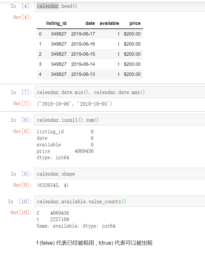
2.2 use data visualization for the first round of analysis
2.2.1 occupancy rate of houses per day
Data analysis
Summarize by day to find out the occupancy rate of houses per day in the data set ()
#Extract the time, date and room status fields and assign new variables
calendar_new = calendar[['date', 'available']]
#Add a new field to record that the listing is enough to be rented. 1 means to be rented.
calendar_new['busy'] = calendar_new.available.map( lambda x: 0 if x == 't' else 1)
#Group by time and date, find the average of daily check-in and reset the index
calendar_new = calendar_new.groupby('date')['busy'].mean().reset_index()
#Finally, the time and date are converted to datetime time format, which is originally string type.
calendar_new['date'] = pd.to_datetime(calendar_new['date'])
#View the first five lines of the processed results
calendar_new.head()

Tip: 1. If you do not reset_index(), the date field of the data is the index. reset_ After index (), the date field becomes a column and can be to_datetime converted.
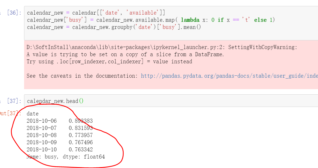
2. The summary of output results shows that there is a pink alert output alert xxwarning. It is necessary to understand that the version of pandas is compatible with various modules in the process of data processing and analysis. Xxwarning is a kind of goodwill alert, not xxerror. This kind of alert will not affect the normal operation of the program, but can also be imported into the module to remind and ignore.
import warnings
warnings.filterwarnings('ignore')
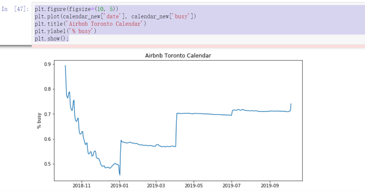
visualization
plt.figure(figsize=(10, 5))
plt.plot(calendar_new['date'], calendar_new['busy'])
plt.title('Airbnb Toronto Calendar')
plt.ylabel('% busy')
plt.show();
We can see from the figure that October November is the busiest month, and then July September of the second year. Since this data is from aibiying Toronto, it can be inferred that the occupancy rate of the whole short rent house will be relatively strong in the second half of the year
2.2.2 price trend changes during the year
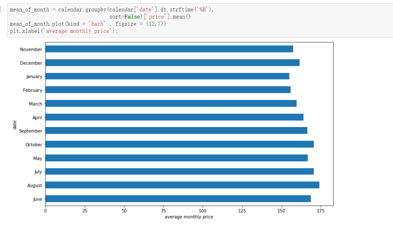
In months
There are two analysis techniques this time. Because the price part has the $symbol and. Sign, we need to format the data and convert the time field. After processing the time field, use the histogram for data analysis
#data processing
calendar['date'] = pd.to_datetime(calendar['date'])
calendar['price'] = calendar['price'].str.replace(',', '')
calendar['price'] = calendar['price'].str.replace('$', '')
calendar['price'] = calendar['price'].astype(float)

#Group and summarize by month to find the average price
#%B local full month name
mean_of_month = calendar.groupby(calendar['date'].dt.strftime('%B'),
                                 sort=False)['price'].mean()
#Draw a bar graph barh to draw horizontally.
mean_of_month.plot(kind = 'barh' , figsize = (12,7))
#Add x-axis label
plt.xlabel('average monthly price')
As can be seen from the figure, June, August and October are the three months with the highest average prices.
bar diagram:

If you want to sort the months by 1-12, then
month_index = ['December', 'November', 'October', 'September', 'August',
               'July','June', 'May',  'April','March', 'February', 'January']
#Drawing after reassigning the index
mean_of_month = mean_of_month.reindex(month_index)
mean_of_month.plot(kind = 'barh' , figsize = (12,7))
plt.xlabel('average monthly price')
--------
Copyright notice: This article is CSDN Blogger「Be_melting」Original articles, follow CC 4.0 BY-SA Copyright agreement, please attach the original source link and this statement.
Original link: https://blog.csdn.net/lys_828/article/details/119940333
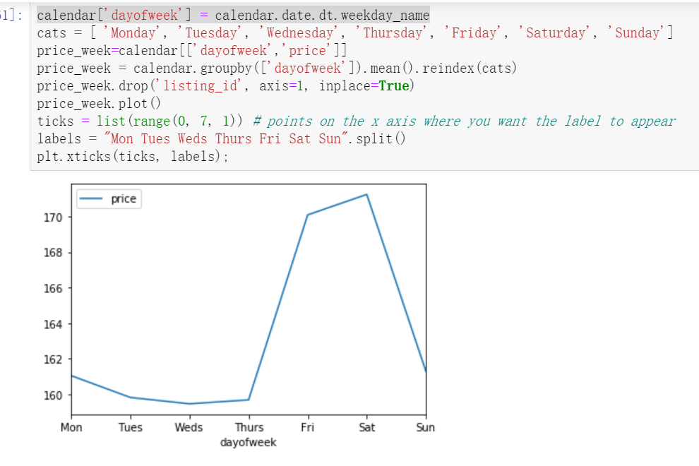
In weeks
#weekday_ The name function returns the week name of the specified day of the week.
calendar['dayofweek'] = calendar.date.dt.weekday_name
#Then specify the index order to display
cats = [ 'Monday', 'Tuesday', 'Wednesday', 'Thursday', 'Friday', 'Saturday', 'Sunday']
#Extract the two fields to analyze
price_week=calendar[['dayofweek','price']]
#Group by week, solve the average price and reset the index
price_week = calendar.groupby(['dayofweek']).mean().reindex(cats)
#Delete unnecessary fields
price_week.drop('listing_id', axis=1, inplace=True)
price_week.plot()
#Specifies the value of the axis scale and the corresponding label value
ticks = list(range(0, 7, 1)) # points on the x axis where you want the label to appear
labels = "Mon Tues Weds Thurs Fri Sat Sun".split()
plt.xticks(ticks, labels);
Very similar to what we expected, short-term rental housing itself mostly exists for tourism, so the price on Friday, Saturday and two days is a grade higher than that in other times. (weekend weekend, so that the time to settle in is two nights on Friday and Saturday)
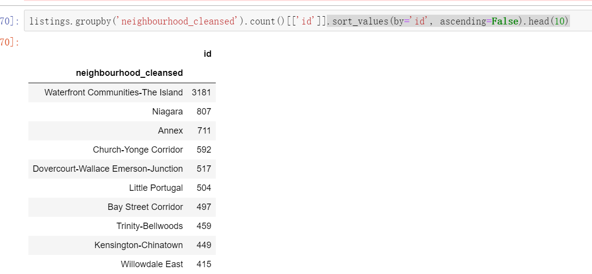
2.2.3 community distribution of houses
17343 houses.
listings = pd.read_csv('toroto/listings.csv.gz')
print('We have', listings.id.nunique(), 'listings in the listing data.')
#According to neighborhood_ Cleared group summary, intercept the id field, arrange it in descending order, and view the first 10 values.
listings.groupby('neighbourhood_cleansed').count()[['id']].sort_values(by='id', ascending=False).head(10)
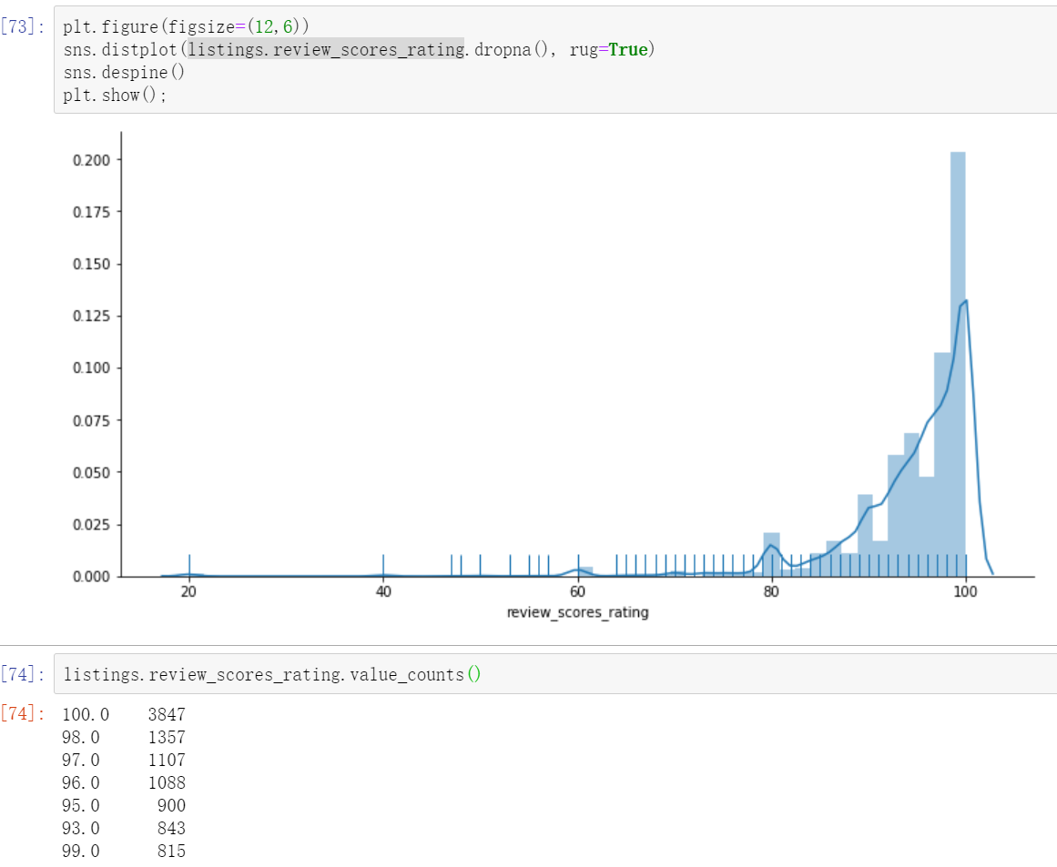
2.2.4 scoring of the house
plt.figure(figsize=(12,6))
# Distplot rug (the density of columns on the x-axis tells us the distribution)
sns.distplot(listings.review_scores_rating.dropna(), rug=True)
sns.despine()
plt.show();
It can be seen that on the whole, the praise rate of aibiying's house is very high.
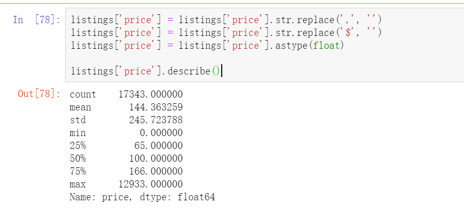
2.2.5 house price
listings['price'] = listings['price'].str.replace(',', '')
listings['price'] = listings['price'].str.replace('$', '')
listings['price'] = listings['price'].astype(float)
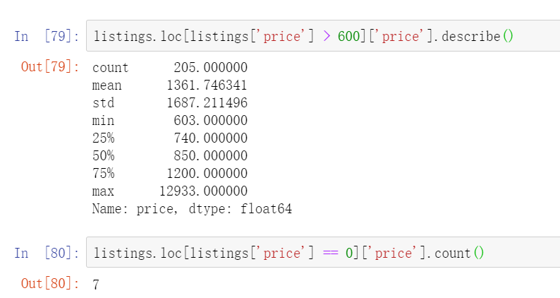
listings['price'].describe()
The most expensive Airbnb house in Toronto costs $12933 / night. Here is the link to the house https://www.Airbnb.ca/rooms/16039481? Local = en. Through the link, you can find that it is about 100 times more expensive than the average price, mainly because this house is an art collector's loft in the most fashionable community in Toronto. (the value of these art collections has greatly raised the price of this house, making it 100 times lower than the average)
Check the record corresponding to the maximum or minimum value. You can use the following code argmax or argmin
listings.iloc[np.argmax(listings['price'])]
In data analysis, we need to obey the principle of normal distribution. We need to clean up the existence of such extreme cases, so we filter the abnormal price data, and the final price is to retain the data between 0-600. To select a specific value, you need to look at the proportion of the number of listings corresponding to the current value above in the whole. Here, there are only 200 + listings above 600, accounting for a small proportion of 1w +, and only 7 listings are free.
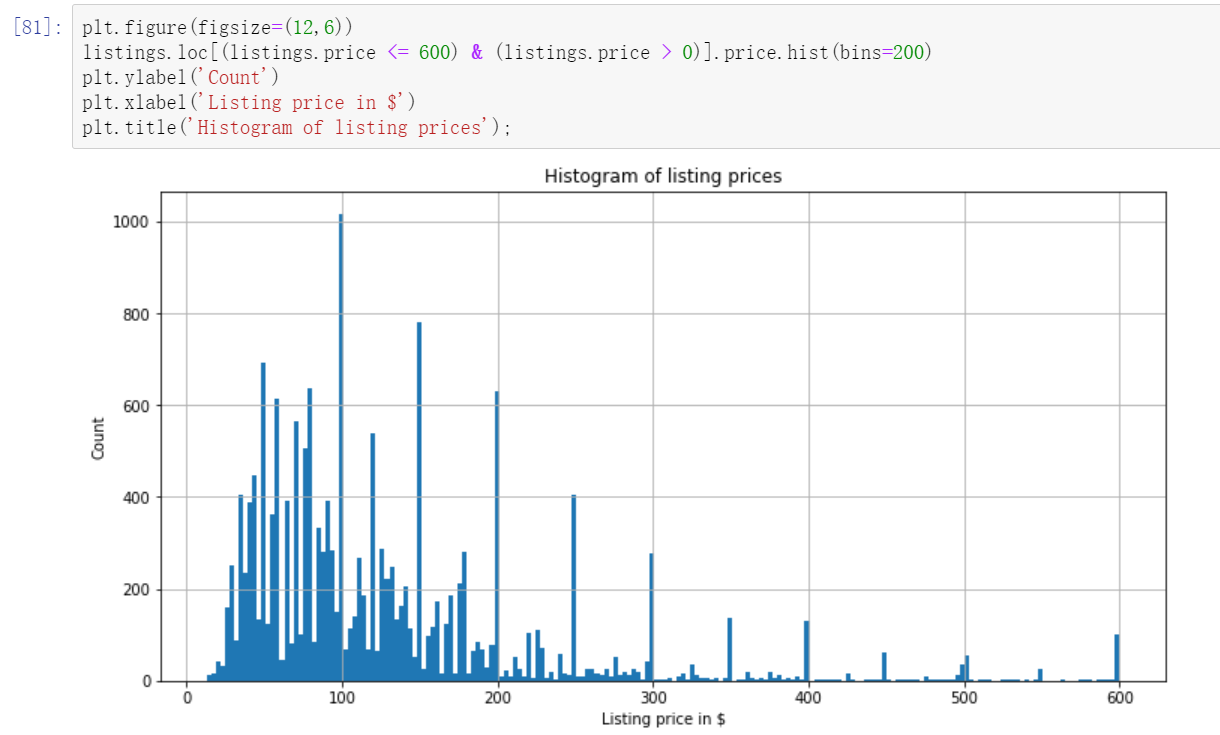
After removing the extreme value, we continue to observe the current price distribution and draw the histogram
plt.figure(figsize=(12,6))
#The number of bins is too small to see.
listings.loc[(listings.price <= 600) & (listings.price > 0)].price.hist(bins=200)
plt.ylabel('Count')
plt.xlabel('Listing price in $')
plt.title('Histogram of listing prices');
It can be seen that the price is mainly between 30-200
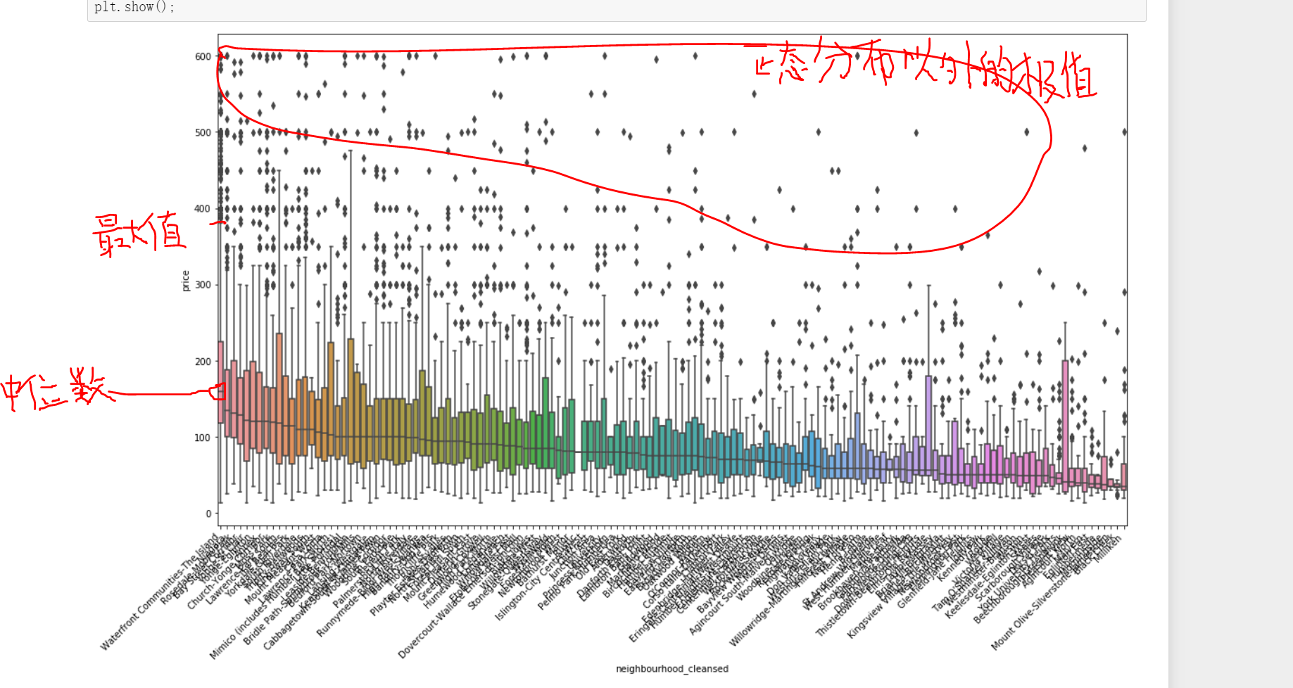
2.2.6 relationship between different communities and housing prices
Previously, we explored the relationship between different communities and the number of houses. Here we can further explore the relationship between different communities and the price of houses
plt.figure(figsize=(18,10))
#Use the median of community price to sort the price on the x-axis.
sort_price = listings.loc[(listings.price <= 600) & (listings.price > 0)]\
                    .groupby('neighbourhood_cleansed')['price']\
                    .median()\
                    .sort_values(ascending=False)\
                    .index
sns.boxplot(y='price', x='neighbourhood_cleansed', data=listings.loc[(listings.price <= 600) & (listings.price > 0)],
            order=sort_price)
ax = plt.gca()

ax.set_xticklabels(ax.get_xticklabels(), rotation=45, ha='right')
plt.show();
The best community is not only the highest price of houses, but also the highest average price in all communities, which is very representative
2.2.7 superior room and ordinary room
host vs. price next, let's observe the Superhost mark information. The real estate with this mark is a high-grade house, which needs to meet certain rating requirements, such as more than 100 successful reservations, and the praise rate exceeds 90%. Let's see if there is a difference in price between houses with this rating and houses without this mark.
sns.boxplot(y='price', x='host_is_superhost', data=listings.loc[(listings.price <= 600) & (listings.price > 0)])
plt.show();
Through the analysis, it can be seen that the price of high-grade houses will be slightly higher than that of ordinary houses.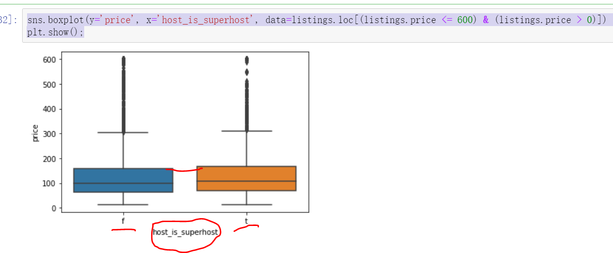
2.2.8 relationship between house soft decoration characteristics and price
property type vs. price
Free wifi subway near dryer washing machine clothes hanger breakfast medical bag free parking and other soft parts
plt.figure(figsize=(18,10))
sort_price = listings.loc[(listings.price <= 600) & (listings.price > 0)]\
                    .groupby('property_type')['price']\
                    .median()\
                    .sort_values(ascending=False)\
                    .index
sns.boxplot(y='price', x='property_type', data=listings.loc[(listings.price <= 600) & (listings.price > 0)], order=sort_price)
ax = plt.gca()
ax.set_xticklabels(ax.get_xticklabels(), rotation=45, ha='right')
plt.show();
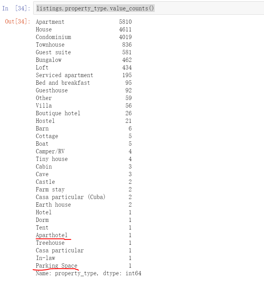
It can be seen from this figure that if the extreme values are not processed during data processing, such a strange situation will be displayed. For example, the keyword Aparthotel apartment hotel has the highest price, but through boxplot, we can see that there is only one such real estate, so the data is not complete. There are also a few keywords such as tent and parking space, which leads to inaccurate data results. I hope to remove the circled part.
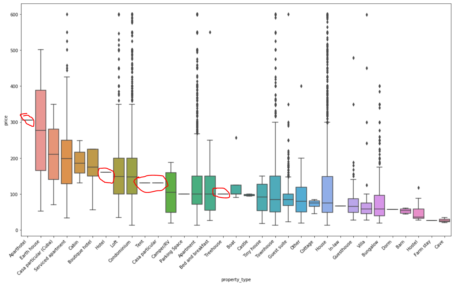
The fundamental reason is that there are too few data values in the classification. You can use value_ Count(). For the classification with few values, you can also set a value as the dividing point for extraction, or directly extract the data of the top 5, top 10 and top 15 according to the display requirements
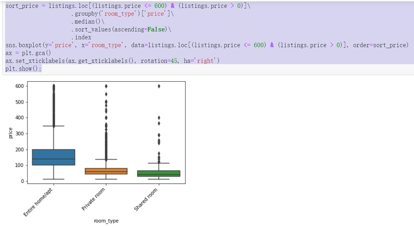
2.2.9 relationship between house type and price
sort_price = listings.loc[(listings.price <= 600) & (listings.price > 0)]\
                    .groupby('room_type')['price']\
                    .median()\
                    .sort_values(ascending=False)\
                    .index
sns.boxplot(y='price', x='room_type', data=listings.loc[(listings.price <= 600) & (listings.price > 0)], order=sort_price)
ax = plt.gca()
ax.set_xticklabels(ax.get_xticklabels(), rotation=45, ha='right')
plt.show();
The whole rent is the most expensive, followed by joint rent, and the cheapest is shared by many people
2.2.10 relationship between house type and price
#pivot PivotTable, stacked: Boolean. If the value is True, the output graph is the result of stack accumulation of multiple data sets
listings.loc[(listings.price <= 600) & (listings.price > 0)].pivot(columns = 'room_type', values = 'price').plot.hist(stacked = True, bins=100)
plt.xlabel('Listing price in $');
There is an obvious dividing line, that is, there is a large gap between the number of whole rental houses before and after 100 and the other two types of houses. The joint rent before 100 accounts for a large proportion, but after 100 is the absolute advantage of whole rent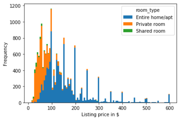
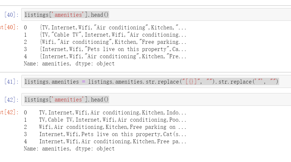
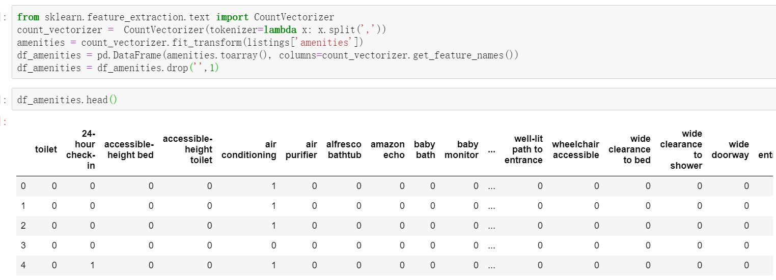
2.2.11 relationship between house amenities and price
Data collation: curly braces and quotation marks need to be removed, and finally separated by commas
listings['amenities'].head()
listings.amenities = listings.amenities.str.replace("[{}]", "").str.replace('"', "")
listings['amenities'].head()
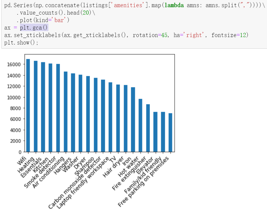
Identify the top 20 most important amenities
Use value_counts() filters related values.
# np.concatenate can splice multiple arrays into a list at one time
pd.Series(np.concatenate(listings['amenities'].map(lambda amns: amns.split(","))))\
    .value_counts().head(20)\
    .plot(kind='bar')
#plt.gca() get current subgraph
ax = plt.gca()
ax.set_xticklabels(ax.get_xticklabels(), rotation=45, ha='right', fontsize=12)
plt.show();
Wifi heating, kitchen and other amenities are the most important part
Relationship between convenience and price in the top 20
Study the first three pieces of code.
#Gets the unique element in the field
amenities = np.unique(np.concatenate(listings['amenities'].map(lambda amns: amns.split(","))))
#The contained elements are statistically averaged and null values are excluded
amenity_prices = [(amn, listings[listings['amenities'].map(lambda amns: amn in amns)]['price'].mean()) for amn in amenities if amn != ""]
#Index by element and average price as value
amenity_srs = pd.Series(data=[a[1] for a in amenity_prices], index=[a[0] for a in amenity_prices])

#Draw the top 20 bar charts
amenity_srs.sort_values(ascending=False)[:20].plot(kind='bar')
ax = plt.gca()
ax.set_xticklabels(ax.get_xticklabels(), rotation=45, ha='right', fontsize=12)
plt.show()
Filter out more than 600 and the results will be different.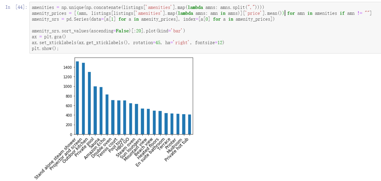
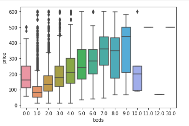
2.2.12 relationship between quantity and price of beds
listings.loc[(listings.price <= 600) & (listings.price > 0)].pivot(columns = 'beds',values = 'price').plot.hist(stacked = True,bins=100)
plt.xlabel('Listing price in $');
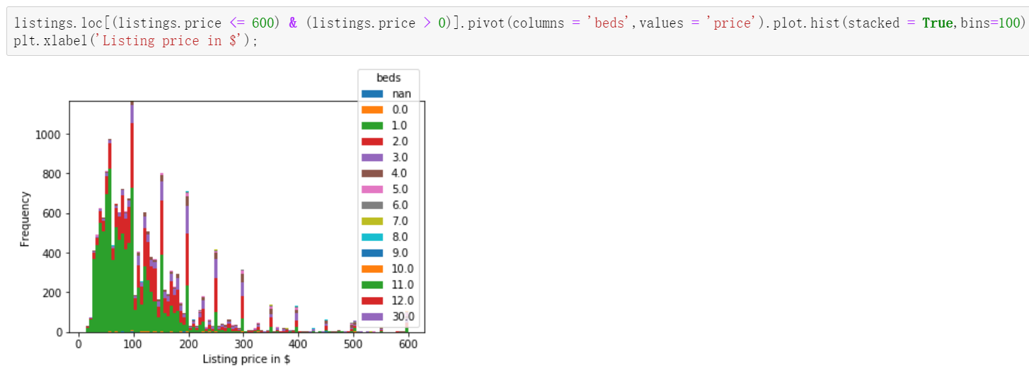
sns.boxplot(y='price', x='beds', data = listings.loc[(listings.price <= 600) & (listings.price > 0)])
plt.show();
In this data, it is amazing to find that the price of a house without a bed is even more expensive than that with two beds.
2.3 relevance discussion
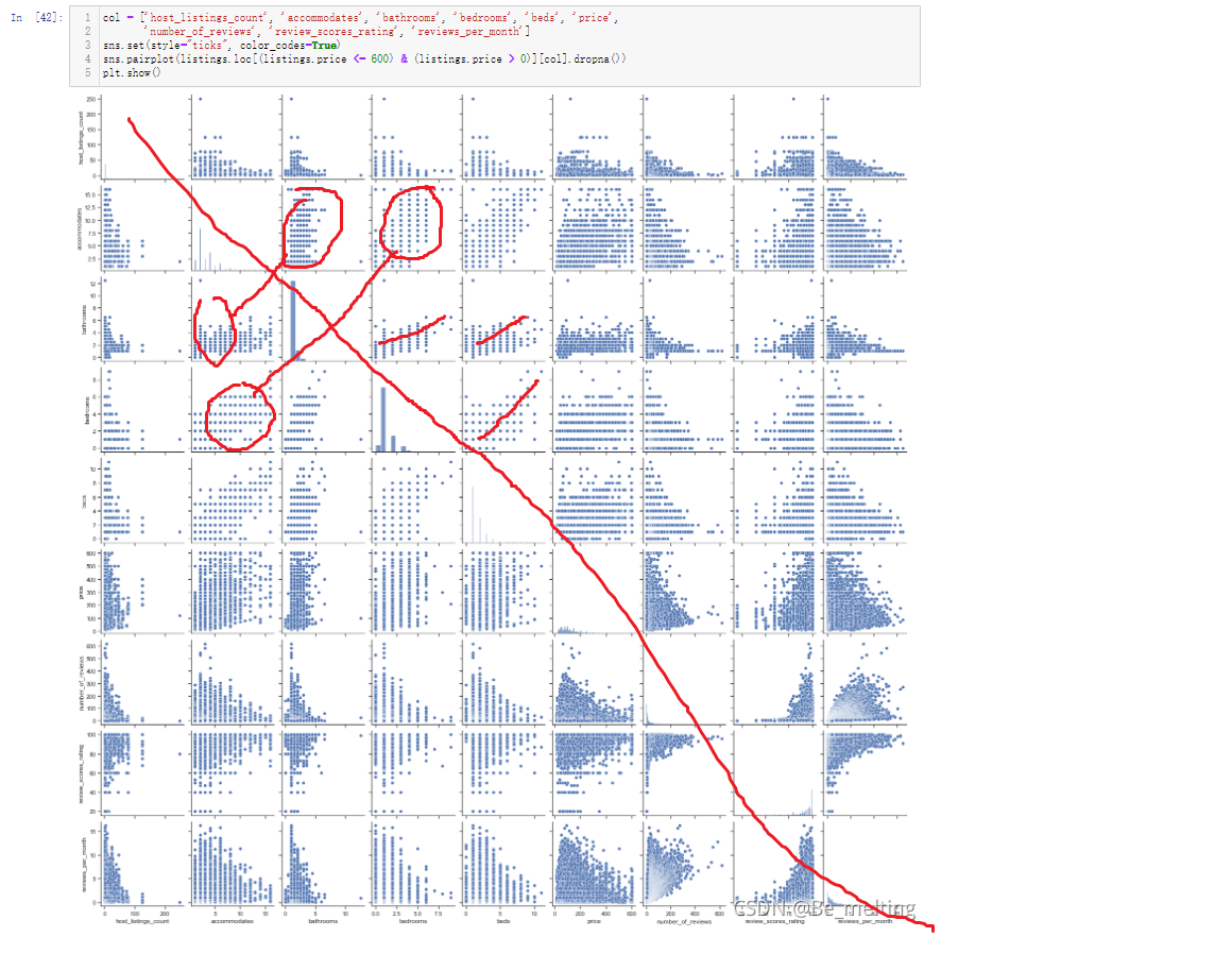
The analysis of two separate fields is based on common sense. In daily life, we have subconsciously thought that the two fields may be related. If we have been using this method all the time, it is difficult to excavate potential valuable information. Therefore, we can use pairplot to draw multi field pairwise comparison map or heatmap thermal map to explore the potential relevance.
1.pairplot mode
#col selects some fields for association discussion
col = ['host_listings_count', 'accommodates', 'bathrooms', 'bedrooms', 'beds', 'price', 'number_of_reviews', 'review_scores_rating', 'reviews_per_month']
sns.set(style="ticks", color_codes=True)
sns.pairplot(listings.loc[(listings.price <= 600) & (listings.price > 0)][col].dropna())
plt.show()
Don't look diagonally,
2. Thermodynamic diagram mode
plt.figure(figsize=(18,10))
corr = listings.loc[(listings.price <= 600) & (listings.price > 0)][col].dropna().corr()
plt.figure(figsize = (6,6))
sns.set(font_scale=1)
sns.heatmap(corr, cbar = True, annot=True, square = True, fmt = '.2f', xticklabels=col, yticklabels=col)
plt.show();
The closer the number is to 1, the stronger the correlation between fields. The values of the main diagonal need not be 1
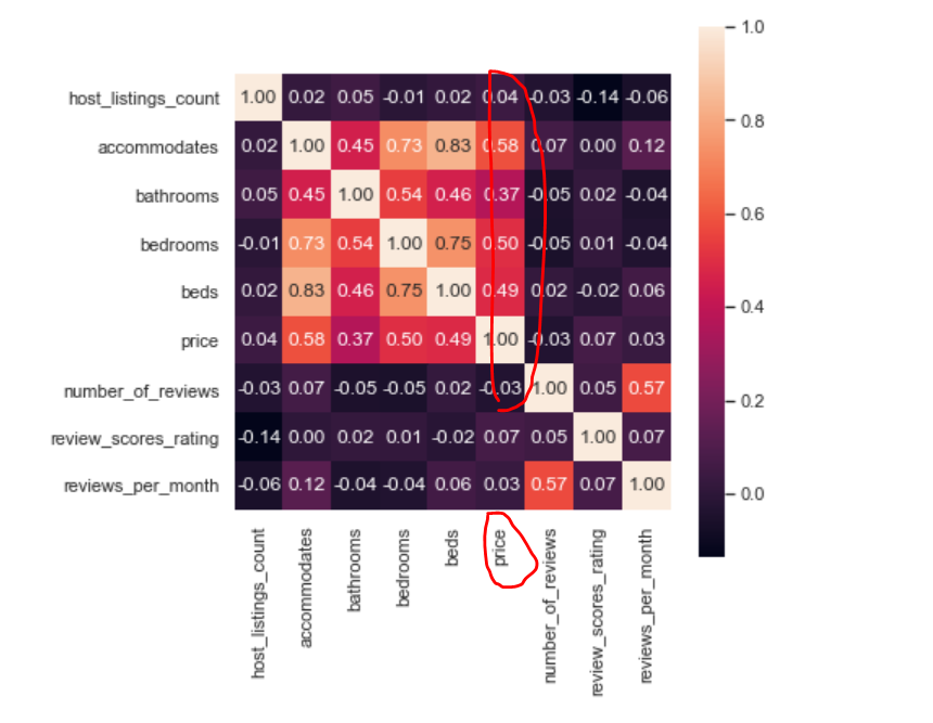
3. Detailed exploration
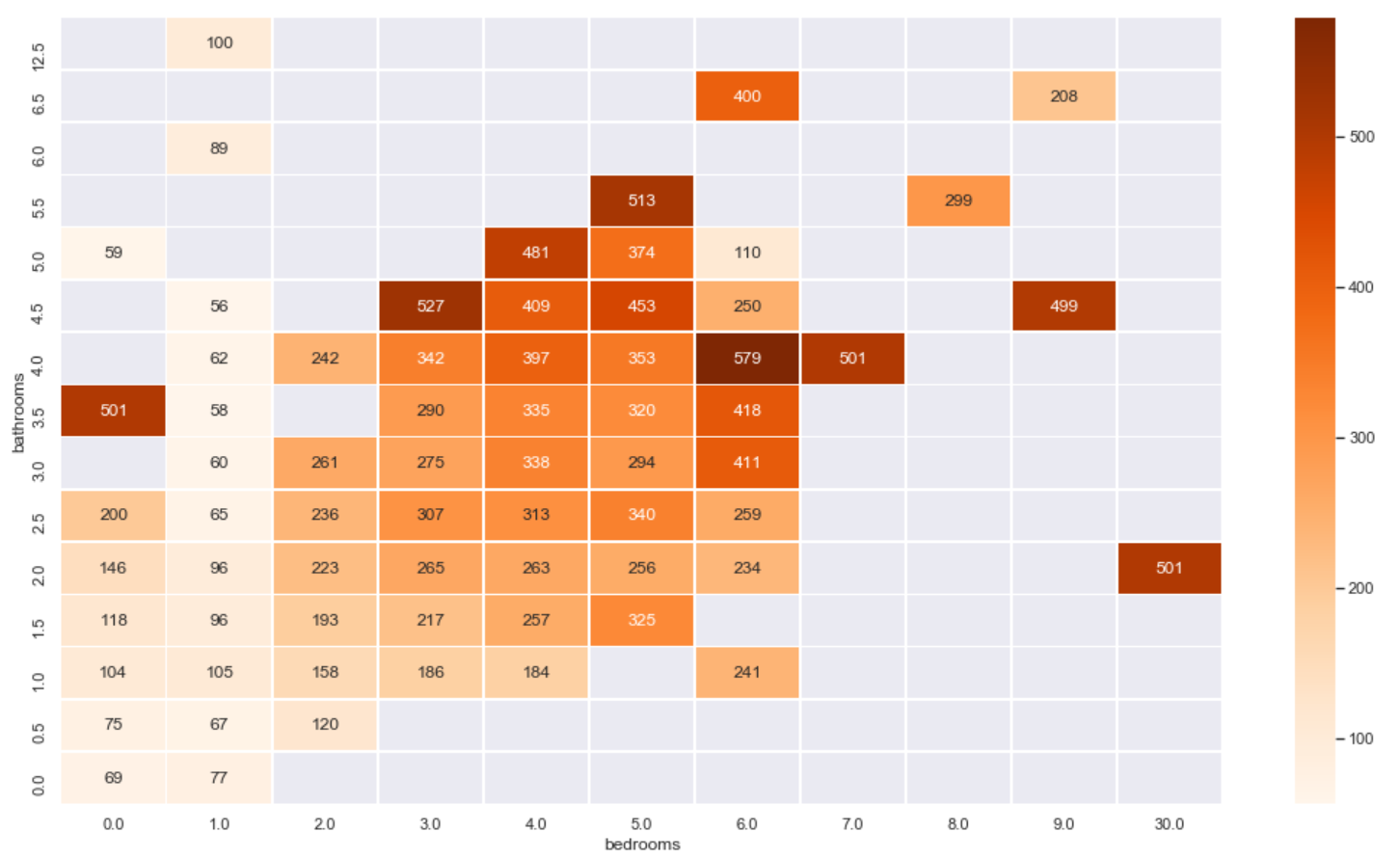
For example, in the above correlation diagram, we can see that the price field has a strong correlation with the bathrooms beds and bedrooms fields, so we can use the thermal diagram to show the relationship between the three.
From the number of times of price:
plt.figure(figsize=(18,10))
sns.heatmap(listings.loc[(listings.price <= 600) & (listings.price > 0)]\
                .groupby(['bathrooms', 'bedrooms'])\
                .count()['price']\
                .reset_index()\
                .pivot('bathrooms', 'bedrooms', 'price')\
                .sort_index(ascending=False),
            cmap="Oranges", fmt='.0f', annot=True, linewidths=0.5)
plt.show();
The heat map explores the relationship between the number of washrooms and bedrooms and the house price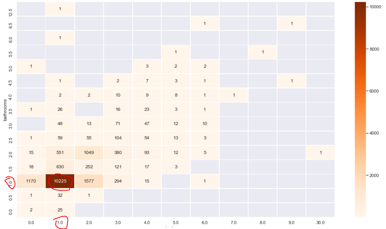
From the average value of the price:
plt.figure(figsize=(18,10))
sns.heatmap(listings.loc[(listings.price <= 600) & (listings.price > 0)]\
                .groupby(['bathrooms', 'bedrooms'])\
                .mean()['price']\
                .reset_index()\
                .pivot('bathrooms', 'bedrooms', 'price')\
                .sort_index(ascending=False),
            cmap="Oranges", fmt='.0f', annot=True, linewidths=0.5)
plt.show();
3 characteristic Engineering
The above contents are the contents to be completed by the traditional data analysis. The analysis process depends on the experience of the data analyst, and the results are displayed in the form of charts. One pain point is that when there are many fields, a lot of images are required for analysis, such as the analysis of three fields and the thermal diagram. At this time, we can explore with the help of machine learning model, but before exploring, we need to process field data and carry out feature engineering.
listings = pd.read_csv('toroto/listings.csv.gz')
listings['price'] = listings['price'].str.replace(',', '')
listings['price'] = listings['price'].str.replace('$', '')
listings['price'] = listings['price'].astype(float)
listings = listings.loc[(listings.price <= 600) & (listings.price > 0)]
listings.amenities = listings.amenities.str.replace("[{}]", "").str.replace('"', "")
listings.amenities.head()
Focus
First process the text data, characterize the text data, import it into the module processing the text data, and convert the word vector.
All classifications in the names field are uniquely encoded to form the DataFrame data type
from sklearn.feature_extraction.text import CountVectorizer
count_vectorizer =  CountVectorizer(tokenizer=lambda x: x.split(','))
amenities = count_vectorizer.fit_transform(listings['amenities'])
df_amenities = pd.DataFrame(amenities.toarray(), columns=count_vectorizer.get_feature_names())
df_amenities = df_amenities.drop('',1)
Process the secondary classification field and replace the classification of true and false with the classification of 1 and 0 recognized by the computer. When there are multiple binary fields, the for loop can be used for unified data conversion.
columns =  ['host_is_superhost', 'host_identity_verified', 'host_has_profile_pic',
                   'is_location_exact', 'requires_license', 'instant_bookable',
                   'require_guest_profile_picture', 'require_guest_phone_verification']
for c in columns:
    listings[c] = listings[c].replace('f',0,regex=True)
    listings[c] = listings[c].replace('t',1,regex=True)
Then fill in the missing values of the price related fields and clean the noise data. Finally, don't forget to convert the numeric fields into floating-point numbers.
listings['security_deposit'] = listings['security_deposit'].fillna(value=0)
listings['security_deposit'] = listings['security_deposit'].replace( '[\$,)]','', regex=True ).astype(float)
listings['cleaning_fee'] = listings['cleaning_fee'].fillna(value=0)
listings['cleaning_fee'] = listings['cleaning_fee'].replace( '[\$,)]','', regex=True ).astype(float)
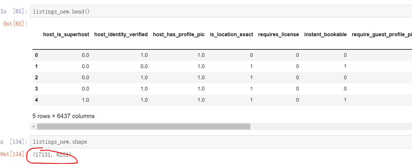
When judging the correlation between fields in the thermodynamic diagram, the correlation between some fields is 0, these fields can be directly discarded, and the related fields can be selected to form a data set again
listings_new = listings[['host_is_superhost', 'host_identity_verified', 'host_has_profile_pic','is_location_exact',
                         'requires_license', 'instant_bookable', 'require_guest_profile_picture',
                         'require_guest_phone_verification', 'security_deposit', 'cleaning_fee',
                         'host_listings_count', 'host_total_listings_count', 'minimum_nights',
                     'bathrooms', 'bedrooms', 'guests_included', 'number_of_reviews','review_scores_rating', 'price']]
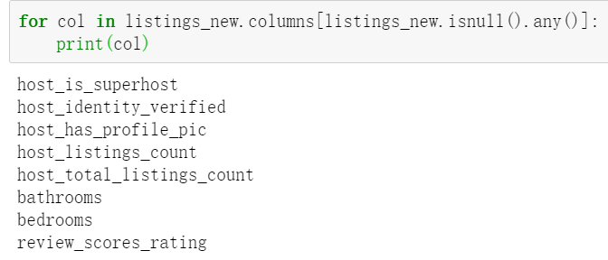
Whether there are still missing values in these fields, the above only deals with some fields. Here, the missing values still need to be dealt with after selecting the fields
for col in listings_new.columns[listings_new.isnull().any()]:
    print(col)
Deal with the missing values of these fields and fill them in according to the median. When the field is a category field, the filling method is median filling, and the price field previously processed is a continuous field, which is filled with the mean value
for col in listings_new.columns[listings_new.isnull().any()]:
    listings_new[col] = listings_new[col].fillna(listings_new[col].median())
The classification fields (except those specified by yourself, they can also be specified. Generally, there are a large number of fields (which have an impact on the price)) are heat coded, and the coded results are combined with the new data
for cat_feature in ['zipcode', 'property_type', 'room_type', 'cancellation_policy', 'neighbourhood_cleansed', 'bed_type']:
    listings_new = pd.concat([listings_new, pd.get_dummies(listings[cat_feature])], axis=1)
Don't forget that the DataFrame data encoded by text at the beginning also needs to be merged. The merging method is to take the intersection, and finally to the data processed by feature engineering. The data is only about 1.7w, but the number of fields has increased to 6000+
listings_new = pd.concat([listings_new, df_amenities], axis=1, join='inner')

listings_new.head()

listings_new.shape
4 machine learning
4.1 random forest
from sklearn.model_selection import train_test_split
from sklearn.metrics import r2_score
from sklearn.metrics import mean_squared_error
from sklearn.ensemble import RandomForestRegressor
y = listings_new['price']
x = listings_new.drop('price', axis =1)
X_train, X_test, y_train, y_test = train_test_split(x, y, test_size = 0.25, random_state=1)
rf = RandomForestRegressor(n_estimators=500,
                               criterion='mse',
                               random_state=3,
                               n_jobs=-1)
#Model creation
rf.fit(X_train, y_train)
x is the field without price, and y is the price field. Generally, the segmentation data set is opened according to 73. Here, the training set is 75%, the test set is 25%, and the random seed state is set to 1. Finally, 500 trees are set in the decision tree model, the evaluation method is mean square error mse, the random seed state is 3, and - 1 represents that the performance of the selection processor is fully on.
The training process will be related to the performance of the selected machine. It takes a certain time to run. After running, the model can be used for prediction.
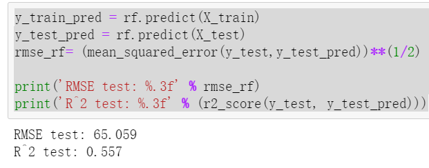
Note that the variable in the predict bracket is passed in, and X is passed in_ The train corresponds to the prediction label calculated from the training set and passes it into X_test corresponds to the prediction label calculated from the test set. The final prediction result can be calculated by comparing the results of the final training set and the test set. R2 is generally between 0.4-0.8
y_train_pred = rf.predict(X_train)
y_test_pred = rf.predict(X_test)
rmse_rf= (mean_squared_error(y_test,y_test_pred))**(1/2)

print('RMSE test: %.3f' % rmse_rf)
print('R^2 test: %.3f' % (r2_score(y_test, y_test_pred)))
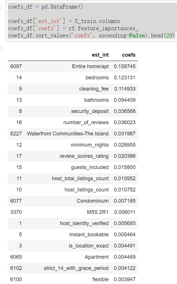
The weights of different data features are calculated through the model.
coefs_df = pd.DataFrame()

coefs_df['est_int'] = X_train.columns
coefs_df['coefs'] = rf.feature_importances_
coefs_df.sort_values('coefs', ascending=False).head(20)
4.2 LightGBM
The results obtained by modeling with only one model are not comparable, and it is impossible to judge whether the final prediction result is good or bad. Therefore, when making prediction, at least two models are used instead of only one model.
from lightgbm import LGBMRegressor

y = listings_new['price']
x = listings_new.drop('price', axis =1)
X_train, X_test, y_train, y_test = train_test_split(x, y, test_size = 0.25, random_state=1)
fit_params={
    "early_stopping_rounds":20,
            "eval_metric" : 'rmse',
            "eval_set" : [(X_test,y_test)],
            'eval_names': ['valid'],
            'verbose': 100,
            'feature_name': 'auto',
            'categorical_feature': 'auto'
           }

X_test.columns = ["".join (c if c.isalnum() else "_" for c in str(x)) for x in X_test.columns]

class LGBMRegressor_GainFE(LGBMRegressor):
    @property
    def feature_importances_(self):
        if self._n_features is None:
            raise LGBMNotFittedError('No feature_importances found. Need to call fit beforehand.')
        return self.booster_.feature_importance(importance_type='gain')


clf = LGBMRegressor_GainFE(num_leaves= 25, max_depth=20,
                         random_state=0,
                         silent=True,
                         metric='rmse',
                         n_jobs=4,
                         n_estimators=1000,
                         colsample_bytree=0.9,
                         subsample=0.9,
                         learning_rate=0.01)
#reduce_train.columns = ["".join (c if c.isalnum() else "_" for c in str(x)) for x in reduce_train.columns]
clf.fit(X_train.values, y_train.values, **fit_params)
y_pred = clf.predict(X_test.values)
print('R^2 test: %.3f' % (r2_score(y_test, y_pred)))
Result: R^2 test: 0.610
Important features:
feat_imp = pd.Series(clf.feature_importances_, index=x.columns)
feat_imp.nlargest(20).plot(kind='barh', figsize=(10,6))
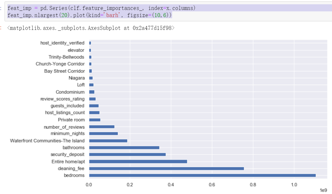
After comparing the important influencing factors finally given by the two models, it can be found that the first five are the same, but there are differences in order. In addition, the specific explanation of the model will be introduced in detail in the subsequent machine learning section. Here is to clarify the process of data analysis cases and know how to call modules to create models and forecasts.
Created on Saturday, September 25, 2021.