Vue3 official website - Accessibility (21) basics, semantics (forms, labels, Aria label, Aria labeled by, Aria describedby, buttons), standards, resources
Summary:
1. Foundation
Web accessibility (also known as a11y) refers to the practice of creating a website that can be used by anyone - whether it's someone with some barrier, accessing through a slow network connection, using old or damaged hardware, or just someone in an adverse environment. For example, adding subtitles to a video can help users who are deaf, have hearing impairment, or are in a noisy environment and can't hear their mobile phone. Similarly, please make sure that the text contrast is not too low, which is helpful for low vision users and those who try to use the mobile phone in strong light.
Are you ready to start but can't start?
You can look at it first World Wide Web Consortium (W3C) Provided Planning and managing web accessibility.
Skip link
You should add a link directly to the main content area at the top of each page so that users can skip content that repeats on multiple pages.
Usually, this link will be placed at the top of App.vue, so it will be the first focusable element on all pages:
<ul class="skip-links">
  <li>
    <a href="#Main "ref =" skiplink "> skip to main content</a>
  </li>
</ul>
If you want to hide the link in an unfocused state, you can add the following styles:
.skipLink {
  white-space: nowrap;
  margin: 1em auto;
  top: 0;
  position: fixed;
  left: 50%;
  margin-left: -72px;
  opacity: 0;
}
.skipLink:focus {
  opacity: 1;
  background-color: white;
  padding: .5em;
  border: 1px solid black;
}
Once the user changes the route, please focus back on this skip link. This can be achieved by focusing on ref as follows:
<script>
export default {
  watch: {
    $route() {
      this.$refs.skipLink.focus();
    }
  }
};
</script>

Read the documentation about skipping links to the main content
Organizational content
One of the most important parts of accessibility is to ensure that the design can support an easily accessible implementation. The design should consider not only color contrast, font selection, text size and language, but also how the content in the application is organized.
title
Users can navigate through the application through titles. Setting descriptive titles for each part of the application makes it easier for users to predict the content of each part. When it comes to titles, there are several recommended accessibility practices:
- Nested titles in level order: < H1 > - < H6 >
- Don't skip the title level in a chapter
- Use the actual title tag instead of styling the text to provide a visual title
<main role="main" aria-labelledby="main-title">
  <h1 id="main-title">Main title</h1>
  <section aria-labelledby="section-title">
    <h2 id="section-title"> Section Title </h2>
    <h3>Section Subtitle</h3>
    <!-- content -->
  </section>
  <section aria-labelledby="section-title">
    <h2 id="section-title"> Section Title </h2>
    <h3>Section Subtitle</h3>
    <!-- content -->
    <h3>Section Subtitle</h3>
    <!-- content -->
  </section>
</main>
landmark
Landmarks provide access planning for chapters in the application. Users who rely on assistive technology can skip the content and navigate directly to each part of the application. You can use ARIA role Help you achieve this goal.
| HTML | ARIA Role | Purpose of landmark |
|---|---|---|
| header | role="banner" | Main title: the title of the page |
| nav | role="navigation" | A collection of links suitable for navigation with composition files or related documents |
| main | role="main" | The body or central content of a document |
| footer | role="contentinfo" | Information about the parent document: footnote / copyright / privacy statement link |
| aside | role="complementary" | It is used to support the main content, and its own content is relatively independent and meaningful |
| No corresponding element | role="search" | This chapter contains the search function of the whole application |
| form | role="form" | A collection of form related elements |
| section | role="region" | Relevant content that the user may navigate to. You must provide a label for this element |
Tip:
When using landmark HTML elements, it is recommended to add redundant landmark role attribute s to maximize the compatibility with traditional HTML elements Browsers that do not support HTML5 semantic elements Compatible.
2. Semantics
form
When creating a form, you may use the following elements: < form >, < label >, < input >, < textarea > and < button >.
Labels are usually placed at the top or left of form fields:
<form action="/dataCollectionLocation" method="post" autocomplete="on">
  <div v-for="item in formItems" :key="item.id" class="form-item">
    <label :for="item.id">{{ item.label }}: </label>
    <input
      :type="item.type"
      :id="item.id"
      :name="item.id"
      v-model="item.value"
    />
  </div>
  <button type="submit">Submit</button>
</form>
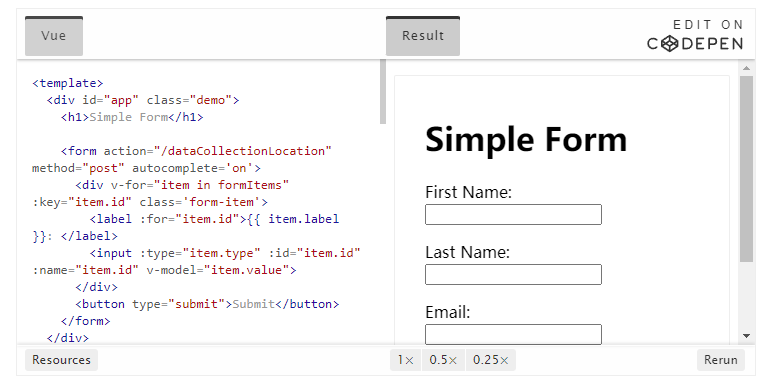
Note how to include autocomplete='on 'in the form element, which will be applied to all inputs in the form. You can also set different values for each input The value of the autocomplete property.
label
Provide labels to describe the purpose of all form controls; links for and id:
<label for="name">Name</label>
<input type="text" name="name" id="name" v-model="name" />
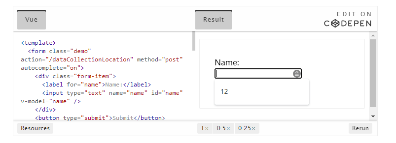
If you check this element in the chrome development tool and open the Accessibility tab in the Elements tab, you will see how the input gets its name from the tag:

Warning:
Although you may have seen the label of the package input field:
<label>
Name:
<input type="text" name="name" id="name" v-model="name" />
</label>
Assistive techniques can better support explicit labeling with matching IDs.
aria-label
You can also configure an input with aria-label The accessible name of the.
<label for="name">Name</label>
<input
  type="text"
  name="name"
  id="name"
  v-model="name"
  :aria-label="nameLabel"
/>
Feel free to check this element in Chrome DevTools to see how the accessible name has changed:

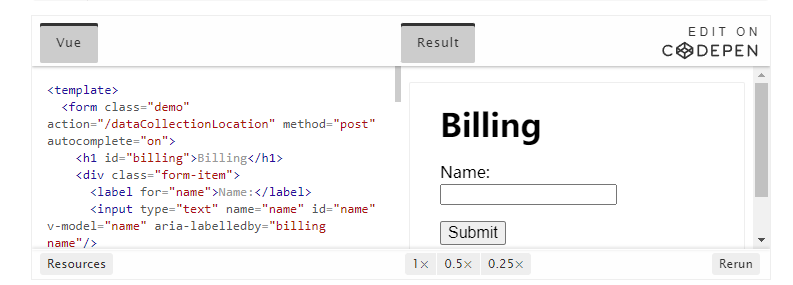
aria-labelledby
use aria-labelledby Similar to aria label, unless the label text is visible on the screen. It pairs with other elements through id, and you can link multiple IDS:
<form
  class="demo"
  action="/dataCollectionLocation"
  method="post"
  autocomplete="on"
>
  <h1 id="billing">Billing</h1>
  <div class="form-item">
    <label for="name">Name:</label>
    <input
      type="text"
      name="name"
      id="name"
      v-model="name"
      aria-labelledby="billing name"
    />
  </div>
  <button type="submit">Submit</button>
</form>

aria-describedby
aria-describedby The usage of is the same as aria labelledby. It provides a description containing additional information that users may need. This can be used to describe any input criteria:
<form
  class="demo"
  action="/dataCollectionLocation"
  method="post"
  autocomplete="on"
>
  <h1 id="billing">Billing</h1>
  <div class="form-item">
    <label for="name">Full Name:</label>
    <input
      type="text"
      name="name"
      id="name"
      v-model="name"
      aria-labelledby="billing name"
      aria-describedby="nameDescription"
    />
    <p id="nameDescription">Please provide first and last name.</p>
  </div>
  <button type="submit">Submit</button>
</form>
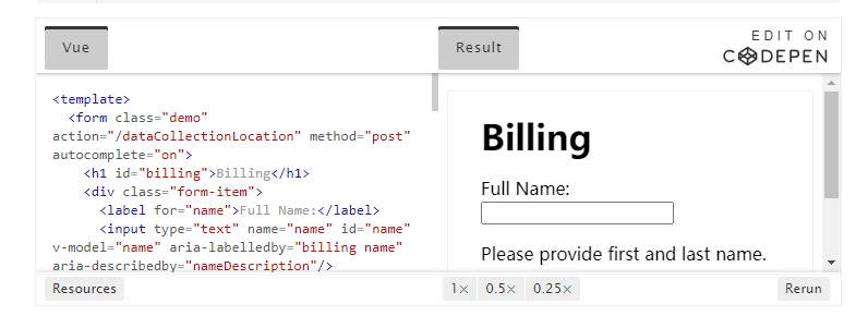
You can view the instructions by using the Chrome development tool:

placeholder
Avoid using placeholders because they can confuse many users.
One problem with placeholders is that they do not match by default Color contrast standard ; fixing the color contrast makes the placeholder look like pre populated data in the input field. Look at the following example to see that the placeholder for the last name that meets the color contrast criteria looks like pre populated data:

It is best to provide all the information the user needs to fill out the form in addition to any input.
Usage instructions
When adding a usage note to an input field, make sure it is correctly linked to the input. You can provide additional usage notes and aria-labelledby Bind multiple IDS ins id e. This makes the design more flexible.
<fieldset>
  <legend>Using aria-labelledby</legend>
  <label id="date-label" for="date">Current Date:</label>
  <input
    type="date"
    name="date"
    id="date"
    aria-labelledby="date-label date-instructions"
  />
  <p id="date-instructions">MM/DD/YYYY</p>
</fieldset>
Or, you can use aria-describedby Attach a usage note to the input.
<fieldset>
  <legend>Using aria-describedby</legend>
  <label id="dob" for="dob">Date of Birth:</label>
  <input type="date" name="dob" id="dob" aria-describedby="dob-instructions" />
  <p id="dob-instructions">MM/DD/YYYY</p>
</fieldset>

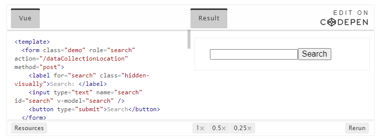
Hide content
In general, it is not recommended to hide the label visually even if the input has an accessible name. However, if we can understand the function of the input with the help of the surrounding content, we can hide the visual label.
Let's look at this search field:
<form role="search">
  <label for="search" class="hidden-visually">Search: </label>
  <input type="text" name="search" id="search" v-model="search" />
  <button type="submit">Search</button>
</form>
We can do this because the search button will help the visual user identify the purpose of the input field.
We can use CSS to visually hide elements, but keep them available for assistive technologies:
.hidden-visually {
  position: absolute;
  overflow: hidden;
  white-space: nowrap;
  margin: 0;
  padding: 0;
  height: 1px;
  width: 1px;
  clip: rect(0 0 0 0);
  clip-path: inset(100%);
}
aria-hidden="true"
Adding aria hidden="true" will hide the elements in assistive technology, but make them visually available to other users. Do not use it on focusable elements, but only for decorative, repetitive or off screen content.
<p>This is not hidden from screen readers.</p>
<p aria-hidden="true">This is hidden from screen readers.</p>
Button
When using buttons in a form, you must set the type to prevent the form from being submitted. You can also use the input create button:
<form action="/dataCollectionLocation" method="post" autocomplete="on">
  <!-- Buttons -->
  <button type="button">Cancel</button>
  <button type="submit">Submit</button>

  <!-- Input buttons -->
  <input type="button" value="Cancel" />
  <input type="submit" value="Submit" />
</form>

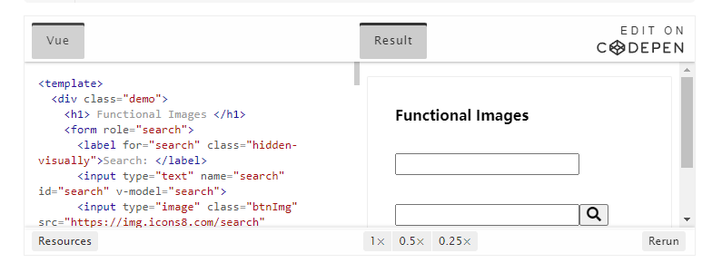
Functional image
You can use this technique to create feature images.
-
Input field
- These images will act as submit type buttons on the form
<form role="search"> <label for="search" class="hidden-visually">Search: </label> <input type="text" name="search" id="search" v-model="search" /> <input type="image" class="btnImg" src="https://img.icons8.com/search" alt="Search" /> </form> -
Icon
<form role="search">
  <label for="searchIcon" class="hidden-visually">Search: </label>
  <input type="text" name="searchIcon" id="searchIcon" v-model="searchIcon" />
  <button type="submit">
    <i class="fas fa-search" aria-hidden="true"></i>
    <span class="hidden-visually">Search</span>
  </button>
</form>
3. Standards
The World Wide Web Consortium (W3C) Web Accessibility Initiative (WAI) has developed web accessibility standards for different components:
- User agent accessibility Guide (UAAG)
- Web browser and media player, including some auxiliary technologies
- Authoring tools accessibility Guide (ATAG)
- Creative tools
- Web content accessibility Guide (WCAG)
- web content - used by developers, authoring tools, and accessibility assessment tools
Web content accessibility Guide (WCAG)
WCAG 2.1 stay WCAG 2.0 It is extended to accept new technologies in the process of Web evolution. The W3C encourages the use of the latest version of WCAG when developing or updating web accessibility policies.
WCAG 2.1 four guiding principles (POUR):
- Perceptibility
- The user must be able to perceive the rendered information
- Operability
- Form interface, controls and navigation are operable
- Comprehensibility
- The operation of information and user interface must be understood by all users
- Robustness
- With the progress of technology, users can access content with the help of auxiliary devices
Web Accessibility Initiative - accessible rich Internet Applications (WAI-ARIA)
W3C's WAI-ARIA provides guidance on how to build dynamic content and high-level user interface controls.
4. Resources
file
Auxiliary technology
test
- Automation tools
- Color tool
- Other auxiliary tools
user
The World Health Organization estimates that 15 per cent of the world's population suffers from some form of disability, of which about 2 - 4 per cent are severely disabled. It is estimated that there are 1 billion people in the world, making persons with disabilities the largest minority in the world.
There are many kinds of disabilities, which can be roughly divided into the following four categories:
- Visual -These users can benefit from using screen readers, screen magnification, controlling screen contrast or Braille display.
- Auditory -These users can benefit from subtitles, text records or sign language videos.
- Athletic -These users can from a range of Assistive technology for dyskinesia Benefits: speech recognition software, eye tracking, single switch access, head stick, sip and puff switches, oversized trackball mouse, adaptive keyboard or other auxiliary technologies.
- Cognitive -These users can benefit from complementary media, structured organization of content, and clear and simple writing.
Please view the following links from WebAim for users to understand: