When dealing with a set of data, the first thing you usually do is to understand the distribution of variables. This article will introduce some functions used to visualize single variables in seaborn.
#Import library

import numpy as np

import pandas as pd

import seaborn as sns

import matplotlib.pyplot as plt

from scipy import stats
sns.set(color_codes=True)
x = np.random.normal(size=100)
Univariate visualization
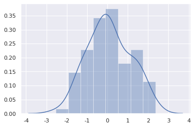
The most convenient way to see the univariate distribution in seaborn is the distplot() function. By default, histogram will be drawn and kernel density estimate (KDE) will be fitted.
sns.distplot(x)
<matplotlib.axes._subplots.AxesSubplot at 0x7fd493fa0390>
histogram
The histogram divides the data into bin(s), and then draws a bar to show the amount of data falling in each bin to represent the distribution of data.
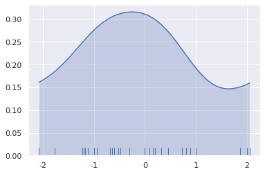
To illustrate this, you can delete the density curve and add a carpet map that draws a small vertical scale every time you observe. You can use the rugplot() function to make a carpet map, or you can use it in distplot().
sns.distplot(x, kde=False, rug=True)
<matplotlib.axes._subplots.AxesSubplot at 0x7fd49669ac50>

When drawing histograms, the main choices are the number of bins and where to place them. distplot() will automatically select parameters for you, but trying more or less bin may reveal other characteristics of the data.
sns.distplot(x, bins=20, kde=False, rug=True)
<matplotlib.axes._subplots.AxesSubplot at 0x7fd493a13b00>

Kernel density estimation
Kernel density estimation is a useful tool for drawing distribution shapes. Like a histogram, KDE displays the height on one axis according to the density of data on the other axis.
sns.distplot(x, hist=False, rug=True)
<matplotlib.axes._subplots.AxesSubplot at 0x7fd493eca898>

Compared with drawing histogram, drawing KDE requires more computation. Its calculation process is that each observation value is first replaced by a Gaussian curve centered on this value.
x = np.random.normal(0, 1, size=30)

bandwidth = 1.06 * x.std() * x.size ** (-1 / 5.)

support = np.linspace(-4, 4, 200)

kernels = []

for x_i in x:
    kernel = stats.norm(x_i, bandwidth).pdf(support)
    kernels.append(kernel)
    plt.plot(support, kernel, color="r")

sns.rugplot(x, color=".2", linewidth=3);

Next, sum these curves to calculate the density value for each point. The resulting curve is then normalized so that the area below it is equal to 1.
from scipy.integrate import trapz

density = np.sum(kernels, axis=0)

density /= trapz(density, support)

plt.plot(support, density)
[<matplotlib.lines.Line2D at 0x7fd3f272d978>]

If you use the kdeplot() function in seaborn, you can get the same curve. distplot() provides a more direct and convenient way to view data density estimates.
sns.kdeplot(x, shade=True)
<matplotlib.axes._subplots.AxesSubplot at 0x7fd493864eb8>

The bandwidth (bw) parameter of KDE controls the tightness between the estimated value and the data, which is very similar to the bin size in the histogram. It corresponds to the width of the kernel drawn above. The default values use general rules, but it may be helpful to try larger or smaller values.
sns.kdeplot(x)

sns.kdeplot(x, bw=.2, label="bw: 0.2")

sns.kdeplot(x, bw=2, label="bw: 2")

plt.legend()
<matplotlib.legend.Legend at 0x7fd3f2754080>

In the above figure, when bw=2, the estimation exceeds the maximum and minimum values in the dataset. You can control how far the limit value of the curve is drawn through the cut parameter. However, this only affects how the curve is drawn, not how it fits.
sns.kdeplot(x, shade=True, cut=0)

sns.rugplot(x)
<matplotlib.axes._subplots.AxesSubplot at 0x7fd493835ac8>
Fitting parameter distribution
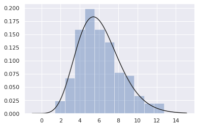
You can also use distplot() to fit the parameter distribution to the data set and visually evaluate its correspondence with the observed data.
x = np.random.gamma(6, size=200)

sns.distplot(x, kde=False, fit=stats.gamma)
<matplotlib.axes._subplots.AxesSubplot at 0x7fd3f08cb2e8>
Bivariate distribution visualization
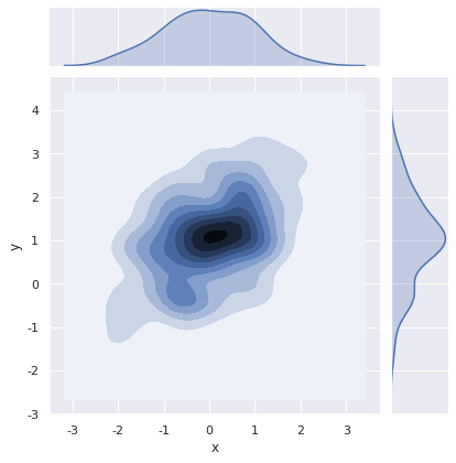
The method of visualizing bivariates in seaborn is the jointplot() function, which creates a multi panel graph that displays the bivariate (or joint) relationship between two variables and the univariate distribution of each variable at the same time.
mean, cov = [0, 1], [(1, .5), (.5, 1)]

data = np.random.multivariate_normal(mean, cov, 200)

df = pd.DataFrame(data, columns=["x", "y"])
Scatter diagram
The most common method for visualizing bivariate distribution is scatter diagram, which is similar to matplotlib plt.scatter.
sns.jointplot(x="x", y="y", data=df)
<seaborn.axisgrid.JointGrid at 0x7fd3f08a0a20>

Hexagonal graph
The bivariate histogram is called a "hexagon" diagram because it shows the observations falling in the hexagon box. The graph is suitable for relatively large data sets. It can be used through the matplotlib plt.hexbin function or as a style in jointplot().
x, y = np.random.multivariate_normal(mean, cov, 1000).T

sns.jointplot(x=x, y=y, kind="hex");

Kernel density estimation
Kernel density estimation can also be performed for bivariate.
sns.jointplot(x="x", y="y", data=df, kind="kde")
<seaborn.axisgrid.JointGrid at 0x7fd3f0523c18>
You can also use the kdeplot() function to draw a two-dimensional kernel density map, and draw the density map onto a specific (possibly existing) matplotlib
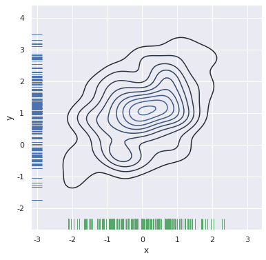
f, ax = plt.subplots(figsize=(6, 6))

sns.kdeplot(df.x, df.y, ax=ax)

sns.rugplot(df.x, color="g", ax=ax)

sns.rugplot(df.y, vertical=True, ax=ax)
<matplotlib.axes._subplots.AxesSubplot at 0x7fd3f069ada0>
If you want to display bivariate density more continuously, you can increase the number of contour levels
f, ax = plt.subplots(figsize=(6, 6))

cmap = sns.cubehelix_palette(as_cmap=True, dark=0, light=1, reverse=True)

sns.kdeplot(df.x, df.y, cmap=cmap, n_levels=60, shade=True)
<matplotlib.axes._subplots.AxesSubplot at 0x7fd3f0597fd0>

The jointplot() function uses JointGrid to manage graphics, and you can draw graphics directly using JointGrid. jointplot() returns the JointGrid object after drawing, which you can use to add more layers or adjust other properties of visualization.
g = sns.jointplot(x="x", y="y", data=df, kind="kde", color="m")

g.plot_joint(plt.scatter, c="w", s=30, linewidth=1, marker="+")

g.ax_joint.collections[0].set_alpha(0)

g.set_axis_labels("$X$", "$Y$")
<seaborn.axisgrid.JointGrid at 0x7fd3f01c92e8>
