Key points of data drawing 4 - problems of pie chart
This article lets us understand the most criticized chart type in history: pie chart.
Bad definition
A pie chart is a circle divided into several parts, each part representing a part of the whole. It is usually used to display percentages where the sum of sectors equals 100%. The problem is that humans are very bad at reading. In the adjacent pie chart, try to find the largest group and try to sort them by value. It may be difficult for you to do so, which is why you must avoid using pie charts. Let's try to compare three pie charts. Try to find out which group has the highest value among the three graphs. In addition, try to find out what the value evolution between groups is.
# Libraries
library(tidyverse)
library(hrbrthemes)
library(viridis)
library(patchwork)

# create 3 data frame
data1 <- data.frame( name=letters[1:5], value=c(17,18,20,22,24) )
data2 <- data.frame( name=letters[1:5], value=c(20,18,21,20,20) )
data3 <- data.frame( name=letters[1:5], value=c(24,23,21,19,18) )
# View data
data1
data2
data3
| name | value |
|---|---|
| <fct> | <dbl> |
| a | 17 |
| b | 18 |
| c | 20 |
| d | 22 |
| e | 24 |
| name | value |
|---|---|
| <fct> | <dbl> |
| a | 20 |
| b | 18 |
| c | 21 |
| d | 20 |
| e | 20 |
| name | value |
|---|---|
| <fct> | <dbl> |
| a | 24 |
| b | 23 |
| c | 21 |
| d | 19 |
| e | 18 |
# Define drawing functions
plot_pie <- function(data, vec){

ggplot(data, aes(x="name", y=value, fill=name)) +
  # The pie chart needs to draw a bar chart first
  geom_bar(width = 1, stat = "identity") +
  # Change to polar coordinate system
  coord_polar("y", start=0, direction = -1) +
  # Set fill color
  scale_fill_viridis(discrete = TRUE,  direction=-1) +
  # display text
  geom_text(aes(y = vec, label = rev(name), size=4, color=c( "white", rep("black", 4)))) +
  scale_color_manual(values=c("black", "white")) +
  theme(
    legend.position="none",
    plot.title = element_text(size=14),
    panel.grid = element_blank(),
    axis.text = element_blank()
  ) +
  xlab("") +
  ylab("")
}

a <- plot_pie(data1, c(10,35,55,75,93))
b <- plot_pie(data2, c(10,35,53,75,93))
c <- plot_pie(data3, c(10,29,50,75,93))
a + b + c

Now, let's use the bar graph barplot to represent exactly the same data:
# Define drawing functions
plot_bar  <- function(data){

ggplot(data, aes(x=name, y=value, fill=name)) +
  # Draw bar chart
  geom_bar(stat = "identity") +
  # Set fill color
  scale_fill_viridis(discrete = TRUE,  direction=-1) +
  scale_color_manual(values=c("black", "white")) +
  theme(
    legend.position="none",
    plot.title = element_text(size=14),
    panel.grid = element_blank(),
  ) +
  ylim(0,25) +
  xlab("") +
  ylab("")

}

a <- plot_bar (data1)
b <- plot_bar (data2)
c <- plot_bar (data3)
a + b + c

Let's talk about the reasons for using charts.
- Charts are a way to get information and make it easier to understand.
- In general, the purpose of charts is to make it easier to compare different data sets.
- Charts can convey as much information as possible without increasing complexity.
As you can see by comparing the pictures, the pie chart is difficult to visually show the differences between data, while the bar chart is just the opposite, which can clearly see the differences between different data. Pie charts can't compare different values, and they can't convey more information.
Solution
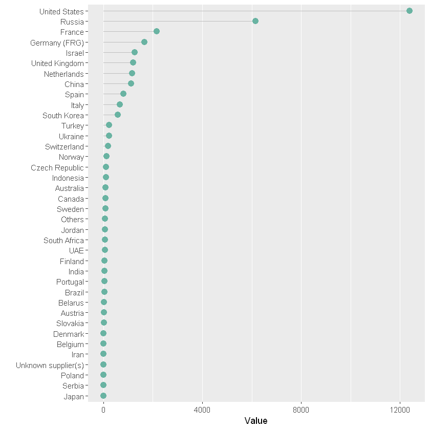
Bar chart and bar chart are the best alternatives to pie chart. If you have a lot of values to show, you can also consider a more elegant lollipop chart in my opinion. The following is an example of a display based on the number of important items sold in a few countries in the world:
# Load data from github
data <- read.table("https://raw.githubusercontent.com/holtzy/data_to_viz/master/Example_dataset/7_OneCatOneNum.csv", header=TRUE, sep=",")
# Clear null data
data <- filter(data,!is.na(Value))
nrow(data)
head(data)
# Arrange data
data<- arrange(data,Value)
# Convert Contry into a factor item to represent classified data
data<- mutate(data,Country=factor(Country, Country))
# mapping
ggplot(data,aes(x=Country, y=Value) ) +
# Define data axis
geom_segment( aes(x=Country ,xend=Country, y=0, yend=Value), color="grey") +
# Draw point
geom_point(size=3, color="#69b3a2") +
# x. Y-axis exchange
coord_flip() +
# set up themes
theme(
    # Set internal line to empty
    panel.grid.minor.y = element_blank(),
    panel.grid.major.y = element_blank(),
    legend.position="none"
) +
# The title of the original x-axis, that is, the y-axis in the image, is set to null
xlab("")
38
| Country | Value | |
|---|---|---|
| <fct> | <int> | |
| 1 | United States | 12394 |
| 2 | Russia | 6148 |
| 3 | Germany (FRG) | 1653 |
| 4 | France | 2162 |
| 5 | United Kingdom | 1214 |
| 6 | China | 1131 |
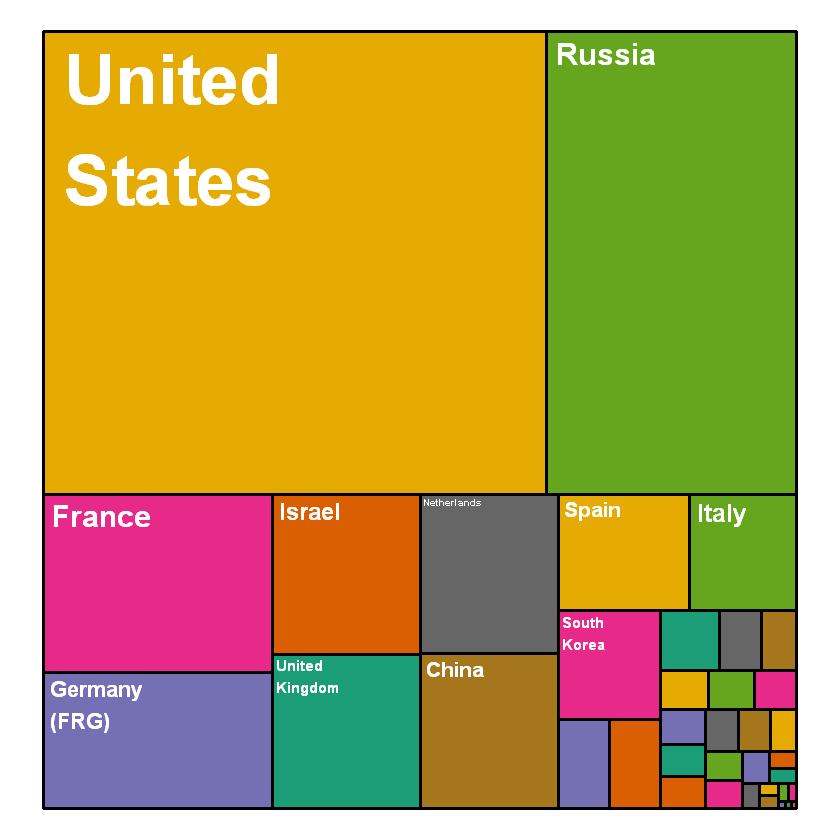
If your goal is to describe the composition of the whole, another possibility is to create a tree view.
# Package
# Import specialized packages
library(treemap)

# Plot plot
treemap(data,
        # data
        index="Country",
        vSize="Value",
        type="index",

        # Set color
        title="",
        palette="Dark2",

        # Border bounding box settings
        border.col=c("black"),
        # Bounding box lineweight
        border.lwds=3,

        # Labels sets the label color
        fontcolor.labels="white",
        # Set font
        fontface.labels=2,
        # Set label location
        align.labels=c("left", "top"),
        # The larger the setting area, the larger the label
        inflate.labels=T,
        # Set the display label level. The smaller the display label, the fewer labels will be displayed
        fontsize.labels=5
)