In our project, components are everywhere. Through the encapsulation of component functions, we can develop web pages like building blocks. Next, let's learn about Vue's componentization mechanism.
1, What is component development
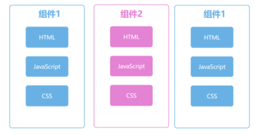
vue allows us to customize components and encapsulate a functional template in a. vue file. As shown in the following figure, we encapsulate the logic and style of each component, that is, JavaScript and CSS, so as to reuse the code of the whole component in the project.
vue has implemented the mechanism of componentization well. It only needs to master and learn the design concept of componentization in use on this basis. The mother of this is to achieve efficient code reuse. In subsequent project development, we will divide components into two types, one is general-purpose component and the other is business component.
General components are the component styles of major component libraries, including buttons, forms, pop ups and other general functions. Business components contain business interaction logic, including shopping cart, login and registration, which will be strongly bound to our different businesses.
Due to the consideration of code reusability, component development requires higher requirements than normal business development, and needs better maintainability and stability. To help understand the main points of designing components, select a simple component to expand.
The requirements are as follows: there is a rating requirement, that is, on the front-end page, the product can display a score of 1 to 5. Take this as an example to understand the design idea of components.
2, Render rating score
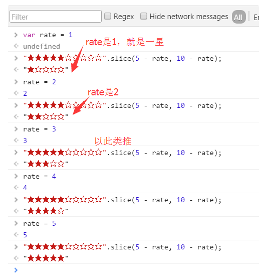
In fact, for rating requirements, you can use components. In this way, only one line of code is needed to realize the rating requirements. For example, if rate is an integer from 1 to 5, you can directly render the corresponding number of stars through slice method.
"★★★★★☆☆☆☆☆".slice(5 - rate, 10 - rate)
View the effect of this line of code and pass in the rating value rate. The code runs as follows. The stars represent the evaluation level, which is determined by the value of rate.
The content rendered by each component is not exactly the same, which is the first thing to confirm when writing components. Each component renders different content in different places in the project.
The component written here is to render different numbers of stars according to the value of rate. Enter the src/components directory, create a new Rate.vue, and then write the following code. Next, use defineProps to standardize the format of data transmission. Here, it is specified that the component will receive the externally transmitted value
Property, and can only be an array. Then, calculate the star of the score according to the value of value.
<template>
    <div>
        {{rate}}
    </div>
</template>

<script setup>
import { defineProps,computed } from 'vue';
let props = defineProps({
    value: Number
})
let rate = computed(()=>"★★★★★☆☆☆☆☆".slice(5 - props.value, 10 - props.value))
</script>>
The way to use the component is to use: value. Pass the score to the Rate component through the attribute, and three solid stars can be displayed on the page according to the score value. The following shows how to use the Rate component to display three stars.
<template>
<Rate :value="score"></Rate>
</template>

<script setup>
import {ref} from 'vue'
import Rate from './components/Rate1.vue'
let score = ref(3)
</script>
Display different contents according to the passed score value, or go further. Go back to the Rate.vue code and add the following codes, such as building some theme colors in the component and adding CSS content. In the following code, the Rate component receives a new attribute theme, and the default value is orange. Several theme colors are built in the Rate component. The color is calculated according to the passed theme, and rendered using: style.
<template>
    <div :style="fontstyle">
        {{rate}}
    </div>
</template>

<script setup>
import { defineProps,computed, } from 'vue';
let props = defineProps({
    value: Number,
    theme:{type:String,default:'orange'}
})
console.log(props)
let rate = computed(()=>"★★★★★☆☆☆☆☆".slice(5 - props.value, 10 - props.value))

const themeObj = {
  'black': '#00',
  'white': '#fff',
  'red': '#f5222d',
  'orange': '#fa541c',
  'yellow': '#fadb14',
  'green': '#73d13d',
  'blue': '#40a9ff',
}
const fontstyle = computed(()=> {
    return `color:${themeObj[props.theme]};`
})

</script>
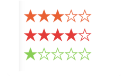
After completing the process shown in the above code, that is, rendering the star color through theme, you can use the following code to pass the two attributes of value and theme, and you can easily reuse components.
<Rate :value="3" ></Rate>
<Rate :value="4" theme="red"></Rate>
<Rate :value="1" theme="green"></Rate>
In the following figure, you can see the rendering results of the above three components:
3, Component events
The rating requirement is completed, but the rating component also needs to have the function of modifying the score. Therefore, it is necessary to make the stars of the component clickable, and whether the clicked score value can be passed to the parent component.
In vue, we use emit to pass events externally, so that the element can listen for changes inside the Rate component. Now we modify the Rate component. First, because the stars are ordinary text, there is no way to bind the click event alone. Therefore, to transform the template, each star is wrapped with span, and the width attribute is used to control the width, which supports the score display of decimals.
Go back to the Rate.vue component, add the following code, wrap ★ and ☆ with span, and bind the mouseover event of the mouse. Then, through: style, you can set the width of the solid five pointed star ★ to achieve the same rating effect.
<template>
<div :style="fontstyle">
    <div class='rate' @mouseout="mouseOut">
      <span @mouseover="mouseOver(num)"  v-for='num in 5' :key="num">☆</span>
      <span class='hollow' :style="fontwidth">
        <span @mouseover="mouseOver(num)" v-for='num in 5' :key="num">★</span>
      </span>
    </div>
</div>
</template>
<script setup>
// ... other codes
// Scoring width
let width = ref(props.value)
function mouseOver(i){
    width.value = i
}
function mouseOut(){
    width.value = props.value
}
const fontwidth = computed(()=>`width:${width.value}em;`)
</script>
<style scoped>
.rate{
  position:relative;
  display: inline-block;
}
.rate > span.hollow {
  position:absolute;
  display: inline-block;
  top:0;
  left:0;
  width:0;
  overflow:hidden;
}
</style>
Because the stars are now displayed by width, it can also support the decimal rating of 3.5 points, and select different scores when the mouse is over. As follows, you can use the Rate component.
<Rate :value="3.5"></Rate>
The effect is as follows:

Then, when you click the five pointed star to select a score, you can pass the current score to the parent component. In Vue3, use defineEmit to define the data of external "launch", which can be triggered when you click scoring. The following defineEmit code shows that after clicking the score, the score data num is "emitted" to the parent element.
<template>
  Omit code
   <span @click="onRate(num)" @mouseover="mouseOver(num)" v-for='num in 5' :key="num">★</span>

</template>
<script setup>
import { defineProps, defineEmits,computed, ref} from 'vue';

let emits = defineEmits('[update-rate]') // Define emits
function onRate(num){
    emits('update-rate',num)
}
</script>
In the following code, we use @ update Rate to receive the data of Rate component emit and modify the value of score, so as to complete the update after data modification.
<template>

<h1>What's your score {{score}}</h1>
<Rate :value="score" @update-rate="update"></Rate>

</template>

<script setup>
import {ref} from 'vue'
import Rate from './components/Rate1.vue'
let score = ref(3.5)
function update(num){
    score.value = num
}

</script>
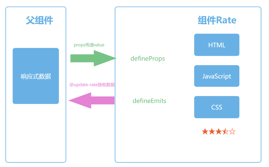
Now the schematic diagram of the component is as follows. The format of data transmission is defined through defineProps, and the listening function is defined through definemits. Finally, the synchronization between the component and external data is realized.
4, v-model of component
The requirement of bidirectional data synchronization in the Rate component above is very common in the form field. This requirement is achieved by using the v-model attribute on the input tag. We can also use v-model for custom components. For custom components, v-model is two grammars, that is, the abbreviation of incoming attributes and receiving data and passed by components.
In the following code, we first modify the property name to modelValue, and then if we want to click the rating on the front page, we only need to send a notification through the emit event update:modelValue.
let props = defineProps({
	modelValue: Number,
	theme:{type:String,default:'orange'}
})
let emits = defineEmits(['update:modelValue'])
Then, use the Rate component as shown in the following code, that is, directly bind the score variable with v-model. In this way, you can achieve the effect of value and onRate attributes.
<template>

<h1>What's your score {{score}}</h1>
<Rate v-model="score"></Rate>
</template>
5, Slot
Similar to the use of HTML tags, it is often necessary to pass content to components. As in the following code, click is not an attribute of the button tag, but a child element. The button tag will render the child element in the middle.
<button> click </button>
The Rate component is similar. The slot component is directly used in vue to display the sub elements of the component, that is, the so-called slot. In the following code, the sub elements of the Rate component are rendered using the component.
<template>
<div :style="fontstyle">
	<slot></slot>
	<div class="rate" @mouseout="mouseOut">
		<span @mouseover="mouseOver(num)" v-for="num in 5" :key="num">☆</span>
		<span class="hollow" :style="fontwidth">
			<span @click="onRate(num)" @mouseover="mouseOver(num)" v-for="num in 5" :key="num">☆</span>
		</span>
	</div>
</div>
</template>
Now when using Rate components, the child elements of the components will be placed before the rating components. In addition to text, you can also pass other components or html tags. The following code shows the results. The first Rate component displays the course score, and the second Rate component displays a picture in front of it.
<Rate v-model="score">Course scoring</Rate>
<Rate v-model="score">
    <img width="14" src="/favicon.ico">
</Rate>
Summary:
First, we use the props attribute to determine the number of stars displayed by passing the value attribute, which is also the first consideration when designing components. The first thing to implement a component library is to render the content through the props attribute. In the Rate component, we can render and display several stars according to the value attribute.
Then, in order to enable users to click and score, we optimized the display method. Each ★ is wrapped with a span tag, and bound with mouseover and mouseout events to display the mouse over style. Finally, on the click event of the ★ tag, we notify the external event to inform the parent component of the change of data.
For this notification mechanism, we use the method defined by defineEmits, which is also an important data exchange mechanism in Vue components. emits cooperates with props, so that when we use a component, we can transfer data to the component, and we can also monitor the changes of internal data of the component. Finally, by standardizing the names of props and emit, we can use v-model directly on the customized components.
Reference blog:
Playing with Vue3 family bucket – Mahatma