Little friends who have done visualization will often hear seaborn visualization, and there are many visualization libraries used by big guys. Today we'll take him and see how real he is. Here, in order to facilitate you to practice later, all display data can be downloaded from the official website. Like this article, like support, welcome to collect and learn
Note: technical exchange group is provided at the end of the text.
Seaborn, a Python visualization library, is based on matplotlib and provides a high-level interface for drawing attractive statistical graphics.
Seaborn is to make difficult things easier. It is aimed at statistical mapping. Generally speaking, it can meet 90% of the mapping needs of data analysis. Seaborn is actually a higher-level API package based on matplotlib, which makes drawing easier. In most cases, Seaborn can make attractive drawings. Seaborn should be regarded as a supplement to matplotlib rather than a substitute. At the same time, it is highly compatible with numpy and pandas data structures, scipy and stats models.
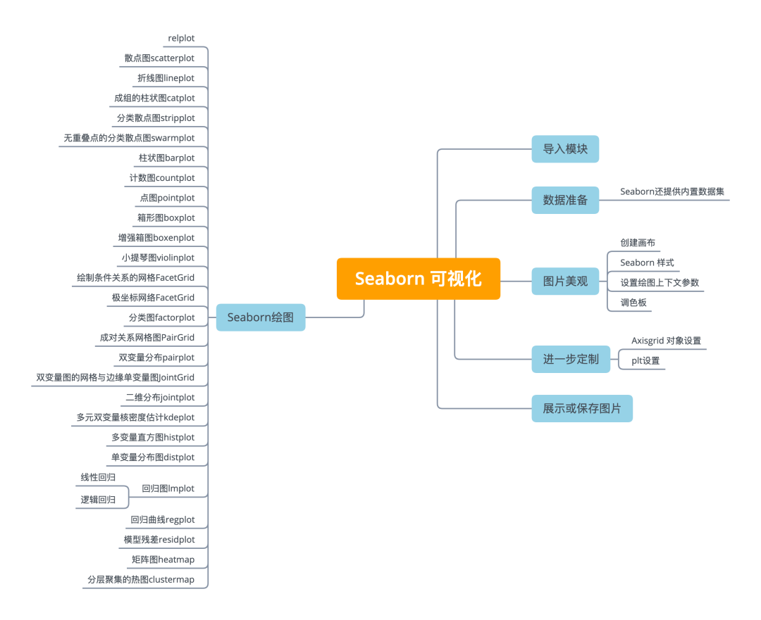
seaborn has 5 categories and 21 kinds of graphs, respectively:
- Relational plots relational class diagram
-
The relaplot relational graph interface is actually the integration of the following two graphs. The following two graphs can be drawn by specifying the kind parameter
-
scatterplot
-
lineplot line chart
- The interface of category plots classification chart is actually the integration of the following eight charts. The following eight charts can be drawn by specifying the kind parameter
-
stripplot classification scatter diagram
-
Swarm plot can display the classified scatter diagram of distribution density
-
boxplot diagram
-
violinplot violin diagram
-
boxenplot enhancement box diagram
-
pointplot
-
Bar plot
-
Countlot count chart
- Distribution plot
-
Join plot bivariate graph
-
pairplot variable relationship group diagram
-
distplot histogram, quality estimation diagram
-
kdeplot kernel density estimation diagram
-
rugplot plots the data points in the array as data on the axis
- Regression plots
-
lmplot regression model diagram
-
regplot linear regression diagram
-
residplot linear regression residual diagram
- Matrix plots
-
Heat map
-
clustermap aggregation graph
Import module
Use the following alias to import and store:
import matplotlib.pyplot as plt
import seaborn as sns
The basic steps to create a drawing using Seaborn are:
-
Prepare some data
-
Beautiful control diagram
-
Seaborn mapping
-
Further customize your graphics
-
Display graphics
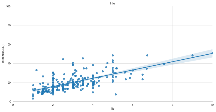
import matplotlib.pyplot as plt
import seaborn as sns
tips = sns.load_dataset("tips")    # Step 1
sns.set_style("whitegrid")         # Step 2
g = sns.lmplot(x="tip",            # Step 3
               y="total_bill",
               data=tips,
               aspect=2)
g = (g.set_axis_labels("Tip","Total bill(USD)") \
    .set(xlim=(0,10),ylim=(0,100)))
plt.title("title")                 # Step 4
plt.show(g)
To display graphics in the NoteBook, use the magic function:
%matplotlib inline
Data preparation
import pandas as pd
import numpy as np
uniform_data = np.random.rand(10, 12)
data = pd.DataFrame({'x':np.arange(1,101),'y':np.random.normal(0,4,100)})
Seaborn also provides built-in data sets
# Load directly and pull data from the Internet
titanic = sns.load_dataset("titanic")
iris = sns.load_dataset("iris")
# If the download is slow or the load fails, you can download to the local and then load the local path
titanic = sns.load_dataset('titanic',data_home='seaborn-data',cache=True)
iris = sns.load_dataset("iris",data_home='seaborn-data',cache=True)
Download address: https://github.com/mwaskom/seaborn-data
Beautiful picture
Create canvas
# Create canvas and a sub graph
f, ax = plt.subplots(figsize=(5,6))
Seaborn style
sns.set()   #(RE) set the default value of seaborn
sns.set_style("whitegrid")    #Set the matplotlib parameter
sns.set_style("ticks",        #Set the matplotlib parameter
             {"xtick.major.size": 8,
              "ytick.major.size": 8})
sns.axes_style("whitegrid")   #Return a dictionary of parameters, or use with to set the style temporarily
Setting drawing context parameters
sns.set_context("talk")        # Set the context to "talk"

sns.set_context("notebook",   # Set the context to "notebook", scale font elements and override parameter mapping
                font_scale=1.5, rc={"lines.linewidth":2.5})
palette
sns.set_palette("husl",3) # Define palette
sns.color_palette("husl") # Using with to use the temporary settings palette

flatui = ["#9b59b6","#3498db","#95a5a6",
          "#e74c3c","#34495e","#2ecc71"]
sns.set_palette(flatui)  # custom palette
Axisgrid object settings
g.despine(left=True)      # Hide left line
g.set_ylabels("Survived") # Label the y axis
g.set_xticklabels(rotation=45)      # Set scale label for x
g.set_axis_labels("Survived","Sex") # Set axis label
h.set(xlim=(0,5),         # Sets the limits and scales for the x and y axes
      ylim=(0,5),
      xticks=[0,2.5,5],
      yticks=[0,2.5,5])
plt settings
plt.title("A Title")    # Add diagram title
plt.ylabel("Survived")  # Adjust y-axis label
plt.xlabel("Sex")       # Adjust the label for the x-axis
plt.ylim(0,100)         # Adjust the upper and lower limits of the y-axis
plt.xlim(0,10)          # Adjust the x-axis limit
plt.setp(ax,yticks=[0,5]) # Adjust drawing properties
plt.tight_layout()      # Minor plot adjustment parameters
Show or save pictures
plt.show()
plt.savefig("foo.png")
plt.savefig("foo.png",   # Save transparent picture
            transparent=True)

plt.cla()   # Clear axis
plt.clf()   # Clear entire picture
plt.close() # close window
Seaborn mapping
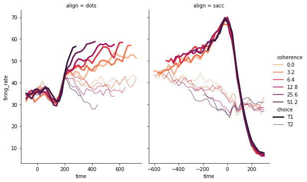
relplot
This is a graph level function, which uses two common means, scatter diagram and line diagram, to represent statistical relations. hue, col classification basis, size will generate variable grouping of elements of different sizes, aspect aspect ratio, legend_full each group has entries.
dots = sns.load_dataset('dots',
            data_home='seaborn-data',
            cache=True)
# Define a palette as a list to specify precise values
palette = sns.color_palette("rocket_r")

# Draw lines on the two sections
sns.relplot(
    data=dots,
    x="time", y="firing_rate",
    hue="coherence", size="choice",
    col="align", kind="line",
    size_order=["T1", "T2"], palette=palette,
    height=5, aspect=.75,
    facet_kws=dict(sharex=False),
)
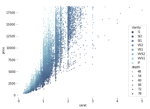
Scatter plot
diamonds = sns.load_dataset('diamonds',data_home='seaborn-data',cache=True)

# Draw a scatter chart, specifying different point colors and sizes
f, ax = plt.subplots(figsize=(8, 6))
sns.despine(f, left=True, bottom=True)
clarity_ranking = ["I1", "SI2", "SI1", "VS2", "VS1", "VVS2", "VVS1", "IF"]
sns.scatterplot(x="carat", y="price",
                hue="clarity", size="depth",
                palette="ch:r=-.2,d=.3_r",
                hue_order=clarity_ranking,
                sizes=(1, 8), linewidth=0,
                data=diamonds, ax=ax)
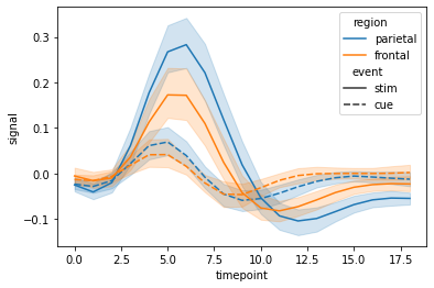
Line plot
The data passed by the lineplot function in seaborn must be a pandas array.
fmri = sns.load_dataset('fmri',data_home='seaborn-data',cache=True)
# Mapping responses to different events and regions
sns.lineplot(x="timepoint", y="signal",
             hue="region", style="event",
             data=fmri)
Group histogram catplot
The interface of classification chart can draw the following eight kinds of charts by specifying the kind parameter
stripplot classification scatter diagram
Swarm plot can display the classified scatter diagram of distribution density
boxplot diagram
violinplot violin diagram
boxenplot enhancement box diagram
pointplot
Bar plot
Countlot count chart
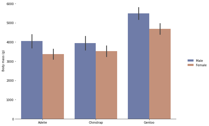
penguins = sns.load_dataset('penguins',data_home='seaborn-data',cache=True)
# Draw a nested leader chart by species and gender
g = sns.catplot(
    data=penguins, kind="bar",
    x="species", y="body_mass_g", hue="sex",
    ci="sd", palette="dark", alpha=.6, height=6)
g.despine(left=True)
g.set_axis_labels("", "Body mass (g)")
g.legend.set_title("")
g.fig.set_size_inches(10,6) # Set canvas size
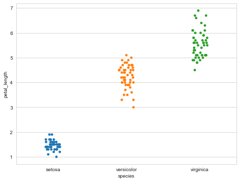
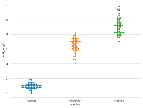
Classified scatter plot
sns.stripplot(x="species",
              y="petal_length",
              data=iris)
Classified scatter graph swarm plot without overlapping points
It can display the classified scatter diagram of distribution density.
sns.swarmplot(x="species",
              y="petal_length",
              data=iris)
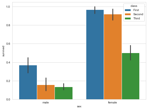
Bar plot
Scatter symbols are used to display point estimates and confidence intervals.
sns.barplot(x="sex",
            y="survived",
            hue="class",
            data=titanic)
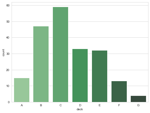
Count plot
# Displays the number of observations
sns.countplot(x="deck",
              data=titanic,
              palette="Greens_d")
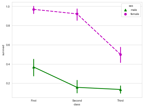
pointplot
Rectangular bars are used to display point estimates and confidence intervals.
The plot represents the central trend estimation of the numerical variable at the position of the scatter plot, and uses error bars to provide some indication of the uncertainty of the estimation. Point charts may be more useful than bar charts to focus on comparisons between different levels of one or more classification variables. They are especially good at showing interaction: how the relationship between the levels of one classification variable changes between the levels of the second classification variable. The line connecting each point from the same tone level allows the interaction to be judged by the difference in slope, which is easier than the height of several groups of points or bars.
sns.pointplot(x="class",
              y="survived",
              hue="sex",
              data=titanic,
              palette={"male":"g", "female":"m"},
              markers=["^","o"],
              linestyles=["-","--"])
boxplot
Box plot, also known as box whisker chart, box chart or box line chart, is a statistical chart used to display a group of data dispersion. It can display the maximum, minimum, median and upper and lower quartiles of a set of data.
sns.boxplot(x="alive",
            y="age",
            hue="adult_male", # hue classification basis
            data=titanic)
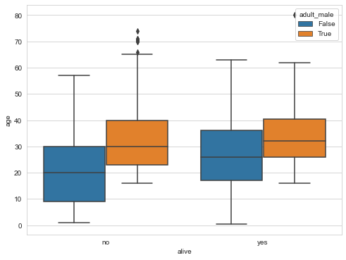
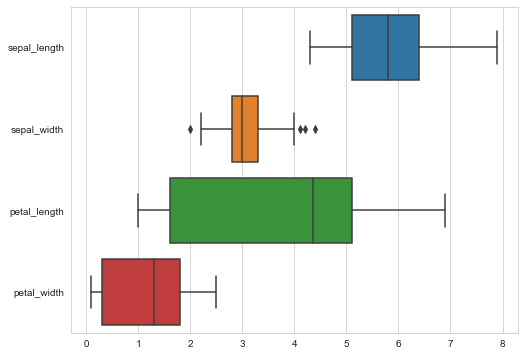
# Draw wide table data box diagram
sns.boxplot(data=iris,orient="h")
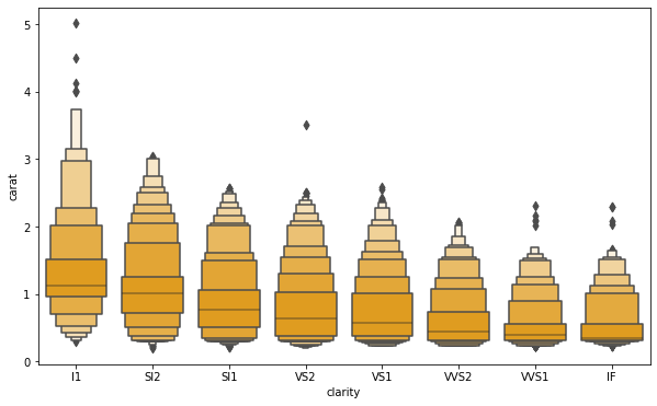
Enhanced boxplot
Boxplot is an enhanced box plot for larger data sets. This style of plot was originally named "confidence map" because it shows a large number of quantiles defined as "confidence intervals". It is similar to drawing a box diagram of nonparametric representation of distribution, in which all features correspond to the actually observed numerical points. By plotting more quantiles, it provides more information about the shape of the distribution, especially the distribution of tail data.
clarity_ranking = ["I1", "SI2", "SI1", "VS2", "VS1", "VVS2", "VVS1", "IF"]
f, ax = plt.subplots(figsize=(10, 6))
sns.boxenplot(x="clarity", y="carat",
              color="orange", order=clarity_ranking,
              scale="linear", data=diamonds,ax=ax)
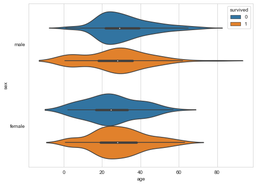
violinplot
violinplot and boxplot play a similar role. It shows the distribution of quantitative data at multiple levels of one (or more) classification variables, which can be compared. Unlike all drawing components in the box diagram correspond to actual data points, violin drawing is characterized by kernel density estimation of basic distribution.
sns.violinplot(x="age",
               y="sex",
               hue="survived",
               data=titanic)
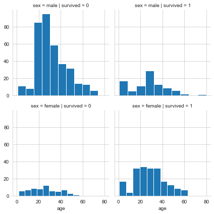
FacetGrid for drawing conditional relationships
FacetGrid is an interface for drawing multiple charts (displayed in grid form).
g = sns.FacetGrid(titanic,
                  col="survived",
                  row="sex")
g = g.map(plt.hist,"age")
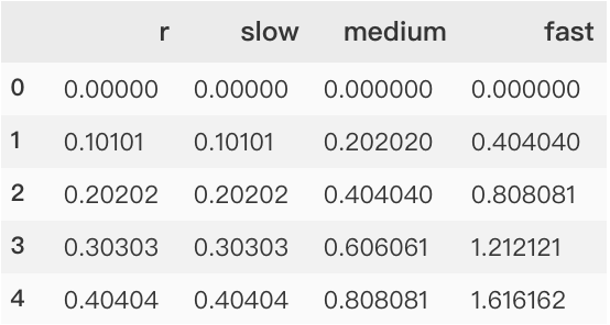
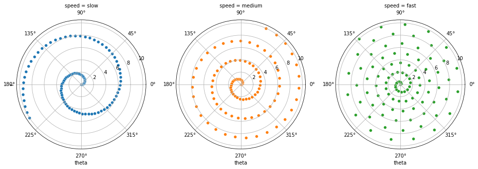
Polar coordinate network FacetGrid
# Generate an example radial data set
r = np.linspace(0, 10, num=100)
df = pd.DataFrame({'r': r, 'slow': r, 'medium': 2 * r, 'fast': 4 * r})

# Convert dataframe to long format or "neat" format
df = pd.melt(df, id_vars=['r'], var_name='speed', value_name='theta')

# A coordinate axis grid is established by polar projection
g = sns.FacetGrid(df, col="speed", hue="speed",
                  subplot_kws=dict(projection='polar'), height=4.5,
                  sharex=False, sharey=False, despine=False)

# Draw a scatter plot on each axis of the grid
g.map(sns.scatterplot, "theta", "r")
The process of converting a dataframe to long or "neat" format
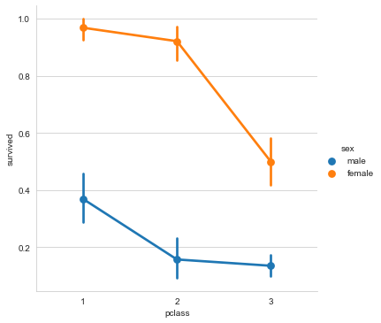
Classification diagram factorplot
# Draw a classification diagram on the Facetgrid
sns.factorplot(x="pclass",
               y="survived",
               hue="sex",
               data=titanic)
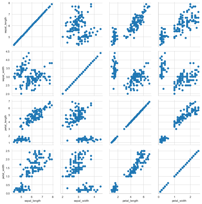
PairGrid graph
h = sns.PairGrid(iris)    # Plot a Subplot grid of pairwise relationships
h = h.map(plt.scatter)
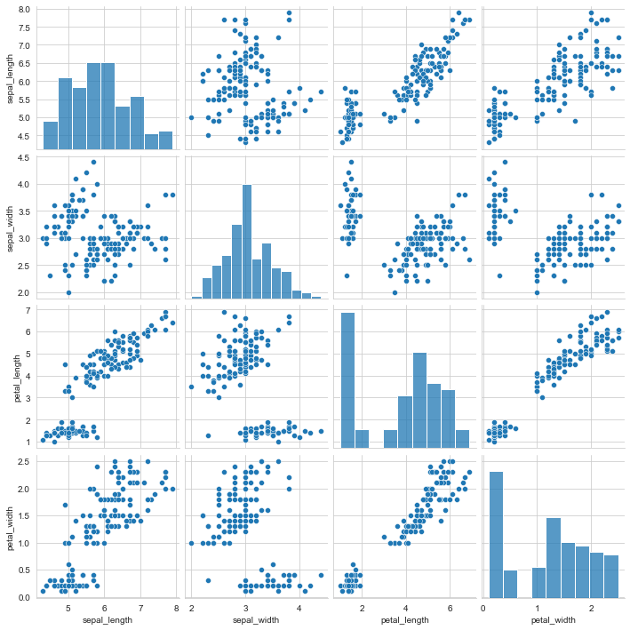
Bivariate distribution pairplot
Variable relationship group diagram.
sns.pairplot(iris) # Plot bivariate distribution
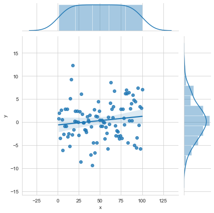
Grid and edge of bivariate graph JointGrid
i = sns.JointGrid(x="x",  # Grid and edge univariate graph of bivariate graph
                  y="y",
                  data=data)
i = i.plot(sns.regplot,
           sns.distplot)
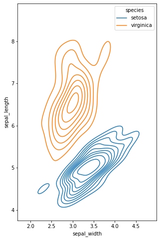
2D distribution jointplot
For the drawing of two variables, it is often useful to visualize the joint distribution of two variables. In seaborn, the simplest implementation is to use the jointplot function, which will generate multiple panels, showing not only the relationship between the two variables, but also the distribution of each variable on the two coordinate axes.
sns.jointplot("sepal_length",  # Draw 2D distribution
              "sepal_width",
              data=iris,
              kind='kde' # kind= "hex" is the histogram displayed on two coordinate axes
             )
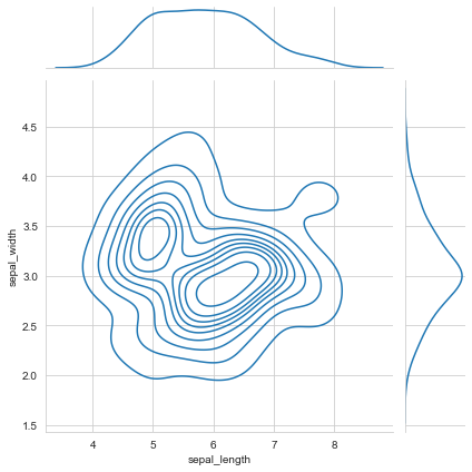
Multivariate bivariate kernel density estimation kdeplot
Kernel density estimation is used to estimate the unknown density function in probability theory. It is one of the nonparametric test methods. Through the kernel density estimation diagram, we can intuitively see the distribution characteristics of the data samples themselves.
f, ax = plt.subplots(figsize=(8, 8))
ax.set_aspect("equal")

# Plot contour plots to represent each binary density
sns.kdeplot(
    data=iris.query("species != 'versicolor'"),
    x="sepal_width",
    y="sepal_length",
    hue="species",
    thresh=.1,)
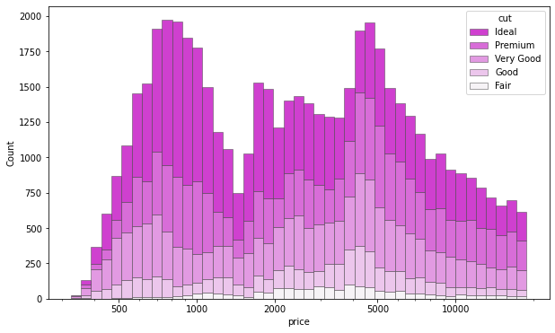
Multivariate histogram histplot
Draw a univariate or bivariate histogram to show the distribution of the data set.
Histogram is a typical visualization tool, which represents the distribution of one or more variables by calculating the number of observations in the discrete box. This function can normalize the statistics calculated in each box to estimate the frequency, density or probability quality, and can add a smooth curve obtained using kernel density estimation, similar to kdeplot().
f, ax = plt.subplots(figsize=(10, 6))
sns.histplot(
    diamonds,
    x="price", hue="cut",
    multiple="stack",
    palette="light:m_r",
    edgecolor=".3",
    linewidth=.5,
    log_scale=True,
)
ax.xaxis.set_major_formatter(mpl.ticker.ScalarFormatter())
ax.set_xticks([500, 1000, 2000, 5000, 10000])
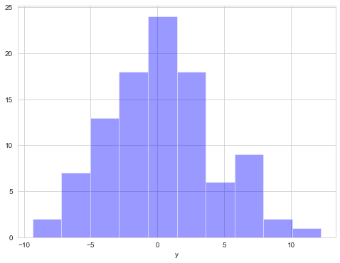
Univariate distribution diagram distplot
In seaborn, the most convenient way to quickly understand the univariate distribution is to use distplot function. By default, it will draw a histogram and draw kernel density estimation (KDE) at the same time.
plot = sns.distplot(data.y,
                    kde=False,
                    color='b')
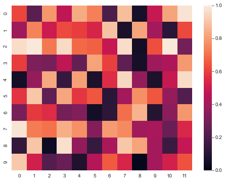
Matrix heatmap
Using the thermodynamic diagram, we can see the similarity of multiple features in the data table.
sns.heatmap(uniform_data,vmin=0,vmax=1)
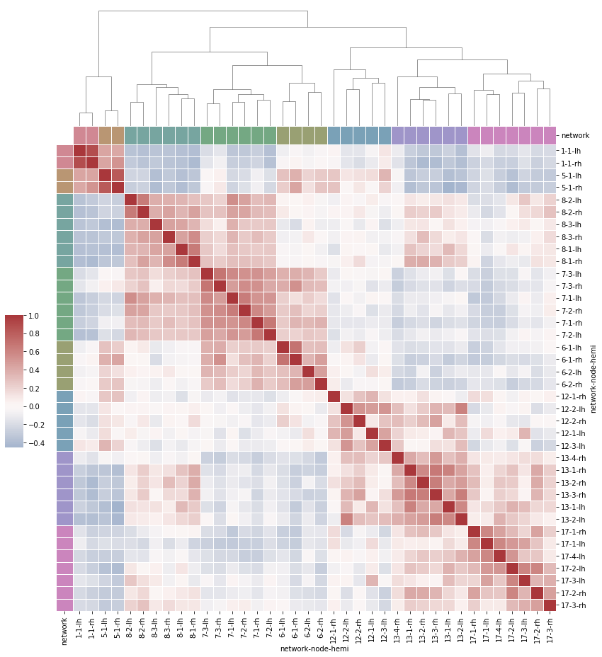
Hierarchical aggregation heat map clustermap
# Load the brain networks example dataset
df = sns.load_dataset("brain_networks", header=[0, 1, 2], index_col=0,data_home='seaborn-data',cache=True)

# Select a subset of networks
used_networks = [1, 5, 6, 7, 8, 12, 13, 17]
used_columns = (df.columns.get_level_values("network")
                          .astype(int)
                          .isin(used_networks))
df = df.loc[:, used_columns]

# Create a classification palette to identify networks
network_pal = sns.husl_palette(8, s=.45)
network_lut = dict(zip(map(str, used_networks), network_pal))

# Convert the palette to a vector that will be drawn on the edge of the matrix
networks = df.columns.get_level_values("network")
network_colors = pd.Series(networks, index=df.columns).map(network_lut)

# Draw a complete diagram
g = sns.clustermap(df.corr(), center=0, cmap="vlag",
                   row_colors=network_colors, col_colors=network_colors,
                   dendrogram_ratio=(.1, .2),
                   cbar_pos=(.02, .32, .03, .2),
                   linewidths=.75, figsize=(12, 13))

g.ax_row_dendrogram.remove()
Technical exchange
Welcome to reprint, collect, gain, praise and support!

At present, a technical exchange group has been opened, with more than 2000 group friends. The best way to add notes is: source + Interest direction, which is convenient to find like-minded friends
- Method ① send the following pictures to wechat, long press identification, and the background replies: add group;
- Mode ②. Add micro signal: dkl88191, remarks: from CSDN
- WeChat search official account: Python learning and data mining, background reply: add group