preface
In the blind date source code, the elements of the list are consistent with the contents of the details. At this time, using Hero animation to switch to the details will feel a seamless transition and the user experience will be better.
thinking
The above effect is that the list and details share the background color of the avatar and avatar. The combination of the two is a Stack component, so you can use the Hero component. Then there is the movement of Hero components. We first move horizontally and then move vertically, so that the transition experience will be better. This can be completed with our custom RectTween. The following is the implementation process of our various parts.
List element
For the list element, we define a HeroListItem class. The whole list element needs to click to enter the details and wrap it with GestureDetector. Then, the Row component is used to complete the horizontal layout, while the avatar part uses the Stack component. The build method of HeroListItem is as follows:
Widget build(BuildContext context) {
  return GestureDetector(
    child: Container(
      padding: EdgeInsets.fromLTRB(0, 10.0, 10.0, 10.0),
      child: Row(
        children: [
          Hero(
            tag: heroTag,
            createRectTween: (begin, end) {
              return ListToDetailRectTween(
                begin: begin!,
                end: end!,
              );
            },
            child: ListImage(
              assetImageName: assetImageName,
              imageBgColor: imageBgColor,
            ),
          ),
          SizedBox(
            width: 10.0,
          ),
          Expanded(
            child: Text(
              content,
              style: TextStyle(
                color: Colors.black87,
                fontSize: 18.0,
              ),
              maxLines: 2,
            ),
          ),
        ],
      ),
    ),
    onTap: () {
      Navigator.of(context).push(
        MaterialPageRoute(
          fullscreenDialog: true,
          builder: (context) => ListDetail(
            heroTag: heroTag,
            imageBgColor: imageBgColor,
            assetImageName: assetImageName,
          ),
        ),
      );
    },
  );
}
Because the avatar involves the border arc processing of the background, a ListImage component is extracted separately. The whole avatar is a Stack component, and the arc on the right of the background Container at the bottom is completed through BoxDecoration. The later OvalImage is a circular Image packaging class. In fact, it's OK to wrap the Image component with ClipOval. There's no code here.
Widget build(BuildContext context) {
  return Stack(
    children: [
      Container(
        height: 90.0,
        width: 110,
        decoration: BoxDecoration(
          color: imageBgColor,
          borderRadius: BorderRadius.only(
            topRight: Radius.circular(45.0),
            bottomRight: Radius.circular(45.0),
          ),
        ),
      ),
      Positioned(
        child: OvalImage(
          assetImageName: assetImageName,
          imageSize: 90.0,
        ),
        left: 20.0,
        top: 0.0,
      )
    ],
  );
}
The key to the list is to wrap the avatar area with Hero, and then use createRectTween to define the Hero flight path.
Details page
The details page is a full screen pop-up, so you need to complete the operation of the return button yourself. In fact, there is a Stack component at the top of the detail page. The background color of the component remains the same as the picture and list, and then add the close button and detail title to the Stack component. In order to keep the top of the page covering the status bar, the CustomScrollView implementation is used. In the top interface, we define a ListDetailHeader component, and the code is as follows.
class ListDetailHeader extends StatelessWidget {
  final heroTag;
  final imageBgColor;
  final assetImageName;
  const ListDetailHeader({
    Key? key,
    required this.heroTag,
    required this.imageBgColor,
    required this.assetImageName,
  }) : super(key: key);

  @override
  Widget build(BuildContext context) {
    return Hero(
      child: Stack(
        children: [
          Container(
            height: 160.0,
            width: double.infinity,
            decoration: BoxDecoration(
              color: imageBgColor,
            ),
          ),
          Positioned(
            child: Material(
              child: IconButton(
                icon: Icon(
                  Icons.close,
                  color: Colors.white,
                ),
                onPressed: () {
                  Navigator.of(context).pop();
                },
              ),
              color: Colors.transparent,
            ),
            left: 10.0,
            top: 50.0,
            height: 40.0,
          ),
          Positioned(
            child: OvalImage(
              assetImageName: assetImageName,
              imageSize: 90.0,
            ),
            right: 20.0,
            top: 50.0,
          ),
          Positioned(
            child: Material(
              color: Colors.transparent,
              child: Text(
                'Here are the details',
                style: TextStyle(
                  color: Colors.white,
                  fontSize: 18.0,
                ),
                maxLines: 1,
              ),
            ),
            left: 20,
            top: 100,
          ),
        ],
      ),
      tag: heroTag,
      createRectTween: (begin, end) {
        return ListToDetailRectTween(
          begin: begin!,
          end: end!,
        );
      },
    );
  }
}
There's nothing special here, but one problem I encountered at the beginning is that there are two underscores under the Text, and the style is wrong. Later, baidu found that when using fullscreenDialog, it actually uses Apple style pages. To maintain the Material style, you need to use Scaffold or use Material components. Therefore, a Material component is added to the Text component. The background color of the Material component itself is white. In order not to affect the background color of the component, its background color needs to be set to transparent.
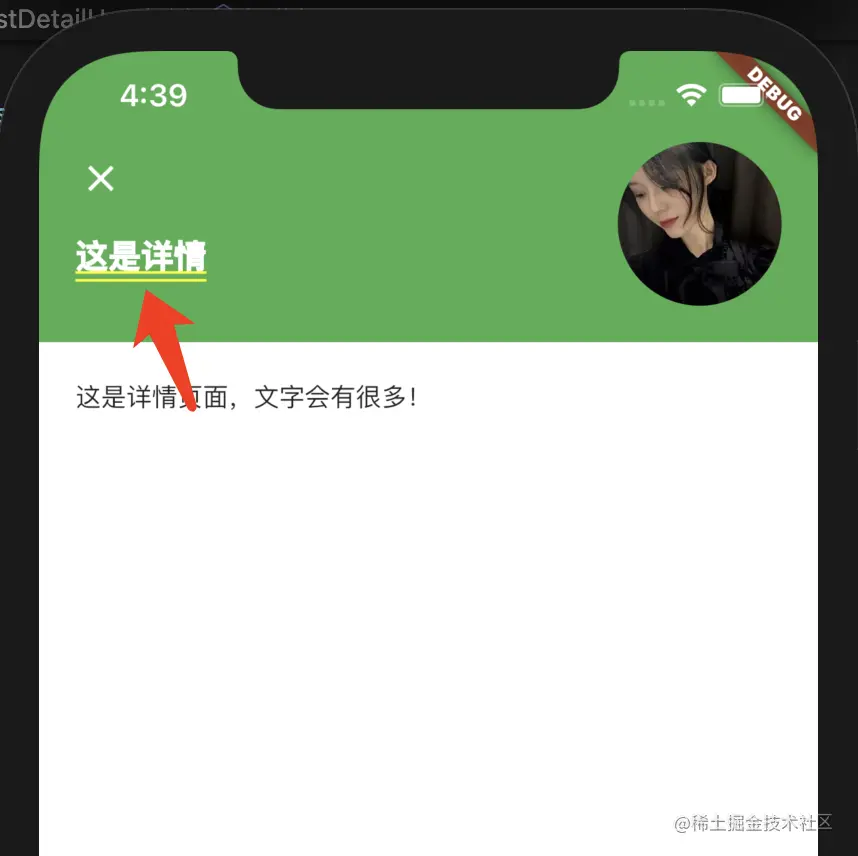
Here, the tag and createRectTween of the Hero component can be consistent with the list. The actual tag can be set using the id of the list element.
summary
This article introduces the use of Hero transition switching from the blind date source code list to details. In fact, if better animation effect is considered, it can also be completed in combination with AnimatedWidget, AnimatedBuilder, etc.
Statement: This article is forwarded by cloudleopard technology from the code farmer blog on the island. If there is any infringement, please contact the author to delete it