}
///Called when the State object is permanently removed from the tree; Resources are usually released in this callback
@override
void dispose() {
super.dispose();
debugPrint('child dispose...');
}
}
The output of the execution is displayed as:

 - Run to display

```java
I/flutter (22218): parent initState......
I/flutter (22218): parent didChangeDependencies......
I/flutter (22218): parent build......
I/flutter (22218): child initState......
I/flutter (22218): child didChangeDependencies......
I/flutter (22218): child build......
- Clicking the button will remove the Child
I/flutter (22218): parent build......
I/flutter (22218): child deactivate......
I/flutter (22218): child dispose......
- Change the code of MyApp from child:isShowChild?Child():Text("demo removes child"), change to
child:Child() when the button is clicked
I/flutter (22765): parent build......
I/flutter (22765): child didUpdateWidget......
I/flutter (22765): child build......
Basic widget
Text display
Text
Text is a text Widget(Android TextView) that displays a single format.
import 'package:flutter/material.dart';
///The main method calls runApp to pass the widget, which becomes the root of the widget tree
void main() => runApp(TextApp());
///1. Single Text
//Create a stateless Widget
class TextApp extends
StatelessWidget {
@override
Widget build(BuildContext context) {
//It encapsulates some widget s required by the application to implement Material Design
return MaterialApp(
title: "Text demonstration",
//Title, the title displayed in recent
//Main page
//Scaffold: the basic implementation of material design layout structure.
home: Scaffold(
//ToolBar/ActionBar
appBar: AppBar(title: Text("Text")),
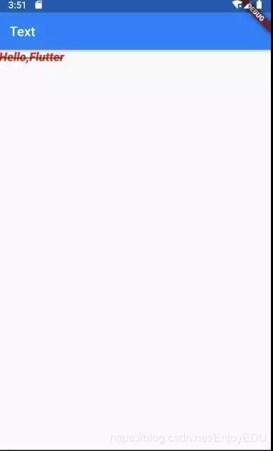
body: Text("Hello,Flutter"
),
),
);
}
}
When using Text to display Text, you may need to set different styles for Text, such as android:textColor/Size, etc
Similar properties are available in the Flutter
Widget _TextBody() {
  return Text(
    "Hello,Flutter",
    style: TextStyle(
        //colour
        color: Colors.red,
//Font size default 14
      fontSize: 18,
//thickness
        fontWeight: FontWeight.w800,
//Italics
        fontStyle: FontStyle.italic,
//Underline: underline, overline: overline, lineThrough: strikeout
        decoration: TextDecoration.lineThrough,
        decorationColor: Colors.black,
//Solid: solid line, double: double line, dotted: dotted line, dashed: horizontal dotted line, wavy: wavy line
        decorationStyle:
      TextDecorationStyle.wavy),
  );
}
class TextApp extends StatelessWidget {

@override
  Widget
  build(BuildContext context)
 {
 return MaterialApp(
   title: "Text demonstration",
   home: Scaffold(
     appBar: AppBar(title: Text("Text")),
     body: _TextBody(),
     ),
   );
  }
}
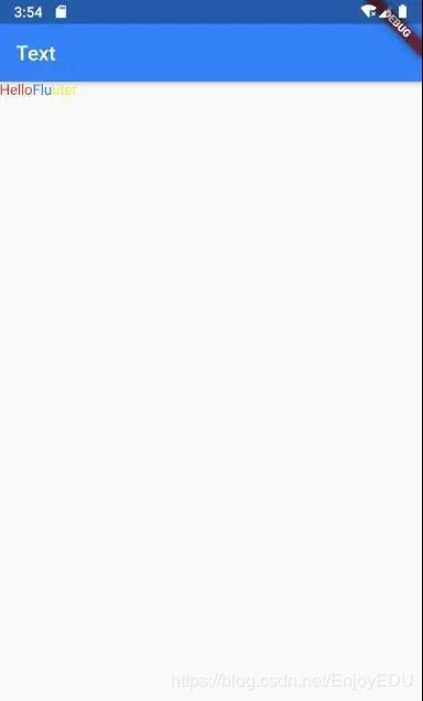
RichText
If you need to display text with richer styles (for example, the text in a paragraph has different colors), you can use RichText or text rich
Widget _RichTextBody() {
  var textSpan = TextSpan(
    text: "Hello",
    style: TextStyle(color: Colors.red),
    children: [
      TextSpan(text: "Flu", style: TextStyle(color: Colors.blue)),
      TextSpan(text: "uter", style: TextStyle(color: Colors.yellow)),
    ],
);
  //Text.rich(textSpan);
  return RichText(text: textSpan);
}
DefaultTextStyle
In the widget tree, the text style can be inherited by default. Therefore, if a default text style is set at a node of the widget tree, all text in the subtree of that node will use this style by default. It is equivalent to defining Theme in Android
Widget _DefaultStyle(){
  DefaultTextStyle(
//Set text default style
 style: TextStyle(
   color:Colors.red,
   fontSize: 20.0,
),
    textAlign: TextAlign.start,
    child: Column(
      crossAxisAlignment:
      CrossAxisAlignment.start,
      children: <Widget>[
        Text("Hello Flutter!"),
        Text("Hello Flutter!"),
        Text("Hello Flutter!",
             style: TextStyle(
               inherit: false,
//Do not inherit default styles
               color: Colors.grey
          ),
        ),
      ],
    ),
  );
}
FlutterLogo
This Widget is used to display the logo of fluent
Widget flutterLogo() {
  return FlutterLogo(
//size
    size: 100,
//The logo color defaults to colors blue
    colors: Colors.red,
//markOnly: only the logo is displayed, horizontal: the right side of the logo displays the text of the shutter, and stacked: the text is displayed below the logo
    style: FlutterLogoStyle.stacked,
//Text color on logo
    textColor: Colors.blue,
  );
}
Icon
The Widget is mainly used to display built-in icons
Widget icon() {
  return Icon(
//Use predefined Material icons
// https://docs.flutter.io/flutter/material/Icons-class.html

Icons.add,
    size: 100,
    color: Colors.red);
}

Image
A Widget that displays a picture. Commonly used image formats mainly include bmp,jpg,png,gif,webp, etc. gif and webp dynamic images are not naturally supported in Android, but this feature is well supported in fluent.
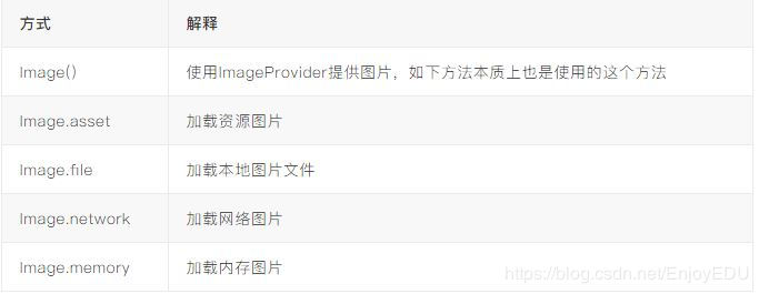
Iamge.asset
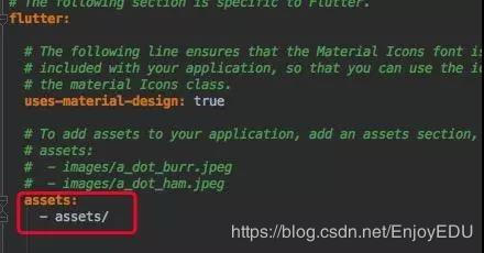
Create a directory under the project directory, such as assets, and put the pictures into this directory. Open the project root directory: pubspec yaml
return MaterialApp(
  title: "Image demonstration",
  home: Scaffold(
    appBar: AppBar(title: Text("Image")),
    body: Image.asset("assets/banner.jpeg"),
  ),
);
Image.file
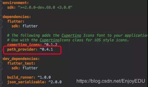
Put a picture in the sd card. Then use path_ The provider library obtains the sd card root directory (the Dart library version can be found at: https://pub.dartlang.org/packages Query).
Attention authority
class ImageState extends State<ImageApp> {
  Image image;

@override
  void initState() {
   super.initState();
    getExternalStorageDirectory().then((path) {
      setState(() {
        image = Image.file(File("${path.path}${Platform.pathSeparator}banner.jpeg"
      ));
    });
  });
}

@override
Widget build(BuildContext context) {
return MaterialApp(
  title: "Image demonstration",
  home: Scaffold(
    appBar: AppBar(title: Text("Image")),
    body: image,
    ),
  );
 }
}
Image.network
Just give the network address directly.
For fluent 1.0, certificate errors often occur when loading https. The AS must be disconnected to open the app
Image.memory
Future<List<int>> _imageByte() async {
  String path = (await getExternalStorageDirectory()).path;
  return await File("$path${Platform.pathSeparator}banner.jpeg").readAsBytes();
}
class ImageState extends State<ImageApp> {
  Image image;

@override
  void initState() {
    super.initState();
    _imageByte().then((bytes) {
      setState(() {
        image = Image.memory(bytes);
      });
    });
}

@override
Widget build(BuildContext context) {
  return MaterialApp(
    title: "Image demonstration",
    home: Scaffold(
      appBar: AppBar(title: Text("Image")),
      body: image,
    ),
   );
  }
}
CircleAvatar
CircleAvatar(
    //Image provider
      backgroundImage: AssetImage("assets/banner.jpeg"),
    //Radius, controlling size
      radius: 50.0,
  );
FadeInImage
When displaying pictures using the default Image widget, you may notice that they are displayed directly on the screen after loading. This may make the user visually abrupt. If we initially display a placeholder and then fade in when the image is loaded, we can use FadeInImage to achieve this!
 image =  FadeInImage.memoryNetwork(
   placeholder: kTransparentImage,
   image: 'https://flutter.io/images/homepage/header-illustration.png',
);
Button
The Material widget library provides a variety of button widgets, such as RaisedButton, FlatButton, outlinbutton, etc. they are directly or indirectly customized for the packaging of RawMaterialButton, so most of their properties are the same as RawMaterialButton. The buttons in all Material libraries have the following similarities:
- When pressed, there will be "water wave animation".
- There is an onPressed attribute to set the click callback. When the button is pressed, the callback will be executed. If the callback is not provided, the button will be disabled, and the disabled status will not respond to user clicks.
RaisedButton
Float button, which has a shadow and gray background by default
RaisedButton(
  child: Text("normal"),
  onPressed: () => {},
)
FlatButton
Flat button. The default background is transparent without shadow
FlatButton(
  child: Text("normal"),
  onPressed: () => {},
)
OutlineButton
By default, there is a border without shadow and the background is transparent.
OutlineButton(
  child: Text("normal"),
  onPressed: () => {},
)
IconButton
Clickable Icon
IconButton(
  child: Text("normal"),
  onPressed: () => {},
)
Button appearance can be defined by its attributes, and different button attributes are similar
const FlatButton({
  ...
@required this.onPressed,
//Button click callback
this.textColor,
//Button text color
this.disabledTextColor,
//Text color when button is disabled
this.color,
//Button background color
this.disabledColor,
//The background color when the button is disabled
this.highlightColor,
//Background color when the button is pressed
this.splashColor,
//When clicked, the color of the water wave in the water wave animation
this.colorBrightness,
//Button theme, the default is light color theme
this.padding,
//Button fill
this.shape,
//appearance
@required this.child,
//Contents of the button
})
  FlatButton( onPressed: () => {},
  child: Text("Raised"),
//blue
  color: Colors.blue,
//wave
  splashColor: Colors.yellow,
//Dark theme, so the text color will turn white
  colorBrightness: Brightness.dark,
//Fillet button
  shape: RoundedRectangleBorder(
    borderRadius: BorderRadius.circular(50)
  ),
)
The default configuration of RaisedButton is shaded. Therefore, when configuring RaisedButton, it has a series of configuration of elevation attributes
const RaisedButton({
  ...
  this.elevation = 2.0,
//Shadow in normal state
  this.highlightElevation = 8.0,
//Shadow when pressed
  this.disabledElevation = 0.0,
// Shadows when off
  ...
}
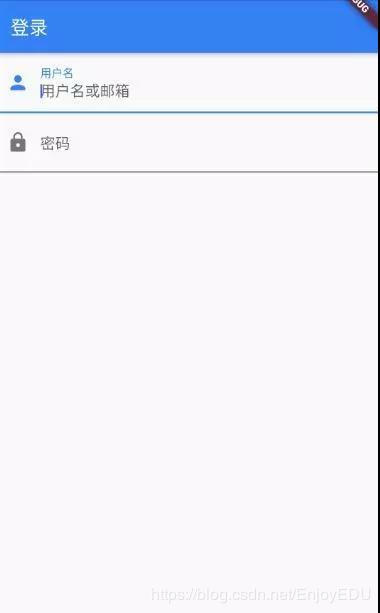
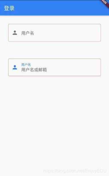
Input box
import 'package:flutter/material.dart';
 void main() => runApp(Demo1());
   class Demo1 extends StatelessWidget {

@override
    Widget build(BuildContext context) {
    return MaterialApp(
      title: "Demo1",
      home: Scaffold(
        appBar: AppBar(
          title: Text("Sign in"),
        ),
      //Linear layout, vertical
      body: Column(
        children: <Widget>[
          TextField(
//Get focus automatically
            autofocus: true,
            decoration: InputDecoration(
              labelText: "user name",
              hintText: "User name or mailbox",
              prefixIcon: Icon(Icons.person)),
            ),
          TextField(
//Hide text being edited
             obscureText: true,
              decoration: InputDecoration(
               labelText: "password",
                hintText: "Your login password",
                prefixIcon: Icon(Icons.lock)),
            ),
          ],
        ),
      ),
    );
  }
}
This effect is very "systematic". In most cases, we may need to replace the underline with a rectangular border. At this time, we may need to combine widget s to complete:
//The container sets the size, background and margin of a control
Container(
  margin: EdgeInsets.all(32),
    child: TextField(
      keyboardType: TextInputType.emailAddress,
      decoration: InputDecoration(
        labelText: "user name",
        hintText: "User name or mailbox",
        prefixIcon: Icon(Icons.person),
            border: InputBorder.none
//Hide underline
)),
//decorate
    decoration: BoxDecoration(
// Border light gray, width 1 pixel
      border: Border.all(color: Colors.red[200], width: 1.0),
//fillet
      borderRadius: BorderRadius.circular(5.0),
    ),
  )
Focus control
FocusNode: it is bound to the Widget and represents the focus of the Widget
FocusScope: focus control range
Focusscope node: control focus
class _TextFocusState extends State<TextFocusWidget> {
  FocusNode focusNode1 = new
  FocusNode();  FocusNode focusNode2 = new FocusNode();
void _listener() {
  debugPrint("User name input box focus:${focusNode1.hasFocus}");
}

@override
  void initState() {
    super.initState();
//Listen for focus state change events
    focusNode1.addListener(_listener);
}

@override
  void dispose() {
    super.dispose();
    focusNode1.dispose();
    focusNode2.dispose();
}

@override
  Widget build(BuildContext context) {
    return Column(
      children: <Widget>[
        TextField(
          autofocus: true,
//Associated focus
          focusNode: focusNode1,
//Set the keyboard action as: next
          textInputAction: TextInputAction.next,
//Click next to execute the callback
          onEditingComplete: () {
//Obtain the focus controller of the focus range of the UI tree corresponding to the context
          FocusScopeNode focusScopeNode = FocusScope.of(context);
//Give focus to focusNode2
          focusScopeNode.requestFocus(focusNode2);
         },
          decoration: InputDecoration(
          labelText: "user name",
           hintText: "User name or mailbox",
         prefixIcon: Icon(Icons.person)),
        ),
        TextField(
//Hide text being edited
        obscureText: true,
          focusNode: focusNode2,
         decoration: InputDecoration(
          labelText: "password",
           hintText: "Your login password",
          refixIcon: Icon(Icons.lock)),
        ),
        custom(),
      ],
    );
  }
}
Get input
There are two ways to get the input content:
- Define two variables to save the user name and password, and then save the input content when onChange is triggered.
- Get it directly through the controller.
onChange to get the input:
TextField(
  onChanged: (s) => debugPrint("ssss:$s"),
controller get:
Define a controller:
//Define a controller
TextEditingController _unameController=new TextEditingController();
Then set the input box controller:
TextField(
  controller: _unameController,
//Set controller
    ...
)
Get the contents of the input box through the controller
# Summary: experience

Now that I have chosen this industry and become a programmer, I understand that only by constantly learning and accumulating practical experience can I be qualified to go up, get a high salary, and have certain economic security for myself, my parents and my family in the future.

Learning time is squeezed out by yourself. It may be difficult to see the effect in a short time. Once you stick to it, it will change. It's better to think about why you want to enter this industry and give yourself an answer.

When interviewing a large factory, the most basic thing is to consolidate the foundation, otherwise you will be cold if the interviewer asks you casually; Secondly, I will ask some technical principles. It will also depend on the breadth of your knowledge. The most important thing is your ideas, which is more valued by the interviewer.

Finally, the above real interview questions of large factories are very good learning materials. Through these real interview questions, you can see the general situation of your mastery of technical knowledge, so as to set a learning direction for yourself. Including the learning guide shared above, you can straighten out the learning route from the learning guide to avoid inefficient learning.

**[CodeChina Open source project: [first tier big factory] Java Analysis of interview questions+Core summary learning notes+Latest explanation Video]](https://codechina.csdn.net/m0_60958482/java-p7)**

**Big factory Java Architecture core notes (suitable for middle and senior programmers):**

extField(
  controller: _unameController,
//Set controller
    ...
)
Get the contents of the input box through the controller
# Summary: experience Now that I have chosen this industry and become a programmer, I understand that only by constantly learning and accumulating practical experience can I be qualified to go up, get a high salary, and have certain economic security for myself, my parents and my family in the future. Learning time is squeezed out by yourself. It may be difficult to see the effect in a short time. Once you stick to it, it will change. It's better to think about why you want to enter this industry and give yourself an answer. When interviewing a large factory, the most basic thing is to consolidate the foundation, otherwise you will be cold if the interviewer asks you casually; Secondly, I will ask some technical principles. It will also depend on the breadth of your knowledge. The most important thing is your ideas, which is more valued by the interviewer. Finally, the above real interview questions of large factories are very good learning materials. Through these real interview questions, you can see the general situation of your mastery of technical knowledge, so as to set a learning direction for yourself. Including the learning guide shared above, you can straighten out the learning route from the learning guide to avoid inefficient learning. **[CodeChina Open source project: [first tier big factory] Java Analysis of interview questions+Core summary learning notes+Latest explanation Video]](https://codechina.csdn.net/m0_60958482/java-p7)** **Big factory Java Architecture core notes (suitable for middle and senior programmers):**