User login form - data bidirectional binding
<template>
  <div class="form-container">
    <el-form label-width="80px">
      <el-form-item label="cell-phone number">
        <el-input v-model="form.mobile"></el-input>
      </el-form-item>
      <el-form-item label="password">
        <el-input v-model="form.code"></el-input>
      </el-form-item>
      <el-form-item>
        <el-button type="primary" @click="onSubmit">Sign in</el-button>
        <el-button>cancel</el-button>
      </el-form-item>
    </el-form>
  </div>
</template>
<script>
export default {
  data() {
    return {
      form: {
        mobile: '',
        code: ''
      }
    }
  },
  methods: {
    onSubmit() {
      console.log('submit!')
    }
  }
}
</script>

<style scoped>
  .form-container{
    width: 600px;
  }
</style>
Summary
-
The data items in the form are usually wrapped with an object
-
The attribute name is generally consistent with that in the back-end interface
-
v-model bidirectional binding is adopted on elements
Form verification - basic introduction
target
Understand the necessity and implementation of form verification
Verification necessity
Before sending a request to the back end to call the interface, we need to verify the parameters to be passed to nip the user's error in the cradle.
You can't trust any input from the user! You can't trust any input from the user! You can't trust any input from the user!
Verification content
- Content cannot be empty
- How many digits must the password be
- The format of mobile phone number shall comply with the regulations
Verification method
- Validation that does not depend on any component
- Before submitting, analyze and process the data yourself.
- Verification based on specific components (different component libraries may have different verification methods)
Summary
-
The form content must be verified (you can't trust any user input!);
-
If you are using forms in the component library, it is best to use their own verification method
Form component - form validation
scene
In the above form, user name is required
target
Master the use of form verification in element UI
Basic steps - three steps in total
-
Define validation rules. Define rules by format in data()
-
Make attribute configuration on the template to apply rules (three configurations)
Set the rules property on the form to pass in the validation rules
Set the model property for the form and pass in the form data
Set the prop property for the form item, whose value is the field name to be verified
-
Manual bottom verification
Step 1 - define form validation rules
In data, supplement the definition rules.
Format:
data() {
  return {
    rules: {
        // Field name 1: indicates the attribute to be verified
        // Value: indicates the list of validation rules. It is an array in which each item represents a rule.
        //     Multiple rules in the array are processed in order
        Field name 1: [
          { Validation rule 1 },
          { Validation rule 2 },
        ],
        Field name 2: [
          { Validation rule 1 },
          { Validation rule 2 },
        ],
		}
  }
}
Example
  { required: true, message: 'Please enter the verification code', trigger: 'blur' },
  { pattern: /^\d{6}$/, message: 'Please enter a valid verification code', trigger: 'blur' },
  { min: 6, max: 8, message: 'Length 6-8 position', trigger: 'blur' }
Practical code
data () {
    return {
      // The form validation rule is an object as a whole
      // Key: the field to be verified, value: is an array, and each item is a rule

      rules: {
        // Field name: mobile indicates the attribute to be verified
        // Value: is an array. Each item in the array represents a rule.
        mobile: [
          { required: true, message: 'Please enter your mobile phone number', trigger: 'blur' }
        ]
      }
    }
  },
be careful:
- The attribute names in rules and form data items must be consistent.
Step 2 - configuration in template
Content:
-
Bind the model to the El form component as a form data object
-
Bind the rules attribute to the El form component to configure the validation rules
-
Bind the prop attribute to the form item El form item to be verified. Note: the prop attribute needs to specify the data name in the form object
code:
<el-form label-width="80px" :model="form" :rules="rules">
  <el-form-item label="cell-phone number" prop="mobile">
    <el-input v-model="form.mobile"></el-input>
  </el-form-item>
  <el-form-item label="password" prop="code">
    <el-input v-model="form.code"></el-input>
  </el-form-item>
  <el-form-item>
    <el-button type="primary" @click="onSubmit">Create now</el-button>
    <el-button @click="onCancel">cancel</el-button>
  </el-form-item>
</el-form>
Acceptance effect
When we do this, when the content entered by the user does not meet the requirements of the form rules, and an input box is out of focus, it will give the corresponding prompt. When the content entered by us meets the requirements, the error prompt will disappear automatically.
Step 3 - Manual bottom verification
format
element-ui Form components for.validate(valid => {
	if(valid) {
	   // It passed the verification
	} else {
		 // Validation failed
	}
})
explain:
- validate The method is provided by the form component to verify the form content.
- You need to add a reference to the form component in the template: ref is mainly used to get the form component to manually trigger validation
Code - template
<el-form label-width="80px"
+  ref="form"
   :model="form"
   :rules="rules">
Add ref to reference the El form component.
code
Conduct manual verification when submitting. If it passes the verification
doLogin () {
  alert('I can log in')
},
submit () {
  this.$refs.form.validate(valid => {
    // valid is the result of the form validation. If true, it means it has passed
    // console.log(valid)
    if (valid) {
      // After passing the verification, you can do the follow-up action
      this.doLogin()
    }
  })
}
Summary
step
-
Define validation rules (according to the requirements of element UI)
-
Configure templates and apply rules
Set the rules property for the form and pass in the validation rules
Set the model property for the form and pass in the form data
Set the prop attribute to the element (form item) in the form, and its value is the field name to be verified
-
Manual bottom verification
Form component - form validation
target
-
The mobile phone number cannot be empty and must be 11 digits (/ ^ 1 [0-9] {10} $/)
-
Password is required and is 6 to 8 characters long
code
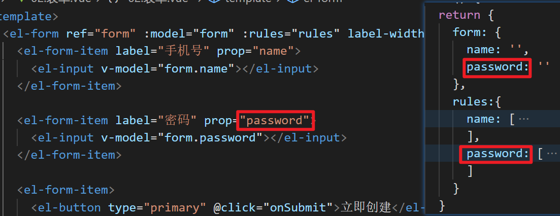
Define rules
rules:{
          name: [
            // trigger: when is validation triggered
            { required: true, message: 'Please enter your mobile phone number', trigger: 'blur' },
            // pattern: regular
            { pattern: /^1[345678]\d{9}$/, message: 'Please enter a valid mobile phone number', trigger: 'blur' }
          ],
          password: [
            { required: true, message: 'Please enter your mobile phone number', trigger: 'blur' },
            { min: 6, max: 8, message: 'Length 6-8 position', trigger: 'blur' }
          ]
        }
Configure application rules in the template
<el-form ref="form" :model="form" :rules="rules" label-width="80px">
    <el-form-item label="cell-phone number" prop="name">
      <el-input v-model="form.name"></el-input>
    </el-form-item>

    <el-form-item label="password" prop="password">
      <el-input v-model="form.password"></el-input>
    </el-form-item>

    <el-form-item>
      <el-button type="primary" @click="onSubmit">Create now</el-button>
      <el-button>cancel</el-button>
    </el-form-item>
  </el-form>
be careful
The property names in the following three places must be consistent
Form component - form validation - custom inspection rules
Scenario:
The password is not allowed to be 123456
target
Master the format of user-defined inspection rules
thinking
Customize the validator in rules
format
rules:{
    Property name 1: [
      {
        // Note the order of parameters
        validator: function (rule, value, callback) {
      		// rule: adopted rules
          // Value: the verified value
          // Callback is a callback function,
          //      If you pass the rule check, you can call callback() directly
          //      If the rule fails to pass the verification, callback (error object, explain the reason in the error object) is called
        	//         For example: callback(new Error('error description '))
      	},
        trigger: 'blur'
     }]
}
Landing code
rules: {
  name: [{required: true, message:'Must be filled in', triggle: 'blur'}],
  code: [
      {
        validator:(rule, value, callback)=>{
          console.log(rule, value, callback)
          if(value === '123456') {
            callback(new Error('This is the worst password in the world'))
          } else {
            callback()
          }
      	},
        triggle: 'blur'
      },
      {min: 6, max:8, message:'Length 6-8 position', triggle: 'blur'},
      {required: true, message:'Must be filled in', triggle: 'blur'},
  ]
}
Summary
- Custom rules can make the verification logic more flexible, and its format is fixed
- callback must call