Componentization is an important direction of front-end development. On the one hand, it improves development efficiency, on the other hand, it reduces maintenance cost. Mainstream Vue JS, React and their extended Ant Design, uniapp, Taro, etc. are component frameworks.
Web Components Is the general name of a set of Web native API s, which allows us to create reusable custom components and use them in our web applications like native HTML tags. At present, many front-end frameworks / libraries have been supported Web Components.
This article will take you back Web Components Core API, and implement a business component library based on Web Components API from 0 to 1.
Final effect: https://blog.pingan8787.com/exe-components/demo.html
Warehouse address: https://github.com/pingan8787/Learn-Web-Components
1, Review Web Components
In the history of front-end development, from the beginning of repeated business and copying the same code everywhere to the emergence of Web Components, we use custom components of native HTML tags to reuse component code and improve development efficiency. Components created through Web Components can be used in almost any front-end framework.
1. Core API review
Web Components consists of three core API s:
- Custom elements: used to define custom elements and their behavior, and provide external component labels;
- Shadow DOM: used to encapsulate the internal structure of components to avoid conflicts with the outside;
- HTML templates: including < template > and < slot > elements, we can define HTML templates of various components and reuse them elsewhere. Students who have used Vue/React and other frameworks should be familiar with them.
In addition, there are HTML imports, which are obsolete at present, so they are not introduced in detail. Their function is to control the dependent loading of components.
2. Getting started example
Next, let's quickly learn how to create a simple Web Components component through the following simple example.
- Use components
<!DOCTYPE html>
<html lang="en">
<head>
    <script src="./index.js" defer></script>
</head>
<body>
    <h1>custom-element-start</h1>
    <custom-element-start></custom-element-start>
</body>
</html>- Define components
/**
 * Use customelementregistry The define () method is used to register a custom element
 * The parameters are as follows:
 * - The element name conforms to the DOMString specification. The name cannot be a single word and must be separated by a dash
 * - Element behavior must be a class
 * - Inherited element, optional configuration, a configuration object containing the extends attribute, which specifies which built-in element the created element inherits from, and can inherit any built-in element.
 */

class CustomElementStart extends HTMLElement {
    constructor(){
        super();
        this.render();
    }
    render(){
        const shadow = this.attachShadow({mode: 'open'});
        const text = document.createElement("span");
        text.textContent = 'Hi Custom Element!';
        text.style = 'color: red';
        shadow.append(text);
    }
}

customElements.define('custom-element-start', CustomElementStart)
The above code mainly does three things:
- Implementation component class
Define components by implementing the CustomElementStart class.
- Define components
Take the component label and component class as parameters through customelements The define method defines the component.
- Use components
After importing a component, you can directly use the custom component < custom element start > < / custom element start >, just like using ordinary HTML tags.
Then the browser accesses index HTML, you can see the following:
3. Introduction to compatibility
stay MDN | Web Components Its compatibility is described in the following sections:
- Firefox (version 63), Chrome and Opera all support Web components by default.
- Safari supports many web component features, but fewer than the above browsers.
- Edge is developing an implementation.
For compatibility, see the following figure: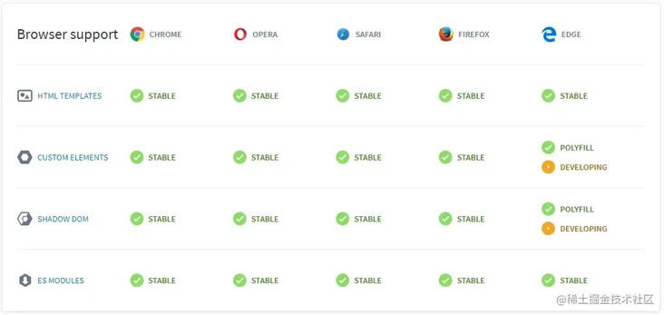
Image source: https://www.webcomponents.org/
In this website, there are many excellent projects about Web Components to learn.
4. Summary
This section mainly reviews the basic knowledge through a simple example. You can read the documents in detail:

2, Analysis and design of exe components component library
1. Background introduction
Suppose we need to implement an EXE components component library. The components of the component library are divided into two categories:
- components type
General simple components are mainly used, such as exe avatar avatar component, EXE button button component, etc;
- modules type
It is mainly composed of complex components, such as exe user avatar user avatar component (including user information), EXE attachment list attachment list component, etc.
See the following figure for details: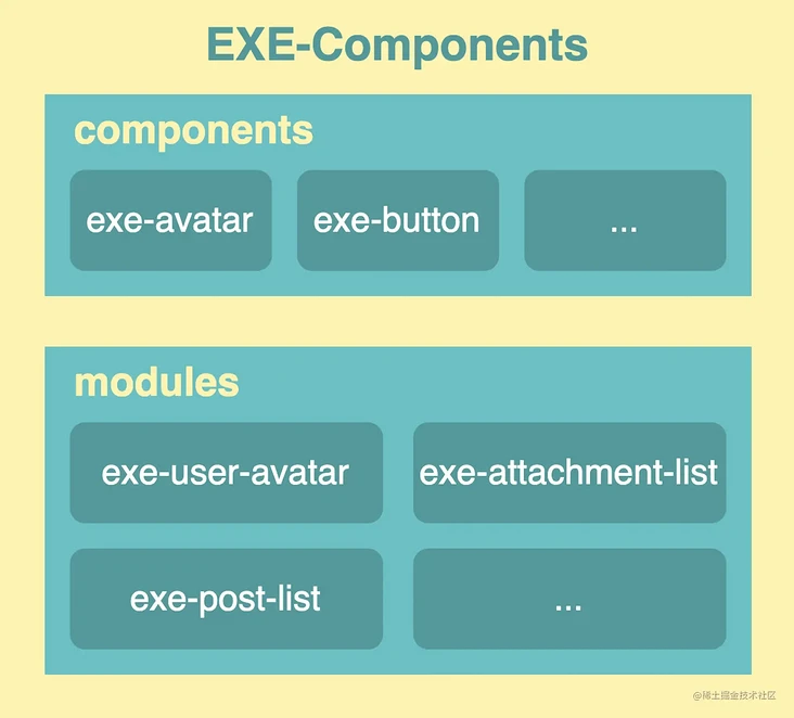
Next, we will design and develop the EXE components component library based on the above figure.
2. Component library design
When designing the component library, the following points should be considered:
- Component naming, parameter naming and other specifications to facilitate subsequent maintenance of components;
- Component parameter definition;
- Component style isolation;
Of course, these are the most basic points to consider. With the complexity of the actual business, more needs to be considered, such as engineering related, component decoupling, component theme, etc.
For the above three points, several naming conventions are agreed here:
- The component name is named by the exe function name. For example, exe avatar represents the avatar component;
- The attribute parameter name is named by the e-parameter name. For example, e-src represents the SRC address attribute;
- The event parameter name is named by the on event type, for example, on click means click event;
3. Component library component design
Here, we mainly design exe avatar, EXE button and exe user avatar. The first two are simple components and the latter are complex components. The first two components are combined internally. Here, first define the attributes supported by the three components: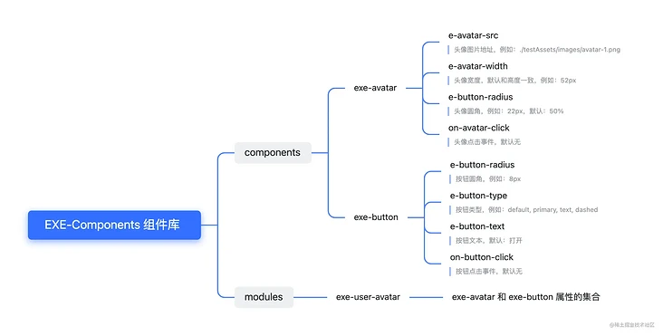
The attribute naming here looks complicated. You can name it according to your own and team habits.
In this way, our thinking is much clearer and we can implement the corresponding components.
3, Preparation of exe components component library
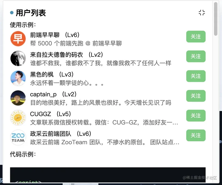
In this example, the implemented components will be combined to achieve the following "user list" effect:
Experience address: https://blog.pingan8787.com/exe-components/demo.html
1. Unified development specification
First, we will unify the development specifications, including:
- Catalog specification
- Define component specifications
- Component development template
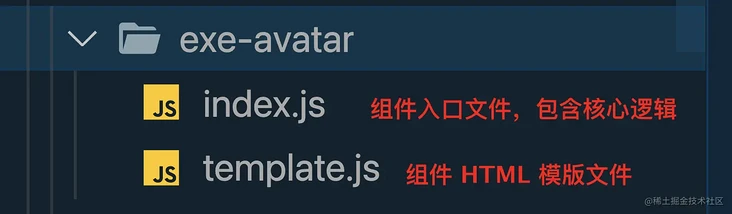
The component development template is divided into index JS component entry file and template JS component HTML template file:
// index.js template
const defaultConfig = {
    // Component default configuration
}

const Selector = "exe-avatar"; // Component tag name

export default class EXEAvatar extends HTMLElement {
    shadowRoot = null;
    config = defaultConfig;

    constructor(){
        super();
        this.render(); // Unified processing component initialization logic
    }

    render() {
        this.shadowRoot = this.attachShadow({mode: 'closed'});
        this.shadowRoot.innerHTML = renderTemplate(this.config);
    }
}

// Define components
if (!customElements.get(Selector)) {
    customElements.define(Selector, EXEAvatar)
}
// template.js template
export default config => {
// Unified read configuration
const { avatarWidth, avatarRadius, avatarSrc } = config;
return `
<style>
/* CSS content */
</style>
<div class="exe-avatar">
/* HTML content */
</div>
`
}2. Construction of development environment and engineering treatment
In order to facilitate the use of exe components component library and be closer to the actual component library, we need to package the component library into a UMD type js file. Here we use rollup Build it and finally package it into exe components JS file, which is used as follows:
<script src="./exe-components.js"></script>
Next, generate the package. Net from npm init -y JSON file, and then install rollup and http-server (used to start the local server for debugging):
npm init -y
npm install --global rollup http-server
Then in package Add "dev" and "build" scripts under the script of JSON:
{
    // ...
  "scripts": {
    "dev": "http-server -c-1 -p 1400",
    "build": "rollup index.js --file exe-components.js --format iife"
  },
}
Of which:
- "dev" command: start the static server through HTTP server and use it as a development environment. Add the - c-1 parameter to disable the cache and avoid refreshing the page. There will also be a cache. See the details HTTP server documentation;
- "build" command: index JS as the entry file packaged by rollup and output exe components JS file, and it is a file of iife type.
In this way, the engineering configuration of simple local development and component library construction is completed, and then the development can be carried out.
4, Development of exe components component library
1. Component library entry file configuration
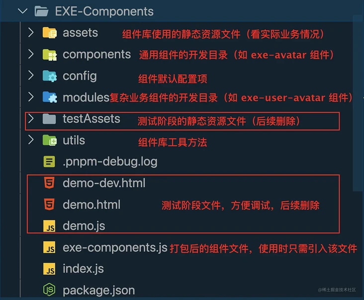
Front package The "build" command configured in the JSON file will use index. Exe under the root directory JS as the entry file, and in order to facilitate the introduction of common basic components of components and common complex components of modules, we create three indexes JS, the directory structure after creation is as follows:
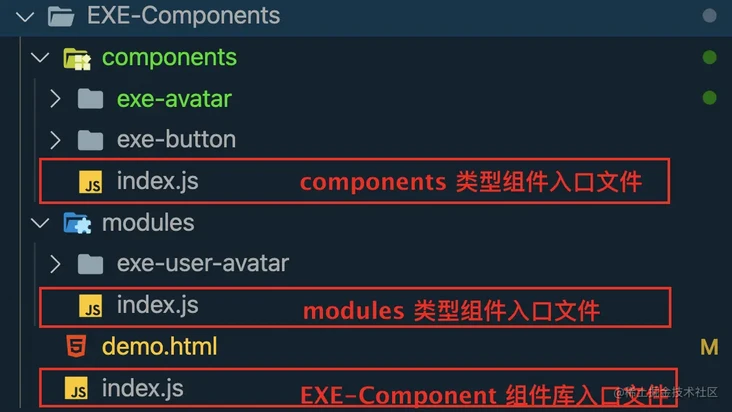
The contents of the three entry files are as follows:
// EXE-Components/index.js
import './components/index.js';
import './modules/index.js';

// EXE-Components/components/index.js
import './exe-avatar/index.js';
import './exe-button/index.js';

// EXE-Components/modules/index.js
import './exe-attachment-list/index.js.js';
import './exe-comment-footer/index.js.js';
import './exe-post-list/index.js.js';
import './exe-user-avatar/index.js';
2. Develop exe avatar component index JS file
Through the previous analysis, we can know that the EXE avatar component needs to support the following parameters:
- E-avatar SRC: address of avatar picture, for example:/ testAssets/images/avatar-1.png
- E-avatar width: Portrait width, which is consistent with the height by default, for example: 52px
- e-button-radius: head fillet, for example: 22px, default: 50%
- On avatar Click: Avatar click event; none by default
Then, according to the previous template, develop the entry file index js :
// EXE-Components/components/exe-avatar/index.js
import renderTemplate from './template.js';
import { Shared, Utils } from '../../utils/index.js';

const { getAttributes } = Shared;
const { isStr, runFun } = Utils;

const defaultConfig = {
    avatarWidth: "40px",
    avatarRadius: "50%",
    avatarSrc: "./assets/images/default_avatar.png",
    onAvatarClick: null,
}

const Selector = "exe-avatar";

export default class EXEAvatar extends HTMLElement {
    shadowRoot = null;
    config = defaultConfig;

    constructor(){
        super();
        this.render();
    }

    render() {
        this.shadowRoot = this.attachShadow({mode: 'closed'});
        this.shadowRoot.innerHTML = renderTemplate(this.config);// Generate HTML template content
    }

        // Lifecycle: called when the custom element is first inserted into the document DOM.
    connectedCallback() {
        this.updateStyle();
        this.initEventListen();
    }

    updateStyle() {
        this.config = {...defaultConfig, ...getAttributes(this)};
        this.shadowRoot.innerHTML = renderTemplate(this.config); // Generate HTML template content
    }

    initEventListen() {
        const { onAvatarClick } = this.config;
        if(isStr(onAvatarClick)){ // Judge whether it is a string
            this.addEventListener('click', e => runFun(e, onAvatarClick));
        }
    }
}

if (!customElements.get(Selector)) {
    customElements.define(Selector, EXEAvatar)
}
Several of them are extracted public methods. Let's briefly introduce their functions. See the source code for details:
- renderTemplate method
From template JS exposed method, pass in configuration config to generate HTML template.
- getAttributes method
Pass in an HTMLElement element and return all attribute key value pairs on the element. The attributes beginning with e - and on - will be processed into normal attributes and event attributes respectively. Examples are as follows:
// input
<exe-avatar
    e-avatar-src="./testAssets/images/avatar-1.png"
    e-avatar-width="52px"
    e-avatar-radius="22px"
    on-avatar-click="avatarClick()"
></exe-avatar>

// output
{
  avatarSrc: "./testAssets/images/avatar-1.png",
  avatarWidth: "52px",
  avatarRadius: "22px",
  avatarClick: "avatarClick()"
}- runFun method
Since the method passed in through the attribute is a string, it is encapsulated, and the event and event name are passed in as parameters to call the method. As in the previous step, the example will execute the avatarClick() method.
In addition, the Web Components lifecycle can be viewed in detail in the following documents: Using lifecycle callback functions.
3. Develop exe avatar component template JS file
This file exposes a method to return the component HTML template:
// EXE-Components/components/exe-avatar/template.js
export default config => {
  const { avatarWidth, avatarRadius, avatarSrc } = config;
  return `
    <style>
      .exe-avatar {
        width: ${avatarWidth};
        height: ${avatarWidth};
        display: inline-block;
        cursor: pointer;
      }
      .exe-avatar .img {
        width: 100%;
        height: 100%;
        border-radius: ${avatarRadius};
        border: 1px solid #efe7e7;
      }
    </style>
    <div class="exe-avatar">
      <img class="img" src="${avatarSrc}" />
    </div>
  `
}
The final results are as follows:

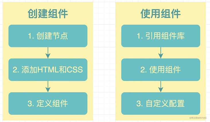
After developing the first component, we can briefly summarize the steps of creating and using components:
4. Develop exe button component
According to the previous development idea of exe avatar component, you can quickly implement exe button component.
The following parameters need to be supported:
- e-button-radius: button fillet, for example: 8px
- e-button-type: button type, for example: default, primary, text, dashed
- e-button-text: button text, default: open
- On button click: button click event; none by default
// EXE-Components/components/exe-button/index.js
import renderTemplate from './template.js';
import { Shared, Utils } from '../../utils/index.js';

const { getAttributes } = Shared;
const { isStr, runFun } = Utils;
const defaultConfig = {
    buttonRadius: "6px",
    buttonPrimary: "default",
    buttonText: "open",
    disableButton: false,
    onButtonClick: null,
}

const Selector = "exe-button";

export default class EXEButton extends HTMLElement {
    // Specifies the observed attribute changes, and attributeChangedCallback takes effect
    static get observedAttributes() {
        return ['e-button-type','e-button-text', 'buttonType', 'buttonText']
    }

    shadowRoot = null;
    config = defaultConfig;

    constructor(){
        super();
        this.render();
    }

    render() {
        this.shadowRoot = this.attachShadow({mode: 'closed'});
    }

    connectedCallback() {
        this.updateStyle();
        this.initEventListen();
    }

    attributeChangedCallback (name, oldValue, newValue) {
        // console.log('attribute change ', name)
    }

    updateStyle() {
        this.config = {...defaultConfig, ...getAttributes(this)};
        this.shadowRoot.innerHTML = renderTemplate(this.config);
    }

    initEventListen() {
        const { onButtonClick } = this.config;
        if(isStr(onButtonClick)){
            const canClick = !this.disabled && !this.loading
            this.addEventListener('click', e => canClick && runFun(e, onButtonClick));
        }
    }

    get disabled () {
        return this.getAttribute('disabled') !== null;
    }

    get type () {
        return this.getAttribute('type') !== null;
    }

    get loading () {
        return this.getAttribute('loading') !== null;
    }
}

if (!customElements.get(Selector)) {
    customElements.define(Selector, EXEButton)
}
The template is defined as follows:
// EXE-Components/components/exe-button/tempalte.js
// Button border type
const borderStyle = { solid: 'solid', dashed: 'dashed' };

// Button type
const buttonTypeMap = {
    default: { textColor: '#222', bgColor: '#FFF', borderColor: '#222'},
    primary: { textColor: '#FFF', bgColor: '#5FCE79', borderColor: '#5FCE79'},
    text: { textColor: '#222', bgColor: '#FFF', borderColor: '#FFF'},
}

export default config => {
    const { buttonRadius, buttonText, buttonType } = config;

    const borderStyleCSS = buttonType
        && borderStyle[buttonType]
        ? borderStyle[buttonType]
        : borderStyle['solid'];

    const backgroundCSS = buttonType
        && buttonTypeMap[buttonType]
        ? buttonTypeMap[buttonType]
        : buttonTypeMap['default'];

    return `
        <style>
            .exe-button {
                border: 1px ${borderStyleCSS} ${backgroundCSS.borderColor};
                color: ${backgroundCSS.textColor};
                background-color: ${backgroundCSS.bgColor};
                font-size: 12px;
                text-align: center;
                padding: 4px 10px;
                border-radius: ${buttonRadius};
                cursor: pointer;
                display: inline-block;
                height: 28px;
            }
            :host([disabled]) .exe-button{
                cursor: not-allowed;
                pointer-events: all;
                border: 1px solid #D6D6D6;
                color: #ABABAB;
                background-color: #EEE;
            }
            :host([loading]) .exe-button{
                cursor: not-allowed;
                pointer-events: all;
                border: 1px solid #D6D6D6;
                color: #ABABAB;
                background-color: #F9F9F9;
            }
        </style>
        <button class="exe-button">${buttonText}</button>
    `
}
The final effect is as follows: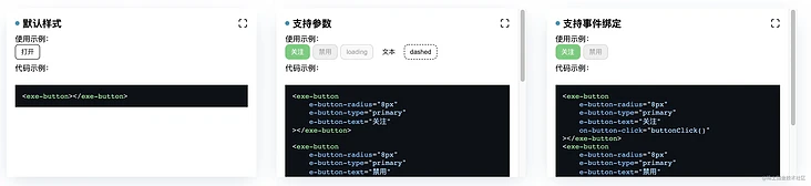
5. Develop exe user avatar component
This component combines the previous exe avatar component and exe button component. It needs to support not only click events, but also slot functions.
Because it is a combination, it is relatively simple to develop ~ first look at the entry file:
// EXE-Components/modules/exe-user-avatar/index.js

import renderTemplate from './template.js';
import { Shared, Utils } from '../../utils/index.js';

const { getAttributes } = Shared;
const { isStr, runFun } = Utils;

const defaultConfig = {
    userName: "",
    subName: "",
    disableButton: false,
    onAvatarClick: null,
    onButtonClick: null,
}

export default class EXEUserAvatar extends HTMLElement {
    shadowRoot = null;
    config = defaultConfig;

    constructor() {
        super();
        this.render();
    }

    render() {
        this.shadowRoot = this.attachShadow({mode: 'open'});
    }

    connectedCallback() {
        this.updateStyle();
        this.initEventListen();
    }

    initEventListen() {
        const { onAvatarClick } = this.config;
        if(isStr(onAvatarClick)){
            this.addEventListener('click', e => runFun(e, onAvatarClick));
        }
    }

    updateStyle() {
        this.config = {...defaultConfig, ...getAttributes(this)};
        this.shadowRoot.innerHTML = renderTemplate(this.config);
    }
}

if (!customElements.get('exe-user-avatar')) {
    customElements.define('exe-user-avatar', EXEUserAvatar)
}
The main content is in template JS:
// EXE-Components/modules/exe-user-avatar/template.js

import { Shared } from '../../utils/index.js';

const { renderAttrStr } = Shared;

export default config => {
    const {
        userName, avatarWidth, avatarRadius, buttonRadius,
        avatarSrc, buttonType = 'primary', subName, buttonText, disableButton,
        onAvatarClick, onButtonClick
    } = config;
    return `
        <style>
            :host{
                color: "green";
                font-size: "30px";
            }
            .exe-user-avatar {
                display: flex;
                margin: 4px 0;
            }
            .exe-user-avatar-text {
                font-size: 14px;
                flex: 1;
            }
            .exe-user-avatar-text .text {
                color: #666;
            }
            .exe-user-avatar-text .text span {
                display: -webkit-box;
                -webkit-box-orient: vertical;
                -webkit-line-clamp: 1;
                overflow: hidden;
            }
            exe-avatar {
                margin-right: 12px;
                width: ${avatarWidth};
            }
            exe-button {
                width: 60px;
                display: flex;
                justify-content: end;
            }
        </style>
        <div class="exe-user-avatar">
            <exe-avatar
                ${renderAttrStr({
                    'e-avatar-width': avatarWidth,
                    'e-avatar-radius': avatarRadius,
                    'e-avatar-src': avatarSrc,
                })}
            ></exe-avatar>
            <div class="exe-user-avatar-text">
                <div class="name">
                    <span class="name-text">${userName}</span>
                    <span class="user-attach">
                        <slot name="name-slot"></slot>
                    </span>
                </div>
                <div class="text">
                    <span class="name">${subName}<slot name="sub-name-slot"></slot></span>
                </div>
            </div>
            ${
                !disableButton &&
                `<exe-button
                    ${renderAttrStr({
                        'e-button-radius' : buttonRadius,
                        'e-button-type' : buttonType,
                        'e-button-text' : buttonText,
                        'on-avatar-click' : onAvatarClick,
                        'on-button-click' : onButtonClick,
                    })}
                ></exe-button>`
            }

        </div>
    `
}
The renderAttrStr method receives a property object and returns its key value pair string:
// input
{
  'e-avatar-width': 100,
  'e-avatar-radius': 50,
  'e-avatar-src': './testAssets/images/avatar-1.png',
}

// output
"e-avatar-width='100' e-avatar-radius='50' e-avatar-src='./testAssets/images/avatar-1.png' "
The final effect is as follows: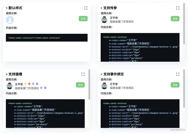
6. Implement a user list service
Next, let's take a look at the effect of our components through an actual business:
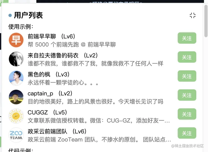
In fact, the implementation is also very simple. According to the given data, the components can be recycled. It is assumed that there are the following user data:
const users = [
  {"name":"Talk early","desc":"Help 5000 front ends run first @ Talk early","level":6,"avatar":"qdzzl.jpg","home":"https://juejin.cn/user/712139234347565"}
  {"name":"Manon from rafdrew","desc":"No one can save me, no one can save me, just as I can't save anyone","level":2,"avatar":"lzlfdldmn.jpg","home":"https://juejin.cn/user/994371074524862"}
  {"name":"Black maple","desc":"Always have an apprentice's heart...","level":3,"avatar":"hsdf.jpg","home":"https://juejin.cn/user/2365804756348103"}
  {"name":"captain_p","desc":"The destination is very beautiful and the scenery on the road is also very good. Have you seen more today","level":2,"avatar":"cap.jpg","home":"https://juejin.cn/user/2532902235026439"}
  {"name":"CUGGZ","desc":"Contact wechat for authorized reprint. WeChat: CUG-GZ,Add friends to learn together~","level":5,"avatar":"cuggz.jpg","home":"https://juejin.cn/user/3544481220801815"}
  {"name":"Zhengcai cloud front end team","desc":"Political mining cloud front end ZooTeam Team, original without water. Team site: https://zoo.team","level":6,"avatar":"zcy.jpg","home":"https://juejin.cn/user/3456520257288974"}
]
We can splice HTML fragments through a simple for loop and then add them to an element of the page:
// Test generation user list template
const usersTemp = () => {
    let temp = '', code = '';
    users.forEach(item => {
        const {name, desc, level, avatar, home} = item;
        temp +=
`
<exe-user-avatar
    e-user-name="${name}"
    e-sub-name="${desc}"
    e-avatar-src="./testAssets/images/users/${avatar}"
    e-avatar-width="36px"
    e-button-type="primary"
    e-button-text="follow"
    on-avatar-click="toUserHome('${home}')"
    on-button-click="toUserFollow('${name}')"
>
${
    level >= 0 && `<span slot="name-slot">
        <span class="medal-item">(Lv${level})</span>
    </span>`}
</exe-user-avatar>
`
})
    return temp;
}

document.querySelector('#app').innerHTML = usersTemp;
Here we have implemented a user list business. Of course, the actual business may be more complex and need to be optimized.
5, Summary
This paper first briefly reviews the core API of Web Components, then analyzes and designs the requirements of the component library, and then builds and develops the environment. There are many contents, which may not be covered in every point. Please also take a look at the source code of my warehouse. If you have any questions, welcome to discuss with me.
Several core purposes of writing this article:
- When we receive a new task, we need to start from analysis and design to development, rather than blindly start development;
- Let's take a look at how to develop a simple business component library with Web Components;
- Experience the disadvantages of Web Components development component library (there is too much to write).
Finally, after reading this article, do you think it is a little complicated to develop component library with Web Components? There's too much to write.
It doesn't matter. I'll take you to use the next one Stencil Framework to develop Web Components standard component library, after all, the whole ionic Already in use Stencil Refactoring, the general trend of Web Components ~!