preface
Today is the fourth day of learning react. My first small goal is to realize all the functions of todo list software on the web side one by one through react!
The previous articles will be put in the preface:
📦 Code warehouse link React todo gitee warehouse
💻 Online preview effect React todo development progress
Development tasks
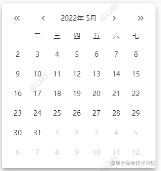
Today's goal is to achieve a 🗓🗓 Calendar component, and this component needs to perform a linkage operation with the time selector component of yesterday, as shown in the following figure.

requirement analysis
When clicking the detailed date on the right side of the date selection column, a pop-up window will pop up to display the calendar component
No matter which month, the calendar component has seven rows and six columns, a total of 42 cells, and the columns are distinguished by weeks
The single arrow at the top of the calendar indicates the switching from last week to next week, and the double arrow indicates the switching from last year to next year
In the calendar, when the date is selected, it is subject color background + white font, when it is not selected, it is black font, non current month date is gray font, and the date of the current day is subject color font
Whether we click the date selection column at the top or the date in the calendar, we will select a date. If the date selected in the calendar exceeds the range of the date selection column at the top, we need to regenerate the week corresponding to the selected date
development
After the requirements analysis, we began to develop.
Pop up window assembly
First, we need to implement a pop-up component. This component is easy to implement. It is directly implemented through the Popover component in mui. In this component, I pass in four parameters. anchorEl is used to control the pop-up of the pop-up component, and activeDate is used to pass it to the calendar component to display the selected date.
// dayTodo/datePopover.jsx
import React from "react"
import PropTypes from "prop-types"
import Popover from "@mui/material/Popover"
import Calendar from "../../components/Calendar"
DatePopover.propTypes = {
  anchorEl: PropTypes.object,
  setAnchorEl: PropTypes.func,
  activeDate: PropTypes.object,
  setDate: PropTypes.func,
}

export default function DatePopover(props) {
  console.log("DatePopover Render")
  const { anchorEl, setAnchorEl, activeDate, setDate } = props
  const handleClose = () => {
    setAnchorEl(null)
  }

  const open = Boolean(anchorEl)
  const id = open ? "simple-popover" : undefined

  return (
    <div>
      <Popover
        id={id}
        open={open}
        anchorEl={anchorEl}
        onClose={handleClose}
        anchorOrigin={{
          vertical: "bottom",
          horizontal: "left",
        }}
      >
        <div className="p-3">
          <Calendar activeDate={activeDate} setDate={setDate}></Calendar>
        </div>
      </Popover>
    </div>
  )
}
In the date selection column component, we introduce the following components and define related hook s. When you click the button, you can obtain the node with id of date picker and display it at the bottom of the node. The core code is as follows:
// dayTodo/dadtePicker.jsx
const [anchorEl, setAnchorEl] = useState(null)
  const showDatePopover = () => {
    const datePickerTarget = document.getElementById("date-picker")
    setAnchorEl(datePickerTarget)
  }


{/* The day of the week corresponding to the currently selected date */}
<Button variant="text" onClick={showDatePopover}>
  {`${activeDate.month() + 1}month ${activeDate.date()}day ${
    activeDate.isToday()
      ? "today"
      : activeDate.localeData().weekdays(dayjs(activeDate))
  }`}
</Button>

<DatePopover
    activeDate={activeDate}
    setDate={setDate}
    anchorEl={anchorEl}
    setAnchorEl={setAnchorEl}
  ></DatePopover>
In this way, our pop-up window is completed. Next, we enter the development of calendar component.
Calendar Component
I put the calendar component in the public components folder for reuse later.
No matter which month, the calendar component has seven rows and six columns, a total of 42 cells, and the columns are distinguished by weeks
According to the demand, we need the data into a calendar. My idea is to first obtain the first day of the month of the currently selected date, and then obtain the corresponding Monday of the week through the first day of the month
Here is the code to implement calendar data:
const { activeDate, setDate } = props

  const [first, setFirstDate] = useState(activeDate.date(1))

  const firstNumber = first.day()
    ? first.day(1)
    : dayjs(first).subtract(1, "day").day(1)

  const dateArr = Array.from({ length: 42 }).map((item, index) => {
    return dayjs(firstNumber).add(index, "day")
  })
One thing to note here is that we need to judge whether the first day of the selected date month is Sunday, because it is on day JS, a week starts on Sunday. If you don't judge some months, something will happen and the date of the first day will be lost. As shown below:
This requirement is implemented as follows:
The single arrow at the top of the calendar indicates the switching from last week to next week, and the double arrow indicates the switching from last year to next year
The implementation code is as follows:
First define the method, modify the month or year corresponding to the selected date through hook operation, and then re render the component
const [first, setFirstDate] = useState(activeDate.date(1))

 const toOtherMonth = (to) => {
    // Jump to another month
    const lastMonthFirstDate = first.month(first.month() + to).date(1)
    setFirstDate(lastMonthFirstDate)
  }

  const toOtherYear = (to) => {
    // Jump to another month
    const lastYearFirstDate = first.year(first.year() + to).date(1)
    setFirstDate(lastYearFirstDate)
  }
Invoke the method in the label:
<IconButton
  onClick={() => {
    toOtherYear(-1)
  }}
>
  <KeyboardDoubleArrowLeftIcon fontSize="small" />
</IconButton>
<IconButton onClick={() => toOtherMonth(-1)}>
  <ChevronLeftIcon fontSize="small" />
</IconButton>

<div className="text-sm">
  {first.year()}year {first.month() + 1}month
</div>

<IconButton onClick={() => toOtherMonth(1)}>
  <ChevronRightIcon fontSize="small" />
</IconButton>
<IconButton
  onClick={() => {
    toOtherYear(1)
  }}
>
  <KeyboardDoubleArrowRightIcon fontSize="small" />
</IconButton>
In the calendar, when the date is selected, it is subject color background + white font, when it is not selected, it is black font, non current month date is gray font, and the date of the current day is subject color font
We can judge this requirement by the inline style, but if the inline style is written, the readability is too poor, so I encapsulated it into a function:
const dateClass = (date) => {
    if (date.isSame(activeDate, "day")) {
      return "bg-primary"
    } else {
      if (date.isToday()) {
        return "text-primary font-bold"
      }
      if (date.month() !== first.month()) {
        return "text-gray-300"
      }
    }
  }
Use the following in the label:
{dateArr.map((item, index) => {
 return (
   <div
     className={`h-10 w-10 flex items-center justify-center cursor-pointer ${dateClass(
       item
     )} `}
     key={index}
     onClick={() => {
       setDate(item)
     }}
   >
     {item.date()}
   </div>
 )
})}
Whether we click the date selection column at the top or the date in the calendar, we will select a date. If the date selected in the calendar exceeds the range of the date selection column at the top, we need to regenerate the week corresponding to the selected date
Finally, to realize the linkage between a calendar component and the top date selection bar component, we need to start from the top date selection bar component. The core code is as follows
// dayTodo/DatePicker.jsx
const [activeDate, setDate] = useState(dayjs())
  useEffect(() => {
    setWeek(getThisWeek())
  }, [activeDate])

  // Array of date objects for seven days of the week
  const getThisWeek = () => {
    return Array.from({ length: 7 }).map((item, index) => {
      return activeDate.isoWeekday(index + 1)
    })
  }
  const [thisWeek, setWeek] = useState(getThisWeek())
Here I use a new hookuseEffect, which is the first time I use it. The effect is similar to the watch in vue. It is used to listen for variable changes and then execute the callback function. Here I use this hook to judge that if the date change is selected, a new date array will be regenerated to change with the date change.
summary
In fact, I finished writing before the fourth day. As a result, I mistakenly updated it into an empty file 😭. It took a long time to write it again. The previous article was as long as 3000 words.
I've read the react documentation again these days and learned more about the APIs. There are many similarities between the react hook and vue3 composition APIs. It is expected that some simple performance optimization of the project will be published later, and redux will be added later.
Finally, I spent some time deploying the project with Tencent cloud hosting to facilitate you to view the progress. You can see it by clicking the link below. If you are interested in how to deploy, I can also give a separate talk later. I hope you can give me more praise and support~
💻 Online preview effect React todo development progress