Buddy, who budgets me directly, should know that Xiaobian recently reproduced some excellent visualized works on some commercial websites. Many students also asked me to explain them live. Here, I told my buddies: we arranged to issue papers in official account, and then proceed to choose whether to broadcast live. Well, I won't say much. Today's Xiaobian brings you a visual work that reproduces the website FiveThirtyEight. The details are as follows:
Introduction to the original work of fivethirty eight
The work to be reproduced today is a commercial visualization work of FiveThirtyEight website. The original picture is as follows:
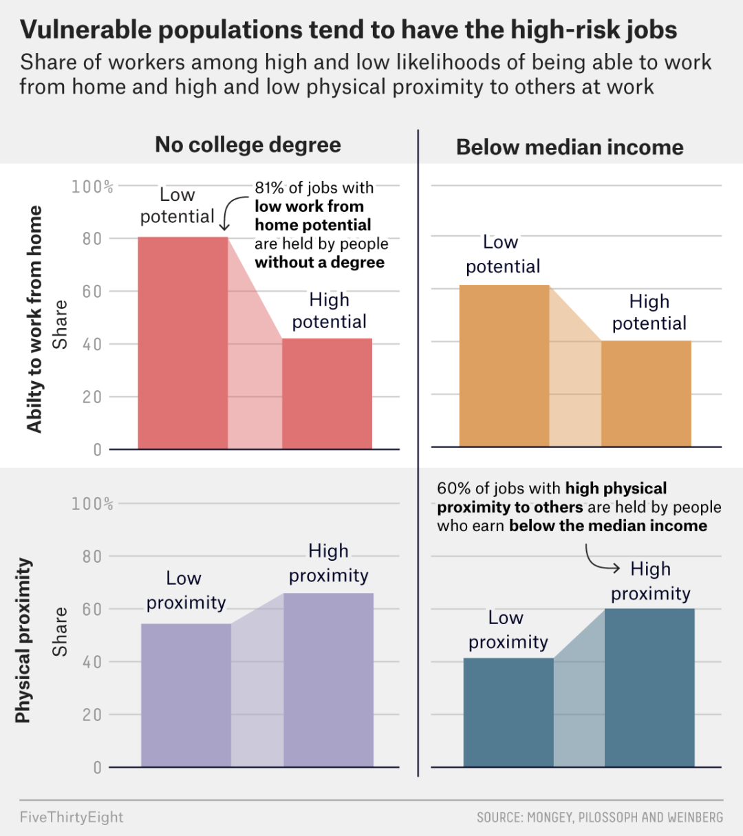
Original image of FiveThirtyEight official website
For more details about the introduction of this work, you can read: details of the original picture on the official website of FiveThirtyEight [1]
Python Matplotlib replication
Using Matplotlib to reproduce the above works, we can see that the following two problems need to be solved:
- Drawing of multi subgraphs
- Addition of different styles (BOLD) text
- Indicates the drawing of the arrow
Next, I'll take you to solve it one by one. The details are as follows:
Drawing of multi subgraphs
Using PLT. In Python Matplotlib Subplots () module can draw multiple subgraphs. For details, please refer to PLT Introduction to subplots () method [2]. Here, we first draw a single sub graph. The detailed drawing code is as follows:
import pandas as pd
import numpy as np
import matplotlib.pyplot as plt

# Draw regular graphics
import matplotlib.patches as patches
plt.rcParams['font.family'] = ['Franklin Gothic Book']

data_01 = [80,42]
x_index = np.arange(len(data_01))

width = 0.7
fig,ax = plt.subplots(figsize=(5.2,5),dpi=100,facecolor="w")
ax.bar(x=x_index,height=data_01,color="#DF7373",width=width)

# Draw linked shapes
x = [0+width/2,1-width/2,1-width/2,0+width/2]
y = [0,0,42,80]
ax.add_patch(patches.Polygon(xy=list(zip(x,y)),color="#DF7373",alpha=.5))

ax.set_xlim(left=-.6,right=1.6)
ax.set_ylim(bottom=0,top=100)
ax.grid(axis="y",linestyle="-",color="gray",alpha=.6)
ax.set_yticklabels(labels = ['0', '20 ', '40 ', '60 ', '80 ', '100%'])
ax.tick_params(which='major',direction='in',labelsize=17,labelcolor="gray",bottom=False,
               labelbottom=False,left=False,pad=2)
ax.set_ylabel("Share",fontsize=18)
for spine in ["top","left","right"]:
    ax.spines[spine].set_visible(False)
ax.spines['bottom'].set_linewidth(2)
ax.set_axisbelow(True)

# Add text information
ax.text(x=0,y=88,s="Low\npotential",va="center",ha="center",fontsize=18,)
ax.text(x=1,y=50,s="High\npotential",va="center",ha="center",fontsize=18,)
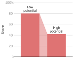
Drawing a separate subgraph
Addition of different styles (BOLD) text
In order to realize such a text melon in Python, you need to draw with the help of Python flexitext library. First, let's give a small example. The drawing code is as follows:
import matplotlib as mpl
import matplotlib.pyplot as plt
from flexitext import flexitext
mpl.rcParams['figure.facecolor'] = 'w'

fig, ax = plt.subplots(figsize=(9, 6))
text = "Normal text"
ax.text(0.5, 0.7, text, size=24, ha="center")
text = "<weight:bold, size:24>Bold text</>"
flexitext(0.5, 0.6, text, ha="center")
text = "<style:italic, size:24>Italic text</>"
flexitext(0.5, 0.5, text, ha="center")
text = "<weight:bold, size:24>Bold and</> <style:italic, size:24>italic too!</>"
flexitext(0.5, 0.4, text, ha="center");
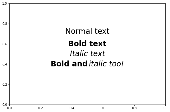
flexitext drawing sample reference
For more details on the flexitext library, please refer to the flexitext official website [3]
Next, we use the flexitext library to optimize the visualization results we draw. The complete code is as follows:
from flexitext import flexitext
import pandas as pd
import numpy as np
import matplotlib.pyplot as plt
import seaborn as sns

# Draw regular graphics
import matplotlib.patches as patches
plt.rcParams["font.family"] = ["Public Sans"]
#Public Sans

data_01 = [80,42]
x_index = np.arange(len(data_01))

width = 0.7
fig,ax = plt.subplots(figsize=(5.2,5),dpi=100,facecolor="w")
ax.bar(x=x_index,height=data_01,color="#DF7373",width=width)

# Draw linked shapes
x = [0+width/2,1-width/2,1-width/2,0+width/2]
y = [0,0,42,80]
ax.add_patch(patches.Polygon(xy=list(zip(x,y)),color="#DF7373",alpha=.5))

ax.set_xlim(left=-.6,right=1.6)
ax.set_ylim(bottom=0,top=100)
ax.grid(axis="y",linestyle="-",color="gray",alpha=.6)
ax.set_yticklabels(labels = ['0', '20 ', '40 ', '60 ', '80 ', '100%'])
ax.tick_params(which='major',direction='in',labelsize=17,labelcolor="gray",bottom=False,
               labelbottom=False,left=False,pad=2)
ax.set_ylabel("Share",fontsize=18)
for spine in ["top","left","right"]:
    ax.spines[spine].set_visible(False)
ax.spines['bottom'].set_linewidth(2)
ax.set_axisbelow(True)

# Add text information
ax.text(x=0,y=88,s="Low\npotential",va="center",ha="center",fontsize=18,)
ax.text(x=1,y=50,s="High\npotential",va="center",ha="center",fontsize=18,)

# Add flexitext font
text = (
    "<size:17>81% of jobs with\n</>"
    "<weight:bold, size:17>low work from\nhome potential\n</>"
    "<size:17>are held by people\n</>"
    "<weight:bold, size:17>without a degree</>"
)
flexitext(.52,.82 , text,)
ax.annotate(text="",
            xy=(0+width/2, 80), xycoords='data',xytext=(.52, 90),va="center",ha="left",
            arrowprops=dict(arrowstyle="->",
                            fc="k", ec="k",
                            relpos=(0, .9),
                            connectionstyle="angle3,angleA=-5,angleB=-90"))
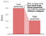
Single chart with bold font
Indicates the drawing of the arrow
The little friends here may see that we use ax The annotate () method is used to draw. It should be noted that in order to better display the annotation information, it is shown in ax The text content in the annotate () method is set to be empty. The purpose is to achieve more flexible text addition in combination with the flexitext() method in the previous line. Some codes for drawing arrows are given below:
ax.annotate(text="",
            xy=(0+width/2, 80), xycoords='data',xytext=(.52, 90),va="center",ha="left",
            arrowprops=dict(arrowstyle="->",
                            fc="k", ec="k",
                            relpos=(0, .9),
                            connectionstyle="angle3,angleA=-5,angleB=-90"))
"Reminder": we also explained this part in the live broadcast. The complete video is also transmitted to station B. you can search DataCharm in station B to watch it.
Multi subgraph complete drawing code
Finally, we can give the code for drawing complete multi font:
plt.rcParams["axes.axisbelow"] = True

#Draw multiple
data_01 = [80,42]
data_02 = [61,40]
data_03 = [55,68]
data_04 = [42,60]
x_index = np.arange(len(data_01))


width = 0.7
fig,axs = plt.subplots(2,2,figsize=(7,6),sharey=True,dpi=100,facecolor="w")
axs[0,0].bar(x=x_index,height=data_01,color="#DF7373",width=width)

# Draw linked shapes
x = [0+width/2,1-width/2,1-width/2,0+width/2]
y = [0,0,data_01[1],data_01[0]]
axs[0,0].add_patch(patches.Polygon(xy=list(zip(x,y)),color="#DF7373",alpha=.5))

axs[0,0].set_xlim(left=-.6,right=1.6)
axs[0,0].set_ylim(bottom=0,top=100)
axs[0,0].grid(axis="y",linestyle="-",color="gray",alpha=.6)
axs[0,0].set_yticklabels(labels = ['0', '20 ', '40 ', '60 ', '80 ', '100%'])
axs[0,0].tick_params(which='major',direction='in',labelsize=15,labelcolor="gray",bottom=False,
               labelbottom=False,left=False,pad=2)
axs[0,0].set_ylabel("Share",fontsize=18)
for spine in ["top","left","right"]:
    axs[0,0].spines[spine].set_visible(False)
axs[0,0].spines['bottom'].set_linewidth(2)

# Add text information
bar_text_size = 14
axs[0,0].text(x=0,y=92,s="Low\npotential",va="center",ha="center",fontsize=bar_text_size,
             bbox=dict(facecolor='w', edgecolor='w',pad=1))
axs[0,0].text(x=1,y=54,s="High\npotential",va="center",ha="center",fontsize=bar_text_size,
             bbox=dict(facecolor='w', edgecolor='w',pad=1))


text = (
    "<size:12>81% of jobs with\n</>"
    "<weight:bold, size:12>low work from\nhome potential\n</>"
    "<size:12>are held by people\n</>"
    "<weight:bold, size:12>without a degree</>"
)
flexitext(.52,.84 , text,ax=axs[0,0])
axs[0,0].annotate(text="",
            xy=(0+width/2, 80), xycoords='data',xytext=(.52, 94),va="center",ha="left",
            arrowprops=dict(arrowstyle="->",
                            fc="k", ec="k",
                            relpos=(0, .9),
                            connectionstyle="angle3,angleA=-5,angleB=-90"))
# Add title text
axs[0,0].text(.5,1.1,"No college degree",transform=axs[0,0].transAxes,fontsize=15,fontweight="bold",
             ha="center")
axs[0,0].text(-.4,.5,"Ability to work from home",transform=axs[0,0].transAxes,fontsize=15,fontweight="bold",
             va="center",rotation="vertical")


axs[0,1].bar(x=x_index,height=data_02,color="#DEA060",width=width)
# Draw linked shapes
x = [0+width/2,1-width/2,1-width/2,0+width/2]
y = [0,0,data_02[1],data_02[0]]
axs[0,1].add_patch(patches.Polygon(xy=list(zip(x,y)),color="#DEA060",alpha=.5))

axs[0,1].set_xlim(left=-.6,right=1.6)
#axs[1].set_ylim(bottom=0,top=100)
axs[0,1].grid(axis="y",linestyle="-",color="gray",alpha=.6)
axs[0,1].tick_params(which='major',direction='in',labelsize=15,labelcolor="gray",bottom=False,
               labelbottom=False,left=False,pad=2)
for spine in ["top","left","right"]:
    axs[0,1].spines[spine].set_visible(False)
axs[0,1].spines['bottom'].set_linewidth(2)
axs[0,1].text(x=0,y=73,s="Low\npotential",va="center",ha="center",fontsize=bar_text_size,
              bbox=dict(facecolor='w', edgecolor='w',pad=1))
axs[0,1].text(x=1,y=53,s="High\npotential",va="center",ha="center",fontsize=bar_text_size,
              bbox=dict(facecolor='w', edgecolor='w',pad=1))

# Add title text information
axs[0,1].text(.5,1.1,"Below median income",transform=axs[0,1].transAxes,fontsize=15,fontweight="bold",
             ha="center")


axs[1,0].bar(x=x_index,height=data_03,color="#A8A3C7",width=width)
# Draw linked shapes
x = [0+width/2,1-width/2,1-width/2,0+width/2]
y = [0,0,data_03[1],data_03[0]]
axs[1,0].add_patch(patches.Polygon(xy=list(zip(x,y)),color="#A8A3C7",alpha=.5))

axs[1,0].set_xlim(left=-.6,right=1.6)
#axs[1].set_ylim(bottom=0,top=100)
axs[1,0].grid(axis="y",linestyle="-",color="gray",alpha=.6)
axs[1,0].tick_params(which='major',direction='in',labelsize=15,labelcolor="gray",bottom=False,
               labelbottom=False,left=False,pad=2)
for spine in ["top","left","right"]:
    axs[1,0].spines[spine].set_visible(False)
axs[1,0].set_ylabel("Share",fontsize=18)
axs[1,0].spines['bottom'].set_linewidth(2)
axs[1,0].text(x=0,y=68,s="Low\npotential",va="center",ha="center",fontsize=bar_text_size,
             bbox=dict(facecolor='w', edgecolor='w',pad=1))
axs[1,0].text(x=1,y=80,s="High\npotential",va="center",ha="center",fontsize=bar_text_size,
             bbox=dict(facecolor='w', edgecolor='w',pad=1))

# Add title text information
axs[1,0].text(-.4,.5,"Physical proximity",transform=axs[1,0].transAxes,fontsize=15,fontweight="bold",
             va="center",rotation="vertical")

axs[1,1].bar(x=x_index,height=data_04,color="#527B91",width=width)
# Draw linked shapes
x = [0+width/2,1-width/2,1-width/2,0+width/2]
y = [0,0,data_04[1],data_04[0]]
axs[1,1].add_patch(patches.Polygon(xy=list(zip(x,y)),color="#527B91",alpha=.5))

axs[1,1].set_xlim(left=-.6,right=1.6)
#axs[1].set_ylim(bottom=0,top=100)
axs[1,1].grid(axis="y",linestyle="-",color="gray",alpha=.6)
axs[1,1].tick_params(which='major',direction='in',labelsize=17,labelcolor="gray",bottom=False,
               labelbottom=False,left=False,pad=2)
for spine in ["top","left","right"]:
    axs[1,1].spines[spine].set_visible(False)
axs[1,1].spines['bottom'].set_linewidth(2)
axs[1,1].text(x=0,y=54,s="Low\npotential",va="center",ha="center",fontsize=bar_text_size,
             bbox=dict(facecolor='w', edgecolor='w',pad=1))
axs[1,1].text(x=1,y=72,s="High\npotential",va="center",ha="center",fontsize=bar_text_size,
             bbox=dict(facecolor='w', edgecolor='w',pad=1))


s = "60% of job with high physical\nproximity to others are held by people\nwho earn below the median income"

text = (
    "<size:12>60% of job with <weight:bold, size:12>high physical\n</></>"
    "<weight:bold, size:12>proximity to others </><size:12>are held by people\n</>"
    "<size:12>who earn <weight:bold, size:12>below the median income</></>"
)
flexitext(.52,.98, text,va="center",ha="center",ax=axs[1,1])
axs[1,1].annotate(text="",
            xy=(.8, 75), xycoords='data',xytext=(.5, 85),va="center",ha="left",
            arrowprops=dict(arrowstyle="->",
                            fc="k", ec="k",
                            relpos=(0, .2),
                            connectionstyle="angle3,angleA=90,angleB=10"))

fig.text(x=.05,y=1,s="Vulnerable population tend to have the high-risk jobs",fontweight='bold',
        fontsize=19)
fig.suptitle(x=.05,t='Share of workers among high and low likelihoods of being able to work\nfrom home\
and high and low physical proximity to others work',ha="left",fontsize=14)
plt.tight_layout()
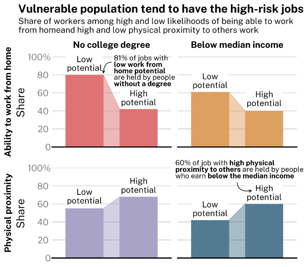
Reproduction of FiveThirtyEight visual works
summary
Today, Xiaobian used Python Matplotlib to reproduce the visualization works of FiveThirtyEight website and customize the text in Maaplotlib. I hope you can learn some visualization tips ~ ~ we will also launch R-ggplot2 version in the future. Please look forward to it!!
reference material
[1]FiveThirtyEight official website address: https://fivethirtyeight.com/features/the-americans-who-suffered-when-the-economy-shut-down-are-also-in-more-danger-as-it-reopens/ .
[2]plt. Introduction to subplots() method: https://matplotlib.org/stable/api/figure_api.html?highlight=subplots#matplotlib.figure.Figure.subplots .
[3]flexitext official website: https://tomicapretto.github.io/flexitext/ .