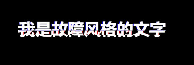
Today, I share a text display animation that uses css3 to realize a recently popular fault style. I dare say that as long as you use this animation in your project, the interviewer will see it. Let's take a look at the finished product drawing first
The animation effect is more complex and uses more knowledge, such as css pseudo elements, element custom attributes, mask attributes, animation animation and so on
Label element part
<body>
    <div class="txt" data-text="I am a fault style text">
        I am a fault style text
    div>
body>
Here we use the custom attribute, that is, data - plus our custom attribute name. We take our text content as the value of the attribute, so that the pseudo element can get the corresponding text later
@keyframes section
@keyframes animation-before{
    0% {
        clip-path: inset(0 0 0 0);
    }

    5% {
        clip-path: inset(.8em 0 .4em 0);
    }

    10% {
        clip-path: inset(.4em 0 .8em 0);
    }

    15% {
        clip-path: inset(.1em 0 1em 0);
    }

    20% {
        clip-path: inset(.3em 0 .6em 0);
    }

    25% {
        clip-path: inset(.6em 0 .3em 0);
    }

    30% {
        clip-path: inset(.8em 0 .5em 0);
    }

    35% {
        clip-path: inset(1em 0 .1em 0);
    }

    40% {
        clip-path: inset(.7em 0 .35em 0);
    }

    45% {
        clip-path: inset(.5em 0 .2em 0);
    }

    50% {
        clip-path: inset(.2em 0 .5em 0);
    }

    55% {
        clip-path: inset(.35em 0 .7em 0);
    }

    60% {
        clip-path: inset(.1em 0 .9em 0);
    }

    65% {
        clip-path: inset(.8em 0 .46em 0);
    }

    70% {
        clip-path: inset(.66em 0 .33em 0);
    }

    75% {
        clip-path: inset(.48em 0 .23em 0);
    }

    80% {
        clip-path: inset(.23em 0 .48em 0);
    }

    85% {
        clip-path: inset(.39em 0 .79em 0);
    }

    90% {
        clip-path: inset(.33em 0 .66em 0);
    }

    95% {
        clip-path: inset(1em 0 .3em 0);
    }

    100% {
        clip-path: inset(.62em 0 .29em 0);
    }
}
@keyframes animation-after{
    0% {
        clip-path: inset(0 0 0 0);
    }

    5% {
        clip-path: inset(.4em 0 .8em 0);
    }

    10% {
        clip-path: inset(.8em 0 .4em 0);
    }

    15% {
        clip-path: inset(1em 0 .1em 0);
    }

    20% {
        clip-path: inset(.6em 0 .3em 0);
    }

    25% {
        clip-path: inset(.3em 0 .6em 0);
    }

    30% {
        clip-path: inset(.5em 0 .8em 0);
    }

    35% {
        clip-path: inset(.1em 0 1em 0);
    }

    40% {
        clip-path: inset(.35em 0 .7em 0);
    }

    45% {
        clip-path: inset(.2em 0 .5em 0);
    }

    50% {
        clip-path: inset(.5em 0 .2em 0);
    }

    55% {
        clip-path: inset(.7em 0 .35em 0);
    }

    60% {
        clip-path: inset(.9em 0 .1em 0);
    }

    65% {
        clip-path: inset(.46em 0 .8em 0);
    }

    70% {
        clip-path: inset(.3em 0 .66em 0);
    }

    75% {
        clip-path: inset(.23em 0 .48em 0);
    }

    80% {
        clip-path: inset(.48em 0 .23em 0);
    }

    85% {
        clip-path: inset(.79em 0 .39em 0);
    }

    90% {
        clip-path: inset(.66em 0 .33em 0);
    }

    95% {
        clip-path: inset(.3em 0 1em 0);
    }

    100% {
        clip-path: inset(.29em 0 .62em 0);
    }
}
Here we set up two keyframes: animation before and animation after
It must be obvious that the former is prepared for the pseudo element before behind us; The latter is used for the pseudo element after
So what is the clip path used for? This is a new attribute of css3, called mask, and the inset() value indicates that the mask shape is rectangular
Let's take a look at its usage
First, inset() receives four length parameters, which respectively represent the distance between the mask and the upper, right, lower and left sides of the element label, thus determining the size of the mask
When we set it to inset (0), it means that the size of the mask action area is as large as the element label, as shown in the following figure (the red border indicates the mask action area)
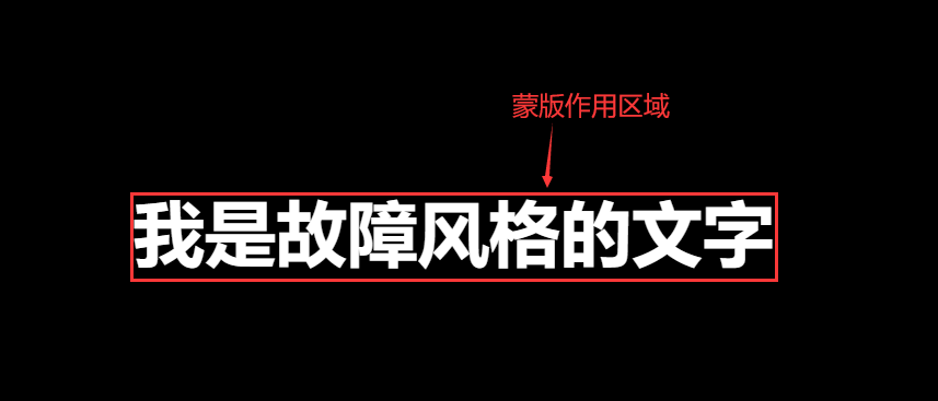
At this time, our text can be fully displayed, because the action area of the mask is the size of our label element
Then let's take a look again. If our setting is inset (30px 0 0 0 0 0 0 0 0 0 0 0 0 0 0 0 0 0 0 0 0 0 0 0 0 0 0 0 0 0 0 0 0 0 0 0 0 0 0 0 0 0 0 0 0 0 0 0 0 0 0 0 0 0 0 0 0 0 0 0 0 0 0 0 0 0 0 0 0 0 0 0 0 0 0 0 0 0 0 0 0 0 0 0 0 0
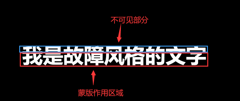
The blue border in the figure is not the function area of the mask, so we can't see the content of this area. The real situation is shown in the figure below
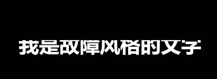
After understanding the use of the mask, we set the frame by frame animation through @ keyframes to make the action area of the mask change in the vertical direction, so as to realize the effect of shaking up and down. The code is as described above
Specific style
body{
    height: 100vh;
    display: flex;
    justify-content: center;
    align-items: center;
    background: black;
}
.txt{
    display: inline-block;
    font-size: 65px;
    font-weight: 600;
    padding: 0 4px;
    color: white;
    position: relative;
}
.txt::before{
    /* Get text */
    content: attr(data-text);
    position: absolute;
    /* Sideshift left 2px */
    left: -2px;
    width: 100%;
    /* Set the background color to the same color as the main background to mask our label elements */
    background: black;
    /* Add a left 2px size red text shadow to the text of the before pseudo element */
    text-shadow:2px 0 red;
    /* Apply a mask to change the animation vertically and cycle all the time */
    animation: animation-before 3s infinite linear alternate-reverse;
}
.txt::after{
    /* Get text */
    content: attr(data-text);
    position: absolute;
    /* Sideshift left 2px */
    left: 2px;
    width: 100%;
    /* Set the background color to the same color as the main background to mask our label elements */
    background: black;
    /* Add a right 2px size blue text shadow to the text of the before pseudo element */
    text-shadow: -2px 0 blue;
    /* Apply a mask to change the animation vertically and cycle all the time */
    animation: animation-after 3s infinite linear alternate-reverse;
}
Here, we set two pseudo elements before and after to locate at the same position as the parent element respectively, and then move a little distance to the left and right respectively to create a misplaced effect. Then, we set the background color to the same color as the background color of the parent element to block the parent element.
Then, after the mask vertical change animation is set, the part obscured by the mask will not be seen, but the parent element content of the lower layer will be exposed, so that a perfect fault style text display animation can be realized.