hello everyone!
Today, let's talk about how to use one line of code to generate cool dynamic interactive charts in the DataFrame dataset. Let's first introduce the module cufflinks to be used this time
Module installation
When it comes to installation, you can directly pip install
pip install cufflinks
Import the module and view the related configuration
Let's import the module and see how much the current version is
cf.__version__
output
'0.17.3'
At present, the version of the module has reached 0.17 3. It is also the latest version. What charts can be drawn in our latest version
cf.help()
output
Use 'cufflinks.help(figure)' to see the list of available parameters for the given figure.
Use 'DataFrame.iplot(kind=figure)' to plot the respective figure
Figures:
 bar
 box
 bubble
 bubble3d
 candle
 choroplet
 distplot
 .......
From the above output, we can see that the general syntax for drawing the chart is DF IPlot (kind = chart name). If we want to view the parameters when drawing a specific chart, such as bar parameters of histogram, we can do so
cf.help('bar')Histogram
Let's take a look at the drawing of histogram chart. First, create a data set for chart drawing
df2 = pd.DataFrame({'Category':['A','B','C','D'],
                    'Values':[95,56,70,85]})
df2
output
  Category  Values
0        A      95
1        B      56
2        C      70
3        D      85
Then let's draw the histogram
df2.iplot(kind='bar',x='Category',y='Values',
          xTitle = "Category",yTitle = "Values",
          title = "histogram")
output
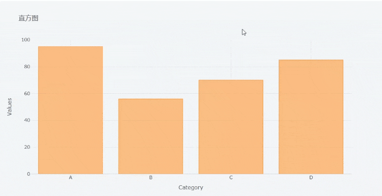
The x parameter is filled with the variable name corresponding to the x axis, and the y parameter is filled with the variable name corresponding to the y axis. We can download the chart in png format,
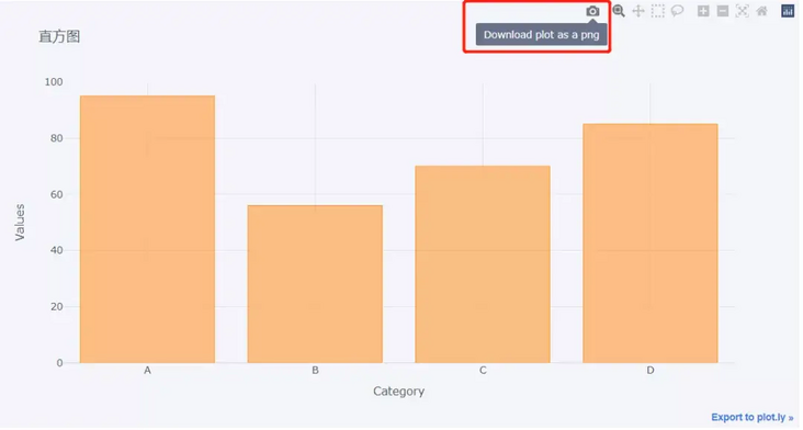
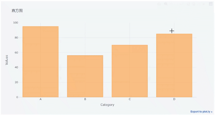
At the same time, we can also zoom in on the chart,
Let's take a look at the following set of data
df = pd.DataFrame(np.random.randn(100,4),columns='A B C D'.split())
df.head()
output
          A         B         C         D
0  0.612403 -0.029236 -0.595502  0.027722
1  1.167609  1.528045 -0.498168 -0.221060
2 -1.338883 -0.732692  0.935410  0.338740
3  1.662209  0.269750 -1.026117 -0.858472
4  1.387077 -0.839192 -0.562382 -0.989672
Let's chart the histogram
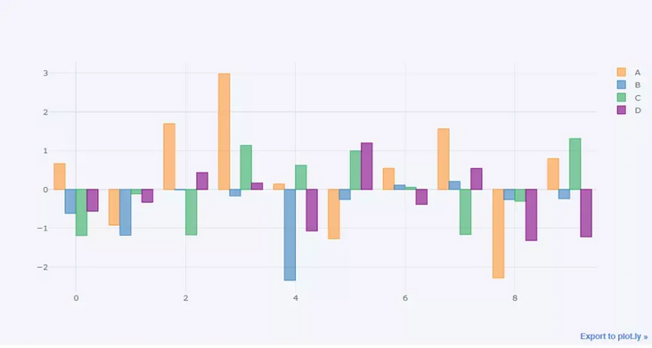
df.head(10).iplot('bar')output
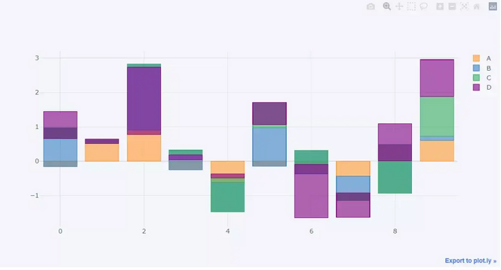
We can also draw a "stacked" histogram
df.head(10).iplot(kind='bar',barmode='stack')
output
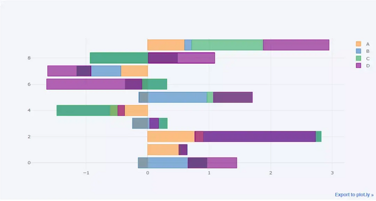
Similarly, we can draw the histogram horizontally
df.head(10).iplot(kind='barh',barmode='stack')
output
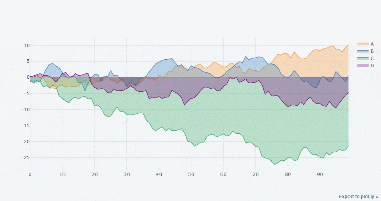
Line chart
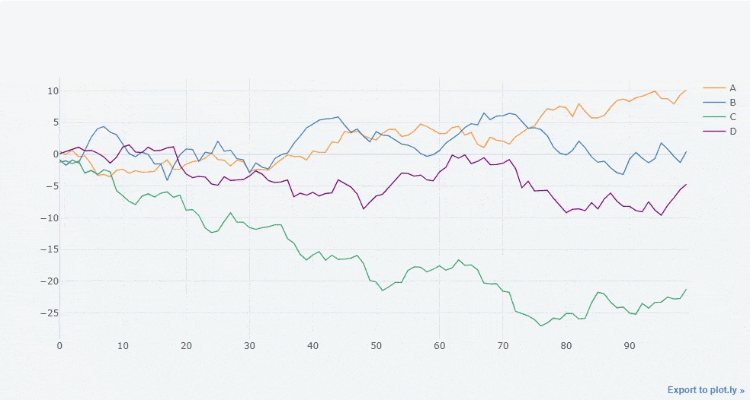
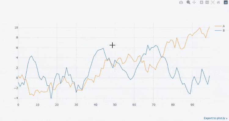
Let's take a look at the drawing of the line graph. First, we make an accumulation for each column of the df dataset above
df3 = df.cumsum()
Then let's draw a line chart
df3.iplot()
output
Of course, you can also filter out several columns and draw them. The effect is as follows
df3[["A", "B"]].iplot()
output
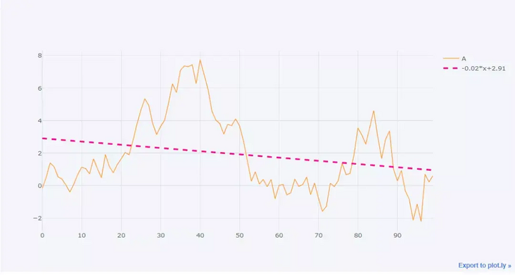
We can also draw a straight line to fit its trend,
df3['A'].iplot(bestfit = True,bestfit_colors=['pink'])
output
Here we focus on the parameters commonly used in an iplot() method
- kind: chart type. The default is scatter and scatter type. There are also bar (histogram), box (box chart), Heatmap (thermal map), etc
- theme: layout themes. You can view the main themes through cf.getThemes()
- Title: title of the chart
- Xtitle / ytitle: the name of the axis above the X or y axis
- colors: the color used to draw the chart
- subplots: Boolean value, which is required when drawing subgraphs. The default value is False
- Mode: string, drawing mode, including lines, markers, lines+markers and lines+text
- Size: for scatter chart, it is mainly used to adjust the size of scatter points
- shape: the layout of each graph when drawing subgraphs
- bargap: distance between columns in histogram
- barmode: histogram shape, stack, group and overlay
Area map
The transition from line chart to area chart is very simple. You only need to set the parameter fill to True. The code is as follows
df3.iplot(fill = True)
output