basemap mapping
Map rendering is also a part of data visualization. The commonly used map rendering library is the basemap toolkit, which is a sub package of matplotlib. This article explains how to use whl file to install basemap in Python 3 environment; Learn to use basemap to draw maps; Learn to zoom area and draw scatter diagram; Through comprehensive cases, consolidate the mapping methods and skills of basemap.
The knowledge points involved are:
- Basemap installation: learn how to install basemap.
- Basemap usage: learn to draw simple maps using basemap.
- Zoom area and drawing: learn to zoom area and draw scatter diagram by positioning longitude and latitude.
- Comprehensive cases: consolidate the mapping methods and skills of basemap through comprehensive cases.
1. Use of basemap
Basemap is a powerful mapping toolkit. This section will explain how to install and use basemap and draw a map in combination with matplotlib.
1.1 basemap installation
In anaconda's Python 3 environment, installing basemap through the conda command will lead to failure. Here, use this website( https://www.lfd.uci.edu/ ~Gohlke / Python LIBS /) download the whl files of the corresponding versions of Pyproj and basemap, as shown in Figures 1 and 2.

Figure 1 Pyproj Download

Figure 2 basemap Download
In anaconda environment, switch to the path of these two whl files and install Pyproj and basemap files through pip in sequence. The code is as follows. Install Pyproj, as shown in Figure 3, which means that Pyproj is successfully installed.
h:
cd H:\python Data analysis\data
pip install pyproj-1.9.5.1-cp36-cp36m-win_amd64.whl

Figure 3 Pyproj installation
Install basemap in the same way. The code is as follows, as shown in Figure 4. Install basemap.
h:
cd H:\python Data analysis\data
pip install basemap-1.1.0-cp36-cp36m-win_amd64.whl
Figure 4 basemap installation
As shown in Figure 5, through from MPL_ toolkits. The basemap import basemap code calls the library and finds that the program can run, which means that the basemap library is successfully installed.

Figure 5 successful installation
1.2 basemap usage
First, import the required third-party library, initialize a map object through basemap, and draw the coastline through drawcouslines. The code is as follows.
import numpy as np
import pandas as pd
import matplotlib.pyplot as plt
from mpl_toolkits.basemap import Basemap
%matplotlib inline

map1 = Basemap(projection='ortho', lat_0=90, lon_0=-105,
              resolution='l', area_thresh=1000.0)      #Initialize map object
map1.drawcoastlines()      #Draw coastline
The projection parameter is used to define the projection method of the map; lat_0 and lon_0 is the center coordinate of the specified map, and the value here is the center coordinate of the United States; The resolution parameter sets the precision of the drawing boundary, and l is low precision; area_ The thresh parameter is the threshold, and those below this threshold will not be drawn. Draw the map as shown in Figure 6.
Note: for more parameter details, please refer to http://matplotlib.org/basemap/.
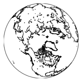
Figure 6 basic map
Draw the national boundary through the drawcountries method. The code is as follows, as shown in Figure 7.
map1 = Basemap(projection='ortho', lat_0=90, lon_0=-105,
              resolution='l', area_thresh=1000.0)
map1.drawcoastlines()  #Draw coastline
map1.drawcountries()   #Draw country
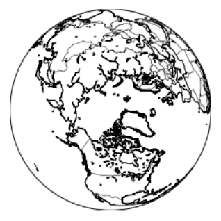
Figure 7 mapping countries
Other common drawing methods are as follows:
drawmapboundary()   #Draw boundary
drawstates()          #Draw state
drawcounties()        #Drawing County
Fill the continent with color by fillcontaints method. The code is as follows, as shown in Figure 12.8.
map1 = Basemap(projection='ortho', lat_0=90, lon_0=-105,
              resolution='l', area_thresh=1000.0)
map1.drawcoastlines()  #Draw coastline
map1.drawcountries()   #Draw country
map1.fillcontinents(color='blue',alpha=0.5)  #fill color
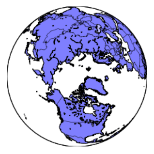
Figure 8 fill continental color
Draw the longitude and latitude through the drawmeridians and drawparallels methods. The code is as follows, as shown in Figure 9.
map1 = Basemap(projection='ortho', lat_0=90, lon_0=-105,
              resolution='l', area_thresh=1000.0)
map1.drawcoastlines()  #Draw coastline
map1.drawcountries()   #Draw country
map1.drawmapboundary() #Draw boundary
map1.fillcontinents(color='blue',alpha=0.5)  #fill color

map1.drawmeridians(np.arange(0, 360, 30))    #Draw longitude
map1.drawparallels(np.arange(-90, 90, 30))   #Draw latitude
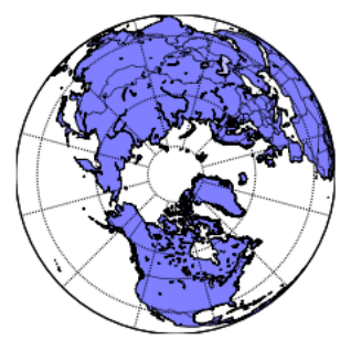
Figure 9 plot longitude and latitude
By changing the projection parameter to robin coordinates, the drawing can be drawn as plane coordinates. The code is as follows, as shown in Figure 10.
map1 = Basemap(projection='robin', lat_0=90, lon_0=-105,
              resolution='l', area_thresh=1000.0)
map1.drawcoastlines()  #Draw coastline
map1.drawcountries()   #Draw country
map1.drawmapboundary() #Draw boundary
map1.fillcontinents(color='blue',alpha=0.5)  #fill color

map1.drawmeridians(np.arange(0, 360, 30))    #Draw longitude
map1.drawparallels(np.arange(-90, 90, 30))   #Draw latitude
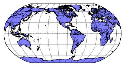
Figure 10 plane coordinates
1.3 zoom area and drawing
In a practical case, it is necessary to draw a map for a specific country or region, so it is necessary to specify the longitude and latitude of the lower left corner and the upper right corner through llcrnrlon, llcrnrlat, urcrnrlon and urcrnrlat. The code is as follows, as shown in Figure 11.
map2 = Basemap(projection='stere', lat_0=90, lon_0=-105,
               llcrnrlon=-118.67, llcrnrlat=23.41,
               urcrnrlon=-64.5, urcrnrlat=45.44,
              resolution='l', area_thresh=1000.0)
map2.drawcoastlines()  #Draw coastline
map2.drawcountries()   #Draw country
map2.drawmapboundary() #Draw boundary
map2.drawstates()      #Draw state
map2.fillcontinents(color='blue',alpha=0.5)  #fill color

map2.drawmeridians(np.arange(0, 360, 30))    #Draw longitude
map2.drawparallels(np.arange(-90, 90, 30))   #Draw latitude

Figure 11 zoom area
Through coordinate positioning, graphics can be drawn on the map. The code is as follows, as shown in Figure 12.
map2 = Basemap(projection='stere', lat_0=90, lon_0=-105,
               llcrnrlon=-118.67, llcrnrlat=23.41,
               urcrnrlon=-64.5, urcrnrlat=45.44,
              resolution='l', area_thresh=1000.0)
map2.drawcoastlines()  #Draw coastline
map2.drawcountries()   #Draw country
map2.drawmapboundary() #Draw boundary
map2.drawstates()      #Draw state

map2.drawmeridians(np.arange(0, 360, 30))    #Draw longitude
map2.drawparallels(np.arange(-90, 90, 30))   #Draw latitude

lon = -74
lat = 40.43
x,y = map2(lon, lat)       #Mapping coordinates
map2.plot(x, y, 'ro', markersize=8)  #Scatter plot
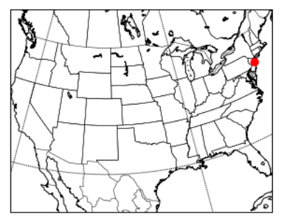
Figure 12 plot scatter diagram
Add text comments for scatter points through the text method of matplotlib library.
map2 = Basemap(projection='stere', lat_0=90, lon_0=-105,
               llcrnrlon=-118.67, llcrnrlat=23.41,
               urcrnrlon=-64.5, urcrnrlat=45.44,
              resolution='l', area_thresh=1000.0)
map2.drawcoastlines()  #Draw coastline
map2.drawcountries()   #Draw country
map2.drawmapboundary() #Draw boundary
map2.drawstates()      #Draw state

map2.drawmeridians(np.arange(0, 360, 30))    #Draw longitude
map2.drawparallels(np.arange(-90, 90, 30))   #Draw latitude

lon = -74
lat = 40.43
x,y = map2(lon, lat)       #Mapping coordinates
map2.plot(x, y, 'ro', markersize=8)  #Scatter plot
plt.text(x,y,'New York')   #Text Annotation
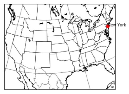
Figure 13 text notes
2. Basemap synthesis example
This section will explain how to draw regional and global maps through basemap, and explain the drawing methods and skills of maps in combination with specific cases.
2.1 US population distribution
Through this website( https://github.com/plotly/datasets/blob/master/2014_us_cities.csv )Download the population data of American cities in 2014 and read the data, as shown in Figure 14. The data has four fields in total, including city name, city population and longitude and latitude coordinates.
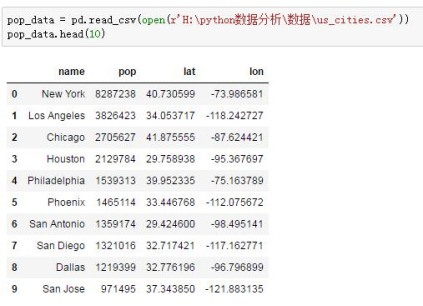
Figure 14 US population data
Use the following code to draw the U.S. population distribution map of the first 180 cities, as shown in Figure 15.
import numpy as np
import pandas as pd
import matplotlib.pyplot as plt
from mpl_toolkits.basemap import Basemap
%matplotlib inline

plt.style.use('ggplot')
plt.figure(figsize=(10,6))

map3 = Basemap(projection='stere', lat_0=90, lon_0=-105,
               llcrnrlon=-118.67, llcrnrlat=23.41,
               urcrnrlon=-64.5, urcrnrlat=45.44,
              resolution='l', area_thresh=1000.0)
map3.drawcoastlines()  #Draw coastline
map3.drawcountries()   #Draw country
map3.drawmapboundary() #Draw boundary
map3.drawstates()      #Draw state
map3.drawcounties()      # Drawing County

map3.drawmeridians(np.arange(0, 360, 30))    #Draw longitude
map3.drawparallels(np.arange(-90, 90, 30))   #Draw latitude

lat = np.array(pop_data["lat"][0:180])                        # Get dimension value of dimension
lon = np.array(pop_data["lon"][0:180])                        # Get longitude value
pop = np.array(pop_data["pop"][0:180],dtype=float)    # Get the population and convert it to numpy floating point
size = (pop/np.max(pop))*1000 # Calculate the size of each point

x,y = map3(lon,lat)
map3.scatter(x,y,s=size)

plt.title('Population distribution in America')     #Add title
Code analysis:
(1) Lines 1 ~ 5
Libraries required by the importer.
(2) Lines 7 ~ 8
Set the style of the chart to ggplot, and set the aspect ratio of the chart.
(3) Lines 10 ~ 21
Define the basemap object and draw the base map, longitude and latitude of the United States.
(4)23~29
Obtain the first 180 data and draw a scatter diagram.
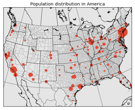
Figure 15 population distribution of the United States
Note: if the population is not converted to numpy floating point, the scatter chart will not show different sizes.
2.2 global seismic visualization
Through the official website of the U.S. Seismological Bureau( https://earthquake.usgs.gov/earthquakes/feed/v1.0/csv.php )Download the seismic data of the past week, as shown in Figure 16.

Figure 16 download of seismic data in the past week
Read the data, as shown in Figure 17. The data has many fields, but the longitude and latitude field and mag field (magnitude) are used in this analysis.

Figure 17 seismic data
Check the missing values for these three fields, as shown in Figure 18. The mag field has one missing value.
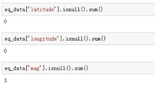
Figure 18 viewing missing values
This missing value is eliminated by filtering, as shown in Figure 19.
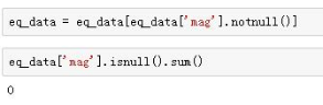
Figure 19 filtering missing values
The seismic distribution map is drawn through the following code, as shown in Figure 20.
plt.style.use('ggplot')
plt.figure(figsize=(10,6))

map4 = Basemap(projection='robin', lat_0=39.9, lon_0=116.3,
              resolution = 'l', area_thresh = 1000.0)

map4.drawcoastlines()         #Draw coastline
map4.drawcountries()          #Draw country
map4.drawmapboundary()      #Draw boundary

map4.drawmeridians(np.arange(0, 360, 30))     #Draw longitude
map4.drawparallels(np.arange(-90, 90, 30))      #Draw latitude

x,y = map4(list(eq_data['longitude']),list(eq_data['latitude']))
map4.plot(x, y, 'ro', markersize=6)       #Scatter plot
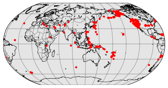
Figure 20 global earthquake distribution (1)
The seismic distribution map with different scattered points is drawn according to the magnitude, as shown in Figure 21.
plt.style.use('ggplot')
plt.figure(figsize=(10,6))

map5 = Basemap(projection='robin', lat_0=39.9, lon_0=116.3,
               resolution = 'l', area_thresh = 1000.0)

map5.drawcoastlines()
map5.drawcountries()
map5.drawmapboundary()

map5.drawmeridians(np.arange(0, 360, 30))
map5.drawparallels(np.arange(-90, 90, 30))

size = 2    #Initialization size
for lon, lat, mag in zip(list(eq_data['longitude']), list(eq_data['latitude']), list(eq_data['mag'])):
    x,y = map5(lon, lat)
    msize = mag * size     #Different magnitudes are different
    map5.plot(x, y, 'ro', markersize=msize)
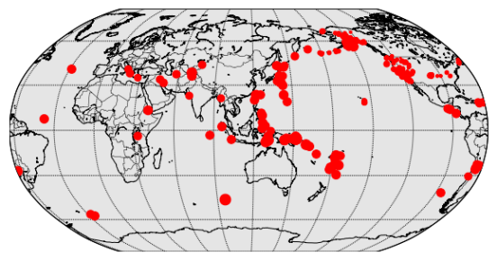
Figure 21 global earthquake distribution (2)
Through the following code, a function is defined to draw maps with different colors through different magnitudes, as shown in Figure 22.
def get_marker_color(mag):
    if mag < 3.0:
        return ('go')
    elif mag < 5.0:
        return ('yo')
    else:
        return ('ro')      #Define and set color functions

plt.style.use('ggplot')
plt.figure(figsize=(10,6))

map6 = Basemap(projection='robin', lat_0=39.9, lon_0=116.3,
               resolution = 'l', area_thresh = 1000.0)

map6.drawcoastlines()
map6.drawcountries()
map6.drawmapboundary()

map6.drawmeridians(np.arange(0, 360, 30))
map6.drawparallels(np.arange(-90, 90, 30))

size = 2
for lon, lat, mag in zip(list(eq_data['longitude']), list(eq_data['latitude']), list(eq_data['mag'])):
    x,y = map6(lon, lat)
    msize = mag * size
    map6.plot(x, y, get_marker_color(mag), markersize=msize)   #Call function

plt.title('Earthquakes')
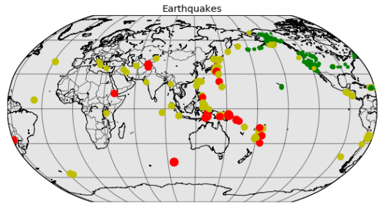
Figure 22 global earthquake distribution (3)
3. Pyecarts mapping
pyecharts can also easily draw beautiful and interactive maps. This section will explain how to use pyechards to draw maps of different regions and draw scatter maps on the map by Geo method.
3.1 maps
To draw a map using pyecarts, you need to download the map js file and install it through pip, as shown in Figure 23.
pip install echarts-countries-pypkg        #Global country map
pip install echarts-china-provinces-pypkg  #Provincial map of China
pip install echarts-china-cities-pypkg      #City level map of China
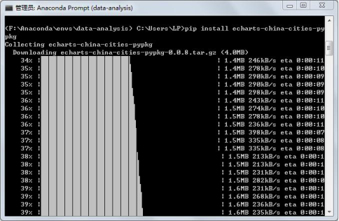
Figure 23 installation map js
Note: remember to restart the Jupiter notebook after installation.
The Map method can be used to draw the Map, and the code is as follows.
value = [155, 78, 23, 65]
label = ["Beijing", "Shanghai", "Tibet", "Guangdong"]
map1 = pyecharts.Map("Example of national map")
map1.add("",label, value, maptype='china')
map1.render()   #Generate html file
The parameters of the add method are as follows: maptype sets the map type and supports china, world, Chinese provincial and municipal names, etc; is_roam scalable map; is_map_symbol_show displays the map red dots.
add(name, attr, value,
    maptype='china',
    is_roam=True,
    is_map_symbol_show=True, **kwargs)
The map of China drawn is shown in Figure 24.
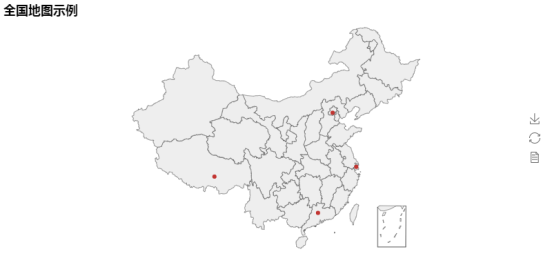
Figure 24 national map (1)
Set is_label_show=True, the name of each province can be displayed. The code is as follows, as shown in Figure 25.
value = [155, 78, 23, 65]
label = ["Beijing", "Shanghai", "Tibet", "Guangdong"]
map1 = pyecharts.Map("Example of national map", width=1200, height=600)
map1.add("",label, value, maptype='china', is_label_show=True)
map1.render()   #Generate html file
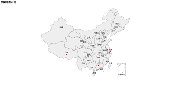
Figure 25 national map (2)
Combined with visual map, you can beautify the map and display different colors according to the values. The code is as follows, as shown in Figure 26.
value = [155, 78, 23, 65]
label = ["Beijing", "Shanghai", "Tibet", "Guangdong"]
map1 = pyecharts.Map("Example of national map", width=1200, height=600)
map1.add("",label, value, maptype='china', is_visualmap=True,
        visual_text_color='#000')
map1.render()   #Generate html file

Figure 26 national map (3)
Modify the maptype parameter to draw a provincial map. The code is as follows, as shown in Figure 27.
value = [233, 102, 41, 82]
attr = ['Wuhan', 'Xianning ', 'Huanggang City', 'Huangshi City']
map1 = pyecharts.Map("Map of Hubei Province")
map1.add("", attr, value, maptype='Hubei', is_visualmap=True,
        visual_text_color='#000')
map1.render()
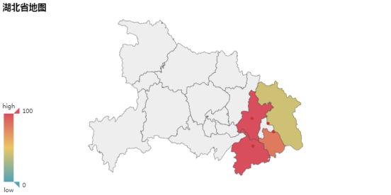
Figure 27 map of Hubei Province
Modify the maptype parameter to world to draw the world map. The code is as follows, as shown in Figure 28.
value = [46, 54, 45, 82, 45]
attr= ["China", "Canada", "Brazil", "Russia", "United States"]
map1 = pyecharts.Map("World map", width=1200, height=600)
map1.add("", attr, value, maptype="world", is_visualmap=True,
        visual_text_color='#000', is_map_symbol_show=False)
map1.render()

Figure 28 global map
3.2 map coordinate system
The map coordinate system component is used for map drawing, and supports the drawing of scatter diagram and line set on the map. Using Geo method, scatter map can be drawn on the map. The code is as follows.
data = [
    ('Shanghai', 78),('Wuhan', 56),('Changsha', 45),('Beijing', 65),('Suzhou', 32),('ynz ', 15),
    ('Nanchang', 87),('Qingdao', 45),('Guangzhou', 78),('Lhasa', 12),('Guilin', 21),('Xi'an', 42),
    ('Jinan', 12)]

geo = pyecharts.Geo("Map drawing case I",
          title_pos="center", width=1200,
          height=600)
attr, value = geo.cast(data)
geo.add("", attr, value, visual_range=[0, 100], visual_text_color="#fff",
        geo_normal_color="#FFFFFF",
        symbol_size=15, is_visualmap=True)
geo.render()
The parameters of the add method are as follows: type sets the legend type, 'scatter', 'effectscutter', and 'heatmap' are optional; symbol_size is the scatter diagram size; border_color sets the map boundary color; geo_normal_color is the color of the map area under normal conditions; geo_emphasis_color is the color of the highlighted map area.
add(name, attr, value,
    type="scatter",
    maptype='china',
    symbol_size=12,
    border_color="#111",
    geo_normal_color="#323c48",
    geo_emphasis_color="#2a333d",
    is_roam=True, **kwargs)
The map drawn is shown in Figure 29.

Figure 29 Case 1
Modify the type parameter and change it to heatmap. The code is as follows, as shown in Figure 30.
data = [
    ('Shanghai', 78),('Wuhan', 56),('Changsha', 45),('Beijing', 65),('Suzhou', 32),('ynz ', 15),
    ('Nanchang', 87),('Qingdao', 45),('Guangzhou', 78),('Lhasa', 12),('Guilin', 21),('Xi'an', 42),
    ('Jinan', 12)]

geo = pyecharts.Geo("Map drawing case II",
          title_pos="center", width=1200,
          height=600)
attr, value = geo.cast(data)
geo.add("", attr, value, type='heatmap', visual_range=[0, 100], visual_text_color="#fff",
        geo_normal_color="#FFFFFF",
        symbol_size=15, is_visualmap=True)
geo.render()
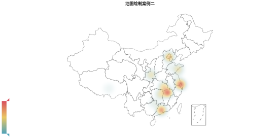
Figure 30 case 2