This dynamic chart is called bar competition chart, which is very suitable for making data that changes over time.
I've used streamlit+bar_chart_race is implemented, and then white whores heroku's server. You can easily make a bar competition chart by uploading a form in csv format through the following website, and the generated video can be saved locally.
https://bar-chart-race-app.herokuapp.com/
In this article, I will introduce the implementation process. White whoring server + deployment will be discussed in the next issue.
Pure matplotlib implementation
Note: all the following implementation methods need to install ffmpeg in advance. The installation method is in Decision tree visualization It is introduced in the article
matplotlib is very simple to implement bar chart race, which is directly loaded into the code
import pandas as pd
import matplotlib.pyplot as plt
import matplotlib.ticker as ticker
import matplotlib.animation as animation
from IPython.display import HTML
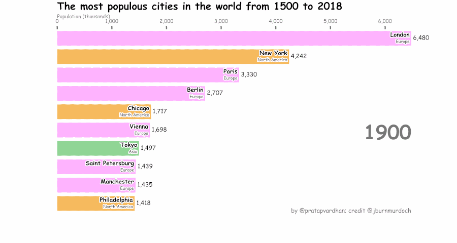
url = 'https://gist.githubusercontent.com/johnburnmurdoch/4199dbe55095c3e13de8d5b2e5e5307a/raw/fa018b25c24b7b5f47fd0568937ff6c04e384786/city_populations'
df = pd.read_csv(url, usecols=['name', 'group', 'year', 'value'])
colors = dict(zip(
["India", "Europe", "Asia", "Latin America", "Middle East", "North America", "Africa"],
["#adb0ff", "#ffb3ff", "#90d595", "#e48381", "#aafbff", "#f7bb5f", "#eafb50"]
))
group_lk = df.set_index('name')['group'].to_dict()
fig, ax = plt.subplots(figsize=(15, 8))
def draw_barchart(current_year):
dff = df[df['year'].eq(current_year)].sort_values(by='value', ascending=True).tail(10)
ax.clear()
ax.barh(dff['name'], dff['value'], color=[colors[group_lk[x]] for x in dff['name']])
dx = dff['value'].max() / 200
for i, (value, name) in enumerate(zip(dff['value'], dff['name'])):
ax.text(value-dx, i, name, size=14, weight=600, ha='right', va='bottom')
ax.text(value-dx, i-.25, group_lk[name], size=10, color='#444444', ha='right', va='baseline')
ax.text(value+dx, i, f'{value:,.0f}', size=14, ha='left', va='center')
ax.text(1, 0.4, current_year, transform=ax.transAxes, color='#777777', size=46, ha='right', weight=800)
ax.text(0, 1.06, 'Population (thousands)', transform=ax.transAxes, size=12, color='#777777')
ax.xaxis.set_major_formatter(ticker.StrMethodFormatter('{x:,.0f}'))
ax.xaxis.set_ticks_position('top')
ax.tick_params(axis='x', colors='#777777', labelsize=12)
ax.set_yticks([])
ax.margins(0, 0.01)
ax.grid(which='major', axis='x', linestyle='-')
ax.set_axisbelow(True)
ax.text(0, 1.15, 'The most populous cities in the world from 1500 to 2018',
transform=ax.transAxes, size=24, weight=600, ha='left', va='top')
ax.text(1, 0, 'by @pratapvardhan; credit @jburnmurdoch', transform=ax.transAxes, color='#777777', ha='right',
bbox=dict(facecolor='white', alpha=0.8, edgecolor='white'))
plt.box(False)
fig, ax = plt.subplots(figsize=(15, 8))
animator = animation.FuncAnimation(fig, draw_barchart, frames=range(1900, 2019))
HTML(animator.to_jshtml())
The core is to define draw_ The Barchart function draws the style of the current chart, and then uses animation Funcanimation repeatedly calls draw_barchart to make animation, and finally use animator to_ html5_ Video () or animator Save() saves GIF / video.
xkcd hand drawn style
We can also use Matplotlib pyplot. XKCD function draws XKCD style charts. The method is also very simple. Just add one line to the last paragraph of the above code
with plt.xkcd():
    fig, ax = plt.subplots(figsize=(15, 8))
    animator = animation.FuncAnimation(fig, draw_barchart, frames=range(1900, 2019))
    HTML(animator.to_jshtml())
bar_ chart_ Minimal implementation of race Library
If it's troublesome, you can also use a library "Bar Chart Race", which can be called the strongest dynamic visualization package in Python.
GitHub address: https://github.com/dexplo/bar_chart_race
At present, there are mainly two versions: 0.1 and 0.2. In version 0.2, dynamic curve and dynamic bar graph realized by Plotly are added.
Via pip install bar_chart_race can only be downloaded to version 0.1, so you need to download it from GitHub and then install it.
git clone https://github.com/dexplo/bar_chart_race
It is very simple to use, and can be realized in three lines of code
import bar_chart_race as bcr
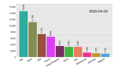
# get data
df = bcr.load_dataset('covid19_tutorial')
# Generate GIF image
bcr.bar_chart_race(df, 'covid19_horiz.gif')
Actually bar_chart_race also has many parameters that can output different forms of gif
bcr.bar_chart_race(
df=df,
filename='covid19_horiz.mp4',
orientation='h',
sort='desc',
n_bars=6,
fixed_order=False,
fixed_max=True,
steps_per_period=10,
interpolate_period=False,
label_bars=True,
bar_size=.95,
period_label={'x': .99, 'y': .25, 'ha': 'right', 'va': 'center'},
period_fmt='%B %d, %Y',
period_summary_func=lambda v, r: {'x': .99, 'y': .18,
's': f'Total deaths: {v.nlargest(6).sum():,.0f}',
'ha': 'right', 'size': 8, 'family': 'Courier New'},
perpendicular_bar_func='median',
period_length=500,
figsize=(5, 3),
dpi=144,
cmap='dark12',
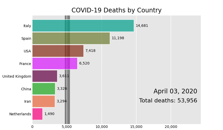
title='COVID-19 Deaths by Country',
title_size='',
bar_label_size=7,
tick_label_size=7,
shared_fontdict={'family' : 'Helvetica', 'color' : '.1'},
scale='linear',
writer=None,
fig=None,
bar_kwargs={'alpha': .7},
filter_column_colors=False)
For example, the following
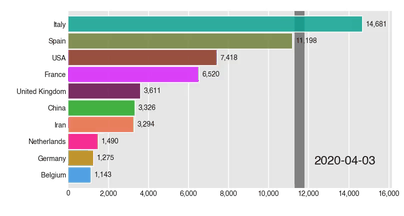
For more detailed usage, you can refer to the official documents
Address: https://www.dexplo.org/bar_chart_race/
streamlit+bar_chart_race
streamlit is a machine learning application development framework that I especially like to play recently. It can help you quickly create a cool Web APP without understanding complex HTML,CSS and other front-end technologies.
I developed it before Decision tree pick watermelon Is using streamlit
Here is streamlit+bar_chart_race overall structure
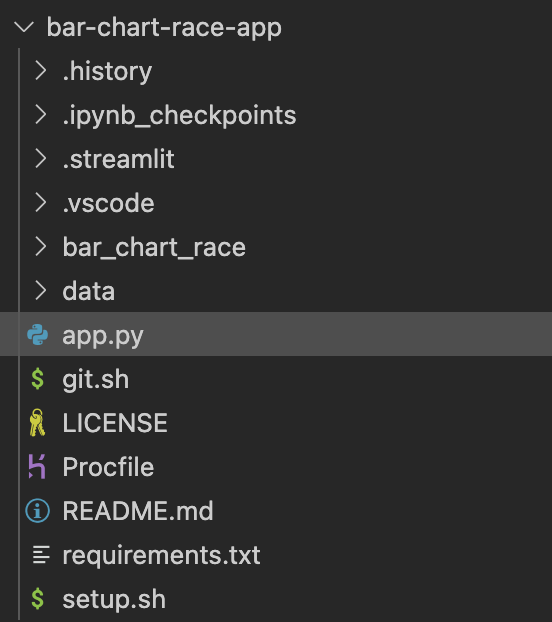
The core is app Py, the code is as follows:
from bar_chart_race import bar_chart_race as bcr
import pandas as pd
import streamlit as st
import streamlit.components.v1 as components
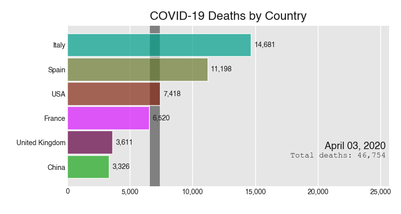
st.title('Bar Chart Race', anchor=None)
uploaded_file = st.file_uploader("", type="csv")
if uploaded_file is not None:
df = pd.read_csv(uploaded_file,sep=',', encoding='gbk')
df = df.set_index("date")
st.write(df.head(6))
bcr_html = bcr.bar_chart_race(df=df, n_bars=10)
components.html(bcr_html.data, width=800, height=600)
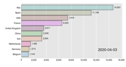
Let's experience the final effect:
https://bar-chart-race-app.herokuapp.com/
Three companies are watching, making millions a year. The next issue starts with white whoring server + deployment. Please look forward to it.