In this section, we introduce the method of adding saliency to the box diagram, similar to this:
"Visualization of single factor two-level T inspection box line diagram"

"Visualization of single factor three level T inspection box line diagram"

"Single factor three horizontal column chart"

"Single factor three level line chart"

"Two factor column chart"

"Two factor line chart"

1. Single factor two level
For example, there are differences in plant height between two varieties, and 10 plants are investigated for each variety, which constitutes such test data.
"Analog data:"
set.seed(123)
y1 = rnorm(10) + 5
y2 = rnorm(10) + 15
dd = data.frame(Group = rep(c("A","B"),each=10),y = c(y1,y2))
dd
str(dd)
dd$Group = as.factor(dd$Group)
Data:
> dd
   Group         y
1      A  4.439524
2      A  4.769823
3      A  6.558708
4      A  5.070508
5      A  5.129288
6      A  6.715065
7      A  5.460916
8      A  3.734939
9      A  4.313147
10     A  4.554338
11     B 16.224082
12     B 15.359814
13     B 15.400771
14     B 15.110683
15     B 14.444159
16     B 16.786913
17     B 15.497850
18     B 13.033383
19     B 15.701356
20     B 14.527209
Here, the ggpubr package is used for drawing:
1.1 draw box line diagram
library(ggplot2)
library(ggpubr)
ggboxplot(dd,x = "Group",y = "y")

Insert picture description here
1.2 add different colors to the box diagram
ggboxplot(dd,x = "Group",y = "y",color = "Group")

1.3 add scatter diagram to box diagram
ggboxplot(dd,x = "Group",y = "y",color = "Group",add = "jitter")

1.4 box plot + scatter plot + significance level
Here, the default statistical method is nonparametric statistics Wilcoxon. If you want to use t.test, see the following operation
ggboxplot(dd,x = "Group",y = "y",color = "Group",add = "jitter") +
  stat_compare_means()

1.5 t.test is used as the statistical method
ggboxplot(dd,x = "Group",y = "y",color = "Group",add = "jitter") +
  stat_compare_means(method = "t.test")

1.6 significance of direct output
ggboxplot(dd,x = "Group",y = "y",color = "Group",add = "jitter") +
  stat_compare_means(method = "t.test",label = "p.signif")

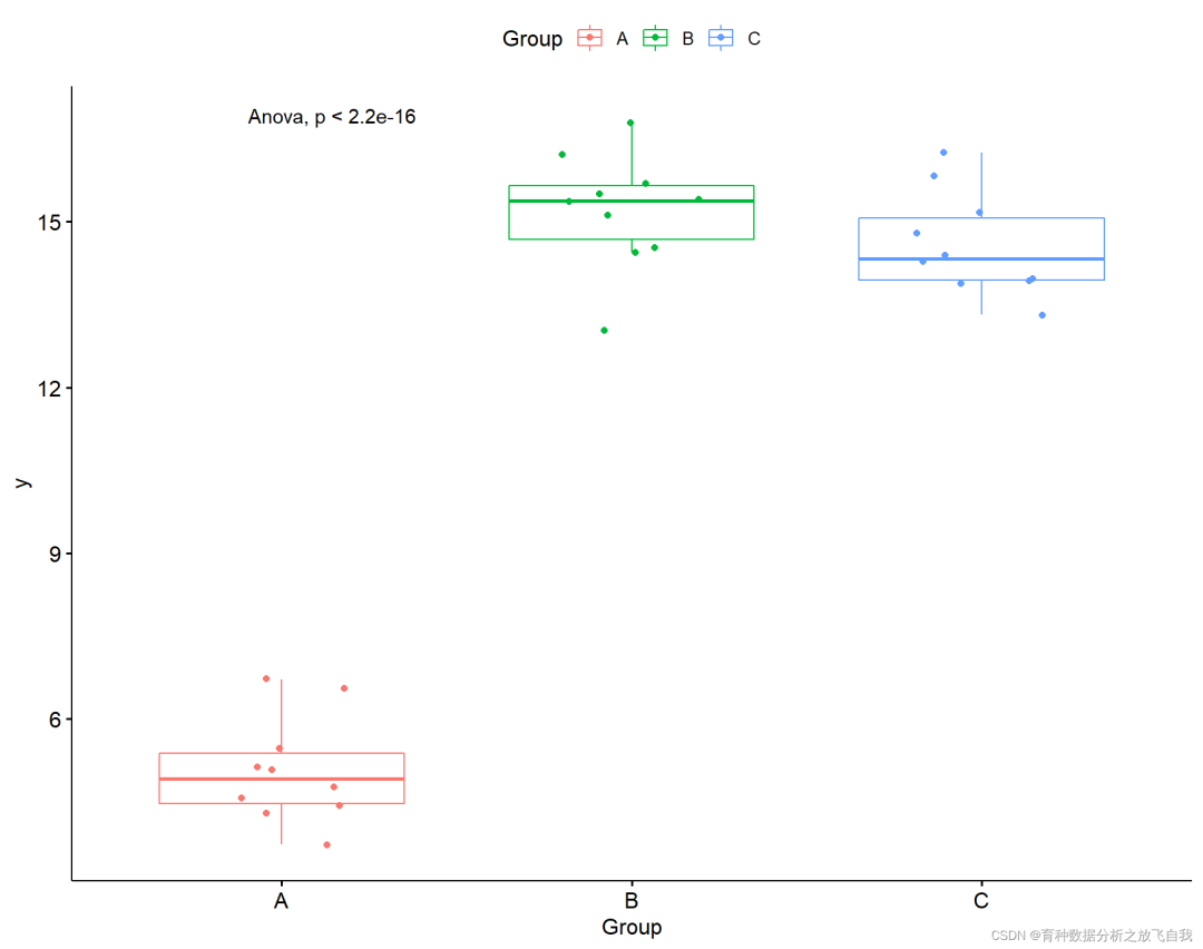
2. Single factor and three levels
Two levels can be tested by T. how to test the data of three or more levels?
"Analog data:"
# Construct three level ANOVA
set.seed(123)
y1 = rnorm(10) + 5
y2 = rnorm(10) + 15
y3 = rnorm(10) + 15

dd = data.frame(Group = rep(c("A","B","C"),each=10),y = c(y1,y2,y3))
dd
str(dd)
dd$Group = as.factor(dd$Group)
"The data are as follows:"
> dd
   Group         y
1      A  4.439524
2      A  4.769823
3      A  6.558708
4      A  5.070508
5      A  5.129288
6      A  6.715065
7      A  5.460916
8      A  3.734939
9      A  4.313147
10     A  4.554338
11     B 16.224082
12     B 15.359814
13     B 15.400771
14     B 15.110683
15     B 14.444159
16     B 16.786913
17     B 15.497850
18     B 13.033383
19     B 15.701356
20     B 14.527209
21     C 13.932176
22     C 14.782025
23     C 13.973996
24     C 14.271109
25     C 14.374961
26     C 13.313307
27     C 15.837787
28     C 15.153373
29     C 13.861863
30     C 16.253815
2.1 box diagram + scatter diagram
p = ggboxplot(dd,x = "Group",y = "y",color = "Group",add = "jitter")
p

2.2 box plot + scatter plot + significance
p + stat_compare_means(method = "anova")
2.3 significance mapping between two
my_comparisons = list( c("A", "B"), c("A", "C"), c("B", "C") )
p + stat_compare_means(comparisons = my_comparisons,
                       # label = "p.signif",
                       method = "t.test")
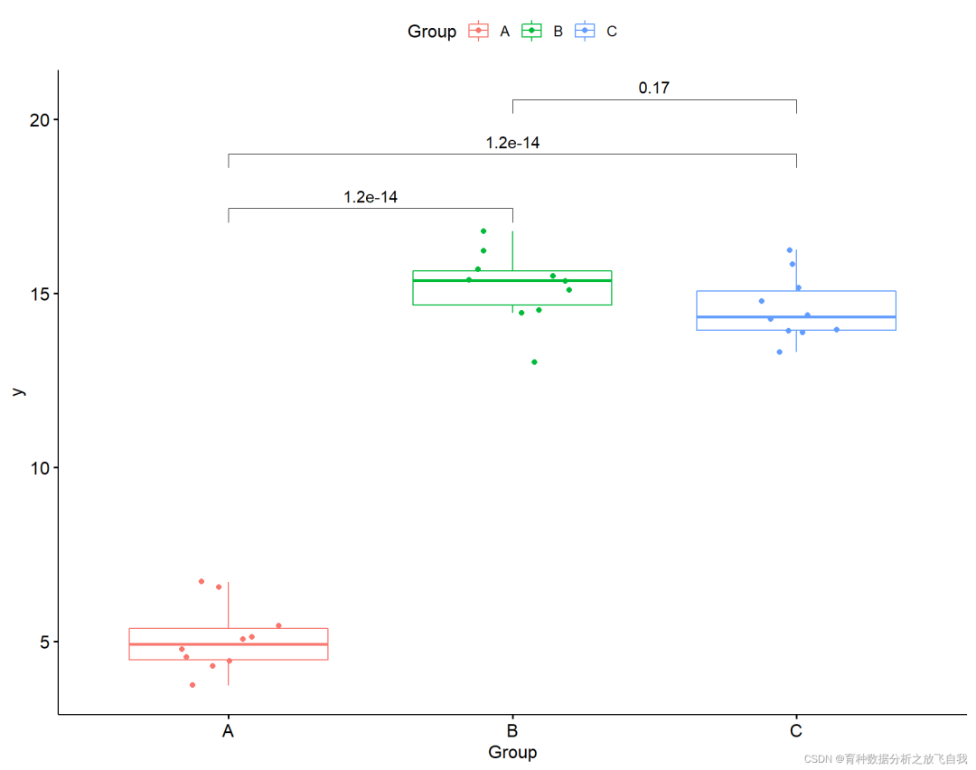
2.4 display significance
p + stat_compare_means(comparisons = my_comparisons,
                       label = "p.signif",
                       method = "t.test")

3. Two factor data
"Analog data:"
# Two factor data
set.seed(123)
y1 = rnorm(10) + 5
y2 = rnorm(10) + 8
y3 = rnorm(10) + 7
y4 = rnorm(10) + 15
y5 = rnorm(10) + 18
y6 = rnorm(10) + 17

dd = data.frame(Group1 = rep(c("A","B","C"),each=10),
                Group2 = rep(c("X","Y"),each=30),
                y = c(y1,y2,y3,y4,y5,y6))
dd
str(dd)
dd$Group1 = as.factor(dd$Group1)
dd$Group2 = as.factor(dd$Group2)
str(dd)
Data preview:
> dd
   Group1 Group2         y
1       A      X  4.439524
2       A      X  4.769823
3       A      X  6.558708
4       A      X  5.070508
5       A      X  5.129288
6       A      X  6.715065
7       A      X  5.460916
8       A      X  3.734939
9       A      X  4.313147
10      A      X  4.554338
11      B      X  9.224082
12      B      X  8.359814
13      B      X  8.400771
14      B      X  8.110683
15      B      X  7.444159
16      B      X  9.786913
17      B      X  8.497850
18      B      X  6.033383
19      B      X  8.701356
20      B      X  7.527209
21      C      X  5.932176
22      C      X  6.782025
23      C      X  5.973996
24      C      X  6.271109
25      C      X  6.374961
26      C      X  5.313307
27      C      X  7.837787
28      C      X  7.153373
29      C      X  5.861863
30      C      X  8.253815
31      A      Y 15.426464
32      A      Y 14.704929
33      A      Y 15.895126
34      A      Y 15.878133
35      A      Y 15.821581
36      A      Y 15.688640
37      A      Y 15.553918
38      A      Y 14.938088
39      A      Y 14.694037
40      A      Y 14.619529
41      B      Y 17.305293
42      B      Y 17.792083
43      B      Y 16.734604
44      B      Y 20.168956
45      B      Y 19.207962
46      B      Y 16.876891
47      B      Y 17.597115
48      B      Y 17.533345
49      B      Y 18.779965
50      B      Y 17.916631
51      C      Y 17.253319
52      C      Y 16.971453
53      C      Y 16.957130
54      C      Y 18.368602
55      C      Y 16.774229
56      C      Y 18.516471
57      C      Y 15.451247
58      C      Y 17.584614
59      C      Y 17.123854
60      C      Y 17.215942
3.1 draw group box line diagram
p = ggboxplot(dd,x = "Group1",y="y",color = "Group2",
              add = "jitter")
p

3.2 increase P value
p + stat_compare_means(aes(group = Group2),method = "t.test")

3.3 is modified to significant results
p + stat_compare_means(aes(group = Group2),method = "t.test",label = "p.signif")

3.4 plot grouped data separately
p = ggboxplot(dd,x = "Group2",y="y",color = "Group1",
              add = "jitter",facet.by = "Group1")
p

3.5 group display statistical inspection
p + stat_compare_means(method = "t.test")

3.6 grouping to show significant results
p + stat_compare_means(method = "t.test",label = "p.signif",label.y = 17)

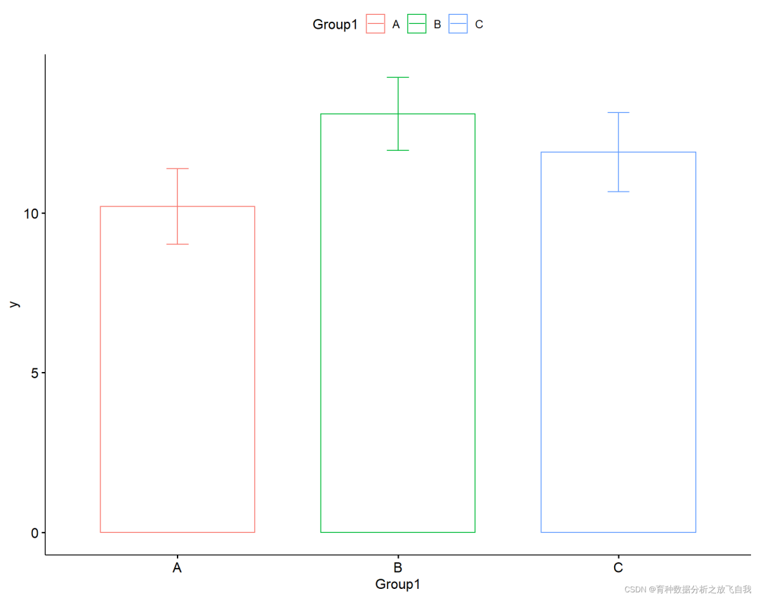
4. Single factor histogram drawing
Histogram + standard error. Before using ggplot2, it takes a long code. Here is a better scheme.
4.1 histogram + standard error
p = ggbarplot(dd,x = "Group1",y = "y",add = "mean_se",color = "Group1")
p
4.2 histogram + standard error + significance
p + stat_compare_means(method = "anova",,label.y = 15)+
  stat_compare_means(comparisons = my_comparisons)

5. Single factor line chart drawing
5.1 line chart + standard error
p = ggline(dd,x = "Group1",y = "y",add = "mean_se")
p

5.2 line chart + standard error + significance
p + stat_compare_means(method = "anova",,label.y = 15)+
  stat_compare_means(comparisons = my_comparisons)

6. Two factor histogram drawing
6.1 histogram + standard error
p = ggbarplot(dd,x = "Group1",y = "y",add = "mean_se",color = "Group2", position = position_dodge(0.8))
p

6.2 histogram + standard error + significance
p + stat_compare_means(aes(group=Group2), label = "p.signif")

7. Drawing of two factor line chart
7.1 line chart + standard error
p = ggline(dd,x = "Group1",y = "y",add = "mean_se",color = "Group2", position = position_dodge(0.8))
p

7.2 line chart + standard error + significance
p + stat_compare_means(aes(group=Group2), label = "p.signif")

8. Code summary
# Welcome to my official account: the release of self analysis of breeding data. Mainly share R language, Python, breeding data analysis, biostatistics, quantitative genetics, mixed linear model, GWAS and GS.

# Build two horizontal t-tests
set.seed(123)
y1 = rnorm(10) + 5
y2 = rnorm(10) + 15
dd = data.frame(Group = rep(c("A","B"),each=10),y = c(y1,y2))
dd
str(dd)
dd$Group = as.factor(dd$Group)

library(ggplot2)
library(ggpubr)
ggboxplot(dd,x = "Group",y = "y")
ggboxplot(dd,x = "Group",y = "y",color = "Group")
ggboxplot(dd,x = "Group",y = "y",color = "Group",add = "jitter")
ggboxplot(dd,x = "Group",y = "y",color = "Group",add = "jitter") +
  stat_compare_means()

ggboxplot(dd,x = "Group",y = "y",color = "Group",add = "jitter") +
  stat_compare_means(method = "t.test")

ggboxplot(dd,x = "Group",y = "y",color = "Group",add = "jitter") +
  stat_compare_means(method = "t.test",label = "p.signif")


# Construct three level ANOVA
set.seed(123)
y1 = rnorm(10) + 5
y2 = rnorm(10) + 15
y3 = rnorm(10) + 15

dd = data.frame(Group = rep(c("A","B","C"),each=10),y = c(y1,y2,y3))
dd
str(dd)
dd$Group = as.factor(dd$Group)

p = ggboxplot(dd,x = "Group",y = "y",color = "Group",add = "jitter")
p
p + stat_compare_means(method = "anova")


# Perorm pairwise comparisons
# compare_means(y ~ Group,  data = dd,method = "anova")

my_comparisons = list( c("A", "B"), c("A", "C"), c("B", "C") )
p + stat_compare_means(comparisons = my_comparisons,
                       # label = "p.signif",
                       method = "t.test")

p + stat_compare_means(comparisons = my_comparisons,
                       label = "p.signif",
                       method = "t.test")

# Two factor data
set.seed(123)
y1 = rnorm(10) + 5
y2 = rnorm(10) + 8
y3 = rnorm(10) + 7
y4 = rnorm(10) + 15
y5 = rnorm(10) + 18
y6 = rnorm(10) + 17

dd = data.frame(Group1 = rep(c("A","B","C"),each=10),
                Group2 = rep(c("X","Y"),each=30),
                y = c(y1,y2,y3,y4,y5,y6))
dd
str(dd)
dd$Group1 = as.factor(dd$Group1)
dd$Group2 = as.factor(dd$Group2)
str(dd)

## Group view
p = ggboxplot(dd,x = "Group1",y="y",color = "Group2",
              add = "jitter")
p
p + stat_compare_means(aes(group = Group2),method = "t.test")
p + stat_compare_means(aes(group = Group2),method = "t.test",label = "p.signif")

## Group view
p = ggboxplot(dd,x = "Group2",y="y",color = "Group1",
              add = "jitter",facet.by = "Group1")
p
p + stat_compare_means(method = "t.test")
p + stat_compare_means(method = "t.test",label = "p.signif",label.y = 17)


# Single grouping
# Three level histogram
p = ggbarplot(dd,x = "Group1",y = "y",add = "mean_se",color = "Group1")
p
p + stat_compare_means(method = "anova",,label.y = 15)+
  stat_compare_means(comparisons = my_comparisons)

# Line chart with error
p = ggline(dd,x = "Group1",y = "y",add = "mean_se")
p
p + stat_compare_means(method = "anova",,label.y = 15)+
  stat_compare_means(comparisons = my_comparisons)


# Two groups
p = ggbarplot(dd,x = "Group1",y = "y",add = "mean_se",color = "Group2", position = position_dodge(0.8))
p
p + stat_compare_means(aes(group=Group2), label = "p.signif")


# Line chart with error
p = ggline(dd,x = "Group1",y = "y",add = "mean_se",color = "Group2", position = position_dodge(0.8))
p
p + stat_compare_means(aes(group=Group2), label = "p.signif")