preface
Fans sent me a very interesting picture:
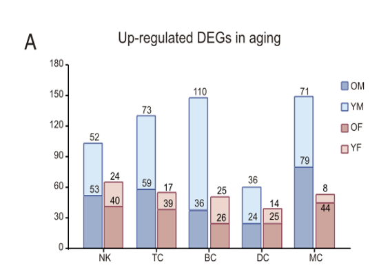
At first glance, this picture is quite simple.
But there are some difficulties, such as how to draw this, which is both dodge and stack.
Come and repeat it.
Start
Direct false data creation:
a1 <- data.frame(
  counts = c(53, 40, 59, 39),
  type1 = c(rep("NK",2), rep("TC",2)),
  type2 = rep(c("YM", "YF"), 2)
)

a2 <- data.frame(
  counts = c(105, 64, 128,66),
  type1 = c(rep("NK",2), rep("TC",2)),
  type2 = rep(c("OM", "OF"), 2)
)
Draw directly:
ggplot() + geom_col(data = a1,
                    aes(type1, counts, fill = type2),
                    position = "dodge") +
  geom_col(data = a2, aes(type1, counts, fill = type2),
           position = "dodge", alpha = 0.8) +
  geom_text(data = a2,
            aes(type1, counts,fill = type2, label = counts),
            position = position_dodge(0.9), vjust = -0.8) +
  geom_text(data = a1,
            aes(type1, counts,fill = type2, label = counts),
            position = position_dodge(0.9), vjust = -0.8)
Originally, you wanted to make your own color adjustment. There is another technical point: the overlapping color ggplot will become the synthetic color corresponding to the two colors, which is inconsistent with that in legand. It needs to be replaced manually. The final code is as follows:
ggplot() + geom_col(data = a1,
                    aes(type1, counts, fill = type2),
                    position = "dodge") +
  geom_col(data = a2, aes(type1, counts, fill = type2),
           position = "dodge", alpha = 0.5) +
  geom_text(data = a2,
            aes(type1, counts,fill = type2, label = counts),
            position = position_dodge(0.9), vjust = -0.8) +
  geom_text(data = a1,
            aes(type1, counts,fill = type2, label = counts),
            position = position_dodge(0.9), vjust = -0.8) +
  ggthemes::theme_economist() +
  # Find colors on this website https://colorbrewer2.org/
  scale_fill_manual(values = c("#fc9272", "#9ecae1", "#de2d26","#3182bd"))

However, the problem of synthetic color remains unsolved.
The reason is that the mapping of this layer should not be low below the high, but high below the low (draw a2 first and then a1):
ggplot() +
  geom_col(data = a2, aes(type1, counts, fill = type2),
           position = "dodge", alpha = 0.5) +
  geom_col(data = a1,
                    aes(type1, counts, fill = type2),
                    position = "dodge") +
  geom_text(data = a2,
            aes(type1, counts,fill = type2, label = counts),
            position = position_dodge(0.9), vjust = -0.8) +
  geom_text(data = a1,
            aes(type1, counts,fill = type2, label = counts),
            position = position_dodge(0.9), vjust = -0.8) +
  ggthemes::theme_economist() +
  # Find colors on this website https://colorbrewer2.org/
  scale_fill_manual(values = c("#fc9272", "#9ecae1", "#de2d26","#3182bd"))
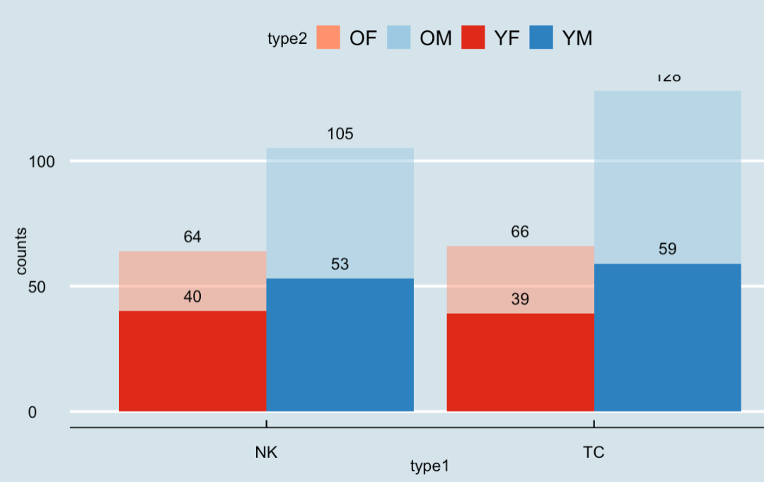
Here is the technical summary:
- Be sure to pay attention to the drawing order. Always draw the high one first, then the low one, and then the text mark, and finally draw;
- The standard to check whether there is a reasonable order is to see whether the legend color corresponds to the real color. For example, the color in the first drawing result is obviously wrong;
- In text, the mapping established should consider fill (corresponding to color in col, which is also color if it is color);
- stay https://colorbrewer2.org/ Choose the right color. I will also make a series about color;
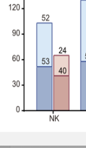
Some students may want to ask why you didn't reduce this high family. Obviously, this will cause misunderstanding. You are obviously in 64, but the value shows 24. It's funny.
Of course, if you want a non head iron, adjust the label of ggtext. Anyway, I won't teach you.
Later words
I feel a bit like Wang Gang. I like to make a technical summary after cooking, hhh.
In addition, I have adopted a different approach to this figure from the author:
It is not difficult to find that the author's large histogram is actually empty at the bottom. Here are two conjectures:
- It is actually painted like me, but ggtext deliberately subtracts the small ones, and produces a visual illusion through color;
- It is indeed the second layer mapping, and the bottom is empty.
So if it's conjecture two, how to draw this horizontal histogram?
Please think about it. Because there is no application value, this pit will not be filled for the time being.