1, Introduction to floating
a. Floating allows an element to move to the left or right of its parent element
b. Use the float attribute to set the float on the element
Optional values:
none is the default, and the element does not float
The left element floats to the left
The right element floats to the right
c. Note that after the element is set to float, the equation of horizontal layout does not need to be enforced
After the element is set to float, it will be completely separated from the document flow and no longer occupy the position of the document flow,
Therefore, the element below the element that is still in the document stream will automatically move upward
d. Floating features:
1. Floating elements are completely separated from the document flow and no longer occupy a position in the document flow
2. After floating is set, the element will move to the left or right of the parent element,
3. Floating elements are not moved out of the parent element by default
4. When a floating element moves left or right, it does not exceed the other floating elements in front of it
5. If the upper edge of a floating element is a block element without floating, the floating element cannot be moved up
6. The floating element will not exceed the floating sibling element above it. At most, it is as high as it is
e. Other features of floating
- The floating element will not cover the text, and the text will automatically surround the floating element, so we can use the floating to set the effect of text surrounding the picture
- After the element is set to float, it will be separated from the document flow. After it is separated from the document flow, some characteristics of the element will also change
f. Characteristics of breaking away from document flow:
Block element:
1. The block element is not on a row of the exclusive page
2. After leaving the document stream, the width and height of the block element are expanded by the content by default
Inline elements:
When an inline element breaks away from the document flow, it will become a block element with the same characteristics as a block element
After leaving the document stream, there is no need to distinguish between blocks and lines
- Brief summary:
At present, the main function of floating is to make the elements in the page arranged horizontally,
Some horizontal layouts can be made by floating
2, Layout of web pages
There are many ways of web page layout, which is generally divided into the following parts: head area, menu navigation area, content area and bottom area.

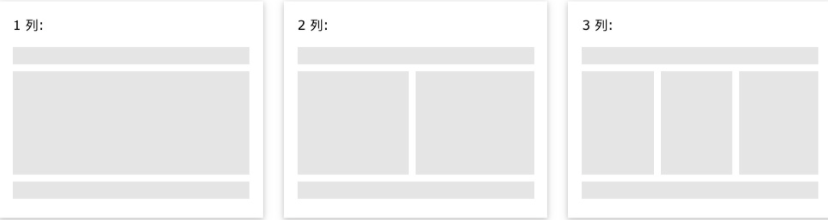
Content area
The content area generally has three forms:
Train 1: generally used for mobile terminal
Column 2: generally used for tablet devices
Column 3: generally used for PC desktop devices
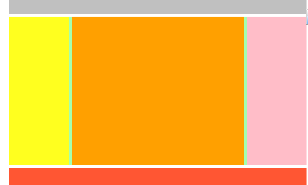
Code demonstration:
Insert the code slice here<!DOCTYPE html>
<html lang="en">
<head>
    <meta charset="UTF-8">
    <meta name="viewport" content="width=device-width, initial-scale=1.0">
    <meta http-equiv="X-UA-Compatible" content="ie=edge">
    <title>Document</title>
    <style>
        header, main, footer{
            width: 1000px;
            margin: 0 auto;
        }

        /* Set header */
        header{
            height: 150px;
            background-color: silver;
        }

        /* Set body */
        main{
            height: 500px;
            background-color: #bfa;
            margin: 10px auto;
        }

        nav, article, aside{
            float: left;
            height: 100%;
        }

        /* Set left navigation */
        nav{
            width: 200px;
            background-color: yellow;
        }

        /* Set the content in the middle */
        article{
            width: 580px;
            background-color: orange;
            margin: 0 10px;
        }

        /* Set content on the right */
        aside{
            width: 200px;
            background-color: pink;
        }

        /* Set bottom */
        footer{
            height: 150px;
            background-color: tomato;
        }
    </style>
</head>
<body>

    <!-- Create head -->
    <header></header>

    <!-- Create the body of the page -->
    <main>
        <!-- Left Navigation  -->
       <nav></nav>

       <!-- Middle content -->
       <article></article>

       <!-- Right sidebar -->
       <aside></aside>

    </main>

    <!-- Bottom of page -->
    <footer></footer>
</body>
</html>
Operation results:
3, Height collapse problem
1. High collapse:
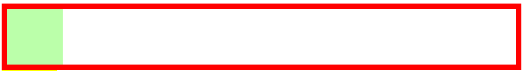
In a floating layout, the height of the parent element is extended by the child element by default,
When the child element floats, it will completely disengage from the document flow, and the child element will disengage from the document flow
The height of the parent element will not be supported, resulting in the loss of the height of the parent element
After the height of the parent element is lost, the elements under it will automatically move up, resulting in confusion in the layout of the page
Child element not floating:
After the child element floats:
BFC(Block Formatting Context) block level formatting environment
-
BFC is an implicit attribute in CSS, which can enable BFC for an element
When BFC is turned on, the element will become a separate layout area -
Features of element after BFC is turned on:
1. Elements with BFC enabled will not be overwritten by floating elements
2. When BFC is enabled, the outer margins of child elements and parent elements will not overlap
3. Elements with BFC enabled can contain floating child elements -
The BFC of an element can be turned on in some special ways:
1. Set element float (not recommended)
2. Set element to inline block element (not recommended)
3. Set the overflow of the element to a non visible value
-The common way is to set overflow:hidden for elements and turn on their BFC so that they can contain floating elements
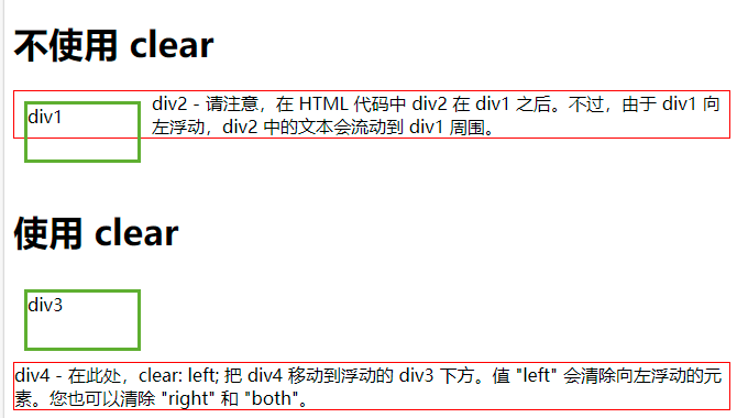
4, clear and clearfix
1,clear
-
Function: clear the influence of floating elements on the current element
-Optional values:
Left clears the influence of the left floating element on the current element
Right clears the influence of the floating element on the right on the current element
Both clear the side with the greatest impact on both sides -
Principle:
After setting and clearing floating, the browser will automatically add an upper and outer margin to the element,
So that its position is not affected by other elements
Part code:
div {
  clear: left;
}
example:
2. The final solution to high collapse
    <style>
        <!--Set one at the end of the lowest container after add clear: both-->
        .box1::after{
            content: '';
            display: block;
            clear: both;
        }
    </style>
3,clearfix
clearfix can solve the problems of height collapse and outer margin overlap at the same time. When you encounter these problems, you can directly use clearfix
Template:
 .clearfix::before,
        .clearfix::after{
            content: '';
            display: table;
            clear: both;
        }
5, Positioning
1. Positioning introduction
- position
-Positioning is a more advanced means of layout
-By positioning, you can place elements anywhere on the page
-Use the position property to set the position
Optional values:
Static is the default value. The element is static and positioning is not enabled
Relative turns on the relative positioning of elements
Absolute turns on the absolute positioning of the element
Fixed opens the fixed positioning of the element
Sticky turns on sticky positioning of elements
2. Relative positioning
- When the position attribute value of the element is set to relative, the relative positioning of the element is turned on
- Characteristics of relative positioning:
1. After the element is enabled for relative positioning, if the offset is not set, the element will not change
2. Relative positioning refers to the position of the element in the document stream
3. Relative positioning will raise the level of elements
4. Relative positioning will not separate elements from the document flow
5. Relative positioning will not change the nature of the element, block or block, inline or inline
position: relative;
3. Offset (offset)
1. After element positioning is enabled, the position of the element can be set by offset
2.top - the distance between the positioning element and the upper edge of the positioning position
bottom - the distance between the positioning element and the lower edge of the positioning position
The vertical position of the positioning element is controlled by the top and bottom attributes
Usually we only use one of them
-The higher the top value, the lower the positioning element moves
-The higher the bottom value, the more the positioning element moves upward
3 left - the left distance between the positioning element and the positioning position
Right - the right distance between the positioning element and the positioning position
The horizontal position of the positioning element is controlled by the left and right attributes
Usually only one is used
-The larger the left, the more right the element is
-The larger the right, the more left the element is
    left: 100px;
    top: -200px;
4. Absolute positioning (mostly used with relative positioning)
- When the position attribute value of the element is set to absolute, the absolute positioning of the element is turned on
- Characteristics of absolute positioning:
1. After absolute positioning is turned on, if the offset is not set, the position of the element will not change
2. When absolute positioning is enabled, the element will be separated from the document stream
3. Absolute positioning will change the nature of the element, turn the line into a block, and the width and height of the block are expanded by the content
4. Absolute positioning will raise the element to one level
5. The absolute positioning element is positioned relative to its containing block
containing block
- Under normal conditions:
The containing block is the closest ancestor block element to the current element
<div> <div></div> </div>
<div><span><em>hello</em></span></div>
Absolutely positioned containing blocks:
The containing block is the nearest ancestor element with positioning turned on,
If all ancestor elements do not have location enabled, the root element is its containing block
html (root element, initial inclusion block)
<!DOCTYPE html>
<html lang="en">
<head>
    <meta charset="UTF-8">
    <meta name="viewport" content="width=device-width, initial-scale=1.0">
    <meta http-equiv="X-UA-Compatible" content="ie=edge">
    <title>Document</title>
    <style>
        body{
            font-size: 60px;
        }
        .box1{
            width: 200px;
            height: 200px;
            background-color: #bfa;
        }

        .box2{
            width: 200px;
            height: 200px;
            background-color: orange;
            position: absolute;
            /* left: 0;
            top: 0; */
            bottom: 0;
            right: 0;
        }

        .box3{
            width: 200px;
            height: 200px;
            background-color: yellow;

        }
        .box4{
            width: 400px;
            height: 400px;
            background-color: tomato;
            position: relative;
        }

        .box5{
            width: 300px;
            height: 300px;
            background-color: aliceblue;
            /* position: relative; */
        }
    </style>
</head>
<body>

    <div class="box1">1</div>

    <div class="box4">
        4
        <div class="box5">
            5
            <div class="box2">2</div>
        </div>
    </div>
        <div class="box3">3</div>
</body>
</html>
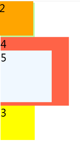
When box4 and 5 turn on relative positioning and box2 has no positioning:

When box4 and box5 turn on relative positioning and box2 turn on absolute positioning:
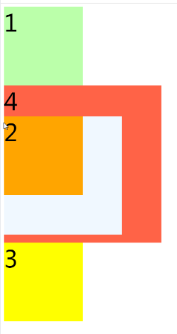
When box4 turns on relative positioning, box5 turns off relative positioning and box2 turns on absolute positioning:
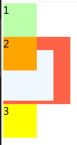
When box4 and box5 turn off relative positioning and box2 turn on absolute positioning:
5. Fixed positioning:
- Setting the position attribute of the element to fixed turns on the fixed positioning of the element
- Fixed positioning is also an absolute positioning, so most of the characteristics of fixed positioning are the same as absolute positioning
The only difference is that fixed positioning is always referenced to the viewport of the browser
Fixed positioned elements do not scroll with the scroll bar of the web page
 position: fixed;
 left: 0;
 top: 0;
6. Viscous positioning
- When the position attribute of the element is set to sticky, the sticky positioning of the element is turned on
- The characteristics of viscous positioning and relative positioning are basically the same,
The difference is that sticky positioning can fix an element when it reaches a certain position
position: sticky;
top: 10px;
7. Hierarchy
For an element with positioning enabled, you can specify the level of the element through the z-index attribute
- z-index requires an integer as a parameter. The higher the value, the higher the level of the element
- The higher the level of the element, the more priority is displayed
- If the level of elements is the same, the lower elements are preferred
- No matter how high the level of an ancestor's element is, it will not cover the descendant's element