
🖼️ preface
Recently, I used vue3 and ts to play with some gadgets. I found that a common requirement in normal development is the rendering of data list. Now I study again and find that many design specifications and logic I considered when learning vue2 are not particularly appropriate.
Therefore, write this article to record the design of data list rendering and global header in component design.
Let's study together~ 🙆
📻 1, ColumnList data rendering
1. Design draft grab prophet
Before understanding the function implementation, let's take a look at the prototype diagram to see how the data list we want to implement is. As shown in the figure below:
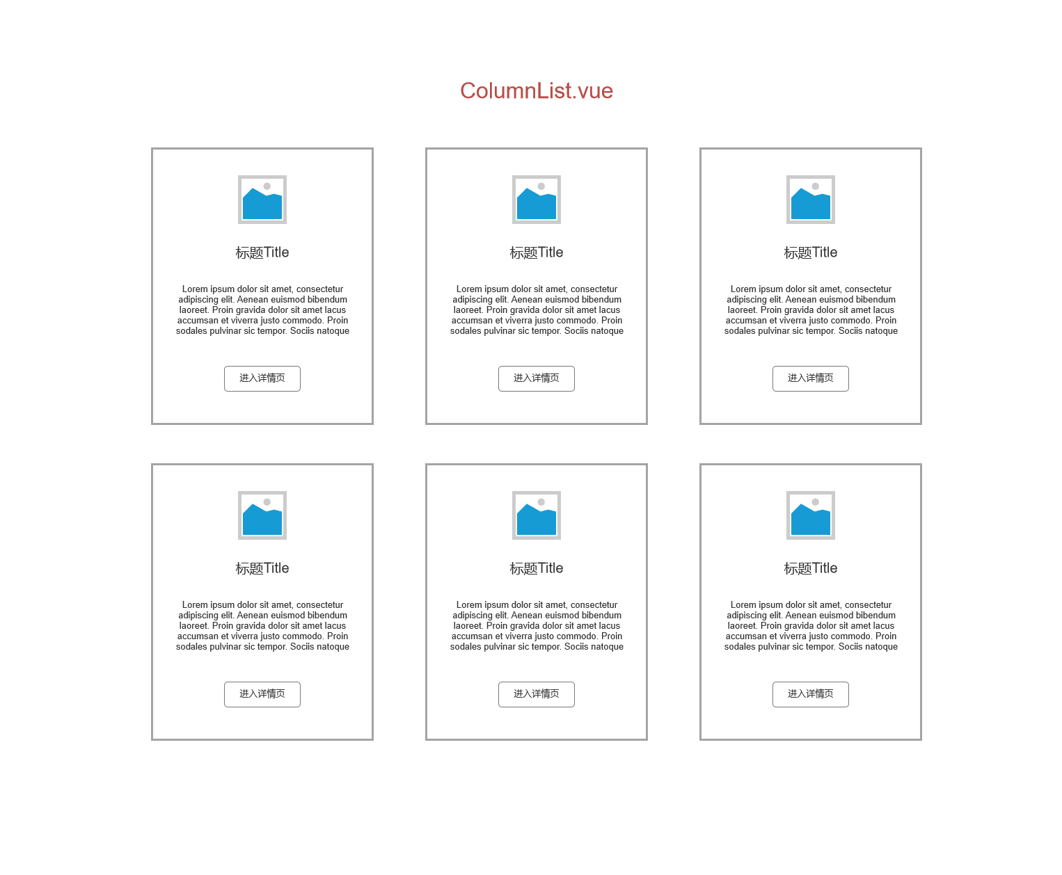
You can first understand the renderings of the contents to be realized in the club.
2. Data conception
After understanding the specific renderings, now we have to start working!
First, we need to figure out what data this component needs?
The data required by this component is the unique id of each row of data, the title, avatar, and the text description corresponding to each title.
After the analysis, we will now create a new file named columnlist under the src|components folder under the vue3 project vue . Then write this business code. The specific codes are as follows:
<template>
	<div></div>
</template>

<script lang="ts">
import { computed, defineComponent, PropType } from 'vue'
//Write an interface with ts to store the attributes of list data
export interface ColumnProps {
  id: number;
  title: string;
  avatar?: string;
  description: string;
}
export default defineComponent({
  name: 'ColumnList',
  props: {
    //Assign the contents of the interface to the list array to receive the data from the parent component
    list: {
      type: Array as PropType<ColumnProps[]>,
      required: true
    }
  }
})
</script>
<style lang="scss" scoped>

</style>
3. View data binding
Now, after conceiving the data, we haven't got any data to render, which is equivalent to an empty ColumnList. But we already have the attribute content of the interface, so let's bind the data to the view first. The specific codes are as follows:
<template>
  <div class="row">
    <div v-for="column in columnList" :key="column.id" class="col-4 mb-3">
      <div class="card h-100 shadow-sm">
        <div class="card-body text-center">
          <img :src="column.avatar" :alt="column.title" class="rounded-circle border border-light w-25 my-3">
          <h5 class="title">{{column.title}}</h5>
          <p class="card-text text-left">{{column.description}}</p>
          <a href="#"Class =" BTN BTN outline primary "> enter the column</a>
        </div>
      </div>
    </div>
  </div>
</template>

<script lang="ts">
import { computed, defineComponent, PropType } from 'vue'
export interface ColumnProps {
  id: number;
  title: string;
  avatar?: string;
  description: string;
}
export default defineComponent({
  name: 'ColumnList',
  props: {
    list: {
      type: Array as PropType<ColumnProps[]>,
      required: true
    }
  }
})
</script>
<style lang="scss" scoped>

</style>
Note: Here I use the bootstrap style library, so I don't write too much about css. You can go to it if you need it Official Chinese documents You can view or design your own style.
At this point, we have completed the first round of data binding. Next, we transfer data in the parent component.
4. Data transmission
We found the app in the src folder of the vue3 project Vue for data transfer. The specific codes are as follows:
<template>
  <div class="container">
    <column-list :list="list"></column-list>
  </div>
</template>

<script lang="ts">
import { defineComponent } from 'vue'
//Introduce bootstrap under the root file
import 'bootstrap/dist/css/bootstrap.min.css'
//Introducing sub components
import ColumnList, { ColumnProps } from './components/ColumnList.vue'

//Interface data for manufacturing sub assemblies
const testData: ColumnProps[] = [
  {
    id: 1,
    title: 'test1 special column',
    description: 'as everyone knows, js Is a weakly typed language with few specifications. This can easily lead to the fact that it is difficult for us to find its errors before the project is launched. As soon as the project is launched, we don't realize it, bug Just UpUp Yes. So, in the past two years, ts Quietly rose. This column will introduce about ts Some learning records.'
    avatar: 'https://img0.baidu.com/it/u=3101694723,748884042&fm=26&fmt=auto&gp=0.jpg'
  },
  {
    id: 2,
    title: 'test2 special column',
    description: 'as everyone knows, js Is a weakly typed language with few specifications. This can easily lead to the fact that it is difficult for us to find its errors before the project is launched. As soon as the project is launched, we don't realize it, bug Just UpUp Yes. So, in the past two years, ts Quietly rose. This column will introduce about ts Some learning records.',
    avatar: 'https://img0.baidu.com/it/u=3101694723,748884042&fm=26&fmt=auto&gp=0.jpg'
  }
]

export default defineComponent({
  name: 'App',
  components: {
    ColumnList
  },
  setup () {
    return {
      list: testData
    }
  }
})
</script>

<style>
#app {
  font-family: Avenir, Helvetica, Arial, sans-serif;
  -webkit-font-smoothing: antialiased;
  -moz-osx-font-smoothing: grayscale;
  text-align: center;
  color: #2c3e50;
  margin-top: 60px;
}
</style>
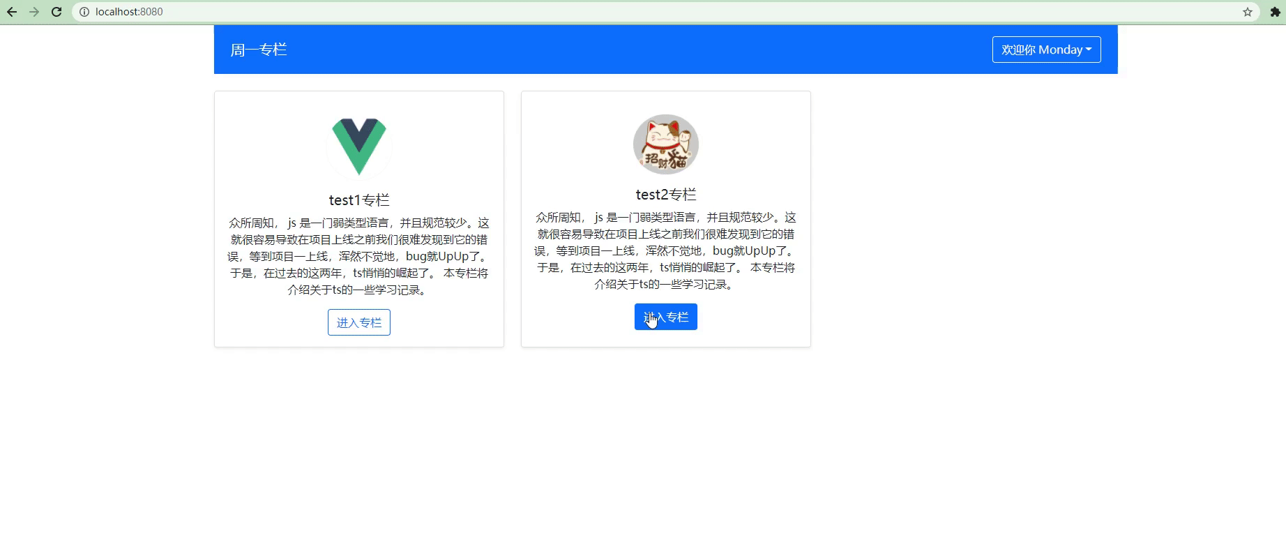
Now let's take a look at the running effect of the browser:
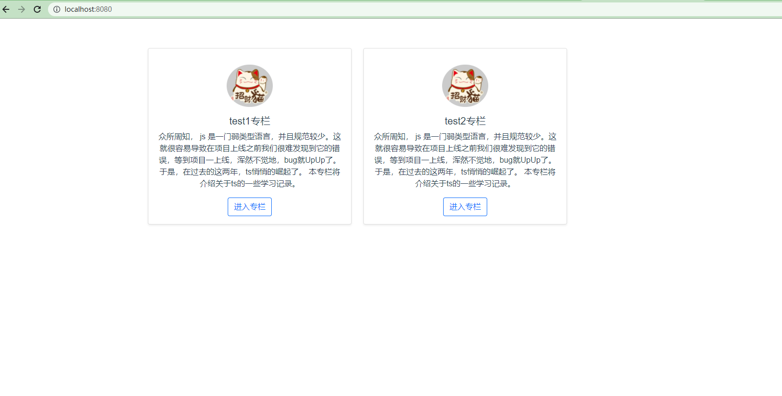
As you can see, through the above code writing, the data is transmitted normally and runs successfully.
5. Head deflection
Seeing here, I feel that the design of the whole component is quite perfect. However, have you ever thought about a special case where there is no avatar value in a row of data transmitted from the backend. At that time, if we did not consider the possible situations in the early stage, the program estimation would easily report errors.
So one more thing we have to do is to add an initialized picture to the avatar when we can't receive the avatar data, so as to keep the list consistent.
Now let's talk about columnlist The Vue file is modified, and the specific code is as follows:
<template>
  <div class="row">
    <div v-for="column in columnList" :key="column.id" class="col-4 mb-3">
      <div class="card h-100 shadow-sm">
        <div class="card-body text-center">
          <img :src="column.avatar" :alt="column.title" class="rounded-circle border border-light w-25 my-3">
          <h5 class="title">{{column.title}}</h5>
          <p class="card-text text-left">{{column.description}}</p>
          <a href="#"Class =" BTN BTN outline primary "> enter the column</a>
        </div>
      </div>
    </div>
  </div>
</template>

<script lang="ts">
import { computed, defineComponent, PropType } from 'vue'
//Write an interface with ts to store the attributes of list data
export interface ColumnProps {
  id: number;
  title: string;
  avatar?: string;
  description: string;
}
export default defineComponent({
  name: 'ColumnList',
  props: {
    //Assign the contents of the interface to the list array to receive the data from the parent component
    list: {
      type: Array as PropType<ColumnProps[]>,
      required: true
    }
  },
  //Pass props to setup
  setup(props) {
    const columnList = computed(() => {
      //Traverse each row of the list array data
      return props.list.map(column => {
        //When there is no avatar in the current row of data
        if (!column.avatar) {
          //Give initialization picture
          column.avatar = require('@/assets/logo.png')
        }
        return column
      })
    })
    return {
      columnList
    }
  }
})
</script>

<style lang="scss" scoped>

</style>
Go on, let's put the app Delete the data of testData in Vue. The specific codes are as follows:
<template>
  <div class="container">
    <column-list :list="list"></column-list>
  </div>
</template>

<script lang="ts">

//Interface data for manufacturing sub assemblies
const testData: ColumnProps[] = [
  {
    id: 1,
    title: 'test1 special column',
    description: 'as everyone knows, js Is a weakly typed language with few specifications. This can easily lead to the fact that it is difficult for us to find its errors before the project is launched. As soon as the project is launched, we don't realize it, bug Just UpUp Yes. So, in the past two years, ts Quietly rose. This column will introduce about ts Some learning records.'
    //avatar: 'https://img0.baidu.com/it/u=3101694723,748884042&fm=26&fmt=auto&gp=0.jpg'
  },
  {
    id: 2,
    title: 'test2 special column',
    description: 'as everyone knows, js Is a weakly typed language with few specifications. This can easily lead to the fact that it is difficult for us to find its errors before the project is launched. As soon as the project is launched, we don't realize it, bug Just UpUp Yes. So, in the past two years, ts Quietly rose. This column will introduce about ts Some learning records.',
    avatar: 'https://img0.baidu.com/it/u=3101694723,748884042&fm=26&fmt=auto&gp=0.jpg'
  }
]
Locate the avatar line in testData, and we annotate the avatar attribute of the first data. Now let's look at the effect of the browser:
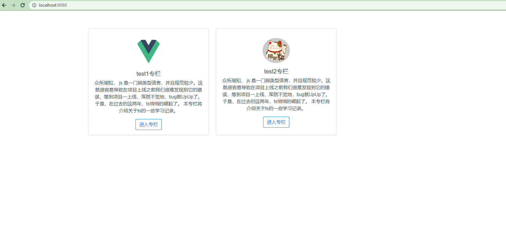
As you can see, when the avatar attribute is missing, the browser automatically displays our pre initialized images as we expected. In this way, whether from the component structure design or the code logic structure design, does it feel that the scalability has been enhanced a lot.
☎️ 2, GlobalHeader global Header
1. First look at the design draft
After writing the columnList component, we use a new component to strengthen this design method. Next, let's write a new component, global header, that is, global header. Let's take a look at the renderings we want to achieve. See the figure below for details:
2. Data conception
After understanding the specific renderings, similarly, let's first conceive what data this component needs.
The data required by this component is first for each user, so each user has its own unique id, followed by the user name, and finally whether to log in to isLogin.
After the analysis is completed, we will now create a new file under the src|components folder under the vue3 project, named globalheader vue . Then write this business code. The specific codes are as follows:
<template>
	<div></div>
</template>

<script lang="ts">
import { defineComponent, PropType } from 'vue'

//Write an interface with ts to store the attributes of list data
//name and id plus? Indicates optional
export interface UserProps{
    isLogin: boolean;
    name?: string;
    id?: number;
}
export default defineComponent({
  name: 'GlobalHeader',
  props: {
    //Assign the content of the interface to the user object to receive the data from the parent component
    user: {
      type: Object as PropType<UserProps>,
      required: true
    }
  }
})
</script>
<style lang="scss" scoped>

</style>
3. View data binding
Now, after the data is conceived, let's bind the data to the view. The specific codes are as follows:
<template>
  <nav class="navbar navbar-dark bg-primary justify-content-between mb-4 px-4">
        <a class="navbar-brand" href="#"> Monday column</a>
        <ul v-if="!user.isLogin" class="list-inline mb-0">
            <li class="list-inline-item"><a href="#"Class =" btn-outline-light MY-2 "> login</a></li>
            <li class="list-inline-item"><a href="#"Class =" BTN BTN outline light MY-2 "> registration</a></li>
        </ul>
        <ul v-else class="list-inline mb-0">
            <li class="list-inline-item"><a href="#"Class =" BTN BTN outline light MY-2 "> welcome {{user. Name}}</a></li>
        </ul>
    </nav>
</template>

<script lang="ts">
import { computed, defineComponent, PropType } from 'vue'
export interface ColumnProps {
  id: number;
  title: string;
  avatar?: string;
  description: string;
}
export default defineComponent({
  name: 'ColumnList',
  props: {
    list: {
      type: Array as PropType<ColumnProps[]>,
      required: true
    }
  }
})
</script>
<style lang="scss" scoped>

</style>
4. Data transmission
Now, let's add app. 1 under the src folder in the vue3 project Vue for data transfer. The specific codes are as follows:
<template>
  <div class="container">
    <global-header :user="user"></global-header>
  </div>
</template>

<script lang="ts">
import { defineComponent } from 'vue'
//Introduce bootstrap under the root file
import 'bootstrap/dist/css/bootstrap.min.css'
//Introducing sub components
import GlobalHeader, { UserProps } from './components/GlobalHeader.vue'

//Interface data for manufacturing sub assemblies
const currentUser: UserProps = {
  isLogin: false,
  name: 'Monday'
}

export default defineComponent({
  name: 'App',
  components: {
    GlobalHeader
  },
  setup () {
    return {
      user: currentUser
    }
  }
})
</script>

<style lang="scss" scoped>

</style>
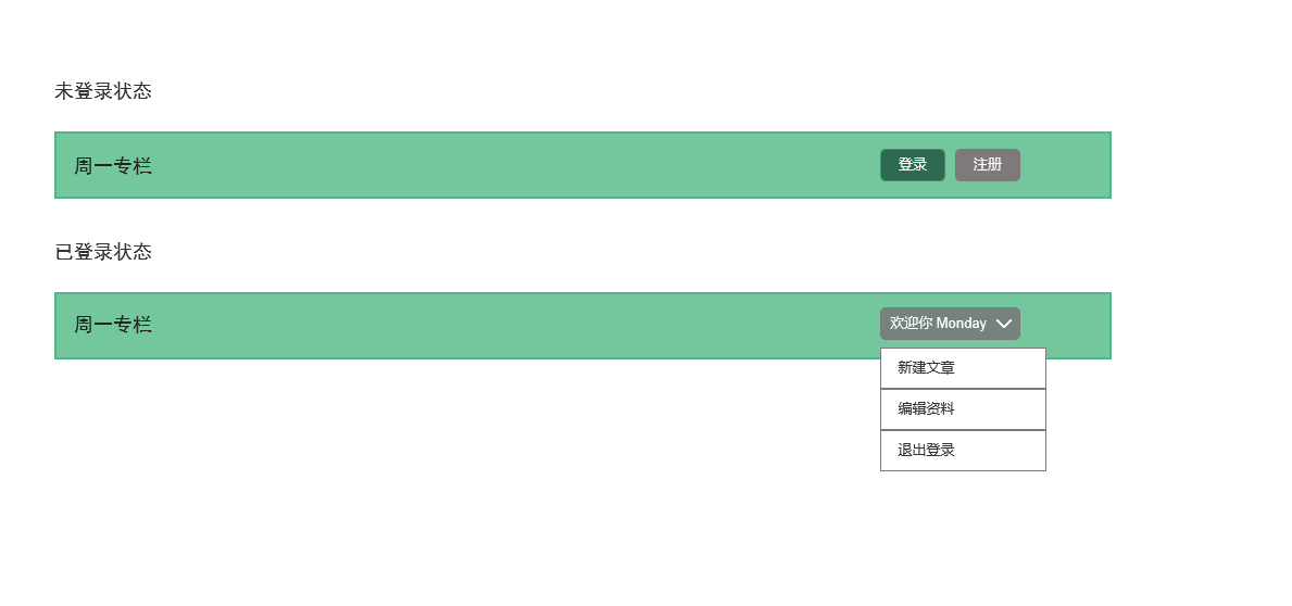
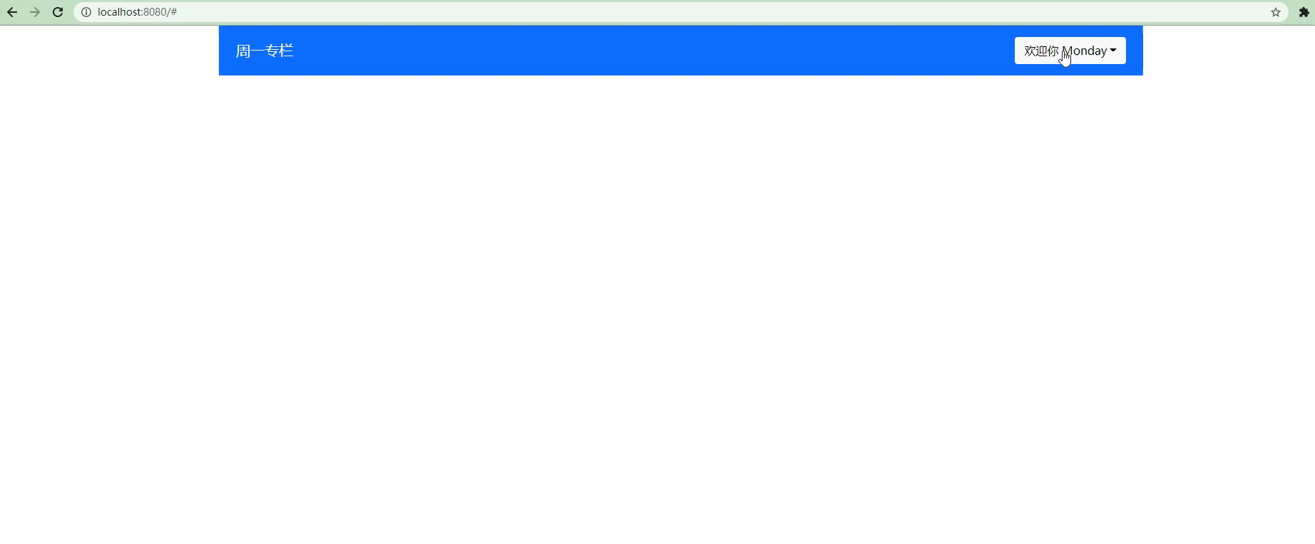
The current state of isLogin is set to false. Now let's take a look at the running effect of the browser:
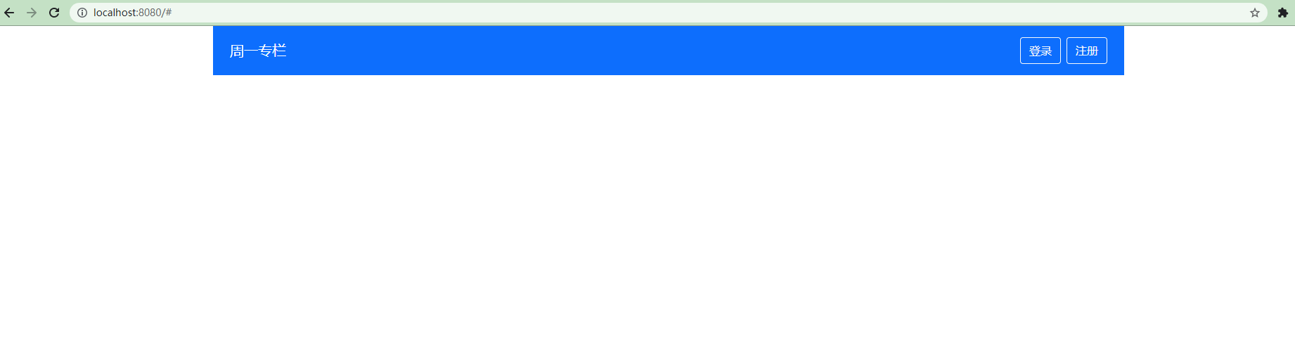
As you can see, the current status is false, so the login and registration buttons are displayed on the right side of the header, as expected.
Now, let's change the state of isLogin to true. The specific code is as follows:
const currentUser: UserProps = {
  isLogin: true,
  name: 'Monday'
}
Now let's take a look at the display effect of the browser, as shown in the following figure:
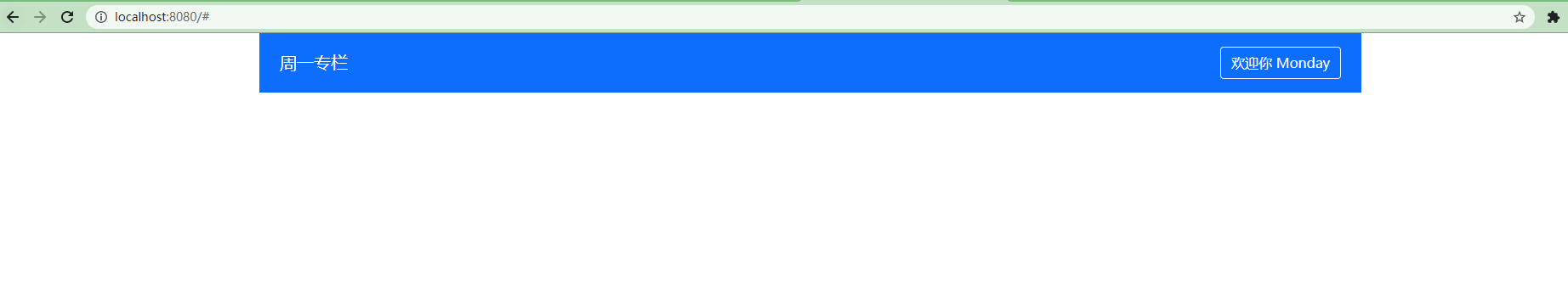
Now, you can see that when isLogin is true, it indicates that the user has successfully logged in. So the right side of the header displays the words welcome to Monday, as we expected.
📸 3, Dropdown drop-down menu
After reading the above content, do you have a doubt? The drop-down menu on the far right of our header has not been realized. Don't worry, let's design this component.
1. Basic functions of components
Now let's design the basic functions of this component. First, add a new one in the src|components folder of the vue3 project Vue file, named dropdown vue . Then write the code of the file. The specific code is as follows:
<template>
    <div class="dropdown">
        <!-- Drop down menu title -->
        <a href="#" class="btn btn-outline-light my-2dropdown-toggle" @click.prevent="toggleOpen()">
            {{title}}
        </a>
        <!-- Drop down menu content -->
        <ul class="dropdown-menu" :style="{ display: 'block' }" v-if="isOpen">
          <li class="dropdown-item">
            <a href="#"> new article</a>
          </li>
          <li class="dropdown-item">
            <a href="#"> Edit Data</a>
          </li>
        </ul>
    </div>
</template>

<script lang="ts">
import { defineComponent, ref, onMounted, onUnmounted, watch } from 'vue'

export default defineComponent({
  name: 'Dropdown',
  props: {
    title: {
      type: String,
      required: true
    }
  },
  setup() {
    const isOpen = ref(false)
    //Click to open the menu
    const toggleOpen = () => {
      isOpen.value = !isOpen.value
    }
    return {
      isOpen,
      toggleOpen
    }
  }
})
</script>

<style lang="scss" scoped>

</style>
Go on, let's transform the globalheader Vue file. The specific codes are as follows:
<template>
    <nav class="navbar navbar-dark bg-primary justify-content-between mb-4 px-4">
        <a class="navbar-brand" href="#"> Monday column</a>
        <ul v-if="!user.isLogin" class="list-inline mb-0">
            <li class="list-inline-item"><a href="#"Class =" btn-outline-light MY-2 "> login</a></li>
            <li class="list-inline-item"><a href="#"Class =" BTN BTN outline light MY-2 "> registration</a></li>
        </ul>
        <ul v-else class="list-inline mb-0">
            <li class="list-inline-item">
                <dropdown :title="`Welcome ${user.name}`"></dropdown>
            </li>
        </ul>
    </nav>
</template>

<script lang="ts">
import { defineComponent, PropType } from 'vue'
import Dropdown from './Dropdown.vue'

export interface UserProps{
    isLogin: boolean;
    name?: string;
    id?: number;
}
export default defineComponent({
  name: 'GlobalHeader',
  components: {
    Dropdown
  },
  props: {
    user: {
      type: Object as PropType<UserProps>,
      required: true
    }
  }
})
</script>

<style lang="scss" scoped>

</style>
Now let's look at the display effect of the browser:
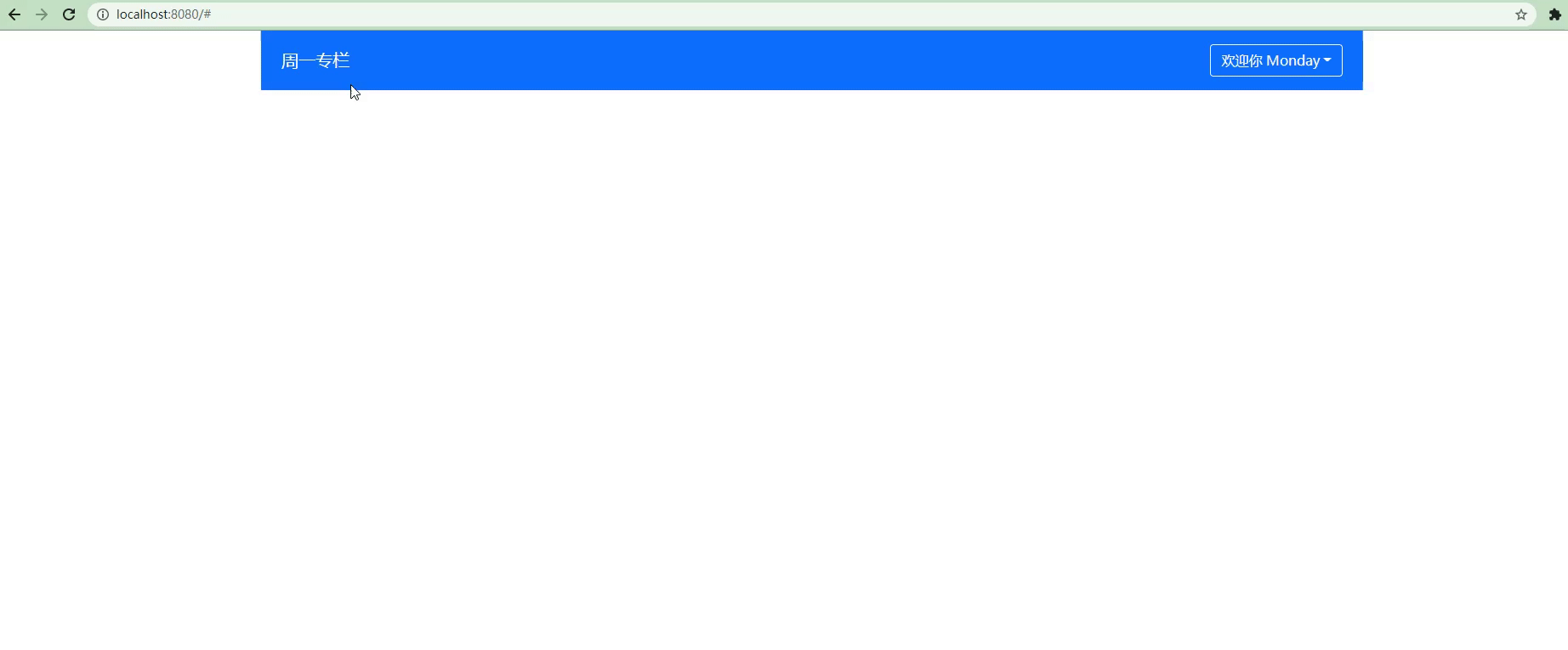
2. Customize menu content DropdownItem
Now, we have completed the basic functions of the component. But careful friends have found that there is no way to customize the drop-down menu because it is written as fixed. Another problem is that we can't put away the menu by clicking on other areas. Indirectly, the user experience seems not so good. So, when there is a demand, we will complete the demand. Now, let's solve the above two problems.
Similarly, add one under the src|components folder in the vue3 project Vue file, named dropdownitem vue . The specific codes are as follows:
<template>
    <li
    class="dropdown-option"
    :class="{'is-disabled': disabled}"
    >
        <!-- Define a slot for the parent component -->
        <slot></slot>
    </li>
</template>

<script lang="ts">
import { defineComponent } from 'vue'
export default defineComponent({
  props: {
    //Disable status properties
    disabled: {
      type: Boolean,
      default: false
    }
  }
})
</script>

<style>
/* Note: * indicates all the elements below the two classes */
.dropdown-option.is-disabled * {
    color: #6c757d;
    /* Don't let it click, set pointer events to none */
    pointer-events: none;
    background: transparent;
}
</style>
Next, let's build the previously written dead content, and locate it at dropdown Vue file, the specific code is as follows:
<template>
    <div class="dropdown">
        <!-- Drop down menu title -->
        <a href="#" class="btn btn-outline-light my-2dropdown-toggle" @click.prevent="toggleOpen()">
            {{title}}
        </a>
        <!-- Drop down menu content -->
        <ul v-if="isOpen" class="dropdown-menu" :style="{ display: 'block' }">
            <slot></slot>
        </ul>
    </div>
</template>

<script lang="ts">
import { defineComponent, ref  } from 'vue'

export default defineComponent({
  name: 'Dropdown',
  props: {
    title: {
      type: String,
      required: true
    }
  },
  setup() {
    const isOpen = ref(false)
    //Click to open the menu
    const toggleOpen = () => {
      isOpen.value = !isOpen.value
    }
    return {
      isOpen,
      toggleOpen
    }
  }
})
</script>

<style lang="scss" scoped>

</style>
From the above code, we can see that the slot is placed in the drop down menu.
Now, in the final step, let's introduce it into globalheader Vue file. The specific codes are as follows:
<template>
    <nav class="navbar navbar-dark bg-primary justify-content-between mb-4 px-4">
        <a class="navbar-brand" href="#"> Monday column</a>
        <ul v-if="!user.isLogin" class="list-inline mb-0">
            <li class="list-inline-item"><a href="#"Class =" btn-outline-light MY-2 "> login</a></li>
            <li class="list-inline-item"><a href="#"Class =" BTN BTN outline light MY-2 "> registration</a></li>
        </ul>
        <ul v-else class="list-inline mb-0">
            <li class="list-inline-item">
                <dropdown :title="`Welcome ${user.name}`">
                    <drop-down-item><a href="#"Class =" dropdown item "> create a new article < / a > < / drop down item >
                    <drop-down-item disabled><a href="#"Class =" dropdown item "> Edit Data < / a > < / drop down item >
                    <drop-down-item><a href="#"Class =" dropdown item "> Exit login < / a > < / drop down item >
                </dropdown>
            </li>
        </ul>
    </nav>
</template>

<script lang="ts">
import { defineComponent, PropType } from 'vue'
import Dropdown from './Dropdown.vue'
import DropDownItem from './DropDownItem.vue'

export interface UserProps{
    isLogin: boolean;
    name?: string;
    id?: number;
}
export default defineComponent({
  name: 'GlobalHeader',
  components: {
    Dropdown,
    DropDownItem
  },
  props: {
    user: {
      type: Object as PropType<UserProps>,
      required: true
    }
  }
})
</script>

<style lang="scss" scoped>

</style>
At this point, let's take a look at the display effect of the browser:
As you can see, the edited data has become gray and can't click and jump. At the same time, the contents of the custom menu are also displayed one by one.
Here, we have finished this step! Next, we continue to sublimate this component to make its user experience more extreme.
3. Click the external area of the component to hide it automatically
You can think of the scene when you click on major websites. When you click on the external area of the menu, will the components be hidden automatically. So, next, let's implement this function.
First of all, we should clarify the two tasks to be completed:
- click events are added when onMounted and deleted when onUnmounted;
- Get the DOM element of the Dropdown to determine whether the clicked content is included by this element.
Next, we navigate to dropdown Vue files, continue to upgrade. The specific codes are as follows:
<template>
    <div class="dropdown" ref="dropdownRef">
        <a href="#" class="btn btn-outline-light my-2 dropdown-toggle" @click.prevent="toggleOpen()">
            {{title}}
        </a>
        <ul v-if="isOpen" class="dropdown-menu" :style="{ display: 'block' }">
            <slot></slot>
        </ul>
    </div>
</template>

<script lang="ts">
import { defineComponent, ref, onMounted, onUnmounted, watch } from 'vue'

export default defineComponent({
  name: 'DropDown',
  props: {
    title: {
      type: String,
      required: true
    }
  },
  setup() {
    const isOpen = ref(false)
    // Get the dow node of ref
    const dropdownRef = ref<null | HTMLElement>(null)
    const toggleOpen = () => {
      isOpen.value = !isOpen.value
    }
    const handler = (e: MouseEvent) => {
      if (dropdownRef.value) {
        // Use contains to determine whether another dow node is included
        // When the node in the current area is not clicked, and the menu is open
        if (!dropdownRef.value.contains(e.target as HTMLElement) && isOpen.value) {
          isOpen.value = false
        }
      }
    }
    onMounted(() => {
      document.addEventListener('click', handler)
    })
    onUnmounted(() => {
      document.removeEventListener('click', handler)
    })
    return {
      isOpen,
      toggleOpen,
      dropdownRef,
      handler
    }
  }
})
</script>

<style lang="scss" scoped>

</style>
Now let's take a look at the display effect of the browser:

As you can see, after the logic of dropdown is modified, as we expected, when we click the external area of the component, the component is automatically hidden.
4. Custom function
Here, the whole GlobalHeader component is relatively perfect. But have you found that when designing dropdown components, dropdown Vue's code seems to be a little redundant.
At this time, we can consider pulling out its logic and putting it into a user-defined function. Let's do it together~
First, we create a new folder named hooks under the src folder in the vue3 project. Then create a new file under hooks, named useClickOutside ts . The specific code of useClickOutside is as follows:
import { ref, onMounted, onUnmounted, Ref } from "vue";

const useClickOutside = (elementRef: Ref<null | HTMLElement>) => {
    const isClickOutside = ref(false)
    const handler = (e: MouseEvent) => {
        if (elementRef.value){
            if(elementRef.value.contains(e.target as HTMLElement)){
                isClickOutside.value = true
            }else{
                isClickOutside.value = false
            }
        }
    }
    onMounted( () => {
        document.addEventListener('click', handler)
    })
    onUnmounted(() => {
        document.removeEventListener('click', handler)
    })
    return isClickOutside
}

export default useClickOutside
After pulling away the code, we continue to drop down Vue simplify. The specific codes are as follows:
<template>
    <div class="dropdown" ref="dropdownRef">
        <a href="#" class="btn btn-outline-light my-2 dropdown-toggle" @click.prevent="toggleOpen()">
            {{title}}
        </a>
        <ul v-if="isOpen" class="dropdown-menu" :style="{ display: 'block' }">
            <slot></slot>
        </ul>
    </div>
</template>

<script lang="ts">
import { defineComponent, ref, onMounted, onUnmounted, watch } from 'vue'
import useClickOutside from '../hooks/useClickOutside'

export default defineComponent({
  name: 'DropDown',
  props: {
    title: {
      type: String,
      required: true
    }
  },
  setup() {
    const isOpen = ref(false)
    // Get the dow node of ref
    const dropdownRef = ref<null | HTMLElement>(null)
    const toggleOpen = () => {
      isOpen.value = !isOpen.value
    }
    const isClickOutside = useClickOutside(dropdownRef)
    if (isOpen.value && isClickOutside) {
      isOpen.value = false
    }
    watch(isClickOutside, () => {
      if (isOpen.value && isClickOutside.value) {
        isOpen.value = false
      }
    })
    return {
      isOpen,
      toggleOpen,
      dropdownRef
    }
  }
})
</script>

<style lang="ts" scoped>

</style>
The browser displays as follows:
As you can see, the final display effect is the same. However, through the separation of code logic, the design of our whole component looks more perfect and the scalability becomes higher.
5. Combined effect
Finally, let's combine the GlobalHeader and Columnist learned above to see the effect of integration. See the figure below for details:
The above is about the implementation of ColumnList and GlobalHeader components. I don't know if you still have more to say~
There will continue to be articles on component design later. Welcome to pay attention~
🛒 4, Conclusion
At this point, the design of the components GlobalHeader and ColumnList is over! When designing components, special consideration should be given to the scalability of components. If a component doesn't feel reusable when writing, you may have to think about whether there is a problem in any link at this time. Ask yourself why and whether this component can be pulled better.
The above is the whole content of this article! If you have any questions or articles, please welcome comments or official account, and add WeChat to us.
-
Pay attention to the public Monday research room. First, pay attention to learning dry cargo. More column will be open for you to unlock official account.
-
If this article is useful to you, remember to leave footprints before you go~
-
See you next time! 🥂🥂🥂
🐣 One More Thing
Basic knowledge review
Software recommendation
Here we recommend a drawing software used in this article: Axure RP 9
Axure RP is designed to draw low fidelity prototypes and is extremely friendly to developers. Rich control library and animation interaction can meet most of the needs of daily drawing.
Amway Yibo~
👋👋👋