Welcome to pay attention Column of "pandas_alive drawing dynamic map of competition" , continuously updating
Welcome to pay attention Column of "pandas_alive drawing dynamic map of competition" , continuously updating
Resource file download:
Column learning instructions (configured venv virtual environment + take and use test code + test data set + parameter api analysis)
Preview of all renderings:
Rendering display (configured venv virtual environment + take and use test code + test data set + parameter api analysis)
Environment configuration:
Environment configuration and detection (configured venv virtual environment + ready to use test code + test data set + parameter api analysis)
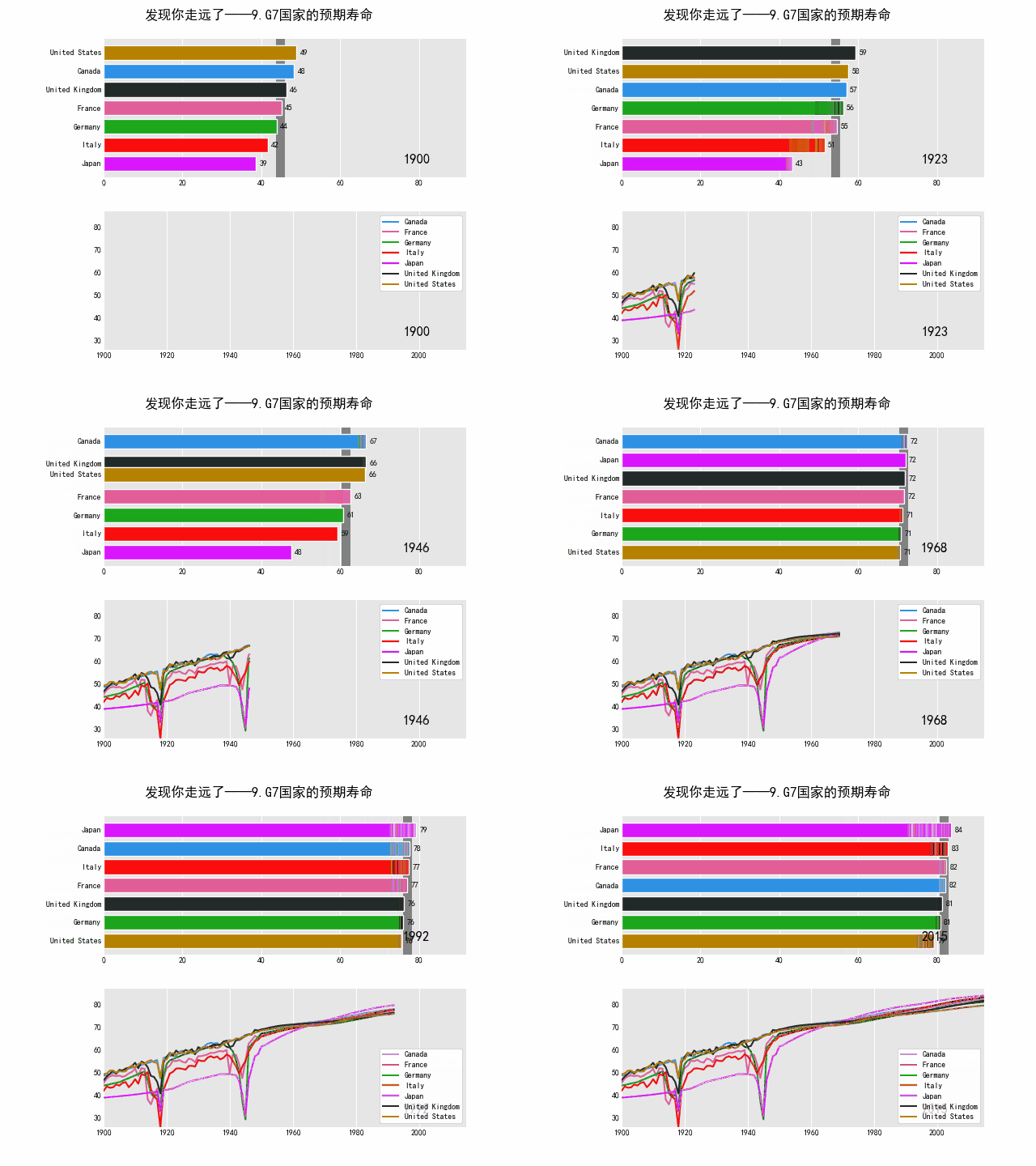
9. Life expectancy in G7 countries
Content and previous figure 8 The urban population is similar, mainly due to more comprehensive applications, combined with data processing (obtaining data from the network and transforming it into the data we need)
API description of life expectancy map for G7 countries:
data_raw = data_raw.pivot(
index="Year", columns="Entity", values="Life expectancy (Gapminder, UN)"
)
- Reshaping the data (generating a "pivot" table) is based on the column values. Form a dataframe result for the axis using unique values from the index / column (remove duplicate values).
Life expectancy map data set for G7 countries
The dataset file name is life expectation in G7 countries, which is downloaded from the code cloud
data_raw = pd.read_csv("data source data/Life Expectancy in G7 Countries.csv")
# The original author is available online. Here you can directly use the downloaded csv
# data_raw = pd.read_csv(
#     "https://raw.githubusercontent.com/owid/owid-datasets/master/datasets/Long%20run%20life%20expectancy%20-%20Gapminder%2C%20UN/Long%20run%20life%20expectancy%20-%20Gapminder%2C%20UN.csv"
# )
Life expectancy map routines for G7 countries
# @Time    : 2022/1/12 22:15
# @Author: Nanli
# @FileName: 9. Life expectancy in G7 countries py

import pandas as pd

######Display Chinese Song typeface import. If you use Chinese, add this code######
import matplotlib as plt

plt.rcParams['font.sans-serif'] = ['SimHei']
plt.rcParams['axes.unicode_minus'] = False
#####################################################

import pandas_alive
import pandas as pd

data_raw = pd.read_csv("data source data/Life Expectancy in G7 Countries.csv")
# The original author is available online. Here you can directly use the downloaded csv
# data_raw = pd.read_csv(
#     "https://raw.githubusercontent.com/owid/owid-datasets/master/datasets/Long%20run%20life%20expectancy%20-%20Gapminder%2C%20UN/Long%20run%20life%20expectancy%20-%20Gapminder%2C%20UN.csv"
# )


list_G7 = [
    "Canada",
    "France",
    "Germany",
    "Italy",
    "Japan",
    "United Kingdom",
    "United States",
]
#Reshaping the data (generating a "pivot" table) is based on the column values. Form a dataframe result for the axis using unique values from the index / column (remove duplicate values).
data_raw = data_raw.pivot(
    index="Year", columns="Entity", values="Life expectancy (Gapminder, UN)"
)

data = pd.DataFrame()
data["Year"] = data_raw.reset_index()["Year"]
#Because there are many countries in the original web page dataset, here we choose the 7 countries we need
for country in list_G7:
    data[country] = data_raw[country].values

data = data.fillna(method="pad")
data = data.fillna(0)
data = data.set_index("Year").loc[1900:].reset_index()

data["Year"] = pd.to_datetime(data.reset_index()["Year"].astype(str))

data = data.set_index("Year")

animated_bar_chart = data.plot_animated(
    period_fmt="%Y",#Dynamically update timestamp in graph
    perpendicular_bar_func="mean", #Set average guides
    period_length=200,#Cycle length 200ms
    fixed_max=True,

)

animated_line_chart = data.plot_animated(
    kind="line",
    period_fmt="%Y",
    period_length=200,
    fixed_max=True
)

pandas_alive.animate_multiple_plots(
    filename="9.G7 National life expectancy.gif",
    plots=[animated_bar_chart, animated_line_chart],
    title="Find you far away - 9.G7 National life expectancy",
    adjust_subplot_left=0.2,
    adjust_subplot_top=0.9,
    enable_progress_bar=True
)

summary
Copyright notice:
If you find that you are far away from the @mzh original work, you must mark the original link for reprint
Copyright 2022 mzh
Crated: 2022-1-14
I've been tossing around for a week and sorted out a lot of methods for getting started with Xiaobai lightning protection, which will continue to be updated. If it's helpful to you, I hope to get your praise 👍 Collection support! (after all, it's too difficult to finish learning in a short time. It's recommended to put it in your favorites to eat ash)
Welcome to pay attention Column of "pandas_alive drawing dynamic map of competition" , continuously updating
Welcome to pay attention Column of "pandas_alive drawing dynamic map of competition" , continuously updating
[I. effect diagram display (configured venv virtual environment + ready to use test code + test data set + parameter api analysis)]
[II. Column learning instructions (configured venv virtual environment + ready to use test code + test data set + parameter api analysis)]
[III. environment configuration and detection (configured venv virtual environment + ready to use test code + test data set + parameter api analysis)]
[IV. data set description (configured venv virtual environment + ready to use test code + test data set + parameter api analysis)]
[v. common problems (configured venv virtual environment + ready to use test code + test data set + parameter api analysis)]
[1. Bar chart (test code + data set + drawing parameter analysis)]
[2. Line chart (test code + data set + drawing parameter analysis)]
[3. Scatter diagram (test code + data set + drawing parameter analysis)]
[4. Pie chart (test code + data set + drawing parameter analysis)]
[5. Bubble chart (test code + data set + drawing parameter analysis)]
[6. Geospatial map (test code + dataset + drawing parameter analysis)]
[7. Multiple charts (test code + data set + drawing parameter analysis)]
[8. Urban population (test code + data set + drawing parameter analysis)]
[9. Life expectancy of G7 countries (test code + data set + drawing parameter analysis)]
[10. New South Wales COVID visualization (test code + dataset + drawing parameter analysis)]
[more details]