I moved my notes on Nuggets: Front end animation implementation,Personal blog
Basic principles of animation
What is animation
Animation is a process of creating motion illusion and change illusion by quickly and continuously arranging continuous images with little difference from each other.
——Wikipedia
- fast
- Continuous arrangement
- There is little difference between them
- The process of creating an "illusion"
History of animation
Today's front-end animation technology has become popular
- Common front-end animation technology
- Sprite animation, CSS animation, JS animation, SVG animation and WebGL animation
- Classification by application
- UI animation, Web-based game animation and animation data visualization
GIF and Flash once became the mainstream. Around 2000, apple believed that Flash would lead to CPU load and faster power consumption. It announced to give up Flash completely, and the battery life of all Apple devices was significantly improved. Today's web animation is mainly composed of CSS and JS animation.
computer animation
computer graphics
The basis of computer vision, covering the mathematical construction methods of point, line, surface, body and field.
- Input, storage and compression of geometric and graphic data.
- Describe texture, curve, light and shadow algorithms.
- Data output of object graphics (graphics interface, animation technology), hardware and graphics interaction technology.
- Relevant technical standards of graphics development software.
Computer animation is a branch of computer graphics, mainly including 2D and 3D animation. No matter how simple the animation is, you always need to define two basic states, the start state and the end state. Without them, we will not be able to define the interpolation state to fill the gap between the two.
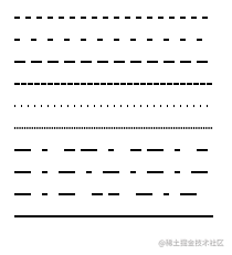
Quick √ continuous arrangement × There is little difference between them × Create "illusion" ×
It can be seen that the above animation is only fast and does not create illusion, so we have to mention the concept of frame rate ~ ~ (the concept of playing games should be familiar)~~
-
Frame: continuous transformation of multiple pictures, each of which is a frame.
-
Frame rate: used to measure the number of frames in a certain period of time. The usual measurement unit is FPS (frame per second).
-
Frame rate and human eye: generally 10-12 frames per second, people will think that the picture is coherent. This phenomenon is called visual persistence. For some computer animations and games, if it is lower than 30 FPS, you will feel the bright graphics card. At present, the mainstream screen and graphics card output is 60FPS, and the effect will be significantly smoother.
Then next, fill the gap between the start point and the end point and try to make the animation coherent.
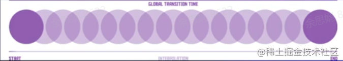
There are two ways to fill in blanks
- Patching animation
- In traditional animation, the main painter draws key frames and gives them to the draft cleaning department, and the supplementary animators in the draft cleaning department supplement the key frames for delivery
- (by analogy, the front-end animation studio animator is assumed by the browser, such as @keyframes,transition)
- Frame By Frame animation
- In terms of words, it means that each frame of the whole film is purely hand-painted. (for example, the steps of css realize sprite animation)
Front end animation classification
css animation
CSS Cascading Style Sheets is a style sheet language used to describe HTML or XML (including XML branch languages such as SVG, MathML and XHTML) animation Property is animation-name,animation-duration, animation-timing-function,animation-delay,animation-iteration-count,animation-direction,animation-fill-mode and animation-play-state An abbreviated form of an attribute.
animation-name
animation-name Property specifies a series of animations to apply, each name representing a @keyframes Defined animation sequence with the following values
- none (initial value) special keyword, indicating that there are no keyframes. You can invalidate the animation without changing the order of other identifiers, or invalidate the cascading animation style.
- IDENT identifies the string of the animation, consisting of case sensitive letters a-z, numbers 0-9, and underscores () And / or horizontal lines (-). The first non horizontal character must be a letter, the number cannot be in front of the letter, and two horizontal lines are not allowed to appear at the beginning.
Multiple animation definitions can be separated by commas
/* Single animation */
animation-name: none;
animation-name: test_05;
animation-name: -specific;
animation-name: sliding-vertically;

/* Multiple animations */
animation-name: test1, animation4;
animation-name: none, -moz-specific, sliding;

/* Global values */
animation-name: initial
animation-name: inherit
animation-name: unset
animation-duration
animation-duration Property specifies the duration of an animation cycle. The default value is 0s, indicating no animation.
Its value is the duration of an animation cycle, in seconds (s) or milliseconds (ms). No unit value is invalid. You can also specify multiple values, which correspond to animation name one by one
**Note: * * negative values are invalid. The browser will ignore this declaration, but some early prefixed declarations will treat negative values as 0s.
/* Single animation */
animation-duration: 6s
animation-duration: 120ms

/* Multiple animations */
animation-duration: 1s, 15s
animation-duration: 10s, 30s, 230ms
animation-timing-function
animation-timing-function Property defines the rhythm of CSS animation execution in each animation cycle. The possible values are one or more, and its multiple values also correspond to animation name one by one. CSS itself defines some slow functions, which we can call to achieve the effect of slow in and slow out.
For keyframe animation, timing function works on one keyframe cycle rather than the whole animation cycle, that is, from the beginning of the keyframe to the end of the keyframe.
The animation timing function defined in a key frame block is applied to the key frame; In addition, if the key frame does not have a jog function defined, the jog function defined for the entire animation is used.
/* Keyword values */
animation-timing-function: ease;
animation-timing-function: ease-in;
animation-timing-function: ease-out;
animation-timing-function: ease-in-out;
animation-timing-function: linear;
animation-timing-function: step-start;
animation-timing-function: step-end;

/* Function values */
animation-timing-function: cubic-bezier(0.1, 0.7, 1.0, 0.1);
animation-timing-function: steps(4, end);
animation-timing-function: frames(10);

/* Multiple animations */
animation-timing-function: ease, step-start, cubic-bezier(0.1, 0.7, 1.0, 0.1);

/* Global values */
animation-timing-function: inherit;
animation-timing-function: initial;
animation-timing-function: unset;
animation-delay
animation-delay Defines when the animation starts, that is, the length of time from when the animation is applied to the element to when the animation starts. (that is, how long to delay the start)
0s is the default value of this attribute, which means that the animation starts immediately after it is applied to the element. Otherwise, the value of the attribute represents the length of time from the animation style applied to the element to the beginning of execution;
**Defining a negative value causes the animation to begin immediately. But the animation starts somewhere in its animation sequence** For example, if you set the value to - 1s, the animation starts immediately from the first second position of its animation sequence.
If a negative value is specified for the animation delay, but the starting value is hidden, the starting value is obtained from the moment the animation is applied to the element.
animation-delay: 3s;
animation-delay: 2s, 4ms;
animation-iteration-count
animation-iteration-count Defines the number of times the animation runs before the end, which can be 1 or an infinite loop
-
infinite
Infinite loop animation
-
<number>
Number of animation playback; The default value is 1. You can define a cycle with decimals to play part of the animation cycle: for example, 0.5 will play to half of the animation cycle. Cannot be negative.
/* Value is a keyword */
animation-iteration-count: infinite;

/* The value is numeric */
animation-iteration-count: 3;
animation-iteration-count: 2.4;

/* Specify multiple values */
animation-iteration-count: 2, 0, infinite;
Its multi value is different from duration. It switches its execution times at the beginning and end of each animation
animation-direction
animation-direction Property indicates whether the animation plays backwards
-
normal (default)
The animation loops forward within each loop, in other words, at the end of each animation loop, the animation resets to the starting point and starts again, which is the default attribute.
-
alternate
The animation runs alternately in reverse. When it runs in reverse, the animation moves backward step by step. At the same time, the function with time function also runs in reverse. For example, ease in becomes ease out when it runs in reverse. The count depends on whether you start with odd or even iterations
-
reverse
Run the animation in reverse, and the animation runs from end to end at the end of each cycle.
-
alternate-reverse
Reverse alternation
The animation is reversed the first time it runs, then forward the next time, followed by a cycle. Determines whether the count of odd or even times starts with 1.
animation-direction: normal
animation-direction: reverse
animation-direction: alternate
animation-direction: alternate-reverse
animation-direction: normal, reverse
animation-direction: alternate, reverse, normal
animation-fill-mode
animation-fill-mode Property sets how CSS animations apply styles to their targets before and after execution.
/* Single animation */
animation-fill-mode: none;
animation-fill-mode: forwards;
animation-fill-mode: backwards;
animation-fill-mode: both;

/* Multiple animations */
animation-fill-mode: none, backwards;
animation-fill-mode: both, forwards, none;
-
none (default)
When the animation is not executed, the animation will not apply any style to the target, but the CSS rules already assigned to the element to display the element. This is the default.
-
forwards
The target will retain the last one encountered during execution Key frame Calculated value. The last keyframe depends on animation-direction and animation-iteration-count Value of (that is, what the last key frame looks like, and it will always look like this later)
-
backwards
The animation applies the value defined in the first keyframe as soon as it is applied to the target, and animation-delay Keep this value during. (this is very important. The first key frame is determined by animation-direction Value of: animation directionfirst relevant keyframe or alternate ` ` 0% or from ` ` reverse or alternate reverse ` ` 100% or to
-
both
The animation follows the rules of forwards and backwards, extending the animation properties in both directions. (both of the above)
Note: when you specify multiple comma separated values on the animation - * attribute, they will be assigned to the user in different ways according to the number of values animation-name Property. For more information, see Set multiple animation attribute values.
animation-play-state
animation-play-state Property defines whether an animation runs or pauses. You can query it to determine whether the animation is running. In addition, its value can be set to pause and resume the playback of animation. Restoring a paused animation will resume when it begins to pause, not from the beginning of the animation sequence.
-
running
The current animation is running.
-
paused
The current animation has been stopped.
/* Single animation */
animation-play-state: running;
animation-play-state: paused;

/* Multiple animations */
animation-play-state: paused, running, running;

/* Global values */
animation-play-state: inherit;
animation-play-state: initial;
animation-play-state: unset;
A chestnut: CSS BEER! (codepen.io)
I went to see other projects of this big man. They were very interesting! #codevember - 19 - CSS Eggs (codepen.io),Periodic Table of Elements - HTML/CSS (codepen.io)
transform API
transform Property allows you to rotate, scale, tilt, or translate a given element. This is achieved by modifying the coordinate space of the CSS visual formatting model.
transform-origin Specify the location of the origin. The default conversion origin is center.
The transform attribute can be specified as the keyword value none or one or more < transform function > values.
-
One or more CSS transformation functions to apply. The transformation functions are multiplied from left to right, which means that the composite transformation is effectively applied from right to left.
-
scale (zoom) notice that its center is transform-origin (zoom) notice that its center is transform-origin
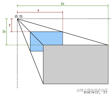
// Reduce to 50% along the x axis
transform: scale(0.5);
// Zoom out to 50% along the x axis and zoom in twice as much along the y axis
transform: scale(0.5, 2);
-
rotate (rotate) rotates the element around the origin without deformation (e.g transform-origin Property). The amount of movement is defined by the specified angle; If positive, the motion will be clockwise, if negative, it will be counterclockwise. A rotation of 180 ° is called point reflection.
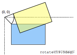
transform: rotate(30deg);
-
skew The (tilt) parameter indicates the tilt angle in deg
One parameter represents the inclination angle (ax) in the horizontal direction;
Two parameters indicate horizontal and vertical (ax, ay).
transform: skew(ax)
transform: skew(ax, ay)
-
-
none
No transformations are applied.
**Note: * * it can only convert the elements located by the box model. According to experience, if the element has display: block, the element will be located by the box model.
transition Transition animation is triggered when dom loading is completed or class changes. This property is transition-property,transition-duration,transition-timing-function and transition-delay An abbreviated attribute of.
/* Apply to 1 property */
/* property name | duration */
transition: margin-right 4s;

/* property name | duration | delay */
transition: margin-right 4s 1s;

/* property name | duration | timing function */
transition: margin-right 4s ease-in-out;

/* property name | duration | timing function | delay */
transition: margin-right 4s ease-in-out 1s;

/* Apply to 2 properties */
transition: margin-right 4s, color 1s;

/* Apply to all changed properties */
transition: all 0.5s ease-out;

/* Global values */
transition: inherit;
transition: initial;
transition: unset;
keyframe animation
@keyframes The key frames @ keyframes at rule rule controls the intermediate steps in the CSS animation sequence by defining the style of key frames (or waypoints) in the animation sequence. and transition In contrast, keyframes can control the intermediate steps of an animation sequence.
// Slide in from the left
@keyframes slidein {
  from {
    transform: translateX(0%);
  }
  to {
    transform: translateX(100%);
  }
}
//
@keyframes identifier {
  0% { top: 0; }
  50% { top: 30px; left: 20px; }
  50% { top: 10px; }
  100% { top: 0; }
}
For example, chestnuts: my CSS Animation pratice (codepen.io)
@keyframes identifier {
  0% { top: 0; left: 0; }
  50% { top: 60%; left: 60%;}
  100% {  top: 0; left: 0; }
}
@keyframes slidein {
  from {
    transform: translateX(0%);
  }
  to {
    transform: translateX(100%);
  }
}
body  >div {
  position: absolute;
  display:flex;
  align-items:center;
  justify-content: center;
  color: #fafafa;
  background-color: #141414;
  padding: 10px;
  width:20%; height:20%;
/*   From top left to bottom right, lasting for 5s, delaying for 1s, infinite cycle */
/*   animation: identifier 5s linear 1s infinite; */
/*   Slide right for 1s, twice */
  animation: slidein 1s 2;
}
To sum up:
The advantages of css Animation: simple, efficient and declarative. It does not depend on the main thread, adopts hardware acceleration (GPU), and simply controls the playback and pause of keyframe animation.
Disadvantages: animations cannot be dynamically modified or defined, animations with different contents cannot be synchronized, and multiple animations cannot be stacked with each other.
Applicable scenario: simple h5 activities / leaflets.
Recommendation Library: Animate.css,CSShake Wait.
svg animation
svg is a vector graphics description language based on XML. It can cooperate well with CSS and]S. There are usually three ways to realize svg Animation: SMIL, JS and CSS
- SMIL: Synchronous Multimedia Integration Language
- Conclusion: the compatibility is not ideal. There is no more discussion here. Of course, there is a polyfill scheme: https://github.com/ericwilligers/svg-animation
- Needless to say, there are many ready-made class libraries using JS to operate SVG animation. For example, the old snap Svg and anime JS allows us to quickly make SVG animation. Of course, in addition to these class libraries, HTML itself has a native Web Animation implementation. Using Web 8622Animation also allows us to make animation conveniently and quickly. These are the teacher's two chestnuts:
- Text deformation: https://codepen.io/jiangxiang/pen/MWmdjeY
- Path realizes writing animation: SVG writing animation (codepen.io)
The implementation principle of the first animation
Text dissolving principle - filter
filter Attribute applies graphic effects such as blur or color offset to the element. Filters are usually used to adjust the rendering of images, backgrounds and borders. Basic case: https://codepen.io/jiangxiang/pen/XWeQGQK
- The blur decreases gradually. When the blur is almost gone, set its opacity to 0 to hide it, and a dissolution effect can be achieved
JS stroke principle - stroke
Stroke dash offset and stroke dash array are used together to achieve stroke effect.
stroke-dasharray Property controls the pattern pattern of dashes used to stroke. It is a sequence of numbers separated by commas or spaces, specifying the length of dashes and gaps. If an odd number of values are provided, the sequence of this value is repeated once to become an even number of values. Therefore, 5,3,2 is equivalent to 5,3,2,5,3,2.
stroke-dashoffset Property specifies the distance from dash mode to the beginning of the path.
Examples of teachers: stroke-dasharray&stroke-dashoffset (codepen.io)
// 5px solid line 5px blank x1y1 - > x2y2
<line stroke-dasharray="5, 5" x1="10" y1="10" x2="190" y2="10" />
// 5px solid line 10px blank
<line stroke-dasharray="5, 10" x1="10" y1="30" x2="190" y2="30" />
// 10px solid line 5px blank
<line stroke-dasharray="10, 5" x1="10" y1="50" x2="190" y2="50" />
// 5px solid line 1px blank
<line stroke-dasharray="5, 1" x1="10" y1="70" x2="190" y2="70" />
<line stroke-dasharray="1, 5" x1="10" y1="90" x2="190" y2="90" />
<line stroke-dasharray="0.9" x1="10" y1="110" x2="190" y2="110" />
<line stroke-dasharray="15, 10, 5" x1="10" y1="130" x2="190" y2="130" />
<line stroke-dasharray="15, 10, 5, 10" x1="10" y1="150" x2="190" y2="150" />
<line stroke-dasharray="15, 10, 5, 10, 15" x1="10" y1="170" x2="190" y2="170" />
// The total length is 180 solid lines and 180 blank (all solid lines). At this time, the stroke effect can be achieved by changing the value of dashoffset
<line stroke-dasharray="180" stroke-dashoffset The value of can achieve the stroke effect="0" x1="10" y1="190" x2="190" y2="190" />
A simple straight line can directly know its total length, and then realize the stroke effect by initializing dashoffset. What about irregular graphics?
Via path getTotalLength();
Path path - d Attribute definition
Upper case letters follow the absolute coordinates x,y, and lower case is the relative coordinates dx,dyM/m to draw the starting point.
-
L/l draws a line segment.
C/c is the Bezier curve.
Z/z connects the current point with the starting point in a straight line. -
Calculate the length of path - path getTotalLength();
-
Calculate the coordinates of a point on path - path getPointAtLength(lengthNumber);
Examples of teachers: SVG uses stroke dashoffset and stroke dashoffset to achieve stroke effect (codepen.io)
-
Advantages of svg Animation: the animation is realized through vector elements, and better definition can be obtained under different screens. It can achieve some special effects: word tracing, deformation, ink diffusion, etc.
-
Disadvantages: the use method is complex, and excessive use may cause performance problems.
js to achieve animation
JS can realize complex animation. You can operate css, svg or canvas animation API for rendering.
How to make a choice?
CSS implementation
-
advantage
- The browser will optimize the CSS3 animation, resulting in a slight advantage in the performance of CSS3 animation (create a new layer to run the animation)
- The code of CSS3 animation is relatively simple
-
shortcoming
-
Animation control is not flexible enough
-
Poor compatibility
-
Some animations cannot be realized (parallax effect, scroll animation)
-
-
For simple animation, css can be used
JS implementation
-
advantage
-
It is flexible to use. Similarly, when defining the keyframe sequence of an animation, several parameters (JS animation function) can be adjusted according to different conditions to change the animation mode. (CSS will have a lot of code redundancy)
-
Compared with CSS, the keyframe granularity is coarser, and the time function of CSS itself is limited. This JS can make up for it.
-
It is difficult for CSS to achieve more than two state transitions (either key frames are used, or multiple animation delay triggers are required, and then it is extremely complex to think of looping or pausing the animation in reverse order)
-
-
shortcoming
- When using JS runtime, the tuning is not as simple as CSS, and the CSS tuning method is fixed.
- For browsers with poor performance and compatibility, CSS can be degraded gracefully, while * * JS requires additional code compatibility** It will affect the volume of the packaged product.
Summary:
- CSS is used when smaller independent states are used for UI elements
- Use JavaScript when you need a lot of control over animation.
- Svg can be used in specific scenarios, and CSS or JS can be used to operate SVG changes. (such as the above dissolution, stroke effect, etc.)
Realize front-end animation
js animation function encapsulation
function animate({easing, draw, duration})    {
  let start = performance.now(); // Take the current time
  return new Promise(resolve => {
    requestAnimationFrame(function animate(time) {
      let timeFraction = (time - start) / duration;
      if(timeFraction > 1) timeFraction = 1;

      let progress = easing(timeFraction);

      draw(progress);

      if(timeFraction < 1) {
          requestAnimationFrame(animate);
      } else {
          resolve();
      }
    });
  });
}
This function first passes performance.now() Take the current system time, which increases slowly at a constant rate and will not be affected by the system time. The time is expressed in the form of floating point numbers, with the highest accuracy of microseconds and is not easy to be tampered with. Entry Description:
-
Draw draw function
-
You can think of it as a brush. With the execution of the function, the function of the brush will be called repeatedly and passed in the progress of the current execution. The progress depends on the value of easing. If it increases linearly, it is 0 ~ 1. For example:
const ball = document.querySelector('.ball');
const draw = (progress) => {
    ball.style.transform = `translate(${progress}px, 0)`;
}
-
-
easing creep function
-
The jog function changes (or distorts) the time of the animation to linear / nonlinear, or multi-dimensional. For example:
easing(timeFraction) {
    return timeFraction ** 2;   //Square of timeFraction
}
-
-
Duration duration, as the name suggests, is in milliseconds
-
Reason for returning Promise last:
-
Promise Is an object that represents the final completion or failure of an asynchronous operation.
-
The animation can be continuous. Promise supports sequential calls through the then function or await, and you can easily get the final state of the animation
-
-
This animation function implements a finite time animation package
-
**RequestAnimationFrame (rAF) ** vs SetTimeout vs Setlnterval
-
use requestAnimationFrame ! Why?
This built-in method allows you to set a callback function to run when the browser is ready to redraw. Usually this is fast, but the exact time depends on the browser.
setTimeout and setInterval when the page is in the background, there is no redrawing at all, so the callback will not run: * * the animation will be paused and will not consume resources** reference resources: javascript - requestAnimationFrame loop not correct FPS - Stack OverflowRearrangement: if a part of the rendering tree is updated and the size changes, rearrangement will occur.
Redraw: some nodes need to be updated without changing the shape of other sets. If you change the visibility, outline, background color, etc. of an element, redrawing will occur.
-
Simple animation
The core idea of JS executive animation
∆r = ∆v∆t
Simple understanding: r is distance, v is velocity, and t is time. The realism of the animation is ensured by scaling the scale factor.
For example: uniform motion, the teacher's example is very comprehensive JS encapsulated animation function (codepen.io) (be sure to check it out!)
const ball = document.querySelector('.ball');
const draw = (progress) => {
    ball.style.transform = `translate(${progress}px, 0)`;
}
// Uniform motion along the x-axis
animate({
    duration: 1000,
    easing(timeFraction) {
        return timeFraction * 100;
    },
    draw
})
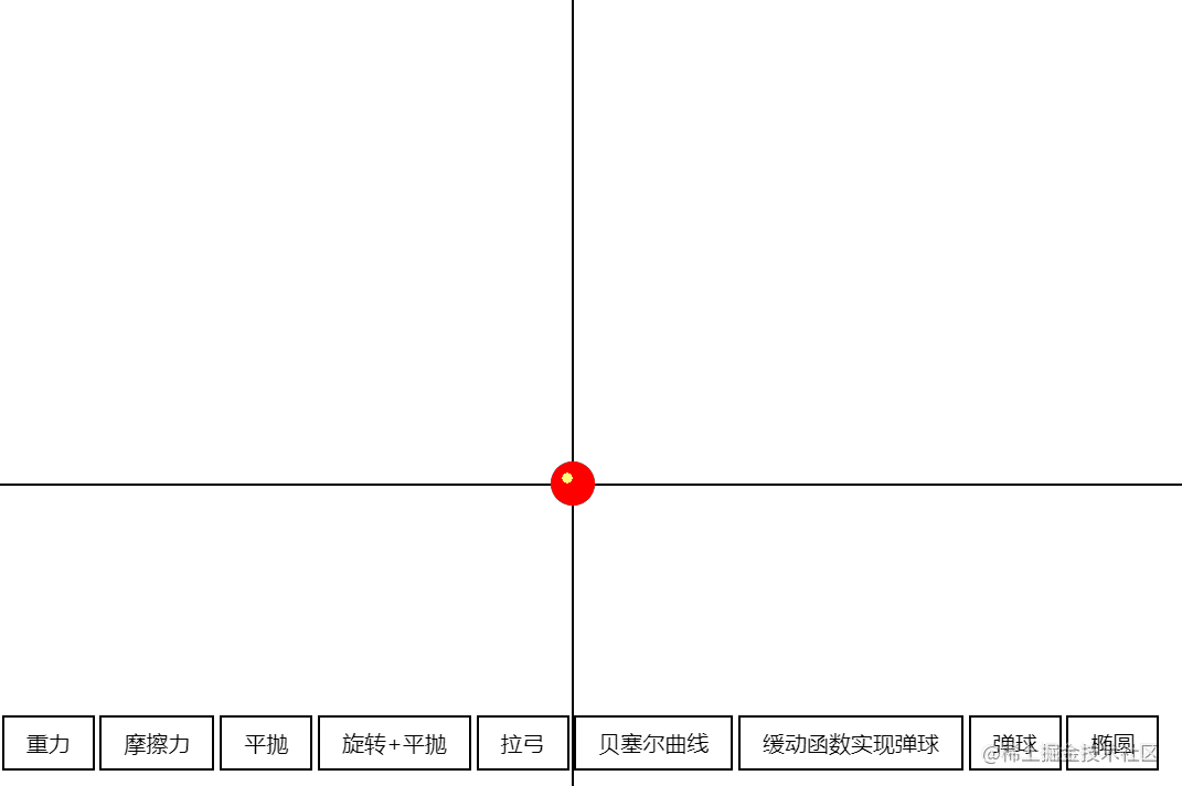
- Gravity: h = g * t 2
// gravity
const gravity = () => {
  const draw = (progress) => {	// Height 500
    ball.style.transform = `translate(0, ${500 * (progress - 1)}px)`;
  };
  animate({
    duration: 1000,
    easing(timeFraction) {
      return timeFraction ** 2;	// t square
    },
    draw,
  });
};
- Friction: time becomes 2t - t2
// friction
const friction = () => {
  // Initial height 500px
  const draw = (progress) => {
    ball.style.transform = `translate(0, ${500 * (progress - 1)}px)`;
  };
  animate({
    duration: 1000,
    easing(timeFraction) {
      // The initial velocity coefficient is 2
      return timeFraction * (2 - timeFraction);
    },
    draw,
  });
};

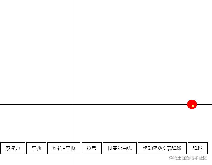
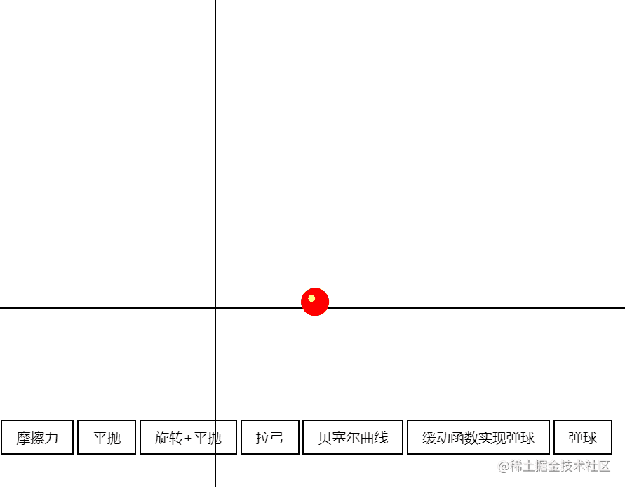
- Flat throwing (x-axis uniform velocity, Y-axis acceleration), that is, the y-axis is similar to t2 in gravity, while the x-axis velocity remains unchanged
// Flat throw x
const horizontalMotion = () => {
  const draw = (progress) => {
    ball.style.transform = `translate(${500 * progress.x}px, ${500 * (progress.y - 1)}px)`;
  };

  // There are two directions, moving uniformly along the x axis and accelerating along the y axis
  animate({
    duration: 1000,
    easing(timeFraction) {
      return {
        x: timeFraction,
        y: timeFraction ** 2,
      }
    },
    draw,
  });
};
There are many others. If more, add new attributes to the object returned by easing, such as rotation:
-
Rotation + horizontal throwing
// Rotation + horizontal throwing
const horizontalMotionWidthRotate = () => {
  const draw = (progress) => {
    ball.style.transform = `translate(${500 * progress.x}px, ${500 * (progress.y - 1)}px) rotate(${2000 * progress.rotate}deg)`;// 2000 here is also the scale factor
  };

  // There are two directions, moving uniformly along the x axis and accelerating along the y axis
  animate({
    duration: 2000,
    easing(timeFraction) {
      return {
        x: timeFraction,
        y: timeFraction ** 2,
        rotate: timeFraction,
      }
    },
    draw,
  });
};
-
Bow pulling (uniform acceleration with x-axis uniform velocity and y-axis negative initial velocity)
// pull back the bow
const arrowMove = () => {
  // Abstracted out, the initial value is 2, becomes a positive 1 at a critical point and increases at a constant speed
  const back = (x, timeFraction) => {
    return Math.pow(timeFraction, 2) * ((x + 1) * timeFraction - x);
  }
  const draw = (progress) => {
    ball.style.transform = `translate(${200*progress.x}px, ${ - 500 * progress.y}px)`;
  };
  animate({
    duration: 1000,
    easing(timeFraction) {
      return {
        x: timeFraction,
        y: back(2, timeFraction),
      };
    },
    draw,
  });
};
-
Bessel curve cubic-bezier(0,2.11,1,.19) ✿ cubic-bezier.com,Animated Bézier Curves - Jason Davies
- ps: at this point, the hard core is gradually getting up, tql
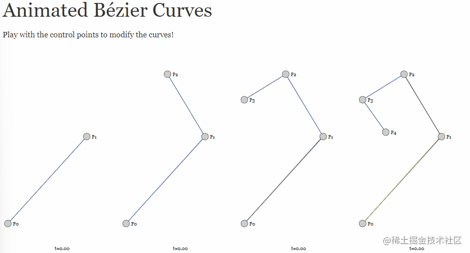
// Bessel
const bezier = () => {
  const bezierPath = (x1, y1, x2, y2, timeFraction) => {
    const x = 3 * x1 * timeFraction * (1 - timeFraction) ** 2 + 3 * x2 * timeFraction ** 2 * (1 - timeFraction) + timeFraction ** 3;
    const y = 3 * y1 * timeFraction * (1 - timeFraction) ** 2 + 3 * y2 * timeFraction ** 2 * (1 - timeFraction) + timeFraction ** 3;
    return [x, y];
  }

  const draw = (progress) => {
    const [px, py] = bezierPath(0.2, 0.6, 0.8, 0.2, progress);
    // Actually drawn on two dimensions
    ball.style.transform = `translate(${300 * px}px, ${-300 * py}px)`;
  }

  animate({
    duration: 2000,
    easing(timeFraction) {
      return timeFraction * (2 - timeFraction);
    },
    draw,
  });
}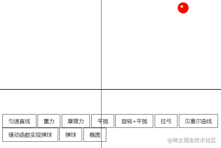
Complex animation
-
Bouncing ball (slow motion function realization / automatic attenuation realization)
- Go directly to the teacher's example: JS encapsulated animation function (codepen.io) , automatic attenuation here is a pit filled in before: why use Promise? After each execution, the handle will be handed over to the above function to judge whether there is speed attenuation. It will end automatically when the speed is 0.
Auto falloff: more complex
-
Elliptical motion
-
Set of formulas, x = a*cos(a), y = b * sin(a)
// ellipse
const ellipsis = () => {
  const draw = (progress) => {
    const x = 150 * Math.cos(Math.PI * 2 * progress);
    const y = 100 * Math.sin(Math.PI * 2 * progress);
    ball.style.transform = `translate(${x}px, ${y}px)`;
  }

  animate({
    duration: 2000,
    easing(timeFraction) {
      return timeFraction * (2 - timeFraction);
    },
    draw,
  });
};
-
Relevant practice resources
Animation code example:
- CodePen Can provide a lot of design inspiration
- CodeSandbox Easy to import SDK
Design website:
- Dribbble - Discover the World's Top Designers & Creative Professionals
- I recommend first-hand figma: Figma
Animation tools (generally used by UE and UI students):
- 2D : Animate CC,After Effects
- 3D :Cinema 4D,Blender,Autodesk Maya
SVG:
-
Snap.SVG - JavaScript library for modern SVG graphics
-
Svg.js - lightweight library for manipulating and animating SVG.
JS:
-
GSAP - JavaScript animation library.
-
TweenJS - a simple but powerful JavaScript patch / animation library. Part of the CreateJS library suite.
-
Velocity - Accelerated JavaScript animation.
CSS:
- Animate. CSS - cross browser library for CSS animation. As easy to use as a simple thing.
canvas:
-
EaselJS - EaselJS is a library for building high-performance interactive 2D content in HTML5
-
Fabric.js - JavaScript painting library that supports animation.
-
Paper.js - Swiss Army knife for vector graphics script
-
Scriptgrapher - using HTML5
Migrate Canvas to JavaScript and browsers.
-
Pixijs – create beautiful digital content with the fastest and most flexible 2D WebGL renderer.
In practical work, it is often to convert the animation frame / design file given by the UI into code
-
When the front end needs to be fully designed and developed by itself:
- Use the encapsulated animation library to make a choice from the perspective of development cost and experience
-
When the design is not very free:
- The definition and picture format can be specified, and the animation shall give a schematic or similar case reference as far as possible. You need help to compress the wizard map resources. (resource adaptation of mobile terminal, etc.)
-
When design resources are sufficient:
-
The design is required to export lottie format files
Lottie is a library that can be applied to Android, ios, Web and Windows,
Analyze AE animation through Bodymovin, and export json files that can render animation on the mobile end and web end.import lottie from 'lottie-web' ; this.animation = lottie.loadAnimation({ container: this.animationRef.current, renderer: 'svg', loop: false, autoplay: false, aninationData: dataJson, path: URL, });
-
optimization
-
12 basic principles of animation - Wikipedia, Encyclopedia of freedom (wikipedia.org)
-
Performance angle
- Key points: reduce redrawing and rearrangement, which are the two most time-consuming links in the whole link.
The general process of page rendering is JS - > CSS - > calculation style - > layout - > drawing - > render layer merging.
Among them, layout and paint are the two most time-consuming links in the whole process, so we try to avoid these two links. In terms of performance, the most ideal rendering pipeline has no layout and rendering links, and only needs to merge the rendering layers.
- adopt CSS Triggers You can query CSS properties and their affected links
proposal
- In practical applications, the simplest thing to note is not to use the display:none attribute value at the beginning of triggering animation, because it will cause Layout and Paint links. Switching class names is a good way.
ps: learned! Go and change it
- CSS3 hardware acceleration, also known as GPU acceleration, is an optimization scheme that uses GPU for rendering and reduces CPU operation. Because CSS attributes such as transform in GPU will not trigger repaint, it can greatly improve the performance of web pages. The following attributes in CSS can trigger hardware acceleration:
- transform
- opacity
- filter
- Will-change
- If some elements do not need the above attributes, but need to trigger the hardware acceleration effect, you can use some tips to induce the browser to turn on hardware acceleration.
- -Algorithm optimization
-Linear function instead of real calculation - geometric model optimization
-Collision detection optimization 622
-Memory / cache optimization - off screen drawing
Summarize your feelings
Today's class is also very hard core. It introduces the basic principle of front-end animation, the classification of front-end animation and how to realize front-end animation, as well as relevant resources and practical methods. Let me have a deeper understanding of the front-end animation, and the final Resource Recommendation is also very helpful~
Most of the content quoted in this article comes from Mr. Jiang Xiang's class and MDN (the introduction of CSS animation properties has been turned over for a long time. MDN is very comprehensive and has vivid examples. I recommend you to have a look)