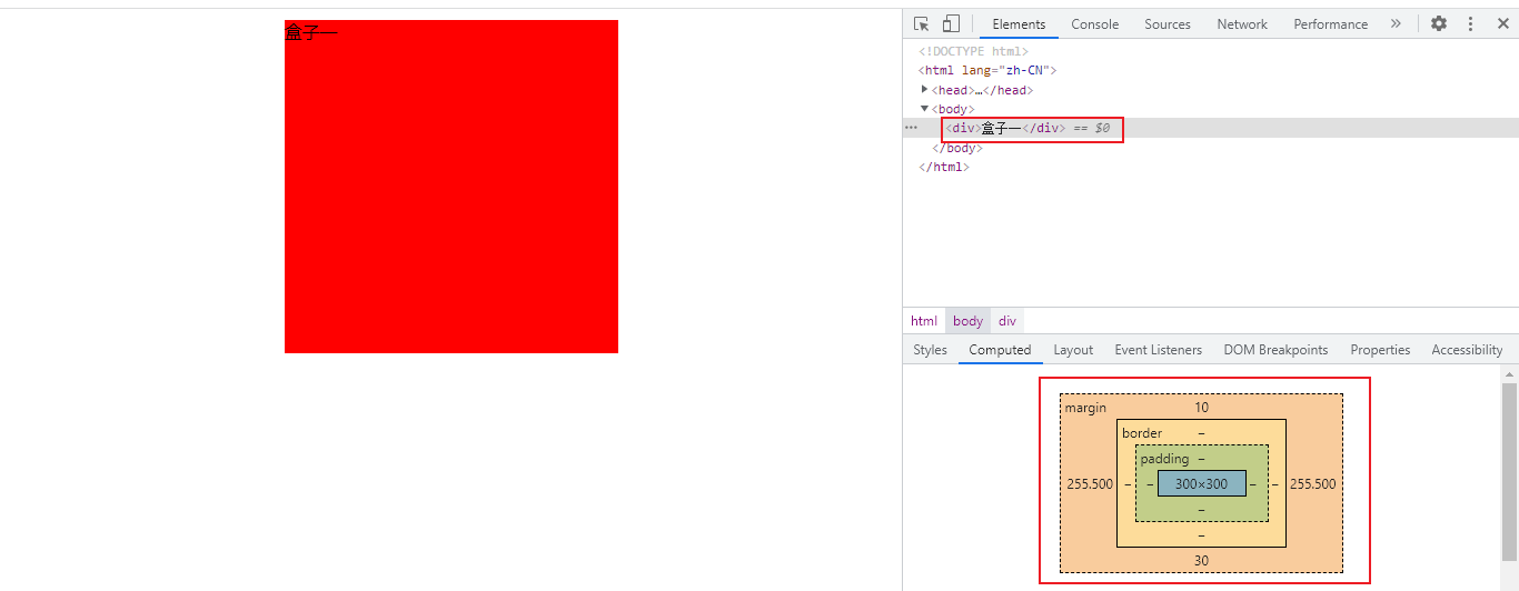
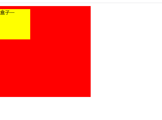
1. Composition of box model

1. border border
<!DOCTYPE html>
<html lang="zh-CN">
<head>
    <meta charset="UTF-8">
    <title>test title</title>

    <style>

        div {
            width: 300px;
            height: 300px;
            border: 5px dotted red;
            border-right: 10px dashed yellow;
        }


    </style>
</head>
<body>

<div>Box one</div>


</body>
</html>
The parameters are described as follows:
- The three parameters of border are border width, border style and border color respectively. The values of border style can be none (default), solid and dashed (dotted line)
- You can also set border top, border left and border bottom
- border will make the actual size of the box larger
The display effect is as follows:

1.1 border-collapse: collapse
<!DOCTYPE html>
<html lang="zh-CN">
<head>
    <meta charset="UTF-8">
    <title>test title</title>

    <style>

        table {
            border-collapse: collapse;
        }


        th,td {
            border: 1px solid red;
        }


    </style>
</head>
<body>

<table>
    <thead>
        <tr>
            <th>full name</th>
            <th>Age</th>
        </tr>
    </thead>

    <tbody>
        <tr>
            <td>Zhang San</td>
            <td>18</td>
        </tr>
        <tr>
            <td>Zhao Si</td>
            <td>19</td>
        </tr>

    </tbody>

</table>

</body>
</html>
- Set border collapse: collapse can eliminate the gap between tables, and the adjacent parts of the set border will be merged
The display effect is as follows:

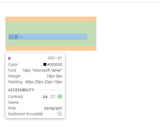
2. padding inner margin
<!DOCTYPE html>
<html lang="zh-CN">
<head>
    <meta charset="UTF-8">
    <title>test title</title>

    <style>

        div {
            width: 300px;
            height: 300px;
            padding: 40px 30px 20px 10px;
        }

        P {
            padding: 40px 30px 20px 10px;
        }


    </style>
</head>
<body>

<div>
    <p>Duan Luoyi</p>
</div>

</body>
</html>
- When the padding value is 1, it indicates 4 surrounding blocks. When the padding value is two, the first represents up and down, and the second represents left and right. When the padding value is 4, it indicates up, right, down and left respectively
- It can also be specified separately with padding left, padding right, padding top and padding bottom
If width/height is specified for the box, and then the padding value is specified, padding will make the box larger
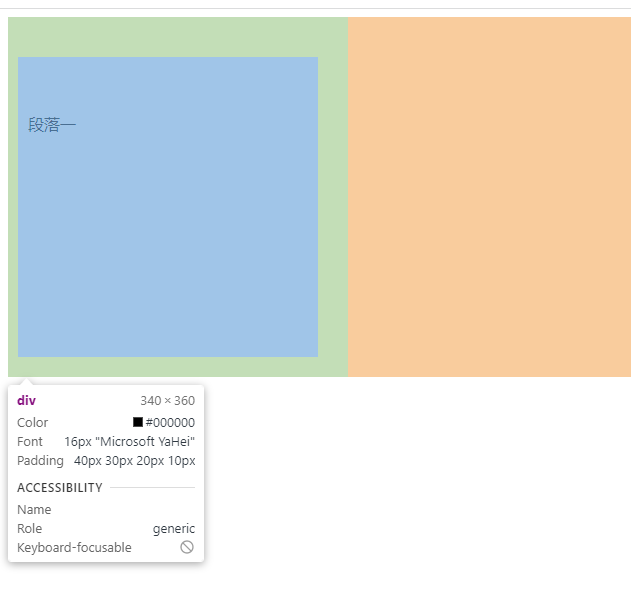
If the box does not specify width/height, but the padding value is specified, padding will not make the box larger
3. margin margin
<!DOCTYPE html>
<html lang="zh-CN">
<head>
    <meta charset="UTF-8">
    <title>test title</title>

    <style>

        * {
            margin: 0px;
            padding: 0px;
        }

        div {
            width: 300px;
            height: 300px;
            background-color: red;
            margin: 10px auto 30px auto;
        }

    </style>
</head>
<body>

<div>Box one</div>

</body>
</html>
explain:
- Because the browser will set different margin and padding for different boxes, in order to unify, you need to set margin and padding to 0
- When the margin value is 1, it indicates the surrounding 4 blocks. When the margin value is two, the first represents up and down, and the second represents left and right. When the margin value is 4, it indicates up, right, down and left respectively
- It can also be specified separately with margin left, margin right, margin top and margin bottom
- Conditions for horizontal centering of block elements:
- The width of the block element is set
- Set the left and right margin of the block element to auto
The display effect is as follows:
3.1 margin top collapse
If both the parent box and the child box have margin top, the box will collapse
<!DOCTYPE html>
<html lang="zh-CN">
<head>
    <meta charset="UTF-8">
    <title>test title</title>

    <style>

        * {
            margin: 0px;
            padding: 0px;
        }

        .outer {
            width: 300px;
            height: 300px;
            background-color: red;
            overflow: hidden;
        }

        .inner {
            width: 100px;
            height: 100px;
            background-color: yellow;

        }

        div {
            margin-top: 10px;

        }


    </style>
</head>
<body>

<div class="outer">
    <div class="inner">Box one</div>
</div>

</body>
</html>
The normal display effect is as follows:
If overflow: hidden; is not added;, The display effect is as follows:

4. In line blocks or in line elements are horizontally centered
<!DOCTYPE html>
<html lang="zh-CN">
<head>
    <meta charset="UTF-8">
    <title>test title</title>

    <style>

        * {
            margin: 0px;
            padding: 0px;
        }

        div {
            text-align: center;
        }

    </style>
</head>
<body>

<div>
    <span>Inline element</span>
    <img src="images/baidu.png"/>
</div>

</body>
</html>
Just add text align: Center to the parent element; that will do
The display effect is as follows:

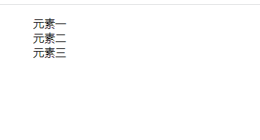
5. Remove li small dots
<!DOCTYPE html>
<html lang="zh-CN">
<head>
    <meta charset="UTF-8">
    <title>test title</title>

    <style>

        li {
            list-style: none;
        }


    </style>
</head>
<body>

<ul>
    <li>Element one</li>
    <li>Element two</li>
    <li>Yuan Susan</li>
</ul>

</body>
</html>
The display effect is as follows:
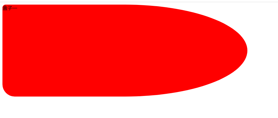
6. Border Radius Fillet
<!DOCTYPE html>
<html lang="zh-CN">
<head>
    <meta charset="UTF-8">
    <title>test title</title>

    <style>

        div {
            width: 800px;
            height: 300px;
            background-color: red;
            border-radius: 10px 50% 50% 40px;
        }


    </style>
</head>
<body>

<div>Box one</div>

</body>
</html>
The parameters are described as follows:
- The length of the percentage, which is the maximum percentage value of length and width
- When the border radius value is 1, it indicates 4 fillets. When the border radius value is two, the first represents the upper left corner and lower right corner, and the second represents the upper right corner and lower left corner. When the border radius value is 4, it indicates the upper left corner, upper right corner, lower right corner and lower left corner respectively
- It can also be specified separately with border top left radius, border top right radius, border bottom right radius and border bottom left radius
The display effect is as follows:
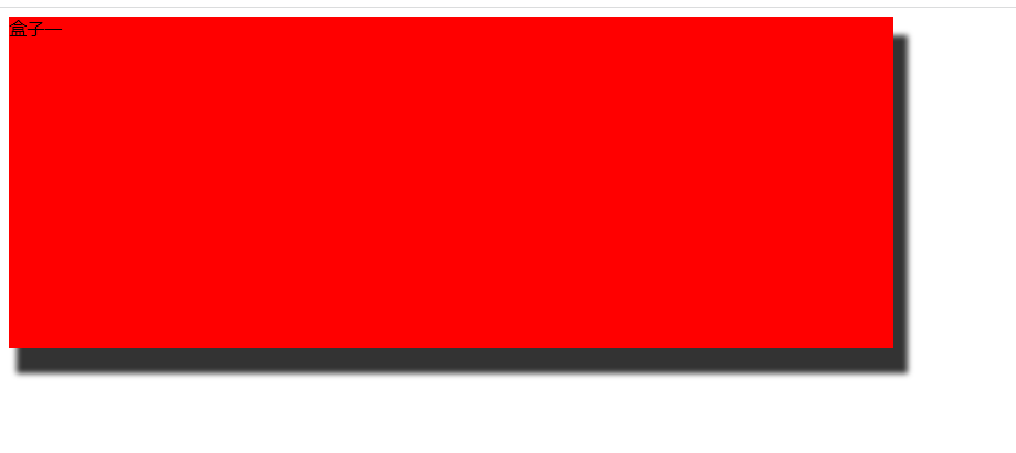
7. Box shadow
<!DOCTYPE html>
<html lang="zh-CN">
<head>
    <meta charset="UTF-8">
    <title>test title</title>

    <style>

        div {
            width: 800px;
            height: 300px;
            background-color: red;
            box-shadow: 10px 20px 5px 3px rgba(0,0,0,0.8);
        }


    </style>
</head>
<body>

<div>Box one</div>

</body>
</html>
The parameters are described as follows:
- Box shadows do not take up space and do not affect the arrangement of other boxes
- The first parameter, h-shadow, is required. It indicates the position of the shadow offset x, which is greater than 0 to the right and less than 0 to the left
- The second parameter v-shadow, which is required, indicates the position of shadow offset y, which is greater than 0 downward and less than 0 upward
- The third parameter, blur, indicates the degree of shadow blur. The default value is 0px no blur. The larger the value, the more blur
- The fourth parameter, spread, indicates the size of the shadow. The larger the value, the larger the shadow
The display effect is as follows:
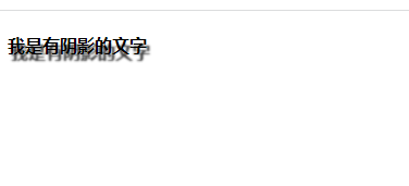
8. Text shadow
<!DOCTYPE html>
<html lang="zh-CN">
<head>
    <meta charset="UTF-8">
    <title>test title</title>

    <style>

        h4 {
            text-shadow: 3px 6px 2px rgba(0, 0, 0, 0.8);
        }


    </style>
</head>
<body>

<h4>I am a text with shadow</h4>

</body>
</html>
The parameters are described as follows:
- The first parameter, h-shadow, is required. It indicates the position of the shadow offset x, which is greater than 0 to the right and less than 0 to the left
- The second parameter v-shadow, which is required, indicates the position of shadow offset y, which is greater than 0 downward and less than 0 upward
- The third parameter, blur, indicates the degree of shadow blur. The default value is 0px no blur. The larger the value, the more blur
The display effect is as follows: