Detailed explanation of Android controls
After learning the layout of Android, to design the UI interface, you also need to master the application of various controls. At the beginning, the design of an interface is to create a container, then continuously add components to the container, and finally form a UI interface. Mastering these basic user interface components is the basis for learning Android programming well. Next, we will introduce how to use each component in detail.
TextView (text box)
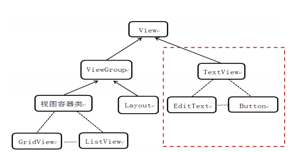
TextView directly inherits View, which is also the parent class of two UI component classes, EditText and Button.
TextView is used to display text on the interface by modifying the content of the text in the layout file or in the Activity.
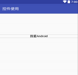
TextView common properties:
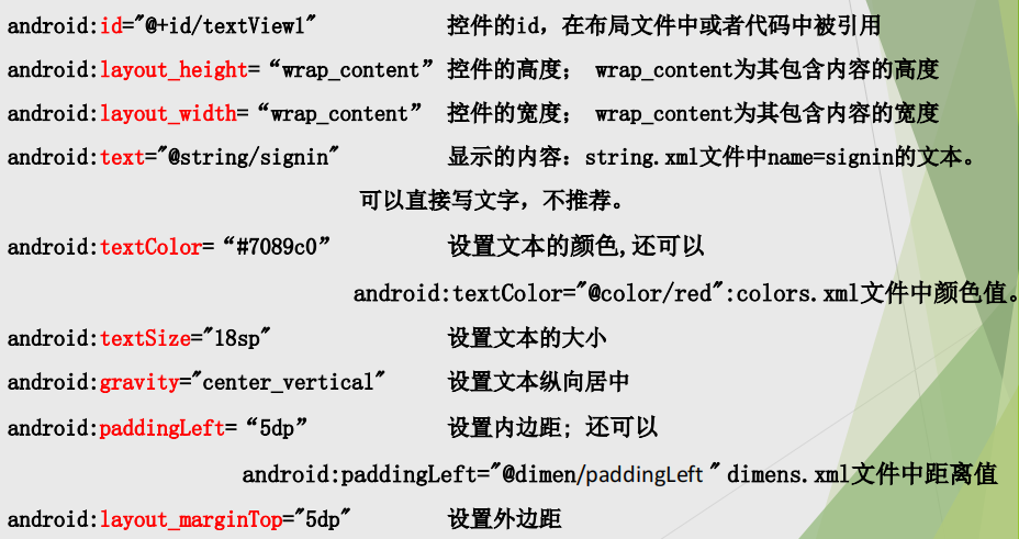
values/colors.xml:
<?xml version="1.0" encoding="utf-8"?>
<resources>
<color name="purple_200">#FFBB86FC</color>
<color name="purple_500">#FF6200EE</color>
<color name="purple_700">#FF3700B3</color>
<color name="teal_200">#FF03DAC5</color>
<color name="teal_700">#FF018786</color>
<color name="black">#FF000000</color>
<color name="white">#FFFFFFFF</color>
<color name="red">#ff0000</color>
</resources>
values/dimens.xml:
<?xml version="1.0" encoding="utf-8"?>
<resources>
<dimen name="paddingLeft">555dp</dimen>
</resources>
EditText (input box)
EditText is very similar to TextView. Many XML attributes can be shared. The biggest difference between EditText and TextView is that EditText can accept user input.
An important attribute of EditText is inputType, which is equivalent to the type attribute of < input... / > element of Html. It is used to set EditText as the input component of the specified type, such as mobile phone number, password, date, etc. Another attribute is to use android:hint = "" to prompt the user what to enter in the current text box. When the user clicks the text box, the text will disappear.
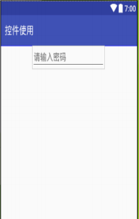
inputType property of EditText
The inputType property starts the style of the virtual keyboard when a value is entered in EditText. Sometimes a virtual keyboard is required
Only characters or numbers can be entered. So inputType is particularly important.
android:inputType = "textCapCharacters" capital letters
android:inputType = "textMultiLine" multiline input
android:inputType = "textEmailAddress" email address
android:inputType = "textPassword" password, hidden characters
android:inputType = "textVisiblePassword" password, characters visible
android:inputType = "number"
android:inputType = "phone" dialing keyboard
android:inputType = "datetime" time date
android:inputType = "date" date keyboard
android:inputType = "time" time keyboard
Button
Button inherits TextView. It is mainly a button generated on the UI interface. Users can click the button and add onClick event, that is, click event, to the button. Buttons are relatively easy to use. You can set the background or customize the style for the button through android:background. The xml attribute of button is similar to TextView, and most attributes can be shared.
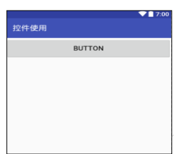
<Button
android:layout_height="40dp"
android:layout_width="wrap_content"
android:minWidth="100dp"
android:layout_marginLeft="0dp"
android:layout_marginRight="2dp"
android:layout_marginTop="5dp"
android:layout_marginBottom="10dp"
android:background="@drawable/button"
android:text="@string/login"
android:textColor="#fff"
android:textSize="18sp"
android:id="@+id/login"
android:textAllCaps="true"
android:onClick="onLoginClick" //Click event handling method
/>
ImageView
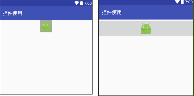
ImageView, whose main function is to display pictures, can be used to display any Drawable object. ImageView also derives the ImageButton component, so the XML attributes and methods supported by ImageView can basically be applied to these two components.
<LinearLayout xmlns:android="http://schemas.android.com/apk/res/android"
xmlns:app="http://schemas.android.com/apk/res-auto"
android:layout_width="match_parent"
android:layout_height="match_parent"
android:orientation="vertical">
<ImageView
android:id="@+id/imageView"
android:layout_width="wrap_content"
android:layout_height="wrap_content"
android:layout_gravity="center"
android:src="@mipmap/ic_launcher" />
<ImageButton
android:id="@+id/imageButton"
android:layout_width="fill_parent"
android:layout_height="wrap_content"
android:src="@mipmap/ic_launcher" />
</LinearLayout>
RadioButton and CheckBox
Radio Button and check box are the most common UI components in the user interface. They all inherit from the Button class, so you can directly use various properties and methods supported by the Button.
Both RadioButton and CheckBox have a selectable function, so you can specify an additional android:checked attribute to specify whether RadioButton and CheckBox are selected initially.
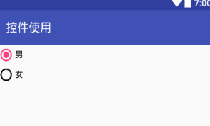
The difference between RadioButton and CheckBox is that only one of a group of RadioButtons can be selected. Therefore, RadioButton is usually used together with RadioGroup to define a group of radio buttons.
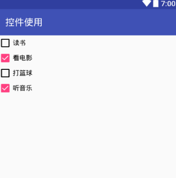
CheckBox: a control that can select multiple options at the same time
RadioButton: a control that can select only one option
RadioGroup is the carrier of RadioButton. It is invisible when the program runs. The application may contain one or more radiogroups.
RadioGroup inherits from LinearLayout, so the property of LinearLayout RadioGroup can use android:orientation property to control the arrangement direction of RadioButton s.
A RadioGroup contains multiple RadioButton s. In each RadioGroup, users can only select one of them
Checked attribute: android:checked = "true" or "false"
RadioButton must set id attribute to realize radio selection
<!--radio button-->
<RadioGroup
android:layout_width="match_parent"
android:layout_height="wrap_content">
<RadioButton
android:id="@+id/radioButton2"
android:layout_width="wrap_content"
android:layout_height="wrap_content"
android:checked="true"
android:text="male" />
<RadioButton
android:id="@+id/radioButton"
android:layout_width="wrap_content"
android:layout_height="wrap_content"
android:text="female" />
</RadioGroup>
<!--check box-->
<CheckBox
android:id="@+id/checkBox"
android:layout_width="match_parent"
android:layout_height="wrap_content"
android:text="read" />
<CheckBox
android:id="@+id/checkBox2"
android:layout_width="match_parent"
android:layout_height="wrap_content"
android:text="watch movie" />
. . . . . .
ProgressBar (progress bar)
ProgressBar is also an important group of components. ProgressBar itself represents the progress bar component. It also derives two common components: seekBar and RatingBar. ProgressBar and its subclasses are very similar, but there are some differences in display.
The progress bar is usually used to show the user the percentage of a time-consuming operation completed. The progress bar can dynamically display the progress, so it can avoid making users feel that the program has lost response when performing a time-consuming operation for a long time, so as to bring users a better experience.
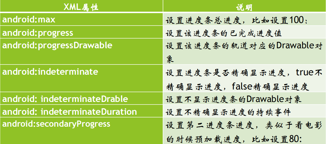
The progressbar is divided into definite and uncertain. The uncertain is the uncertain time required for an operation to be completed. The uncertain ProgressBar is needed at this time. This is controlled by the attribute android:indeterminate. If it is set to true, the progressbar may be a circular scroll bar or a horizontal scroll bar (determined by the style). By default, if it is a horizontal progress bar, it is determined.
Android supports a variety of styles of progress bars. You can specify the style for the ProgressBar through the style attribute:
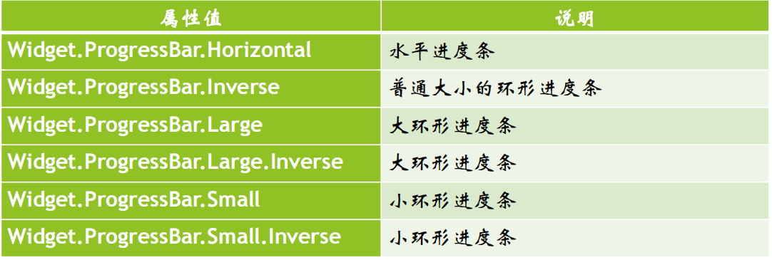
When using style="@android:style/Widget.ProgressBar.Small".
Another way is to use the system's attr:
style="?android:attr/progressBarStyle"
style="?android:attr/progressBarStyleHorizontal"
style="?android:attr/progressBarStyleInverse"
style="?android:attr/progressBarStyleLarge"
style="?android:attr/progressBarStyleLargeInverse"
style="?android:attr/progressBarStyleSmall"
style="?android:attr/progressBarStyleSmallInverse"
style="?android:attr/progressBarStyleSmallTitle"
<?xml version="1.0" encoding="utf-8"?>
<LinearLayout
xmlns:android="http://schemas.android.com/apk/res/android"
android:layout_width="match_parent"
android:layout_height="match_parent"
android:orientation="vertical">
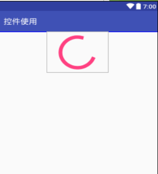
<ProgressBar
android:id="@+id/progressBar5"
style="?android:attr/progressBarStyle"
android:layout_width="match_parent"
android:layout_height="wrap_content" />
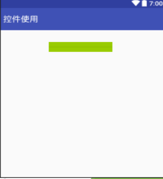
<ProgressBar
android:id="@+id/progressBar4"
style="?android:attr/progressBarStyleHorizontal"
android:layout_width="145dp"
android:layout_height="25dp"
android:layout_gravity="center"
android:layout_marginTop="30dp"
android:background="@android:color/holo_green_light" />
</LinearLayout>
Seekbar (drag bar)
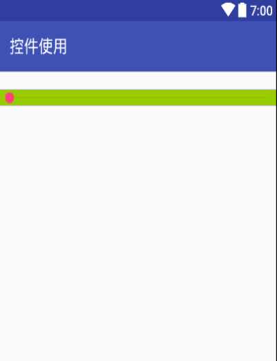
The SeekBar is very similar to the progress bar, except that the progress bar is filled with color to indicate the degree of progress completion, while the drag bar identifies numbers by the position of the slider. The drag bar allows the user to drag the slider to change the value, so the drag bar is usually used to adjust some value of the system, such as volume adjustment.
Because the drag bar inherits the progress bar, the XML properties and methods supported by the progress bar also apply to the drag bar. The progress bar allows users to change the appearance of the slider of the drag bar. Changing the appearance of the slider is specified by the android:thumb attribute. This attribute specifies a Drawable object, which will be used as a custom slider. In order to enable the program to respond to the change of the slider position of the drag bar, the program can bind an OnSeekBarChangeListener listener to it.
<?xml version="1.0" encoding="utf-8"?>
<LinearLayout
xmlns:android="http://schemas.android.com/apk/res/android"
android:layout_width="match_parent"
android:layout_height="match_parent">
<SeekBar
android:id="@+id/seekBar"
android:layout_width="wrap_content"
android:layout_height="wrap_content"
android:layout_marginTop="20dp"
android:background="@android:color/holo_green_light"
android:layout_weight="1" />
</LinearLayout>
AdapterView and its subclasses
AdapterView is a group of important components. AdapterView itself is an abstract base class. Its derived subclasses are very similar in usage, but there are some differences in the display interface. AdapterView has the following characteristics:
AdapterView inherits ViewGroup, which is essentially a container.
AdapterView can include multiple "list items" and display them in an appropriate way.
Multiple "list items" displayed by AdapterView are provided by Adapter. Call the setAdapter(Adapter) method of AdapterView to set the Adapter.
ListView and ListActivity
ListView is a component widely used in mobile phone system. It displays all list items in the form of vertical list.
The screen space of mobile phone is limited, and there is not much content to display. You can use ListView to display more content.
ListView allows users to scroll the data outside the screen to the screen by sliding up and down, and the original data in the screen scrolls out of the screen, so as to display more data content.

There are two ways to generate a list view:
Create directly using ListView.
Create an Activity that inherits ListActivity (equivalent to the component displayed by the Activity is ListView).
Once the ListView is obtained in the program, you need to set the list items to be displayed for the ListView. Provide an Adapter for ListView through setAdapter(Adapter) method, and the Adapter provides list items.
Use ListActivity to display list data
Steps for using ListActivity:
1) Inherited from ListActivity, such as xxx extends ListActivity
2) Override the onCreate method. In this method, you need to do three things:
a) Prepare data source
b) Set up adapter
c) Binding adapter
3) Rewrite click event
void onListItemClick(ListView l, View v, int position, long id)
public class MainActivity extends ListActivity {
@Override
protected void onCreate(Bundle savedInstanceState) {
super.onCreate(savedInstanceState);
//setContentView(R.layout.main);
//1. Data source
String[] data = {"Wuhan","Beijing","Shanghai","Chengdu","Xi'an"};
//2. Adapter
@SuppressWarnings("unchecked")
ArrayAdapter arrayAdapter = new ArrayAdapter(this,
android.R.layout.simple_list_item_1, data);
//3. Binding
setListAdapter(arrayAdapter);
}
@Override
protected void onListItemClick(ListView l, View v, int position, long id) {
super.onListItemClick(l, v, position, id);
Toast.makeText(MainActivity.this
,"Hit the third"+position+"individual"+" "+l.getAdapter().getItem(position).toString()
,Toast.LENGTH_LONG).show();
} }
Common XML attributes of ListView
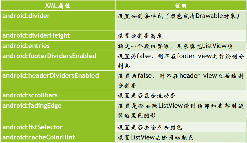
<?xml version="1.0" encoding="utf-8"?>
<LinearLayout
xmlns:android="http://schemas.android.com/apk/res/android"
android:layout_width="match_parent"
android:layout_height="match_parent">
<!--Directly use array resources to list view Add list item-->
<!--Sets the color of the splitter bar-->
<!--Sets the height of the splitter bar--> <ListView
android:id="@+id/listview1"
android:layout_width="match_parent"
android:layout_height="wrap_content"
android:divider="#C4C4C4"
android:dividerHeight="1dp">
android:entries="@array/teacher_name" </ListView>
</LinearLayout>
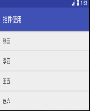
values/arrays.xml file
<?xml version="1.0" encoding="utf-8"?>
<resources>
<!--Add array element-->
<string-array name="teacher_name">
<item>Zhang San</item>
<item>Li Si</item>
<item>Wang Wu</item>
<item>Zhao Liu</item>
</string-array>
</resources>
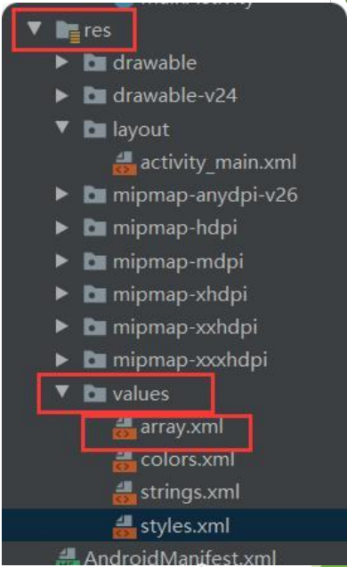
Create a new array in the res folder xm
Adapter interface
Adapter itself is just an interface, which derives two sub interfaces: ListAdapter and SpinnerAdapter. ListAdapter provides list items for AbsListView and SpinnerAdapter provides list items for AbsSpinner.
The common implementation classes of Adapter are as follows:
ArrayAdapter: supports generic operations. It is the simplest and can only display one line of words.
SimpleAdapter: it has the best extensibility and can customize various effects.
BaseAdapter: it is an abstract class. Inheriting it requires more methods, so it has high flexibility.
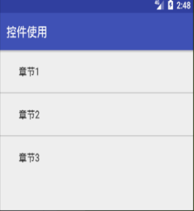
Example 1: create ListView based on ArrayApter
public class MainActivity extends AppCompatActivity {
@Override
protected void onCreate(Bundle savedInstanceState) {
super.onCreate(savedInstanceState);
setContentView(R.layout.listview_layout);
ListView listView=findViewById(R.id.listview1);
//Define an array to fill the listview
String[] arr={"Chapter 1","Chapter 2","Chapter 3"};
ArrayAdapter<String>adapter=newArrayAdapter<String>(
this,android.R.layout.simple_expandable_list_item_1,arr);
//Set adapter for listview
listView.setAdapter(adapter);
} }
Example 2: create ListView based on SimpleAdapter
activity_main.xml
<?xml version="1.0" encoding="utf-8"?>
<LinearLayout
xmlns:android="http://schemas.android.com/apk/res/android"
android:layout_width="match_parent"
android:layout_height="match_parent">
<ListView
android:id="@+id/listview1"
android:layout_width="match_parent"
android:layout_height="wrap_content"
>
</ListView>
</LinearLayout>
list_item_layout.xml
<LinearLayout
xmlns:android="http://schemas.android.com/apk/res/android"
android:layout_width="match_parent"
android:layout_height="match_parent"
android:orientation="horizontal">
<!--Define a ImageView Component to display Avatar--> <ImageView
android:id="@+id/icon"
android:layout_width="wrap_content"
android:layout_height="wrap_content" />
<LinearLayout
android:layout_width="match_parent"
android:layout_height="wrap_content"
android:orientation="vertical">
<!--Define a TextView Component to display the name--> <TextView
android:id="@+id/name"
android:layout_width="wrap_content"
android:layout_height="wrap_content"
android:textSize="16sp"/>
<!--Define a TextView Component to display the description of the person--> <TextView
android:id="@+id/dexc"
android:layout_width="wrap_content"
android:layout_height="wrap_content"
android:textSize="16sp"/>
</LinearLayout>
</LinearLayout>
Activity Code:
public class MainActivity extends AppCompatActivity {
//Define name array
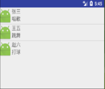
private String[] name={"Zhang San","Wang Wu","Zhao Liu"};
//Define and describe task array
private String[] desc={"sing","dance","play a ball"};
//Define avatar array
private int[] icon=new int[]
{R.mipmap.ic_launcher,R.mipmap.ic_launcher,R.mipmap.ic_launch
er};
@Override
protected void onCreate(Bundle savedInstanceState) {
super.onCreate(savedInstanceState);
setContentView(R.layout.activity_main);
ListView listView = findViewById(R.id.listview1);
//Create a list set whose element is MAP
List<Map<String,Object>> list=
new ArrayList<Map<String,Object>>();
for(int i=0;i<name.length;i++){
Map<String, Object> listitem=new HashMap<String, Object>();
listitem.put("icon",icon[i]);
listitem.put("name",name[i]);
listitem.put("desc",desc[i]);
list.add(listitem);
//Create a SimpleAdapter
SimpleAdapter adapter=
new SimpleAdapter(this,list,R.layout.list_item_layout,
new String[]{"name","icon","desc"},
new int[]{R.id.name,R.id.icon,R.id.dexc});
listView.setAdapter(adapter); } }
The most important thing to use SimpleAdapter is its five parameters, especially the last four. The second parameter is list < map < String,? > > A collection object of type. Each map in the collection is < String,? > Object generates a row; The third parameter is to specify the ID of an interface layout, which refers to a custom layout list_item_layout.xml file; The fourth parameter is a parameter of String [] type, which determines which content to extract and display in each row of listview; The last one is a parameter of type int [], which determines which components are displayed.
Example 3: create ListView based on BaseAdapter
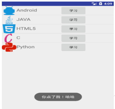
When using SimpleAdapter, users can define buttons in the layout, but when users click, because the click operation is overwritten by the ListView Item, the button cannot get the focus. At this time, the most convenient way is to use the flexible Adapter BaseAdapter. BaseAdapter is the most basic Adapter, which is omnipotent. It does not have so many limitations as the encapsulated classes such as ArrayAdapter, but in this case, it will be more troublesome to use.
(1) Custom layout file list_item_layout.xml as the layout style of each row
<?xml version="1.0" encoding="utf-8"?>
<LinearLayout
xmlns:android="http://schemas.android.com/apk/res/android"
android:layout_width="match_parent"
android:layout_height="match_parent"
android:orientation="horizontal" > <LinearLayout
android:layout_width="200dip"
android:layout_height="match_parent"
android:orientation="horizontal">
<ImageView
android:id="@+id/imageview"
android:layout_width="50dip"
android:layout_height="50dip" />
<TextView
android:id="@+id/textview"
android:layout_width="wrap_content"
android:layout_height="match_parent"
android:paddingTop="8dip"
android:textSize="20sp" />
</LinearLayout>
<Button
android:id="@+id/button"
android:layout_width="wrap_content"
android:layout_height="wrap_content" />
</LinearLayout>
(2) Customize a MyAdapter class, inherit from BaseAdapter, and then override the methods inside
public class MyAdapter extends BaseAdapter {
private List<Map<String, Object>> datas;
private Context mContext;
public MyAdapter(List<Map<String, Object>> datas, Context
mContext) {
this.datas = datas;
this.mContext = mContext; }
public int getCount() {
// Total number of returned data
return datas.size(); }
public Object getItem(int position) {
// Returns the contents of the data at the specified position in the list
return datas.get(position); }
public long getItemId(int position) {
// Returns the location of the data in the list
return position; }
public View getView(int position, View convertView, ViewGroup parent) {
final ViewHolder holder;
if (convertView == null) {
// Use a custom Layout file as Layout
convertView = LayoutInflater.from(mContext).inflate(
R.layout.list_item_layout, null);
// Reduce the number of findviews
holder = new ViewHolder();
// Initialize elements in layout
holder.mImageView
convertView.findViewById(R.id.imageview);
holder.mTextView =
convertView.findViewById(R.id.textview);
holder.mButton =
convertView.findViewById(R.id.button);
holder.mButton.setOnClickListener(new View.OnClickListener() {
public void onClick(View view) {
Toast.makeText(mContext,"You ordered me! ha-ha",
Toast.LENGTH_SHORT).show(); }
});
convertView.setTag(holder); } else {
holder = (ViewHolder) convertView.getTag(); }
// Extract data from the incoming data and bind it to the specified view
holder.mImageView.setImageResource((Integer) datas.
get(position).get("img"));
holder.mTextView.setText(datas.get(position).get("title").
toString());
holder.mButton.setText(datas.get(position).get("button").
toString());
return convertView; }
static class ViewHolder {
ImageView mImageView;
TextView mTextView;
Button mButton; } }
(3) Add data to MainActivity and add the Adapter customized above to ListView
public class MainActivity extends Activity {
private ListView mListView;
private MyAdapter myAdapter;
private List<Map<String, Object>> list =
new ArrayList<Map<String, Object>>();
protected void onCreate(Bundle savedInstanceState) {
super.onCreate(savedInstanceState);
setContentView(R.layout.activity_main);
initData();
mListView =
findViewById(R.id.listview);
myAdapter = new MyAdapter(list, this);
mListView.setAdapter(myAdapter); }
private void initData() {
Map<String, Object> map = new HashMap<String, Object>();
map.put("img", R.drawable.android);
map.put("title", "Android");
map.put("button", "study");
list.add(map);
map = new HashMap<String, Object>();
map.put("img", R.drawable.java1);
map.put("title", "JAVA");
map.put("button", "study");
list.add(map);
map = new HashMap<String, Object>();
map.put("img", R.drawable.html5);
map.put("title", "HTML5");
map.put("button", "study");
list.add(map);
//. . . . . .
} }
(4) About ViewHolder
When the itemView is the same, the control (findViewById) must be repeatedly unbound every time the itemView is created. Duplicate findViewById is very performance consuming, especially when there are many itemviews in listView.
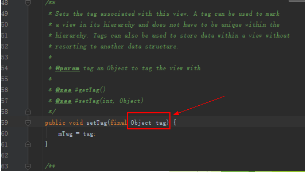
setTag(Onbect) in the View can add an extra data to the View. In the future, you can use getTag() to get this data.
setTag() stores the view with the Object object as a parameter. In other words, we want to extract the control in an itemView into an Object, so we create a ViewHolder.
When the itemView is created for the first time, the binding of the control is completed. At the same time, the control, as an object – holder, saves it in the itemView through setTag(). When it is used for the second time, the holder can be taken out through getTag() for direct use. That is to say, when the itemView in the list is the same, we only bind the control resources once.
Spinner: a control that can select one option from multiple options, similar to the ComboBox of desktop programs, but without the drop-down menu of ComboBox, it uses a floating menu to provide users with choices
Use the ArrayAdapter array adapter to bind the interface control with the underlying data
To use the Spinner component in your code, you need to introduce:
import android.widget.Spinner;
import android.widget.ArrayAdapter;
import android.widget.AdapterView;
import java.util.ArrayList;
import java.util.List;
<Spinner
android:id="@+id/spCity"
android:layout_width="match_parent"
android:layout_height="wrap_content"
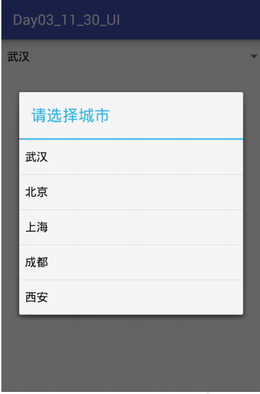
android:prompt="Please select a city"
android:spinnerMode="dialog"
android:entries="@array/cities"/
>
entries attribute, data in spinner list
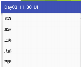
Spinnermode attribute. spinner is displayed as a dialog box or a drop-down box; android:spinnerMode=[“dialog”|“dropdown”]
The prompt property indicates the prompt above the spinner list
android:prompt must reference strings Resource ID in XML, instead of raw text.
Text can only be displayed when android:spinnerMode = "dialog"
spinnerMode="dialog"
spinnerMode="dropdown"
values/arrays.xml file
<?xml version="1.0" encoding="utf-8"?>
<resources>
<string-array name="cities">
<item >Wuhan</item>
<item >Beijing</item>
<item >Shanghai</item>
<item >Chengdu</item>
<item >Xi'an</item>
</string-array>
</resources>
Spinner sets the method ItemSelected of the event listener
spinner.setOnItemSelectedListener(new AdapterView.OnItemSelectedListener() {
@Override
public void onItemSelected(AdapterView<?> arg0, View arg1,
int arg2, long arg3) {
// TODO Auto-generated method stub
Toast.makeText(MainActivity.this, adapter.getItem(arg2), Toast.LENGTH_LONG).show();
// list.get(arg2)
// arg0.getAdapter().getItem(arg2).toString()
}
@Override
public void onNothingSelected(AdapterView<?> arg0) {
// TODO Auto-generated method stub
}
});
arg0 Represents an adapter control, i.e spinner; arg1 Represents the control inside the adapter, i.e spinner Children in; arg2 Indicates the location of the selected child position ; arg3 That represents a child ID