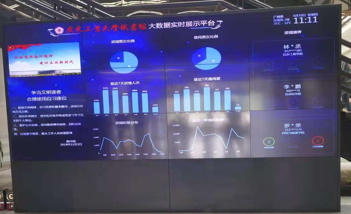
The handsome guy went to the library to paddle. When he entered the door, he was shocked by the big screen at the door of the library. I would also ha ha ha, so I took it down! As a result, when writing a blog, the handsome guy found that the name of the handsome guy happened to be on the photo. The handsome guy shouted: "handsome (wonderful)"
With passion, the handsome boy began his operation
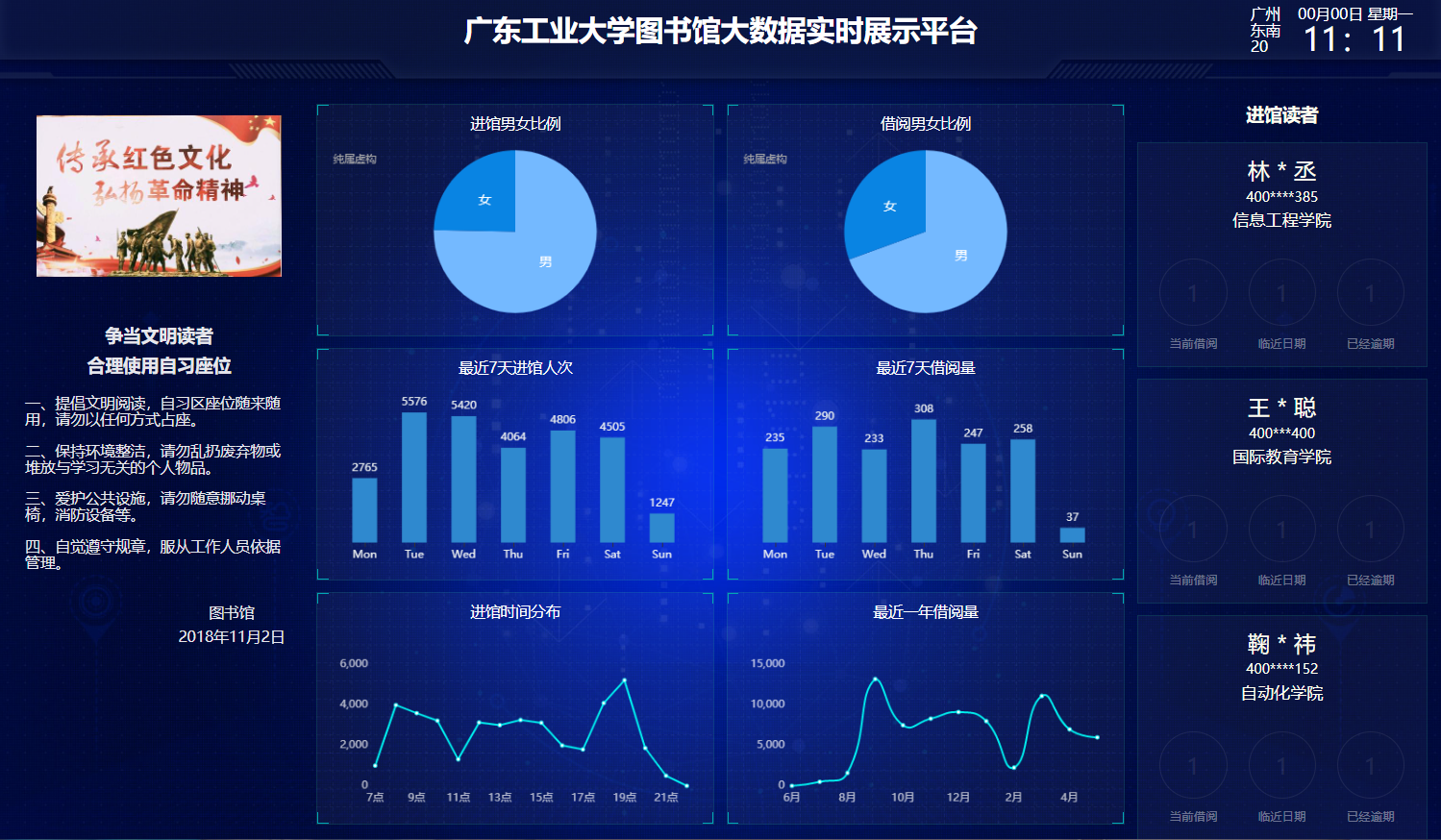
Realization effect
I can't say as like as two peas. This is just the same. I don't know. I thought this platform was what I wrote. 💛
tips: since there is no back-end data, the data here is written at will
1. Overall layout
The layout of the whole page is the same as that of the previous study of echarts. The rem layout is adopted, and the middle section adopts the flex layout. Each section takes one share to achieve the effect of equal distribution
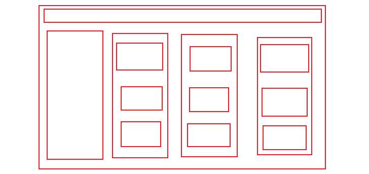
This is probably the layout
2. Obtain weather information
Find a weather interface on the Internet, then receive the returned data and render it. The handsome guy uses http://www.tianqiapi.com The free interface of this website can only be used 300 times a day, so please close it when you don't use it, otherwise it will be undefind like the handsome guy
$.ajax({
    type: "get",
    url: "https://tianqiapi.com/api",
    data: {
        appid: 53877822,
        appsecret: "UjcKYyQ6",
        version: "v6",
    },
    success: function (response) {
        console.log(response);
        let city = document.querySelector(".city")
        let wind = document.querySelector(".wind")
        let tem = document.querySelector(".tem")
        city.innerHTML = response.city + 'city'
        wind.innerHTML = response.win + " " + response.win_speed;
        tem.innerHTML = response.tem2 + "℃ - " + response.tem1 + "℃";
    }
});
In this way, you can return the weather conditions under the current ip address and deal with the rendering. Because the handsome guy is lazy, he finds that there are jQuery packages in the folder and uses jq directly
It is not recommended to simply use Ajax in jQuery. After all, jQuery is too large
3. Pie chart of gender ratio
The interface of the library is actually very simple. It looks very high-end. The graphics are very basic graphics
For this pie chart, echarts is used. You only need to make some basic configuration, change the data in the series, adjust the position of text display, set the trigger mode and the performance after trigger
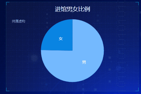
// Pie chart proportion of men and women entering the library
(function () {
    let myChart = echarts.init(document.querySelector('.pie .chart'))
    let option = {
        // title
        title: {
            subtext: 'It's pure fiction',
            left: 'left'
        },
        // prompt box
        tooltip: {
            // Trigger mode
            trigger: 'item'
        },
        series: [{
            name: 'Male female ratio',
            type: 'pie',
            // Cake size
            radius: '90%',
            //data
            data: [{
                    value: 3750,
                    name: 'male'
                },
                {
                    value: 1230,
                    name: 'female'
                },
            ],
            // Color of cake
            color: [
                "#74b9ff",
                "#0984e3"
            ],
            // Position of text display
            label: {
                position: 'inner',
                fontSize: 14,
            },
            // Triggered performance
            emphasis: {
                itemStyle: {
                    shadowBlur: 10,
                    shadowOffsetX: 0,
                    shadowColor: 'rgba(0, 0, 0, 0.5)'
                }
            }
        }]
    };
    myChart.setOption(option)
    window.addEventListener('resize', function () {
        myChart.resize()
    })
})();
4. Histogram of the number of visitors
There are several things to pay attention to in the histogram
The first is to remove the border and two coordinate axes. Configure the coordinate axes and separation lines in xAxis and yAxis. show: false remove all the lines
axisLine: {
    show: false
},
splitLine: {
    show: false
}
At the same time, you need to adjust the position of the icon, otherwise it will be small and a little ugly, which can be realized by configuring the grid attribute
grid: {
    top: "10%",
    left: "3%",
    right: "4%",
    bottom: "3%",
    containLabel: true
}
Trigger method of prompt box
tooltip: {
    trigger: "axis",
    axisPointer: {
        // Axis indicator, axis trigger active
        type: "shadow" // The default is straight line, and the options are: 'line' | 'shadow'
    }
}
echarts still needs to try more to master. There are too many configuration items to remember. It will be much better if you are familiar with them
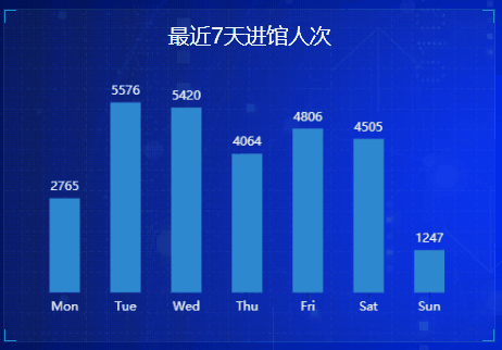
(function () {
    let myChart = echarts.init(document.querySelector('.bar .chart'));
    let option = {
        color: ["#2f89cf"],
        tooltip: {
            trigger: "axis",
            axisPointer: {
                // Axis indicator, axis trigger active
                type: "shadow" // The default is straight line, and the options are: 'line' | 'shadow'
            }
        },
        xAxis: {
            type: 'category',
            data: ['Mon', 'Tue', 'Wed', 'Thu', 'Fri', 'Sat', 'Sun'],
            axisLabel: {
                textStyle: {
                    color: "#ecf0f1",
                    fontSize: '12'
                }
            },
            axisLine: {
                show: false
            },
            axisTick: {
                alignWithLabel: true
            }
        },
        yAxis: {
            type: 'value',
            axisLabel: {
                show: false
            },
            axisLine: {
                show: false
            },
            splitLine: {
                show: false
            },
            axisTick: {
                show: false
            }
        },
        grid: {
            top: "10%",
            left: "3%",
            right: "4%",
            bottom: "3%",
            containLabel: true
        },
        series: [{
            data: [2765, 5576, 5420, 4064, 4806, 4505, 1247],
            type: 'bar',
            label: {
                show: true,
                position: "top",
                textStyle: {
                    color: "#ecf0f1",
                    fontSize: '12'
                }
            },
            barWidth: "50%"
        }]
    };
    myChart.setOption(option)
    window.addEventListener("resize", function () {
        myChart.resize();
    });
})();
5. Distribution chart of admission time
The discount chart is interesting. There are many options to configure. First, we need to deal with the scale of the coordinate axis. The scale of the y axis needs to be separated into one grid every 2000, and the maximum is 6000
yAxis: [{
    min: 0,
    max: 6000,
    interval: 2000 //Separation distance
}]
This completes the calibration of the y-axis, which needs to be configured next
xAxis: {boundaryGap: false}
This configuration item is to align the starting point with the y axis, that is, close to the y axis. Next, you need to configure the prompt box
tooltip: {
    // Triggered by coordinate axis
    trigger: "axis"
}
In the histogram, we use shodow. The default value is line. There is no need to configure here
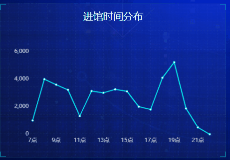
// Line chart
(function () {
    let myChart = echarts.init(document.querySelector('.line .chart'))
    let option = {
        color: "#00f2f1",
        tooltip: {
            // Triggered by coordinate axis
            trigger: "axis"
        },
        grid: {
            top: "20%",
            left: "3%",
            right: "4%",
            bottom: "3%",
            show: false,
            containLabel: true
        },
        xAxis: {
            type: 'category',
            boundaryGap: false,
            data: ['7 spot', '8 spot', '9 spot', '10 spot', '11 spot', '12 spot', '13 spot', '14 spot', '15 spot', '16 spot', '17 spot', '18 spot', '19 spot', '20 spot', '21 spot', '22 spot'],
            axisTick: {
                show: false
            },
            axisLabel: {
                color: "rgba(255,255,255,.7)"
            },
            axisLine: {
                show: false
            },
            splitLine: {
                show: false
            }
        },
        yAxis: [{
                type: "value",
                axisTick: {
                    show: false
                },
                axisLabel: {
                    color: "rgba(255,255,255,.7)",
                },
                splitLine: {
                    show: false
                },
                axisLine: {
                    show: false
                },
                min: 0,
                max: 6000,
                interval: 2000
            }

        ],
        series: [{
            type: 'line',
            data: [1000, 4000, 3600, 3224, 1318, 3135, 3007, 3260, 3120, 2000, 1800, 4100, 5231, 1870, 500, 0]
        }]

    }
    myChart.setOption(option)
    window.addEventListener("resize", function () {
        myChart.resize();
    });
})();
summary
The implementation of this page is very simple. It may be because there is no background data. At least it doesn't take too much time to do it. In general, the effect is very good. The inspiration comes from life. We should learn to find the application scenarios of technology from life!
If you need the source code, you can pay attention to the blogger's private letter~