❉ 520 on Valentine's day, I sent a gift to my girlfriend with code ~ html+css+javascript to realize the cherry blossom love album "you can take it to the person you like"
The annual / 520 Valentine's Day / Tanabata Valentine's Day / birthday gift / advertising younger martial sister / Christmas / New Year's Day / New Year's Day / programmer confession, do you want to give a little surprise to your girlfriend or the girl you are pursuing? Today, this blog will share how to realize 3D three-dimensional dynamic photo album with the front-end code html+css+javascript. Quickly learn to make romance that belongs to our programmers!
Before advertising, our message area is open to you! Come and show your different ways of confession and confess to the ta you like!
❉ Preface
For programmers, "single" is still the biggest bug in life. The key is that they can't debug yet. Although the saying goes "heroes are lonely since ancient times", life without another half is always incomplete. Besides, it's not far from the annual human (dog) festival.
1. PC (computer side) demonstration

2. H5 (mobile terminal) demonstration

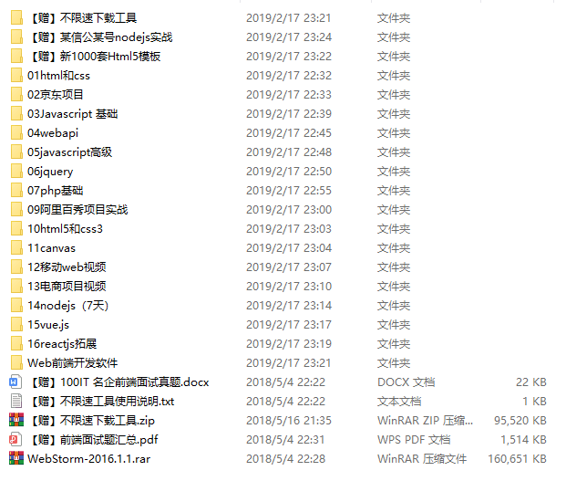
❉ code file directory
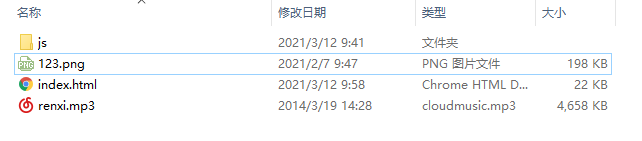
1, 3D photo album (code implementation)
html (3D album section)
<html>
  <head>
    <title></title>
  </head>
  <style>
    * {
      padding: 0;
      margin: 0;
    }
    html,
    body {
      height: 100%;
      padding: 0;
      margin: 0;
      background: #000;
    }
    canvas {
      position: absolute;
      width: 100%;
      height: 100%;
    }
    .aa {
      position: fixed;
      left: 50%;
      bottom: 10px;
      color: #ccc;
    }
  </style>
  <body>
    <canvas id="pinkboard"></canvas>
  </body>
js (Cherry Blossom love part)
      <script>
      /*
       * Settings
       */
      var settings = {
        particles: {
          length: 500, // maximum amount of particles
          duration: 2, // particle duration in sec
          velocity: 100, // particle velocity in pixels/sec
          effect: -0.75, // play with this for a nice effect
          size: 30, // particle size in pixels
        },
      };

      /*
       * RequestAnimationFrame polyfill by Erik M?ller
       */
      (function () {
        var b = 0;
        var c = ["ms", "moz", "webkit", "o"];
        for (var a = 0; a < c.length && !window.requestAnimationFrame; ++a) {
          window.requestAnimationFrame = window[c[a] + "RequestAnimationFrame"];
          window.cancelAnimationFrame =
            window[c[a] + "CancelAnimationFrame"] ||
            window[c[a] + "CancelRequestAnimationFrame"];
        }
        if (!window.requestAnimationFrame) {
          window.requestAnimationFrame = function (h, e) {
            var d = new Date().getTime();
            var f = Math.max(0, 16 - (d - b));
            var g = window.setTimeout(function () {
              h(d + f);
            }, f);
            b = d + f;
            return g;
          };
        }
        if (!window.cancelAnimationFrame) {
          window.cancelAnimationFrame = function (d) {
            clearTimeout(d);
          };
        }
      })();
      var Point = (function () {
        function Point(x, y) {
          this.x = typeof x !== "undefined" ? x : 0;
          this.y = typeof y !== "undefined" ? y : 0;
        }
        Point.prototype.clone = function () {
          return new Point(this.x, this.y);
        };
        Point.prototype.length = function (length) {
          if (typeof length == "undefined")
            return Math.sqrt(this.x * this.x + this.y * this.y);
          this.normalize();
          this.x *= length;
          this.y *= length;
          return this;
        };
      var Particle = (function () {
        function Particle() {
          this.position = new Point();
          this.velocity = new Point();
          this.acceleration = new Point();
          this.age = 0;
        }
        Particle.prototype.initialize = function (x, y, dx, dy) {
          this.position.x = x;
          this.position.y = y;
          this.velocity.x = dx;
          this.velocity.y = dy;
          this.acceleration.x = dx * settings.particles.effect;
          this.acceleration.y = dy * settings.particles.effect;
          this.age = 0;
        };
        Particle.prototype.update = function (deltaTime) {
          this.position.x += this.velocity.x * deltaTime;
          this.position.y += this.velocity.y * deltaTime;
          this.velocity.x += this.acceleration.x * deltaTime;
          this.velocity.y += this.acceleration.y * deltaTime;
          this.age += deltaTime;
        };
css (3D album section)
.box {
  width: 200px;
  height: 200px;
  background-size: cover;
  background-repeat: no-repeat;
  background-attachment: fixed;
  background-size: 100% 100%;
  position: absolute;
  margin-left: 42%;
  margin-top: 22%;
  -webkit-transform-style: preserve-3d;
  -webkit-transform: rotateX(13deg);
  -webkit-animation: move 5s linear infinite;
}
.minbox li:nth-child(1) {
  background: url(../img/01.png) no-repeat 0 0;
  -webkit-transform: translateZ(50px);
}
.minbox li:nth-child(2) {
  background: url(../img/02.png) no-repeat 0 0;
  -webkit-transform: rotateX(180deg) translateZ(50px);
}
.minbox li:nth-child(3) {
  background: url(../img/03.png) no-repeat 0 0;
  -webkit-transform: rotateX(-90deg) translateZ(50px);
}
.minbox li:nth-child(4) {
  background: url(../img/04.png) no-repeat 0 0;
  -webkit-transform: rotateX(90deg) translateZ(50px);
}
.minbox li:nth-child(5) {
  background: url(../img/05.png) no-repeat 0 0;
  -webkit-transform: rotateY(-90deg) translateZ(50px);
}
.minbox li:nth-child(6) {
  background: url(../img/06.png) no-repeat 0 0;
  -webkit-transform: rotateY(90deg) translateZ(50px);
}
.maxbox li:nth-child(1) {
  background: url(../img/1.png) no-repeat 0 0;
  -webkit-transform: translateZ(50px);
}
.maxbox li:nth-child(2) {
  background: url(../img/2.png) no-repeat 0 0;
  -webkit-transform: translateZ(50px);
}
.maxbox li:nth-child(3) {
  background: url(../img/3.png) no-repeat 0 0;
  -webkit-transform: rotateX(-90deg) translateZ(50px);
}
.maxbox li:nth-child(4) {
  background: url(../img/4.png) no-repeat 0 0;
  -webkit-transform: rotateX(90deg) translateZ(50px);
}
.maxbox li:nth-child(5) {
  background: url(../img/5.png) no-repeat 0 0;
  -webkit-transform: rotateY(-90deg) translateZ(50px);
}
.maxbox li:nth-child(6) {
  background: url(../img/6.png) no-repeat 0 0;
  -webkit-transform: rotateY(90deg) translateZ(50px);
}
.maxbox {
  width: 800px;
  height: 400px;
  position: absolute;
  left: 0;
  top: -20px;
  -webkit-transform-style: preserve-3d;
}
.maxbox li {
  width: 200px;
  height: 200px;
  background: #fff;
  border: 1px solid #ccc;
  position: absolute;
  left: 0;
  top: 0;
  opacity: 0.2;
  -webkit-transition: all 1s ease;
}
.maxbox li:nth-child(1) {
  -webkit-transform: translateZ(100px);
}
.maxbox li:nth-child(2) {
  -webkit-transform: rotateX(180deg) translateZ(100px);
}
.maxbox li:nth-child(3) {
  -webkit-transform: rotateX(-90deg) translateZ(100px);
}
.maxbox li:nth-child(4) {
  -webkit-transform: rotateX(90deg) translateZ(100px);
}
.maxbox li:nth-child(5) {
  -webkit-transform: rotateY(-90deg) translateZ(100px);
}
.maxbox li:nth-child(6) {
  -webkit-transform: rotateY(90deg) translateZ(100px);
}
2, 3D album clipping (Tutorial)
The tutorial is as follows: 1 picture is required (customizable)
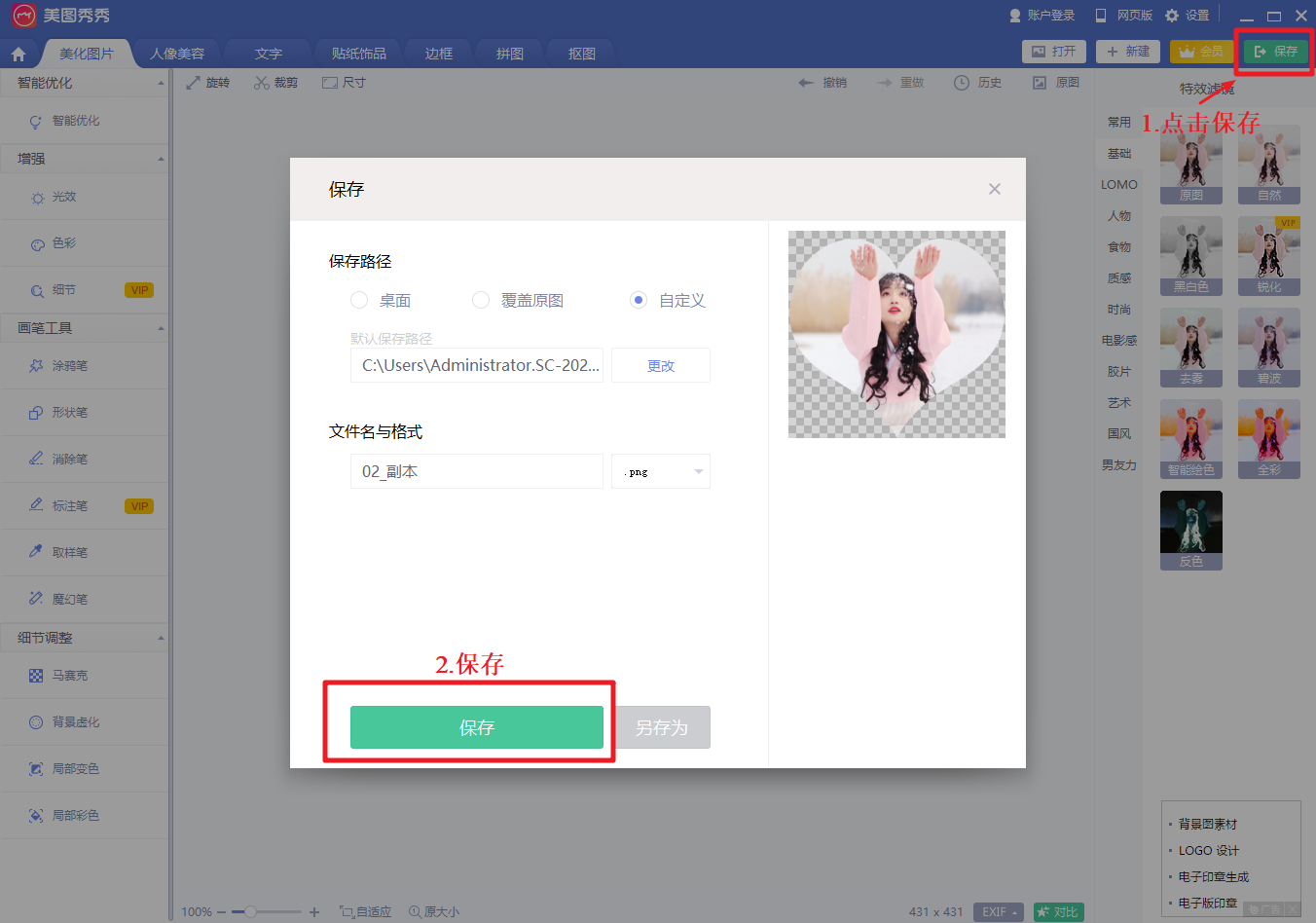
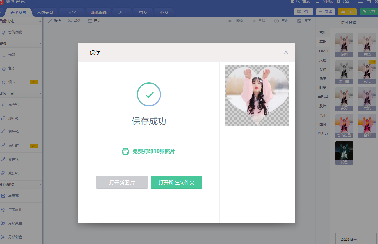
1. Photo clipping (Tutorial)
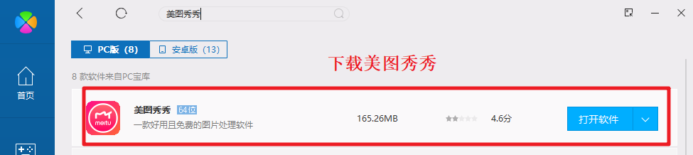
First: Download Meitu XiuXiu / Baidu download / or software installation
Or use online link clipping - > Clip image links online
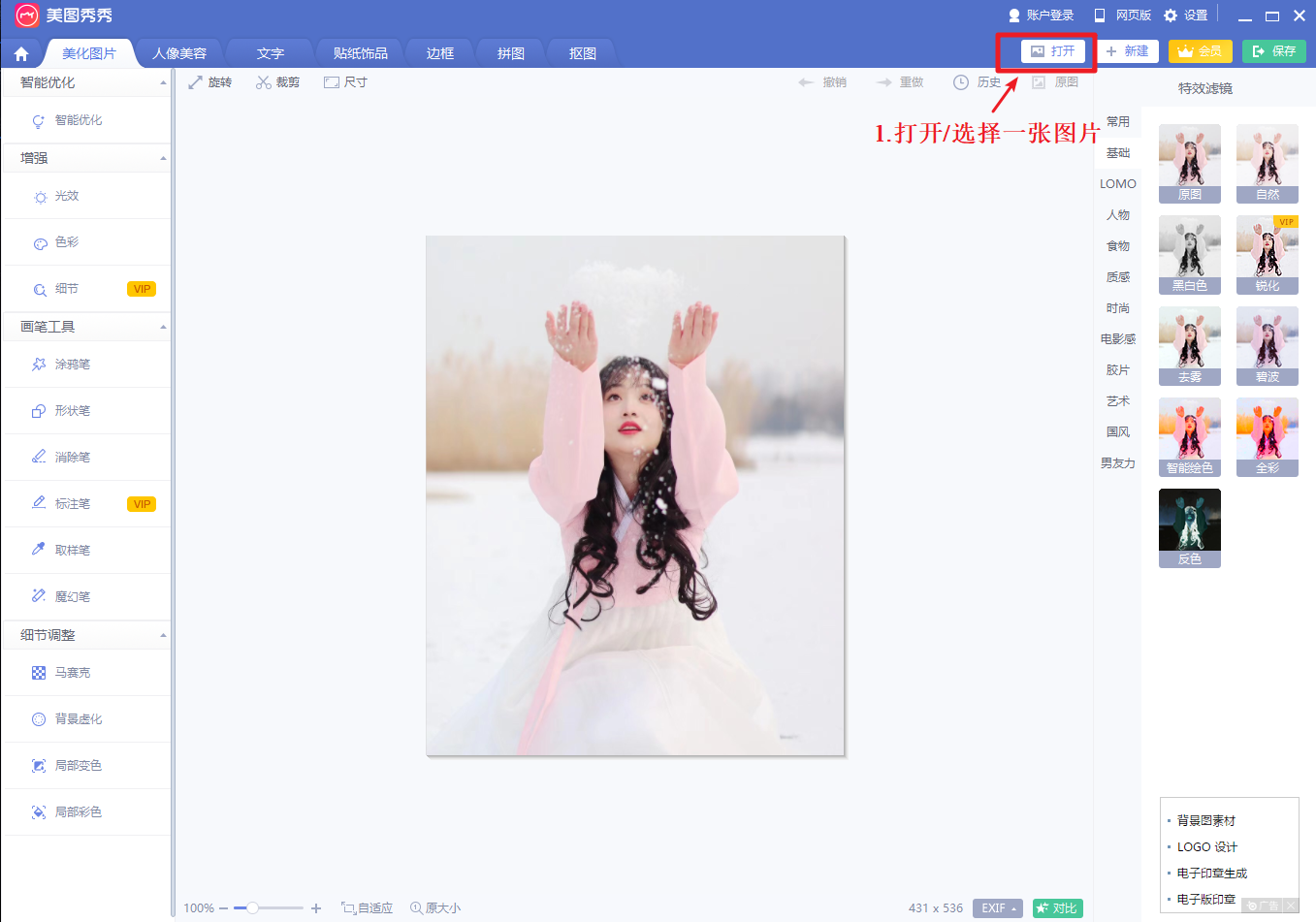
2. Meitu XiuXiu (computer version) cutting pictures
1. Select the picture to be cut
2. It is recommended to reduce the size of the picture to about 600px *600px, otherwise the picture is too large and the page will get stuck
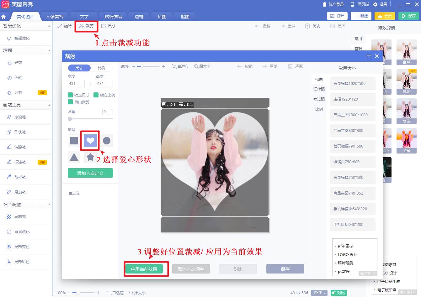
3... Save photos
3, Song mp3 replacement tutorial (Tutorial)
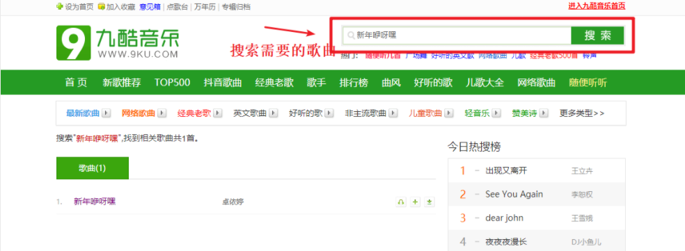
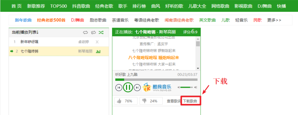
If you need to change mp3 background music, you can download and replace it yourself~ mp3 free download address
1. Search for the song you need
2. Download
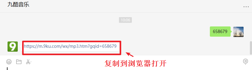
3 get song id
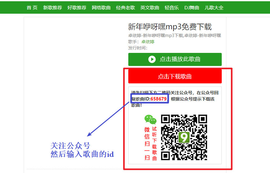
4 pay attention to the official account number / link to browser.
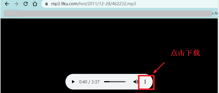
5 download mp3 ~ after downloading, you can replace the mp3 file by yourself (if you don't want to modify the code, you must keep the same name)
4, Do a good job of web page effect, how to send links to others?
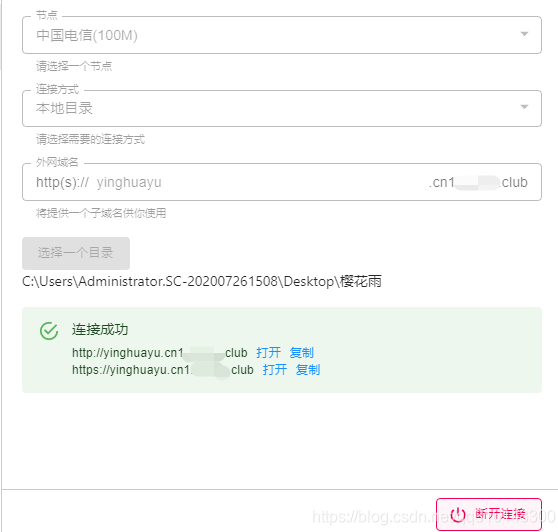
1.1 solution deployment online ~ > deployment online tool (can be used permanently and free of charge)
1. You can deploy online without buying a server, and the world can access your connection. Here is a necessary artifact for programmers~
The plug-in integrates super easy-to-use plug-ins, which can be downloaded and installed for free. It is simple and easy to understand. It is an artifact ~ you can get it under the public Z number at the bottom of the article ↓
2. After your code effect is completed, deploy it online and send the link to others, so that the other party can click in through your connection and see your web page effect. Both computer and mobile phones can be used! (otherwise, when others see your web page, they have to send files, so the experience is not very good ~)
1.1 deployment process
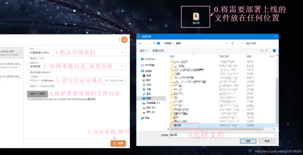
1.2 wow ~ successful deployment
Wow ~ deployment succeeded! After the page you have written is deployed online, people all over the world can access your web page through links (permanent free use)~
5, A complete set of front-end zero basic introduction to advanced (Video + source code + development software + learning materials + interview questions) (Tutorial)
Suitable for children's shoes from entry to advanced~
6, ❉ source code acquisition
❉ ~ pay attention to me and praise the blog ~ bring you up knowledge every day!
❉ 1. See here, just [praise + praise + collection] three company ~ with the support of your "praise, praise and collection" is the driving force of my creation.
❉ 2. Pay attention to me ~ take you to learn every day: various front-end plug-ins, 3D cool effects, picture display, text effects, as well as the whole station template, college student graduation template, final assignment template, etc! "There are many front-end developers here to discuss the front-end Node knowledge and learn from each other"!
❉ 3. You can learn from each other about the above technical issues. You can pay attention to ↓ Gong Z to get more source code!