1, Foreword
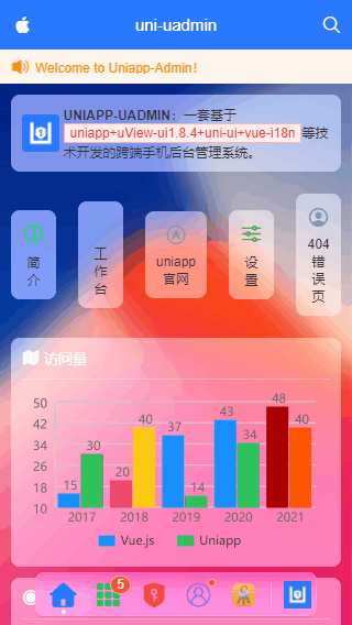
Many back-end management systems on the Internet are pc web pages, and there are relatively few back-end systems on mobile phones. There are few cross end mobile end background management templates. So I used uniapp + uview UI + uni UI to build a cross device background management system uniapp-uadmin project
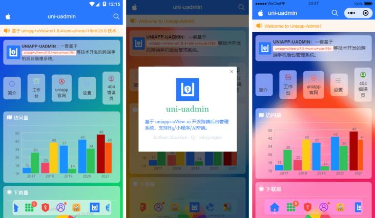
The uni uadmin project is based on uniapp + Vue js+uView-ui+uni-ui+mock. JS and other technologies.
2, Technical framework
- Editor: hbuilderx3 three point five
- Usage technology: vue+uniapp+uViewUI+mockjs
- Pop up window component: UA pop (based on uni app cross end bullet frame component)
- Table component: UA table (multifunctional table based on uni app encapsulation)
- Custom component: uaDock's new dock style tabbar component
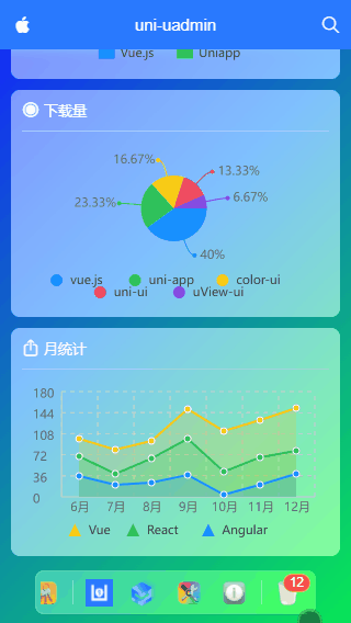
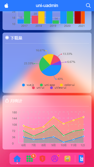
- Chart component: u-charts chart Library
- Simulation data: mock js
The new ground glass visual UI texture uses business modules such as charts, custom tables, forms, waterfall flow and graphic editor, dynamic permission management and error page processing, which can be compiled to H5 + applet + APP
3, Project structure directory
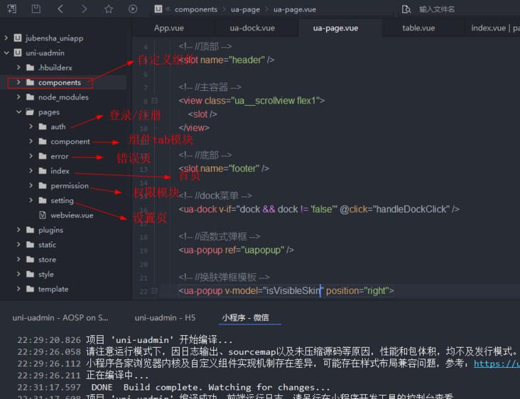
4, Public template
The whole page is divided into three parts: customized navigation bar at the top + content area + dock menu at the bottom.
<!-- Public page template -->
<template>
<view class="ua__pageview flexbox flex-col" :style="{'--SKIN': $store.state.skin, 'background': bgcolor, 'color': color}">
<slot name="header" />
<!-- //Main container -- >
<view class="ua__scrollview flex1">
<slot />
</view>
<!-- //Bottom -- >
<slot name="footer" />
<!-- //dock menu -- >
<ua-dock v-if="dock && dock != 'false'" @click="handleDockClick" />
<!-- //Functional pop-up -- >! [
<ua-popup ref="uapopup" />](/img/bVcXG8X)
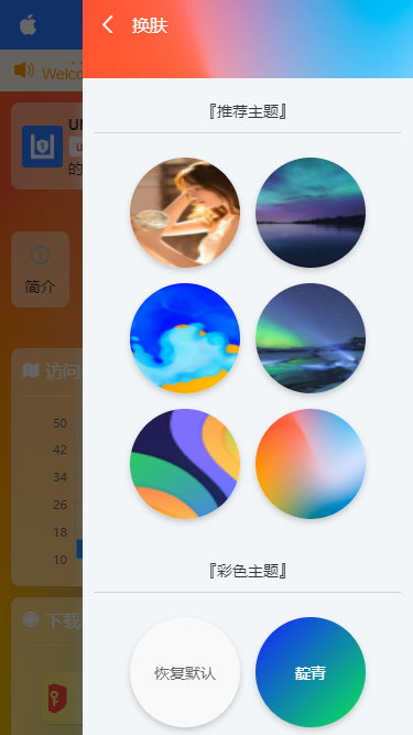
<!-- //Skin changing bullet frame template -- >
<ua-popup v-model="isVisibleSkin" position="right">
<Skin />
</ua-popup>
</view>
</template>
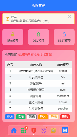
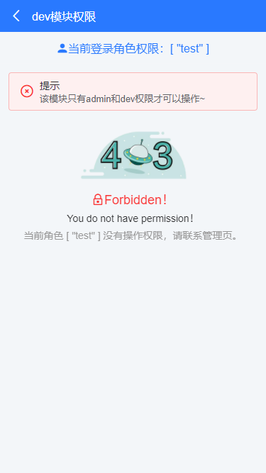
Support dynamic component control permission and automatic jump prompt of error page.
One of the more innovative parts of the project is the dock menu at the bottom, which can be the same as the native tabbar switch of uniapp. It can slide left and right, and customize the icon and title text.
<!-- //Bottom dock menu -- >
<template>
    <view class="ua__dockbar">
        <scroll-view class="ua__dock-scroll ua__filter" :class="platform" scroll-x :style="{'background': bgcolor}">
            <view class="ua__dock-wrap">
                <!-- Tab menu item -->
                <block v-for="(item, index) in menu" :key="index">
                    <view v-if="item.type == 'divider'" class="ua__dock-divider"></view>
                    <view v-else class="ua__dock-item" :class="currentTabIndex == index ? 'cur' : ''" @click="switchTab(index, item)">
                        <text v-if="item.icon" class="iconfont nvuefont" :class="item.icon">{{item.icon}}</text>
                        <image v-if="item.img" :src="item.img" class="iconimg" :style="{'font-size': item.iconSize}" />
                        <text v-if="item.badge" class="ua__badge ua__dock-badge">{{item.badge}}</text>
                        <text v-if="item.dot" class="ua__badge-dot ua__dock-badgeDot"></text>
                    </view>
                </block>
            </view>
        </scroll-view>
    </view>
</template>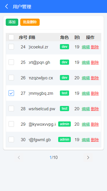
The props option of the menu can be passed in the following parameter configuration.
props: {
    // Current index
    current: { type: [Number, String], default: 0 },
    // Background color
    bgcolor: { type: String, default: null },
    /**
     * [ [menu options]
        type    Menu type: 'tab' supports Uni Switchtab switch type: 'divider' split line
        path    Menu page address
        icon    Menu icon iconfont Icon
        img     Menu picture
        color    Menu icon color
        title    title
        badge    Dot number
        dot        Little red dot
     */
    menu: {
        type: Array,
        default: () => [
            /* Tab menu */
            {
                type: 'tab',
                path: '/pages/index/index',
                icon: `\ue619`,
                color: '#2979ff',
                title: 'home page',
            },
            {
                type: 'tab',
                path: '/pages/component/index',
                icon: 'icon-component',
                color: '#17c956',
                title: 'assembly',
                badge: 5,
            },
            {
                type: 'tab',
                path: '/pages/permission/index',
                icon: 'icon-auth',
                color: '#f44336',
                title: 'Authority management',
            },
            {
                type: 'tab',
                path: '/pages/setting/index',
                icon: 'icon-wo',
                color: '#8d1cff',
                title: 'set up',
                dot: true,
            },
            {
                path: '/pages/error/404',
                img: require('@/static/mac/keychain.png'),
                title: 'Error page',
            },

            { type: 'divider' },

            /* Nav menu */
            {
                img: require('@/static/logo.png'),
                title: 'github',
            },
            {
                img: 'https://www.uviewui.com/common/logo.png',
                title: 'gitee',
            },
            {
                img: require('@/static/mac/colorsync.png'),
                title: 'skin',
            },
            {
                img: require('@/static/mac/info.png'),
                title: 'about',
            },

            { type: 'divider' },

            {
                img: require('@/static/mac/bin.png'),
                title: 'recycle bin',
                badge: 12,
            },
        ]
    },
},
// Tab switch
switchTab(index, item) {
if(item.path) {
let type = item.type == 'tab' ? 'switchTab' : 'navigateTo'
uni[type]({
url: item.path,
})
}else {
if(item.type == 'tab') {
this.currentTabIndex = index
}
}
this.$emit('click', index)
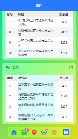
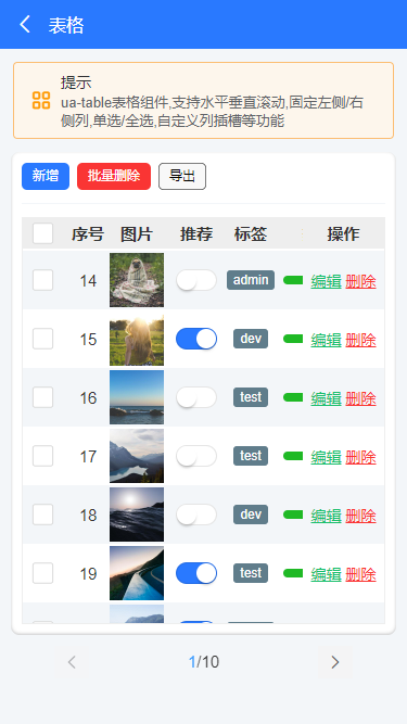
}In addition, the form component used in the project is also a uniapp form component plug-in developed by ourselves.
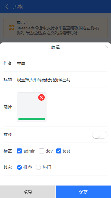
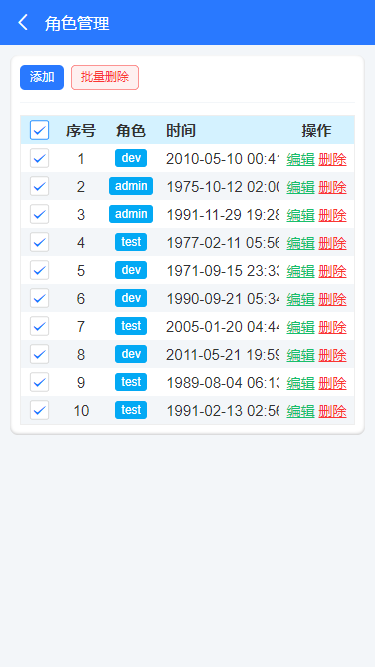
UA table supports multiple rows and columns, fixed header, customized slot content, clicking rows and columns to return data and other functions.
It is very simple to use. As follows, create a simple table.
<ua-table
    :columns="columns"
    headerBgColor="#eee"
    :headerBold="true"
    stripe
    padding="5px 0"
    :data="data.list"
    height="450rpx"
>
</ua-table>

<script>
import Mock from 'mockjs'

export default {
    data() {
        return {
            columns: [
                {type: 'index', align: 'center', width: 100, fixed: true}, // Index ordinal
                {prop: 'title', label: 'title', align: 'left', width: '350'},
                {prop: 'num', label: 'Search volume', align: 'center', width: 120},
            ],
            data: Mock.mock({
                total: 100,
                page: 1,
                pagesize: 10,
                'list|10': [
                    {
                        id: '@id()',
                        title: '@ctitle(10, 20)',
                        num: '@integer(1000,10000)'
                    }
                ]
            }),
        }
    }
}
</script>
The table also supports fixed headers and user-defined contents similar to the component library.
<ua-table
    :columns="columns"
    headerBgColor="#eee"
    :headerBold="true"
    :stripe="true"
    :data="data.list"
    @row-click="handleRowClick"
    @select="handleCheck"
    height="750rpx"
    style="border:1px solid #eee"
>
    <template #default="{row, col, index}">
        <block v-if="col.slot == 'image'">
            <u-image :src="row.image" :lazy-load="true" height="100rpx" width="100rpx" @click="previewImage(row.image)" />
        </block>
        <block v-if="col.slot == 'switch'">
            <u-switch v-model="row.switch" inactive-color="#fff" :size="36"></u-switch>
        </block>
        <block v-if="col.slot == 'tags'">
            <u-tag :text="row.tags" bg-color="#607d8b" color="#fff" mode="dark" size="mini" />
        </block>
        <block v-if="col.slot == 'progress'">
            <u-line-progress active-color="#1fb925" :percent="row.progress" :show-percent="false" :height="16"></u-line-progress>
        </block>
        <block v-if="col.slot == 'btns'">
            <view class="ua__link success" @click.stop="handleFormEdit(row)">edit</view>
            <view class="ua__link error" @click.stop="handleDel(row, index)">delete</view>
        </block>
    </template>
</ua-table>

<script>
/**
 * uniapp Custom table
 * @author XY Q: 282310962
*/
import Mock from 'mockjs'

export default {
    data() {
        return {
            columns: [
                {type: 'selection', align: 'center', width: 80, fixed: true}, // Multiple choice
                {type: 'index', align: 'center', width: 80, fixed: true}, // Index ordinal
                {prop: 'author', label: 'author', align: 'center', width: 120},
                {prop: 'title', label: 'title', align: 'left', width: 350},
                {slot: 'image', label: 'picture', align: 'center', width: 120},
                {slot: 'switch', label: 'recommend', align: 'center', width: 100},
                {slot: 'tags', label: 'label', align: 'center', width: 100},
                {slot: 'progress', label: 'degree of heat', align: 'center', width: 150},
                {prop: 'date', label: 'Release time', align: 'left', width: 300}, // time
                {slot: 'btns', label: 'operation', align: 'center', width: 150, fixed: 'right'}, // operation
            ],
            data: Mock.mock({
                total: 100,
                page: 1,
                pagesize: 10,
                'list|30': [
                    {
                        id: '@id()',
                        author: '@cname()',
                        title: '@ctitle(10, 20)',
                        image: 'https://picsum.photos/400/400?random=' + '@guid()',
                        switch: '@boolean()',
                        'tags|1': ['admin', 'test', 'dev'],
                        progress: '@integer(30, 90)',
                        date: '@datetime()'
                    }
                ]
            }),
        }
    }
}
</script>
However, it should be noted that when multiple v-for programs are compiled into applets, the custom slots will become invalid and need to be handled specially.
OK, that's all for sharing the background system based on uniapp development. I hope it can help you~~
Finally, a short video project of uniapp is attached
https://segmentfault.com/a/11...