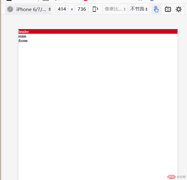
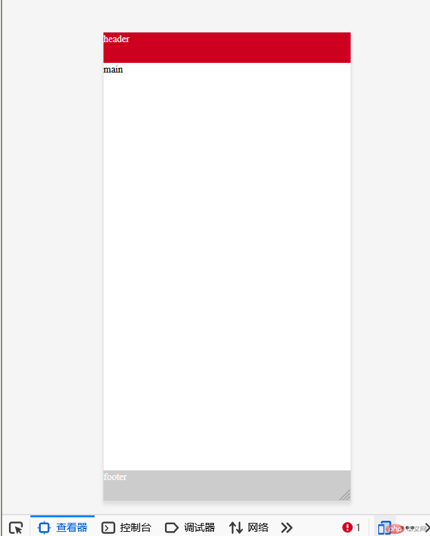
Layout of header and footer of home page of mobile mall
Let's first demonstrate the three properties of the flex project
1. The scaling scale of the project and the base width
| element | attribute | meaning |
|---|---|---|
| flex | 0 1 auto / initial | By default, it is forbidden to enlarge, allowed to shrink, and the width is automatically |
| flex | 1 1 auto / auto | Allow zooming in and out |
| flex | 0 0 auto / none | Do not enlarge and shrink the / pc layout |
① flex 0 1 auto / initial demo
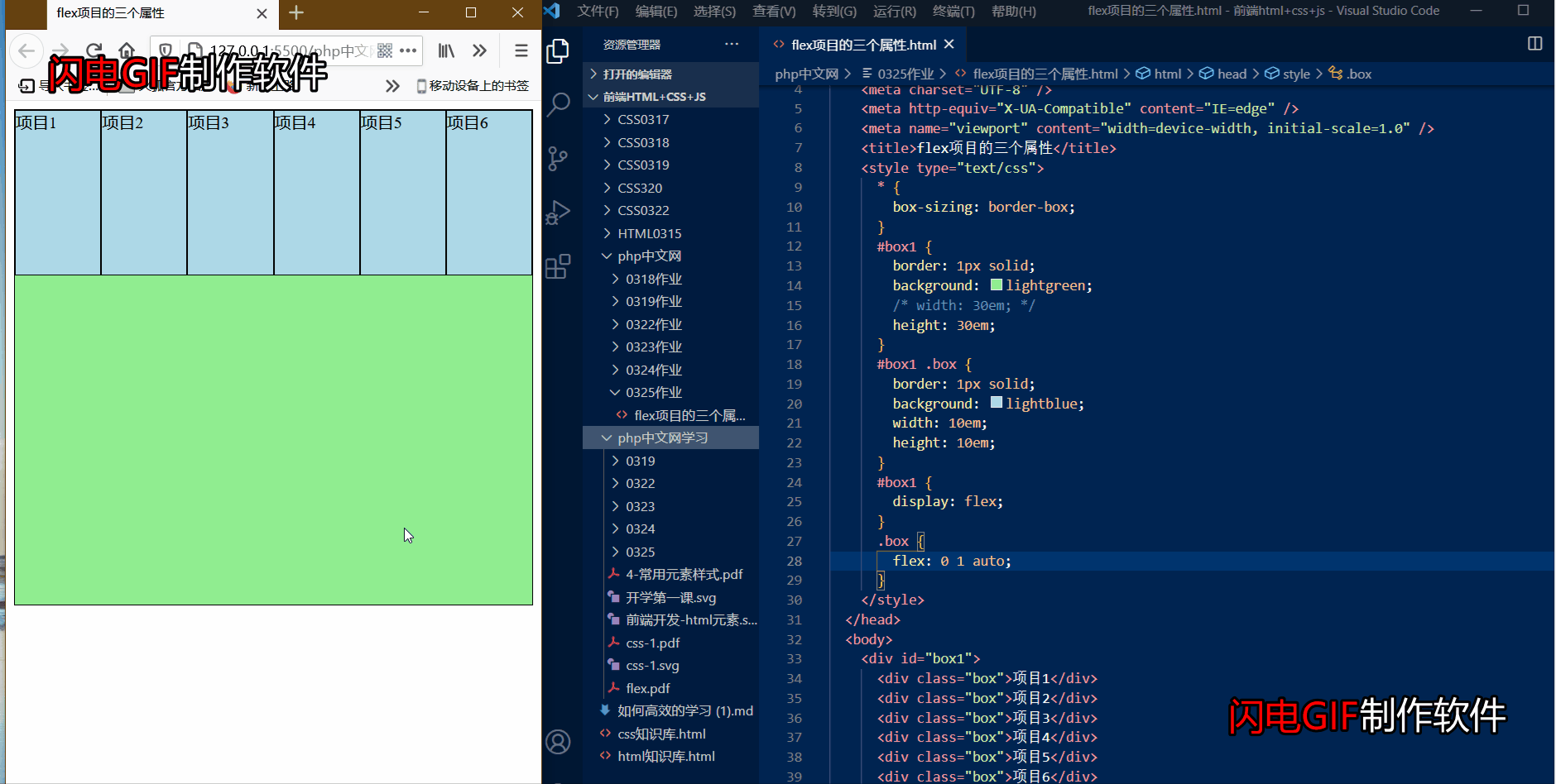
The default of flex 0 1 auto attribute of flex project is to prohibit enlargement, allow contraction and automatic width. We can see the effect of dynamic graph
② Flex 1 auto / Auto demo
Flex item flex 1 1 auto attribute. In the dynamic diagram, we can see that the item can be enlarged inside, and the item will change with the width of the page.
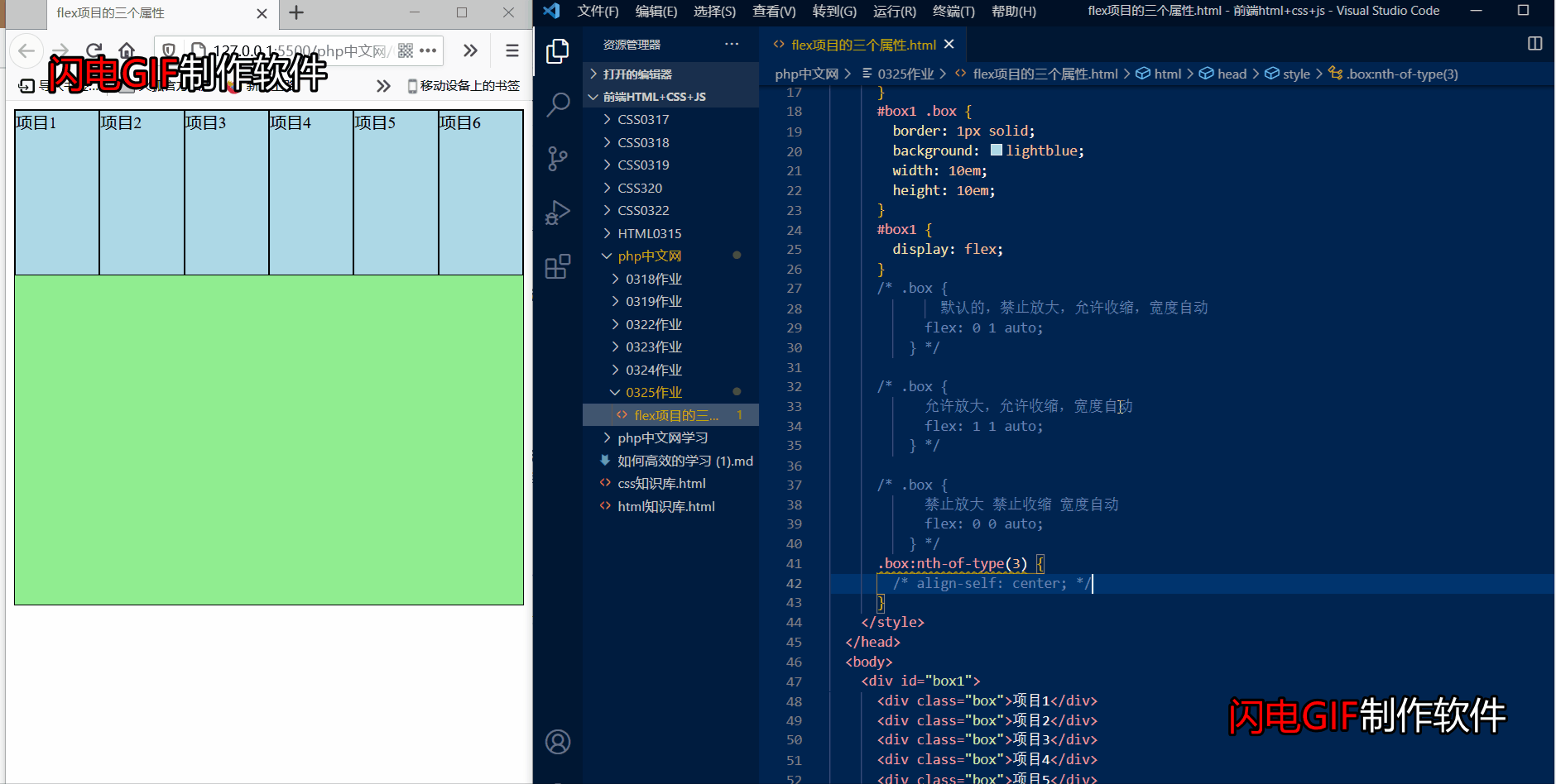
③ flex 0 0 auto / none demo
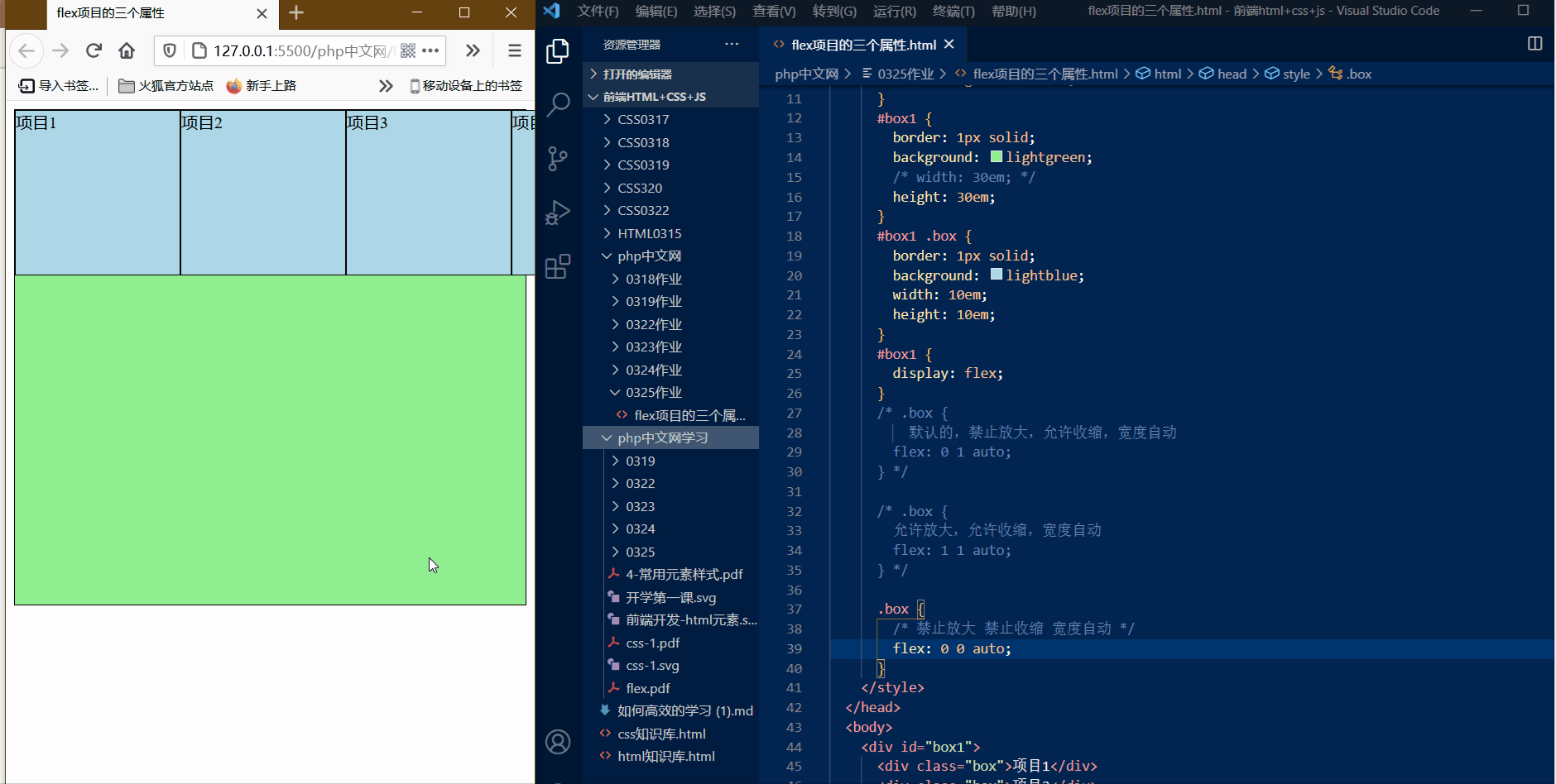
The flex 0 0 auto attribute of the flex item prohibits zooming in and shrinking. It will not change with the change of the page, but only fix its own value
2. Alignment of individual items on the cross axis
| element | attribute | meaning |
|---|---|---|
| align-self | flex-start | Starting line |
| align-self | flex-end | Termination line |
| align-self | stretch | Default stretch |
| align-self | center | Center |
① Align self flex start demo
The default start line is the default style. Skip to the second alignment.
② Align self flex end demo
With the align self flex end parameter, you can move the selected single item to the end line of the cross axis.
③ Align self stretch demo
This principle is the same. Are the default stretches, skipping to the fourth alignment
④ Align self center demo
The align self center parameter can center the selected item on the vertical line, and the effect is very good.
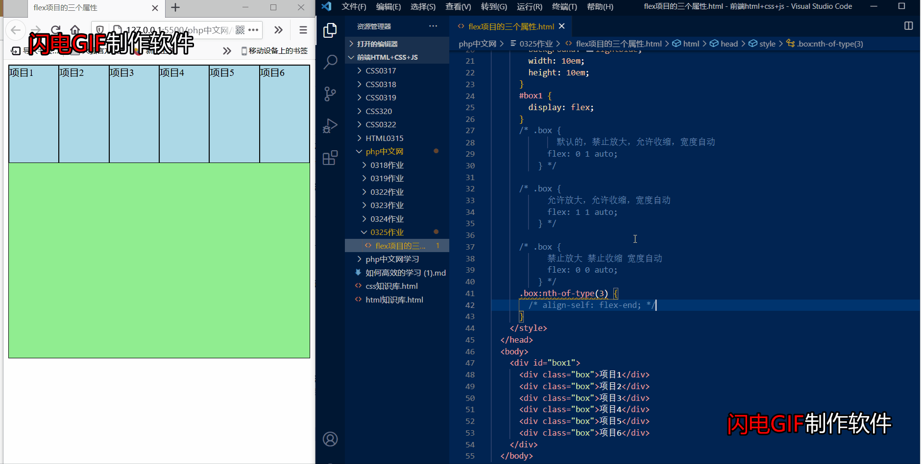
3. Arrangement order of items on the spindle
| element | attribute | meaning |
|---|---|---|
| order | 0-100 value | The larger the value, the lower the value, and the front |
① order demo
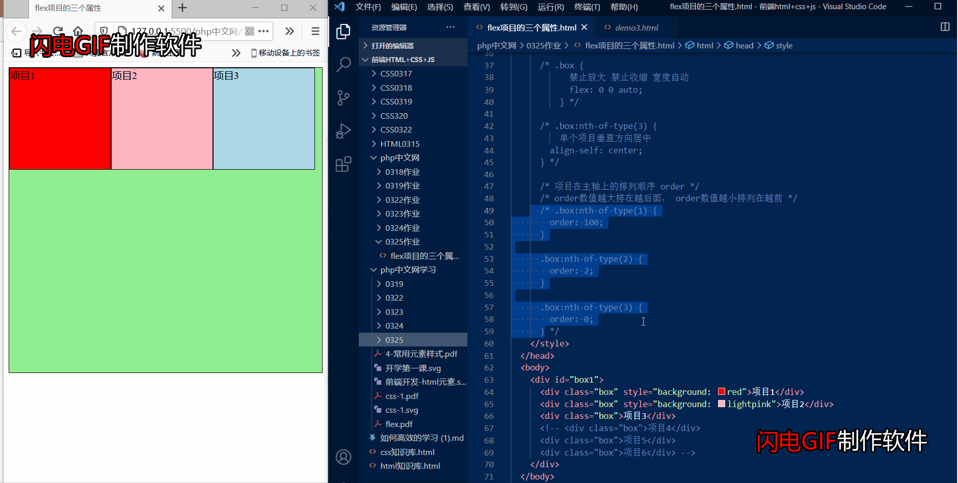
Here we can see that the color distinguishes the items, and then the values are set for each item in the code block. The larger the item value is, the lower the value is, and the higher the value is.
Code block
<!DOCTYPE html>
<html lang="en">
  <head>
    <meta charset="UTF-8" />
    <meta http-equiv="X-UA-Compatible" content="IE=edge" />
    <meta name="viewport" content="width=device-width, initial-scale=1.0" />
    <title>flex Three properties of the project</title>
    <style type="text/css">
      * {
        box-sizing: border-box;
      }
      box1 {
        border: 1px solid;
        background: lightgreen;
        /* width: 30em; */
        height: 30em;
      }
      box1 .box {
        border: 1px solid;
        background: lightblue;
        width: 10em;
        height: 10em;
      }
      box1 {
        display: flex;
      }
      /* .box {
              By default, it is forbidden to enlarge, allowed to shrink, and the width is automatically
            flex: 0 1 auto;
          } */

      /* .box {
            Allow to enlarge, allow to shrink, width automatic
            flex: 1 1 auto;
          } */

      /* .box {
            Do not enlarge or shrink width automatically
            flex: 0 0 auto;
          } */

      /* .box:nth-of-type(3) {
          Center a single item vertically
        align-self: center;
      } */

      /* order of items on the spindle */
      /* order The larger the value, the lower the order value, and the higher the order value */
      .box:nth-of-type(1) {
        order: 100;
      }

      .box:nth-of-type(2) {
        order: 2;
      }

      .box:nth-of-type(3) {
        order: 0;
      }
    </style>
  </head>
  <body>
    <div id="box1">
      <div class="box" style="background: red">Item 1</div>
      <div class="box" style="background: lightpink">Item 2</div>
      <div class="box">Item 3</div>
      <!-- <div class="box">Item 4</div>
      <div class="box">Item 5</div>
      <div class="box">Item 6</div> -->
    </div>
  </body>
</html>
Layout of header and footer of home page of mobile mall
1. First locate a web page layout, then create a css file to initialize the web page, and use the media checker to set the text size.
* {
  padding: 0;
  margin: 0;
  box-sizing: border-box;
}
a {
  text-decoration: none;
  color: 7b7b7b;
}
li {
  list-style: none;
}
html {
  font-size: 10px;
}

/* Set media query to change font size */

@media screen and (min-width: 480px) {
  html {
    font-size: 12px;
  }
}

@media screen and (min-width: 640px) {
  html {
    font-size: 14px;
  }
}

@media screen and (min-width: 720px) {
  html {
    font-size: 16px;
  }
}
2. Next, use absolute positioning and fixed positioning to position the header, main body and footer
/* Initialize style sheet */
@import url(lnitialize.css);

/* Page header */
.header {
  background: ce001f;
  color: fff;
  height: 4.4rem;

  /* Use fixed positioning to position the header to the top */
  position: fixed;
  top: 0;
  right: 0;
  left: 0;
  font-size: 1.4rem;
}

/* Web page subject */
.main {
  background: fff;
  font-size: 1.4rem;

  /* Use absolute positioning to locate the middle part */
  position: absolute;
  top: 4.4rem;
  right: 0;
  bottom: 4.4rem;
  left: 0;
}

/* Page footer */
.footer {
  background: ccc;
  color: fff;
  height: 4.4rem;
  font-size: 1.4rem;

  /* Use fixed positioning to locate to the bottom */
  position: fixed;
  right: 0;
  bottom: 0;
  left: 0;
}
3. Set the style of the header, using Font Icon and flex layout
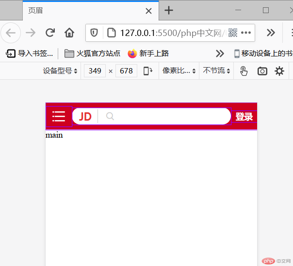
This is the font icon for setting the html header
<!DOCTYPE html>
<html lang="en">
  <head>
    <meta charset="UTF-8" />
    <meta http-equiv="X-UA-Compatible" content="IE=edge" />
    <meta name="viewport" content="width=device-width, initial-scale=1.0" />
    <title>header</title>
    <link
      rel="stylesheet"
      href="style/css/my-key tubiao/font123/iconfont.css"
    />
    <style type="text/css">
      @import url(style/css/index.css);
      @import url(style/css/header.css);
    </style>
  </head>
  <body>
    <!-- Page header -->
    <div class="header">
      <!-- Font icon menu -->
      <div class="menu iconfont icon-category"></div>
      <!-- logo And magnifying glass and search box -->
      <div class="search">
        <div class="logo">JD</div>
        <div class="glass iconfont icon-search"></div>
        <input type="text" class="words" value="Vertical air conditioning cabinet" />
      </div>
      <!-- Login button -->
      <div class="login"><a href="" class="login">Sign in</a></div>
    </div>
    <!-- Web page subject -->
    <div class="main">main</div>
    <!-- Page footer -->
    <div class="footer">footer</div>
  </body>
</html>
This is the css style of the header
/* Get the class of the header, and you can modularize the selection of child elements */
.header {
  display: flex;
  align-items: center;
}

/* The menu and search box also have login button sub areas */
/* A menu */
.header .menu {
  flex: 1;
  text-align: center;
  font-size: 3rem;
}

/* Set the touch style of the menu */
.header .menu:hover {
  cursor: pointer;
}

/* Six copies of search box */
.header .search {
  flex: 6;
  display: flex;
  /* Set the background color to white */
  background: rgb(255, 255, 255);
  /* Define background fillet */
  border-radius: 3rem;
  /* Set inner margin */
  padding: 0.3rem;
}

/* Set logo style */
.header .search .logo {
  color: e43130;
  font-size: 2rem;
  flex: 0 1 4rem;
  text-align: center;

  /* Set font model */
  font-family: "Franklin Gothic Medium", "Arial Narrow", Arial, sans-serif;
}

/* Set magnifier style */
.header .search .glass {
  color: ccc;
  flex: 0 1 4rem;
  font-size: 2rem;
  /* Set left border */
  border-left: 1px solid;
  text-align: center;
}

/* Search box style */
.header .search .words {
  border: none;
  outline: none;
  color: ccc;
  flex: 0 0 auto;
}

/* Log in 1 copy */
.header .login {
  flex: 1;
  /* Set font color */
  color: rgb(255, 255, 255);
  /* Set center */
  text-align: center;
  /* Set text bold */
  font-weight: 600;
Set footer style
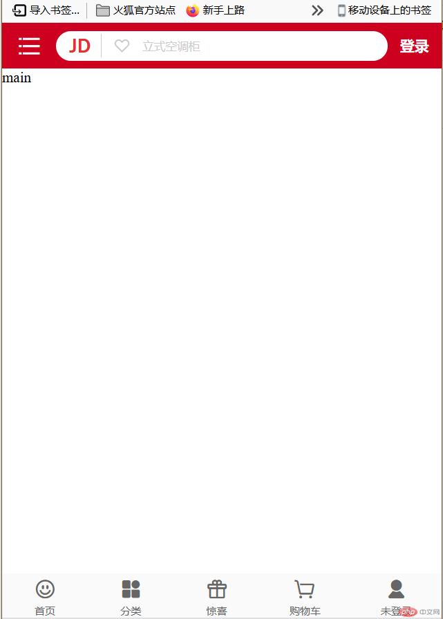
This is the font icon for setting the html footer
<!DOCTYPE html>
<html lang="en">
  <head>
    <meta charset="UTF-8" />
    <meta http-equiv="X-UA-Compatible" content="IE=edge" />
    <meta name="viewport" content="width=device-width, initial-scale=1.0" />
    <title>footer</title>
    <link
      rel="stylesheet"
      href="style/css/my-key tubiao/font123/iconfont.css"
    />
    <link rel="stylesheet" href="style/css/my-key tubiao/iconfont.css" />

    <style type="text/css">
      @import url(style/css/index.css);
      @import url(style/css/header.css);
      @import url(style/css/footer.css);
    </style>
  </head>
  <body>
    <!-- Page header -->
    <div class="header">
      <!-- Font icon menu -->
      <div class="menu iconfont icon-category"></div>
      <!-- logo And magnifying glass and search box -->
      <div class="search">
        <div class="logo">JD</div>
        <div class="glass iconfont icon-search"></div>
        <input type="text" class="words" value="Vertical air conditioning cabinet" />
      </div>
      <!-- Login button -->
      <div class="login"><a href="" class="login">Sign in</a></div>
    </div>
    <!-- Web page subject -->
    <div class="main">main</div>
    <!-- Page footer -->
    <div class="footer">
      <div>
        <div class="iconfont icon-smile"></div>
        <span>home page</span>
      </div>
      <div>
        <div class="iconfont icon-all-fill"></div>
        <span>classification</span>
      </div>
      <div>
        <div class="iconfont icon-gift"></div>
        <span>pleasantly surprised</span>
      </div>
      <div>
        <div class="iconfont icon-cart-Empty"></div>
        <span>Shopping Cart</span>
      </div>
      <div>
        <div class="iconfont icon-account-fill"></div>
        <span>Not logged in</span>
      </div>
    </div>
  </body>
</html>
This is the css style of the footer
.footer {
  display: flex;
  background: rgb(250, 250, 250);
  color: 666;
  flex: 1 1 auto;
  /* Set the scattered alignment of the spindle direction */
  justify-content: space-around;
  /* Set cross axis center alignment */
  align-items: center;
}
/* Set div child element */
.footer > div {
  display: flex;
  flex-flow: column nowrap;
  align-items: center;
}

/* Set home page icon style */
.footer .iconfont {
  font-size: 2.5rem;
}

/* Set font size */
.footer div span {
  font-size: 1rem;
}