Advanced CSS skills
01 wizard map
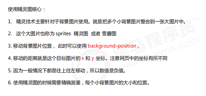
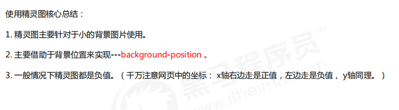
1.1 why do I need sprite diagram
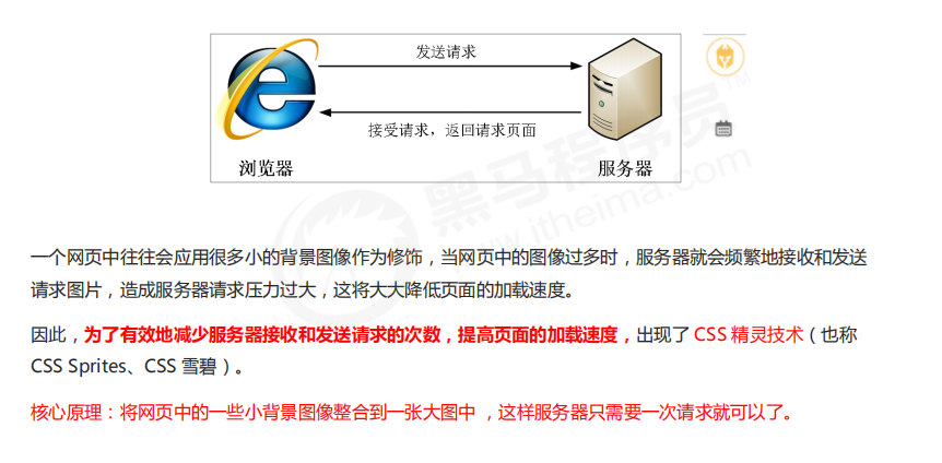
1.2 use of Sprite diagram
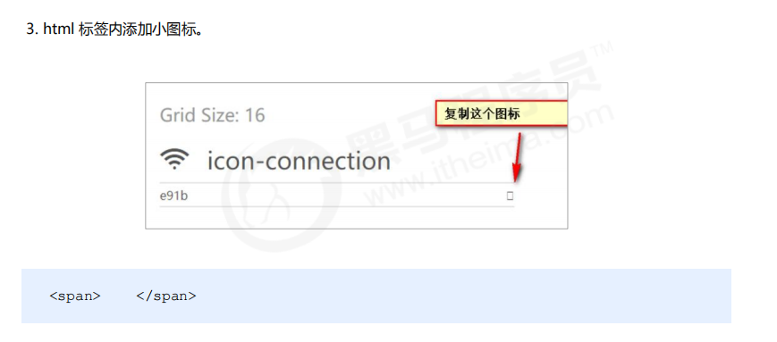
02 Font Icon
2.1 generation of font icons
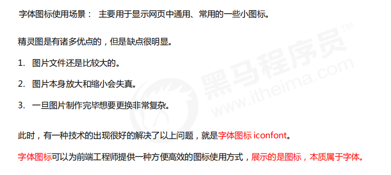
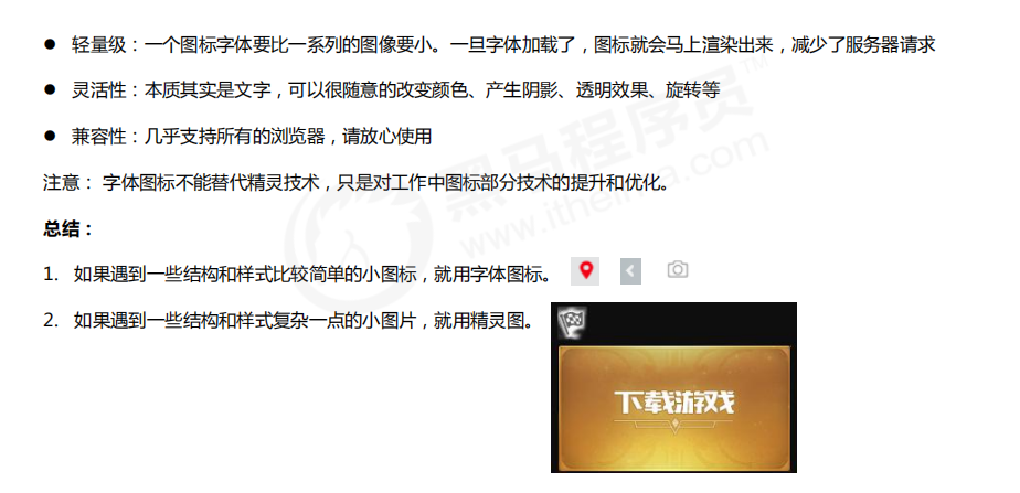
1.2 advantages of font icons
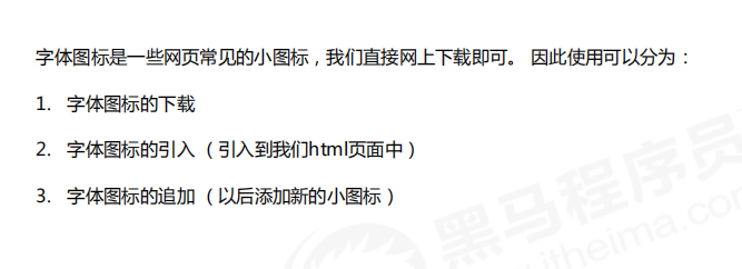
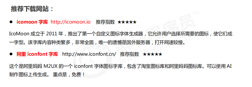
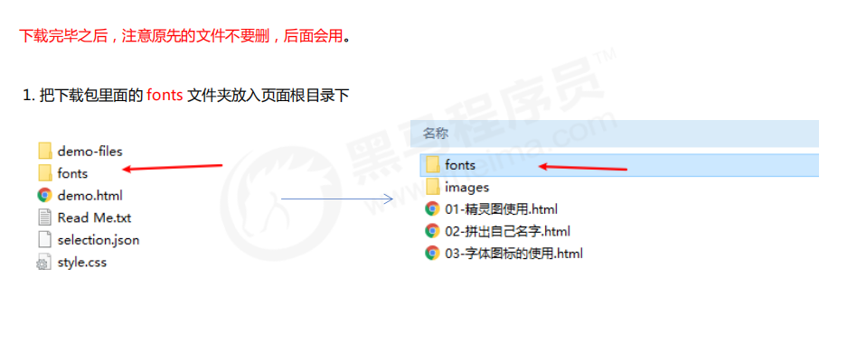
2.3 font icon download
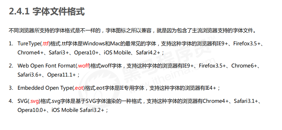
2.4 introduction of Font Icon
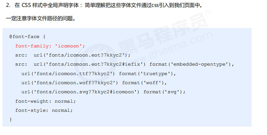
@font-face {
 font-family: 'icomoon';
 src: url('fonts/icomoon.eot?7kkyc2');
 src: url('fonts/icomoon.eot?7kkyc2#iefix') format('embedded-opentype'),
 url('fonts/icomoon.ttf?7kkyc2') format('truetype'),
 url('fonts/icomoon.woff?7kkyc2') format('woff'),
 url('fonts/icomoon.svg?7kkyc2#icomoon') format('svg');
 font-weight: normal;
 font-style: normal;
}
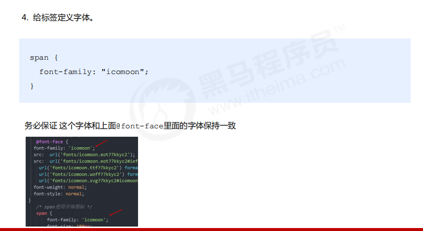
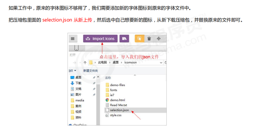
2.5 addition of Font Icon
03 CSS triangle
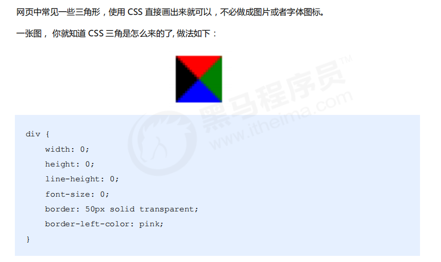
div {
 width: 0;
 height: 0;
 line-height: 0;
 font-size: 0;
 border: 50px solid transparent;
 border-left-color: pink;
}
Case: Jingdong triangle
<!DOCTYPE html>
<html lang="en">
<head>
    <meta charset="UTF-8">
    <meta http-equiv="X-UA-Compatible" content="IE=edge">
    <meta name="viewport" content="width=device-width, initial-scale=1.0">
    <title>Document</title>
    <style>
        .jd {
            position: relative;
            width: 120px;
            height: 249px;
            background-color: pink;
        }
        .jd span {
            position: absolute;
            right: 15px;
            top: -10px;
            width: 0;
            height: 0;
            line-height: 0;
            font-size: 0;
            border :5px solid transparent;
            border-bottom-color: pink;
        }
    </style>
</head>
<body>
    <div class="jd">
        <span></span>
    </div>
</body>
</html>
04 CSS user interface style
4.1 what is interface style
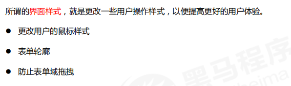
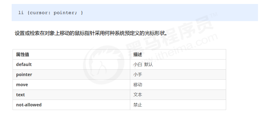
4.1 mouse style cursor
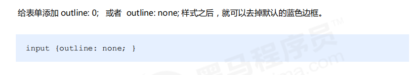
4.2 outline
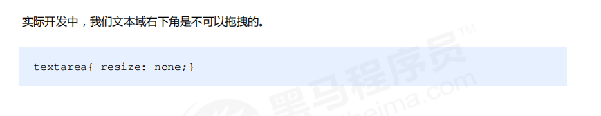
4.3 prevent dragging text field resize
05 vertical aligh attribute application
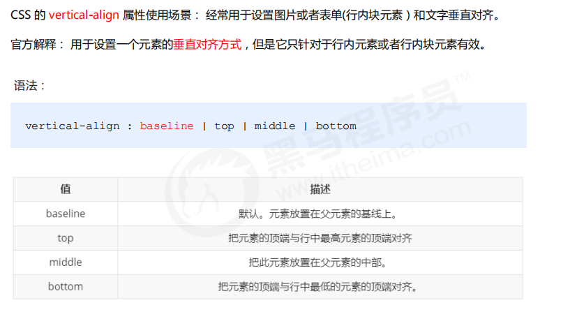
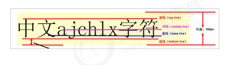
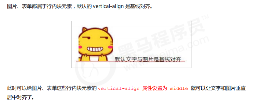
5.1 picture, form and text alignment
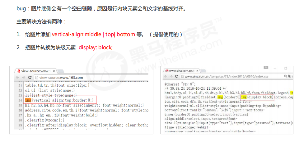
5.2 solve the problem of default blank gap at the bottom of the picture
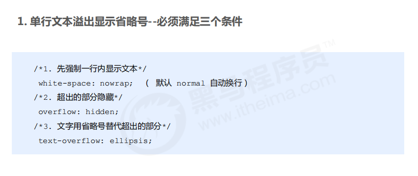
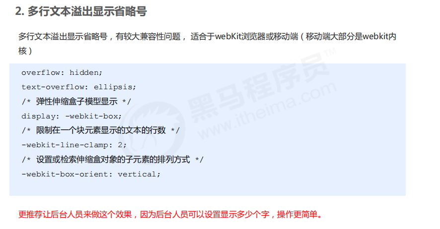
06 overflow text ellipsis display
6.1 single line text overflow
6.2 multiline text overflow
07 common layout skills
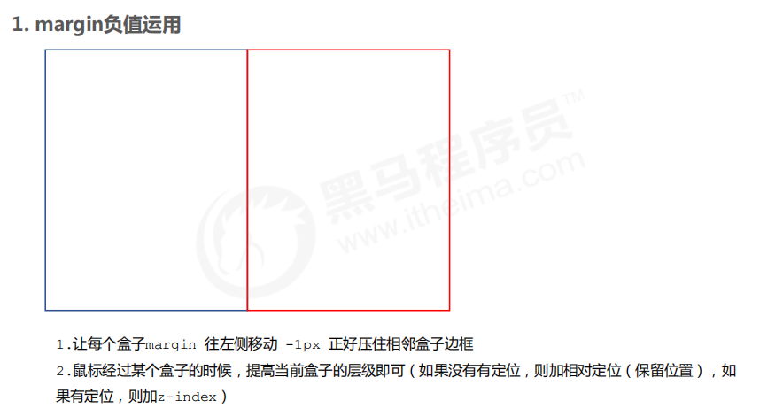
7.1 application of negative margin
<!DOCTYPE html>
<html lang="en">

<head>
    <meta charset="UTF-8">
    <meta name="viewport" content="width=device-width, initial-scale=1.0">
    <meta http-equiv="X-UA-Compatible" content="ie=edge">
    <title>margin Clever use of negative values</title>
    <style>
        ul li {
            position: relative;
            float: left;
            list-style: none;
            width: 150px;
            height: 200px;
            border: 1px solid red;
            margin-left: -1px;
        }

        /* ul li:hover {
           1. If the box is not positioned, the mouse can add relative positioning
        position: relative;
        border: 1px solid blue;

       } */
        ul li:hover {
            /* 2.If li has positioning, use z-index to improve the level */
            z-index: 1;
            border: 1px solid blue;
        }
    </style>
</head>

<body>
    <ul>
        <li>1</li>
        <li>2</li>
        <li>3</li>
        <li>4</li>
        <li>5</li>
    </ul>
</body>

</html>
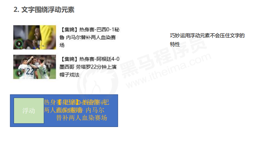
7.2 text around floating elements
<!DOCTYPE html>
<html lang="en">
<head>
    <meta charset="UTF-8">
    <meta name="viewport" content="width=device-width, initial-scale=1.0">
    <meta http-equiv="X-UA-Compatible" content="ie=edge">
    <title>Clever use of text around floating elements</title>
    <style>
        * {
            margin: 0;
            padding: 0;
        }
        .box {
            width: 300px;
            height: 70px;
            background-color: pink;
            margin: 0 auto;
            padding: 5px;
        }
        .pic {
            float: left;
            width: 120px;
            height: 60px;
            margin-right: 5px;
        }
        .pic img {
            width: 100%;
        }
    </style>
</head>
<body>
    <div class="box">
        <div class="pic">
            <img src="images/img.png" alt="">
        </div>
        <p>[[highlights] warm up-Brazil 0-1 Peru Neymar substitutes for two bloody players</p>
    </div>
</body>
</html>
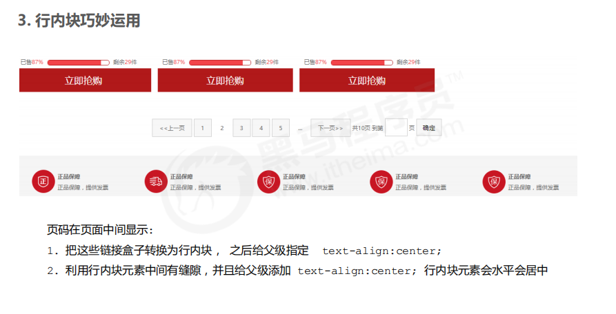
7.3 ingenious use of inline blocks
<!DOCTYPE html>
<html lang="en">
<head>
    <meta charset="UTF-8">
    <meta name="viewport" content="width=device-width, initial-scale=1.0">
    <meta http-equiv="X-UA-Compatible" content="ie=edge">
    <title>Ingenious use of in-line blocks</title>
    <style>
        * {
            margin: 0;
            padding: 0;
        }
        .box {
            text-align: center;
        }
        .box a {
            display: inline-block;
            width: 36px;
            height: 36px;
            background-color: #f7f7f7;
            border: 1px solid #ccc;
            text-align: center;
            line-height: 36px;
            text-decoration: none;
            color: #333;
            font-size: 14px;
        }
       .box .prev,
        .box .next {
            width: 85px;
        }
        .box .current,
        .box .elp {
            background-color: #fff;
            border: none;
        }
        .box input {
            height: 36px;
            width: 45px;
            border: 1px solid #ccc;
            outline: none;
        }
        .box button {
           width: 60px;
           height: 36px;
           background-color: #f7f7f7;
            border: 1px solid #ccc;

        }
    </style>
</head>
<body>
    <div class="box">
        <a href="#"Class =" prev "> & lt; & lt; previous</a>
        <a href="#" class="current">2</a>
        <a href="#">3</a>
        <a href="#">4</a>
        <a href="#">5</a>
        <a href="#">6</a>
        <a href="#" class="elp">...</a>
        <a href="#"Class =" next "> & gt; & gt; next page</a>
        To the first
        <input type="text">
        page
        <button>determine</button>
    </div>
</body>
</html>
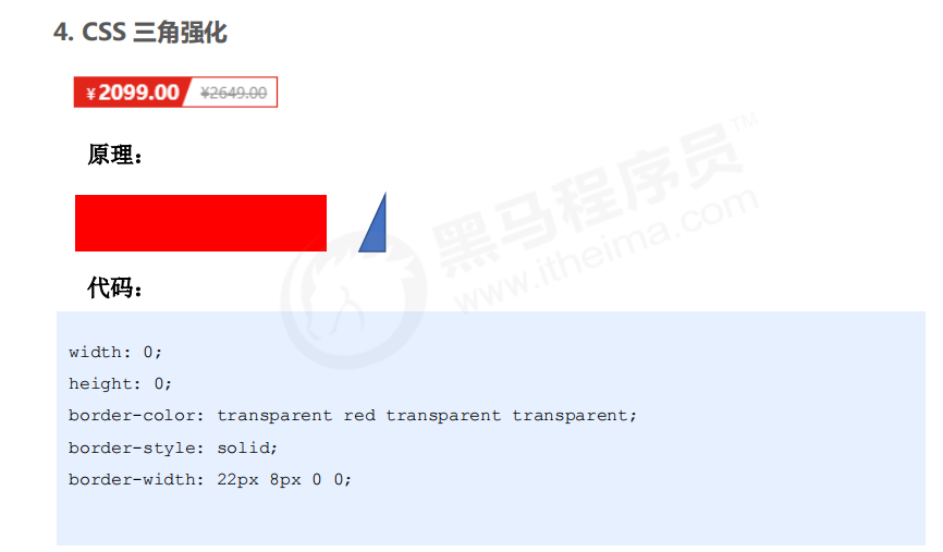
7.4 CSS triangle reinforcement
<!DOCTYPE html>
<html lang="en">
<head>
    <meta charset="UTF-8">
    <meta name="viewport" content="width=device-width, initial-scale=1.0">
    <meta http-equiv="X-UA-Compatible" content="ie=edge">
    <title>CSS Ingenious application of triangular reinforcement</title>
    <style>
         .box1 {
            width: 0;
            height: 0;
            /* Increase the width of the top border */
            /* border-top: 100px solid transparent;
            border-right: 50px solid skyblue; */
            /* The left and bottom border widths are set to 0 */
            /* border-bottom: 0 solid blue;
            border-left: 0 solid green; */
           /* 1.Only the right border has color */
           border-color: transparent red transparent transparent;
            /* 2. The styles are solid */
            border-style: solid;
            /* 3. The width of the top border should be larger, the width of the right border should be smaller, and the other borders should be 0 */
            border-width: 100px 50px 0 0 ;

        }
        .price {
            width: 160px;
            height: 24px;
            line-height: 24px;
            border: 1px solid red;
            margin: 0 auto;
        }
        .miaosha {
            position: relative;
            float: left;
            width: 90px;
            height: 100%;
            background-color:red;
            text-align: center;
            color: #fff;
            font-weight: 700;
            margin-right: 8px;

        }
        .miaosha i {
            position: absolute;
            right: 0;
            top: 0;
            width: 0;
            height: 0;
            border-color: transparent #fff transparent transparent;
            border-style: solid;
            border-width: 24px 10px 0 0;
        }
        .origin {
            font-size: 12px;
            color: gray;
            text-decoration: line-through;
        }
    </style>
</head>
<body>
        <div class="box1"></div>
        <div class="price">
            <span class="miaosha">
                ¥1650
                <i></i>
            </span>
            <span class="origin">¥5650</span>
        </div>
</body>
</html>
08 CSS initialization
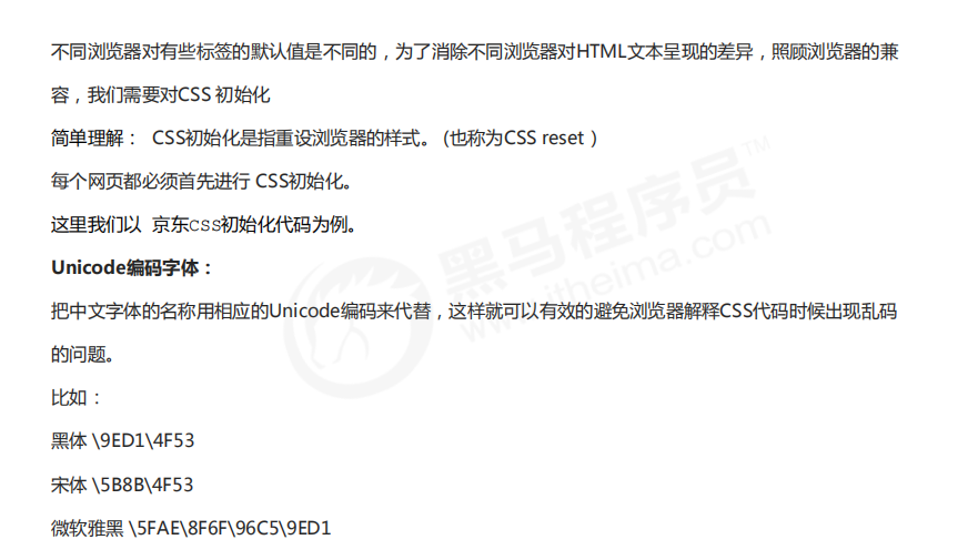
/* Clear the inside and outside margins of all our labels */
* {
    margin: 0;
    padding: 0
}
/* em And i italicized text is not tilted */
em,
i {
    font-style: normal
}
/* Remove the dot of li */
li {
    list-style: none
}

img {
    /* border 0 Take care of lower version browsers. If the picture contains links, there will be border problems */
    border: 0;
    /* Cancel the problem of blank gap at the bottom of the picture */
    vertical-align: middle
}

button {
    /* When our mouse passes the button button, the mouse becomes a small hand */
    cursor: pointer
}

a {
    color: #666;
    text-decoration: none
}

a:hover {
    color: #c81623
}

button,
input {
    /* "\5B8B\4F53" This means that the browser has better compatibility */
    font-family: Microsoft YaHei, Heiti SC, tahoma, arial, Hiragino Sans GB, "\5B8B\4F53", sans-serif
}

body {
    /* CSS3 Anti aliasing makes the text clearer */
    -webkit-font-smoothing: antialiased;
    background-color: #fff;
    font: 12px/1.5 Microsoft YaHei, Heiti SC, tahoma, arial, Hiragino Sans GB, "\5B8B\4F53", sans-serif;
    color: #666
}

.hide,
.none {
    display: none
}
/* Clear float */
.clearfix:after {
    visibility: hidden;
    clear: both;
    display: block;
    content: ".";
    height: 0
}

.clearfix {
    *zoom: 1
}
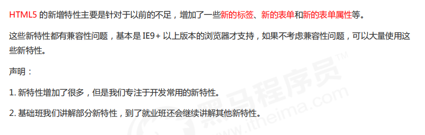
New features in HTML5 and CSS3
01 new features of HTML5
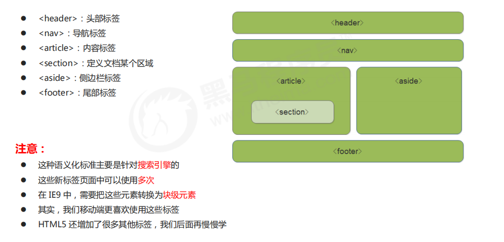
1.1 new semantic tags in HTML5
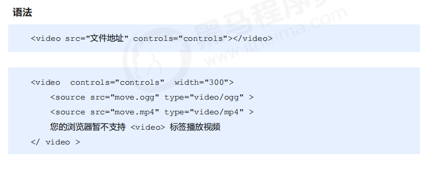
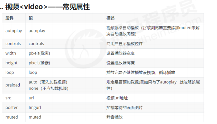
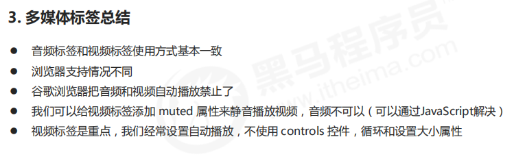
1.2 new multimedia tags in HTML5
1. Video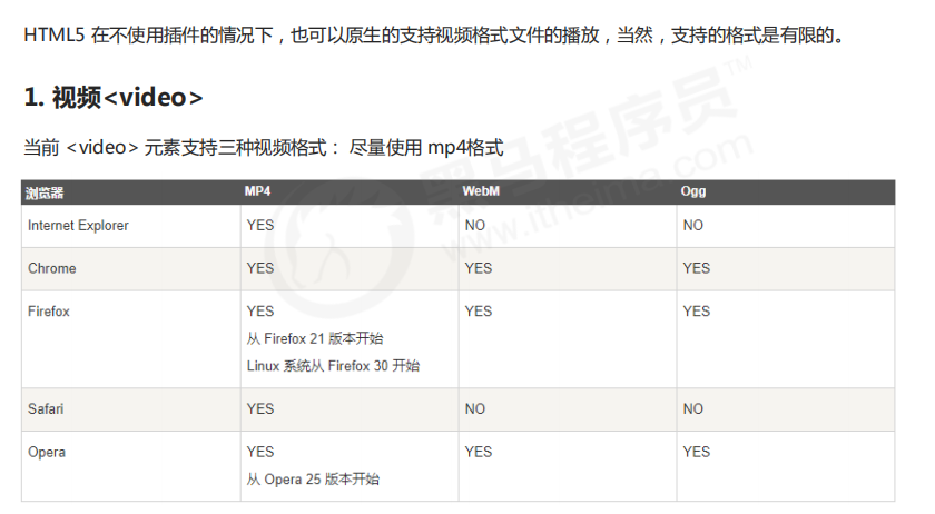
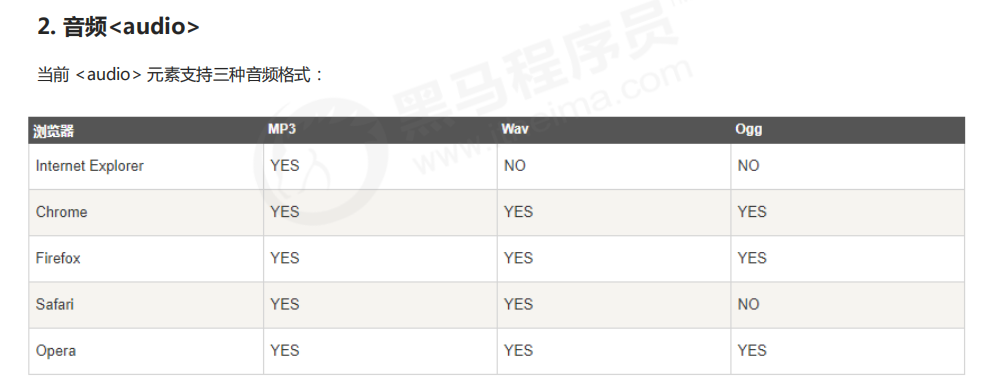
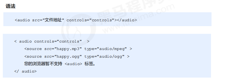
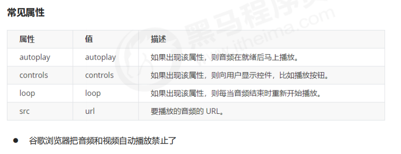
2. Audio
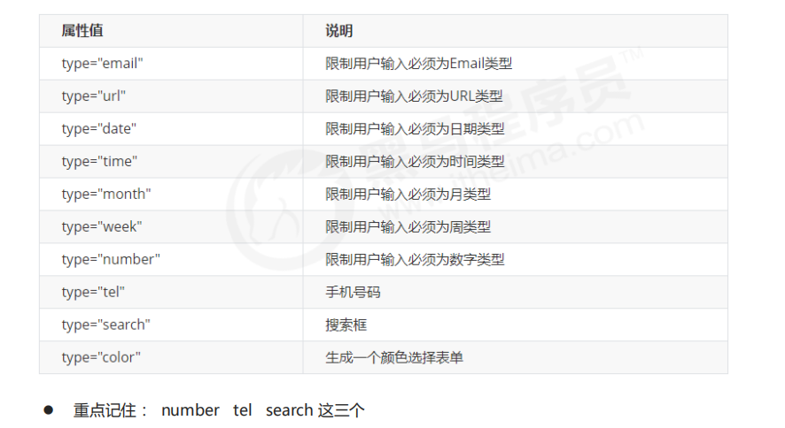
1.3 input type added in HTML5
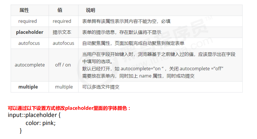
1.4 form attributes added in HTML5
02 new features of CSS3
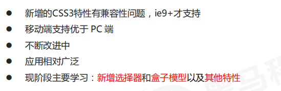
2.1 current situation of CSS3
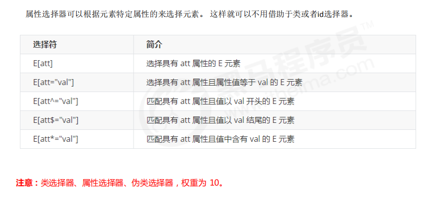
2.2 attribute selector
<!DOCTYPE html>
<html lang="en">
<head>
    <meta charset="UTF-8">
    <meta name="viewport" content="width=device-width, initial-scale=1.0">
    <meta http-equiv="X-UA-Compatible" content="ie=edge">
    <title>CSS3 New attribute selector</title>
    <style>
        /* Must be input but have the attribute value at the same time. Select this element [] */
        /* input[value] {
            color:pink;
        } */
        /* Select only the input of the type =text text text box */
        input[type=text] {
            color: pink;
        }
        /* Select these elements that are div first and then have class attribute, and the attribute value must start with icon */
        div[class^=icon] {
            color: red;
        }
        section[class$=data] {
            color: blue;
        }
        div.icon1 {
            color: skyblue;
        }
        /* The weight of class selector and attribute selector and pseudo class selector is 10 */
    </style>
</head>
<body>
    <!-- 1. Using attribute selectors can eliminate the need for classes or id selector -->
    <!-- <input type="text" value="enter one user name">
    <input type="text"> -->
    <!-- 2. The attribute selector can also select attributes=Some key elements of value must be mastered -->
    <input type="text" name="" id="">
    <input type="password" name="" id="">
    <!-- 3. The attribute selector can select some elements at the beginning of the attribute value -->
    <div class="icon1">Small icon 1</div>
    <div class="icon2">Small icon 2</div>
    <div class="icon3">Small icon 3</div>
    <div class="icon4">Small icon 4</div>
    <div>none of my business</div>
    <!-- 4. The attribute selector can select certain elements at the end of the attribute value -->
    <section class="icon1-data">I'm Angela</section>
    <section class="icon2-data">I am Godzilla </section>
    <section class="icon3-ico">Who am I</section>

</body>
</html>
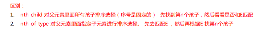
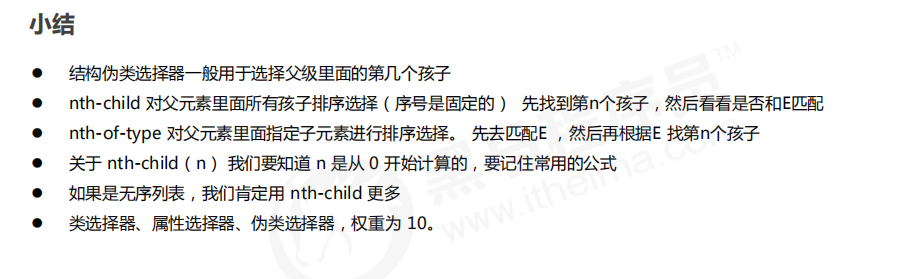
2.3 structure pseudo class selector
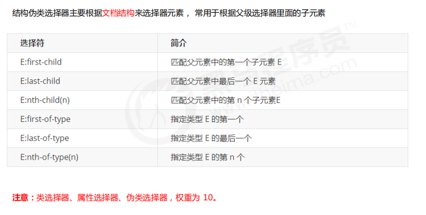
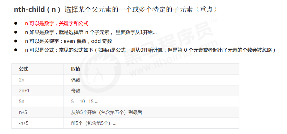
<style>
        /* 1. Choose the first child in ul, little li */
        ul li:first-child {
            background-color: pink;
        }
        /* 2. Choose the last child in ul, little li */
        ul li:last-child {
            background-color: pink;
        }
         /* 3. Choose the second child in ul, li */
         ul li:nth-child(2) {
            background-color: skyblue;
        }
        ul li:nth-child(6) {
            background-color: skyblue;
        }
    </style>
<!DOCTYPE html>
<html lang="en">

<head>
    <meta charset="UTF-8">
    <meta name="viewport" content="width=device-width, initial-scale=1.0">
    <meta http-equiv="X-UA-Compatible" content="ie=edge">
    <title>CSS3 New selector nth-type-of</title>
    <style>
        /* nth-child Will sequence all the boxes */
        /* When executing, first look at nth child (1) and then go back to the front div */

        section div:nth-child(1) {
            background-color: red;
        }
         /* nth-of-type The boxes of the specified elements are numbered */
        /* When children go back to see the first element of div-1 */
        section div:nth-of-type(1) {
            background-color: blue;
        }
    </style>
</head>

<body>
    <ul>
        <li>I am the first child</li>
        <li>I'm the second child</li>
        <li>I'm the third child</li>
        <li>I'm the fourth child</li>
        <li>I'm the fifth child</li>
        <li>I'm the sixth child</li>
        <li>I'm the seventh child</li>
        <li>I'm the eighth child</li>
    </ul>
    <!-- difference -->
    <section>
        <p>Bald head strength</p>
        <div>Xiong Da</div>
        <div>Xiong er</div>
    </section>
</body>

</html>
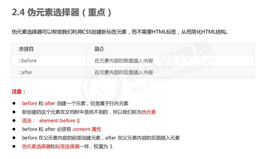
2.4 pseudo element selector
<!DOCTYPE html>
<html lang="en">
<head>
    <meta charset="UTF-8">
    <meta name="viewport" content="width=device-width, initial-scale=1.0">
    <meta http-equiv="X-UA-Compatible" content="ie=edge">
    <title>Pseudo element selector before and after</title>
    <style>
        div {
            width: 200px;
            height: 200px;
            background-color: pink;
        }
        /* div::before The weight is 2 */
        div::before {
            /* This content must be written */
            /* display: inline-block; */
            content: 'I';
            /* width: 30px;
            height: 40px;
            background-color: purple; */
        }
        div::after {
            content: 'Peppa Pig';
        }
    </style>
</head>
<body>
    <div>
        yes
    </div>
</body>
</html>
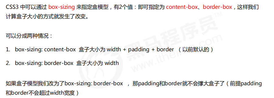
2.5 CSS3 box model
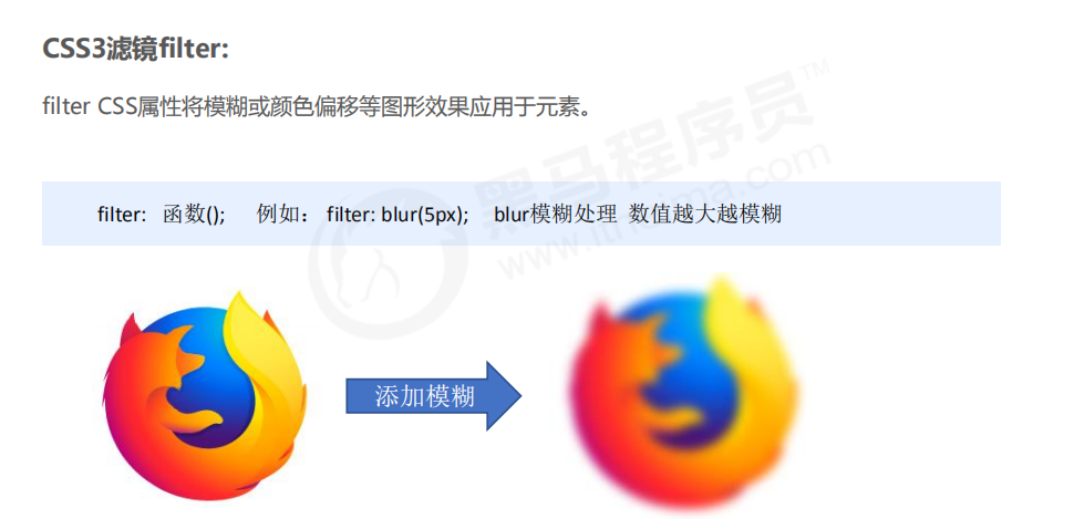
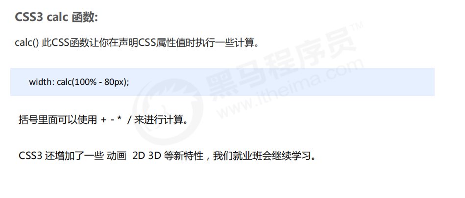
2.6 CSS3 other features (understand)
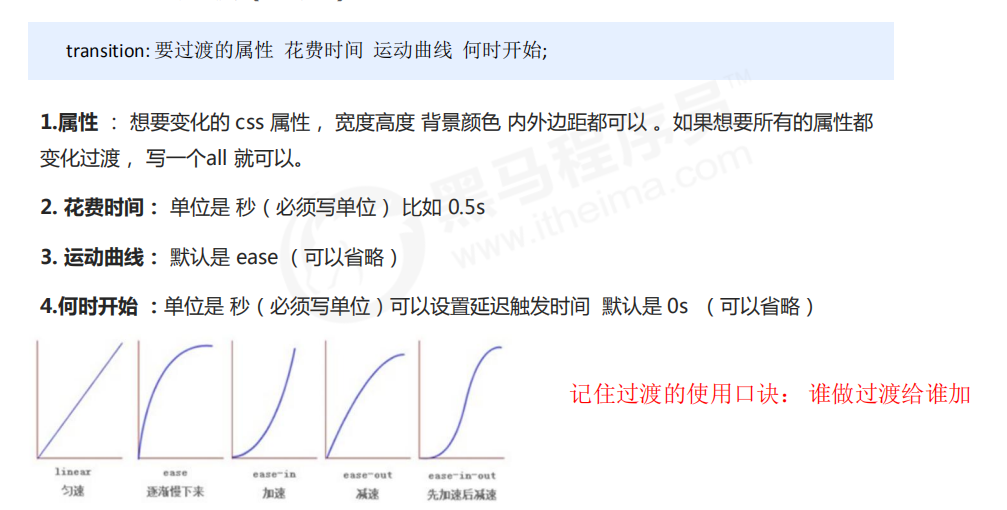
2.7 CSS3 transition (key)
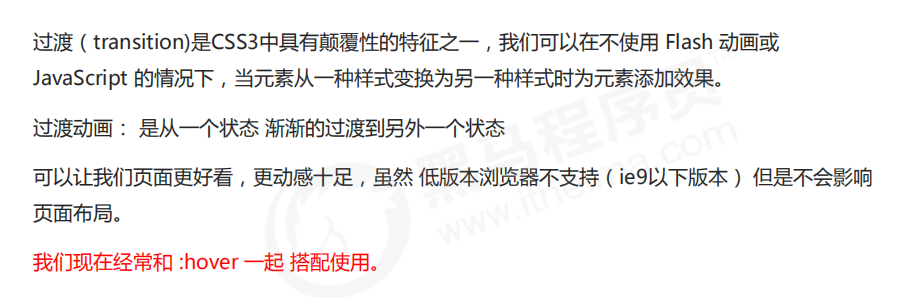
<!DOCTYPE html>
<html lang="en">
<head>
    <meta charset="UTF-8">
    <meta name="viewport" content="width=device-width, initial-scale=1.0">
    <meta http-equiv="X-UA-Compatible" content="ie=edge">
    <title>CSS3 Transition effect</title>
    <style>
        div {
            width: 200px;
            height: 100px;
            background-color: pink;
            /* transition: When the changing attribute takes time and the motion curve starts; */
            /* transition: width .5s ease 0s, height .5s ease 1s; */
            /* If you want to write multiple attributes, separate them with commas */
            /* transition: width .5s, height .5s; */
            /* If you want multiple attributes to change, write all for the attribute */
            /* transition: height .5s ease 1s; */
            /* Who makes the transition and adds to who */
            transition: all 0.5s;
        }
        div:hover {
            width: 400px;
            height: 200px;
            background-color: skyblue;
        }
    </style>
</head>
<body>
    <div></div>
</body>
</html>
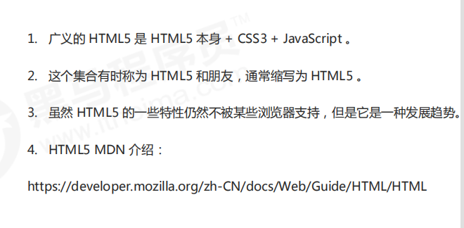
03 narrow HTML5 CSS3
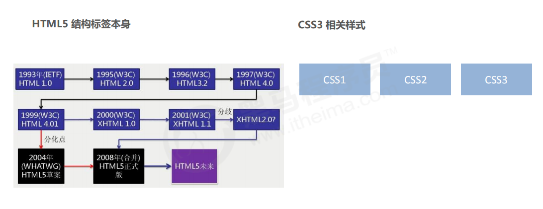
04 generalized HTML5
PC end product excellent purchase project
01 pinyougou project planning
1.1 website production process
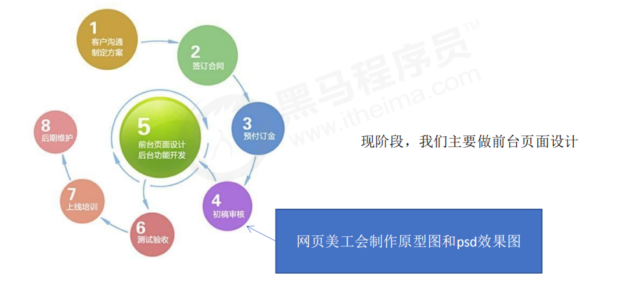
1.2 overall introduction of the project
project name: pinyougou
Project Description: pinyougou is an e-commerce website. We need to complete the PC front page, list page
Production of registration page
1.3 learning purpose of excellent product purchase project
1. E-commerce websites are relatively comprehensive, which requires a large number of layout technologies, including layout methods, common effects and peripheral technologies.
***
3. After writing the excellent purchase project, you can have an overall perception of the process of making PC page in the actual development.
4. Pave the way for later learning mobile terminal projects.
1.4 development tools and technology stack
- development tool
VScode, Photoshop (fw), mainstream browsers (mainly Chrome browser) - Technology stack
using HTML5 + CSS3 manual layout, you can use a large number of H5 new labels and styles
adopt the separation of structure and style and modular development
good code specifications are conducive to better development and cooperation of the team and improve code quality. Therefore, in the pinyougou project, please follow the following code specifications. (for details, see the material folder - code specification of pinyougou. md)
Summary:
- Overall introduction of pinyougou project (making three pages: home page, list page and registration page)
- Learning purpose of pinyougou project (it contains many technologies, which can greatly exercise our layout technology)
- Development tools and technology stack (ps for cut-off, vscade for code, chrome for test, and HTML5+CSS3)
1.5 construction of excellent product purchase project
- Modular development
The so-called Modularization: divide a project according to functions, one function and one module, without affecting each other
Modular development has the advantages of reuse and convenient replacement
some styles and structures appear on many pages, such as the head and bottom of the page, and most pages have them. At this time, these structures and styles can be used as a single module and then reused
the most typical application here is common CSS public style. Write a style and use the same style for the rest of the pages
modular development has the advantages of reuse and convenient modification
common.css public styles include public styles such as layout center width, clear floating, page text color and so on.
1.6 website favicon Icon
favicon.ico is generally used as an abbreviated website logo, which is displayed on the address bar or label of the browser.
At present, the main browsers support favicon ICO icon.
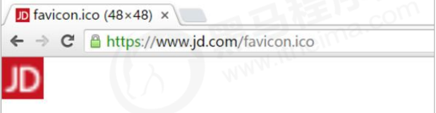
1, Make favicon Icon
- Cut the pinyougou icon into png pictures.
- Converting png images into ico icons requires the help of third-party conversion websites, such as bitworms: http://www.bitbug.net/
2, Put the favicon icon in the root directory of the website
3, Introduction of favicon icon in HTML page
Introduce code between < head > < / head > elements in html pages.
<link rel="shortcut icon" href="favicon.ico" type="image/x-icon"/>
1.7 website TDK three labels SEO optimization
SEO (Search Engine Optimization) is a way to improve the natural ranking of websites in relevant search engines by using the rules of search engines.
The purpose of SEO is to deeply optimize the website, so as to help the website obtain free traffic, and then improve the ranking of the website on the search engine and improve the popularity of the website.
The page must have three tags to comply with SEO optimization.
1. title website title
title is irreplaceable. It is the first important label of our inner page and the best judgment point for search engines to understand the entrance of web pages and the attribution of Web topics.
Suggestion: website name (product name) - website introduction (try not to exceed 30 Chinese characters)
For example:
jd.com - the first choice for comprehensive online shopping - genuine low price, quality assurance, timely delivery and easy shopping!
Xiaomi Mall - official websites of Xiaomi 5s, Hongmi Note 4, Xiaomi MIX and Xiaomi notebook
2. description website description
Briefly describe what our website mainly does.
We advocate that description, as the overall business and theme summary of the website, mostly adopts "we are...", "we provide..."“ ××× Net as... "," phone: 010... "And other statements.
For example:
<meta name="description" content="JD.COM JD.COM-Professional comprehensive online shopping mall,Sales of home appliances, digital communications, computers
 Tens of thousands of brand high-quality commodities such as home department stores, clothing, mother and baby, books and food.Convenient and honest services provide you with pleasant online shopping
 experience!" />
3. keywords keyword
Keywords are page keywords, which is one of the concerns of search engines.
Keywords should be limited to 6 ~ 8 keywords, separated by English commas, in the form of keyword 1 and keyword 2.
For example:
<meta name= " keywords" content="Online shopping,E-Shop,mobile phone,notebook,computer,MP3,CD,VCD,DV,camera,Digital,Accessories,Wrist watch,Memory card,JD.COM" />
For our front-end personnel, we only need to prepare these three labels. The specific contents are prepared by special SEO personnel.
02 pinyougou homepage production
2.1 naming of common module class names
The following is our agreed naming module. Students can directly use the following class names
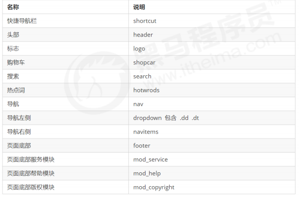
2.2 production of shortcut for quick navigation

the box in the general column is named shortcut, which means fast navigation. Note that the row height here can be inherited from the inner sub box
the box containing the layout Center
the layout box contains No. 1 left floating box
the layout box contains No. 2 right floating box
font icons are required
2.3 LOGO SEO optimization
- First put an h1 tag in the logo to raise the right and tell the search engine that this place is very important.
- Put another link in h1 to return to the home page and give the background picture of the logo to the link.
- In order to include us in the search engine, we should put text (website name) in the link, but the text should not be displayed.
method 1: move the text indent to the outside of the box (text indent: - 9999px), and then overflow:hidden, the practice of Taobao.
method 2: directly to font size: 0; You can't see the text. Jingdong's practice. - Finally, give the link a title attribute, so that you can see the prompt text when you put the mouse on the logo.
03 web server
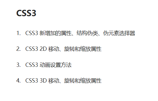
CSS3 improve
01 CSS3 property selector
02 CSS3 structure pseudo class selector
03 CSS3 pseudo element selector
01, 02, 03 see note (III)
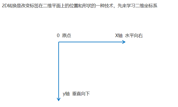
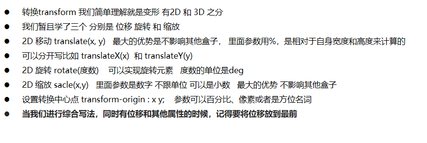
04 CSS3 2D conversion
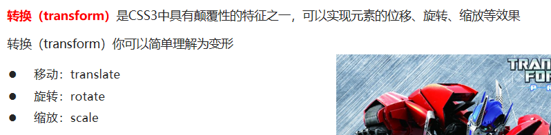
4.1 two dimensional coordinate system
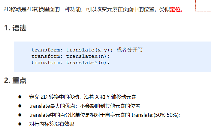
4.2 movement of 2D conversion
<!DOCTYPE html>
<html lang="en">

<head>
    <meta charset="UTF-8">
    <meta name="viewport" content="width=device-width, initial-scale=1.0">
    <meta http-equiv="X-UA-Compatible" content="ie=edge">
    <title>Document</title>
    <style>
        /* Move the position of the box: position the outer edge of the box and 2d convert the movement */

        div {
            width: 200px;
            height: 200px;
            background-color: pink;
            /* x Is the moving position on the x axis, and y is the moving position on the y axis, separated by commas*/
            /* transform: translate(x, y); */
            /* transform: translate(100px, 100px); */
            /* 1. If we only move the x coordinate */
            /* transform: translate(100px, 0); */
            /* transform: translateX(100px); */
            /* 2. If we only move the y coordinate */
            /* transform: translate(0, 100px); */
            /* transform: translateY(100px); */
        }

        div:first-child {
            transform: translate(30px, 30px);
        }

        div:last-child {
            background-color: purple;
        }
    </style>
</head>

<body>
    <div></div>
    <div></div>
</body>

</html>
Center the box vertically and horizontally
<!DOCTYPE html>
<html lang="en">

<head>
    <meta charset="UTF-8">
    <meta name="viewport" content="width=device-width, initial-scale=1.0">
    <meta http-equiv="X-UA-Compatible" content="ie=edge">
    <title>Document</title>
    <style>
        div {
            position: relative;
            width: 500px;
            height: 500px;
            background-color: pink;
            /* 1. The parameters in tranlate can use% */
            /* 2. If the parameter inside is% and the moving distance is compared with the width or height of the box itself */
            /* 50% here is 50px, because the width of the box is 100px */
            /* transform: translateX(50%); */
        }

        p {
            position: absolute;
            top: 50%;
            left: 50%;
            width: 200px;
            height: 200px;
            background-color: purple;
            /* margin-top: -100px;
            margin-left: -100px; */
            /* translate(-50%, -50%)  The box goes up half its height   */
            transform: translate(-50%, -50%);
        }

        span {
            /* translate Is not valid for inline elements */
            transform: translate(300px, 300px);
        }
    </style>
</head>

<body>
    <div>
        <p></p>
    </div>
    <span>123</span>
</body>

</html>
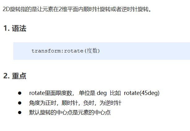
4.3 rotation of 2D conversion
<!DOCTYPE html>
<html lang="en">

<head>
    <meta charset="UTF-8">
    <meta name="viewport" content="width=device-width, initial-scale=1.0">
    <meta http-equiv="X-UA-Compatible" content="ie=edge">
    <title>Document</title>
    <style>
        img {
            width: 150px;
            /* Rotate 45 degrees clockwise */
            /* transform: rotate(45deg); */
            border-radius: 50%;
            border: 5px solid pink;
            /* When the transition is written on itself, who will animate and add to who */
            transition: all 0.3s;
        }

        img:hover {
            transform: rotate(360deg);
        }
    </style>
</head>

<body>
    <img src="media/pic.jpg" alt="">
</body>

</html>
CSS writing small triangle case
<!DOCTYPE html>
<html lang="en">

<head>
    <meta charset="UTF-8">
    <meta name="viewport" content="width=device-width, initial-scale=1.0">
    <meta http-equiv="X-UA-Compatible" content="ie=edge">
    <title>Document</title>
    <style>
        div {
            position: relative;
            width: 249px;
            height: 35px;
            border: 1px solid #000;
        }

        div::after {
            content: "";
            position: absolute;
            top: 8px;
            right: 15px;
            width: 10px;
            height: 10px;
            border-right: 1px solid #000;
            border-bottom: 1px solid #000;
            transform: rotate(45deg);
            transition: all 0.2s;
        }
        /* The mouse rotates through the triangle inside the div */

        div:hover::after {
            transform: rotate(225deg);
        }
    </style>
</head>

<body>
    <div></div>
</body>

</html>
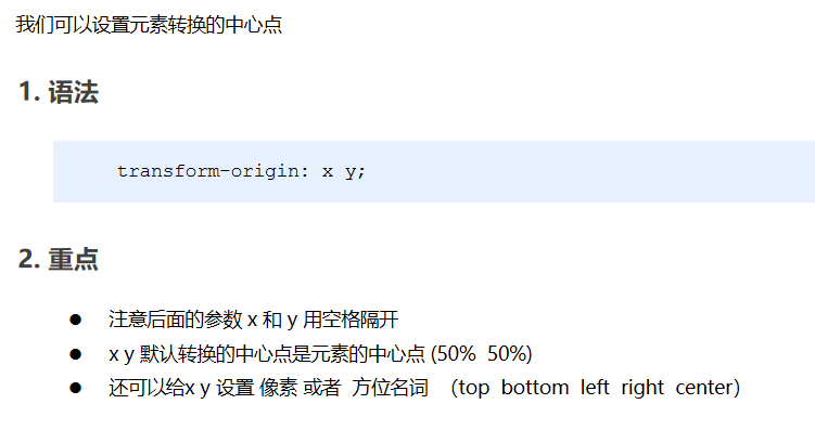
4.4 2D conversion center point transform origin
<!DOCTYPE html>
<html lang="en">

<head>
    <meta charset="UTF-8">
    <meta name="viewport" content="width=device-width, initial-scale=1.0">
    <meta http-equiv="X-UA-Compatible" content="ie=edge">
    <title>Document</title>
    <style>
        div {
            width: 200px;
            height: 200px;
            background-color: pink;
            margin: 100px auto;
            transition: all 1s;
            /* 1.Can be followed by location nouns */
            /* transform-origin: left bottom; */
            /* 2. By default, 50% is equivalent to center */
            /* 3. Can be px pixels */
            transform-origin: 50px 50px;
        }

        div:hover {
            transform: rotate(360deg);
        }
    </style>
</head>

<body>
    <div></div>
</body>

</html>
Rotation center point case
<!DOCTYPE html>
<html lang="en">

<head>
    <meta charset="UTF-8">
    <meta name="viewport" content="width=device-width, initial-scale=1.0">
    <meta http-equiv="X-UA-Compatible" content="ie=edge">
    <title>Document</title>
    <style>
        div {
            overflow: hidden;
            width: 200px;
            height: 200px;
            border: 1px solid pink;
            margin: 10px;
            float: left;
        }

        div::before {
            content: "dark horse";
            display: block;
            width: 100%;
            height: 100%;
            background-color: hotpink;
            transform: rotate(180deg);
            transform-origin: left bottom;
            transition: all 0.4s;
        }
        /* The mouse is restored after before in div */

        div:hover::before {
            transform: rotate(0deg);
        }
    </style>
</head>

<body>
    <div></div>
    <div></div>
    <div></div>
</body>

</html>
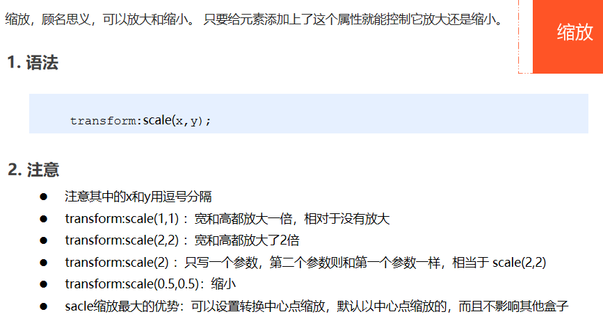
4.5 scaling of 2D conversion
<!DOCTYPE html>
<html lang="en">

<head>
    <meta charset="UTF-8">
    <meta name="viewport" content="width=device-width, initial-scale=1.0">
    <meta http-equiv="X-UA-Compatible" content="ie=edge">
    <title>Document</title>
    <style>
        div {
            width: 200px;
            height: 200px;
            background-color: pink;
            margin: 100px auto;
            /* transform-origin: left bottom; */
        }

        div:hover {
            /* 1. The number written in it does not follow the unit, which means that 1 is 1 times and 2 is 2 times */
            /* transform: scale(x, y); */
            /* transform: scale(2, 2); */
            /* 2. Modified the width to twice the original height */
            /* transform: scale(2, 1); */
            /* 3. The width and height can be modified at the same time by equal scale. We have a simple way to write it. The following is that the width is modified twice, and the height is the same as the first parameter by default*/
            /* transform: scale(2); */
            /* 4. We can zoom out. Less than 1 is zoom */
            /* transform: scale(0.5, 0.5); */
            /* transform: scale(0.5); */
            /* 5. scale Advantages: it will not affect other boxes, and the center point of scaling can be set*/
            /* width: 300px;
            height: 300px; */
            transform: scale(2);
        }
    </style>
</head>

<body>
    <div></div>
    123123
</body>

</html>
Picture enlargement case
<!DOCTYPE html>
<html lang="en">

<head>
    <meta charset="UTF-8">
    <meta name="viewport" content="width=device-width, initial-scale=1.0">
    <meta http-equiv="X-UA-Compatible" content="ie=edge">
    <title>Document</title>
    <style>
        div {
            overflow: hidden;
            float: left;
            margin: 10px;
        }

        div img {
            transition: all .4s;
        }

        div img:hover {
            transform: scale(1.1);
        }
    </style>
</head>

<body>
    <div>
        <a href="#"><img src="media/scale.jpg" alt=""></a>
    </div>
    <div>
        <a href="#"><img src="media/scale.jpg" alt=""></a>
    </div>
    <div>
        <a href="#"><img src="media/scale.jpg" alt=""></a>
    </div>
</body>

</html>
Paging box case
<!DOCTYPE html>
<html lang="en">

<head>
    <meta charset="UTF-8">
    <meta name="viewport" content="width=device-width, initial-scale=1.0">
    <meta http-equiv="X-UA-Compatible" content="ie=edge">
    <title>Document</title>
    <style>
        li {
            float: left;
            width: 30px;
            height: 30px;
            border: 1px solid pink;
            margin: 10px;
            text-align: center;
            line-height: 30px;
            list-style: none;
            border-radius: 50%;
            cursor: pointer;
            transition: all .4s;
        }

        li:hover {
            transform: scale(1.2);
        }
    </style>
</head>

<body>
    <ul>
        <li>1</li>
        <li>2</li>
        <li>3</li>
        <li>4</li>
        <li>5</li>
        <li>6</li>
        <li>7</li>
    </ul>
</body>

</html>
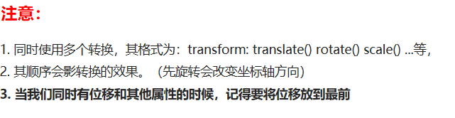
4.6 2D conversion comprehensive writing method
<!DOCTYPE html>
<html lang="en">

<head>
    <meta charset="UTF-8">
    <meta name="viewport" content="width=device-width, initial-scale=1.0">
    <meta http-equiv="X-UA-Compatible" content="ie=edge">
    <title>Document</title>
    <style>
        div {
            width: 200px;
            height: 200px;
            background-color: pink;
            transition: all .5s;
        }

        div:hover {
            /* transform: rotate(180deg) translate(150px, 50px); */
            /* We have both displacement and other properties. We need to put the displacement first */
            transform: translate(150px, 50px) rotate(180deg) scale(1.2);
        }
    </style>
</head>

<body>
    <div></div>
</body>

</html>
4.7 2D conversion summary
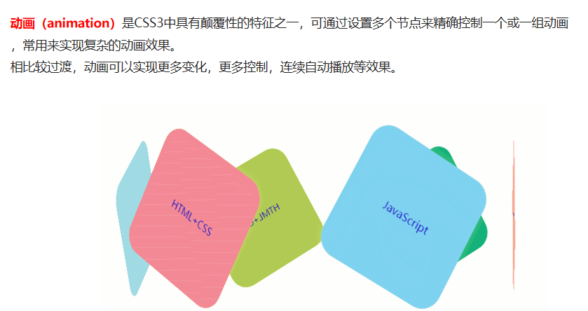
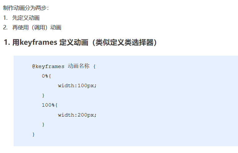
05 CSS3 animation
5.1 basic use of animation
<!DOCTYPE html>
<html lang="en">
<head>
<meta charset="UTF-8">
<meta name="viewport" content="width=device-width, initial-scale=1.0">
<meta http-equiv="X-UA-Compatible" content="ie=edge">
<title>Document</title>
<style>
/* We want a box to go from left to right as soon as the page opens */
/* 1. Define animation */
@keyframes move {
/* Start state */
0% {
transform: translateX(0px);
}
/* End state */
100% {
transform: translateX(1000px);
}
}
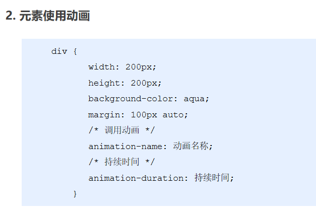
div {
width: 200px;
height: 200px;
background-color: pink;
/* 2. Call animation */
/* Animation name */
animation-name: move;
/* Duration */
animation-duration: 2s;
}
</style>
</head>
<body>
<div></div>
</body>
</html>
Animation sequence
<!DOCTYPE html>
<html lang="en">

<head>
    <meta charset="UTF-8">
    <meta name="viewport" content="width=device-width, initial-scale=1.0">
    <meta http-equiv="X-UA-Compatible" content="ie=edge">
    <title>Document</title>
    <style>
        /* from to Equivalent to 0% and 100% */
        /* @keyframes move {
            from {
                transform: translate(0, 0);
            }
            to {
                transform: translate(1000px, 0);
            }
        } */
        /* Animation sequence */
        /* 1. You can make multiple state changes keyframe keyframes */
        /* 2. The percentage inside should be an integer */
        /* 3. The percentage inside is 25% of the total time (10s in our case) * 10 = 2.5s */

        @keyframes move {
            0% {
                transform: translate(0, 0);
            }
            25% {
                transform: translate(1000px, 0)
            }
            50% {
                transform: translate(1000px, 500px);
            }
            75% {
                transform: translate(0, 500px);
            }
            100% {
                transform: translate(0, 0);
            }
        }

        div {
            width: 100px;
            height: 100px;
            background-color: pink;
            animation-name: move;
            animation-duration: 10s;
        }
    </style>
</head>

<body>
    <div>

    </div>
</body>

</html>
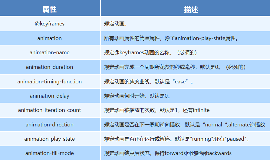
5.2 common attributes of animation
<!DOCTYPE html>
<html lang="en">
<head>
<meta charset="UTF-8">
<meta name="viewport" content="width=device-width, initial-scale=1.0">
<meta http-equiv="X-UA-Compatible" content="ie=edge">
<title>Document</title>
<style>
@keyframes move {
0% {
transform: translate(0, 0);
}
100% {
transform: translate(1000px, 0);
}
}
div {
width: 100px;
height: 100px;
background-color: pink;
/* Animation name */
animation-name: move;
/* Duration */
/* animation-duration: 2s; */
/* Motion curve */
/* animation-timing-function: ease; */
/* When does it start */
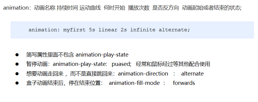
animation-delay: 1s;
/* Number of repetitions iteration number of repetitions infinite */
/* animation-iteration-count: infinite; */
/* Whether to play in the opposite direction. The default is normal. If you want to play in the opposite direction, write alternate */
/* animation-direction: alternate; */
/* By default, the state after the animation is back to the starting state, and we can keep it in the end state forward */
/* animation-fill-mode: forwards; */
/* animation: name duration timing-function delay iteration-count direction fill-mode; */
/* animation: move 2s linear 0s 1 alternate forwards; */
/* The first two attributes name duration must be written */
/* animation: move 2s linear alternate forwards; */
}
div:hover {
/* The mouse passes through the div to stop the animation, and the mouse leaves to continue the animation */
animation-play-state: paused;
}
</style>
</head>
<body>
<div>
</div>
</body>
</html>
5.3 short form of animation
Big data hotspot Map Case
<!DOCTYPE html>
<html lang="en">
<head>
    <meta charset="UTF-8">
    <meta http-equiv="X-UA-Compatible" content="IE=edge">
    <meta name="viewport" content="width=device-width, initial-scale=1.0">
    <title>Document</title>
    <style>
        body {
            background-color: #333;
        }
        .map {
            position: relative;
            width: 747px;
            height: 616px;
            background: url(media/map.png) no-repeat;
            margin: 0 auto;
        }
        .city {
            position: absolute;
            top: 227px;
            right: 193px;
            color: #fff;
        }
        .tb {
            top: 500px;
            right: 80px;
        }
        .gz {
            top: 542px;
            right: 195px;
        }
        .dotted {
            width: 8px;
            height: 8px;
            background-color: #09f;
            border-radius: 50%
        }
        .city div[class^="pulse"] {
            position: absolute;
            top: 50%;
            left: 50%;
            transform: translate(-50%,-50%);
            width: 8px;
            height: 8px;
            box-shadow: 0 0 12px #009dfd;
            border-radius: 50%;
            animation: pulse 1.2s linear infinite;
        }
        .city div.pulse2 {
            animation-delay: 0.4s;
        }
        .city div.pulse3 {
            animation-delay: 0.8s;
        }

        @keyframes pulse {
            0% {

            }
            70% {
                width: 40px;
                height: 40px;
                opacity: 1;
            }
            100% {
                width: 70px;
                height: 70px;
                opacity: 0;
            }
        }
    </style>
</head>
<body>
    <div class="map">
        <div class="city">
            <div class="dotted"></div>
            <div class="pulse1"></div>
            <div class="pulse2"></div>
            <div class="pulse3"></div>
        </div>
        <div class="city tb">
            <div class="dotted"></div>
            <div class="pulse1"></div>
            <div class="pulse2"></div>
            <div class="pulse3"></div>
        </div>
        <div class="city gz">
            <div class="dotted"></div>
            <div class="pulse1"></div>
            <div class="pulse2"></div>
            <div class="pulse3"></div>
        </div>
    </div>
</body>
</html>
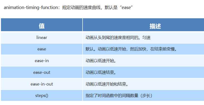
5.4 speed curve details
<!DOCTYPE html>
<html lang="en">

<head>
    <meta charset="UTF-8">
    <meta name="viewport" content="width=device-width, initial-scale=1.0">
    <meta http-equiv="X-UA-Compatible" content="ie=edge">
    <title>Document</title>
    <style>
        div {
            overflow: hidden;
            font-size: 20px;
            width: 0;
            height: 30px;
            background-color: pink;
            /* Let's force our text to appear on one line */
            white-space: nowrap;
            /* steps Just complete our animation in several steps. With steps, don't write ease or linear */
            animation: w 4s steps(10) forwards;
        }

        @keyframes w {
            0% {
                width: 0;
            }
            100% {
                width: 200px;
            }
        }
    </style>
</head>

<body>
    <div>I'll wait for you here</div>
</body>

</html>
Running polar bear case
<!DOCTYPE html>
<html lang="en">

<head>
    <meta charset="UTF-8">
    <meta name="viewport" content="width=device-width, initial-scale=1.0">
    <meta http-equiv="X-UA-Compatible" content="ie=edge">
    <title>Document</title>
    <style>
        body {
            background-color: #ccc;
        }

        div {
            position: absolute;
            width: 200px;
            height: 100px;
            background: url(media/bear.png) no-repeat;
            /* We can add multiple animations to the element, separated by commas */
            animation: bear .4s steps(8) infinite, move 3s forwards;
        }

        @keyframes bear {
            0% {
                background-position: 0 0;
            }
            100% {
                background-position: -1600px 0;
            }
        }

        @keyframes move {
            0% {
                left: 0;
            }
            100% {
                left: 50%;
                /* margin-left: -100px; */
                transform: translateX(-50%);
            }
        }
    </style>
</head>

<body>
    <div></div>
</body>

</html>
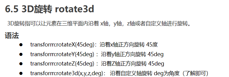
06 CSS3 3D conversion
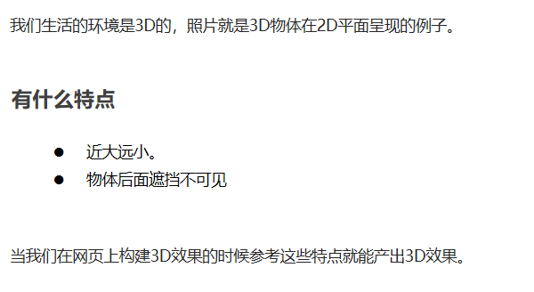
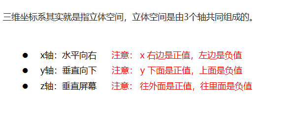
6.1 3D coordinate system
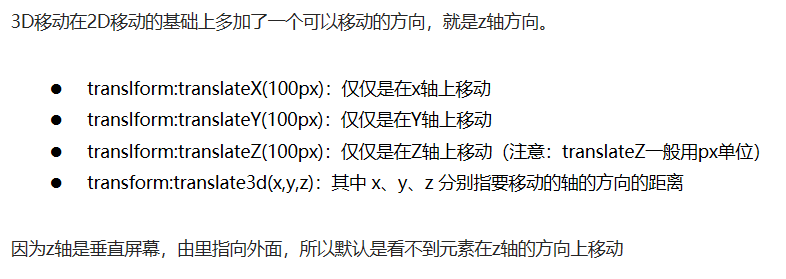
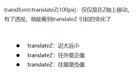
6.2 3D mobile translate3d
<style>
        body {
            /* The perspective is written on the parent box of the observed element */
            perspective: 200px;
        }

        div {
            width: 200px;
            height: 200px;
            background-color: pink;
            /* transform: translateX(100px);
            transform: translateY(100px); */
            /* transform: translateX(100px) translateY(100px) translateZ(100px); */
            /* 1. translateZ Move along the Z axis */
            /* 2. translateZ We usually follow px in the latter units */
            /* 3. translateZ(100px) Move 100px outward (towards our eyes) */
            /* 4. 3D There are short ways to move */
            /* transform: translate3d(x,y,z); */
            /* transform: translate3d(100px, 100px, 100px); */
            /* 5. xyz It cannot be omitted. If not, write 0 */
            transform: translate3d(400px, 100px, 100px);
        }
    </style>
6.3 perspective
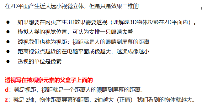
6.4 translateZ
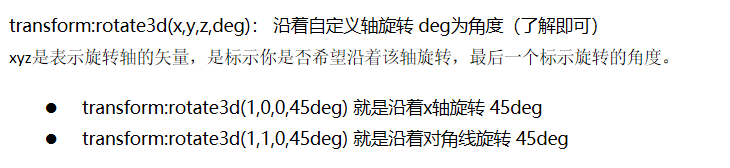
6.5 rotate3d
Left hand rule
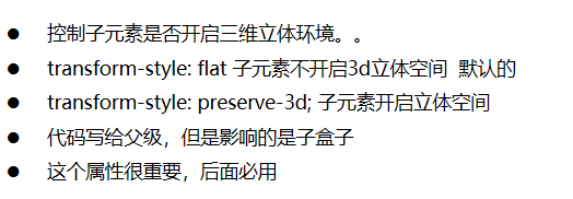
6.6 3D rendering transform style
Case of a box turned on both sides
<!DOCTYPE html>
<html lang="en">

<head>
    <meta charset="UTF-8">
    <meta name="viewport" content="width=device-width, initial-scale=1.0">
    <meta http-equiv="X-UA-Compatible" content="ie=edge">
    <title>Document</title>
    <style>
        body {
            perspective: 400px;
        }

        .box {
            position: relative;
            width: 300px;
            height: 300px;
            margin: 100px auto;
            transition: all .4s;
            /* Let the purple box on the back reserve three-dimensional space for the parent to add */
            transform-style: preserve-3d;
        }

        .box:hover {
            transform: rotateY(180deg);
        }

        .front,
        .back {
            position: absolute;
            top: 0;
            left: 0;
            width: 100%;
            height: 100%;
            border-radius: 50%;
            font-size: 30px;
            color: #fff;
            text-align: center;
            line-height: 300px;
        }

        .front {
            background-color: pink;
            z-index: 1;
        }

        .back {
            background-color: purple;
            /* Rotate back to back like a mobile phone */
            transform: rotateY(180deg);
        }
    </style>
</head>

<body>
    <div class="box">
        <div class="front">Xi'an Engineering University</div>
        <div class="back">Wang Sai is waiting for you here</div>
    </div>
</body>

</html>
3D navigation bar case
<!DOCTYPE html>
<html lang="en">

<head>
    <meta charset="UTF-8">
    <meta name="viewport" content="width=device-width, initial-scale=1.0">
    <meta http-equiv="X-UA-Compatible" content="ie=edge">
    <title>Document</title>
    <style>
        * {
            margin: 0;
            padding: 0;
        }

        ul {
            margin: 100px;
        }

        ul li {
            float: left;
            margin: 0 5px;
            width: 120px;
            height: 35px;
            list-style: none;
            /* Later, we need to rotate the box and also need perspective. Simply add the sub box inside li to have perspective effect */
            perspective: 500px;
        }

        .box {
            position: relative;
            width: 100%;
            height: 100%;
            transform-style: preserve-3d;
            transition: all .4s;
        }

        .box:hover {
            transform: rotateX(90deg);
        }

        .front,
        .bottom {
            position: absolute;
            left: 0;
            top: 0;
            width: 100%;
            height: 100%;
        }

        .front {
            background-color: pink;
            z-index: 1;
            transform: translateZ(17.5px);
        }

        .bottom {
            background-color: purple;
            /* This x-axis must be negative */
            /* If we have mobile or other styles, we must write our mobile first */
            transform: translateY(17.5px) rotateX(-90deg);
        }
    </style>
</head>

<body>
    <ul>
        <li>
            <div class="box">
                <div class="front">Dark horse programmer</div>
                <div class="bottom">pink The teacher is waiting for you</div>
            </div>
        </li>
        <li>
            <div class="box">
                <div class="front">Dark horse programmer</div>
                <div class="bottom">pink The teacher is waiting for you</div>
            </div>
        </li>
        <li>
            <div class="box">
                <div class="front">Dark horse programmer</div>
                <div class="bottom">pink The teacher is waiting for you</div>
            </div>
        </li>
        <li>
            <div class="box">
                <div class="front">Dark horse programmer</div>
                <div class="bottom">pink The teacher is waiting for you</div>
            </div>
        </li>
        <li>
            <div class="box">
                <div class="front">Dark horse programmer</div>
                <div class="bottom">pink The teacher is waiting for you</div>
            </div>
        </li>
        <li>
            <div class="box">
                <div class="front">Dark horse programmer</div>
                <div class="bottom">pink The teacher is waiting for you</div>
            </div>
        </li>
    </ul>
</body>

</html>
Carousel case
<!DOCTYPE html>
<html lang="en">

<head>
    <meta charset="UTF-8">
    <meta name="viewport" content="width=device-width, initial-scale=1.0">
    <meta http-equiv="X-UA-Compatible" content="ie=edge">
    <title>Document</title>
    <style>
        body {
            perspective: 1000px;
        }

        section {
            position: relative;
            width: 300px;
            height: 200px;
            margin: 150px auto;
            transform-style: preserve-3d;
            /* Add animation effect */
            animation: rotate 10s linear infinite;
            background: url(media/pig.jpg) no-repeat;
        }

        section:hover {
            /* Put the mouse into the section to stop the animation */
            animation-play-state: paused;
        }

        @keyframes rotate {
            0% {
                transform: rotateY(0);
            }
            100% {
                transform: rotateY(360deg);
            }
        }

        section div {
            position: absolute;
            top: 0;
            left: 0;
            width: 100%;
            height: 100%;
            background: url(media/dog.jpg) no-repeat;
        }

        section div:nth-child(1) {
            transform: rotateY(0) translateZ(300px);
        }

        section div:nth-child(2) {
            /* Rotate first and then move the distance */
            transform: rotateY(60deg) translateZ(300px);
        }

        section div:nth-child(3) {
            /* Rotate first and then move the distance */
            transform: rotateY(120deg) translateZ(300px);
        }

        section div:nth-child(4) {
            /* Rotate first and then move the distance */
            transform: rotateY(180deg) translateZ(300px);
        }

        section div:nth-child(5) {
            /* Rotate first and then move the distance */
            transform: rotateY(240deg) translateZ(300px);
        }

        section div:nth-child(6) {
            /* Rotate first and then move the distance */
            transform: rotateY(300deg) translateZ(300px);
        }
    </style>
</head>

<body>
    <section>
        <div></div>
        <div></div>
        <div></div>
        <div></div>
        <div></div>
        <div></div>
    </section>
</body>

</html>
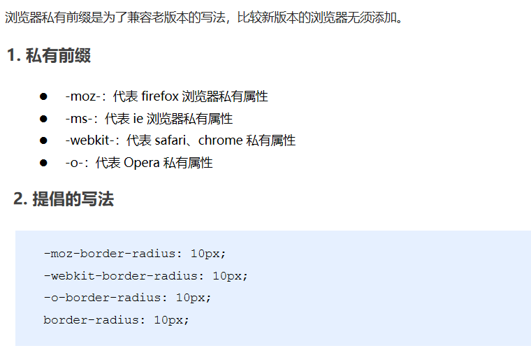
07 browser private prefix
summary