- The topics selected in this paper are some classic and difficult interview questions
- Gold content bar!, And will conduct in-depth explanation, professional explanation and analysis, including teaching and meeting

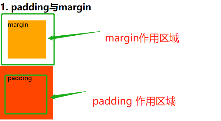
1. padding and margin
- Please briefly describe the difference between padding and margin?
Analysis: at first glance, this question seems very superficial and simple: one is the outer margin and the other is the inner margin. Isn't that the difference?
However, this is not so simple. The positive solution is:
-
The objects of action of the two are different
- The outer margin acts on the surrounding elements
- The inner margin acts on itself
-
As shown in the figure:
2. What is the difference between VW and%?
- VW: viewport size, 100vw = full screen, 50vw = half screen (only related to screen size)
- %: percentage size, inheritance relationship, percentage of inherited parent
- The case is as follows:
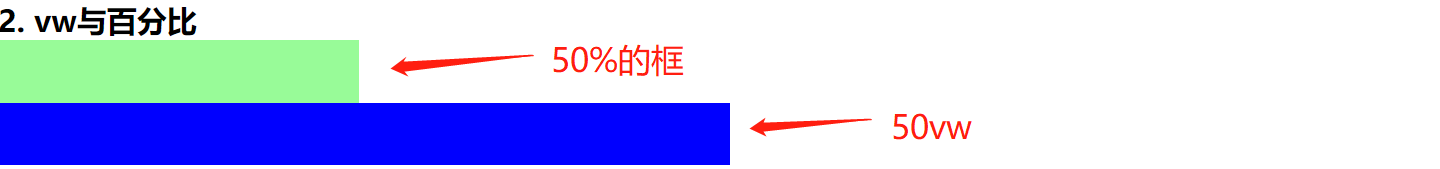
Resolution: the width of the parent element of both is 50% (1 / 2 of the full screen)
- Using the "%" unit will inherit the width of the parent. The parent is 50% and it is 50% of the parent (1 / 4 screen)
- The element using vw, no matter what the parent width is, is only linked to the screen width, so its width is still 1 / 2 of the screen
3. How are inline elements different from block level elements?
Analysis: this question seems simple, but it is also a test of the foundation, because your answer may be the following sentence: the elements in the line do not wrap, and the block level elements occupy a single line, which is not comprehensive
- Inline elements:
- nowrap
- Cannot set size
- The size is determined by the content
- Block level element
- Travel independently
- You can set the size
- Its width inherits the width of the parent
4. How to quickly center and align a div in the body?
The test question code is as follows:
<!DOCTYPE html>
<html>
    <head>
        <title></title>
        <style>
            *{
                margin: 0;
                padding: 0;
            }
            html,body{
                width: 100%;
                height: 100%;
            }
            .con{
                width: 500px;
                height: 500px;
                background-color: orange;
            }
        </style>
    </head>
    <body>
        <div class="con">
            <h1>element</h1>
        </div>
    </body>
</html>
At this moment, you must have many answers in your mind:
- Use positioning
- Calculate inner and outer margins
- Floating + calculated margin
- ...
Are these answers right? In fact, it can achieve the above effect, but please pay attention to the question: how to speed up?
If you want the fastest and best implementation method in the interview, you must use the flex layout. You only need to add two lines of code. The code is as follows:
<!DOCTYPE html>
<html>
    <head>
        <title></title>
        <style>
            *{
                margin: 0;
                padding: 0;
            }
            html,body{
                width: 100%;
                height: 100%;
            }
            .con{
                width: 500px;
                height: 500px;
                background-color: orange;
                /* Add an outer margin here: Auto */
                margin: auto;
            }
            /* Set the body as flex layout here */
            body{
                display: flex;
            }
        </style>
    </head>
    <body>
        <div class="con">
            <h1>element</h1>
        </div>
    </body>
</html>

5. How to draw the following triangles with CSS?
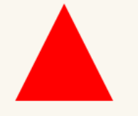
- Direct code:
#triangle-up {
    width: 0;
    height: 0;
    border-left: 50px solid transparent;
    border-right: 50px solid transparent;
    border-bottom: 100px solid red;
}
- If the triangle is like this:

#triangle-down {
    width: 0;
    height: 0;
    border-left: 50px solid transparent;
    border-right: 50px solid transparent;
    border-top: 100px solid red;
}
6. What is the BFC specification?
- BFC specifies how the internal Block Box is laid out
- The inner boxes will be placed one by one in the vertical direction.
- The vertical distance of the Box is determined by the margin, and the margins of two adjacent boxes belonging to the same BFC will overlap.
- The left side of the margin box of each element contacts the left side of the containing block border box.
- The area of BFC will not overlap with the float box.
- BFC is an isolated independent container on the page. The child elements in the container will not affect the external elements.
- When calculating the height of BFC, floating elements will also participate in the calculation (this point is singled out)
Do you think it's still a lot of trouble? Take a break for a minute and continue to look down

7. How to make Chrome support text smaller than 12px?
- We all know that the minimum text of Google browser is 12px, so how to make it smaller?
- Here we need to use the scale in transform
p{
	font-size: 12px;
	transform: scale(0.8);
	/* Compatible with Google writing */
	-webkit-transform: scale(0.8);
}
8. Will CSS loading cause blocking?
Resolution:
- To solve this problem, you must first know the browser parsing process
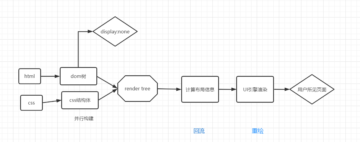
- From the above figure, we can see:
- Dom and CSSOM are usually built in parallel, so CSS loading will not block DOM parsing
- However, because Render Tree depends on DOM Tree and CSSOM Tree,
So he must wait until the CSSOM Tree is built.
That is, the rendering can be started only after the CSS resource loading is completed (or the CSS resource loading fails). Therefore, CSS loading will block Dom's rendering - If you modify these element attributes and render the interface at the same time (that is, JavaScript threads and UI threads run at the same time), the stylesheet will be loaded and executed before the subsequent js execution, so css will block the subsequent js execution
9. How to solve the problem of 1 pixel border?
There are many solutions to this problem, for example:
- Media query uses the device pixel ratio to zoom and set decimal pixels
.border { border: 1px solid #999 }
@media screen and (-webkit-min-device-pixel-ratio: 2) {
    .border { border: 0.5px solid #999 }
}
@media screen and (-webkit-min-device-pixel-ratio: 3) {
    .border { border: 0.333333px solid #999 }
}
Disadvantages: the compatibility of decimal pixels is poor at present
- Box shadow scheme
div {
    -webkit-box-shadow: 0 1px 1px -1px rgba(0, 0, 0, 0.5);
}
Disadvantages: the color is not easy to control, and it is easy to have compatibility problems
- transform: scale(0.5) is recommended. This is the best solution
div {
    height:1px;
    background:#000;
    -webkit-transform: scaleY(0.5);
    -webkit-transform-origin:0 0;
    overflow: hidden;
}
10. What are the methods to optimize CSS and improve performance?
This is an open question. Please answer the following questions:
- Semantically, what kind of label is best for what scenario (this must be answered)
- Avoid over restraint
- Avoid descendant selectors
- Avoid chain selectors
- Use compact syntax
- Avoid unnecessary namespaces
- Avoid unnecessary repetition
- Avoid! important (unless forced)
- Simplify rules as much as possible (duplicate rules in different classes can be merged)
- It's not easy to create. If it's helpful to you, please support a wave~
- Praise, pay attention and collect. Thank you very much!
The next article will update the JS interview questions of big factories such as byte beating. Please look forward to