8. Comprehensive practice of jQuery mobile interface
The main knowledge points include:
- Development method using JQuery Mobile
- Develop skills in actual combat
- What kind of applications can be developed with JQuery Mobile
8.1 refreshing e-book reader
<!DOCTYPE html>
<head>
<meta http-equiv="Content-Type" content="text/html; charset=utf-8" />
<meta name="viewport" content="width=device-width, initial-scale=1"/>
<link rel="stylesheet" href="../css/jquery.mobile-1.4.5.min.css" />
<script src="../script/jquery-2.1.4.min.js"></script>
<script src="../script/jquery.mobile-1.4.5.min.js"></script>
</head>
<body>
<div data-role="page" id="home" data-title="home page">
<div data-role="header" data-position="fixed">
<a href="#"> Return</a>
<h1>eBook Reader </h1>
<a href="#"> Settings</a>
</div>
<div data-role="content">
<ul data-role="listview">
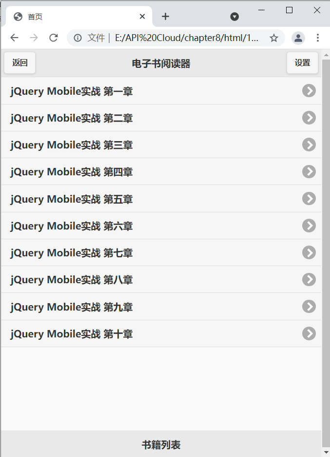
<li><a href="#page_ 1 "> jQuery mobile actual combat Chapter 1</a></li>
<li><a href="#page_ 2 "> jQuery mobile actual combat Chapter 2</a></li>
<li><a href="#page_ 3 "> jQuery mobile actual combat Chapter 3</a></li>
<li><a href="#page_ 1 "> jQuery mobile actual combat Chapter 4</a></li>
<li><a href="#page_ 2 "> jQuery mobile actual combat Chapter 5</a></li>
<li><a href="#page_ 3 "> jQuery mobile actual combat Chapter 6</a></li>
<li><a href="#page_ 1 "> jQuery mobile actual combat Chapter 7</a></li>
<li><a href="#page_ 2 "> jQuery mobile actual combat Chapter 8</a></li>
<li><a href="#page_ 3 "> jQuery mobile actual combat Chapter 9</a></li>
<li><a href="#page_ 1 "> jQuery mobile actual combat Chapter 10</a></li>
</ul>
</div>
<div data-role="footer" data-position="fixed">
<h1>List of books</h1>
</div>
</div>
<!--home page-->
<div data-role="page" id="page_1" data-title="Chapter I">
<div data-role="header" data-position="fixed">
<a href="#Home "> Return</a>
<h1>Chapter I</h1>
<a href="#"> Settings</a>
</div>
<div data-role="content">
<h1>jQuery Mobile Actual combat chapter I</h1>
<h4>today, jQuery Driving Internet A large number of websites on the Internet provide dynamic user experience in browsers, which promotes the gradual reduction of traditional desktop applications. Now, the functions of browsers on major mobile platforms catch up with desktop browsers, so jQuery The team introduced jQuery Mobile(or JQM). JQM Our mission is to provide a unified experience to all major mobile browsers to make the whole Internet Richer content on - no matter what viewing device you use.</h4>
</div>
<div data-role="footer" data-position="fixed">
<h1>jQuery Mobile actual combat</h1>
</div>
</div>
<!---->
<div data-role="page" id="page_2" data-title="Chapter II">
<div data-role="header" data-position="fixed">
<a href="#Home "> Return</a>
<h1>Chapter II</h1>
<a href="#"> Settings</a>
</div>
<div data-role="content">
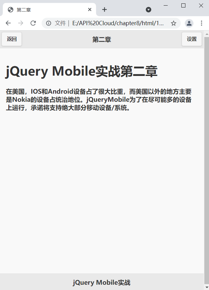
<h1>jQuery Mobile Actual combat Chapter II</h1>
<h4>stateside, IOS and Android Equipment accounts for a large proportion, while places outside the United States are mainly Nokia The equipment is dominant. jQueryMobile In order to run on as many devices as possible, it is promised to support the vast majority of mobile devices/System.</h4>
</div>
<div data-role="footer" data-position="fixed">
<h1>jQuery Mobile actual combat</h1>
</div>
</div>
<!---->
<div data-role="page" id="page_3" data-title="Chapter III">
<div data-role="header" data-position="fixed">
<a href="#Home "> Return</a>
<h1>Chapter III</h1>
<a href="#"> Settings</a>
</div>
<div data-role="content">
<h1>jQuery Mobile Actual combat Chapter III</h1>
<h4>jQuery Mobile yes HMT5 Friendly, it contains a large number of functions that can run on a variety of devices UI Components, such as: Pages&Dialogs,Toolbars,Buttons,Forms,Lists and Content formatting. The framework also includes processing Events(Touch, position, scroll, page, animation) API,Themes And other detection settings.</h4>
</div>
<div data-role="footer" data-position="fixed">
<h1>jQuery Mobile actual combat</h1>
</div>
</div>
</body>
</html>
The effect is as follows:
8.2 simple calculator
<!DOCTYPE html>
<head>
<meta http-equiv="Content-Type" content="text/html; charset=utf-8" />
<meta name="viewport" content="width=device-width, initial-scale=1"/>
<link rel="stylesheet" href="../css/jquery.mobile-1.4.5.min.css" />
<script src="../script/jquery-2.1.4.min.js"></script>
<script src="../script/jquery.mobile-1.4.5.min.js"></script>
<style>
.ui-grid-d .ui-block-a
{
width:20%;
}
.ui-grid-d .ui-block-b
{
width:20%;
}
.ui-grid-d .ui-block-c
{
width:20%;
}
.ui-grid-d .ui-block-d
{
width:20%;
}
.ui-grid-d .ui-block-e
{
width:20%;
}
</style>
</head>
<body>
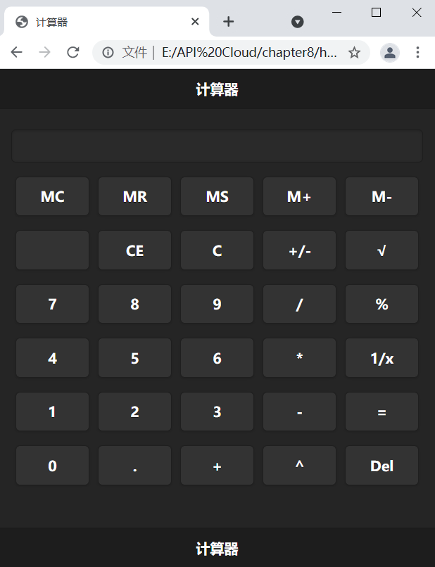
<div data-role="page" data-theme="b">
<div data-role="header" data-position="fixed">
<h1>Calculator</h1>
</div>
<div data-role="content">
<form>
<input type="text">
</form>
<fieldset class="ui-grid-d">
<div class="ui-block-a">
<a href="#" data-role="button" >MC</a>
</div>
<div class="ui-block-b">
<a href="#" data-role="button" >MR</a>
</div>
<div class="ui-block-c">
<a href="#" data-role="button" >MS</a>
</div>
<div class="ui-block-d">
<a href="#" data-role="button" >M+</a>
</div>
<div class="ui-block-e">
<a href="#" data-role="button" >M-</a>
</div>
<!---->
<div class="ui-block-a">
<a href="#" data-role="button" > </a>
</div>
<div class="ui-block-b">
<a href="#" data-role="button" >CE</a>
</div>
<div class="ui-block-c">
<a href="#" data-role="button" >C</a>
</div>
<div class="ui-block-d">
<a href="#" data-role="button" >+/-</a>
</div>
<div class="ui-block-e">
<a href="#" data-role="button" >√</a>
</div>
<!---->
<div class="ui-block-a">
<a href="#" data-role="button" >7</a>
</div>
<div class="ui-block-b">
<a href="#" data-role="button" >8</a>
</div>
<div class="ui-block-c">
<a href="#" data-role="button" >9</a>
</div>
<div class="ui-block-d">
<a href="#" data-role="button" >/</a>
</div>
<div class="ui-block-e">
<a href="#" data-role="button" >%</a>
</div>
<!---->
<div class="ui-block-a">
<a href="#" data-role="button" >4</a>
</div>
<div class="ui-block-b">
<a href="#" data-role="button" >5</a>
</div>
<div class="ui-block-c">
<a href="#" data-role="button" >6</a>
</div>
<div class="ui-block-d">
<a href="#" data-role="button" >*</a>
</div>
<div class="ui-block-e">
<a href="#" data-role="button" >1/x</a>
</div>
<!---->
<div class="ui-block-a">
<a href="#" data-role="button" >1</a>
</div>
<div class="ui-block-b">
<a href="#" data-role="button" >2</a>
</div>
<div class="ui-block-c">
<a href="#" data-role="button" >3</a>
</div>
<div class="ui-block-d">
<a href="#" data-role="button" >-</a>
</div>
<div class="ui-block-e">
<a href="#" data-role="button" >=</a>
</div>
<!---->
<div class="ui-block-a">
<a href="#" data-role="button" >0</a>
</div>
<div class="ui-block-b">
<a href="#" data-role="button" >.</a>
</div>
<div class="ui-block-c">
<a href="#" data-role="button" >+</a>
</div>
<div class="ui-block-d">
<a href="#" data-role="button" >^</a>
</div>
<div class="ui-block-e">
<a href="#" data-role="button" >Del</a>
</div>
</fieldset>
</div>
<div data-role="footer" data-position="fixed">
<h1>Calculator</h1>
</div>
</div>
</body>
</html>
The effect is as follows:
8.3 moving BBS template
Forum page implemented by JQuery Mobile:
<!DOCTYPE html>

<head>
<meta http-equiv="Content-Type" content="text/html; charset=utf-8" />
<meta name="viewport" content="width=device-width, initial-scale=1"/>
<link rel="stylesheet" href="../css/jquery.mobile-1.4.5.min.css" />
<script src="../script/jquery-2.1.4.min.js"></script>
<script src="../script/jquery.mobile-1.4.5.min.js"></script>
</head>
<body>
	<div data-role="page">
		<div data-role="header" data-position="fixed">
			<a href="#"Data icon =" info "> about</a>
            <h1>jQuery Mobile actual combat<a href="#"> Web version</a></h1>
			<a href="#"Data icon =" home "> Home Page < / a > x
        </div>
		<div data-role="content">
			<ul data-role="listview" data-filter="true" data-filter-placeholder="Search fruits..." data-inset="true">
				<li data-role="list-divider">jQuery Mobile Development resource sharing area</li>
				<li>
					<a href="#"> beginner introduction and knowledge Encyclopedia</a>
				</li>
				<li>
					<a href="#"> jQuery mobile development data sharing</a>
				</li>
				<li>
					<a href="#"> jQuery mobile instance tutorial</a>
				</li>
				<li>
					<a href="#"> jQuery mobile extension</a>
				</li>
				<li>
					<a href="#"> jQuery mobile book recommendation</a>
				</li>
				<li>
					<a href="#"> jQuery mobile interface layout research</a>
				</li>
				<li data-role="list-divider">jQuery Mobile Development advanced Q & A</li>
				<li>
					<a href="#"> jQuery mobile FAQ</a>
				</li>
				<li>
					<a href="#"> advanced development of jQuery Mobile</a>
				</li>
				<li>
					<a href="#"> jQuery mobile application test album</a>
				</li>
				<li data-role="list-divider">jQuery Mobile Development and project outsourcing</li>
				<li>
					<a href="#"> jQuery mobile talent recruitment</a>
				</li>
				<li>
					<a href="#"> jQuery mobile project outsourcing</a>
				</li>
				<li>
					<a href="#"> jQuery mobile plug-in transaction</a>
				</li>
				<li data-role="list-divider">jQuery Mobile Plug in zone</li>
				<li>
					<a href="#"> jQuery mobile plug-in customization</a>
				</li>
				<li>
					<a href="#"> jQuery mobile document translation</a>
				</li>
				<li>
					<a href="#"> jQuery mobile development tool</a>
				</li>
			</ul>
		</div>
		<div data-role="footer" data-position="fixed">
			<div data-role="navbar">
				<ul>
					<li><a href="#"Data icon =" check "> login</a></li>
				</ul>
			</div>
		</div>
	</div>
</body>
</html>
The effect is as follows:
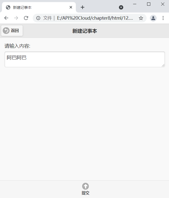
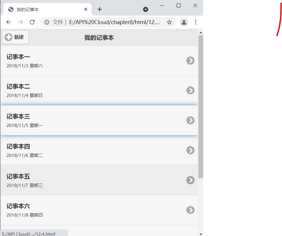
8.4 simple Notepad based on JQuery Mobile
<!DOCTYPE html>

<head>
<meta http-equiv="Content-Type" content="text/html; charset=utf-8" />
<meta name="viewport" content="width=device-width, initial-scale=1"/>
<link rel="stylesheet" href="../css/jquery.mobile-1.4.5.min.css" />
<script src="../script/jquery-2.1.4.min.js"></script>
<script src="../script/jquery.mobile-1.4.5.min.js"></script>
</head>
<body>
	<div data-role="page" id="home" data-title="My notepad">
		<div data-role="header" data-position="fixed">
            <h1>My notepad</h1>
			<a href="#New "data icon =" plus "> New</a>
        </div>
		<div data-role="content">
			<ul data-role="listview">
				<li><a href="#">
					<h1>Notepad 1</h1>
					<p>2018/11/3 Saturday</p>
				</a></li>
				<li><a href="#">
					<h1>Notepad 2</h1>
					<p>2018/11/4 Sunday</p>
				</a></li>
				<li><a href="#">
					<h1>Notepad III</h1>
					<p>2018/11/5 Monday</p>
				</a></li>
				<li><a href="#">
					<h1>Notepad 4</h1>
					<p>2018/11/6 Tuesday</p>
				</a></li>
				<li><a href="#">
					<h1>Notepad 5</h1>
					<p>2018/11/7 Wednesday</p>
				</a></li>
				<li><a href="#">
					<h1>Notepad 6</h1>
					<p>2018/11/8 Thursday</p>
				</a></li>
				<li><a href="#">
					<h1>Notepad 7</h1>
					<p>2018/11/9 Friday</p>
				</a></li>
				<li><a href="#">
					<h1>Notepad 8</h1>
					<p>2018/11/10 Saturday</p>
				</a></li>
				<li><a href="#">
					<h1>Notepad 9</h1>
					<p>2018/11/11 Sunday</p>
				</a></li>
			</ul>
		</div>
		<div data-role="footer" data-position="fixed">
		</div>
	</div>
	<!---->
	<div data-role="page" id="new" data-title="New Notepad">
		<div data-role="header" data-position="fixed">
            <h1>New Notepad</h1>
			<a href="#Home "data icon =" back "> Return</a>
        </div>
		<div data-role="content">
			<form>
				<label for="note">Please enter the content:</label>
				<textarea name="note" id="note"></textarea>
			</form>
		</div>
		<div data-role="footer" data-position="fixed">
			<div data-role="navbar">
				<ul>
					<li><a href="#"Data icon =" arrow-u "> submit</a></li>
				</ul>
			</div>
		</div>
	</div>
</body>
</html>
The effect is as follows:
8.5 full keyboard interface based on JQuery Mobile
<!DOCTYPE html>

<head>
<meta http-equiv="Content-Type" content="text/html; charset=utf-8" />
<meta name="viewport" content="width=device-width, initial-scale=1"/>
<link rel="stylesheet" href="../css/jquery.mobile-1.4.5.min.css" />
<script src="../script/jquery-2.1.4.min.js"></script>
<script src="../script/jquery.mobile-1.4.5.min.js"></script>
</head>
<body>
	<div data-role="page" data-theme="b">
		<div data-role="header">
			<h1>ordinary QWER keyboard</h1>
		</div>
		<div data-role="content">
			<!--first row-->
			<a href="#" data-role="button" data-inline="true">~</a>
			<a href="#" data-role="button" data-inline="true">1</a>
			<a href="#" data-role="button" data-inline="true">2</a>
			<a href="#" data-role="button" data-inline="true">3</a>
			<a href="#" data-role="button" data-inline="true">4</a>
			<a href="#" data-role="button" data-inline="true">5</a>
			<a href="#" data-role="button" data-inline="true">6</a>
			<a href="#" data-role="button" data-inline="true">7</a>
			<a href="#" data-role="button" data-inline="true">8</a>
			<a href="#" data-role="button" data-inline="true">9</a>
			<a href="#" data-role="button" data-inline="true">0</a>
			<a href="#" data-role="button" data-inline="true">-</a>
			<a href="#" data-role="button" data-inline="true">+</a>
			<a href="#" data-role="button" data-inline="true">Del</a>
			<br/><!--Second row-->
			<a href="#" data-role="button" data-inline="true">Tab</a>
			<a href="#" data-role="button" data-inline="true">Q</a>
			<a href="#" data-role="button" data-inline="true">W</a>
			<a href="#" data-role="button" data-inline="true">E</a>
			<a href="#" data-role="button" data-inline="true">R</a>
			<a href="#" data-role="button" data-inline="true">T</a>
			<a href="#" data-role="button" data-inline="true">Y</a>
			<a href="#" data-role="button" data-inline="true">U</a>
			<a href="#" data-role="button" data-inline="true">I</a>
			<a href="#" data-role="button" data-inline="true">O</a>
			<a href="#" data-role="button" data-inline="true">P</a>
			<a href="#" data-role="button" data-inline="true">[</a>
			<a href="#" data-role="button" data-inline="true">]</a>
			<a href="#" data-role="button" data-inline="true">\</a>
			<br/><!--Third row-->
			<a href="#" data-role="button" data-inline="true">Caps Lock</a>
			<a href="#" data-role="button" data-inline="true">A</a>
			<a href="#" data-role="button" data-inline="true">S</a>
			<a href="#" data-role="button" data-inline="true">D</a>
			<a href="#" data-role="button" data-inline="true">F</a>
			<a href="#" data-role="button" data-inline="true">G</a>
			<a href="#" data-role="button" data-inline="true">H</a>
			<a href="#" data-role="button" data-inline="true">J</a>
			<a href="#" data-role="button" data-inline="true">K</a>
			<a href="#" data-role="button" data-inline="true">L</a>
			<a href="#" data-role="button" data-inline="true">;</a>
			<a href="#" data-role="button" data-inline="true">'</a>
			<a href="#" data-role="button" data-inline="true">Enter</a>
			<br/><!--Fourth row-->
			<a href="#" data-role="button" data-inline="true" data-icon="arrow-u" style="width:130px;">Shift</a>
			<a href="#" data-role="button" data-inline="true">Z</a>
			<a href="#" data-role="button" data-inline="true">X</a>
			<a href="#" data-role="button" data-inline="true">C</a>
			<a href="#" data-role="button" data-inline="true">V</a>
			<a href="#" data-role="button" data-inline="true">B</a>
			<a href="#" data-role="button" data-inline="true">N</a>
			<a href="#" data-role="button" data-inline="true">M</a>
			<a href="#" data-role="button" data-inline="true"><</a>
			<a href="#" data-role="button" data-inline="true">></a>
			<a href="#" data-role="button" data-inline="true">/</a>
			<a href="#" data-role="button" data-inline="true" data-icon="arrow-u" style="width:130px;">Shift</a>
			<br/><!--The last line-->
			<a href="#" data-role="button" data-inline="true" style="width:130px;">Ctrl</a>
			<a href="#" data-role="button" data-inline="true">Fn</a>
			<a href="#" data-role="button" data-inline="true">Win</a>
			<a href="#" data-role="button" data-inline="true">Alt</a>
			<a href="#" data-role="button" data-inline="true" style="width:300px;">Space</a>
			<a href="#" data-role="button" data-inline="true">Alt</a>
			<a href="#" data-role="button" data-inline="true">Ctrl</a>
			<a href="#" data-role="button" data-inline="true">PrntScr</a>
		</div>
    </div>
</body>
</html>
The effect is as follows:
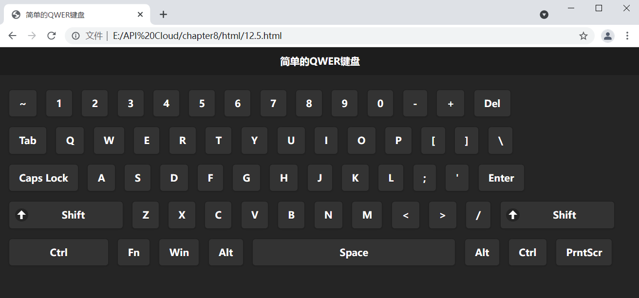
This example uses three ways to adjust the width of the button:
- Use the length of the button title to control the width of the button;
- Increase the width of the button by adding a button icon;
- Modify the button width by directly modifying CSS
Custom style vs column layout
- Flexibility: the user-defined style has high flexibility, and the size of each element can be designed according to your own preferences; The flexibility of column layout is low, and the elements can only be arranged in a certain law;
- Uniformity: low uniformity of custom styles; Column layout height;
- Screen adaptability: the adaptability of user-defined style screen is low. When the screen space is full, it will automatically wrap lines; The column layout has high screen adaptability and good screen adaptation function;
- Scope of application: the custom style has a certain order, but the overall layout is disordered, such as full-size keyboard, waterfall structure, etc; The column layout has a neat network structure, such as tables, checkerboards, etc.
Through these comparisons, it can be seen that column layout and custom style have their own adaptive fields. As developers, they need to decide which method to use according to their own needs.