**1. Tool introduction
**
Tools required for this case (including but not limited to): vscode (code editor), node JS (various plug-in download tools), China js,echarts. min.js,juquery. Min.js, etc. (official. JS plug-ins related to JavaScript), IDEA (all code can be written here)
Languages and other technologies involved: html5+css+JavaScript ajax polling request
Project publishing tool: gitee code hosting (static page)
The project is already hosted in gitee:[ http://krystaljungen.gitee.io/my-krystal2/ ], welcome to visit!!!
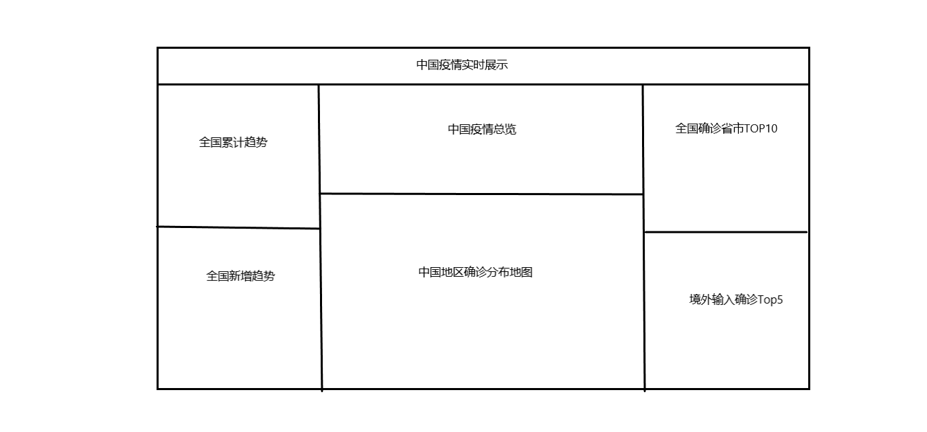
2. Project finished product display and project layout
The project uses ECharts charts to analyze and display COVID-19 China.
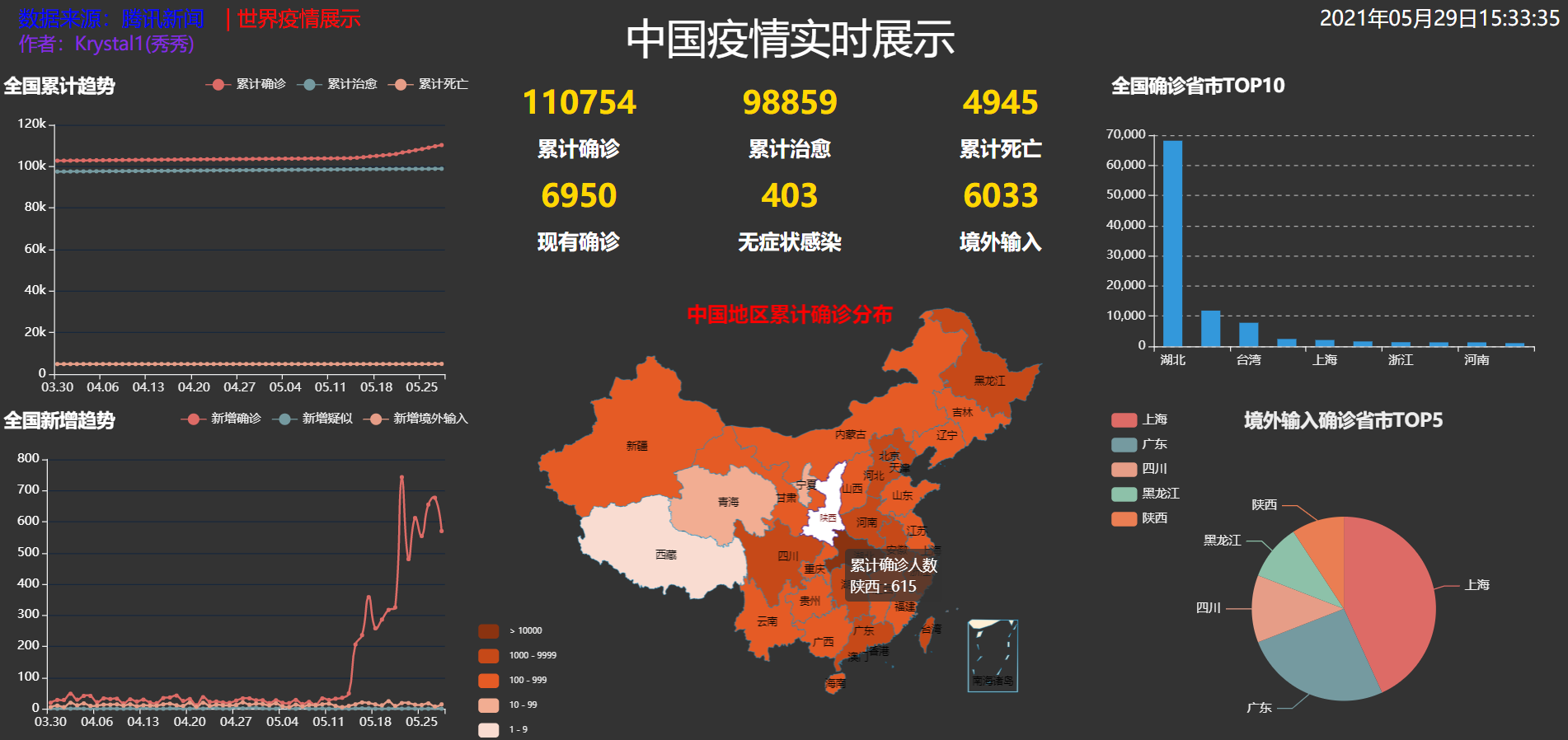
As shown in the figure, the project layout is as follows:
**3. realization
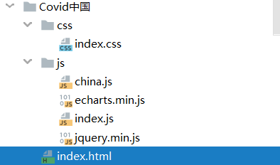
The ide project structure is as follows:
**
3.1 project plug-in introduction
This project needs the support of JQuery and ECharts. All plug-ins can be found on the official website. Here is the website of ecarts plug-in: ECharts tutorial , readers can get started in a short time.
The plug-ins introduced in this project are as follows:
<script src="./js/echarts.min.js"></script>
		<script src="./js/china.js"></script>
		<script src="./js/jquery.min.js"></script>
		<script src="./js/index.js"></script>
Among them, index.js For the whole html Document js Part, so it can be introduced directly.
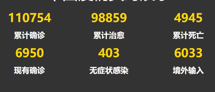
3.2 realization of China data overview
The renderings are as follows:
html code:
<div id="center1">
			<div class="item">
				<div class="number" id="confirm">123</div>
				<div class="text">Cumulative diagnosis</div>
			</div>
			<div class="item">
				<div class="number" id="heal">123</div>
				<div class="text">Cumulative cure</div>
			</div>
			<div class="item">
				<div class="number" id="dead">123</div>
				<div class="text">Cumulative death</div>
			</div>
			<div class="item">
				<div class="number" id="nowConfirm">123</div>
				<div class="text">Existing diagnosis</div>
			</div>
			<div class="item">
				<div class="number" id="noInfect">123</div>
				<div class="text">Asymptomatic infection</div>
			</div>
			<div class="item">
				<div class="number" id="import">123</div>
				<div class="text">Overseas input</div>
			</div>
		</div>
index. Code in JS file:
function center1(data){
	$('#confirm').text(data.chinaTotal.confirm);
	$('#heal').text(data.chinaTotal.heal);
	$('#dead').text(data.chinaTotal.dead);
	$('#nowConfirm').text(data.chinaTotal.nowConfirm);
	$('#noInfect').text(data.chinaTotal.noInfect);
	$('#import').text(data.chinaTotal.importedCase);
}
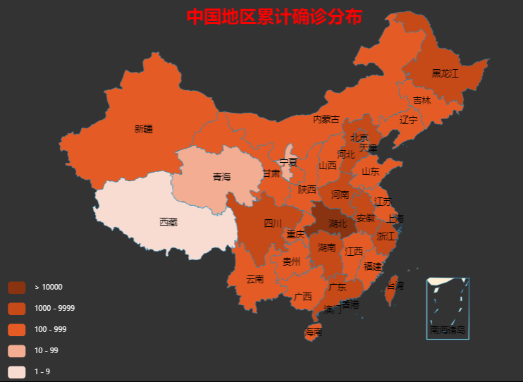
3.3 implementation of epidemic map in China
The implementation of this part requires the Chinese map plug-in of ECharts, which is not available in the current version 5.0. If necessary, it is recommended to use 4.0 X plug-in, version 4.8 used by the writer. (use NPM Download Management).
design sketch:
html code:
<div id="center2"></div>
index.js code:
function center2(data){
	var myChart=echarts.init($('#center2')[0],'dark');
	var option={
		title:{
			text:'\n\n Cumulative distribution in China',
			left:'center',
			textStyle: {
				fontSize: 20,
				color: "rgba(255, 0, 0, 1)"
			  },
		},
		tooltip:{
			//show:true,
			trigger:'item'
		},
		visualMap:{ //Left small navigation icon
			show:true,
			x:'left',
			y:'bottom',
			textStyle:{
				fontSize:8,
			},
			splitList:[{start:1,end: 9},
				{start:10,end:99},
				{start:100,end:999},
				{start:1000,end:9999},
				{start:10000}],
			color:['#8A3310','#C64918','#E55B25','#F2AD92','#F9DCD1']
		},
		series:[{
			name:'Cumulative number of confirmed cases',
			type:'map',
			mapType:'china',
			roam:false,		//Disable drag and zoom

			itemStyle:{		//Graphic style
				normal:{
					borderWidth: .3,//Area border width
					borderColor:'#009fe8 ', / / area border color
					areaColor:'#ffefd5 ', / / area color
				},
				emphasis:{      //Mouse over the relevant settings highlighted in the map
				borderWidth: .5,
				borderColor:'#4b0082',
				areaColor:'#fff',
				}
			},
			label:{ // Text labels on graphics
				normal:{
					show:true,   //Province name
					fontSize:10,
				},
				emphasis:{
					show:true,
					fontSize:8,
				}
			},
			data:[]     //[{'name': 'Shanghai', 'value':318},{'name': 'Jiangsu', 'value':308}]
		}]
	};

	var provinces = data.areaTree[0].children;
	for(var province of provinces){
		option.series[0].data.push({
			'name':province.name,
			'value':province.total.confirm
		});
	}
	myChart.setOption(option);
}
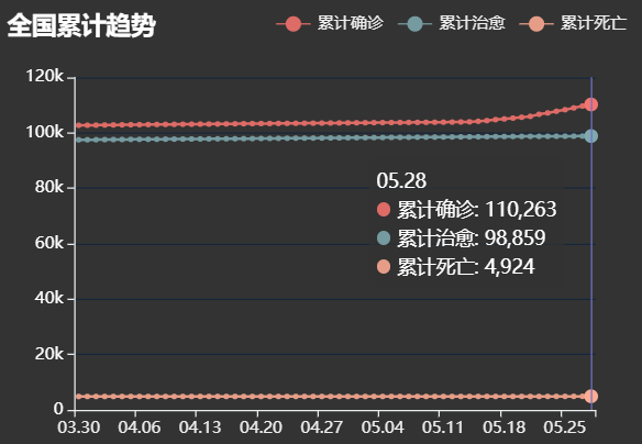
3.4 realization of national cumulative trend
design sketch:
html code:
<div id="left1"></div>
js code:
function left1(data){
	var myChart = echarts.init($('#left1')[0],'dark');
	var option = {
		title:{
			text:"National cumulative trend",
			textStyle:{
				color:'white',
			},
			left:'left',
		},
		tooltip:{
			trigger:'axis',
			//indicator
			axisPointer:{
				type:'line',
				lineStyle:{
					color:'#7171C6'
				}
			},
		},
		//legend
		legend:{
			data:['Cumulative diagnosis','Cumulative cure','Cumulative death'],
			left:"right"
		},
		//Graphic location
		grid:{
			left:'4%',
			right:'6%',
			bottom:'4%',
			top:50,
			containLabel:true
		},
		xAxis:[{
			type:'category',
			data:[]   // ['03.20','03.21','03.22'],
		}],
		yAxis:[{
			type:'value',
			//y-axis font settings
			axisLabel:{
				show:true,
				color:'white',

				fontSize:12,
				formatter: function(value){
					if(value>=1000){
						value = value/1000+'k';
					}
					return value;
				},

			},

			//y-axis setting display
			axisLine:{
				show:true
			},
			//Line style parallel to x axis
			splitLine:{
				show:true,
				lineStyle:{
					color:'#17273B',
					width:1,
					type:'solid',
				}
			}
		}],
		series:[{
			name:"Cumulative diagnosis",
			type:'line',
			smooth:true,
			data:[]//[260,406,529],
		},{
			name:"Cumulative cure",
			type:'line',
			smooth:true,
			data:[]  //[6,150,270],
		},{
			name:"Cumulative death",
			type:'line',
			smooth:true ,
			data:[] //[6,9,17],
		}]
	};

	var chinaDayList =data.chinaDayList;
	for(var day of chinaDayList){
		//console.log(day);
		option.xAxis[0].data.push(day.date);
		option.series[0].data.push(day.confirm);
		option.series[1].data.push(day.heal);
		option.series[2].data.push(day.dead)
	}


	myChart.setOption(option);
}
3.5 data crawling and injection
The above only introduces the generation of some charts. The chart generation of ECharts is very simple. Basically, you can copy the code of the official website and inject your own data. The rest is about style. The following describes the data sources of this project.
This project crawls the data of Tencent news, uses JQuery's Ajax request, after processing the acquired data, calls the written method, the ECharts code in the method receives the data and completes the mapping.
js code is as follows:
function getData(){
	$.ajax({
		url:'https://view.inews.qq.com/g2/getOnsInfo?name=disease_h5',
		data:{
			name:'disease_h5'
		},
		dataType:'jsonp',
		success:function(res){
			var data = JSON.parse(res.data);
			console.log(data)
			center1(data);
			center2(data);
			right1(data);
			right2(data);
		}
	});
	$.ajax({
		type:'post',
		url:'https://api.inews.qq.com/newsqa/v1/query/inner/publish/modules/list',
		data:{
			modules: 'chinaDayList,chinaDayAddList,nowConfirmStatis,provinceCompare'
		},
		dataType:'json',
		success:function(res){
			//console.log(res);
			var data = res.data;
			//console.log(res.data);
			left1(data);
			left2(data);
		}
	});
}
4. Summary
The project is not difficult and easy to implement. The difficulty is the acquisition and analysis of data. After realizing the epidemic data in China, we can try to realize the data in the world.
Project reference B Standing on the video of you guys, I won't repeat them one by one here.
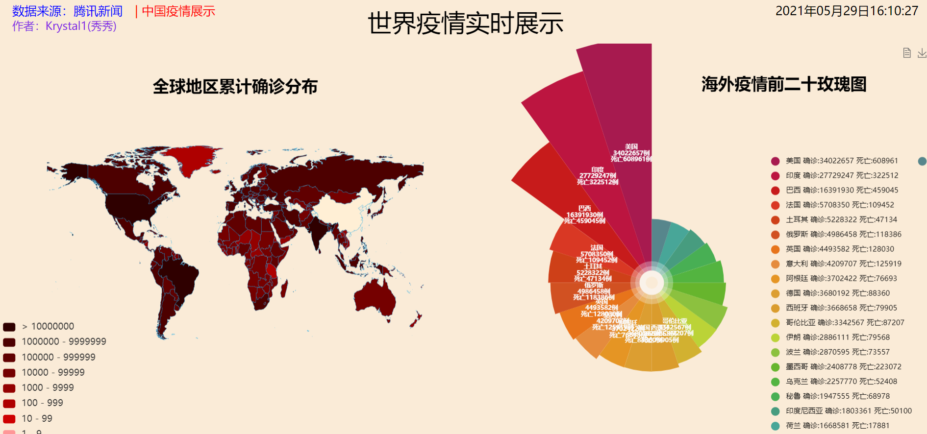
Attached is my world epidemic analysis screen: