- Date : [[2022-01-03_Mon]]
- Tags: #r / index / 02 #R/R visualization #R/R data science #R/R package
- reference resources:
- Picture annotation in R: Shenbao aplot - Jianshu (jianshu.com)[1]
preface
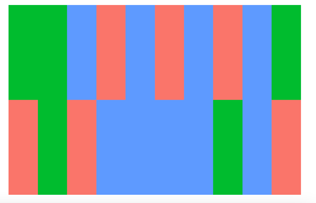
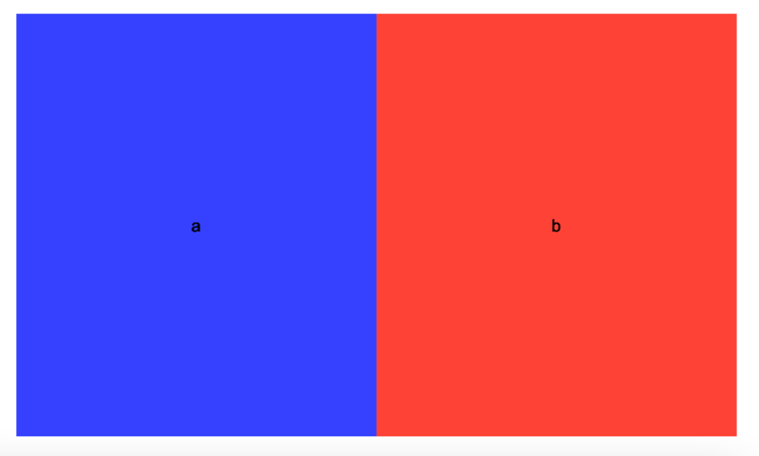
You may not be unfamiliar with this picture:
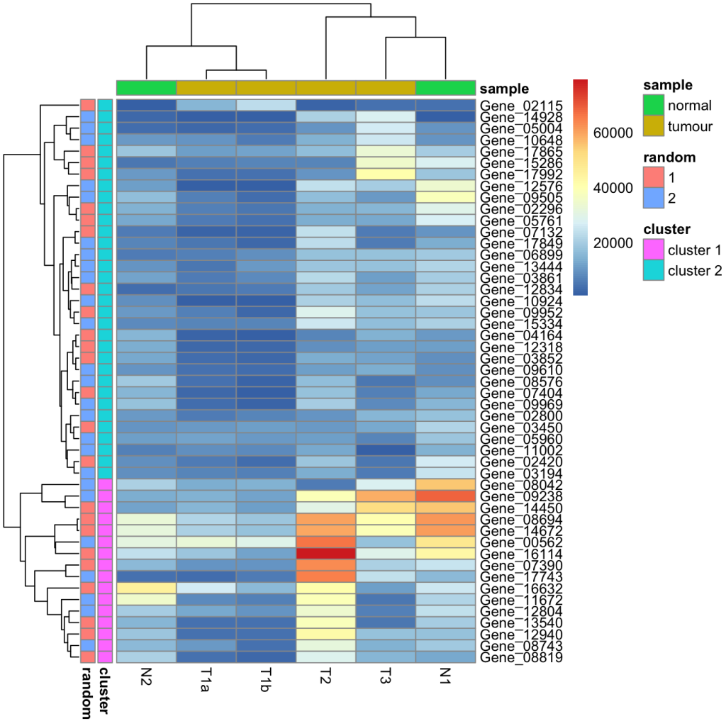
This is actually a very simple picture drawn by pheatmap. Through the source code, we can find that it actually operates with the help of grid package.
However, for mature functions such as pheatmap, they only provide parameters to call.
So can we draw similar annotation columns through ggplot instead of grid bottom layer?
Start operation
Here is mainly with the help of jigsaw puzzle scheme.
In [[88-R visualization 20-R's several ggplot based puzzle solutions]], we just introduced aplot, a natural solution suitable for annotation diagrams.
Here's the actual operation.
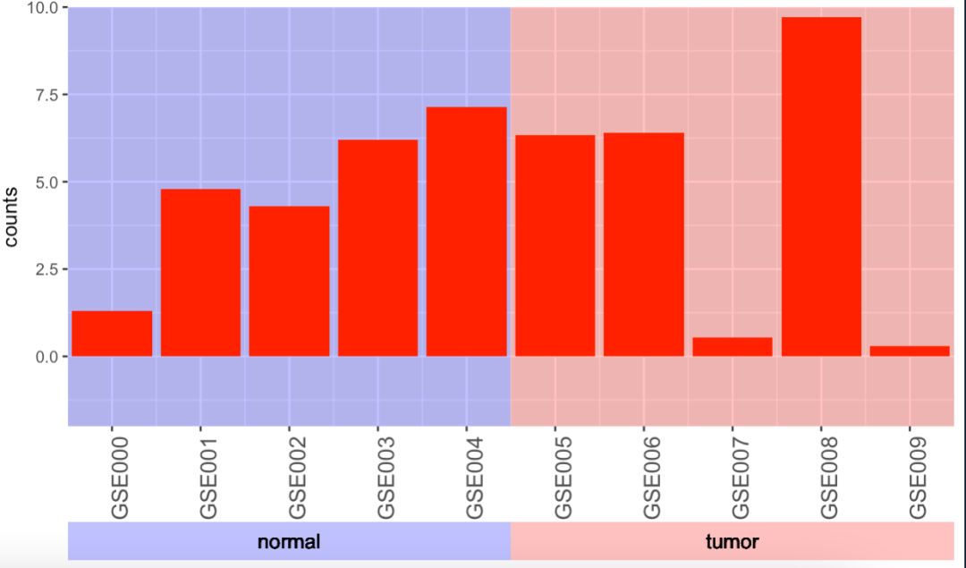
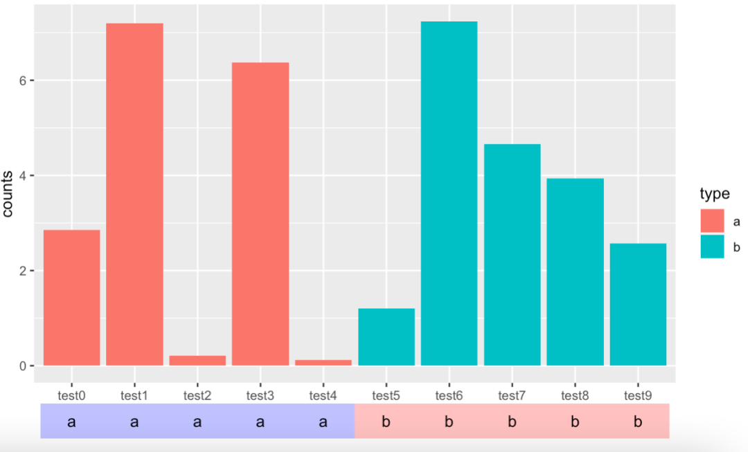
It's really very simple. I'll post all the code to you directly:
my_packages<- c("ggplot2", "data.table", "tidyverse",
"RColorBrewer", "paletteer","ggfittext",
"aplot","patchwork")
tmp <- sapply(my_packages, function(x) library(x, character.only = T)); rm(tmp, my_packages)
my_data2 <- data.frame(
counts = runif(10, -1, 10),
id = 0:9,
type = rep(c("a","b"), each = 5)
)
p1 <- ggplot() + geom_rect(data = my_data2,aes(xmin = -.5, xmax = 4.5,
ymin = -Inf, ymax = Inf),fill = "blue", alpha=0.03) +
geom_rect(data = my_data2, aes(xmin = 4.5, xmax = 9.5,
ymin = -Inf, ymax = Inf),fill = "red", alpha=0.03) +
geom_col(data = my_data2, aes(id, counts), fill = "red") + labs(x = NULL) +
scale_x_continuous(breaks=seq(0,9,1),
expand=c(0,0),
label = paste0("GSE", "00", 0:9)) +
scale_y_continuous(expand=c(0,0), limits = c(-2,10)) +
theme(axis.text.x = element_text(angle = 90, size = 12))
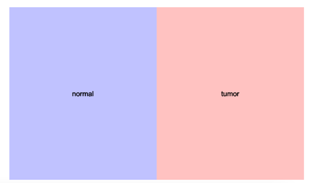
p2 <- ggplot(data = my_data2) + geom_tile(aes(id, 1, fill = type), alpha = 0.3) +
theme(panel.grid = element_blank(),
panel.background = element_blank(), axis.line = element_blank(),
axis.ticks = element_blank(), axis.text = element_blank(),
axis.title = element_blank(),
legend.position = "none") + scale_fill_manual(values = c("blue", "red")) +
geom_text(x= 2, y=1, label="normal") +
geom_text(x = 7, y = 1, label = "tumor")
# wrap_plots(p1, p2, heights = c(11,1))
p1 %>% insert_bottom(p2, height = .1)
The main technical point is that the theme of the annotation column needs to be set up, using geom_tile or geom_rect draw a first-class bare color block:
theme(panel.grid = element_blank(),
        panel.background = element_blank(), axis.line = element_blank(),
        axis.ticks = element_blank(), axis.text = element_blank(),
        axis.title = element_blank(),
        legend.position = "none")
As for the text effect on the annotation diagram below, I will share it with you later.
At this time, some students may ask, I want to splice multiple pictures, can I? Of course, no problem.
Two modes of annotation column splicing
Stacking sense
The first is to realize the illusion of stacking together:
In fact, this is just an annotation column:
> my_data3
   value  anno type3
1      0 anno1     a
2      1 anno1     b
3      2 anno1     a
4      3 anno1     c
5      4 anno1     c
6      5 anno1     c
7      6 anno1     c
8      7 anno1     b
9      8 anno1     c
10     9 anno1     a
11     0 anno2     b
12     1 anno2     b
13     2 anno2     c
14     3 anno2     a
15     4 anno2     c
16     5 anno2     a
17     6 anno2     c
18     7 anno2     a
19     8 anno2     c
20     9 anno2     b
Its x value is repeated twice, realizing two kinds of mapping:
ggplot(data = my_data3) + geom_tile(aes(value, anno, fill = type3)) +
  theme(panel.grid = element_blank(),
        panel.background = element_blank(), axis.line = element_blank(),
        axis.ticks = element_blank(), axis.text = element_blank(),
        axis.title = element_blank())
In addition, we can also achieve the effect of marking the meaning of different annotation diagrams, that is, retain the y-axis text of the color block diagram:
p3 <- ggplot(data = my_data3) + geom_tile(aes(value, anno, fill = type3)) +
  theme(panel.grid = element_blank(),
        panel.background = element_blank(), axis.line = element_blank(),
        axis.ticks = element_blank(), axis.text.x = element_blank(),
        axis.title = element_blank()) + scale_y_discrete(position="right")

p1 %>% insert_bottom(p2, height = .1) %>%
  insert_top(p3, height=.1)
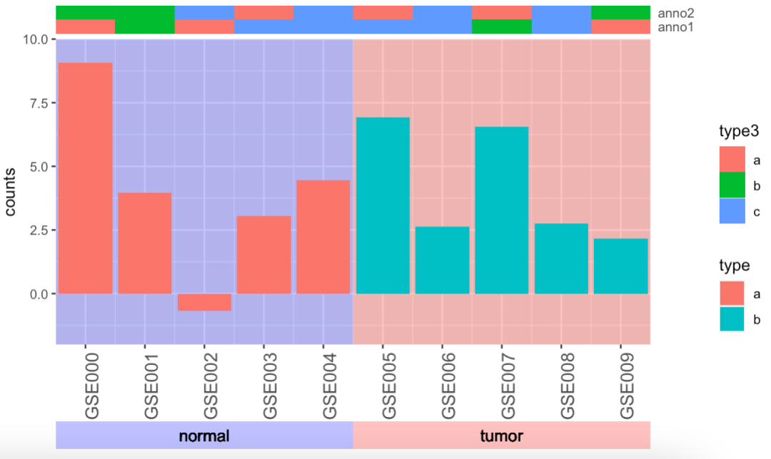
The advantage of this is that the annotation columns can be stacked together, which saves space; However, the legends of different types of color block columns will be "stitched" together to produce missundstanding.
However, this problem can be solved through mediation legend. Let's dig a hole first.
Sense of withdrawal
It's actually a two-tier puzzle.
my_data2 <- data.frame(
  counts = runif(10, -1, 10),
  id = 0:9,
  type = rep(c("a","b"), each = 5),
  anno1 = rep("anno1", 10),
  anno2 = rep("anno2", 10),
  type2 = rep(c("a","b"), each = 5),
  type3 = sample(c("a","b","c"), 10, replace = T)
)

p4 <- ggplot(data = my_data2) + geom_tile(aes(id, anno1, fill = type2)) +
  theme(panel.grid = element_blank(),
        panel.background = element_blank(), axis.line = element_blank(),
        axis.ticks = element_blank(), axis.text.x = element_blank(),
        axis.title = element_blank()) + scale_y_discrete(position="right")
p5 <- ggplot(data = my_data2) + geom_tile(aes(id, anno2, fill = type3)) +
  theme(panel.grid = element_blank(),
        panel.background = element_blank(), axis.line = element_blank(),
        axis.ticks = element_blank(), axis.text.x = element_blank(),
        axis.title = element_blank()) + scale_y_discrete(position="right")

p1 %>% insert_bottom(p2, height = .1) %>%
  insert_top(p4, height=.1) %>%
  insert_top(p5, height=.1)
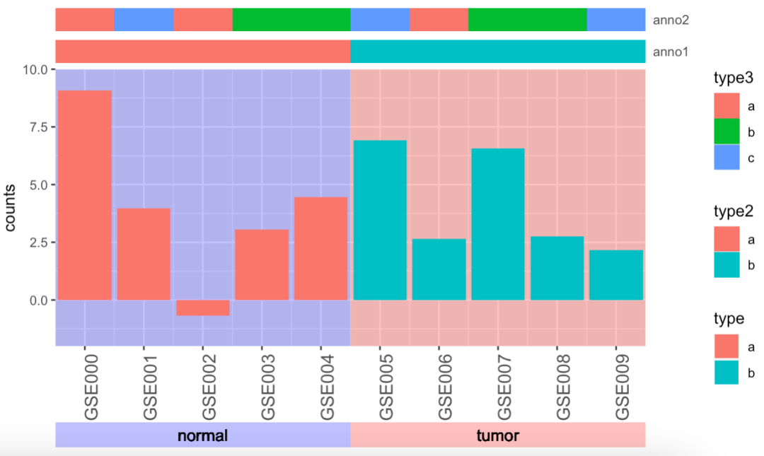
I don't know how you feel. I still feel uncomfortable with this widening gap.
Add text to annotation diagram
In fact, it is geom with the help of [[66-R visualization 10 - free addition of text on ggplot (histogram plus count)]]_ Textadd manually.
It's not hard to see from my code:
p2 <- ggplot(data = my_data2) + geom_tile(aes(id, 1, fill = type), alpha = 0.3) +
  theme(panel.grid = element_blank(),
        panel.background = element_blank(), axis.line = element_blank(),
        axis.ticks = element_blank(), axis.text = element_blank(),
        axis.title = element_blank(),
        legend.position = "none") + scale_fill_manual(values = c("blue", "red")) +
  geom_text(x= 2, y=1, label="normal") +
  geom_text(x = 7, y = 1, label = "tumor")
This setting process is actually quite painful, mainly because my main image is a piece of continuous data. See: [[87-R visualization 19 - freely control the color of the background by mapping other layers]]. Because you have to set the text manually to make the text reach a center and satisfactory position.
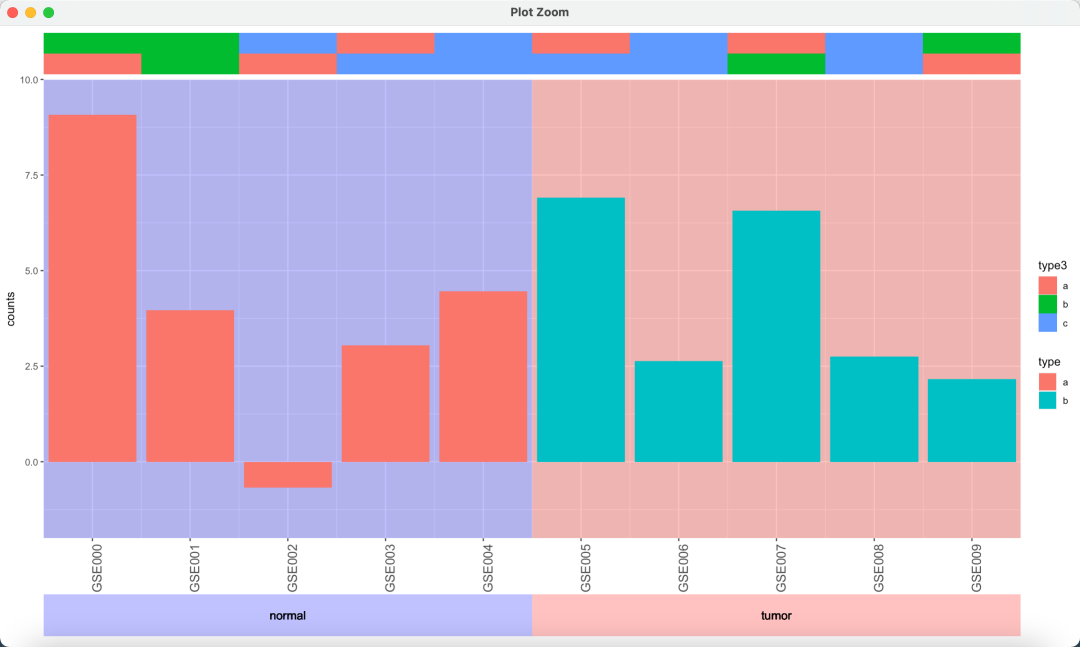
> p1 %>% insert_bottom(p3, height = .1)
error: Discrete value supplied to continuous scale
Therefore, from this point of view, the puzzle of aplot also needs to consider the type relationship between different layers. Its use is complex and higher than patchwork.
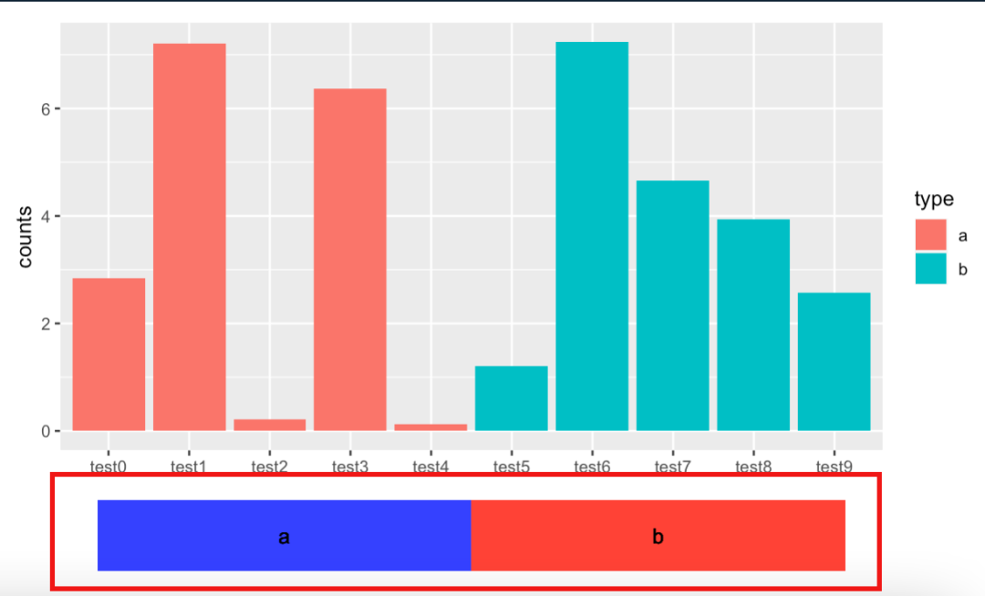
If you don't care about alignment, violent patchwork is actually very convenient: [88-R visualization 20-R several ggplot based puzzle solutions]]
But there is a hard injury here: because they are two independent ggplot objects, the background theme in the annotation diagram is left blank by us, but it still lives in the heart of patchwork, which will lead to the result that it has disappeared but not completely disappeared:
In fact, for general graphics, you can directly use the label parameter, but there are also problems.
For example, when I try to give a mapping different from the main graph:
pp <- ggplot() +
  geom_col(data = my_data5, aes(id, counts, fill = type)) + labs(x = NULL)
p3 <- ggplot(data = my_data5) + geom_tile(aes(fill = type, x = type, y = 1), alpha = 0.3) +
  theme(panel.grid = element_blank(),
        panel.background = element_blank(), axis.line = element_blank(),
        axis.ticks = element_blank(), axis.text = element_blank(),
        axis.title = element_blank(),
        legend.position = "none") + scale_fill_manual(values = c("blue", "red")) +
  geom_text(aes(x = type, y = 1,label = type))
pp %>% aplot::insert_bottom(p3, height = .1)
I have to put geom_ The tile can only be displayed if it corresponds to the same column as the x of the main map. Otherwise, a warning will be given:
Warning messages:
1: Removed 10 rows containing missing values (geom_tile).
2: Position guide is perpendicular to the intended axis. Did you mean to specify a different guide `position`?
If the mapping is consistent, the text below will be displayed multiple times.
Is there a better way?
reference material
[1] Picture annotation in R: Shenbao aplot - Jianshu (jianshu.com): https://www.jianshu.com/p/904166e52ea1