Strolling B I found some when I was standing up The main small special effects are recorded here, and the knowledge points are analyzed
The special effects are as follows
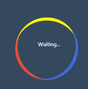
HTML code
<!DOCTYPE html>
<html>
	<head>
		<meta charset="utf-8" />
		<link rel="stylesheet" href="./css/style.css">
		<title></title>
	</head>
	<body>
		<div class="loading">
			<span>Waiting...</span>
		</div>
	</body>
</html>
css code
body {
	margin: 0;
	padding: 0;
	background: #34495e;
	height: 100vh;
	display: flex;
	align-items: center;
	justify-content: center;
}

.loading {
	width: 200px;
	height: 200px;
	border-top: 10px solid #e74c3c;
	border-radius: 50%;
	box-sizing: border-box;
	position: relative;
	animation: a1 2s linear infinite;
}

.loading::before, .loading::after {
	content: '';
	width: 200px;
	height: 200px;
	box-sizing: border-box;
	border-radius: 50%;
	/* background-color: #E74C3C; */
	position: absolute;
	left: 0px;
	top: -8px;
}

.loading::before {
	border-top: 10px solid yellow;
	transform: rotate(120deg);
}

.loading::after {
	border-top: 10px solid royalblue;
	transform: rotate(240deg);
}

.loading span {
	position: absolute;
	text-align: center;
	color: #fff;
	width: 200px;
	height: 200px;
	line-height: 180px;
	animation: a2 2s linear infinite;
}

@keyframes a1{
	to{
		transform: rotate(360deg);
	}
}

@keyframes a2{
	to{
		transform: rotate(-360deg);
	}
}
box-sizing:
In general, we do not set the box sizing attribute. At this time, it will default to the standard mode, that is, box sizing: content box
This is a specific picture from Chrome
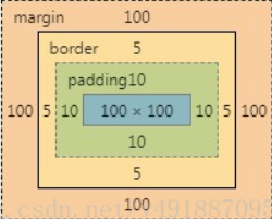
When you add width/height to div, their value only refers to the value of content area, that is, the blue area in the figure
At this time, the total width / height of the box model = width/height+padding+border+margin
Weird pattern
Also known as the weird box model, it is different from the standard model
width/height = Content area width/height + padding + border
.box{
    width:100px;
    height:100px;
    border:10px #ddd solid;
    padding:10px;
    margin:10px;
    box-sizing:border-box;
}
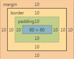
The total width of the box at this time/high = width/height + margin
 It is not difficult to see from the picture width = border(10+10) + padding(10+10) + content(60)=100
 Total width and height of the box = width(100) + margin(10+10) = 120
animation:
Syntax format:
Animation: animation name, duration, when the motion curve starts playing, whether the number of times is in the opposite direction, and whether the animation starts or ends;
- The name and time are self-defined
- Define the running track of the animation to complete a cycle. The following are some common values:
(1)linear:Indicates that the speed of the animation is the same from beginning to end.

(2)ease-in:Indicates that the animation starts at a low speed.

(3)ease-out:Indicates that the animation ends at a low speed.

(4)ease-in-out:Indicates that the animation starts and ends at a low speed.
- Set the delay time before the animation starts:
The default value is 0. You can also define it by yourself. The unit can be(s) and (ms)
- There are two attributes for animation playback times:
(1)Set the number of playback by yourself.
(2)infinite: Set the animation to play wirelessly.
- Do you want to play the animation backwards in turn
The default value is normal,The animation plays normally.
 Settable attribute values:
(1)reverse:Indicates that the animation plays backwards.
(2)alternate:Indicates that the animation is played forward for odd times and backward for even times.
(3)alternate-reverse: :Indicates that the animation is played in reverse for odd times and forward for even times.
- Define the element style after or before the end of the element Animation:
(1)forwards:Indicates that after the animation, the element directly uses the current style.

(2)backwards:Indicates in the keyframe used by the animation delay time element from Property value or to Attribute value (when animation-direction by reverse perhaps alternate-reverse Time)
give an example:
animation:move 1s ease 2s 3 alertnate forwards
transform:
Basic syntax:
transform: rotate | scale | skew | translate |matrix;
-
Rotate:
Only one 2D rotation is performed on the original element. The angle to be rotated is filled in the bracket of rotate(). A positive number indicates clockwise rotation. If the set value is negative, it indicates counterclockwise rotation. For example: transform:rotate(120deg); -
Move translate
- translate(x,y), which means that the object is translated. Based on the central point of the element and according to the set x,y parameter values, when the value is positive, the object moves to the right and when it is negative, it moves in the opposite direction, such as transform:translate(10px,10px):
- translateX: specify a translation by giving a number in the X direction. Move the element only to the x-axis. Similarly, its base point is the center point of the element. You can also change the base point position according to transform origin. For example: transform:translateX(100px):
- translateY: specify a translation by the number of given Y directions. Only move to the Y axis, and the base point is at the element center point. You can change the base point position through transform origin. For example: transform:translateY(20px):
-
Zoom scale
-
Scale, scale (X,Y) is used to scale the element. The X and Y in brackets correspond to the X and Y axes of the coordinate axis of the element, and the base point is also the center point of the element. However, when x and y are greater than 1, the element is enlarged, and when they are less than 1, they are reduced. If there is only one value in brackets, it means that the scaling multiple in the direction of X and Y axes is the same.
-
The X-1 base point of the element is the same as the X-1 base point of the element. By default, the X-1 base point of the element is the same as the X-1 base point of the element. For example: transform:scaleX(2).
-
scaleY: scaleY means that the element is scaled only on the Y-axis (vertical direction), and its base point is also at the center of the element. You can change the base point of the element through transform origin. Such as transform:scaleY(2).
-
-
Twist skew
- skew(): refers to the oblique tangent transformation on the XY axis. Two parameters can be filled in brackets, corresponding to the X and Y axes respectively. If the second parameter is not provided, the value is 0, that is, there is no oblique tangent in the Y axis direction. The writing method can be: transform:skew(30deg,30deg);
- skewX(): specifies a miter transformation along the X axis at a given angle. skewX is to make the element take its center as the base point and twist and change the line in the horizontal direction (x axis). Similarly, the base point of the element can be changed through transform origin. It can be written as: transform:skewX(30deg)
3.skewY(): specify a miter transformation along the Y axis at a given angle. skewY is to make the element base on its center and twist and deform in the vertical direction (Y axis). Similarly, we can change the base point of the element through transform origin. It can be written as: transform:skewY (30deg)