
preface
Recently, I'm preparing to sort out the foundation, prepare to change jobs after the year, and find a better owner. 😎 Record the process of learning and sorting. I hope it can help you change jobs in the next year. Let's consolidate the foundation together. At present, in a state-owned enterprise, I feel comfortable living from nine to five. I have a lot of time to do what I like. For a long time, I feel anxious. Because the company is non internet and its development is also based on its own known technology, the technology growth is very slow and the technical atmosphere is not so strong. If you want to break through yourself, it's time to escape from the comfort zone</ Br > < / BR > this chapter mainly reviews the use of Flex and the writing methods of some common layouts</ br>
Familiar with HTML page architecture and common layout
Flex
Flex concept
Elements with Flex layout are called Flex containers, or "containers" for short. All its child elements automatically become container members, which are called Flex items, or "items" for short.
be careful:
Any container can be specified as Flex Flex: display inline can also be specified as the layout element; The browser of webkit kernel must be prefixed with - webkit. display: -webkit-flex; / Safari /
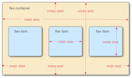
The container has two axes by default: the horizontal main axis and the vertical cross axis. The starting position of the spindle (the intersection with the border) is called main start, and the ending position is called main end; The start position of the cross axis is called cross start and the end position is called cross end.
Items are arranged along the main axis by default. The spindle space occupied by a single item is called main size, and the cross axis space occupied is called cross size.
Container properties
Properties that act on the parent container
attribute | Function description |
|---|---|
flex-direction | Property determines the direction of the spindle (that is, the arrangement direction of items). |
flex-wrap | By default, items are arranged on a single line, also known as a grid line. The flex wrap attribute defines how to wrap lines if one axis cannot be arranged |
justify-content | Determines the alignment of child elements in the spindle. |
align-items | Determines the alignment of child elements on the cross axis (vertical axis) |
align-content | Determines the alignment of multiple axes. |
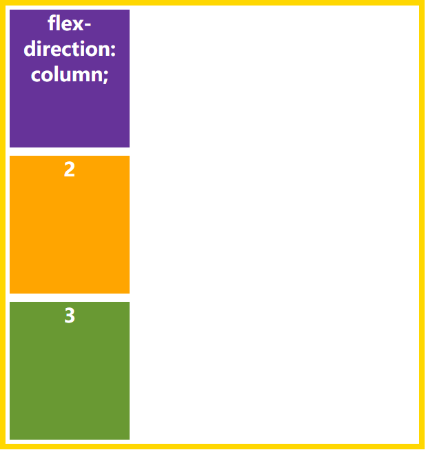
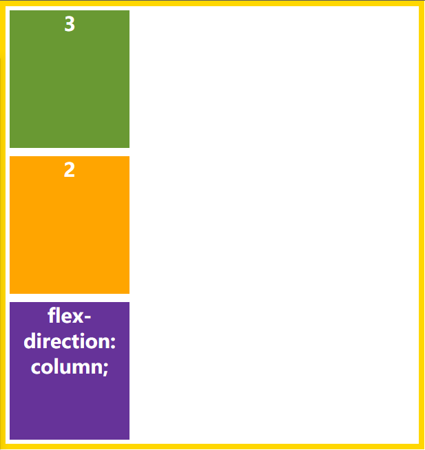
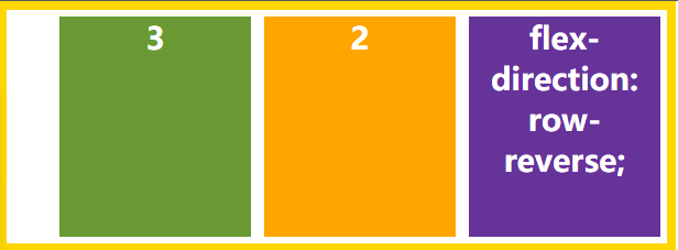
flex-direction
This attribute determines the direction in which the spindles are arranged
row (default): the main axis is horizontal and the starting point is at the left end. Row reverse: the main axis is horizontal and the starting point is at the right end. column: the main axis is vertical and the starting point is on the top edge. Column reverse: the main axis is vertical, and the starting point is at the lower edge.
flex-direction: column;
flex-direction:row-reverse
flex-direction: row-reverse;
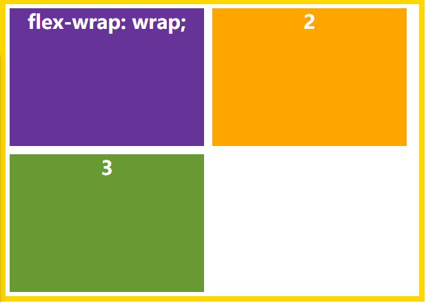
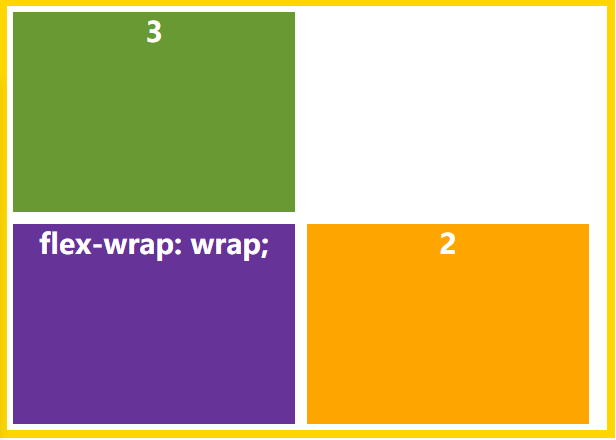
flex-wrap
This attribute determines whether the element is on an axis. By specifying its attribute, the child element can wrap.
nowrap: default, no line breaks. Wrap: make the child elements orderly arranged on a line. When a line cannot be arranged, it will wrap. Wrap reverse: reverse of wrap.
flex-wrap: wrap;
flex-wrap: wrap-reverse;
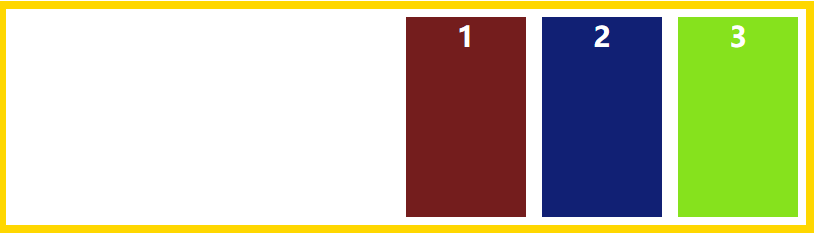
justify-content
This attribute determines the alignment of child elements on the spindle
Properties:
Flex start (default): align left Flex end: right justified center: center Space between: arrange each element evenly. The first element is placed at the beginning and the last element is placed at the end Interval: number of elements n - 1 Space evenly: arrange each element evenly with equal spacing between each element. Interval: number of elements n + 1 Space around: the space on both sides of each item is equal. Therefore, the interval between items is twice as large as that between items and borders.
justify-content: center;
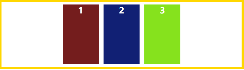
justify-content: flex-end;
justify-content: space-between;
justify-content: space-around;
justify-content: space-evenly;
align-items
This attribute is how to align the child elements in the cross drawing (vertical axis) direction.
Properties:
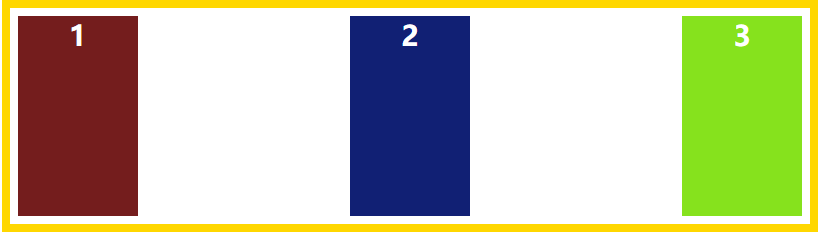
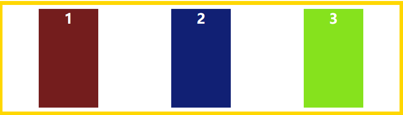
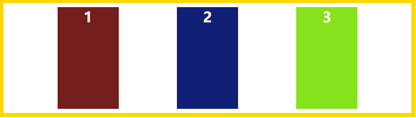
Flex start: align the start point of the cross axis. Flex end: align the ends of the cross axes. center: align the midpoint of the cross axis. Baseline: the baseline alignment of the first line of text of the project. stretch (default): if the item is not set to height or set to auto, it will occupy the height of the entire container.
align-items: flex-end;
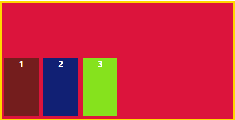
align-items: center;
align-items: baseline;
align-items: stretch;
align-content
This element defines the alignment of multiple axes and does not work when there is only one axis.
Properties:
Flex start: align with the starting point of the cross axis. Flex end: align with the end of the cross axis. center: align with the midpoint of the cross axis. Space between: align with both ends of the cross axis, and the spacing between the axes is evenly distributed. Space around: the spacing on both sides of each axis is equal. Therefore, the spacing between the axes is twice as large as that between the axis and the frame. stretch (default): the axis occupies the entire cross axis.
align-content: flex-start;
align-content: flex-end;
align-content: center;
align-content: space-between;
align-content: space-around;
Attributes that act on child elements
attribute | Attribute description |
|---|---|
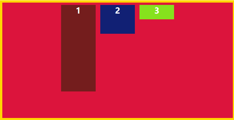
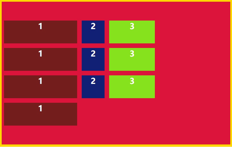
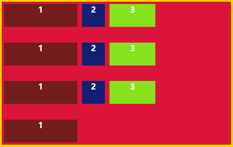
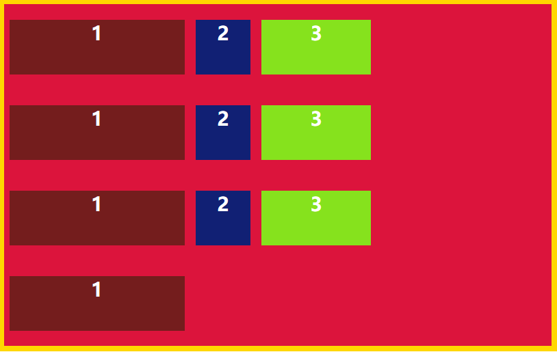
order | You can sort the child elements by size. The smaller the value, the higher the ranking. |
flex-grow | You can arrange the child elements in a certain proportion. If the values of the child elements are the same, the child elements will be arranged in an equal proportion. |
flex-shrink | If there is not enough space, you can use it to scale down the child elements |
flex-basis | It determines the size of the project in the spindle before the spindle allocates space. The browser will calculate its size based on the remaining space. |
flex-self | It can specify that an element is arranged differently from other elements. |
order
The parent container is flex When, the sub elements can be sorted through order. The smaller the value is, the top is arranged.
    <div class="main">
        <div class="son1">

        </div>
        <div class="son2">

        </div>
        <div class="son3">

        </div>
    </div>


<style>
.main{
    width: 400px;
    height: 300px;
    border-radius: 15px;
    display: flex;
    justify-items: center;
    align-items: center;
    background: lightseagreen;
    margin: auto;
    margin-top: 200px;
}
.son1{
    width: 80px;
    height: 100px;
    border-radius: 15px;
    margin: 10px;
    order: 1;
    background: coral;
}
.son2{
    width: 80px;
    height: 100px;
    border-radius: 15px;
    margin: 10px;
    order: 0.2;
    background: darkcyan;
}
.son3{
    width: 80px;
    height: 100px;
    border-radius: 15px;
    margin: 10px;
    order: 3;
    background: gold;
}
</style>
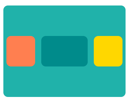
flex-grow
This attribute is used to specify that the child elements are proportionally sized in the parent container. If each item specifies the same proportion, the elements will be arranged evenly.
    <div class="main">
        <div class="son1">

        </div>
        <div class="son2">

        </div>
        <div class="son3">

        </div>
    </div>
<style>
.main{
width: 400px;
height: 300px;
border-radius: 15px;
display: flex;
justify-items: center;
align-items: center;
background: lightseagreen;
margin: auto;
margin-top: 200px;
}
.son1{
height: 100px;
border-radius: 15px;
margin: 10px;
flex-grow: 2;
background: coral;
}
.son2{
height: 100px;
border-radius: 15px;
margin: 10px;
flex-grow: 2;
background: darkcyan;
}
.son3{
height: 100px;
border-radius: 15px;
margin: 10px;
flex-grow: 2;
background: gold;
}
</style>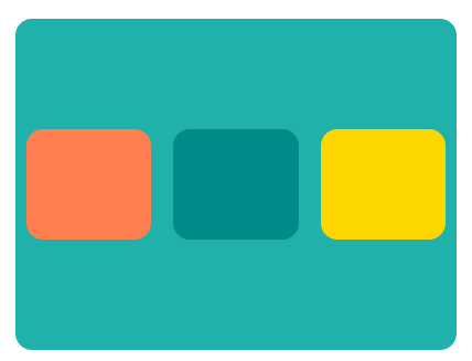
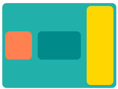
flex-shrink
This attribute is a scaled down sub element, which defaults to 1. When the spindle space is insufficient, it will be scaled down.
<style>
.main{
    width: 400px;
    height: 300px;
    border-radius: 15px;
    display: flex;
    justify-items: center;
    align-items: center;
    background: lightseagreen;
    margin: auto;
    margin-top: 200px;
}
.son1{
    width: 200px;
    height: 100px;
    border-radius: 15px;
    margin: 10px;
    /* Scale down by 5 */
    flex-shrink: 5;
    background: coral;
}
.son2{
    width: 160px;
    height: 100px;
    border-radius: 15px;
    margin: 10px;
    background: darkcyan;
}
.son3{
    width: 160px;
    height: 100px;
    border-radius: 15px;
    margin: 10px;
    background: gold;
}
</style>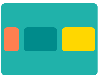
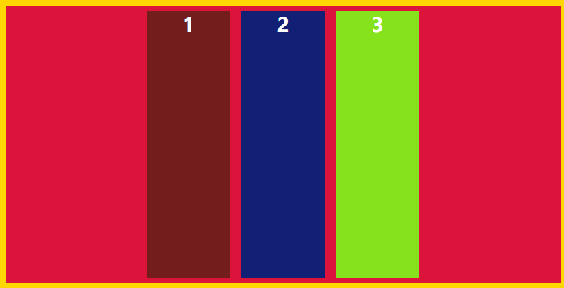
flex-basis
This attribute defines the spindle space occupied by the project before allocating excess space. Based on this attribute, the browser calculates whether the spindle has excess space. Its default value is auto, which is the original size of the project.
.son1{
    /* The specified width has no effect. Flex basis determines how much width occupies the spindle,
    The browser calculates how much width the spindle has based on the remaining width */
    width: 300px;
    height: 100px;
    border-radius: 15px;
    margin: 10px;
    flex-basis: 100px;
    background: coral;
}
.son2{
    width: 160px;
    height: 100px;
    border-radius: 15px;
    margin: 10px;
    background: darkcyan;
}
.son3{
    height: 100px;
    border-radius: 15px;
    margin: 10px;
    flex-basis: 100px;
    background: gold;
}
flex-self
This attribute allows a single element to be arranged differently from other elements, overriding the align items of the parent element
Value:
Flex start left alignment Align right flex Center center Baseline aligns the baseline of the first line of text of the baseline item. stretch if the item is not set to height or set to auto, it will occupy the height of the whole container.
.son3{
    border-radius: 15px;
    margin: 10px;
    flex-basis: 100px;
    background: gold;
    align-self: stretch;
}
Common layout
Full screen layout
The global layout consists of top, main body and bottom. Generally, the height of the top and bottom is fixed, and the main body is adaptive, so as to realize the full screen layout.
You can use semantic tags, such as header and main footer
Next, the effect of full screen layout is achieved through Flex layout.
Set a container on the outermost layer and assign display: flex to the container; In the container, it refers to the arrangement of sub elements, flex direction: column; For the top and bottom heights, the main body uses the flex: 1 scale to achieve adaptation.
Flex is the abbreviation of flex grow, flex shrink and flex basis
Flex growth attribute: defines the magnification of the project. The default value is 0. That is, if there is remaining space, it will not be enlarged. Flex shrink attribute: defines the reduction scale of the item. The default value is 1. That is, if there is insufficient space, the item will be reduced. Flex basis attribute: defines the main size occupied by the project before allocating excess space. Based on this attribute, the browser calculates whether the spindle has excess space. Its default value is auto, which is the original size of the project.
    <div class="full">
        <header>Navigation</header>
        <main>Main content</main>
        <footer>bottom</footer>
    </div>
*{
margin: 0;
padding: 0;
}
.full{
width: 100%;
height: 100vh;
display: flex;
flex-direction: column;
}
header{
height: 60px;
font-weight: 900;
color: white;
text-align: center;
background: darkcyan;
}
main{
flex: 1;
align-items: center;
font-weight: 900;
color: white;
text-align: center;
background:orange;
}
footer{
height: 60px;
font-weight: 900;
color: white;
text-align: center;
background: rgb(48, 40, 163);
}
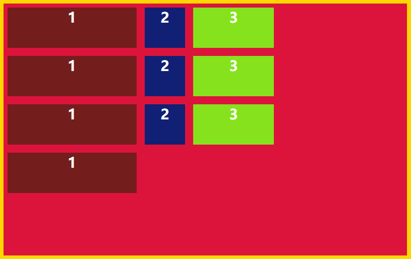
Two column layout
The most classic system management layout, two column layout It is mainly composed of two columns with fixed height, the left end specifies the width, and the right end achieves adaptive width through flex:1.
    <div class="full">
        <div class="left">

        </div>
        <div class="right">

        </div>
    </div>
*{
margin: 0;
padding: 0;
}
.full{
width: 100%;
height: 100vh;
display: flex;
flex-wrap: wrap;
}
.left{
width: 200px;
height: 100vh;
background: rgb(0, 140, 255);
}
.right{
flex:1;
height: 100vh;
background: rgb(158, 159, 160);
}
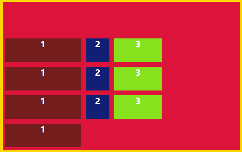
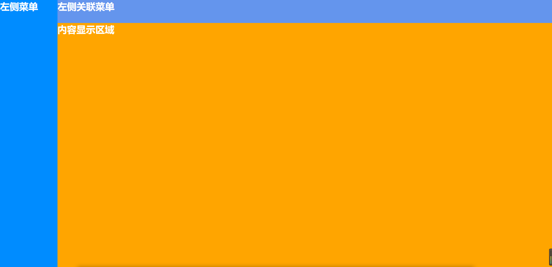
Background system layout
When I write the background, the layout page will also have this layout in addition to the two column layout. I call it the background system layout 🤣.
Its features: it is actually a two column layout, but it is divided into two parts at the right end: the top and the main body. Some menus associated with clicking the menu on the left will be placed at the top, and the main body will place the contents displayed by clicking the menu
How to layout
It is basically the same as the two column layout, except that it is displayed differently at the right end The right end is divided into the main body and the top. The top is fixed in height. The main body is adaptive through flex:1 The right end container passes the flex direction: column; Specifies that the child elements are arranged on a cross axis (vertical axis).
    <div class="full">
        <div class="left">

        </div>
        <div class="right">
            <div class="right-head">

            </div>
            <div class="right-main">

            </div>
        </div>
    </div>
*{
margin: 0;
padding: 0;
}
.full{
width: 100%;
height: 100vh;
display: flex;
/* flex-wrap: wrap; */
}
.left{
width: 200px;
height: 100vh;
background: rgb(0, 140, 255);
}
.right{
height: 100vh;
display: flex;
flex:1;
flex-direction: column;
background: rgb(158, 159, 160);
}
.right-head{
height: 80px;
background: cornflowerblue;
}
.right-main{
flex: 1;
background: orange;
}
Centered layout
Central layout is often used in our daily page writing, and there are many scenes, eg: login, pop-up Dialog
Here, I use flex to realize the central layout. Flex is more concise. Other implementation methods are not discussed here.
How to layout
By covering the entire screen with 100% of the width and height of the parent container, If the parent container display is flex, use justify content: Center; Determine how the child elements are displayed in the direction of the main axis through align items: Center; To determine how child elements are displayed on the cross axis (vertical axis). The sub container only needs to specify width and · height.
    <div class="full">
        <div class="login">
            land
        </div>
    </div>
*{
margin: 0;
padding: 0;
}
.full{
width: 100%;
height: 100vh;
background: rgb(0, 110, 255);
display: flex;
justify-content: center;
align-items: center;
}
.login{
width: 500px;
height: 400px;
line-height: 400px;
text-align: center;
border-radius: 15px;
background: rgb(70, 25, 129);
color: white;
font-size: 33px;
font-weight: 900;
}
Waterfall flow layout
Waterfall flow layout is often used in our current front-end pages. It can effectively reduce the complexity of the page and save a lot of space. For the whole page, there is no need for too many operations. You only need to pull down to browse the data that users need to see; Moreover, in the current era of APP supremacy, waterfall flow can provide a good user experience. By combining pull-down refresh and pull-up loading for lazy loading of data, it is close to full marks for the user's sense of experience!
Characteristics of waterfall flow:
The height is displayed by dynamically recognizing the height of the image. It will calculate the width of the current screen to display the corresponding number. If a row is full, it will find the one with the lowest height of the first row, continue to arrange the second row, and so on.
Implementation method
CSS implementation method: column count + column gap to achieve the column arrangement and the spacing between each item, but it has disadvantages. It fixes the dead column and cannot dynamically change the column with the dynamic change of the browser width. JS implementation method: fix the width of the dead picture, place the picture into an array, the browser judges how many items are currently displayed according to the dynamic recognition width, then traverse the array, place the url in src, pull down and refresh the data, call back the request data interface, and push it into the array to realize the pull-down request data.
This paper adopts CSS implementation. In order to save time in development, you can use library to implement it.
<div class="container">
    <div class="waterFall">
      <div class="item">
        <img src="https://ss0.bdstatic.com/70cFuHSh_Q1YnxGkpoWK1HF6hhy/it/u=1737312773,3182446833&fm=26&gp=0.jpg"
          alt="">
        <p>First</p>
      </div>
      <div class="item">
        <img src="https://ss3.bdstatic.com/70cFv8Sh_Q1YnxGkpoWK1HF6hhy/it/u=1875486819,805819368&fm=26&gp=0.jpg" alt="">
        <p>First</p>
      </div>
      <div class="item">
        <img src="https://ss2.bdstatic.com/70cFvnSh_Q1YnxGkpoWK1HF6hhy/it/u=35353288,1650949252&fm=26&gp=0.jpg" alt="">
        <p>First</p>
      </div>
      <div class="item">
        <img src="https://ss0.bdstatic.com/70cFvHSh_Q1YnxGkpoWK1HF6hhy/it/u=1474216128,3433531408&fm=26&gp=0.jpg"
          alt="">
        <p>First</p>
      </div>

      <div class="item">
        <img src="https://ss0.bdstatic.com/70cFuHSh_Q1YnxGkpoWK1HF6hhy/it/u=143483417,2871731501&fm=26&gp=0.jpg" alt="">
        <p>First</p>
      </div>
      <div class="item">
        <img src="https://ss0.bdstatic.com/70cFuHSh_Q1YnxGkpoWK1HF6hhy/it/u=1098989386,3642257866&fm=26&gp=0.jpg"
          alt="">
        <p>First</p>
      </div>
      <div class="item">
        <img src="https://ss2.bdstatic.com/70cFvnSh_Q1YnxGkpoWK1HF6hhy/it/u=1040129980,3013621150&fm=26&gp=0.jpg"
          alt="">
        <p>First</p>
      </div>
    </div>
  </div>
.container {
width: 80%;
margin: 0 auto;
}
.waterFall {
/* The page is displayed in several columns */
column-count: 4;
-webkit-column-count: 4;
/* Firfox */
-moz-column-count: 4;
/* */
/* Spacing between columns */
column-gap: 1em;
-webkit-column-gap: 1em;
-moz-column-gap: 1em;
}
.item {
padding: 1em;
margin: 0 0 1em 0;
border: 1px solid orange;
}
.item img {
width: 100%;
margin-bottom: 10px;
}summary
This paper mainly reviews the HTML layout to check the deficiencies and fill the gaps. The next chapter will supplement the BOM. I wish you all a good job!