The built-in component checkbox is required for the uni app form multi selector. See the link on the official website for details, as follows:
Checkbox - uni app official website (dcloud.io)
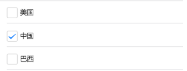
The official default style of h5 terminal is as follows:
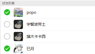
Now you need to change the style to this:
So we began to modify:
<checkbox-group @change="checkboxChange">
    <label class="radio">
	    <checkbox :value="item+''" class="checkbox"/>
	    <image :src="item.imgUrl" class="friend-avator"></image>
	    view class="friend-name">{{item.name}}</view>
	</label>
</checkbox-group>
......

<style scoped>
    .checkbox:active{
	    border: 2rpx solid #24c023 !important;
	    background-color: #24c023 !important;
	    color: #FFFFFF !important;
    }
    ......
<style>
The added style cannot achieve the final effect, even if it is added! The important modifier is still invalid.
Then it was found that since the checkbox is a built-in component, the style must be modified through the class name or id name in the checkbox component, so the built-in class name was found in the development tool
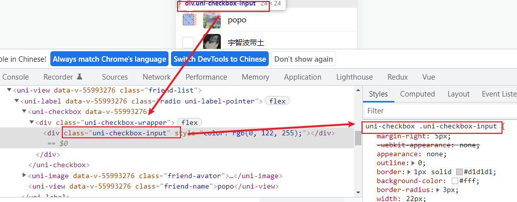
But it still can't be realized after modification
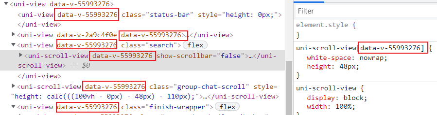
To solve this problem, first understand that after the scoped attribute is added to the style tag, all element tags of the current component will uniformly add a custom attribute such as data-v-xxxx. Finally, the browser will use this attribute to match the style for the attribute selector. The purpose is to prevent the current component from conflicting with duplicate class names of sub components or other components.
To be on the safe side, all the style tags here are decorated with the scoped attribute. Of course, if you don't worry about naming conflicts, you can completely avoid using the scoped attribute. Then you can solve the problem as long as you find the class name in the checkbox and modify it.
Therefore, when the scoped attribute exists, it is invalid to modify the style of the child component in the parent component directly through the class name of the child component. To achieve style penetration, you need to use the depth action selector and add > > > before the class name in the child component, as follows:
/* checkbox style */
>>> .uni-checkbox-input{
	margin-right: 0;
	border-radius: 50% ;
	border: 2rpx solid #828181 ;
}
/* Unchecked style */
>>> uni-checkbox:not([disabled]) .uni-checkbox-input:hover{
	border: 2rpx solid #828181;
}
/* Style when selected */
>>> uni-checkbox .uni-checkbox-input.uni-checkbox-input-checked{
	border: 2rpx solid #24c023 !important;
	background-color: #24c023 !important;
	color: #FFFFFF !important;
}
Style validation~~~
To sum up, depth action selector
Native css usage > > >
less use / deep/
sass uses: v-deep
But It's over???
emmm...... When you open the applet developer tool for debugging, you find that the style that takes effect in the browser does not take effect at all
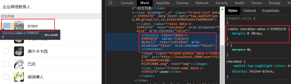
The audit element found that in the applet developer tool, the checkbox component is encapsulated by a black box. It is impossible to view the class name inside the component, that is, it is impossible to know whether the modified class name is effective.
Therefore, it is found that the actual internal class name of the checkbox component of the applet platform is inconsistent with that of the h5 side. Therefore, to be compatible with multiple platforms, two sets of styles need to be written. In the uni app, conditional comments can be used for cross segment compatibility. The following code is only effective on the applet side:
/* ifdef MP-WEIXIN */
/*checkbox Option box size  */
>>> checkbox .wx-checkbox-input {
  border-radius: 50% !important;
  /* background-color: #FFFFFF; */
  border: 2rpx solid #828181 !important;
}
/*checkbox Style when selected  */
>>> checkbox .wx-checkbox-input.wx-checkbox-input-checked {
  border: 2rpx solid #24c023 !important;
  background-color: #24c023 !important;
  color: #FFFFFF !important;
}
/*checkbox Icon style when selected  */
>>> checkbox .wx-checkbox-input.wx-checkbox-input-checked::before {
  color: #FFFFFF !important;
}
/* endif */
For conditional comments, you can view: Conditional compilation to solve the differences at each end - uni app official website (dcloud.io)