In recent days, hot spots around the Winter Olympics have emerged one after another. The audience flashed one strange, fresh and fun project after another, and the topic changed faster than the steel snowmobile. Naturally, Bing dwen dwen will be divided into several aspects: Gu Ailing's nationality, Su Yi Ming's score, and almost every fall and punishment in the short track speed skating competition. This is the debate and quarrel which is indispensable in every sports competition. Only the ice pier has become an exception.
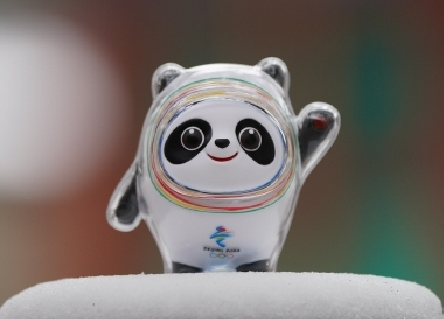
The official mascot of the 2022 Olympic Winter Games was held by all the people in Beijing and was really pursued by the whole world. Whether athletes, Bing dwen dwen, members of the media, media reporters or ordinary spectators are asking the same question: how can we get the ice Pier? Since you can't buy it, make one yourself. The code is not original. It comes from sister Qing. The link is at the bottom:
After Bing dwen dwen spent 3 or 4 hours, she drew an ice pier with css. In fact, html structure is very simple, mainly on css, and the most used ones are pseudo class, rounded corners and positioning. If interested, Bing dwen dwen, try to draw one yourself. If you use css3 animation and css3 color change, let the ice pier move up, the effect will be better.
demonstration:
Bing dwen dwen: https://www.talklee.com/bdd.html
Shuey Rhon Rhon: https://www.talklee.com/xrr.html
Bing dwen dwen html code:
<div class="bdd">
<div class="m_body"></div>
<div class="ear1"></div>
<div class="ear2"></div>
<div class="eye1"></div>
<div class="eye2"></div>
<div class="face c_blue"></div>
<div class="face c_red"></div>
<div class="face c_purple"></div>
<div class="face c_yellow"></div>
<div class="face c_green"></div>
<div class="nose"></div>
<div class="mouse"></div>
<div class="arm1"></div>
<div class="arm2"></div>
<div class="leg1"></div>
<div class="leg2"></div>
</div>
Bing dwen dwen css code:
* { margin: 0; padding: 0 }
body { font: 15px "Microsoft YaHei", Arial, Helvetica, sans-serif; background: #d4ebf1; color: #000; background-attachment: fixed; }
.bdd { position: absolute; left: 50%; top: 50%; width: 520px; height: 500px; margin-top: -250px; margin-left: -260px; }
.m_body {width: 362px;height: 410px;border: #393939 8px solid;margin: 50px auto;border-radius: 88% 88% 62% 68% / 82% 82% 95% 84%;position: absolute;left: 109px;top: -30px;background: #fff;}
.ear1, .ear2 {background: #393939;width: 81px;height: 115px;border-radius: 50%;position: absolute;z-index: -1;}
.ear1 {left: 150px;top: 26px;transform: rotate( -10deg );}
.ear2 {left: 362px;top: 28px;transform: rotate(10deg);}
.eye1, .eye2 {background: #393939;width: 83px;height: 115px;border-radius: 50%;position: absolute;}
.eye1 { left: 185px; top: 122px; transform: rotate(45deg); }
.eye2 { left: 329px; top: 122px; transform: rotate(-45deg); }
.eye1:before, .eye2:before { content: ""; width: 40px; height: 40px; border: #fff 5px solid; border-radius: 100%; position: absolute; }
.eye1:before { right: 10px; top: 22px; }
.eye2:before { left: 10px; top: 22px; }
.eye1:after, .eye2:after { content: ""; width: 10px; height: 10px; background: #9b9b9b; border-radius: 100%; position: absolute; }
.eye1:after { right: 27px; top: 31px; }
.eye2:after { left: 41px; top: 44px; }
.face {position: absolute;border-radius: 48% 48% 44% 49%/ 53% 54% 45% 47%;}
.c_blue { border: #6bcdf3 5px solid; width: 280px; height: 224px; left: 150px; top: 78px; }
.c_red { border: #af2350 5px solid; width: 287px; height: 233px; left: 146px; top: 73px; }
.c_purple { border: #5d75b3 5px solid; width: 295px; height: 240px; left: 142px; top: 70px; }
.c_yellow { border: #ffc346 5px solid; width: 305px; height: 248px; left: 137px; top: 65px; }
.c_green { border: #7fcb58 5px solid; width: 313px; height: 256px; left: 133px; top: 61px; }
.arm1, .arm2 { background: #333; position: absolute; z-index: -1; }
.arm1 {width: 75px;height: 118px;left: 64px;top: 244px;transform: rotate(45deg);border-radius: 24% 69% 68% 76%/ 53% 95% 40% 52%;}
.arm2 {width: 75px;height: 148px;left: 463px;top: 162px;transform: rotate(37deg);border-radius: 56% 62% 98% 6%/ 40% 46% 80% 58%;}
.arm2:before { content: ""; width: 16px; height: 24px; background: #bc242c; position: absolute; border-top-left-radius: 50%; border-top-right-radius: 50%; transform: rotate(45deg); left: 32px; top: 20px; }
.arm2:after { content: ""; width: 16px; height: 24px; background: #bc242c; position: absolute; border-top-left-radius: 50%; border-top-right-radius: 50%; transform: rotate(-45deg); left: 26px; top: 20px; }
.arm_c { content: ""; width: 16px; height: 24px; position: absolute; left: 426px; top: 20px; }
.nose{background-color: #333333; position: absolute;left: 284px;top: 187px;width: 28px;height: 18px;border-radius: 42px 42px 60px 61px/ 30px 30px 50px 46px;}
.mouse {position: absolute;left: 265px;top: 205px;width: 68px;height: 25px;border-radius: 48%;border: #393939 7px solid;border-top: none;border-left: 0;border-right: 0;}
.leg1, .leg2 {background: #333;position: absolute;width: 83px;height: 80px;border-radius: 0 0 30px 30px;z-index: -1;}
.leg1 { left: 187px; top: 423px; }
.leg2 { left: 328px; top: 423px; }
.leg1:after, .leg2:after { content: ""; width: 43px; height: 30px; position: absolute; background: #333; border-radius: 30px; }
.leg1:after { bottom: 0; right: -3px; }
.leg2:after { bottom: 0; left: -3px; }
Bing dwen dwen has been completed, Bing dwen dwen's love hands add a greeting (left or right) swing action:
.arm2 { animation:hi 2s infinite; }

@keyframes hi
{
0%{transform: rotate(37deg);}
50% {transform: rotate(44deg);}
100% {transform: rotate(37deg);}
}
Bing dwen dwen buddy Shuey Rhon Rhon Bing dwen dwen, Shuey Rhon Rhon, and the other, can directly copy the code of the demonstration station, copy and paste directly, and arrange the ice pier pier. Then arrange a small snow curtain of the ice pier pier. Snow Rong Rong is a red small lantern. It is much more difficult to use css to draw than the ice pier. Are irregular, lantern green sister is realized with multiple ellipses. Shuey Rhon Rhon is more time than Bing dwen dwen.
Shuey Rhon Rhon html code:
<div class="xrr">
<div class="cap">
<div class="cap1"></div>
<div class="cap2"></div>
<div class="cap3"></div>
<div class="cap4"></div>
<div class="cap5"></div>
<div class="cap6"></div>
<div class="cap7"></div>
<div class="cap8"></div>
</div>
<div class="snow">
<div class="snow1"></div>
<div class="snow2"></div>
<div class="snow3"></div>
<div class="snow4"></div>
<div class="snow5"></div>
<div class="snow6"></div>
<div class="snow7"></div>
<div class="snow8"></div>
<div class="snow9"></div>
<div class="snow10"></div>
</div>
<div class="x_head">
<div class="x_head_line1"></div>
<div class="x_head_line2"></div>
<div class="x_head_line3"></div>
<div class="x_head_line4"></div>
<div class="x_head_line5"></div>
</div>
<div class="x_face">
<div class="x_face1"></div>
<div class="x_face2"></div>
<div class="x_face3"></div>
<div class="x_face4"></div>
<div class="x_face5"></div>
<div class="x_face6"></div>
<div class="x_face7"></div>
<div class="x_face8"></div>
<div class="x_face9"></div>
</div>
<div class="x_eye1"></div>
<div class="x_eye2"></div>
<div class="rouge1"></div>
<div class="rouge2"></div>
<div class="x_body">
<div class="abdomen"></div>
</div>
<div class="scarf"></div>
<div class="scarf2">
<div class="line1"></div>
<div class="line2"></div>
<div class="line3"></div>
<div class="line4"></div>
</div>
<div class="x_arm1"></div>
<div class="x_arm2"></div>
<div class="x_leg1"></div>
<div class="x_leg2"></div>
</div>
<!--Shuey Rhon Rhon end-->
Shuey Rhon Rhon css code:
<style>
/*xrr*/
* { margin: 0; padding: 0 }
body { font: 15px "Microsoft YaHei", Arial, Helvetica, sans-serif; background: #d4ebf1; }
.xrr {position: absolute; left: 50%; top: 50%; width: 600px; height: 500px; margin-top: -250px; margin-left: -300px; }
.x_head { position: absolute; width: 366px; height: 297px; left: 97px; top: 63px; background: #d62b01; border: #b82b00 8px solid; border-radius: 166px; }
.x_head_line1, .x_head_line2, .x_head_line3 { position: absolute; background: #d62b01; border: #b82b00 4px solid; }
.x_head_line1 { width: 323px; height: 298px; border-radius: 50%; left: 15px; top: -7px; }
.x_head_line2 { width: 177px; height: 301px; border-radius: 59%; left: 90px; top: -7px; }
.x_head_line3 { width: 52px; height: 301px; border-radius: 80%; left: 163px; top: -3px; border-right: 0; border-top: 0; border-bottom: 0; }
.x_head_line4 { width: 311px; height: 30px; left: 21px; top: 26px; position: absolute; border: 6px solid #b82b00; border-radius: 50% 50% 0 0/100% 100% 0 0; border-bottom: none; }
.x_head_line5 { width: 284px; height: 74px; left: 41px; top: -3px; position: absolute; border: #d62b01 30px solid; border-radius: 50%; border-right: transparent; border-left: transparent; border-bottom: transparent; }
.cap1 { border: #f9ad47 6px solid; width: 32px; height: 12px; position: absolute; top: -8px; left: 268px; border-radius: 50% 50% 0 0/100% 100% 0 0; border-bottom: none; background: #fff; z-index: 6; }
.cap2 { border: #f9ad47 6px solid; width: 14px; height: 10px; position: absolute; top: 9px; left: 249px; border-radius: 50% 50% 0 0/100% 100% 0 0; border-bottom: none; transform: rotate(-89deg); background: #fff; z-index: 5; }
.cap3 { border: #f9ad47 6px solid; width: 14px; height: 10px; position: absolute; top: 9px; left: 303px; border-radius: 50% 50% 0 0/100% 100% 0 0; border-bottom: none; transform: rotate(89deg); background: #fff; z-index: 5; }
.cap4 { position: absolute; top: 20px; left: 264px; width: 5px; height: 5px; border: 6px solid #f9ad47; border-color: #f9ad47; border-left-color: transparent; border-radius: 50%; z-index: 4; transform: rotate(45deg); background: #fff; }
.cap5 { position: absolute; top: 20px; left: 297px; width: 5px; height: 5px; border: 6px solid #f9ad47; border-color: #f9ad47; border-left-color: transparent; border-radius: 50%; z-index: 4; transform: rotate(137deg); background: #fff; }
.cap6 { border: #f9ad47 6px solid; width: 4px; height: 1px; position: absolute; top: 26px; left: 276px; border-radius: 0 0 50% 50%/0 0 100% 100%; border-top: none; transform: rotate(346deg); z-index: 5; }
.cap7 { border: #f9ad47 6px solid; width: 4px; height: 1px; position: absolute; top: 26px; left: 286px; border-radius: 0 0 50% 50%/0 0 100% 100%; border-top: none; transform: rotate(14deg); z-index: 5; }
.cap8 { content: ""; position: absolute; background: #fff; width: 53px; height: 26px; border-radius: 30px; left: 265px; top: 5px; }
.x_body { background: #d62b01; border: #ba2b00 8px solid; width: 156px; height: 116px; border-radius: 10% 10% 40% 52% / 10% 21% 44% 47%; position: absolute; top: 364px; left: 207px; z-index: 2; }
.x_body:before {content: "";width: 90px;height: 84px;background: url(../skin/html/bdd/logo.png) no-repeat center #fff;background-size: 44px;position: absolute;border-radius: 100%;left: 37px;top: 23px;}
.x_arm1, .x_arm2 { background: #d62b01; border: #ba2b00 6px solid; width: 45px; height: 83px; position: absolute; z-index: 1; }
.x_arm1 { top: 346px; left: 160px; border-radius: 50% 50% 40% 65% / 30% 30% 52% 72%; transform: rotate(-45deg); }
.x_arm2 { top: 364px; left: 357px; border-radius: 46% 39% 56% 65% / 30% 57% 47% 44%; transform: rotate( 321deg ); }
.x_leg1, .x_leg2 { background: #d62b01; border: #ba2b00 6px solid; width: 46px; height: 59px; position: absolute; z-index: 1; border-radius: 0% 0% 50% 50% / 0% 32% 40% 50%; }
.x_leg1 { top: 465px; left: 233px; }
.x_leg2 { top: 465px; left: 303px; }
.x_leg1:before, .x_leg2:before { content: ""; position: absolute; left: 11px; bottom: 3px; width: 57%; height: 5px; border-radius: 0% 0% 50% 50% / 0% 32% 40% 50%; border: #ffc346 6px solid; border-top: none; border-left: 0; border-right: 0; }
.scarf { position: absolute; left: 212px; top: 360px; background: #f8a644; width: 163px; height: 34px; border-radius: 15px 19px 51px 51px/17px 16px 24px 17px; z-index: 2 }
.scarf2 { position: absolute; left: 223px; top: 374px; background: #f8a644; width: 44px; height: 77px; border-radius: 0 0 12px 5px; transform: rotate(18deg); z-index: 2; }
.line1, .line2, .line3, .line4 { background: #f8a644; position: absolute; width: 4px; height: 16px; border-radius: 0 0 10px 10px; border: #d62b01 4px solid; border-top: 0; }
.line1 { left: 5px; top: 62px; }
.line2 { left: 13px; top: 61px; }
.line3 { left: 21px; top: 60px; }
.line4 { left: 28px; top: 59px; }
.rouge1, .rouge2 { width: 42px; height: 37px; position: absolute; background: #e95535; border-radius: 40px; }
.rouge1 { left: 162px; top: 225px; }
.rouge2 { left: 364px; top: 230px; }
.x_eye1, .x_eye2 { width: 21px; height: 28px; position: absolute; background: #3d3d3d; border-radius: 89% 100% 90% 90% / 100% 100% 86% 100%; }
.x_eye1 { left: 221px; top: 210px; }
.x_eye2 { left: 333px; top: 210px; }
.x_eye1:before, .x_eye2:before { content: ""; position: absolute; left: 5px; top: 5px; width: 6px; height: 8px; border-radius: 10px; background: #fff; transform: rotate(21deg); }
.x_face { width: 282px; height: 160px; position: absolute; left: 146px; top: 139px; border-radius: 80px 80px 20px 40px; }
.x_face1, .x_face2, .x_face3, .x_face4, .x_face5, .x_face6, .x_face7, .x_face8 { border: #b92c00 6px solid; border-radius: 50%; border-right: transparent; border-left: transparent; border-top: transparent; background: #fff; position: absolute; }
.x_face1 { width: 78px; height: 87px; left: 10px; top: 50px; transform: rotate(58deg); }
.x_face2 { width: 73px; height: 55px; left: 120px; top: -3px; transform: rotate(29deg); border: #b92c00 6px solid; border-radius: 50% 50% 0 0/100% 100% 0 0; border-bottom: none; }
.x_face3 { width: 72px; height: 78px; left: 204px; top: 33px; transform: rotate(322deg); border-radius: 0 100% 100% 0/50%; border: #b92c00 6px solid; border-left: none; }
.x_face4 { width: 81px; height: 85px; left: 64px; top: 3px; transform: rotate(165deg); }
.x_face5 { width: 73px; height: 69px; left: 19px; top: 33px; transform: rotate(137deg); }
.x_face6 { width: 49px; height: 67px; left: 218px; top: 79px; transform: rotate(303deg); }
.x_face7 { width: 188px; height: 74px; left: 51px; top: 82px; }
.x_face8 { width: 29px; height: 13px; left: 182px; top: 33px; transform: rotate(38deg); z-index: 2; background: none; border: 6px solid #b92c00; border-radius: 0 0 50% 50%/0 0 100% 100%; border-top: none; }
.x_face8:after { content: ""; width: 29px; height: 13px; right: -6px; top: -12px; position: absolute; border: 6px solid #b92c00; border-left-color: transparent; border-right-color: transparent; border-bottom-color: #d62b01; border-top-color: transparent; border-radius: 0 0 50% 50%/0 0 100% 100%; }
.x_face9 { width: 170px; height: 119px; background: #ffffff; left: 40px; top: 19px; border-radius: 100%; position: absolute; }
.x_face9:before { content: ""; background: #ffffff; border-radius: 100%; right: -14px; top: 31px; width: 35px; height: 37px; position: absolute; transform: rotate(30deg); }
.snow1 { width: 105px; height: 16px; transform: rotate(341deg); left: 147px; top: 57px; position: absolute; z-index: 3; border: 6px solid #83b9e8; border-radius: 50% 50% 0 0/100% 100% 0 0; border-bottom: none; background: #fff; border-right: 0; }
.snow2 { position: absolute; width: 78px; height: 20px; left: 243px; top: 29px; z-index: 2; background: #fff; border: 6px solid #83b9e8; border-radius: 50% 50% 0 0/100% 100% 0 0; border-bottom: none; }
.snow2:after { content: ""; width: 80px; height: 16px; background: #ffffff; position: absolute; border-radius: 10px; top: 13px; left: -1px; }
.snow3 { position: absolute; width: 44px; height: 13px; left: 228px; top: 63px; z-index: 2; background: #fff; border: 6px solid #83b9e8; border-radius: 0 0 50% 50%/0 0 100% 100%; border-top: none; border-left: 0; border-right: 0; }
.snow4 { position: absolute; width: 42px; height: 11px; left: 268px; top: 58px; z-index: 3; background: none; border: 6px solid #83b9e8; border-radius: 50% 50% 0 0/100% 100% 0 0; border-bottom: none; transform: rotate(4deg); border-left: 0; border-right: 0; }
.snow5 { position: absolute; width: 41px; height: 15px; left: 300px; top: 56px; z-index: 2; background: #fff; border: 6px solid #83b9e8; border-radius: 0 0 50% 50%/0 0 100% 100%; border-top: none; transform: rotate(359deg); border-right: 0; border-left: 0; }
.snow6 { background: none; border: 6px solid #83b9e8; position: absolute; left: 150px; top: 72px; width: 62px; height: 14px; border-radius: 24px; transform: rotate(340deg); z-index: 2; border-top: 0; border-right: 0; border-left: 0; }
.snow7 { border: 6px solid #83b9e8; position: absolute; left: 362px; top: 69px; width: 58px; height: 13px; border-radius: 24px; transform: rotate(23deg); z-index: 3; border-top: 0; border-left: 0; border-right: 0; }
.snow8 { position: absolute; width: 32px; height: 6px; left: 203px; top: 69px; z-index: 4; background: none; border: 6px solid #83b9e8; border-radius: 50% 50% 0 0/100% 100% 0 0; border-bottom: none; border-right: 0; transform: rotate(357deg); }
.snow9 { position: absolute; width: 40px; height: 4px; left: 332px; top: 65px; z-index: 4; background: none; border: 6px solid #83b9e8; border-radius: 50% 50% 0 0/100% 100% 0 0; border-bottom: none; transform: rotate(16deg); border-left: 0; border-right: 0; }
.snow10 { width: 97px; height: 16px; transform: rotate(21deg); left: 320px; top: 54px; position: absolute; z-index: 3; border: 6px solid #83b9e8; border-radius: 50% 50% 0 0/100% 100% 0 0; border-bottom: none; background: #fff; border-left: 0; }
</style>
Similarly, the Shuey Rhon Rhon that wants to give snow to melt adds a greeting (left or right) swing action:
.x_arm1 {animation:hi 2s infinite;}

@keyframes hi
{
0%{transform: rotate(-37deg);}
50% {transform: rotate(-44deg);}
100% {transform: rotate(-37deg);}
}
So far, the code has been completed. The code of greeting can be added as needed, and the swing time and action can be modified. Please study it yourself. Finally, thank sister Qing again for her selfless dedication and tribute!!!
PS: the code is only for learning and communication, and it is strictly prohibited to be used for commercial purposes.