I haven't opened my blog for a long time. I found that my previous blog had a certain number of views. I was surprised and felt that blogging was very meaningful.
Let's talk about html related knowledge today
1. Two box models
As we all know, the element in our page is a box, which has width, height, border, padding and margin.
Calculation of box model width
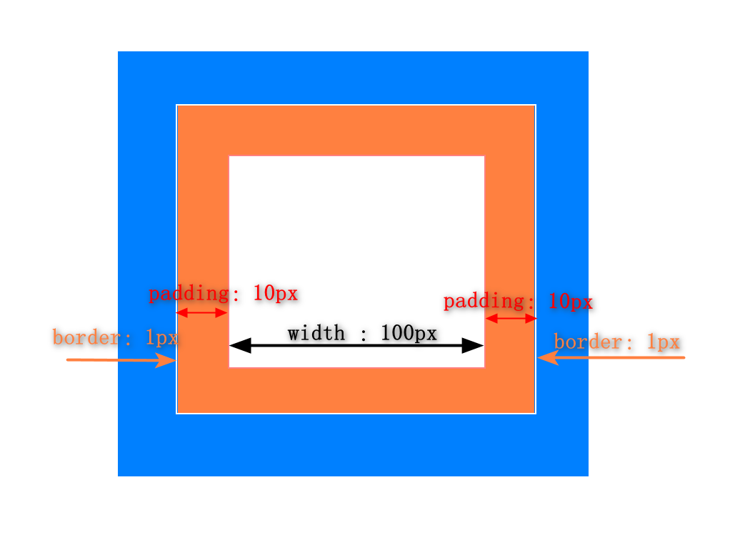
Ordinary box model
Total width of box: offsetwidth = width + padding left + padding right + border left + border right;
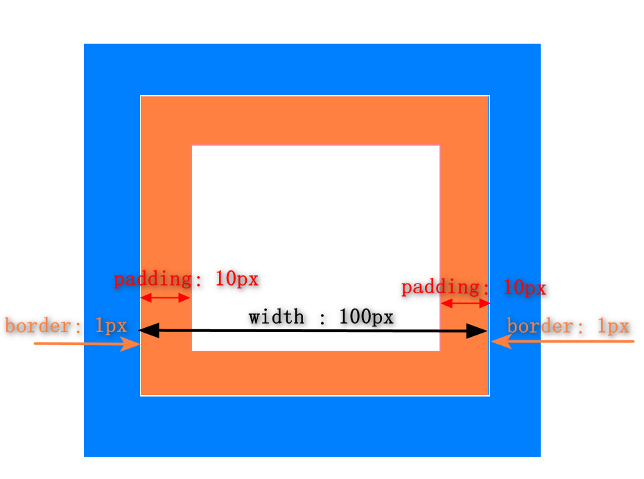
Weird box model
Weird box model is that the border and inner margin are included in the width, such as setting
p{
	box-sizing:border-box;
	width:100px;
	border:1px;
	padding:10px;
}
Then, after this setting, the value of the real width is (100-10-10-1-1)px=78px;
Set: box sizing: border box in the css statement of an element; You can set the box as a weird box.
The total width of the box is offset width (100px) = width (78px) + padding left + padding right + border left + border right.
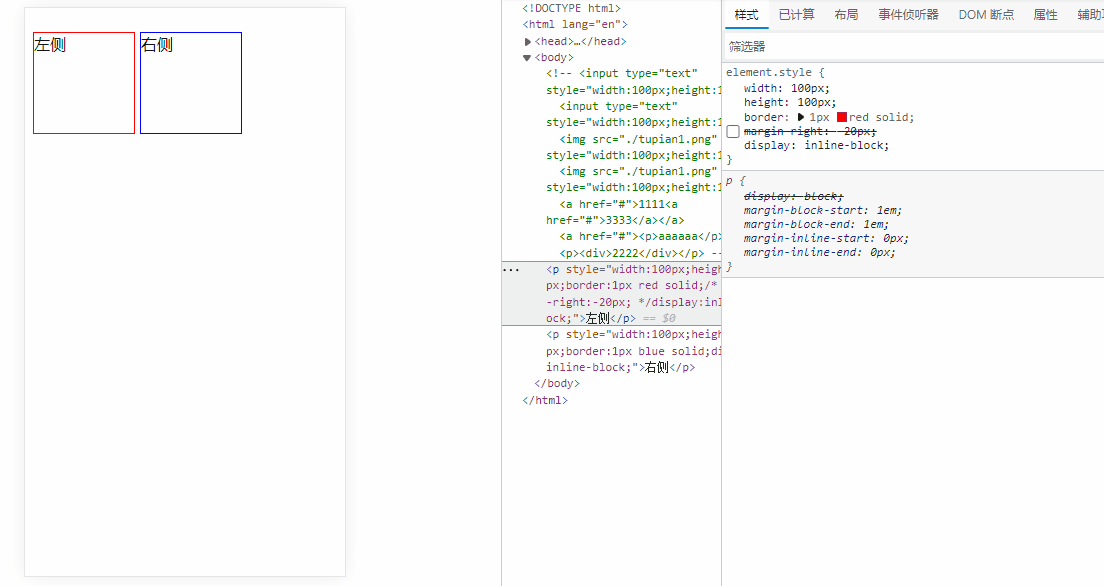
2. Block level labels, inline labels, and inline block elements
Block level label
The feature of block level elements is that they occupy a single line and exclude other elements from being in the same line. width, height, padding, border and margin can be set.
have
p element, h1-h6 element, div, ol, li, ul, etc
Inline label
Inline tags are also called inline tags. They can share a line with other inline elements in the browser. They will be displayed on a new line only when the total width of multiple elements is greater than the width of the browser.
yes:
span,a,input,strong,b,i
Inline block element
In line block elements occupy one line with other in line elements or in line block elements in the browser. Only when the total width of multiple elements is greater than the width of the browser will they be displayed on a new line.
Including: img, input
  <input type="text" style="width:100px;height:100px">
  <input type="text" style="width:100px;height:100px">
  <img src="./tupian1.png" style="width:100px;height:100px">
  <img src="./tupian1.png" style="width:100px;height:100px">
``
Nesting rules between elements
- Block level elements can nest block level elements, inline elements and inline block elements
- Inline elements can nest block level elements, inline elements and inline block elements
- A element cannot be nested with a element
- Partial block level elements: block level elements cannot be nested, only inline elements can be nested, such as p, h1~h6
For example, if a block level element is embedded in the p element, the browser can display 2222 normally without error. For example, if a tag is nested in a tag, 1111 and 3333 can be displayed normally. In fact, in these two cases, the browser parses the wrong code correctly
<p><div>2222</div></p>
<a href="#">1111<a href="#">3333</a></a>
Resolve as
<div>2222</div>
<p></p>
<a href="#">1111</a>
<a href="#">3333</a>
With the previous knowledge, you must know that html5 has added many semantic tags. Let's take a look
3. New semantic tags in html5
My personal understanding of semantic tags is that in order to reduce the use of tags without practical significance, such as div and span, semantic tags have more rich meanings, which means that browsers can well present content structure and code structure without css.
There are header, nav, article, section, aside and footer
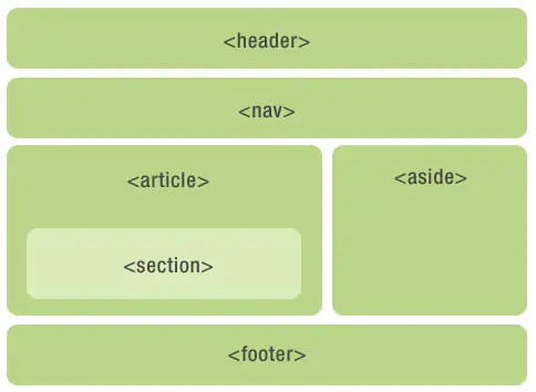
Advantages of semantic tags:
- The browser can well present the content structure and code structure without css
- It has richer meanings than div and span and is convenient for maintenance
- It is conducive to the search engine to recognize the structure of the page and SEO
- Facilitate the analysis of other devices (such as mobile terminal and blind reader)
- Conducive to cooperation and abide by w3c principles
4. margin vertical overlap problem
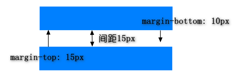
After understanding the basic elements, we will find that the outer margins of the upper and lower block level element boxes overlap. The calculation method of the outer margins is as follows:
- If both margin bottom and margin top are greater than 0, the largest of the two will be taken
- If one of the margin bottom and margin top is greater than 0 and the other is less than 0, take the sum of the two
- If both margin bottom and margin top are less than 0, then take the sum of the two
Negative margin problem
- Margin top and bottom left are negative values, and the element will move up or left
- Margin right is a negative value. The element on the right will move to the left without moving itself
- Margin bottom is a negative value. The lower element moves up and does not move itself.
5, BFC
-
Block Format Context: block level format context
-
An independent rendering area. The rendering of internal elements will not affect elements outside the boundary
-
Conditions for forming BFC:
1. Set float to left and right
2. position is set to absolute and fixed
3. overflow is set to hidden, scroll and auto
4. Set display to flex or inline block -
application
Clear float
6,float
First of all, let's look at the two applications of float. Use float to realize the Holy Grail layout and double flying wing layout
characteristic:
- Realize the three column layout of PC end, and the middle column is rendered first
- The width of both sides is fixed and the middle is adaptive
- design sketch
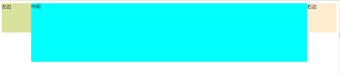
Grail layout
Idea: the middle column is rendered first, then the middle box is above the left box, and the basic layout is completed. Then, in order to prevent the contents in the middle from being overwritten, set padding left and padding right for the container. Then move the left box to the left by the distance of the width of the middle box. At this time, the left box moves to the far left of the middle box, and then translate the distance of the padding left value through relative positioning. The box on the right moves the distance of its own width to the left, and then moves the padding right distance to the right through relative positioning.
  <div class="container">
    <div class="middle">middle</div>
    <div class="left">left</div>
    <div class="right">right</div>
  </div>
  <style>
    /* The middle box is rendered first, so the middle box is before the left box, the outermost box container sets the inner margin, and the middle, left and right boxes float
    If the middle box does not float, the middle box will monopolize one line, so the left box will only move to the left of the browser and will not want to go up*/
    .container{
      padding:0 100px;
      background-color: #ddd;
    }
    .left {
      position: relative;
      width: 100px;
      height: 100px;
      /* Set left float */
      float: left;
      background-color: rgb(216, 226, 156);
      /* The left box moves the width of the middle box to the left, and now moves to the leftmost end of the middle box*/
      margin-left: -100%;
      /* Then translate the left box to the left and the width of the inner margin */
      left: -100px;
    }
    .right {
      position:relative;
      width: 100px;
      height: 100px;
      float: left;
      background-color: blanchedalmond;
      /* Move width left */
      margin-left:-100px;
      /* Move paddin g width to the right */
      left:100px;
    }
    .middle {
      width: 100%;
      height: 200px;
      float: left;
      background-color: aqua;
    }
  </style>
Dual wing layout
Idea:
- The middle box is written in front of the left box and wrapped with a layer of box container
- The middle of the middle box sets the left and right outer margins
- left, right, container all float
- Left box moves the box width of the container to the left
- The right box moves the width of margin right to the left
  <div class="container">
    <div class="middle">middle</div>
  </div>
    <div class="left">left</div>
    <div class="right">right</div>
  <style>
    /* The middle box is rendered first, so the middle box is before the left box, the outermost box container sets the inner margin, and the middle, left and right boxes float
    If the middle box does not float, the middle box will monopolize one line, so the left box will only move to the left of the browser and will not want to go up*/
    .left {
      width: 100px;
      height: 100px;
      /* Set left float */
      float: left;
      background-color: rgb(216, 226, 156);
      /* The left box moves the width of the middle box to the left. At this time, it moves to the leftmost end of the middle box container*/
      margin-left: -100%;
    }
    .right {
      width: 100px;
      height: 100px;
      float: left;
      background-color: blanchedalmond;
      /* Move padding width to the left */
      margin-left:-100px;
    }
    .container{
      width: 100%;
      float:left;
    }
    .middle{
      margin:0 100px;
      background-color: aqua;
      height: 200px;
    }
  </style>
Clear float
There are several methods to clear floating:
-
Additional labeling method
Add an element Clearfix under the required box, and then clearfix{float:both} -
Given height of outer box
-
The parent elements also float together
-
The parent element defines overflow:hidden or overflow:auto to trigger BFC
    .clearfix{
      height:200px;
      /* zoom:1; */
      /*overflow:hidden;*/
      overflow:auto;
    }
- The parent element defines pseudo elements:: after and zoom (this method is recommended)
.clearfix:after{
      display:block;
      clear:both;
      content:"";
      visibility: hidden;
      height:0px;
    }
    //Compatible with lower versions
    .clearfix{
      zoom:1
    }
7. flex layout
Basic understanding of flex
-
Element structure: child elements are arranged in the container, and the container is set with display: flex;
-
Layout idea:
-Set the spindle direction to control the arrangement direction of sub elements
-Set container related attributes to control the layout of child elements
-Set the related attributes of child elements and control the layout of child elements -
Container style properties
- flex-direction
- justify-content: flex-start/flex-end/space-between/space-around/center
-Align items (for single line of child elements): Flex start / flex end / space between / space around / Center
-Align content (applicable when the child element is multi line)
- flow-wrap :nowrap/wrap-reverse -
Child element style
- flex
- order
- align-self
Realize three points of dice
Insert code slice here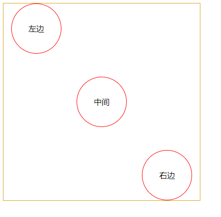
  <div class="container">
    <div class="left">left</div>
    <div class="middle">middle</div>
    <div class="right">right</div>
  </div>
</body>
    .container{
      display:flex;
      flex-direction: row;
      justify-content: space-around;
      width:400px;
      height:400px;
      border:1px goldenrod solid;
    }
    .middle,.left,.right{
      width:100px;
      height:100px;
      border-radius: 100%;
      border:1px solid red;
      text-align: center;
      line-height: 100px;
    }
    .middle{
      align-self:center;
    }
    .right{
      align-self:flex-end;
    }
  </style>
8. Element centered
Positioning review
- relative positioning
- absolute is located according to the location element of the nearest layer
-The positioning element is set to relative, absolute and fixed
-If the nearest element cannot be found, it is relative to the body
In line elements are centered horizontally and vertically
-
horizontally
- text-align: center
-
Vertical center
- Line height: box height (one line content)
- Line height: set the line height (1 / 2 /...)
Block level elements are horizontally and vertically centered
-
horizontally
margin:0 auto; (provided that the box defines the width value) -
Horizontal vertical center
-
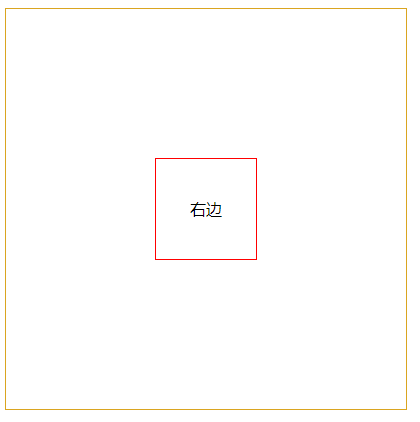
posiiton:absolute;top:50%;left:50%;transform:(-50%,-50%);
-
position:absolute;top:0;left:0;bottom:0;right:0;maigin:auto;// To set width and height
  <div class="container">
    <div class="right">right</div>
  </div>

      .container{
      posiiton:relative;
      width:400px;
      height:400px;
      border:1px goldenrod solid;
      }
    .right{
      position:absolute;
      top:0;
      left:0;
      bottom:0;
      right:0px;
      margin:auto;
      width:100px;
      height:100px;
      border:1px red solid;
      text-align:center;
      line-height:100px;
    }
-
Use flex to center horizontally and vertically
display:flex;justify-content:center;align-item:center; -
Use table to center horizontally and vertically
Parent box: display:: table cell; text-align:center; vertical-align:middle;
Child element: display: inline block;
    .container{
      display:table-cell;
      width:400px;
      height:400px;
      border:1px goldenrod solid;
      text-align:center;
      vertical-align: middle;
    }
    .right{
      display:inline-block;
      width:100px;
      height:100px;
      border:1px red solid;
      text-align:center;
      line-height:100px;
    }
   <div class="container">
    <div class="right">right</div>
  </div>
9. Style unit
- em: unit relative to its own font size
- rem: unit relative to the font size of html tag
- VH: unit relative to viewport height, 20vh = = viewport height / 100 * 20
- VW: unit relative to viewport width, 20vw = = viewport width / 100 * 20