1. Introduction to echarts
Previously Baidu echart (echarts.baidu.com), but now ECharts are hatching at the Apache Open Source Foundation, so the domain name (echarts.baidu.com) is no longer in use. Visit echarts.apache.org.
ECharts, an open source visualization library using JavaScript, runs smoothly on PC s and mobile devices, is compatible with most current browsers (IE8/9/10/11, Chrome, Firefox, Safari, etc.), and relies on the vector graphics library ZRender at the bottom to provide intuitive, interactive and highly customizable data visualization charts.
Don't talk too much now. Official address: https://echarts.apache.org/
2. Download, Install and Use of echarts
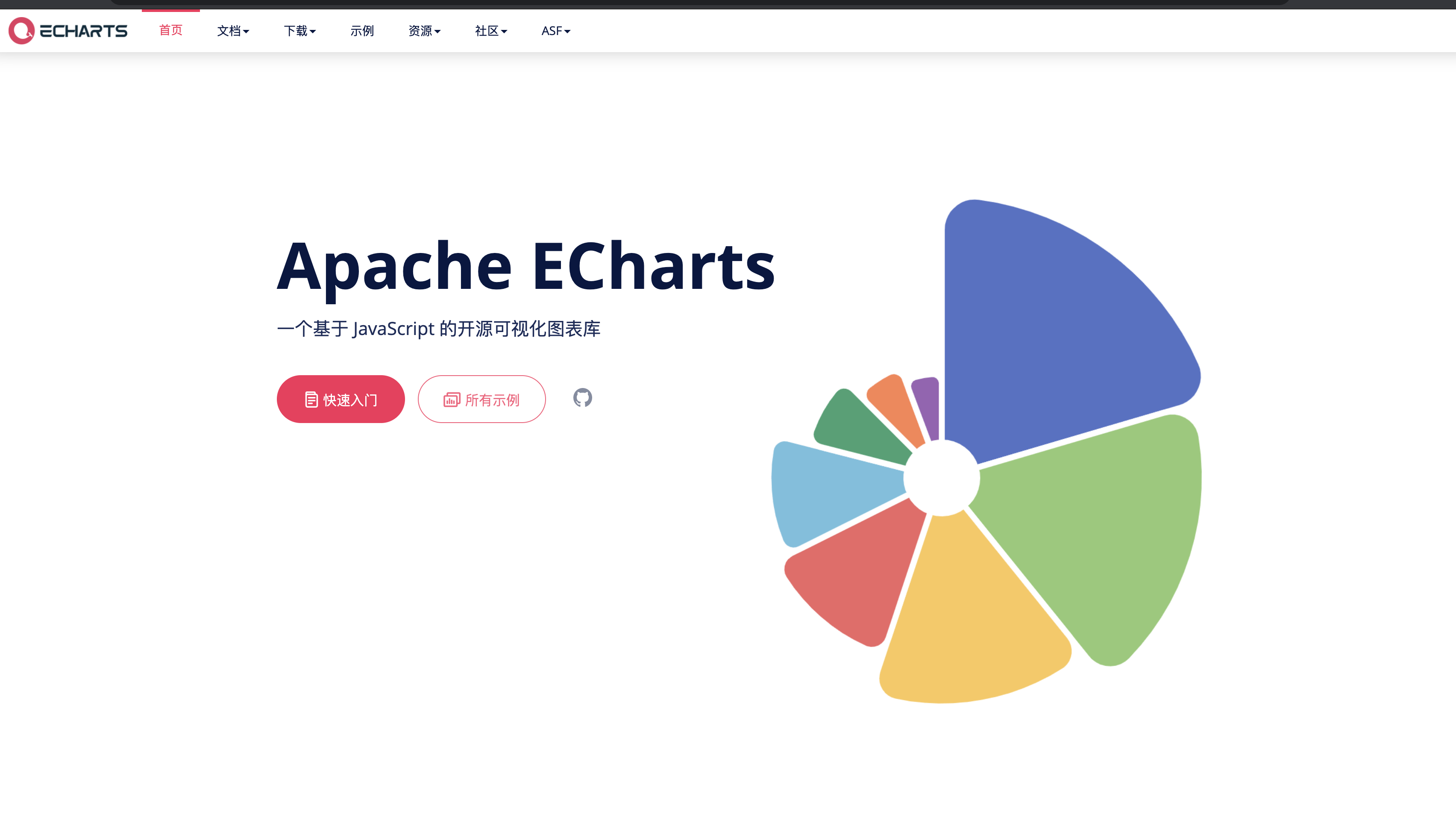
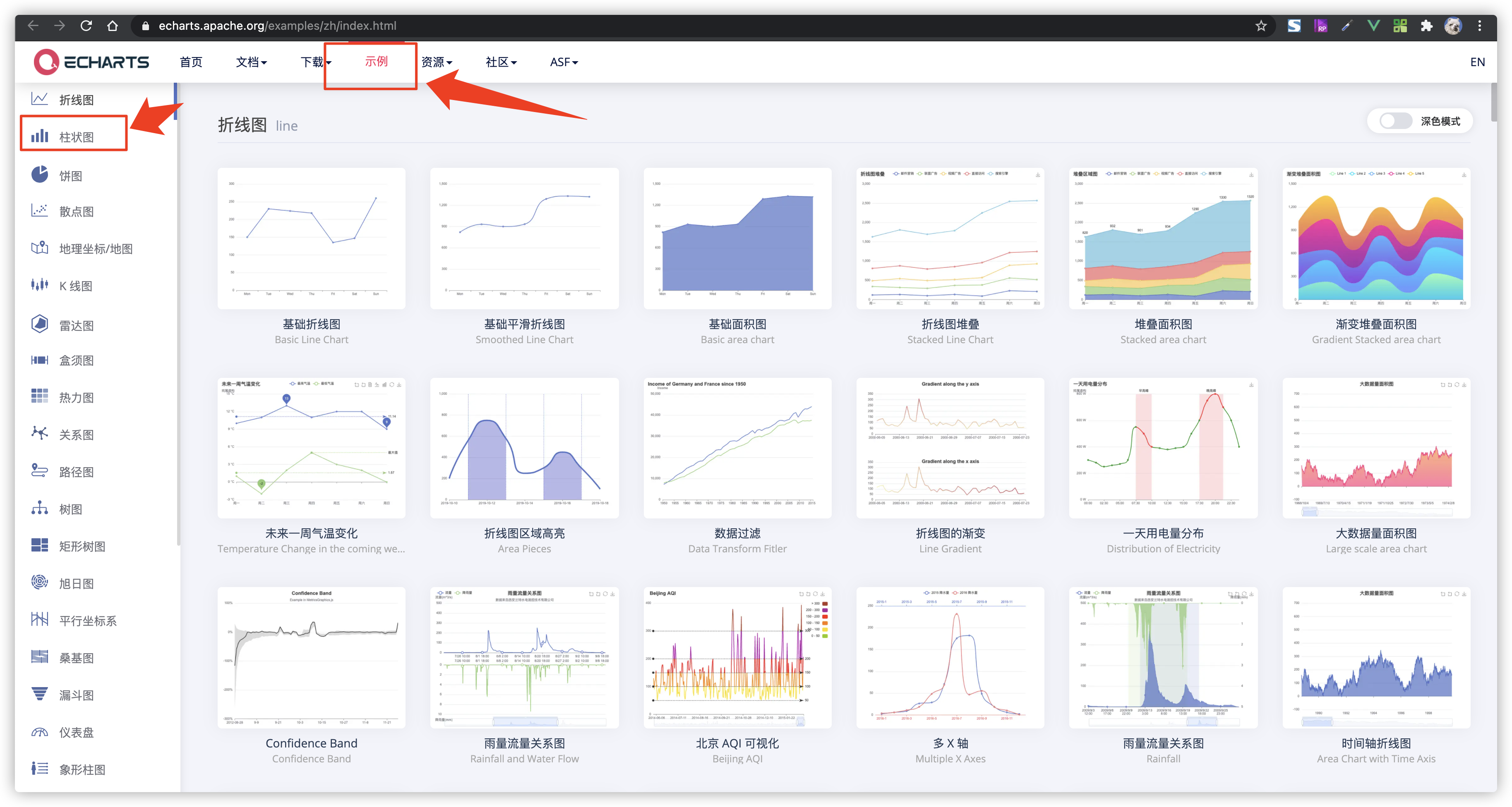
Click on the website above to get to the official website of echarts. The latest version of Apache Echarts is 5.x version.
The official website looks like this.
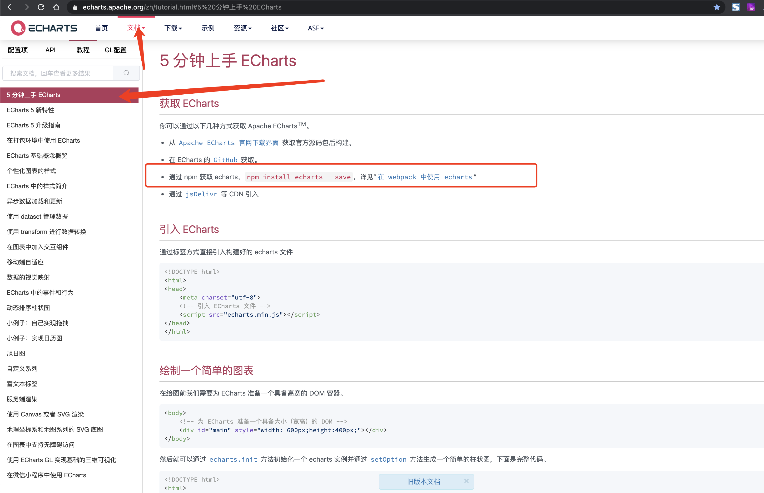
Then click Quick Start, let's install echarts and do the following.
Author's demo environment is a scaffold for vue-cli3 used to install Echarts into the project
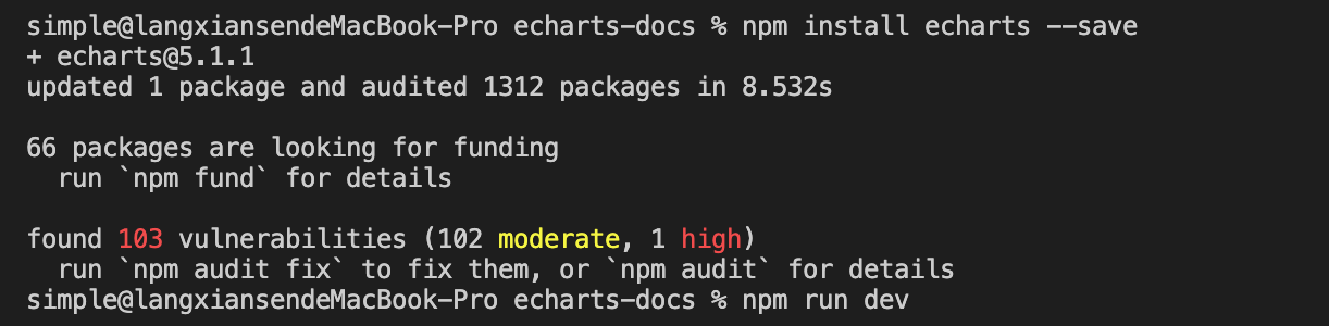
Run the command:
npm install echarts --save
//or
yarn add echarts
Install the entire package into the project
For use in a project, write a test case first to see if the installation was successful.
<template>
    <div id="charts-container" />
</template>
<script>
// Introducing a basic template
import * as echarts from "echarts";
export default {
    name: "LineCharts",
    props: {
        options: {
            required: false,
            type: [Object],
            default: () => {},
        },
    },
    data() {
        return {

        };
    },
    mounted() {
        this.init();
    },
    methods: {
        /**
         * Initialize charts
         */
        init() {

             // Initialize echarts instance based on prepared dom
            let myChart = echarts.init(document.getElementById('charts-container'));
            var option = {
                xAxis: {
                    type: 'category',
                    data: ['Mon', 'Tue', 'Wed', 'Thu', 'Fri', 'Sat', 'Sun']
                },
                yAxis: {
                    type: 'value'
                },
                series: [{
                    data: [120, 200, 150, 80, 70, 110, 130],
                    type: 'bar',
                    showBackground: true,
                    backgroundStyle: {
                        color: 'rgba(180, 180, 180, 0.2)'
                    }
                }]
            };
            myChart.setOption(option);
        }
    }
};
</script>

<style lang="scss" scoped>
#charts-container {
    width: 100%;
    height: 410px;
}
</style>
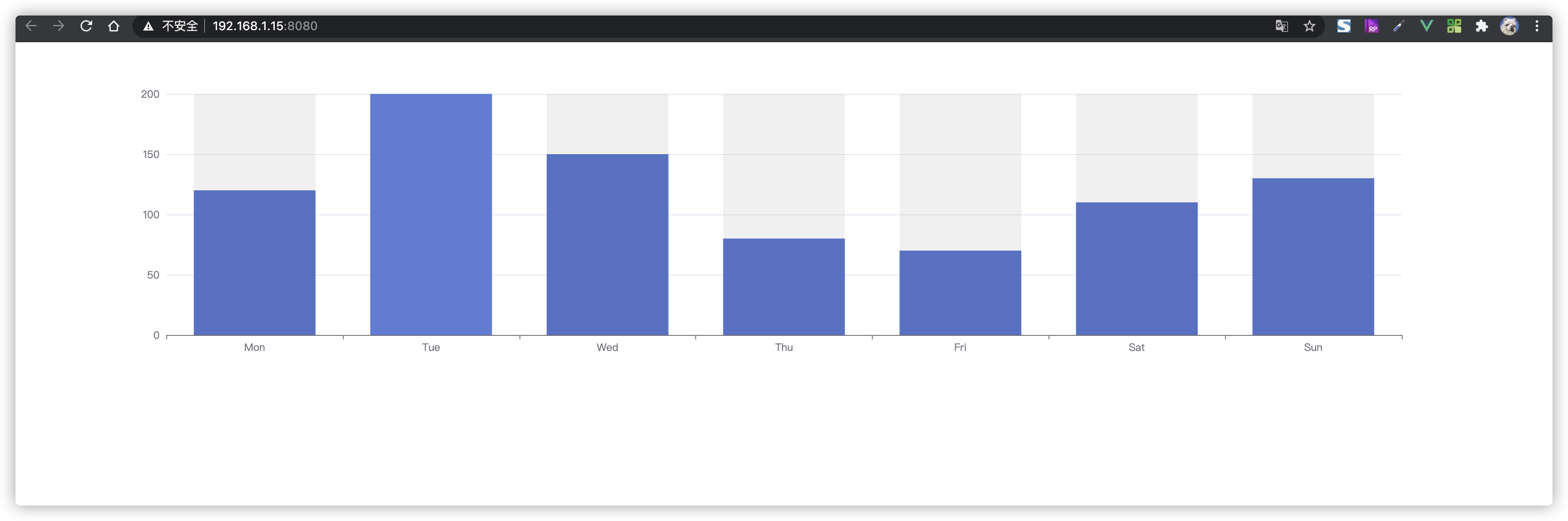
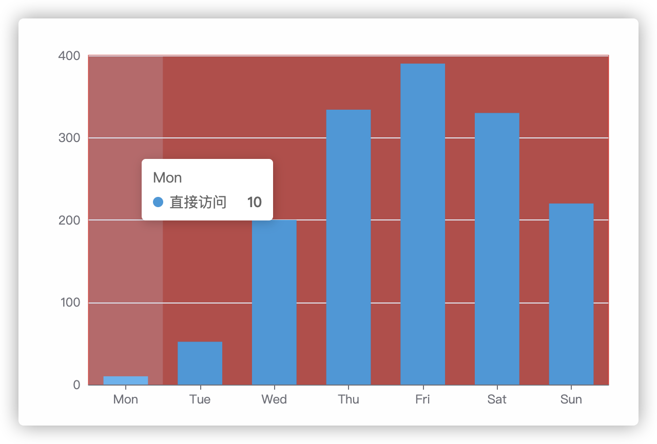
We used code from an example of the official website, which is the simplest version of the Echart prototype.
https://echarts.apache.org/examples/zh/editor.html?c=bar-background
3. Examples of echarts'needs
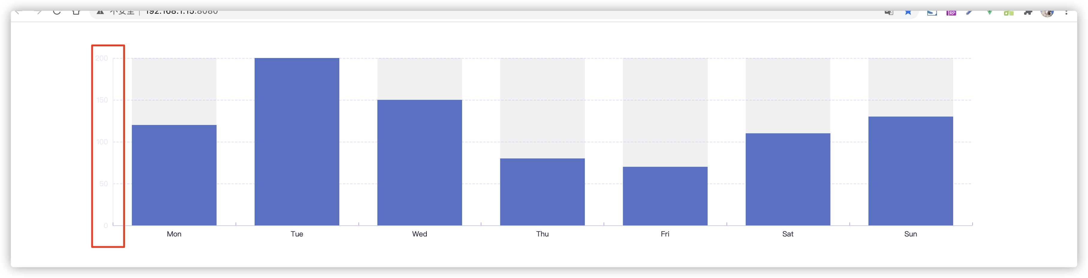
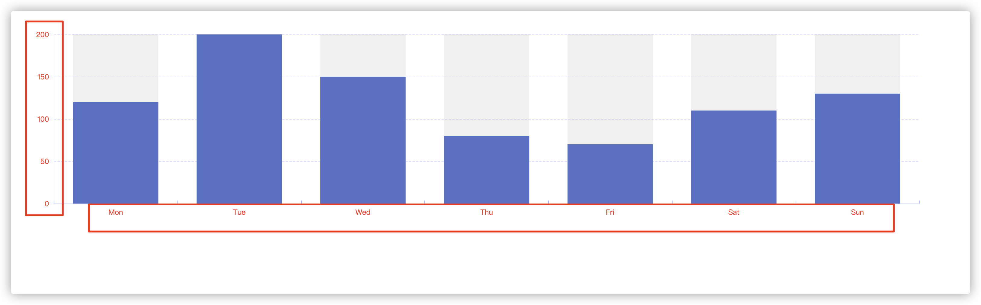
For example, if the design of the UI we get is as follows, we need to make a column chart which needs the following style (this article does not restore 100%, just examples of common attributes).
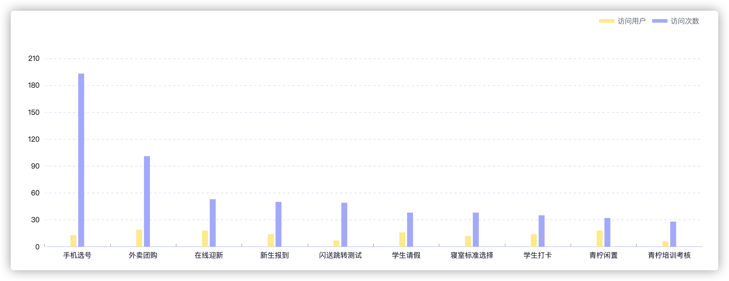
In fact, I think the design of the test Demo and UI we just wrote is different. That's how we can configure a simple Demo on our website to have consistent UI diagrams.
How can I quickly restore this UI diagram? The first thing we need to do is find the Echarts class to which this UI diagram belongs. As shown in the following figure, find the Example and then the Column Chart. This allows us to find the underlying configuration items again in the column chart. Just like in Demo.
Now it's time to configure the next step. Before configuring these properties, you need to understand what your needs are. First look at where the histogram in the UI diagram needs to be modified. Current naked-eye views include "The style of the grid (needs to be changed to dashed lines, all with color changes), the color of the histogram, the need for a legend, the scale lines on the X and Y axes are different", and so on.
The next section quickly remembers the properties of a configuration item.
4. Shorthand echarts attribute
First of all, we need to remember these attributes, so we need to classify them. In fact, the "Configuration Item Manual" in the official website has been classified very fine, but due to the high flexibility of Echarts, the things in the Configuration Item Manual appear more and more, which will lead to "eye fatigue" after a long time.
No more crap, just start. In fact, these attributes correspond to English one time. A little better English will make it easier.
Sort by the properties commonly used in the project as follows:
First-level attributes (options.xxxx):
- Grid Settings--- grid
 {
	  grid: {
	    borderColor: "rgba(222, 48, 48, 1)",
	    show: true,
	    backgroundColor: "rgba(188, 71, 71, 1)"
	  }
 }
- X-Axis Settings--- xAxis
{
	xAxis: {
      type: 'category',
      data: ['Mon', 'Tue', 'Wed', 'Thu', 'Fri', 'Sat', 'Sun'],
      axisLabel: { //Coordinate text
          color: '#24253B',
          interval: 0
      },
      axisLine: {
          lineStyle: { //Axis color
              color: '#C6C9FF'
          }
      },
      axisTick: { //Axis scale
          inside: true, //Inward
          lineStyle: {
              color: '#A3A8FF'
          }
      }
  	}
}
- Y-Axis Settings--- yAxis
 yAxis: {
     type: 'value',
     axisLine: {
         show: !false,
         lineStyle: { //Axis color
             color: '#E6EAF9'
         }
     },
     splitLine: { //grid settings
         lineStyle: {
             color: '#DADCFF',
             type: 'dashed'
         }
     }
 },
- Series Settings (Series Data) --- series
It's also easy to understand which chart data style you need to set in order to find the corresponding type
- Global Font Style Settings--- textStyle
This is also not difficult to understand. The global font style of the current chart is set, which will override the default font style. This will also have a priority, that is, individual subattribute Settings > global styles > Default
{
	textStyle:{
     	color:'#f00'//Set global font to red
 	}
}
- Legend Settings--- legend
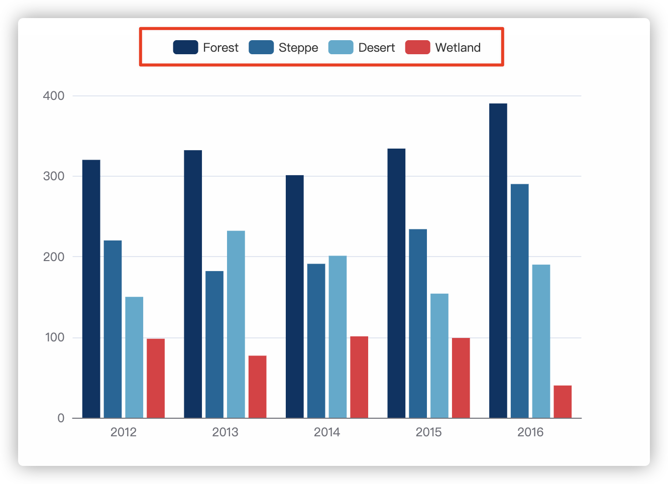
A legend is an identifier for each data item that lets you know that a color corresponds to a data item.
option = {
  color: ["#003366", "#006699", "#4cabce", "#e5323e "], 	// This is a sample color of four legends.
  dataset: {
    source: [
      ["type", "2012", "2013", "2014", "2015", "2016"],
      ["Forest", 320, 332, 301, 334, 390],
      ["Steppe", 220, 182, 191, 234, 290],
      ["Desert", 150, 232, 201, 154, 190],
      ["Wetland", 98, 77, 101, 99, 40]
    ]
  },
  legend: {
    itemStyle: {
      color: "rgba(249, 0, 0, 1)" //The child property settings here override the above settings
    }
  },
  xAxis: {
    type: "category",
    axisTick: {
      show: false
    }
  },
  yAxis: {},
  series: [{
    type: "bar",
    seriesLayoutBy: "row"
  }, {
    type: "bar",
    seriesLayoutBy: "row"
  }, {
    type: "bar",
    seriesLayoutBy: "row"
  }, {
    type: "bar",
    seriesLayoutBy: "row"
  }]
}
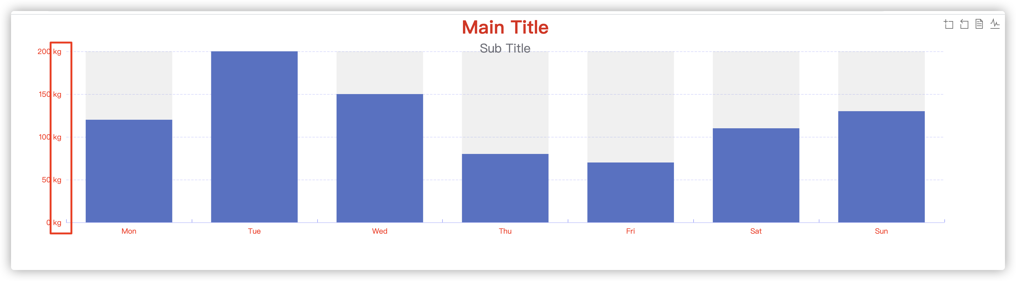
- Title Settings--- title
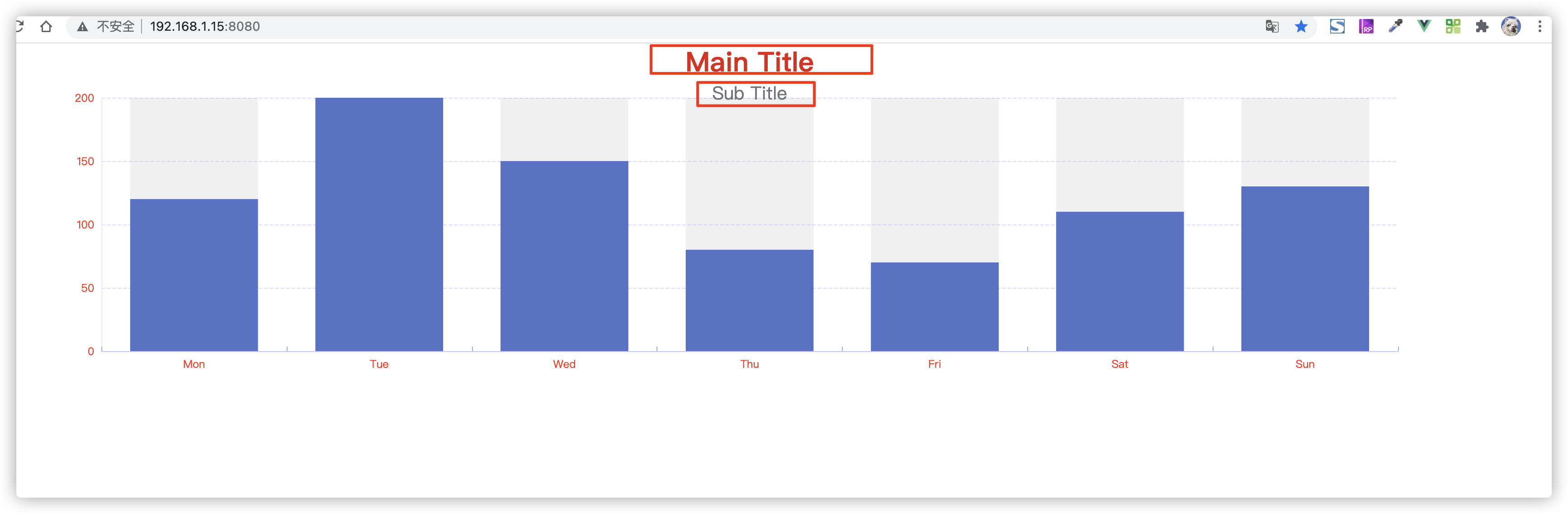
Here the title can be divided into main title and subtitle, and the show property can be used to control display hiding.
{
	title: {
        text: "Main Title",
        subtext: "Sub Title",
        left: "center",
        textStyle: {
            fontSize: 30,
            color: "rgba(225, 15, 15, 1)"
        },
        subtextStyle: {
            fontSize: 20
        }
    }
}
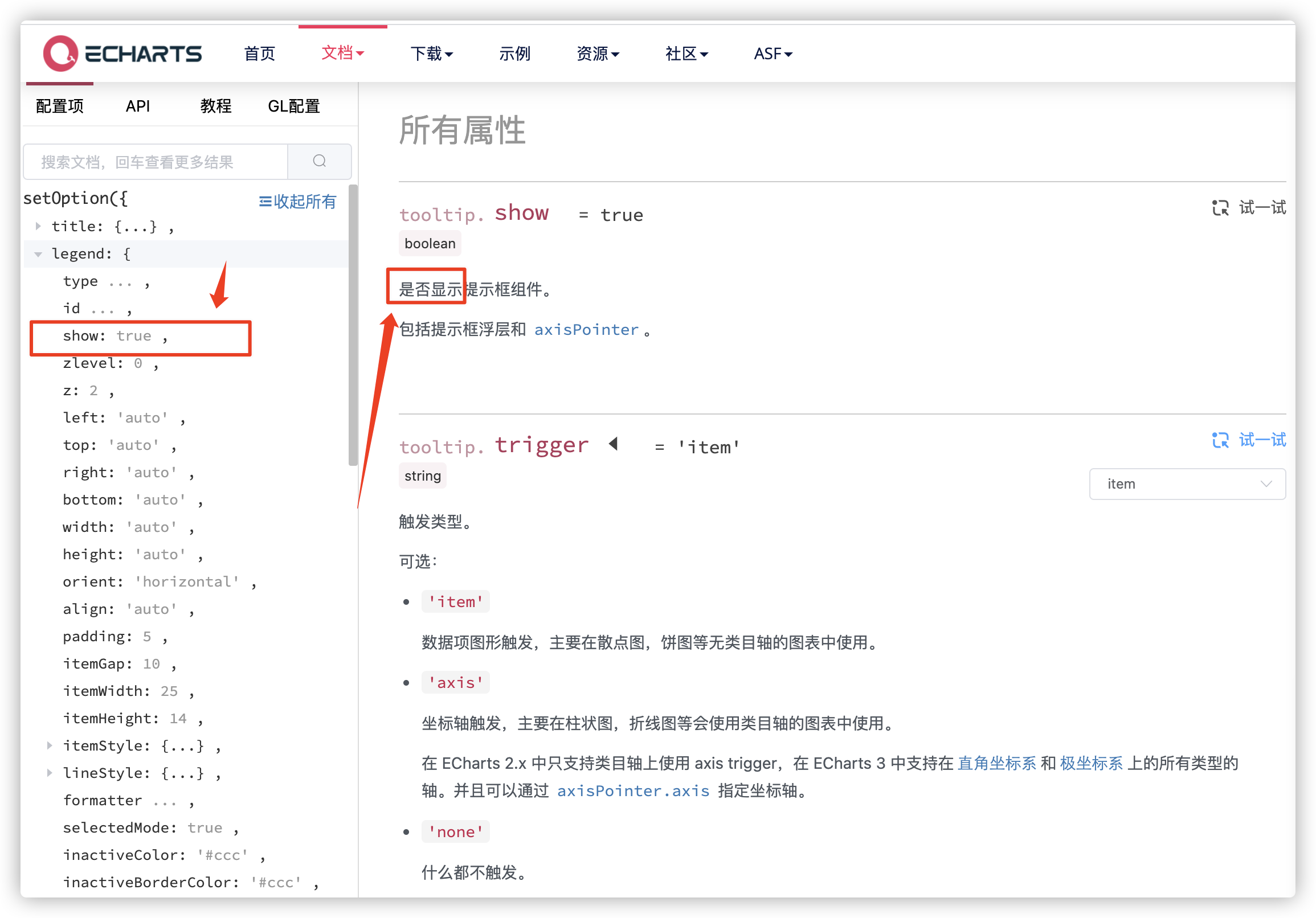
- Tip Settings (Mouse over Graph Interaction Style) --- tooltip
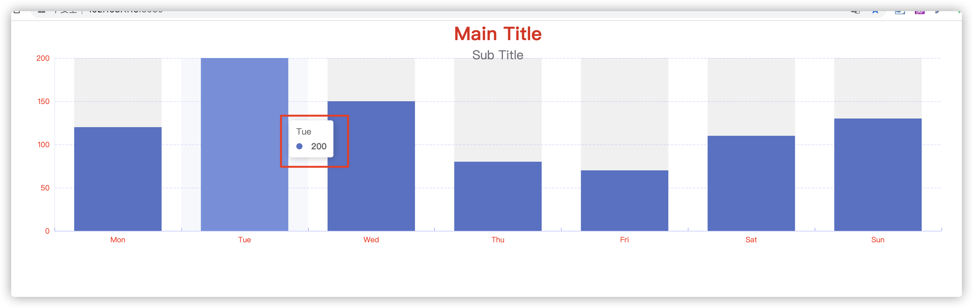
This is the prompt component, typically set with the mouse hovering over the chart.
- Toolbar Settings--- toolbox
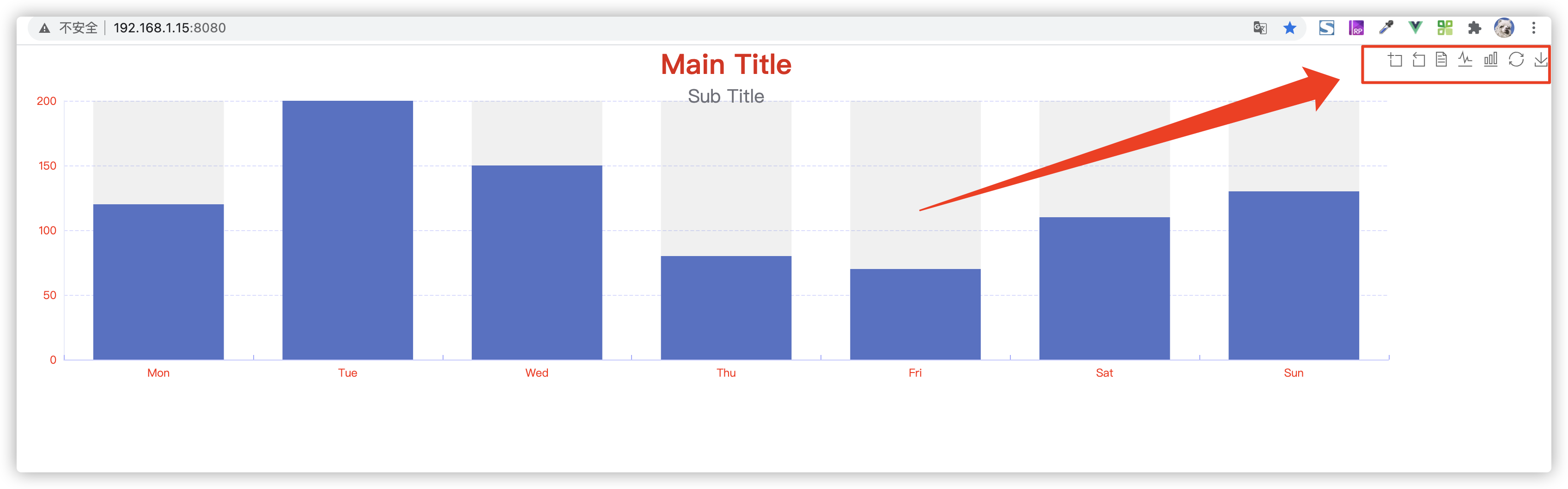
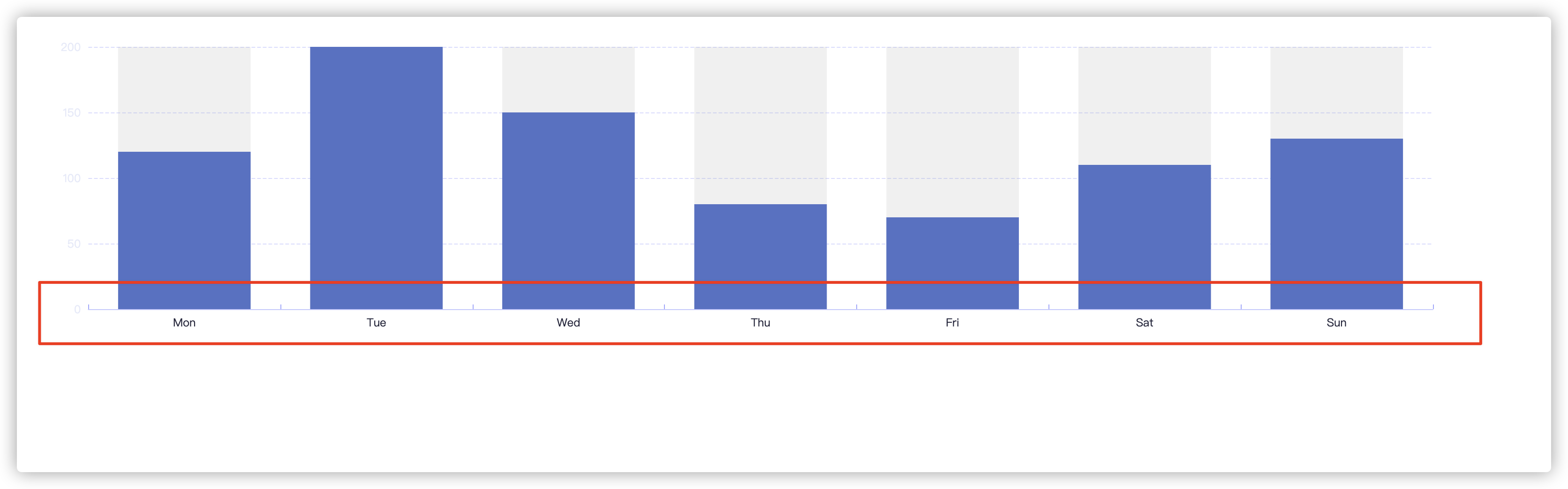
The area indicated by the arrow in the figure above is the toolbar. Functions are common tools for configuring graphs, such as downloading, switching graphs, and so on.
Secondary attributes (options.xxxx.xxx)
- Whether to show a style--- show (Boolean type)
Keep this show in mind. Most of the first-level attributes have this attribute, which controls the display and hiding. It needs to be true and it doesn't need to be false.
- Axis grid settings--- splitLine (properties for both x and y axes)
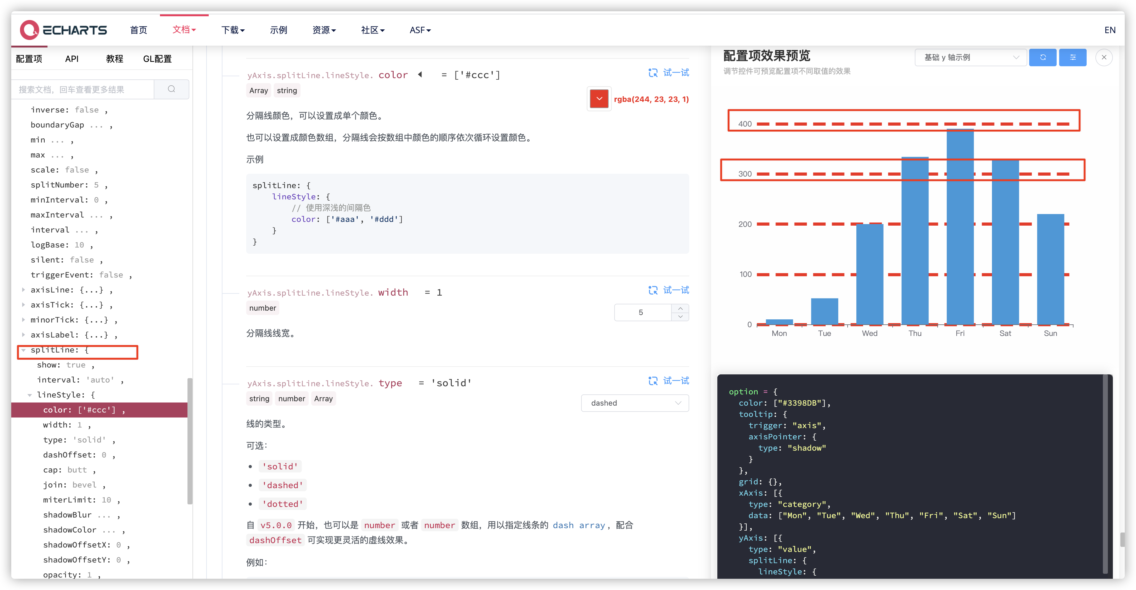
This property is also not difficult to understand, that is, to set the style of x- or y-axis display in the grid, the grid is all in the world, and the settings here are the detailed settings for each axis.
 yAxis: [{
    type: "value",
    splitLine: {	//Grid settings for coordinates
      lineStyle: {
        width: 5,
        type: "dashed",
        color: "rgba(244, 23, 23, 1)"
      }
    }
}
- Font Settings--- textStyle
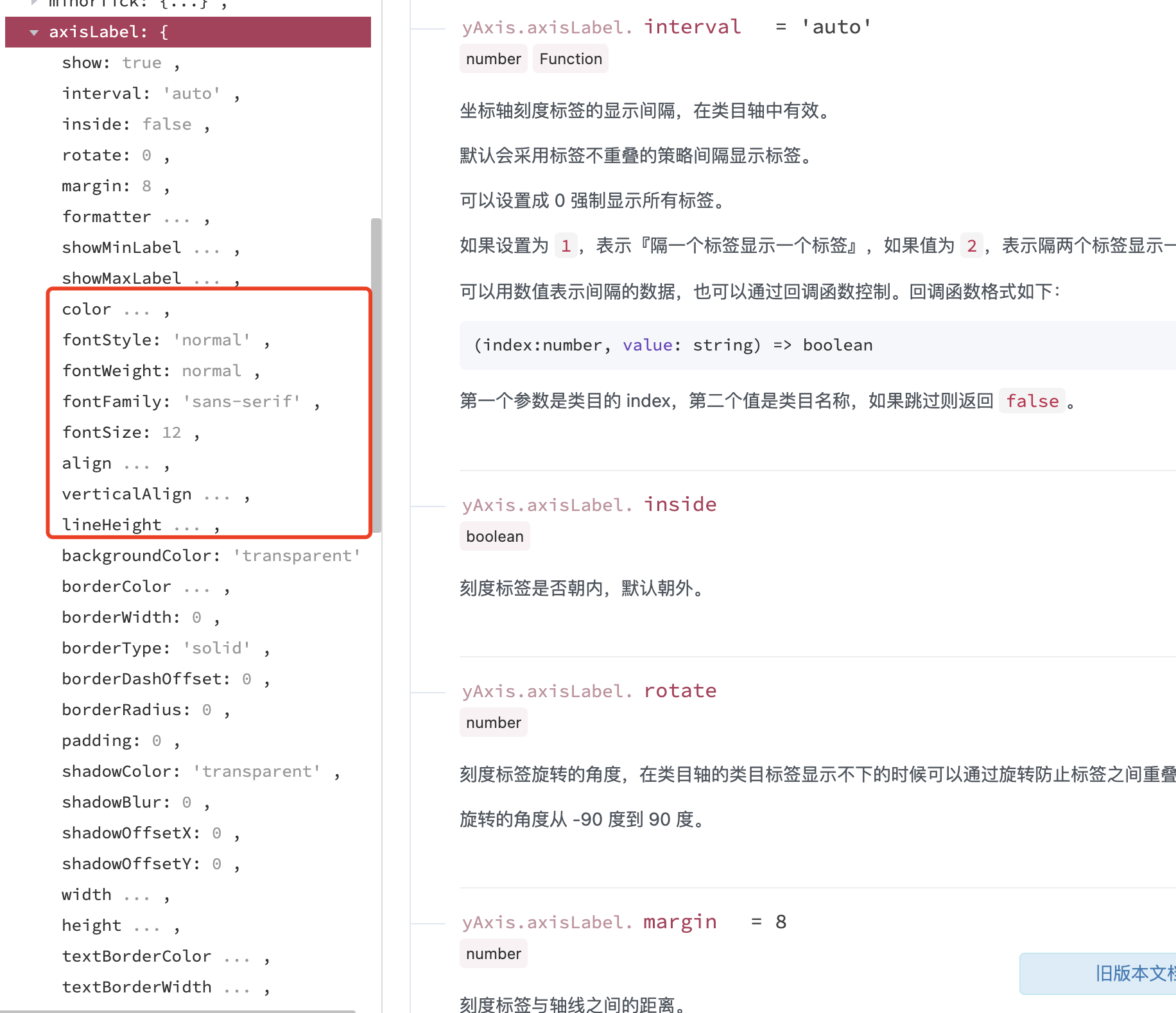
There may be some misconception here. The textStyle style of a sub-attribute is generally defined as the font style set in a specific attribute, just like that set by js.
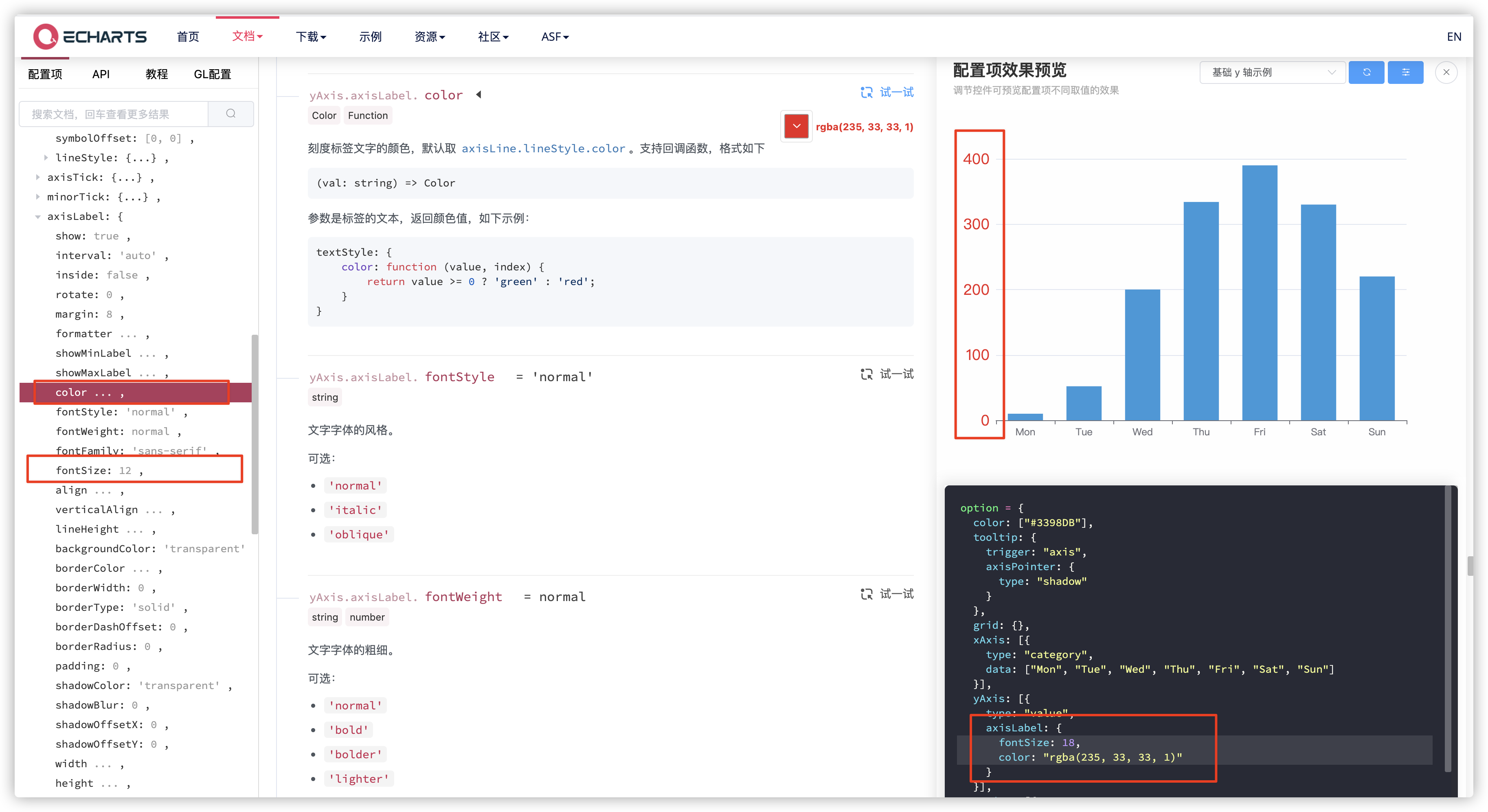
 yAxis: {
    type: "value",
    axisLabel: {	//Scale Label Text Settings
      fontSize: 18,	//
      color: "rgba(235, 33, 33, 1)"
    }
 }
- Graphic Style Settings--- itemStyle
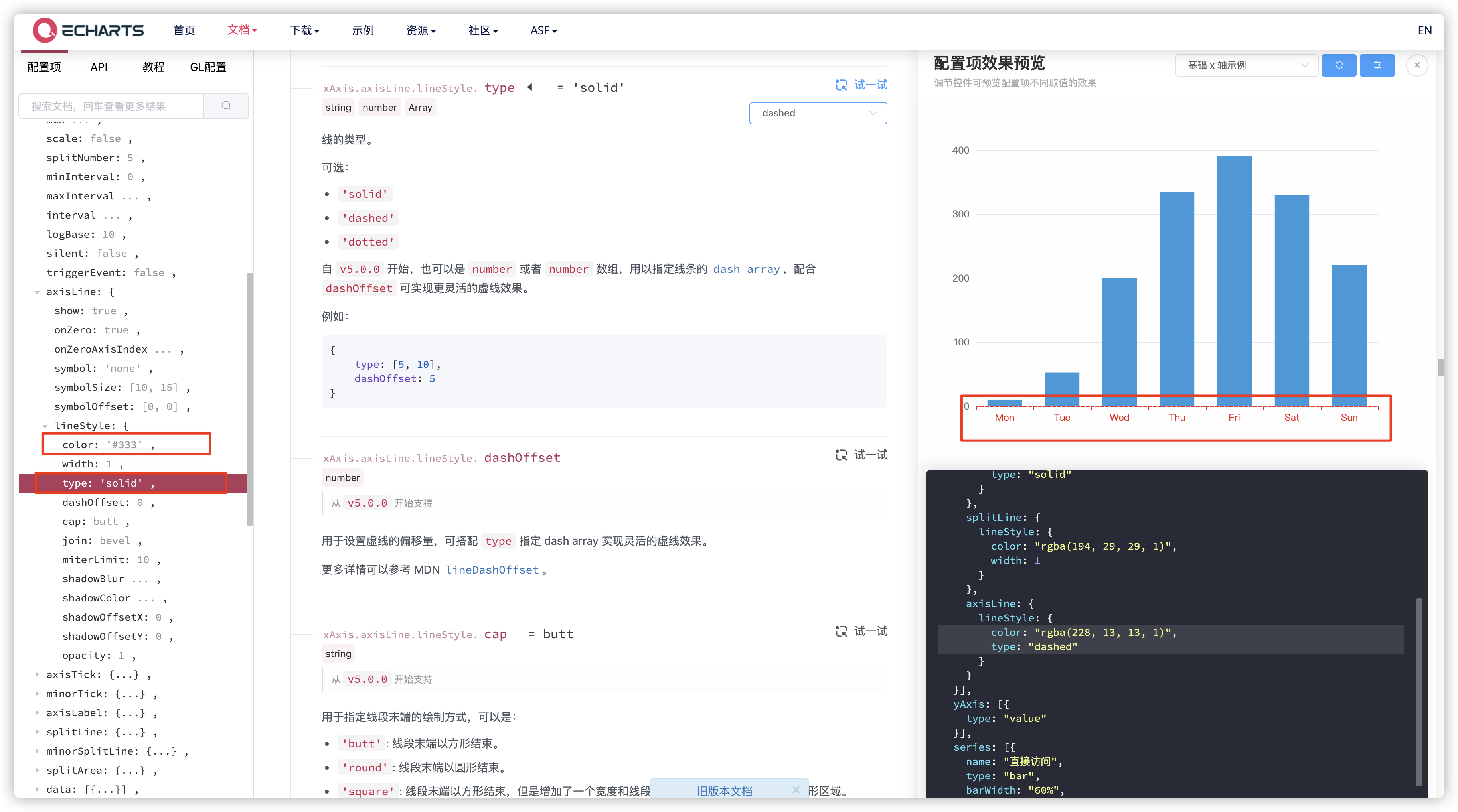
This property is also set in most property settings, which can be understood as setting a geometric property of an attribute.
 xAxis: {
    axisLine: {
      lineStyle: {	//Axis Style Settings
        color: "rgba(228, 13, 13, 1)",
        type: "dashed"
      }
    }
}
- Style settings for lines--- lineStyle
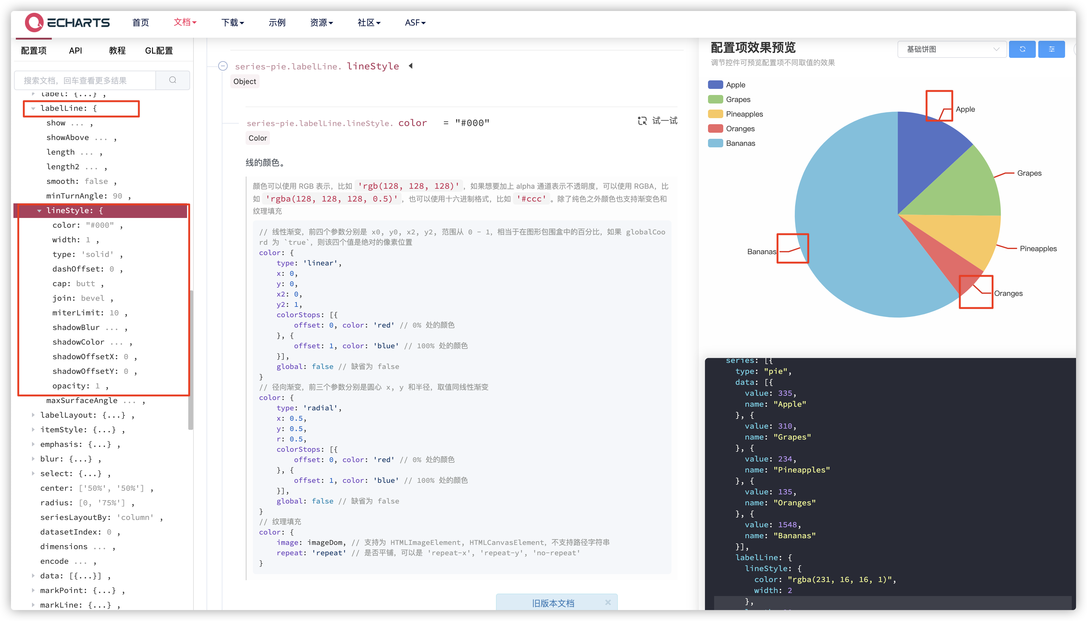
This property is mainly the style of this visual guide.
series: [{
    type: "pie",
    labelLine: {
      lineStyle: { //Style settings for guide lines
        color: "rgba(231, 16, 16, 1)",
        width: 2
      },
      length: 20
    }
}]
- Text Label Settings--- label
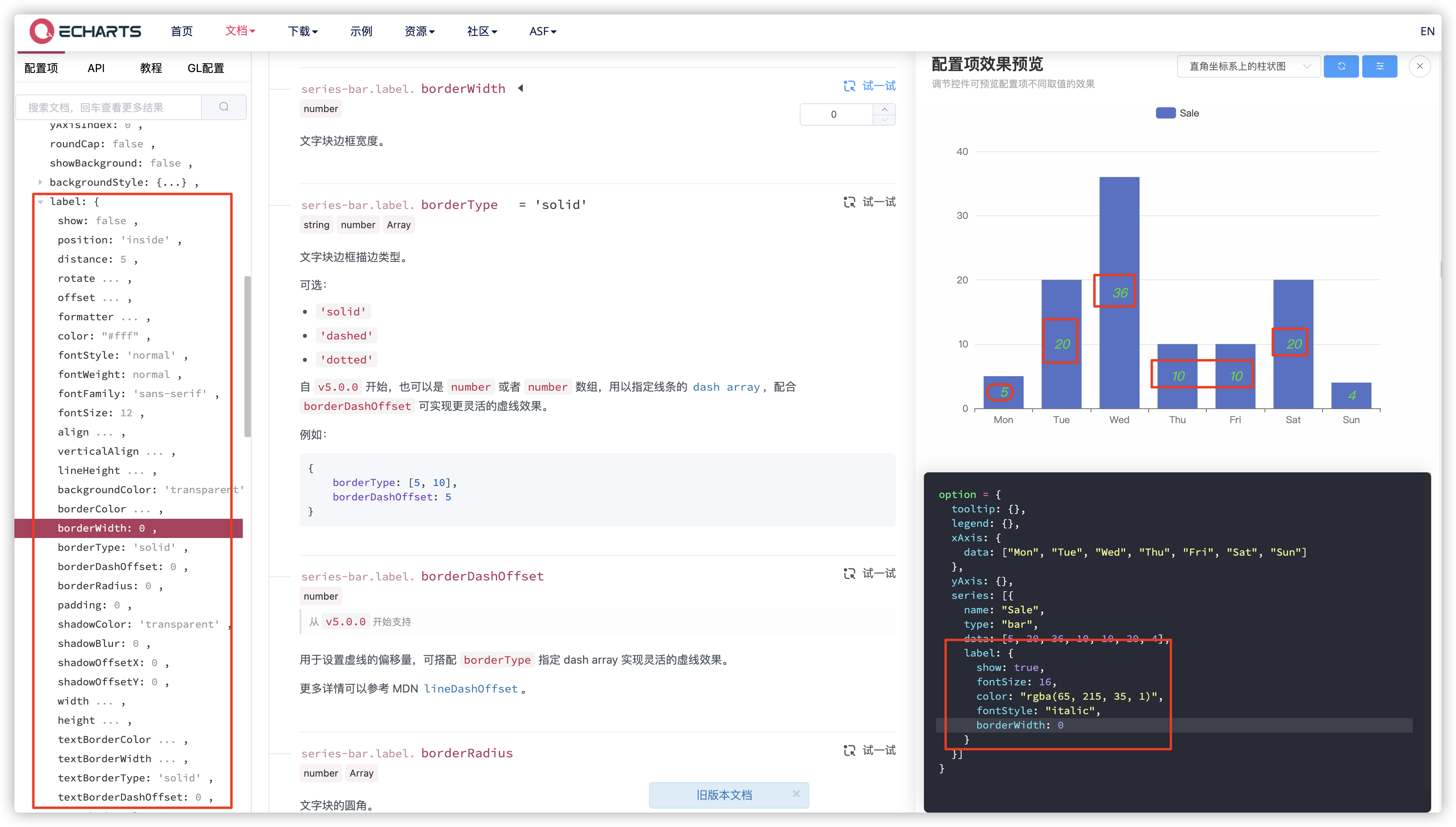
The part marked in the text is to set the properties of a label, generally referring to the text displayed in the chart data.
 series: [{
    name: "Sale",
    type: "bar",
    data: [5, 20, 36, 10, 10, 20, 4],
    label: {
      show: true,
      fontSize: 16,
      color: "rgba(65, 215, 35, 1)",
      fontStyle: "italic",
      borderWidth: 0
    }
}]
- Label's Visual Guide Settings--- labelLine
This property was mentioned earlier when lineStyle was written.
- Location settings for display - --- (left, right, top, bottom), etc., are the same as positioning properties
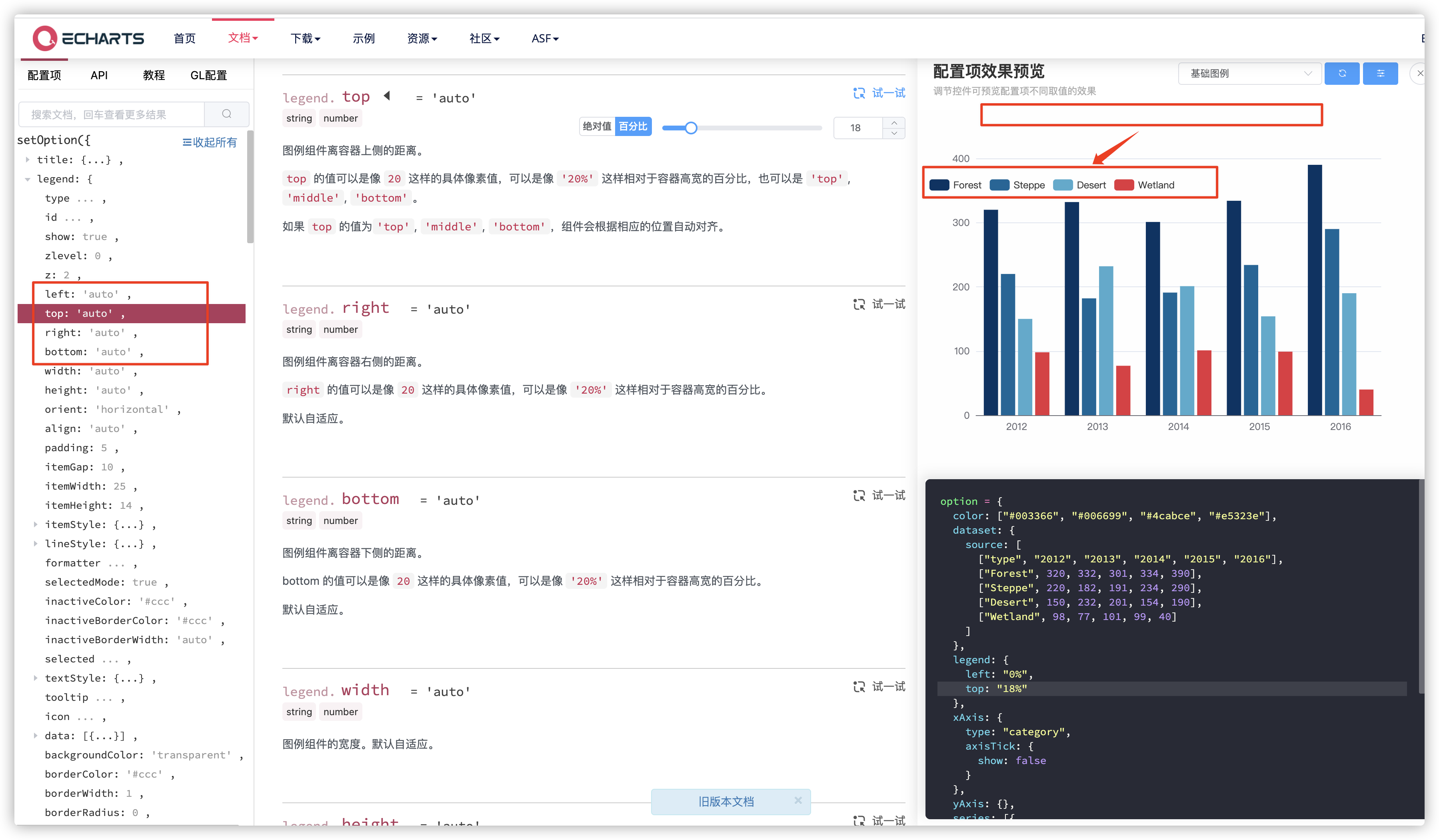
It's not difficult to see here that we moved the legend that was centered at the top to the next point on the left, controlled by these properties, which are found in most data-independent prompt classes, such as toolbars, titles, labels, and so on.
- Transparency Settings--- opacity
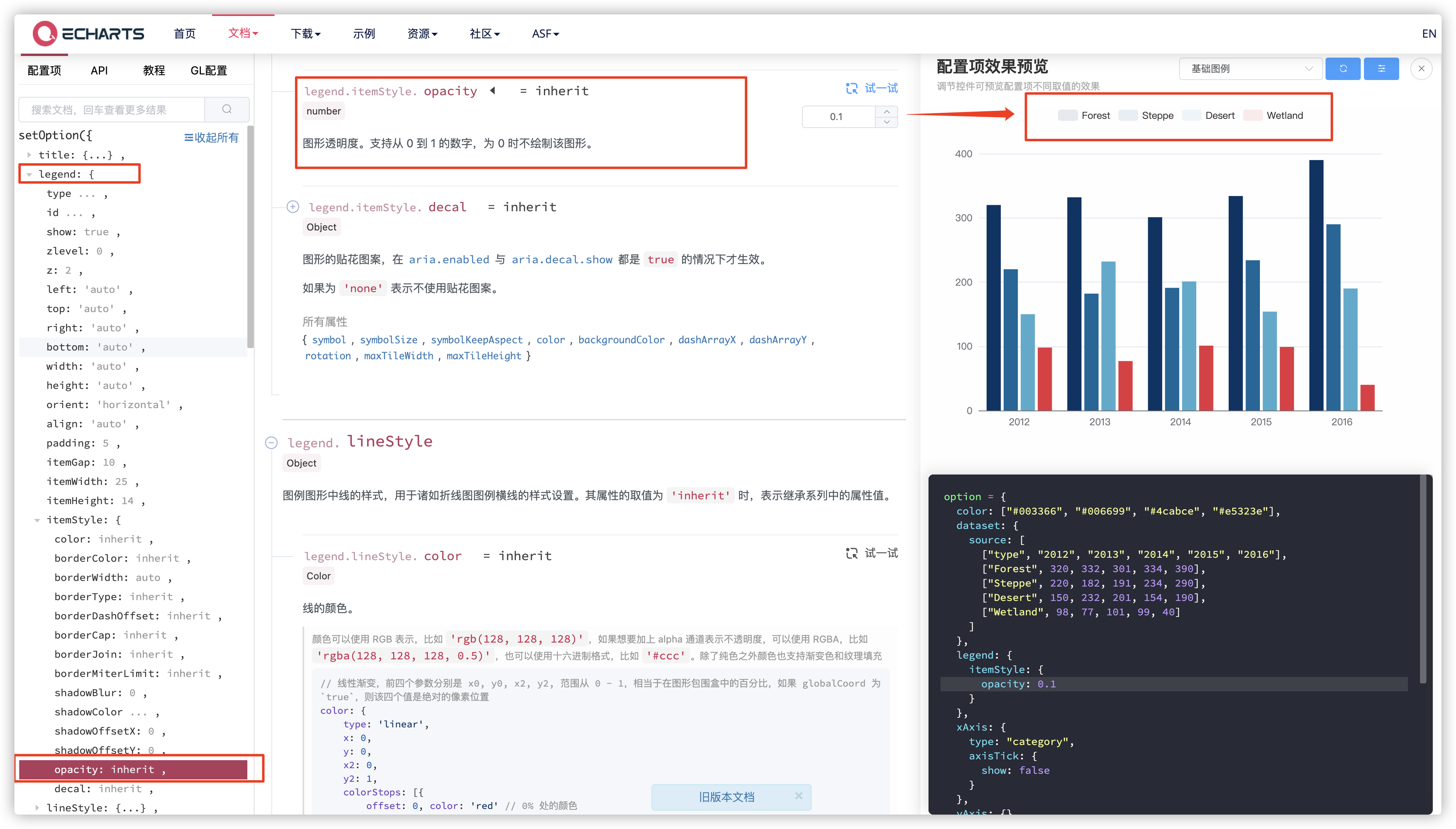
It's also a good idea to write wherever you want the part to be transparent.
legend: {
    itemStyle: {
      opacity: 0.1
    }
},
- Formatting Settings--- formatter
These are some of the common property settings. Did you learn them?
5. Summary of this paper
In fact, it is not difficult to see from the above subsection that some of the property settings of Echarts are very regular, as long as you find these rules, you can quickly get started with Echarts. This is an article in the series of Echarts. The main purpose of this article is to make your Echart friends get started quickly and keep updating.
Please leave a message or @blogger if you have any questions. Thank you for supporting o())o~
Thank you for your reading. If this article or item is helpful to you, please give it a one-click-three-link if you can!
GitHub has open source projects, so the little buddies you need can star t right away!
GitHub: https://github.com/langyuxiansheng